| THIS WEEK'S ARTICLES |
| The Market Message |
| Stock Indexes Try to Regain 50-Day Averages; The Nasdaq 100 QQQ Has Already Cleared Its Blue Line |
| by John Murphy |
Editor's Note: This article was originally published in John Murphy's Market Message on Friday, September 4th at 3:11pm ET.
Stock prices are continuing the rebound that began with yesterday's upside reversal off their 200-day moving averages. And they're now trying to clear some overhead resistance. Chart 1 shows the Dow Industrials entering an overhead "gap" area created by Wednesday's downside price gap (red lines). An overhead gap often acts as resistance; and a move above that gap would be a positive sign. The Dow has also reached its 50-day line. A close back over that line would confirm the importance of yesterday's upside reversal. Chart 2 shows the S&P 500 having already filled all of Wednesday's overhead price gap; and testing its 50-day line. A close above its blue line would be a positive sign.
Chart 3, however, is the most impressive of the three charts. It shows the Invesco Nasdaq 100 QQQ Trust (QQQ) already trading above its blue line. In addition, the QQQ has also completed a small "island reversal" bottom (see black box). A bullish "island reversal" is formed when a downside price gap (formed on Wednesday) is followed shortly by an upside price gap (which was formed today). That's normally a good sign for a market and is usually associated with a market bottom.
Chart 1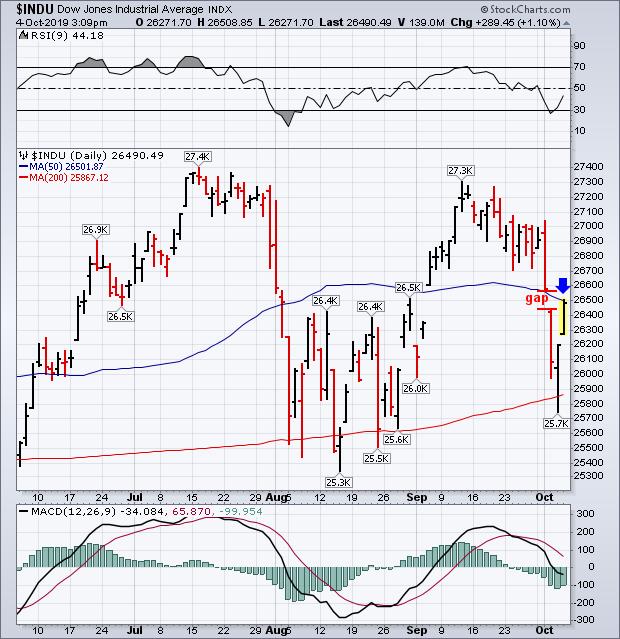
Chart 2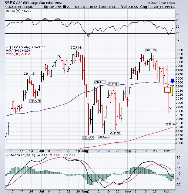
Chart 3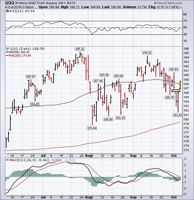
|
| READ ONLINE → |
|
|
|
| Art's Charts |
| Using New Highs and Lows to Track Trends in Two Timeframes |
| by Arthur Hill |
 Today we are going to show how 52-week highs and lows can be used to track long-term and short-term trends in the S&P 500. Full disclosure: this is not the holy grail. It is one indicator that can be used in conjunction with others to keep you on the right side of the trend. Today we are going to show how 52-week highs and lows can be used to track long-term and short-term trends in the S&P 500. Full disclosure: this is not the holy grail. It is one indicator that can be used in conjunction with others to keep you on the right side of the trend.
52-week highs and lows are exceptional. A stock recording a 52-week high is clearly in a strong uptrend and clearly a leader. These stocks are worth counting because they contribute to broad market strength. On the other side, a stock recording a 52-week low is clearly in a strong downtrend and a laggard. Stocks in strong downtrends detract from broad market strength.
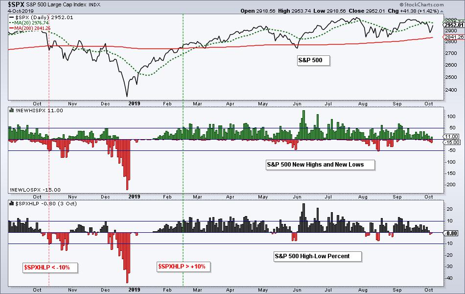
Now we need to measure "net strength" using High-Low Percent. This indicator shows net new highs (new highs less new lows) as a percentage of total issues. The chart below shows new highs and new lows for the S&P 500 in the middle window and High-Low Percent in the lower window.

As part of my Index Breadth Model, I consider a move above +10% as bullish and a move below -10% as bearish. A move above +10% shows enough "net strength" to give the bulls a clear edge, while a move below -10% gives the bears a clear edge. This indicator has been bullish since February and it would take a move below -10% to trigger bearish.
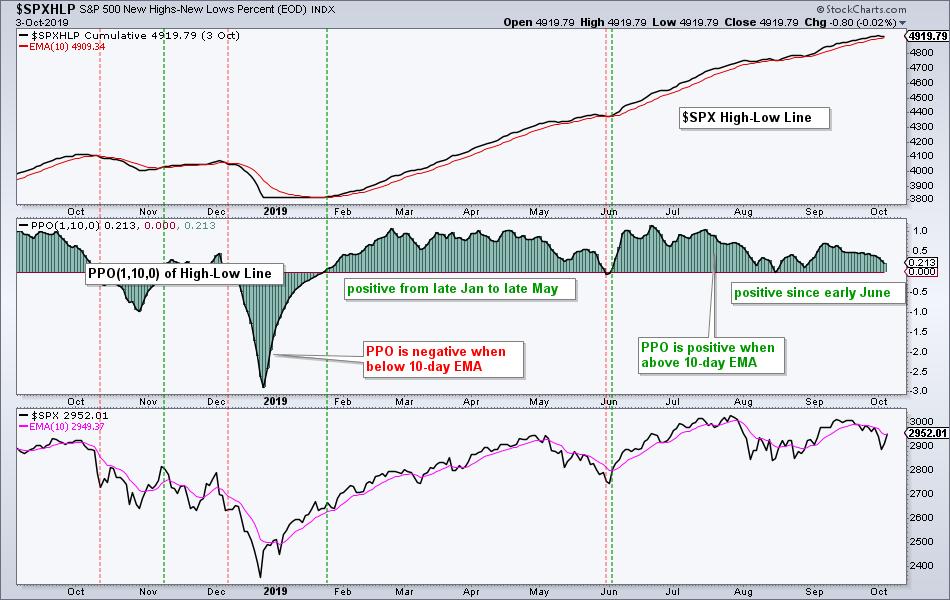
For shorter swings, chartists can apply the PPO to the High-Low Line. Like the Advance-Decline Line, this indicator is a cumulative measure of High-Low Percent. The chart below shows the High-Low Line with the 10-day EMA in the top window, the PPO of the High-Low Line and the S&P 500. The PPO(1,10,0) turns positive when the High-Low Line moves above its 10-day EMA (rising) and negative when the High-Low Line moves below its 10-day EMA.

The red and green lines mark the crosses over the past year. The PPO turned positive in early June and remains positive. Except for a short whipsaw in May-June, this line has been pretty much rising since late January. Chartists looking for an early warning signal from the S&P 500 can watch this indicator. A move below zero would signal an expansion of new lows (strong downtrends) and this would be negative for the S&P 500.
Note that these charts show Thursday's values for new highs and new lows. Simply click on the charts to open a link to a live chart with Friday's data.
|
| READ ONLINE → |
|
|
|
| The Canadian Technician |
| Living Through Global Stress |
| by Greg Schnell |
The markets have wobbled and wobbled, but they haven't fallen off the wall. When I look though my charts, I can't help but be amazed by the strength holding the market up. It makes me wonder: Why do all the previous market rollovers look so easy in hindsight? (Isn't that always the way?)
The market has been oscillating since late April. What I am surprised at is the resilience. Over and over, the market has shown plenty of broken charts that could easily accelerate lower. Lousy economic data continues to pour in worldwide. The USCAM North American trade deal has not been ratified. Deals with Europe just got less likely. More tariffs will be applied to Europe later this month. The China trade deal continues to get all the press with no real view that it is getting better. Yet the market keeps holding up. With China trade talks next week and (I believe) the Europe discussions following the week after, there will be no shortage of news flow.
It couldn't feel more like a launch pad - or a cliff drop. Which way will this go?
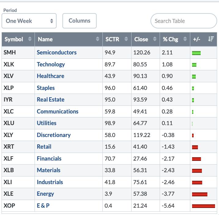
My deep dive through the charts continued to make defense the best plan to end the week. Broker/Dealers, Banks, Railways and Industrials all moved lower. Commodities had a difficult week. One positive surprise was the Semiconductors as a differentiator. Additionally, Apple (AAPL) had a great week and almost made new 52-week highs. The Friday bounce showed up across the technology sector and moved it back to positive on the week.

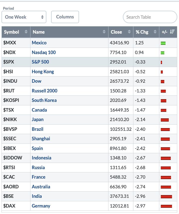
China's markets were closed for the week, so we could not analyze how Chinese investors perceive the trade talks. Europe was down hard. Commodity countries were weak as well.

I continue to be defensive in posture, as the sectors and industry groups weaken. As I mentioned in my last ChartWatchers article, the charts were poised to go lower, and they have been falling in the couple of weeks since. The charts are even weaker now and appear really set up a break down and continue lower. But that is not the story the semiconductors are telling us.
It's difficult to have conviction higher as it seems like we are at the edge of support. Poor trade talk results would probably accelerate this market meaningfully lower. With the economy slowing, good trade talk results would catch a lot of people short or underinvested. It's an important couple of weeks. Stay tuned!
I continue to make progress on my website for the new subscription service I am building. As a non-techie, it surprises me how much has to happen to get all the plumbing to work. With a few experts helping me, we are getting closer! Please head over to gregschnell.com to submit your email address; that way, you will get an email in the next few days with the introductory offer inside. For all of the readers that have followed my work closely over the years, I will have a specific, deep discount for you. Thank you for all your support!
|
| READ ONLINE → |
|
|
|
| ChartWatchers |
| Q4 and Earnings Season Kick into High Gear. Get Ready! |
| by John Hopkins |
In just over a week, some of the largest banks will report their earnings including Citigroup, JP Morgan and Wells Fargo. When these financial behemoths report, I consider that the kickoff of Q3 earnings season. And when I think about the beginning of earnings season, my blood gets flowing thinking of so many great trading opportunities, as thousands of companies report their numbers over the next few months while we head towards the end of the year.
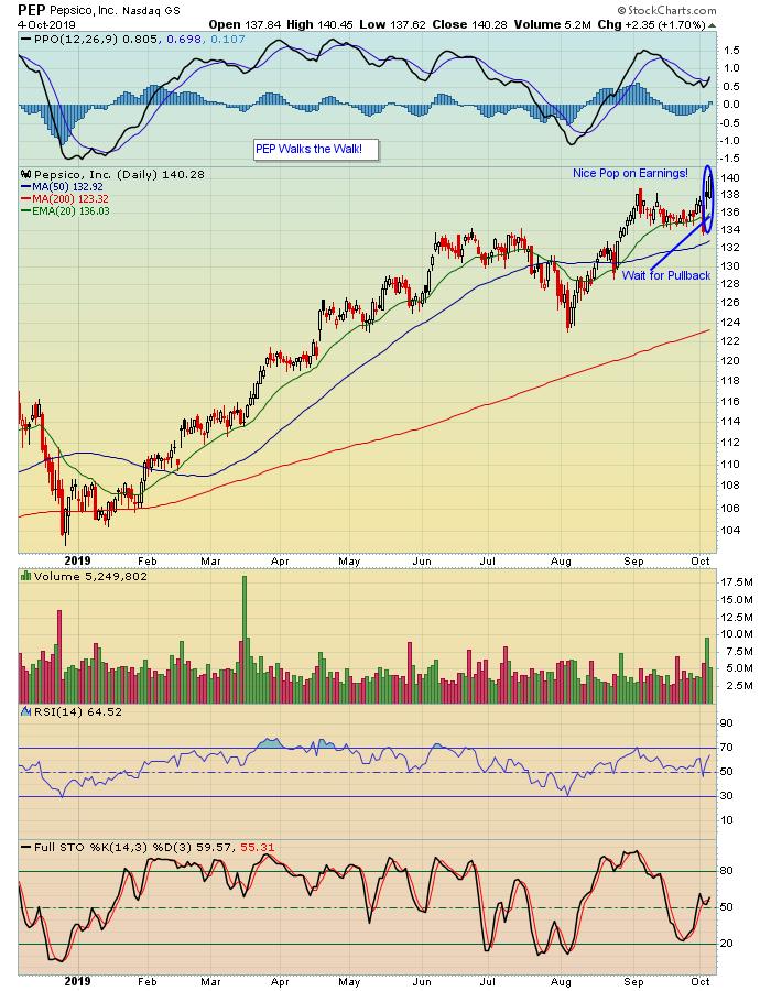
At EarningsBeats.com, all we do is focus on companies that beat earnings expectations, both the top and bottom lines. Specifically, we scan the market for those that do beat expectations and also have promising technical charts. A current example is Pepsi (PEP), who just reported numbers this past Thursday that beat both earnings and revenue expectations.

You can see that PEP made a nice move higher after reporting its numbers. In fact, it hit an all-time high. But we prefer to wait to see the market reaction to an earnings report before getting involved in a trade, as there's no telling how the stock will behave once numbers have been released. So, in the case of PEP, we're happy to wait for a pullback to a key price or support level before issuing a trade alert to our members.
The whole concept behind focusing on stocks that beat earnings expectations and have strong charts is this: traders flock to those companies that show strength on the fundamental and technical side. Makes sense, right? Why not zero in on the strong performers? And, better yet, let the dust settle once the numbers are in and then wait patiently for the right time to strike.
With Q4 just underway and Q3 earnings season about to kick into high gear, we're going to be conducting two highly educational and timely webinars featuring Chief Market Strategist Tom Bowley, who will be presenting his Q4 Outlook in a members-only webinar this Monday, October 7. That will be followed by our Q3 Earnings webinar on October 21, where Tom will be zeroing in on stocks that have reported earnings, along with those stocks which are about to report and could present high reward-to-risk opportunities. These are both extremely popular events and, if you would like to join us, just click here to learn more.
Trading stocks brings with it many challenges, from finding appropriate candidates to setting entry, target and stop losses to pulling the trigger on the entry and exit sides. Why not zero in on those stocks that "walk the walk" and give yourself a greater opportunity to succeed?
At your service,
John Hopkins
EarningsBeats.com
Better Timing. Better Trades.
|
| READ ONLINE → |
|
|
|
| The Traders Journal |
| Hail To The Sell-Side Savant: My Mentor |
| by Gatis Roze |

I lost a mentor in September. Justin Mamis, who taught me how to formulate and engage my sell techniques, passed away at the age of 90. The lessons he taught me were the foundation for Stage Nine — the art of selling — in our book. I owe him an immeasurable debt of gratitude.
As a young aspiring money manager over 25 years ago, I was very fortunate. Dr. Hank Pruden recommended that I read Justin Mamis’ book, When To Sell. To this day, it is one of the essential books I recommend to all aspiring investors. When Grayson and I wrote our book, Tensile Trading, we clearly stood on the shoulders of this Wall Street titan.
Sage advice for all aspiring individual portfolio managers would be to read and reread not only Mamis’ book, When To Sell, but the Mark Douglas book, Trading In The Zone, as well. Many readers of Tensile Trading have confessed to Grayson and me that the selling chapter was transformational in their personal investment endeavors. Likewise for the two of us.
When we researched our book, we were shocked by the dearth of credible material on the discipline and techniques of selling. Perhaps the explanation is as simple as Wall Street. The investment community is always yelling “hurrah, hurrah…buy, buy…come on in — the waters fine!” On the other hand, investors are left to their own devices with respect to the sell side. It is precisely for this reason that Justin Mamis earned his reputation as an oracle on Wall Street.
Similarly, in his 2018 book, Muscular Portfolios, author Brian Livingston (also a StockCharts.com contributor) presents conclusive research that supports a Wall Street insider secret. Warren Buffet’s superior long term returns are based on his skills in protecting his profits and losing less during market corrections than his outperforming in bull markets. I’m sure he knew Justin Mamis.
An enduring lesson I’ve embraced is that Wall Street and all the talking heads are populated by a breed of Pinocchios. Whether it’s opacity or complexity, I’ve come to realize that selling based on the unknowable universe of fundamentals is likely to leave one standing last and alone in the party room. Sell on what the price action is telling you. You’ll find out why perhaps weeks or months later.
Here are a few sample selling affirmations:
- Fundamentals are fine on the buy-side but they are too late on the sell-side.
- Formulate your selling strategy BEFORE you buy into a position.
- Get your ego out of the way. The markets are always right, so trade what you see in your charts — not what you feel.
- Your personal selling methodology must acknowledge that the markets will gladly continue to offer you more sell-side information, but the cost they charge is a lower exit price.
- Don’t make the mistake of trying to get every last drop of a gain from your position. Sell, lock in a profit and move on.
In closing, remember that your sell discipline provides you a significant “odds enhancer” towards achieving a profitable portfolio. If you choose to ignore the market, it will not ignore you. Benign neglect is not an investment strategy.
Justin Mamis: thank you for your many insights. May you rest in peace.
Trade well; trade with discipline!
- Gatis Roze, MBA, CMT
StockMarketMastery.com
|
| READ ONLINE → |
|
|
|
|
|
| DecisionPoint |
| De-Fanging the FAANG Stocks - Bearish Patterns on Weekly Charts |
| by Erin Swenlin |
About two weeks ago, my dad, Carl, pointed out that the FAANG stocks were forming some "impressive" bearish topping formations. I took a look and I have to agree. Despite a blow-out rally today, we both believe there is still trouble ahead. These charts in particular concern us, given the influence these stocks have on the broader markets; a few are especially bearish.
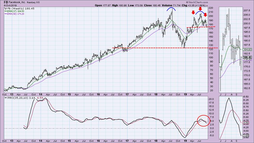
So, in their "FAANG" order, let's start with the weekly chart of Facebook (FB). This is one of the "especially" bearish weekly charts. Interestingly, we see a smaller head-and-shoulders pattern, with a minimum downside target that measures just above the confirmation line for the larger double-top pattern. The weekly PMO is in decline after a clean SELL signal.

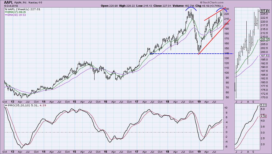
Apple (AAPL) is one of the charts that isn't horribly bearish, having not quite formed the second top of a possible double-top bearish pattern. The weekly PMO is rising, but... this last move toward a second top is a bearish rising wedge, which suggests a breakdown below the rising bottoms trend line. So, even though a large double-top has not formed, the rising wedge is a problem.

On Amazon (AMZN), we see a smaller head-and-shoulders pattern, just like Facebook. The minimum downside target would not take it down to the confirmation line of the bigger double-top, but I suspect that, if we saw that kind of move downward, it would eventually reach it.

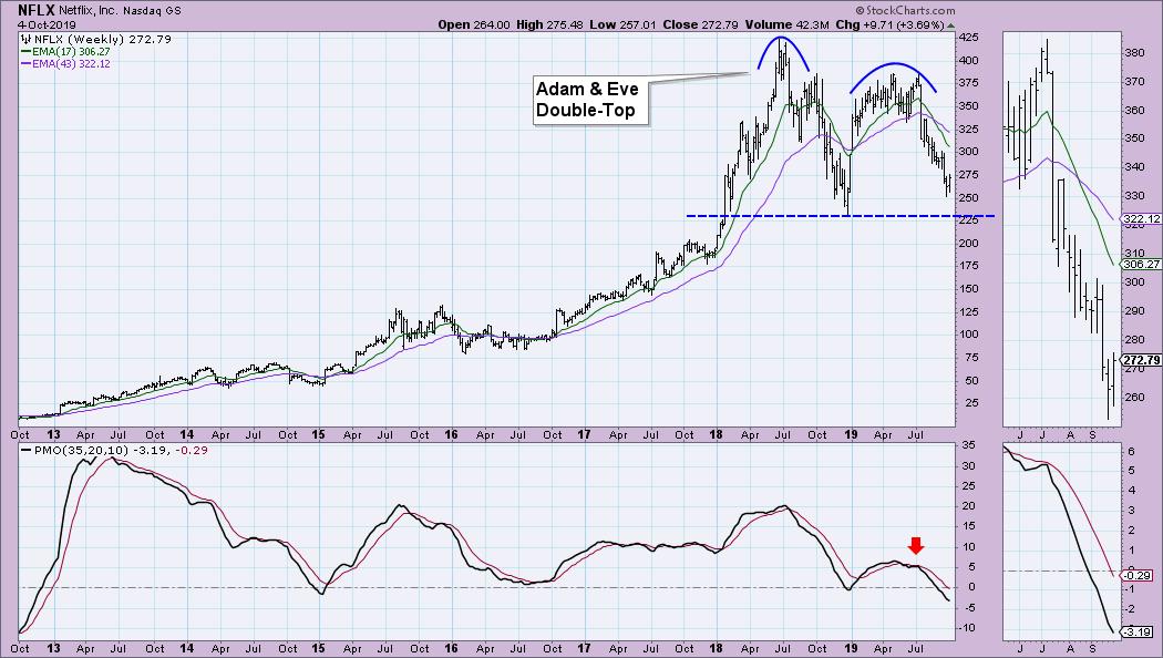
One of my favorite named double-top patterns, the Adam & Eve Double-Top, has clearly formed on Netflix (NFLX) and price is nearing the confirmation line. Should it execute this pattern, the minimum downside target would be, conservatively, $75. We already have a PMO that has delved farther below the zero line, all the way to a level we haven't seen since 2012.

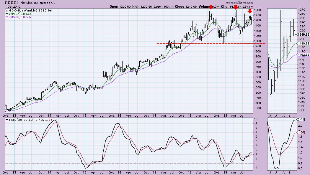
Google (GOOGL) is fairly healthy in comparison to the others, but I still see a multi-top bearish pattern. The PMO is decelerating. I would look for a move down to the $1000 level.

Conclusion: Not everyone will agree with my and Carl's assessment of these weekly charts, but it is hard to think bullish thoughts when you look closely at these charts. These stocks can shape how the broader markets move because of their capitalization and the volume they trade. They have led both rallies and downturns in the markets. I'm not suggesting these double-tops will fully execute, but price certainly seems ready to test confirmation lines on some of these stocks.
Watch the latest episode of DecisionPoint with Carl & Erin Swenlin LIVE on Fridays 4:30p EST or on the StockCharts TV YouTube channel here!
Technical Analysis is a windsock, not a crystal ball.
Happy Charting! - Erin
erinh@stockcharts.com
Helpful DecisionPoint Links:
Erin's PMO Scan
DecisionPoint Chart Gallery
Trend Models
Price Momentum Oscillator (PMO)
On Balance Volume
Swenlin Trading Oscillators (STO-B and STO-V)
ITBM and ITVM
SCTR Ranking
**Don't miss DecisionPoint Commentary! Add your email below to be notified of new updates"**
|
| READ ONLINE → |
|
|
|
|
|
| MORE ARTICLES → |
|


 Today we are going to show how 52-week highs and lows can be used to track long-term and short-term trends in the S&P 500. Full disclosure: this is not the holy grail. It is one indicator that can be used in conjunction with others to keep you on the right side of the trend.