| THIS WEEK'S ARTICLES |
| Market Roundup |
| Stocks are Overdue for a Correction, But These Charts Say it Doesn't Matter |
| by Martin Pring |
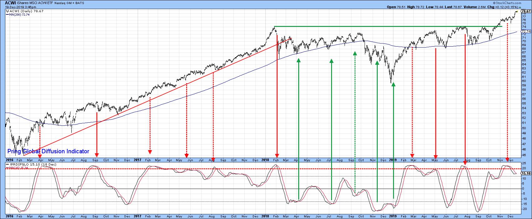
Right now, stocks are very overextended and likely due for a correction. In Chart 1, for instance, you can see that my Global Diffusion indicator has just triggered a sell signal from an extreme level. The solid red arrows show that the MSCI World Stock ETF (ACWI) has usually responded to such an event with a sell-off. However, the dashed ones tell a different story. That's because they were triggered during a strong bull market. Indeed, the price has so far failed to respond in a negative way to the most recent signal. That suggests that the current advance is packing a lot of upside momentum and that the short-term indicators will continue to thumb their noses at such bearish technical events. In my experience, that's a typical characteristic of a powerful young bull market. The first sell signal triggered in the chart in the spring of 2016 is a classic example. These failed bearish signals are the exception, rather than the rule, but there are several other charts that suggest this bull has only just begun.

Chart 1
Most of these indicators come from an improvement in the trend of several of my confidence indicators that I actively follow in my monthly Intermarket Review and as strategist for Pring Turner Capital. Let's take a closer look.
Confidence is Breaking Out All Over
Technicians closely follow sentiment indicators in order to have a better understanding of what the crowd may be thinking. Generally speaking, this data is used from a contrarian aspect, as most groups of investors are usually wrong at major turning points. An alternative is to monitor not what people say they are but what they are actually doing. In this respect, it is possible to come up with relationships that act as a proxy for such swings in confidence.
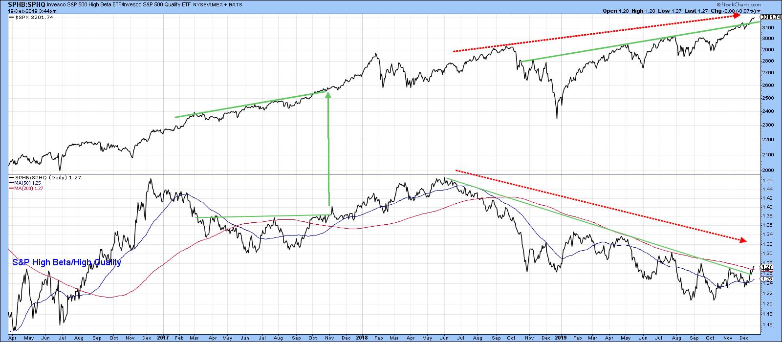
One possibility is to compare the performance of a risky item with one that is far more defensive. An example might be the ratio between the S&P High Beta to the S&P High Quality stocks. The two ETF symbols are SPHB and SPHQ, as plotted in Chart 2. It is apparent that confidence, as monitored by this relationship, peaked in 2018 and has been slowly deteriorating since. In the latest sessions, though, the ratio has violated its 2018-2019 downtrend line and 200-Day MA, suggesting that it is headed higher. In other words, a new trend favoring the more risky high beta stocks is underway. The current setup looks to be similar (and actually stronger) than that indicated by the two trend line breaks in late 2017. There is one other important takeaway from the chart, which lies with the fact that while the S&P has been making its way higher since the soring of 2018, this confidence ratio has not. That's not a good sign from a long-term point of view, but there is always the hope that it might get cleared up as we move forward. Since the current indicated trend is up, I am not currently worried about this potential discrepancy. However, if down the road the ratio fails to confirm the new high in the Index, that will be the time to become concerned.

Chart 2
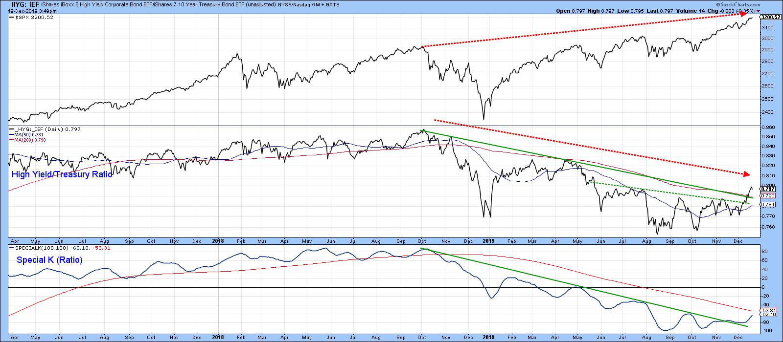
Swings in confidence also show up in the bond market in the form of credit spreads. In Chart 3, for instance, the SPX is compared to the ratio between the iBoxx High Yield Corporate and the iShares 7-10-year Treasury Bond ETF (HYG/IEF). Note that both series have been plotted using the underscore. In that way, interest and dividends are excluded from the calculation. Once again, the two thick dashed red arrows are pointing up the potential for a large negative divergence, as we saw in the previous chart. However, the ratio itself has completed a base, broken above its 2018-19 downtrend line, and has also managed to clear its 200-day MA. More importantly, the Special K has violated its 2018-19 down trend line. All these factors suggest that a major uptrend in this confidence relationship is underway.

Chart 3
Editor's Note: This is an excerpt of an article that was originally published in Martin Pring's Market Roundup on Friday, December 6th at 3:09pm ET. Click here to read the full article, which includes Charts 4-6.
Good luck and good charting
Martin J. Pring
The views expressed in this article are those of the author and do not necessarily reflect the position or opinion of Pring Turner Capital Group of Walnut Creek or its affiliates.
|
| READ ONLINE → |
|
|
|
| The Mindful Investor |
| Coffee, Charts and a Proper Perspective |
| by David Keller |

You pour yourself a cup and coffee, fire up the computer and begin your daily investment process. What do you look at first? What's the last thing you review before moving on to other things? Most importantly, is your daily process consistent from one day to the next?
In working with active investors over the years, I have found that most successful investors achieve greatness through a consistent, disciplined, thoughtful and deliberate process of analysis. Amateur investors, on the other hand, treat each day and week and month a little bit differently; as a result, consistent outcomes are a real challenge, and behavioral biases run rampant.
Earlier this week, I presented a webcast called "Better Routines Mean Better Decisions" in preparation for the Market Vision 2020 conference in January. My goal was to share my own "morning coffee routine" which includes a series of charts in a very particular order.
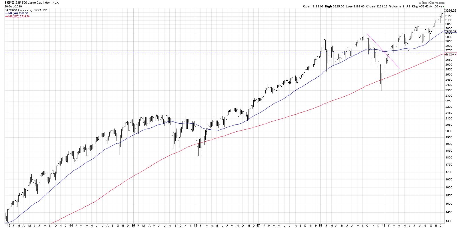
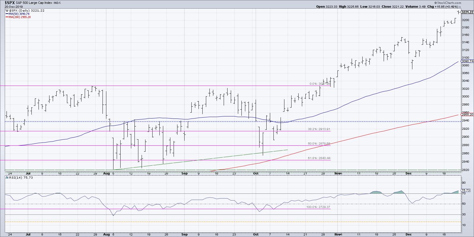
I am a long-term investor. Therefore, my first chart is a long-term weekly chart of the S&P 500. I want to prime myself with a long-term view, because all later inputs should relate back to the question which I'm able to answer with that first chart: Is the market in a primary uptrend or downtrend?

The second chart is a daily chart of the S&P 500, so I can assess how the short-term tactical price movements relate the long-term picture. Are recent days confirming or moving contrary to the primary trend?

As I continue through broad market indexes, global markets, breadth indicators and beyond, each step allows me to compile more evidence and provides a complete picture of fear and greed, supply and demand, euphoria and desperation.
By following this same script every day, I am better equipped to detect changes, inflection points, and rotations because I literally am watching the charts evolve over time.
A mindful investor develops their own process for building a good situational awareness for the markets. You are welcome to use my Morning Coffee Routine to start with - simply install my ChartPack to your own StockCharts account.
Just make sure that you evolve your process over time. If certain charts don't speak to you, remove them. If you find new charts that add value to your process, add them. The more you make the daily routine your own, the more likely you are to stick with the daily routine!
RR#6,
Dave
David Keller, CMT
Chief Market Strategist
StockCharts.com
David Keller, CMT is Chief Market Strategist at StockCharts.com, where he helps investors minimize behavioral biases through technical analysis. He is also President and Chief Strategist at Sierra Alpha Research LLC, a boutique investment research firm focused on managing risk through market awareness. He is a Past President of the Chartered Market Technician (CMT) Association and most recently served as a Subject Matter Expert for Behavioral Finance. David was formerly a Managing Director of Research at Fidelity Investments in Boston as well as a technical analysis specialist for Bloomberg in New York. You can follow his thinking at MarketMisbehavior.com, where he explores the relationship between behavioral psychology and the financial markets.
Disclaimer: This blog is for educational purposes only and should not be construed as financial advice. The ideas and strategies should never be used without first assessing your own personal and financial situation or without consulting a financial professional.
The author does not have a position in mentioned securities at the time of publication. Any opinions expressed herein are solely those of the author and do not in any way represent the views or opinions of any other person or entity.
|
| READ ONLINE → |
|
|
|
|
|
| Trading Places |
| Here's a Stock Breaking Out With 21% of its Float Short! |
| by Tom Bowley |
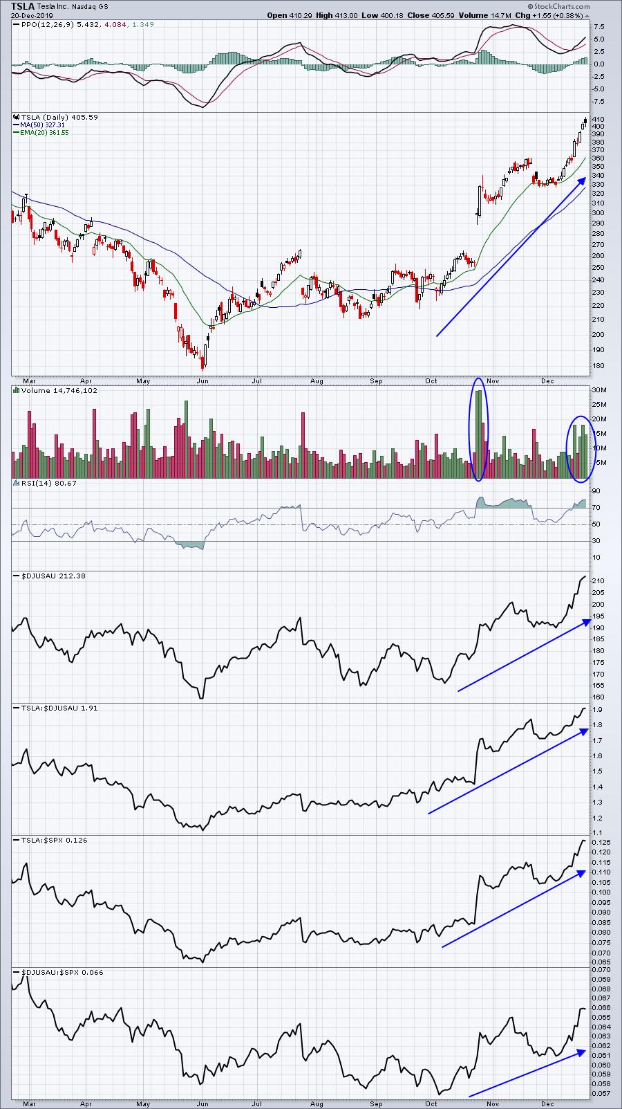
I was looking at the performance of NASDAQ 100 stocks after the close on Friday and realized that Tesla (TSLA) closed above 400 for the first time in its history. Volume was unusually high all week long as TSLA gained 13% to clear resistance in the upper 300s. TSLA had traded above 380 without once clearing 400 during 8 different weeks over the past few years. Now that 400 resistance has ben cleared and is in the books, what's next?
Well, the heat will likely turn much hotter next week for those who are shorting TSLA. Yahoo Finance shows that TSLA had 28.65 million shares short as of November 28, 2019. That represents a lot of guaranteed buyers for a stock that's showing tremendous momentum right now:

TSLA's breakout is solid evidence of absolute strength, but check out those relative strength lines. It's hard to argue against TSLA being one of the best-looking stocks as we head into 2020. And I certainly wouldn't want to be one of those with a short position right now. I believe we'll see panicked short covering in the very near future to send TSLA spiraling higher.
TSLA is one of many possibilities to line your portfolio with winners in 2020. In just two weeks, EarningsBeats.com will be hosting "Market Vision 2020", the premier online financial event of the new year, and we've assembled a "Who's Who" list of speakers. Our Keynote Speaker will be John Murphy, who's already been hinting recently at major areas of rotation in 2020. To check out John's presentation, along with many other expert technical analysts, you'll need to register very soon! CLICK HERE to see our list of speakers, a brief description of their presentations and a link to register for Market Vision 2020.
Happy trading!
Tom
|
| READ ONLINE → |
|
|
|
| SPECIAL EVENT ANNOUNCEMENT |
| Don't miss your chance to hear David Keller, Chief Market Strategist at StockCharts.com! David will be a featured presenter at the upcoming Orlando MoneyShow conference, February 6th - 8th. The event is free to register and attend, and you'll have the chance to hear David speak alongside a long list of other industry legends and market experts. Click the banner below to learn more. |
 |
| LEARN MORE → |
|
| RRG Charts |
| Slicing and Dicing Seasonality |
| by Julius de Kempenaer |
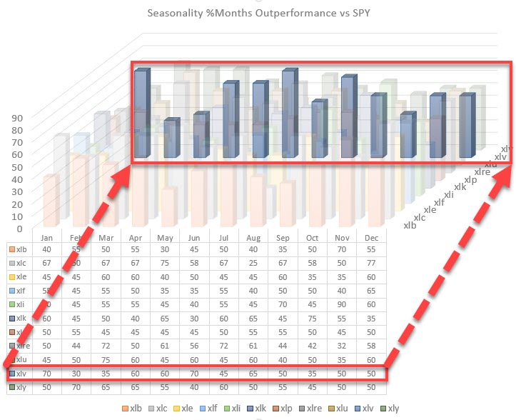
I previously highlighted the chart below in this past Thursday's DITC article (12/19). But what does it mean?

What is it Showing?
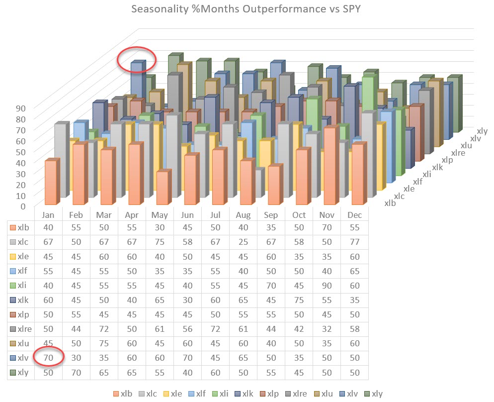
This chart visualizes the collective seasonality of all 11 sectors in the S&P 500.
To get there, I collected the numbers from the seasonality chart (which is available on the site) for every sector and the S&P 500 over the past 20 years (the maximum lookback period). I then punched all these numbers (288 indeed) into a spreadsheet and created this 3D-column chart. By visualizing these data in this way, we can get a view of the seasonality across the entire universe.
Just like a Relative Rotation Graph shows the relative rotations of all sectors around the benchmark (SPY) over a certain period of time (tail length), this 3-D column chart shows the annual Seasonality for all sectors in one picture.
These sort of visualizations, IMHO, are very helpful when it comes to getting a high-level overview of markets, seeing the forest from the trees and putting things in perspective.
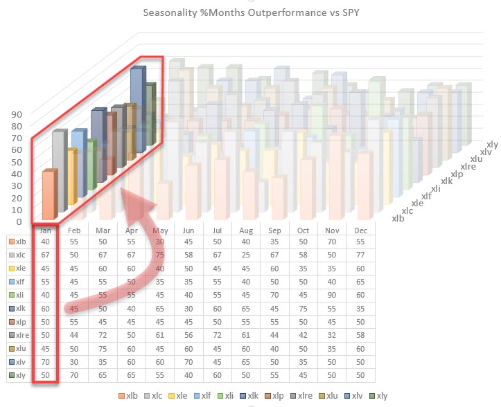
Following the chart above, we can slice and dice this universe and zoom in on individual seasonalities - for example, by highlighting one month as shown in the chart below.
Highlighting the seasonality for all sectors for the month of January shows that Health Care has a tendency, at least over the last 20 years, to outperform the S&P 500. This occurred in 14 out of the 20 months of data that are available, or 70% of the time.

Highlighting the other axis can show us the seasonal tendency for XLV throughout the year. This is the same view that you get on the standard seasonality chart that we have on StockCharts.com for a single security.

This exercise tells us that January, in general, is a good month for Health Care, as is the period from April-May-June. This is helpful information when analyzing the markets and/or individual securities.
Please bear in mind that the data used in the charts in this article are relative to the S&P 500. Clearly, a similar setup can be created for outright performance data.
What about returns?
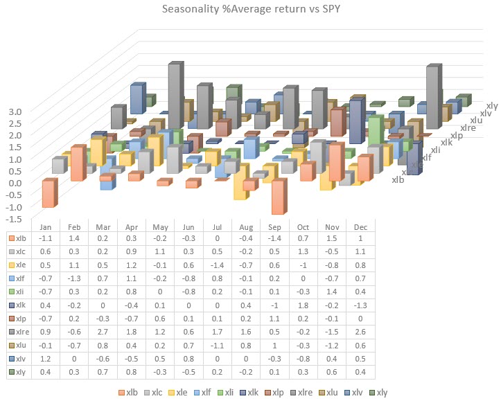
Now that we can visualize the seasonality of months outperforming SPY, we can take the next step and make a visualization of the average returns per sector, per month. That gives us the chart below:

Obviously these RELATIVE (don't forget) returns can be positive and negative, so this chart has a virtual floor at zero. Columns that rise above that floor indicate an outperformance on average, while columns that drop below that virtual 0-floor are indicating an underperformance on average.
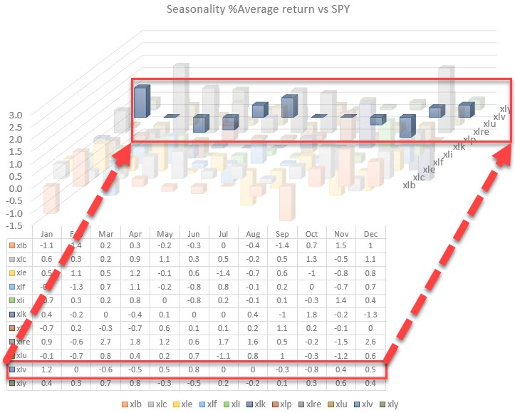
Zooming in can be done in a similar way as we did for the seasonality.

This chart highlights the average relative performance for the Health care sector throughout a year. We see that January not only scores high on seasonality for XLV, but also produces 1.2% of outperformance over SPY on average.
The average return for April is a bit out of line. April-May-June are months with strong seasonality numbers 60-60-70. The fact that the average return in April is negative suggests that one or more of the negative months (40%) were really bad, which is dragging the average down. A good example how of working with averages can be dangerous...
"Don't cross a river if it is (on average) four feet deep," - Nassim Nicholas Taleb
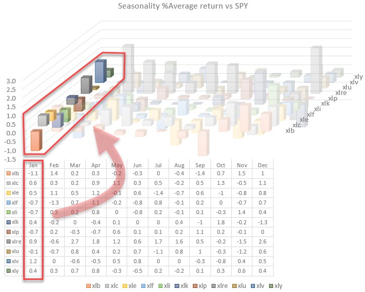
The other entry would be to highlight the relative performances for a month. In the image below, January is highlighted and shows not only the peak for Health Care but also, for example, the negative return for Materials (and XLF,XLI,XLP,and XLU).

Combining Various Pieces of the Puzzle
Seasonality and average performance per sector per month are very helpful tools/metrics to get some guidance on what usually/on average happens with a sector on a forward-looking basis. As with all tools that we have in our toolkit and on StockCharts.com, there is no certainty. They are all providing us with pieces of the puzzle.
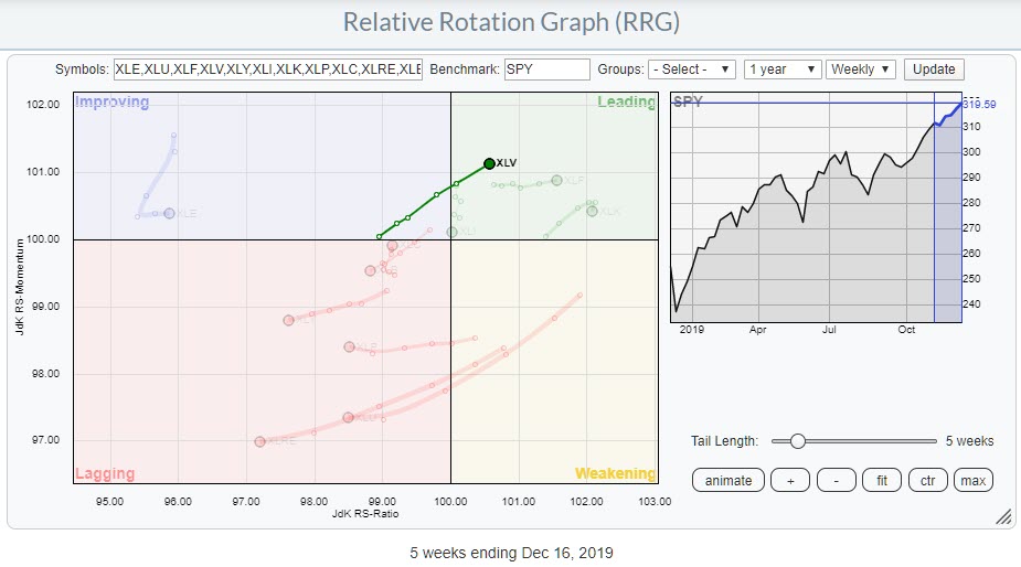
 Weekly RRG for US sectors highlighting XLV Weekly RRG for US sectors highlighting XLV
The combination of various tools is what provides us with insight. Obviously, I want to combine things with a Relative Rotation Graph. When I run the RRG for US sectors, XLV seems well-positioned to enter the new year on a positive note.
Of course, there are still a few weeks left in this year, but the combination of a strong rotation on the Relative Rotation Graph and an outperformance from SPY in 14 out of 20 Januarys over the last 20 years (average outperformance 1.2%) suggests a good relative start in 2020 for the Health Care sector.
--Julius
My regular blog is the RRG Chartsblog. If you would like to receive a notification when a new article is published there, simply "Subscribe" with your email address.
Julius de Kempenaer
Senior Technical Analyst, StockCharts.com
Creator, Relative Rotation Graphs
Founder, RRG Research
Want to stay up to date with the latest market insights from Julius?
– Follow @RRGResearch on Twitter
– Like RRG Research on Facebook
– Follow RRG Research on LinkedIn
– Subscribe to the RRG Charts blog on StockCharts
Feedback, comments or questions are welcome at Juliusdk@stockcharts.com. I cannot promise to respond to each and every message, but I will certainly read them and, where reasonably possible, use the feedback and comments or answer questions.
To discuss RRG with me on S.C.A.N., tag me using the handle Julius_RRG.
RRG, Relative Rotation Graphs, JdK RS-Ratio, and JdK RS-Momentum are registered trademarks of RRG Research.
|
| READ ONLINE → |
|
|
|
| The MEM Edge |
| This IPO Shifted the Dynamics for an Entire Group; Here are 3 Stocks Poised To Benefit |
| by Mary Ellen McGonagle |
It's been a tough year for many new IPOs as most of the 170 companies that came public this year are now trading below their initial price offerings. That said, there have been a couple of high-flying new offerings that have spurred moves in their peers.
Take newcomer Beyond Meat (BYND), which spiked 160% on its first day in the markets in early May and went on to even greater heights before peaking in price 3 months later. The rally in BYND sparked advances in other Meat Products companies that announced news of developing their own protein-based foods.
In an entirely different area of the markets, Bill.com Holdings (BILL) went public over a week ago, where a 60% pop on their first day of trading caught investor's attention. Bill.com is a Financial Software company that provides bill paying and invoicing services to smaller companies.
While not revolutionary on the surface, the company's AI enabled software digitizes and automates back-office financial operations that can amount to substantial cost savings for their clients. Reduced back office personnel needs and faster bill payments from customers can also bolster cash flow.
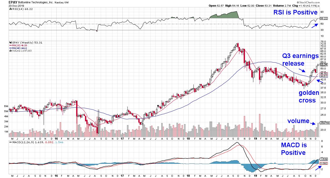
WEEKLY CHART OF BOTTOMLINE TECHNOLOGIES (EPAY)
Other Financial Software companies perked up following Bill.com's sharp advance as renewed interest in the market opportunities for these Software stocks took hold. Let's take a look at Bottomline Technologies (EPAY), which had already been in the throes of a downtrend reversal. The company offers Paymode-X, which helps businesses transition away from manual accounts payable processes.
The stock peaked in price along with many Software stocks back in October 2018 and had been unable to recover due to tough year-over-year growth metrics. The outlook has shifted for EPAY following their Q3 earnings release in early November. As you can see, the stock broke back above its key 50-day moving average and appears poised for further upside as analysts raise earnings estimates.
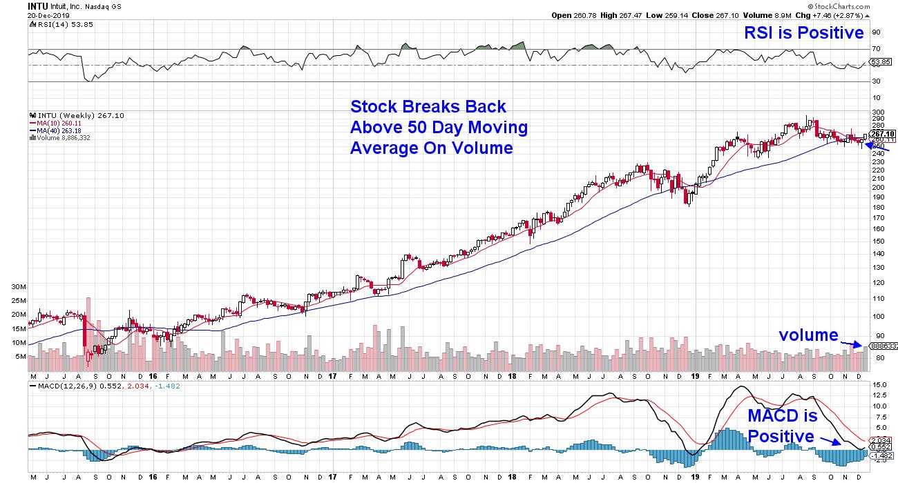
WEEKLY CHART OF INTUIT (INTU)
Next up is Intuit (INTU), which offers Quickbooks Online to help businesses automate back-office work. The company announced last month that they're now using AI for certain features and will be rolling out this technology to additional areas over the next year.
This week, INTU bullishly broke back above its 50-day moving average on volume. As you can see, the RSI and MACD are both positive, with a signal crossover on the horizon. This recent action is reminiscent of the stock's early January downtrend reversal.
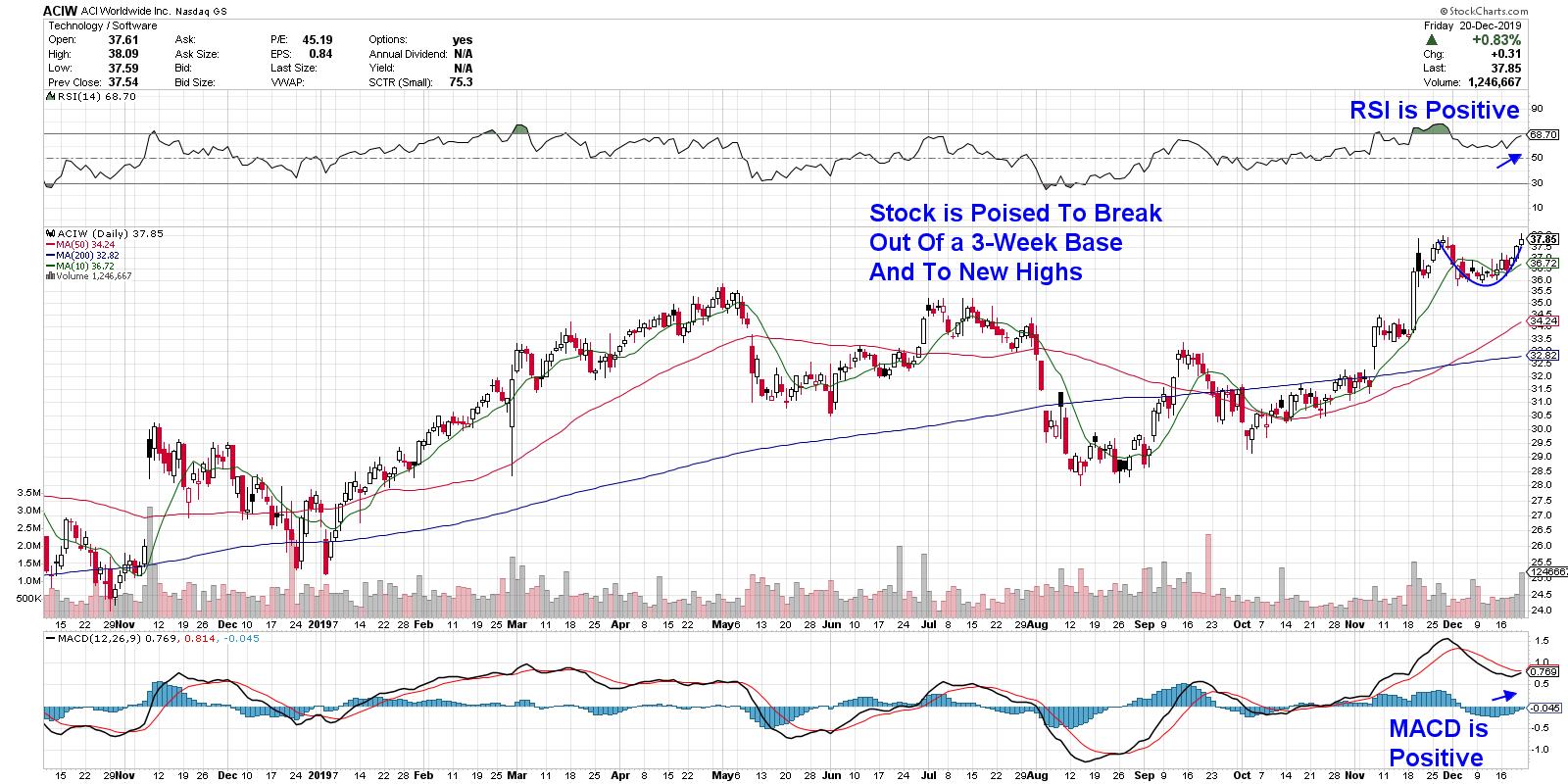
DAILY CHART OF ACI WORLDWIDE (ACIW)
Last up is Small Cap company ACI Worldwide (ACIW), which offers solutions that enable customers to present bills and collect payments electronically through a single platform. This service is not the largest part of ACIW's revenues, as they have many other services that are spurring growth.
The stock is very attractive following a 3-week consolidation period, which occurred after hitting a new high in price on the heels of reporting strong earnings. Analysts are predicting 31% earnings growth next year and, while the stock is more volatile than its peers, the positive RSI and MACD point to further upside.
It's been an exciting year for the markets as innovative companies, such as the ones highlighted here, are driving stocks higher. I expect this uptrend to continue well into next year and, for those who'd like to be alerted to high-quality stock candidates poised to trade higher, take a trial of my MEM Edge Report for a nominal fee. In addition to providing entry and exit points for top-performing stocks, this biweekly report also provides insights into the markets as well as various sectors.
For those who'd like to give the gift of learning how to trade stocks during this holiday season, take advantage of my first ever promotional discount. You can check out my courses here and use the promo code "holiday" for 15% off any purchases.
Happy Holidays!
Warmly,
Mary Ellen McGonagle,
MEM Investment Research
|
| READ ONLINE → |
|
|
|
| MORE ARTICLES → |
|
