| THIS WEEK'S ARTICLES |
| The Traders Journal |
| My Daily Five: The Ultimate S&P 500 Chart And Four Strong Setups From This Week's "10 I'm Stalking" |
| by Grayson Roze |
 It's always a true pleasure to kick off the week by hosting a new episode of "Your Daily Five". I've said it before and I'll say it again – this is without a doubt one of my favorite shows of the many we're running these days on StockCharts TV. With a different host every day of the week, the show delivers a concise, action-packed daily rundown of the five most important charts that you need to be watching, always with a new perspective and a bucket full of insights from some of the most skilled technicians out there. It's always a true pleasure to kick off the week by hosting a new episode of "Your Daily Five". I've said it before and I'll say it again – this is without a doubt one of my favorite shows of the many we're running these days on StockCharts TV. With a different host every day of the week, the show delivers a concise, action-packed daily rundown of the five most important charts that you need to be watching, always with a new perspective and a bucket full of insights from some of the most skilled technicians out there.
Check out today's edition of "Your Daily Five" below:
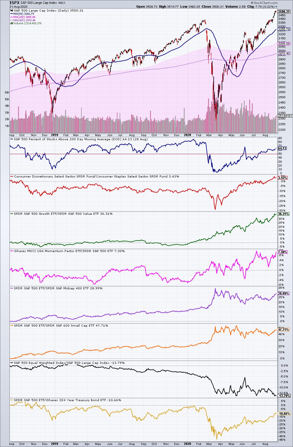
On today's edition, I got us going with what I call my "Ultimate S&P 500 Chart". In addition to a look at the price action on the index, the chart includes eight of the key market metrics that I watch closely every week:
- Breadth (Percentage of S&P 500 stocks above their 200-day Moving Average)
- Offense vs. Defense (XLY:XLP)
- Growth vs. Value (SPYG:SPYV)
- Momentum vs. the S&P 500 (MTUM:SPY)
- Large Caps vs. Mid Caps (SPY:MDY)
- Large Caps vs. Small Caps (SPY:SLY)
- S&P 500 Equal Weight vs. Cap Weight ($SPXEW:$SPX)
- Stocks vs. Bonds (SPY:TLT)
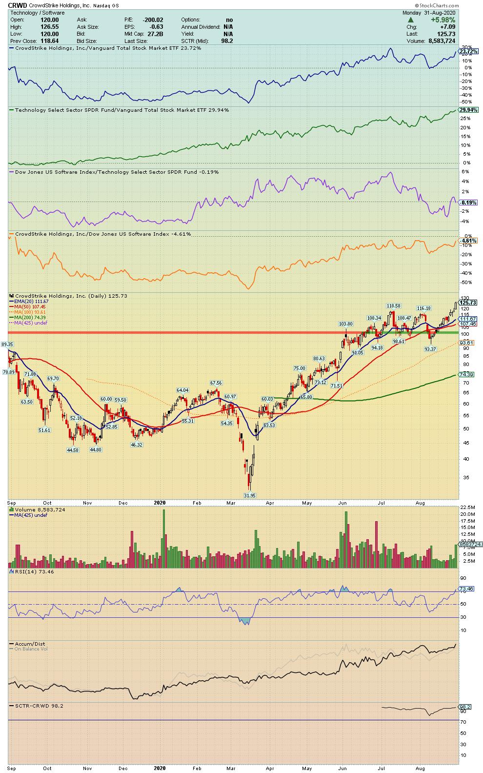
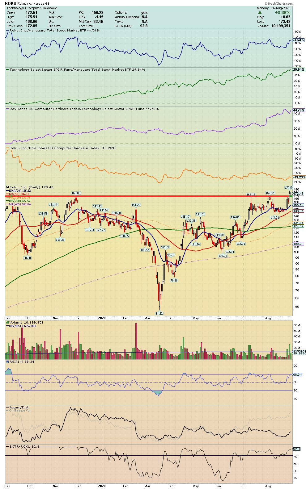
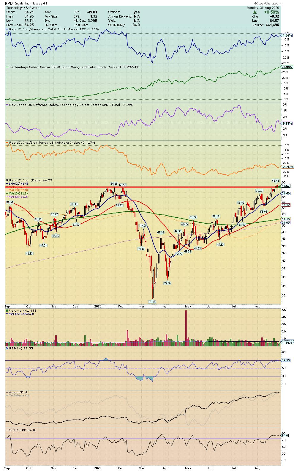
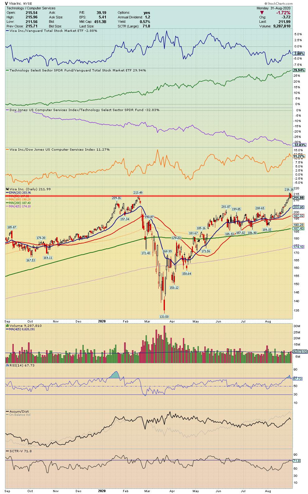
After a quick review of where we stand on one of the market's most important indexes, I dove into a few individual ideas from this week's "10 I'm Stalking" list. If you follow me on Twitter, you probably know that every Sunday, I put out a list of 10 setups I'm watching closely. So on this week's show, I highlighted a few specific stocks that not only look strong technically, but also tick some of my top "Theme Trade" boxes – cybersecurity, streaming and digital payments. When I see a stock that fits into a clear business theme that I'm bullish on AND it starts to show technical strength on the chart, I pay very close attention. On today's show, I took a closer look at four examples:
CRWD - Crowdstrike
ROKU - Roku
RPD - Rapid7
V - Visa
Money In, Eyes Open.
- Grayson Roze
VP of Operations, StockCharts.com
Author, Trading for Dummies (Wiley, 2017)
Author, Tensile Trading: The 10 Essential Stages of Stock Market Mastery (Wiley, 2016)
StockMarketMastery.com
@GraysonRoze
|
| READ ONLINE → |
|
|
|
| The Market Message |
| Strong Jobs Report Boosts Bond Yields |
| by John Murphy |
This morning's strong jobs report saw a bigger than expected jump in nonfarm payrolls during August and a bigger than expected drop in the unemployment report to 8.4%. That strong combination helped contribute to today's rebound in bond yields. Chart 1 shows the 10-Year Treasury yield rising 9 basis points today to 0.71%. The 30-year Treasury yield in up an even stronger 12 bps. That means that Treasury bond prices are dropping. That's unusual on a day when stocks are having another weak day. But not all stocks are being sold equally. The biggest losers are in technology, communications, and consumer discretionary which have been the most over-extended on the upside. Some stocks in the value category are holding up a bit better. That's especially true of financials which usually benefit from higher bond yields and a steeper yield curve.
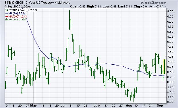 Chart 1 Chart 1
Most market sectors are in the red today. The only two in the black are financials and industrials. Part of that may be due to some money rotating out of over-extended megacap growth stocks like technology and into cheaper value stocks. Rising bond yields are another factor boosting financials, and banks in particular. Chart 2 shows the Financial Sector SPDR (XLF) trading modestly higher today and continuing to struggle with its 200-day moving average and resistance at its August high. The XLF needs a decisive close above both to signal higher prices. The XLF has been one of market's weakest sectors this year (-16%) and has remained an underachiever over the last month. That can be seen by the XLF/SPX ratio (solid gray line) which declined during August. But the ratio line has gotten a nice bounce over the last couple of days due to relative XLF stability in the face of a weaker stock market. And higher bond yields. Banks are also outperforming today.
Rate sensitive banks and life insurers are leading the XLF higher today. Chart 3 shows the KBW Bank Index ($BKX) trading higher today and continuing to find support along its 50-day moving average (blue line). The BKX, however, remains well below its 200-day average. The solid gray line shows the BKX/SPX relative strength ratio also bouncing over the last two days after a weak August. There again, some money leaving tech stocks may be moving into cheaper and more stable bank stocks. Banks also benefit from higher bond yields.
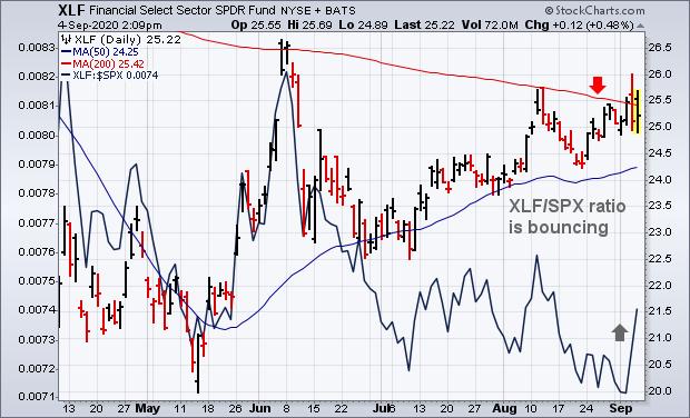 Chart 2 Chart 2
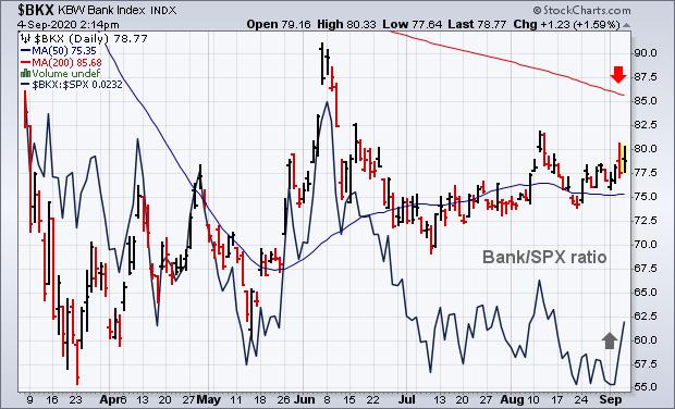 Chart 3 Chart 3
Editor's Note: This is an article that was originally published in John Murphy's Market Message on Friday, September 4th at 2:03pm ET.
|
| READ ONLINE → |
|
|
|
| SPECIAL EVENT |
 |
|
| Market Roundup |
| Eight Charts I Am Watching Closely Right Now |
| by Martin Pring |
Strong Bull Market Indications
We are all aware of the Shakespearian saying "Beware of the Ides of March," which didn't go so well for Julius Caesar. In market folklore, October is the season for crashes and September is the worst-performing month. Welcome to the bearish season!
Right now, there are eight charts I am watching closely. Some are long-term, to remind me we are in a bull market. Others are short-term, to alert me to the fact that bull markets are never straight lines up, but usually interrupted from time-to time by unexpected sharp and believable shakeouts. Let's start with the long-term perspective.
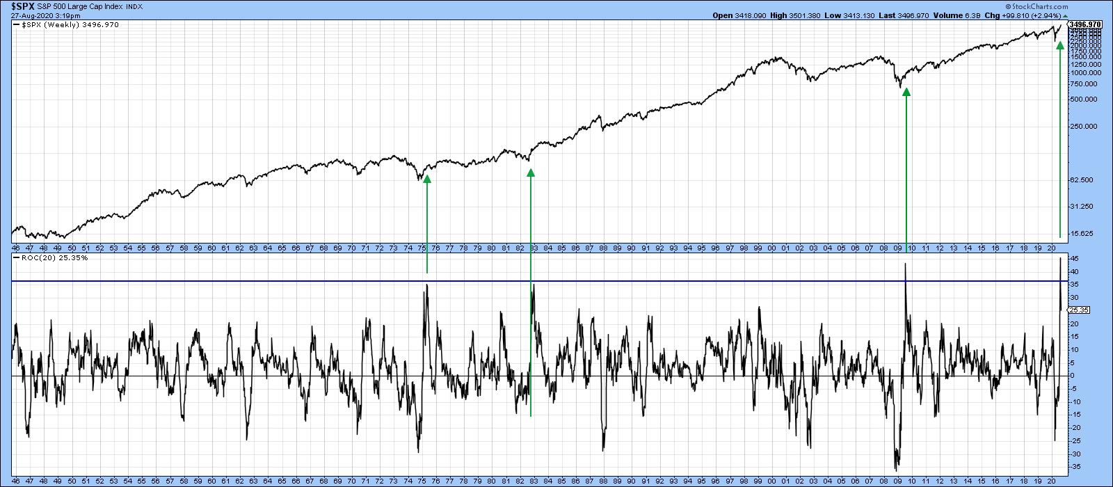 Chart 1The beginning of a powerful long-term bull market is often heralded with short or medium-term oscillators reaching an exceptionally high level. Chart 1 compares the S&P to its 20-week ROC and shows that three of the last four bull markets were signaled by the ROC reaching an extraordinary high level. Mid-July saw this indicator reach a post-1946 record. It's not the only example of a strong initial thrust, as I could have used several other breadth and price momentum series that transmit a similar message. In the three previous examples featured in the chart, it would clearly have paid to downplay the inevitable short-term correction, but instead to focus on the bigger trend. Chart 1The beginning of a powerful long-term bull market is often heralded with short or medium-term oscillators reaching an exceptionally high level. Chart 1 compares the S&P to its 20-week ROC and shows that three of the last four bull markets were signaled by the ROC reaching an extraordinary high level. Mid-July saw this indicator reach a post-1946 record. It's not the only example of a strong initial thrust, as I could have used several other breadth and price momentum series that transmit a similar message. In the three previous examples featured in the chart, it would clearly have paid to downplay the inevitable short-term correction, but instead to focus on the bigger trend.
Chart 2 features the NASDAQ, which is clearly in a strong bull market as the Index is above its 12-month MA and is experiencing a positive KST. This action is certainly reinforcing the powerful reading in the 20-week ROC for the S&P.
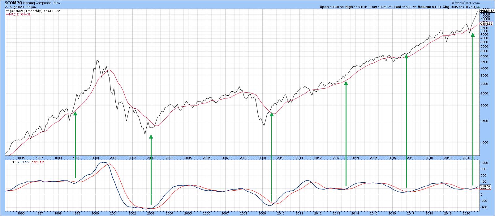 Chart 2 Chart 2
Chart 3 downplays the technology strength in the regular capital-weighted S&P in the form of the Invesco Equal Weight ETF (RSP). It's also been inflation-adjusted. After all, if stocks and the CPI both increase by 10%, there is no actual gain, just an illusory paper profit. Over the long-term, the adjusted series offers a more accurate picture of what's going on. The green horizontal arrow indicates that, unlike the regular S&P or NASDAQ, there has been no net gain for the average S&P stock since the end of 2017, as it has been range-bound for the last 3 years. The small arrows show that the 12-month MA has turned back numerous rallies and reactions over the last 16 years and, therefore, represents a really impressive dynamic level of support and resistance. It's not the end of the month yet, but the price appears to be punching through the average. The point I am trying to make is that, while the NASDAQ and S&P might look a bit overextended on the upside, indexes such as the unweighted S&P and NYSE Composite are poised to break out from major trading ranges and move substantially higher.
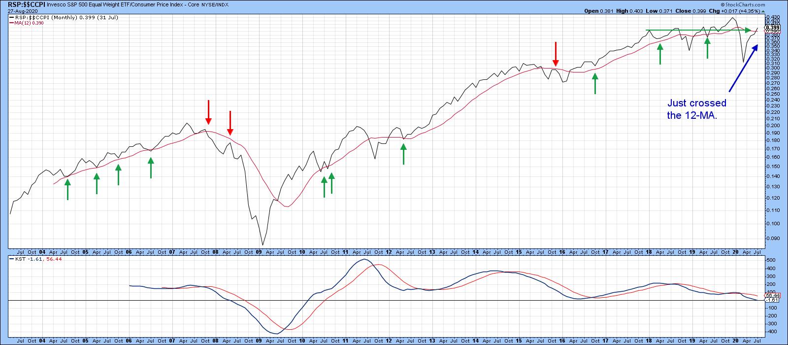 Chart 3 Chart 3
Short-term Vulnerability?
Chart 4 shows the long-term perspective of the monthly VIX. The red arrows indicate that all the major peaks since 1994 developed when the VIX was well below the blue horizontal line. The only exception developed in 1998, when it reversed from a position slightly above it. The indicator touched a major peak earlier in the year. Despite a substantial decline, it is still well above that sub-blue line complacent zone associated with market tops. That does not mean that the upcoming negative seasonal period will avoid an uncomfortable shakeout, after all, the VIX itself is quite volatile, but, more to the point, several short-term indicators are starting to misbehave.
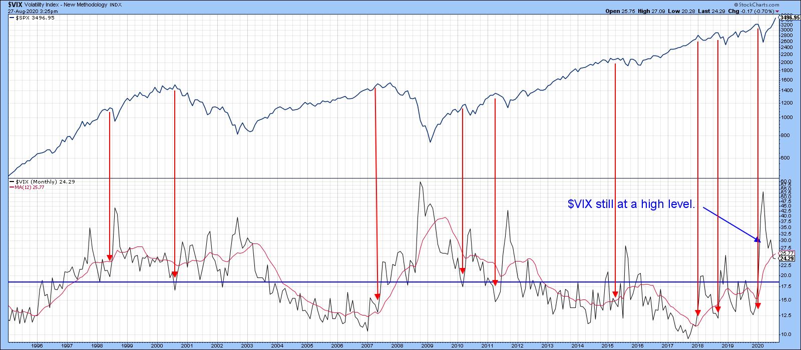 Chart 4 Chart 4
Take Chart 5, for instance. It shows that the Common Stock A/D line has been pretty much in gear with the S&P for the last couple of years. Just prior to the 2020 bear market, it diverged negatively, as indicated by the two dashed arrows at "1". Recently, we have seen another small divergence at "2" as the A/D line declined and the S&P exploded to the upside. There is also another, much larger, divergence that has been flagged by the solid red arrows.
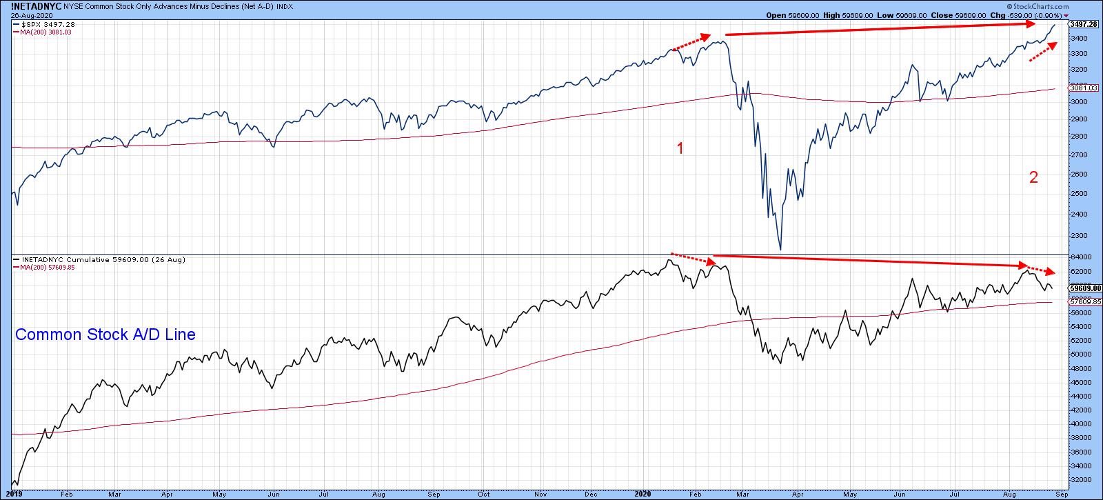 Chart 5 Chart 5
Chart 6 tells us that the sharp rally being experienced at the NASDAQ is starting to show some cracks, as the NASDAQ bullish percentage has diverged negatively with the Index itself. Three previous examples of negative divergences and trendline breaks, in both the indicator and the Index, were all followed by a correction of some kind. Right now, neither series has cracked its up trendline, but it's something I am watching carefully.
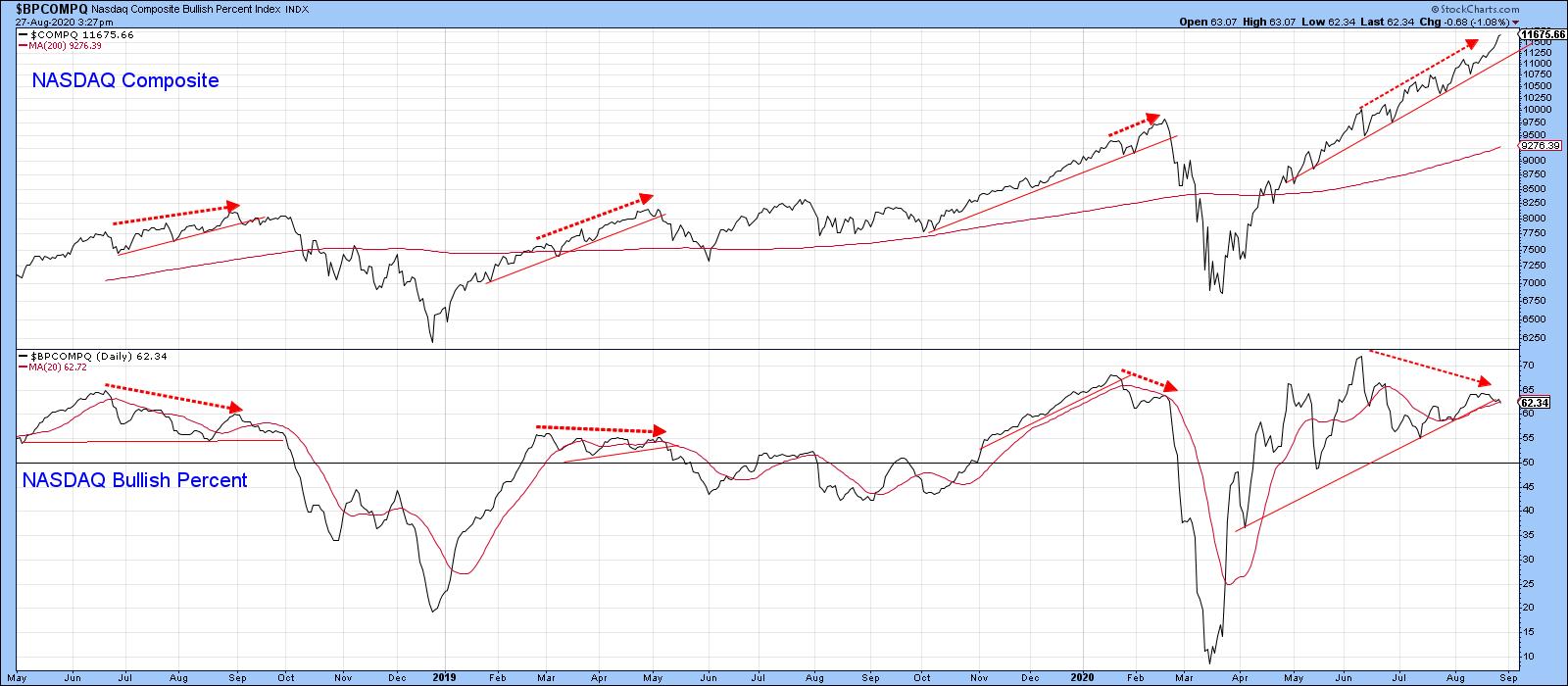 Chart 6 Chart 6
Elsewhere, things are starting to look a little precarious from a short-term aspect. Chart 7 shows that joint trendline breaks by the S&P and VIX have given us two timely signals this year. A third could well be in the cards. The VIX is already experiencing a sight break, but two violations are required for a signal and the S&P remains above its line.
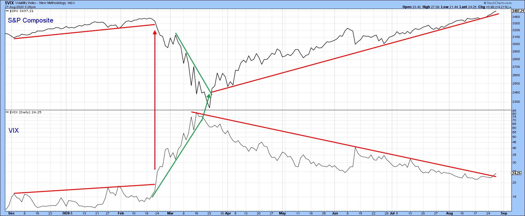 Chart 7 Chart 7
A similar exercise for the NASDAQ and NASDAQ VIX indicates that both trendlines are intact, but certainly close enough to justify some careful monitoring in the next few sessions.
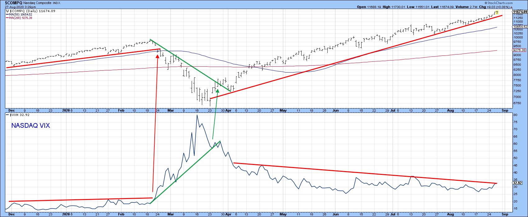 Chart 8 Chart 8
The bottom line: expect the bull market to continue big time, but don't be surprised if a seasonal correction comes first.
Editor's Note: This article was originally published in Martin Pring's Market Roundup on Thursday, August 27th at 5:51pm ET.
Good luck and good charting
Martin J. Pring
The views expressed in this article are those of the author and do not necessarily reflect the position or opinion of Pring Turner Capital Group of Walnut Creek or its affiliates.
|
| READ ONLINE → |
|
|
|
| Art's Charts |
| A Healthcare Stock Poised to End its Correction |
| by Arthur Hill |
 The Bollinger Band squeeze signals a volatility contraction that can lead to a volatility expansion. But which way? For directional clues, we need to analyze price action and other indicators. Henry Schein caught my eye because the stock has a Bollinger Band squeeze, a bullish chart pattern, an uptrend and a strong sector. That's a potentially powerful combination. The Bollinger Band squeeze signals a volatility contraction that can lead to a volatility expansion. But which way? For directional clues, we need to analyze price action and other indicators. Henry Schein caught my eye because the stock has a Bollinger Band squeeze, a bullish chart pattern, an uptrend and a strong sector. That's a potentially powerful combination.
The chart below shows HSIC with the Bollinger Bands in pink and at their narrowest since February. This means volatility contracted and we should prepare for a volatility expansion. In other words, prepare for a move.
As far as directional clues, the long-term trend is up because price is above the 200-day SMA. The sector is also strong as the Healthcare SPDR (XLV) recorded a 52-week high earlier this week. This suggests that the path of least resistance is up.
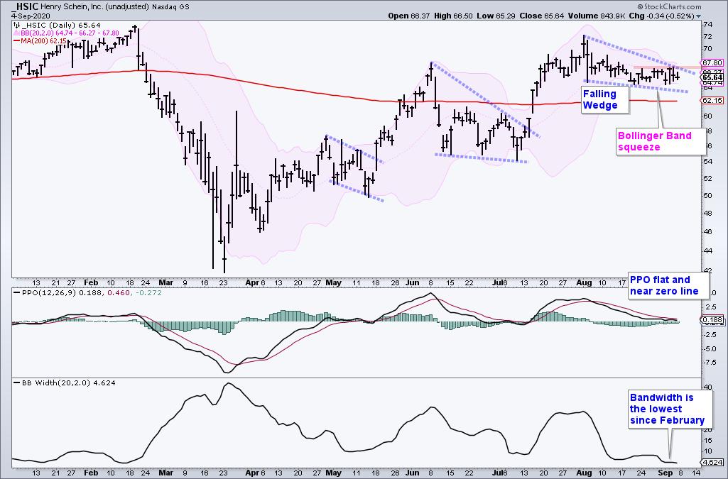
The price chart also sports a bullish corrective pattern, the falling wedge. The stock advanced from late March to early August and then fell back with the falling wedge the last five weeks. This decline retraced 38-50% of the prior decline and price is holding above the 200-day. The retracement amount and the pattern are typical for corrections within bigger uptrends.
Now what? The immediate trend is down as long as the wedge falls and the PPO remains below its signal line. Watch for a breakout at 68 and an upturn in the PPO to reverse this fall. A breakout would end the correction and signal a continuation of the bigger uptrend.
This week at TrendInvestorPro we unveiled a new chartbook that features long-term and short-term breadth models for the S&P 500, Nasdaq 100, S&P 100, S&P MidCap 400 and S&P SmallCap 600. Combined with the trend indicators, these models can keep investors and traders on the right side of the trend.
Click here to take your analysis to the next level!
--------------------------------------
|
| READ ONLINE → |
|
|
|
|
|
| The Canadian Technician |
| V-Bottoms and Carat Tops |
| by Greg Schnell |
In high school, my CB- Radio handle was carrot-topper. As a chartered market technician, we talk about rounded tops and v-bottoms. But the last three stock market tops have been more like solitaire-diamond tops protruding up and priced for perfection. We've come a long way from the March bottom and, this week, the big price drop Thursday and the wild oscillations Friday have considerably slowed the momentum.
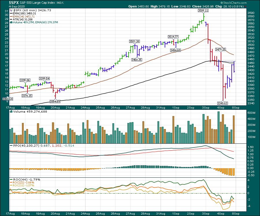
The NASDAQ 100 was even more severe in its reversal. I broadened this chart out and you can see the change in momentum shown by the PPO.
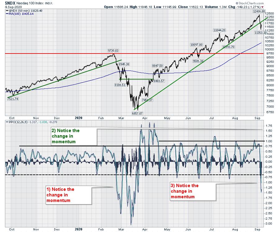
If the tops are going to be carat tops now, I'll need to be changing my expectations for a topping structure. While my faster indicators were breaking down, my regular topping indicators still have a ways to go. Perhaps that means we'll still get a rally back up to test the highs and then fall away?
There is no doubt the market was frothy, but the market can go higher than we expect, and I think this was a good example of continuing to march up and up.
As we settle in for the final 60 days of the US election cycle, can the market propel higher?
The 2016 market cycle was weak for the two months leading into the election cycle, with a quick drop in early September as well. The red line is 60 days out and the dotted line was the election.
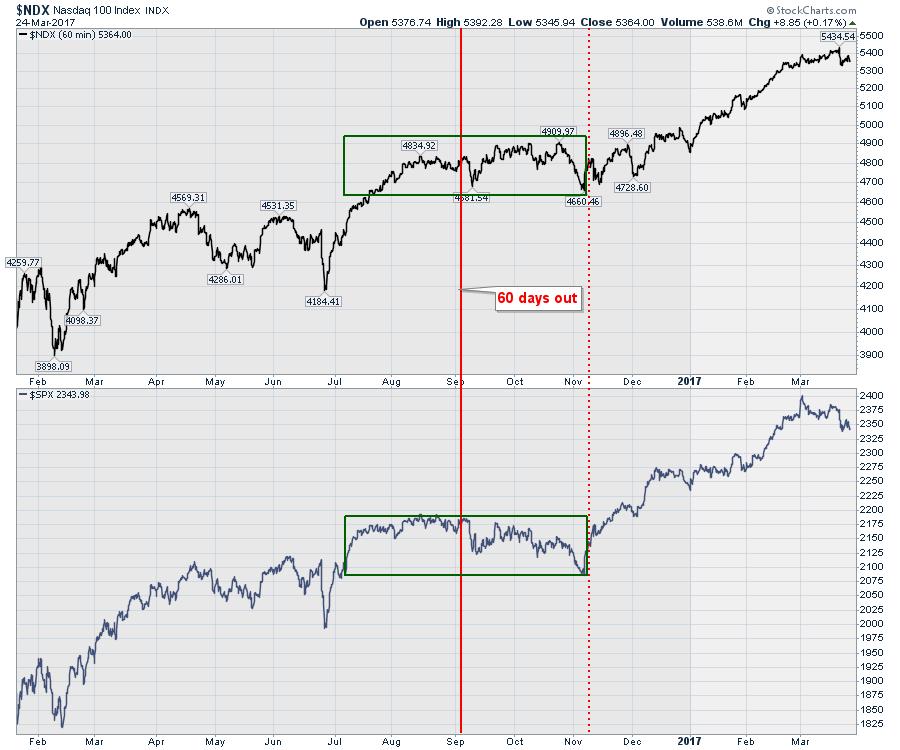
I am not a huge seasonality fan, but a 4-8 week correction could give the market a chance to consolidate here and set a leg higher in the usually bullish fourth quarter and 1st quarter of 2021.
Next week, I'll be announcing a September 30th presentation on StockCharts TV. This will be focused on being prepared for one of the biggest swings coming at us. Stay tuned for a link to the registration page and I hope to see you there!
|
| READ ONLINE → |
|
|
|
| The Traders Journal |
| How Not To Let Five Media Frankensteins Devastate Your Portfolio |
| by Gatis Roze |
 No, this is not a political blog. This is three decades of blood-and-sweat soaked lessons gleaned from investing and following the media. Like condensed milk, it's all boiled down to the five essential "must knows" for you. These are the five Frankensteins that will kill your investing profits unless you keep your eyes wide open. No, this is not a political blog. This is three decades of blood-and-sweat soaked lessons gleaned from investing and following the media. Like condensed milk, it's all boiled down to the five essential "must knows" for you. These are the five Frankensteins that will kill your investing profits unless you keep your eyes wide open.
My three decades of experiences trading and investing have proven to me time and time again that profits play on a loop. Profits are the result of consistent and rational decisions. Good decisions come from clarity. Supreme clarity is based on truths. This blog is about achieving this golden loop. Before you can learn to avoid these five Frankensteins, you must understand the five monsters of the media.
1. Filtered Truth
Beware of the triplets! By the time reality is filtered through the eyes of individual journalists, their editors and a corporate media's strategic agenda, it's virtually impossible for the truth to emerge unscathed. It's widely known that certain newspapers and broadcast media invariably spin a story in a predictable manner. You may try to pick your media carefully but regardless, the best you can expect is what I'd label "TRUTH-LITE".
2. Shock & Surprise
The media is clearly biased and will always report stories about the unexpected. They are in the entertainment industry, after-all. Important truths that aren't deemed exciting are dismissed. Unusual events are sensationalized. If Corporation XYZ achieves another stellar quarter of 20% growth, raised its dividend and added 5,000 new jobs, that routine good news will get overlooked in place of a sex scandal or bankruptcy at Corporation ABC. Reporting is not balanced. For this reason, you must have a dashboard of routines to search for the appropriate news that you need to monitor. As an example, consider the daily drumbeat of Covid-19 reporting today. Are you hearing about the colleges that are successfully returning students to campus? Hardly. But you are hearing plenty about wild Frat Row parties and the near-death infection spikes at a handful of colleges. Shock and surprise sells.
3. A Puzzle With Missing Pieces
Ever try to assemble a used jigsaw puzzle? Inevitably, there are essential pieces missing. I find it maddening. As investors, we strive for a complete puzzle picture with all the financial tradeoffs delineated so we can rationally assess the risks and rewards of a particular equity or fund. The media often makes this beyond difficult as they selectively overlook and omit relevant facts, thereby presenting an incomplete distorted picture. This negates the possibility of a clear and accurate vision pertaining to a particular investment. We investors have a uneasy relationship with the media. We need their news to make risk and reward decisions, but their distortions make it more challenging than necessary.
4. Unnamed "Reliable" Sources
This one is my hot button. How many times have you read or heard stories based on a single anonymous but supposedly reliable source speaking off the record? This is a non-random sample of one, but journalists take it as gospel. This is statistically naive and unforgivable in my estimation. Start noticing how often there is no second source in many reports. Layer on top of this what I've witnessed many times — a business executive or financial manager feeding self-serving disinformation to a young reporter who in turn presents the information as if it's the word of God. I have deep reservations about small sample sizes, uncorroborated statements and intentional self-serving disinformation by those who'll profit the most. And in the financial arena, the consequences of this disinformation can move vast amounts of assets, producing significant winners and losers. This is another reason I have embraced my stock charts for so many years. To me, a chart represents a picture of how thousands of buyers and sellers are voting with their real money on a particular day in the auction of an equity. It's statistically significant, seldom gets re-stated, and yields an authentic full-frame snapshot of all known and unknown information regarding that equity.
5. Eyeballs, Ads & Profits
Lastly, I'm sorry to break it to you but your financial well-being and success doesn't rank in the top 100 objectives for these purveyors of news. Their objectives and mission statements are centered around an unholy trinity — (a) maximize audience eyeballs, (b) maximize ads and (c) maximize profits. For these explicit reasons, I urge you to be a very careful and selective consumer of their handiwork. A personal investment toolbox based largely on news will yield notoriously wild results.
And So, In Conclusion...
As a successful investor, you must have a personal dashboard with which you filter your investing decisions. One that allows you to drive in a consistent manner, replicating your successes and avoiding the potholes of past failures. If the news media is providing you that toolbox, you will be prone to make irrational financial decisions based on their filtered truths, cherry-picked sensationalized stories, and incomplete information with key pieces missing due to uncorroborated or anonymous sources.
You can raise your IQ by 40 points by not letting yourself slip into forgetting any of these five media monsters. And for these reasons, I remain unapologetic about my chart-centric investing methodology. I've learned to believe my eyes. My charts have never betrayed me or lied to me, but instead have protected me from an aggressive world of media disinformation, deception and Trojan horses.
As I said in my introduction, it's my experience that:
- Truth leads to clarity
- Clarity leads to rational decisions
- Rational decisions lead to consistent profits
Within my charts live the truths that have produced my profits for decades. Join me! Defend yourself and your portfolio. Let's crush and defeat disinformation. Don't be timid. Be a warrior for truth. I challenge you to uncouple yourself from the media for one season. Believe in yourself. Believe in your charts and restore truth and reality to your investing efforts. I wager you that it'll be your season of profits. Period. End of story.
Trade well; trade with discipline!
- Gatis Roze, MBA, CMT
StockMarketMastery.com
|
| READ ONLINE → |
|
|
|
| DecisionPoint |
| Warning: Natural Gas (UNG) Looking Bearish and THE Sector to Watch! |
| by Erin Swenlin |
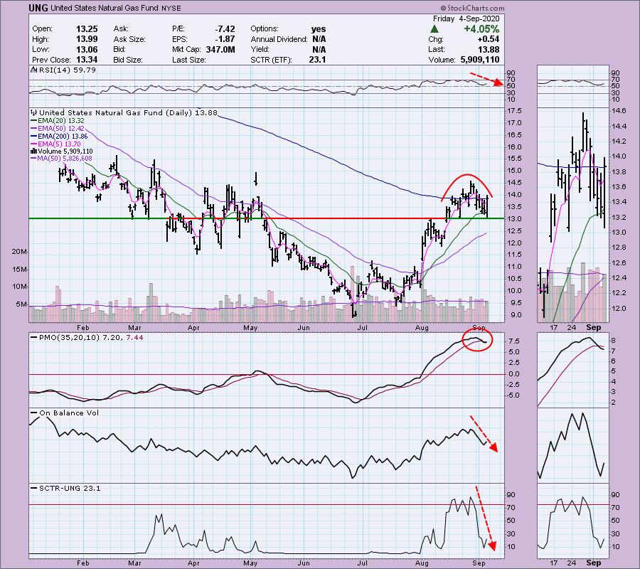
It may seem strange to write a negative review of an ETF after it just made a 4%+ move today, but I wrote to my subscribers earlier this week about the bearish warning signs on Natural Gas (UNG). While admittedly I'm not quite as bearish, given the price action today and the shift in the RSI, there are still bearish warning signs. If you recall, I wrote about UNG in ChartWatchers back on July 24th and then again for my Diamond subscribers on July 26th after the big drop, giving them an even better entry. I know many of them pulled the trigger and so I decided to let them (and you) know there are problems on the UNG chart.
Back to UNG: The PMO has triggered a crossover SELL signal in very overbought territory. The RSI is looking okay now, but I don't like the configuration of the OBV and SCTR, which dove much much lower. If you do own it, that $13.00 level is a good "line in the sand." It held up today and, if it holds up going into next week with improving volume, it should be a good hold. The 50-EMA could also provide support, but, if that $13 level is lost, I expect you'll see more selling.
Be sure to read all the way through today's article to see my "Sector to Watch" and my ChartWatchers "Diamond of the Week", which was presented yesterday exclusively to my Diamonds subscribers.

Every Friday, when I write the DP Diamonds Report Recap, I pick a sector (or two) that we should watch in the coming week. It gives me some direction as to where I want to "mine" for my Diamonds in the coming week.
I like Financials (XLF) going into next week and I will continue to monitor the Energy sector -- when money begins rotating to Energy, you can bet I'll be looking for bargains for my Diamonds subscribers.
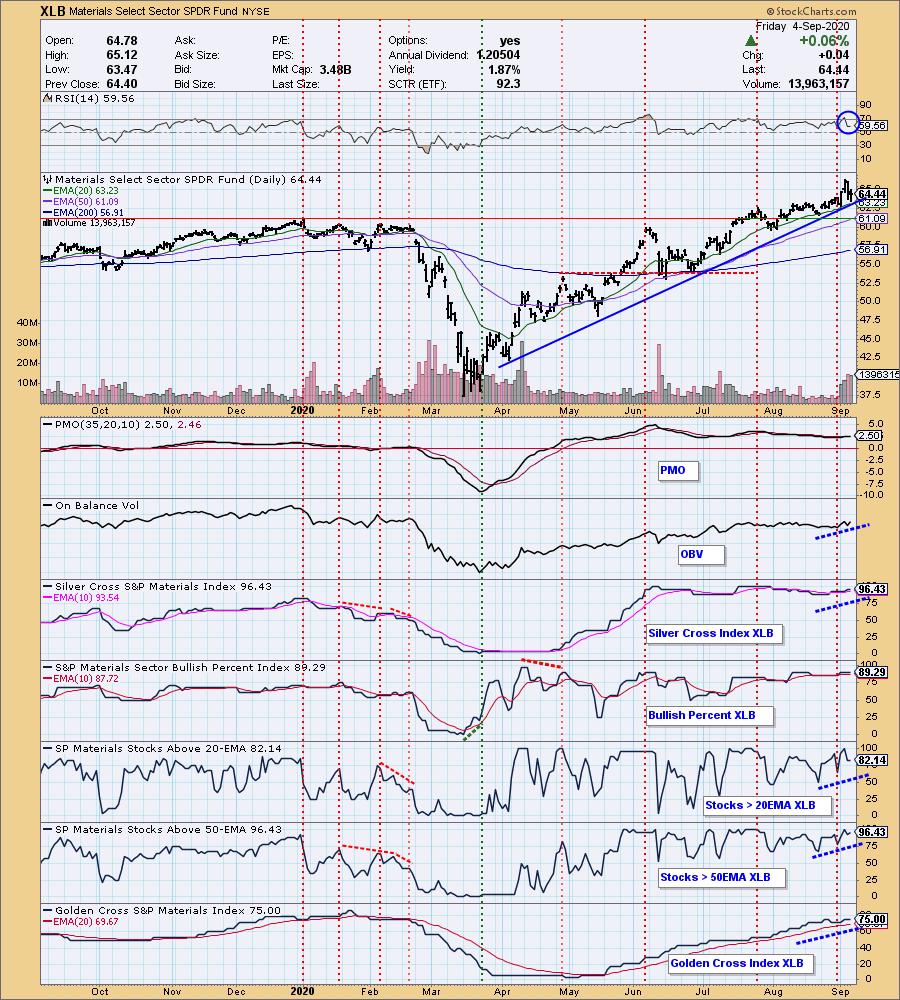
However, my top pick for next week is the Materials sector (XLB). I wrote about the rotation out of technology and what appears to be rotation into materials. The chart below is from our Sector ChartList (subscriber-only) on the DecisionPoint.com website. Carl does the annotations and updates them daily on all three of our DecisionPoint.com ChartLists!
What I love about our sector charts is that all of the pertinent indicators are there, including our newest... the Silver Cross Index (SCI) and Golden Cross Index (GCI). The SCI measures the %stocks that have a 20-EMA above their 50-EMA (silver cross) and the GCI measures %stocks that have their 50-EMA above their 200-EMA (golden cross). Notice the positive confirmations on most of these indicators. We are seeing greater participation based on the %Stocks indicators. Additionally, the BPI, SCI and GCI are all confirming the rotation into Materials. Strength is building in this sector.

Conclusion: UNG is acting "toppy," so keep an eye on the $13.00 support level! Materials (XLB) looks like the sector I'll be watching this week for Diamonds. I just finished up my DP "Diamond Mine" trading room this morning for Diamonds subscribers only. This intimate trading room is fantastic and is certainly worth the price of admission by subscribing to our Diamonds Reports. We examined the Diamonds presented this week and symbols to watch in the coming week. I cover how to enter and exit stocks to improve your trading.
We also just started our FREE DecisionPoint LIVE Trading Room on Mondays at noon ET. Details on registering for the Trading Room are below! Read on for the ChartWatchers "Diamond of the Week".

Register for the Free Trading Room at this link or click above. Our next session is on 9/14/2020!
DecisionPoint Diamonds are becoming even more indispensable! Not only do you get 60 "Diamonds in the Rough" stocks/ETFs per month, with complete analysis including stops/targets... but there will now be a Friday Diamonds Recap that will look at the performance of each week's Diamonds and their prospects moving forward. Over the weekend, we clean the slate and start over again.
Included for my Diamonds subscribers only will be a new one-hour trading room, "The DecisionPoint Diamond Mine" on Fridays! It will provide an opportunity for us to talk live, review current and past Diamonds for possible entries/exits/stops/targets and take your questions and symbol requests in this intimate trading room.
DecisionPoint Alert subscribers will continue to enjoy clear, concise analysis of the overall market, including Dollar, Gold, Gold Miners, Oil and Bonds from both Erin and Carl Swenlin. You will be prepared each market day knowing the implications of market behaviors for that day, week or month!
All subscribers have access to our exclusive ChartLists that are annotated and curated by Carl Swenlin. Know what he thinks is important for all of the sectors, indexes, indicators and more!
Today's ChartWatchers "Diamond of the Week":
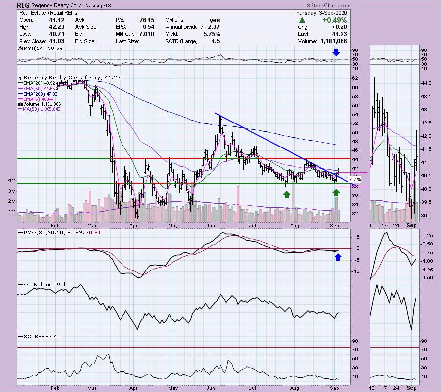
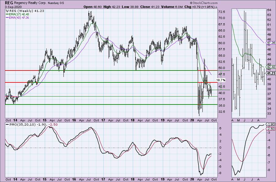
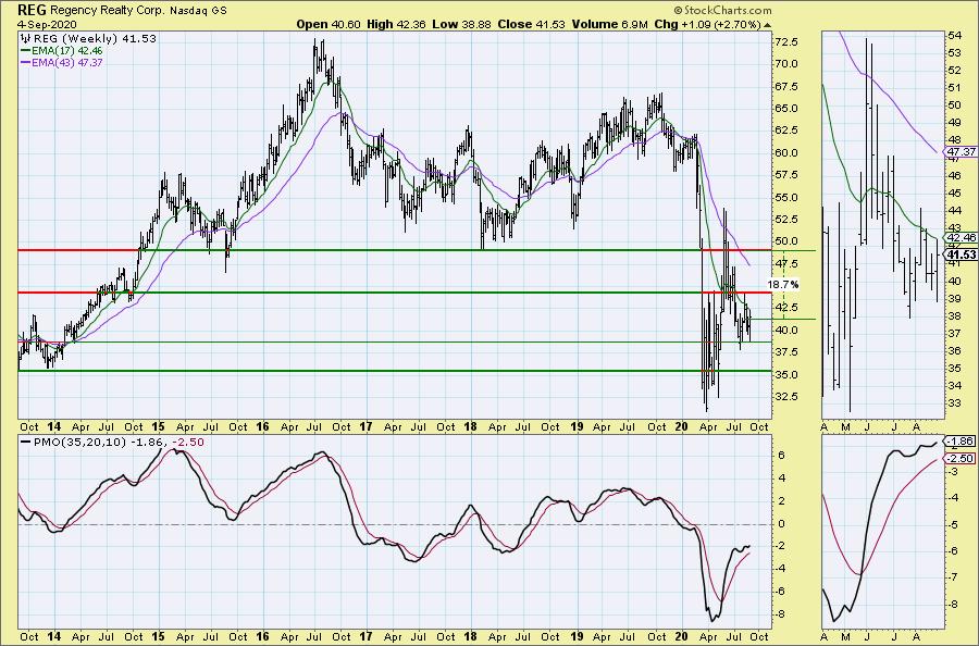
This "Diamond in the Rough" selection is from the September 3, 2020 DecisionPoint Diamonds Report. I have included the chart from Thursday with my original comments, after which I follow up with the current chart.
Regency Realty Corp (REG)
EARNINGS: 10/28/2020 (AMC)
Regency Centers Corp. operates as a real estate investment trust, which engages in the ownership, operation, and development of retail shopping centers. Its portfolio includes thriving properties merchandised with highly productive grocers, restaurants, service providers and best-in-class retailers that connect to its neighborhoods, communities and customers. The company was founded by Martin Edward Stein, Sr. and Joan Wellhouse Newton in 1963 and is headquartered in Jacksonville, FL.
Alright, this is my Diamond pick today. As I noted in the opening, Real Estate has perked up and, since it is generally considered part of the "defensive" area of the market, this could do well if the market continues lower. If the market rebounds, the setup is pretty good and you'll also have a reasonable stop in place. The PMO has turned up and the RSI just moved into positive territory. Volume is coming in on REG and we could be looking at a double-bottom coming off the correction experienced in June/July. I don't like that SCTR, but price is well below the 200-EMA, so not a surprise. Sometimes that is the price you pay for a beat-down candidate.

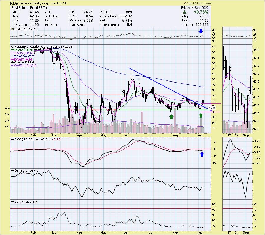
FRIDAY's CHART:

I was pleasantly surprised when I saw the weekly chart had a rising PMO that was making a move toward positive territory. I've made a conservative upside target based on the 2018 low; however, the 2020 high is certainly attainable if REG starts to rally big time.

FRIDAY's CHART:

TRY US OUT! Don't forget, you can give our reports a try with a 1-week free trial by subscribing to the "Bundle" package and using coupon code: dptrialcw.
Happy Charting! - Erin
Technical Analysis is a windsock, not a crystal ball.
Helpful DecisionPoint Links:
DecisionPoint Alert Chart List (subscribers only)
DecisionPoint Golden Cross/Silver Cross Index Chart List (subscribers only)
DecisionPoint Sector Chart List (subscribers only)
DecisionPoint Chart Gallery
Trend Models
Price Momentum Oscillator (PMO)
On Balance Volume
Swenlin Trading Oscillators (STO-B and STO-V)
ITBM and ITVM
SCTR Ranking
|
| READ ONLINE → |
|
|
|
|
|
| The MEM Edge |
| This Game Changing Stock Sparked Highly Bullish Moves In These 2 Candidates |
| by Mary Ellen McGonagle |
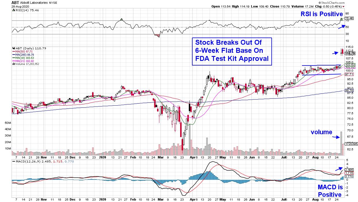
Shares of Abbott Laboratories (ABT) jumped 8% Thursday on news that the FDA granted emergency use authorization for their COVID-19 testing kit.
Abbott's test is a game-changer as it is rapid, reliable and affordable and can detect active coronavirus at massive scale. At a cost of $5 and with a 15-minute result time, the news sparked a sharp rally in many Airline, Cruise and Movie Theatre stocks that would benefit from reliably fast analysis of virus cases.
DAILY CHART OF ABBOTT LABORATORIES (ABT)

While ABT may consolidate a bit here following its gap up in price, signs of expected heavy demand for their kits will easily spur further upside. The company is planning to produce as many as 50 million tests per month starting in October.
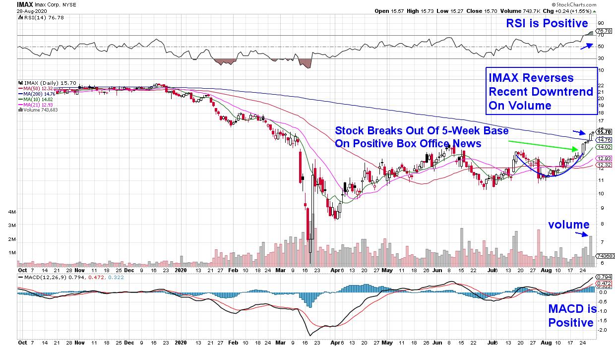
Below is a chart for Movie Theatre company Imax Corp. (IMAX), which reversed its 6-week downtrend following Thursday's break back above a downward trending 200-day moving average. The fact that the move occurred on volume is quite positive.
DAILY CHART OF IMAX CORP. (IMAX)

IMAX not only rallied on positive COVID testing news that pushed the stock into an uptrend, but the stock rallied strongly earlier in the week after reporting impressive box office results from their first major theatrical release in China. This country accounts for 46% of the company's global screen base and last week's news pushed the stock out of a 5-week base on Monday.
The RSI is in an overbought position, which may signal a slight pullback, but its positive position, as well as the MACD, bode well for further upside.
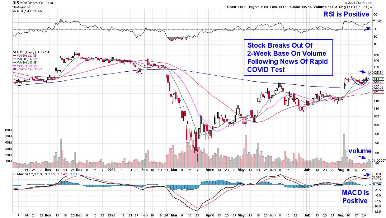
DAILY CHART OF WALT DISNEY CO. (DIS)

Walt Disney Co. (DIS) broke out of a 2-week base this week following news that foot traffic has picked up at their Walt Disney World location. While traffic is still down considerably from pre-pandemic levels, news of improved testing possibilities helped push the stock even higher, with DIS ending the week with a 6.5% gain.
Disney (DIS) is one of the country's largest and oldest media companies, and an even stronger near-term catalyst for growth is their pivot to direct-to-consumer streaming. Disney is expected to generate $11 billion in revenues from this division, and their unconventional decision to release their new film Mulan online next week has investors excited.
While Airline and Cruise stocks rallied, they remain below key longer-term moving averages, which may act as upside resistance. Instead, my work screens for stocks that are trading above their key simple moving averages, with the company currently seeing growth from a high demand for their products.
My bi-weekly MEM Edge Report focuses on even higher growth names than this article highlights with precise entry and exit points that subscribers agree, have helped them greatly outperform the markets. Check out our track record here!
And right now, you can take a 4-week trial of this top performing MEM Edge Report at a nominal fee. You'll receive insights into Industries and Sectors experiencing strong growth, as well as entry points into select stocks from those areas that are poised to take off.
Warmly,
Mary Ellen McGonagle, MEM Investment Research
|
| READ ONLINE → |
|
|
|
| ChartWatchers |
| Many Stocks Just Got Cheaper - Now What? |
| by John Hopkins |
Anyone who has followed the market like I have through every possible scenario, from the dot-com bubble to 9/11 to the Great Recession to what we've seen the past few days, should have recognized that the market was getting VERY extended. When you start seeing Stochastics near 100 with RSI's 80+ on tons of individual stocks as well as in the major indexes, alongside the VIX starting to move higher in unison with the market, you're likely to see the type of selling we saw this past week. Add to the massively overbought conditions the fact that many "new" investors and traders have only seen the market go higher for months now with many of them only trading options as a "cheaper" alternative, and it becomes a recipe for a sizable pullback.
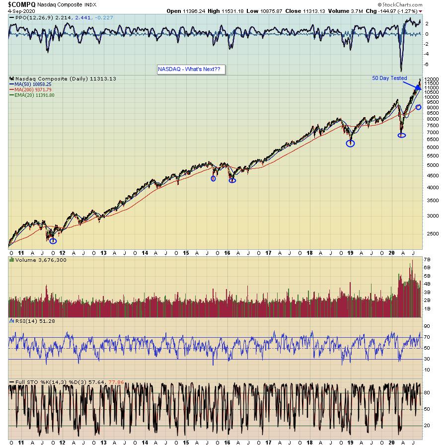
There is some good news. Once a big batch of traders have thrown up their hands in unison and surrendered, once the margin calls run their course and once the market goes from being extremely overbought to oversold, stocks start to look more attractive. And this is particularly true for those companies who posted great earnings numbers, especially those that guided higher for the future. How long the current selling lasts is anyone's guess, but, as you can see in the chart below, the NASDAQ has mostly managed to hold above its 20- and 50-day moving averages - and there's only been a handful of times when it's fallen meaningfully below its 200-day moving average during the past 10 years. This past week, the first key line of defense was the 50-day, currently at 10,858 (tested Friday) with the "biggie" being the 200-day, currently at 9,371, which is 13% below the 50-day.

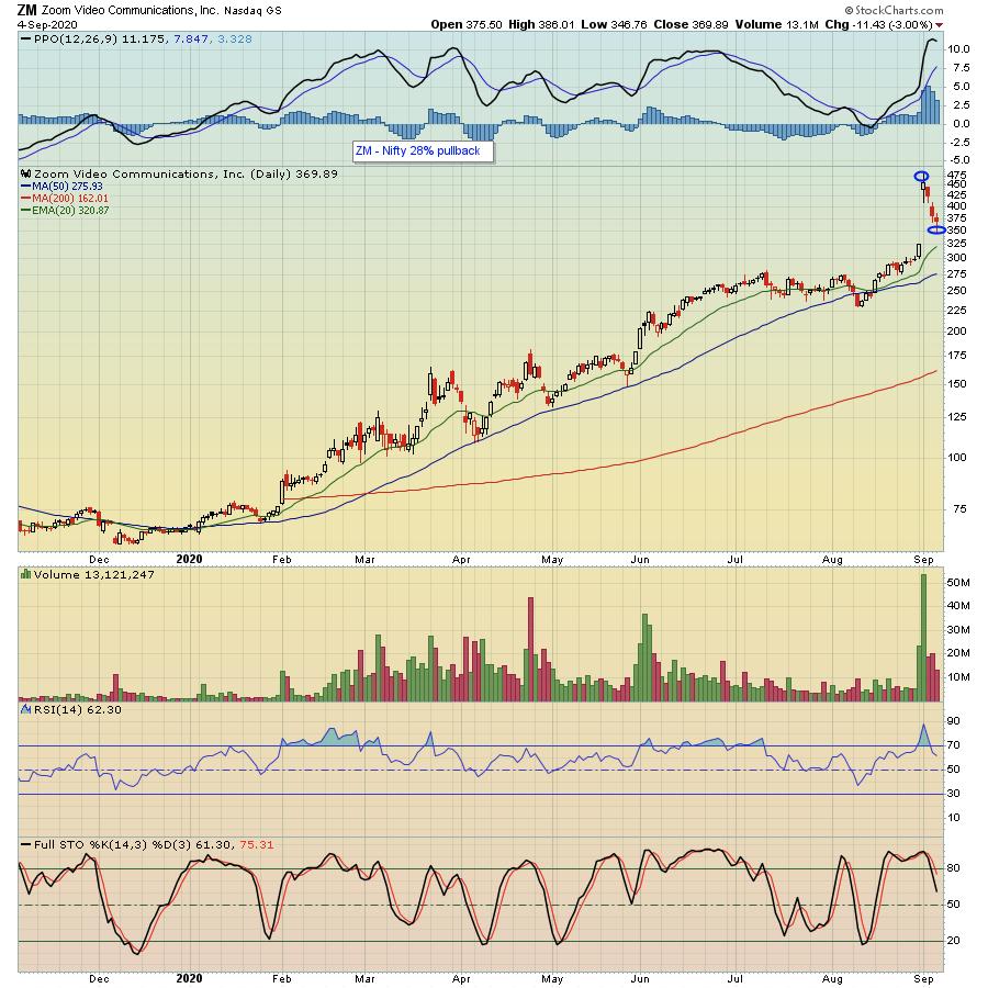
There's certainly nothing wrong with a market correction, but it often takes many traders by surprise when they see the market correct 10% - like the NASDAQ just did from Wednesday's top to Friday's bottom - over the course of just a few days. And that 10% correction can seem rather minor compared to corrections in individual stocks, which can easily see double- or triple-percentage declines in just a day or two. For example, take a look at the chart below on ZOOM (ZM), a company that recently reported blowout earnings, that fell almost 30% from its high to its low in just a few days.

All of this leading to: now what? To me, it's important to continue to zero in on those companies that reported the strongest earnings recently and may pull back to more attractive levels. These are stocks like AAPL, TSLA, SHOP - all in our Model Portfolio - that are likely to be targets once the current bout of selling ends.
At EarningsBeats.com, our focus is on those companies that beat both top- and bottom-line expectations and have promising charts. These stocks end up on our "Strong Earnings ChartList" and there are currently 498 stocks on the list. If you would like to get access to the entire list, just click here to sign up for a 30-day NO COST trial membership. And if you are a StockCharts.com Extra level member or higher, you will be able to download the entire list into your StockCharts account, which will allow you to sort and scan for those stocks that meet your specific criteria. Very powerful!
At your service,
John Hopkins
EarningsBeats.com
|
| READ ONLINE → |
|
|
|
| MORE ARTICLES → |
|
 It's always a true pleasure to kick off the week by hosting a new episode of "Your Daily Five". I've said it before and I'll say it again – this is without a doubt one of my favorite shows of the many we're running these days on StockCharts TV. With a different host every day of the week, the show delivers a concise, action-packed daily rundown of the five most important charts that you need to be watching, always with a new perspective and a bucket full of insights from some of the most skilled technicians out there.


 The Bollinger Band squeeze signals a volatility contraction that can lead to a volatility expansion. But which way? For directional clues, we need to analyze price action and other indicators. Henry Schein caught my eye because the stock has a Bollinger Band squeeze, a bullish chart pattern, an uptrend and a strong sector. That's a potentially powerful combination.


 No, this is not a political blog. This is three decades of blood-and-sweat soaked lessons gleaned from investing and following the media. Like condensed milk, it's all boiled down to the five essential "must knows" for you. These are the five Frankensteins that will kill your investing profits unless you keep your eyes wide open.