| THIS WEEK'S ARTICLES |
| Market Roundup |
| Is There More Corrective Activity Ahead? |
| by Martin Pring |
Some Indicators Have Moved to Levels Consistent with a Low
Most corrections in a bull market fall in the 5-10% range. On Thursday, the NASDAQ is down 10% intraday and the S&P Composite 7%, so it's not unrealistic to conclude that the correction might be over. Let's take a look at some indicators and find out.
The 10-day ROC for the NASDAQ VIX (Chart 1) and that of the NYSE (Chart 2), for example, both look as if they have peaked from a level that has consistently flagged a short-term buying opportunity. Valid signals have been flagged with the solid green vertical lines, whereas the failed ones are represented by a dashed red variety. This approach is clearly not perfect, but these charts do suggest that a good case can be made for the end of the correction.
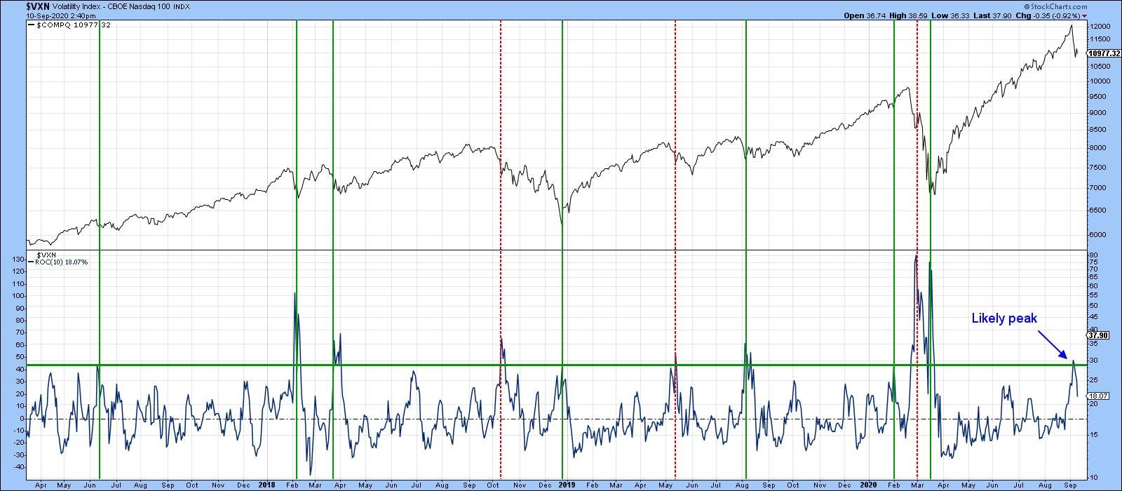 Chart 1 Chart 1
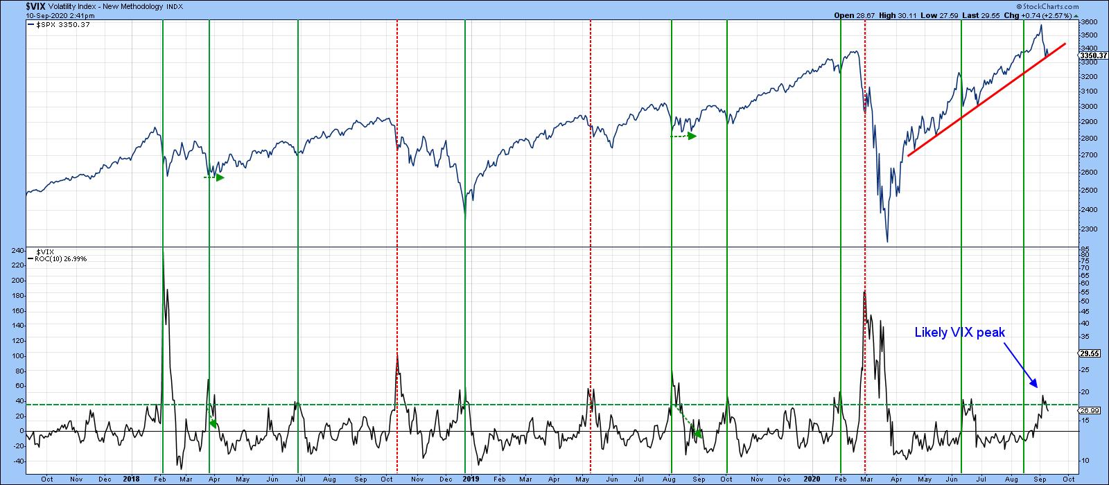 Chart 2 Chart 2
Others Suggest the Likelihood of More Corrective Activity
On the other hand, Chart 3 tells us that the percentage of NASDAQ stocks above their 200-day MA has just triggered a sell signal by dropping below its 30-Day MA. Some of these signals, such as last January's and that of July 2018, have been pretty timely. Others have not, but even the less consequential ones have usually been followed by a month or more of weakness. Remember, "weakness" does not necessarily mean a lower Index, but it does imply a more challenging trading environment if the trend of fewer stocks trading above their 200-day MA's extends.
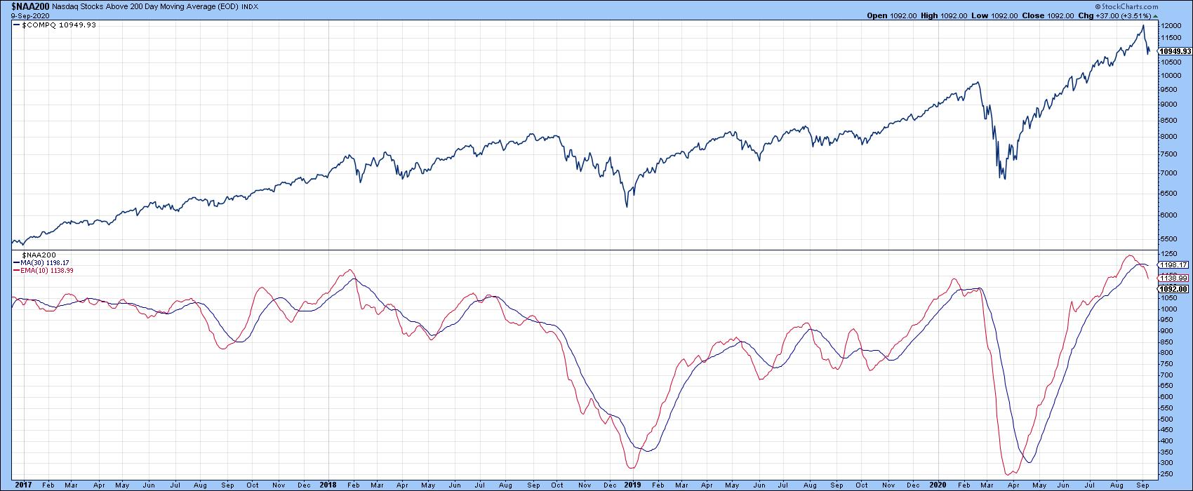 Chart 3 Chart 3
My Dow Diffusion Indicator (Chart 4), which monitors Dow stocks in a positive trend, has been indecisive for the last few months. However, it has just crossed below its 15-day MA for the third time since the rally began in March. Moreover, recent action has been quite indecisive, even as the DJIA itself took out its June peak. The indicator remains at an elevated level compared to the low-level reversals that have usually signaled the end of a correction. It's not mandatory for it to drop below the dashed green oversold line, but most rallies have been signaled when it has been trading at a lower level than it is currently. My basic conclusion is that this indicator is hinting at further weakness going into the fall.
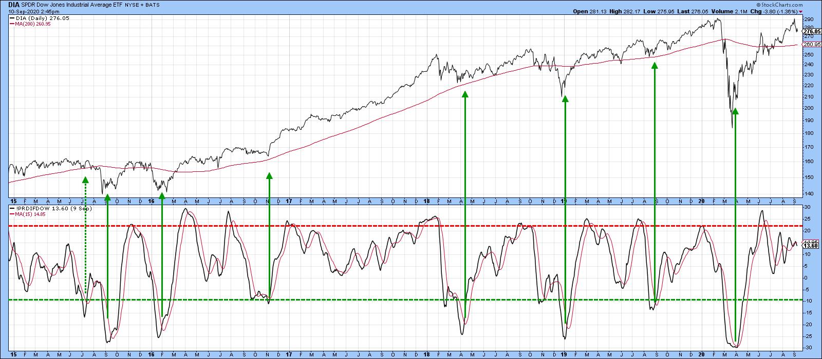 Chart 4 Chart 4
The idea of further corrective activity is suggested by Chart 5, which shows that the NASDAQ experienced an outside bar for the first week in September. An outside week totally encompasses the trading range of its predecessor and indicates a change in the buyer/seller relationship in favor of sellers. The power of outside patterns can be seen from the bullish price action in late March. This was an unusually strong after-effect, which I am not expecting in the case of last week's bearish pattern. However, since the outside week was observed for the World and most US aggregate indexes, it is likely to act as a damper over the next few weeks.
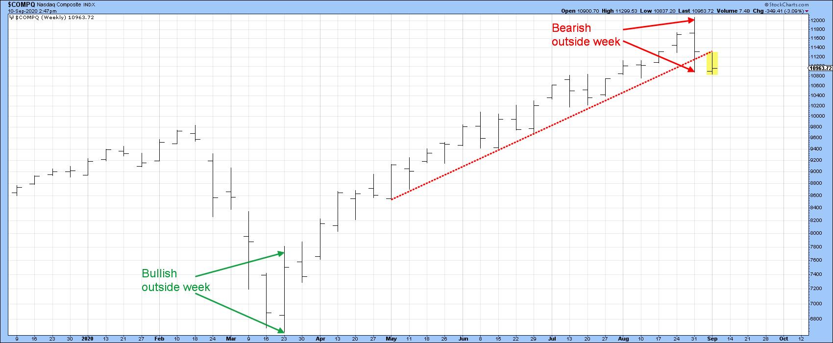 Chart 5 Chart 5
In summary, Charts 1 and 2 show some promise. However, the bulk of the evidence suggests further corrective activity lies ahead. That could either take the form of downside or range-bound activity. For those focusing on the long-term, this should not be a problem, as the vast majority of primary trend indicators remain positive. Indeed, some of them are deeply oversold. When they turn, likely after the correction has run its course, this should be really positive for US equities.
Editor's Note: This is an excerpt of an article originally published in Martin Pring's Market Roundup on Thursday, September 10th at 5:19pm ET. Click here to read the full article, which includes charts 6-8 and a discussion of what indicators should be monitored for a possible upside reversal.
Good luck and good charting,
Martin J. Pring
The views expressed in this article are those of the author and do not necessarily reflect the position or opinion of Pring Turner Capital Group of Walnut Creek or its affiliates.
|
| READ ONLINE → |
|
|
|
| The Mindful Investor |
| The Ratios Speak to Market Rotation |
| by David Keller |
"Great chart, but it seems super short-term. When would you get out of this?"
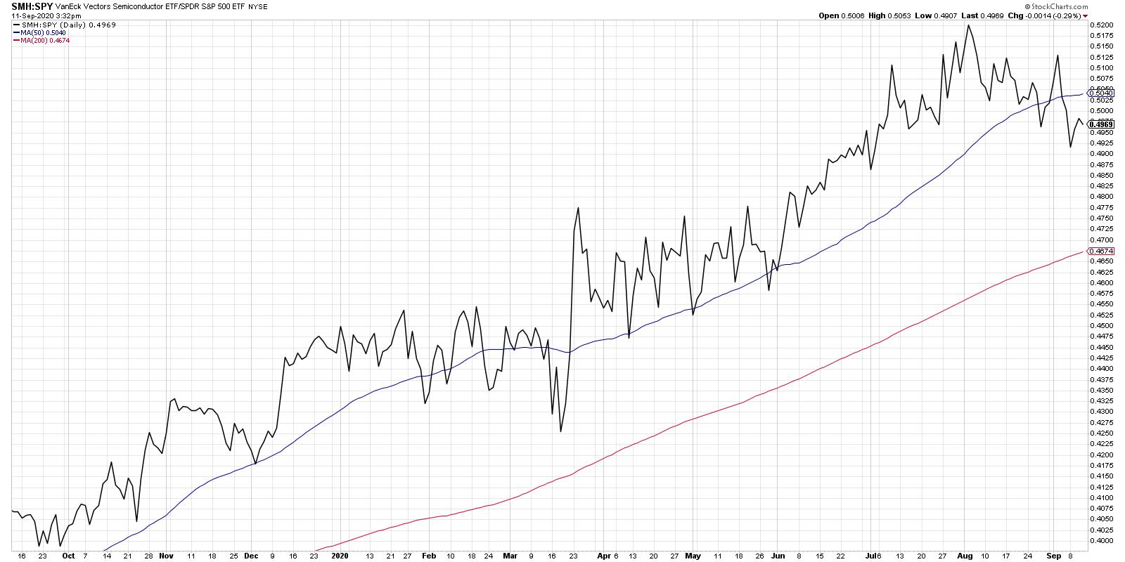
That was the reaction I received on social media when I posted this chart showing the relative strength of semiconductors to the S&P 500.
In terms of my process, I focus my macro perspective on three stages: price, breadth and sentiment. Price is most important of all, as it tells you how people are voting with their capital. Are investors buying stocks or bonds? Gold or energy stocks? Homebuilders or medical equipment names? The price charts can answer all of those questions.
Here's the challenge. Technical analysis often focuses on the tools you use to analyze one particular chart, one particular asset, one particular trade. But how do you know if you're looking at the right chart in the first place? That's where ratio charts come in.
For me, relative strength is a vital step in the decision-making process. They are how you determine how this particular stock relates to all other names you could be buying or selling at any given moment. To be clear, I'm talking about relative strength here (i.e. this stock versus other stocks) as opposed to the Relative Strength Index, which is a measure of price momentum.
One of my ChartLists is filled with ratio charts, which essentially apply the discipline of relative strength investing to a bunch of different combinations of ETFs and asset classes. This allows me to see whether investors are leaning more into offense (Consumer Discretionary) or defense (Consumer Staples), for example.
Now let's get back to the chart of semiconductors vs. the S&P 500 index.
I have found the relative performance to be a key market tell, in that semiconductors over time have become more of a central component to the success of the economy. Much like Charles Dow used the Dow Industrials index to track the health of the economy, I would argue that, at this point the semiconductors group may be the best broad market indication.
When the economy is doing well, when things are growing and people are buying, that should be reflected in the performance of semiconductor names. Recently, we've seen a bit of a rotation away from semiconductors, as this ratio has gone from a confirmed uptrend (higher highs and higher lows) to a confirmed downtrend (lower lows and lower highs).
What's my time frame? Where would I initiate a short position? What would be my risk management if the price went higher? All of those questions I would answer, mainly, with a chart of the SMH to better understand the price dynamics and identify potential entry and exit points.
My friend Dave Landry recently pointed out that "Indicators are Illustrators," meaning that he uses technical indicators more to visualize the price dynamics and less for actual execution, which is based on price itself.
I tend to think of ratios in the same way. They give you a broad sense of when investors are leaning into one side or the other of a relationship. They speak to potential leadership rotation, especially at turning points.
The ratio in today's chart turning lower tells me that a leadership rotation is occurring now. And it tells me to focus on individual price charts of the SMH, as well as names like AMD, AVGO, KLAC and others, to analyze price trends and manage potential downside risk.
David Keller, CMT
Chief Market Strategist
StockCharts.com
Disclaimer: This blog is for educational purposes only and should not be construed as financial advice. The ideas and strategies should never be used without first assessing your own personal and financial situation or without consulting a financial professional.
The author does not have a position in mentioned securities at the time of publication. Any opinions expressed herein are solely those of the author and do not in any way represent the views or opinions of any other person or entity.
|
| READ ONLINE → |
|
|
|
|
|
| Trading Places |
| Here are 3 Ways to Calculate S&P 500 Downside Targets |
| by Tom Bowley |
Despite remaining very bullish, I've written several short-term bearish articles lately, mostly dealing with extreme sentiment issues. Those sentiment extremes have been rectified and are no longer a problem, but they've now changed the mentality in the market from "buy on the dip" to "sell on the rebound." I believe that's rather pronounced when we look at a 60-minute chart:
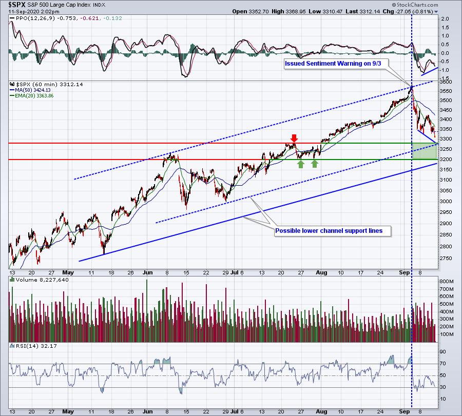
I want to point out a few things on this chart:
(1) I posted a warning in my Trading Places blog on the morning of Thursday, September 3rd, titled "2 Sentiment Indicators Are Suggesting Extreme Caution - BEWARE!". This warning coincided with the blue-dotted vertical line in the chart above. You can see that the market immediately heeded that warning. It should be noted that this warning was coming from someone who remains steadfastly bullish, but please don't confuse a long-term secular bull market with a short-term sentiment warning. And remember one more thing: September is historically the worst calendar month of the year. It makes sense to be much more cautious this time of year.
(2) There's a 60-minute positive divergence in play. We could see a bit more short-term selling, but we're likely going to see a bounce next week - one that could take us back to 3400 or slightly above. I wouldn't be surprised, though, to see one more serious bout of selling to shake out more traders before the next pre-earnings rally. Based on the above chart, I'm looking for a September low somewhere in the 3200-3300 range.
(3) I like to draw channels. If we take the high from June and connect it to the high from a week ago, we get an upper channel line. To get a lower channel line, we simply drag that top line down to key price lows. The blue-dotted channel line connects the late-June low, while the solid channel line connects the May low. Look for a bounce off of one of these channel lines.
Downside Target Using 60-Minute Chart: 3200-3300
Next, I want to look at key Fibonacci retracement support levels. For this, I'll use the 6-month daily chart:
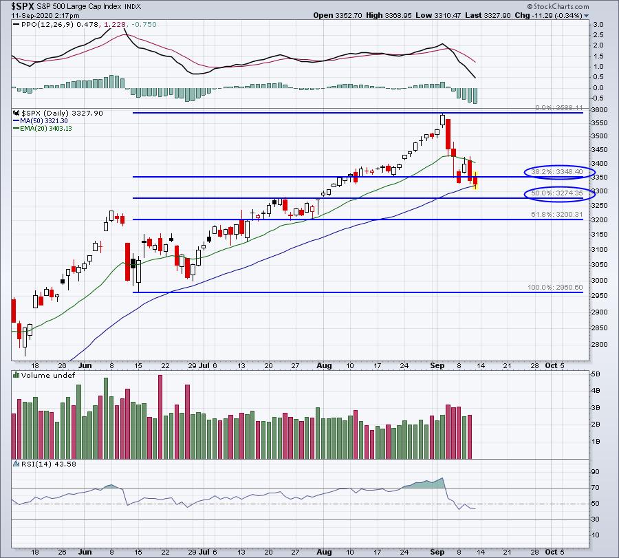
I believe the selling will end at either the 38.2% or 50.0% retracement levels. If we do see a bounce next week, that could set us up for one more decline to take us back down to roughly 3275.
Downside Target Using Fibonacci: 3275-3348
Finally, I think it's always prudent to review the long-term weekly charts. Sometimes, we get so caught up in the "here and now" that we lose sight of the Big Picture. So if we step back and view where we've been, it's a little easier to see where we might go:
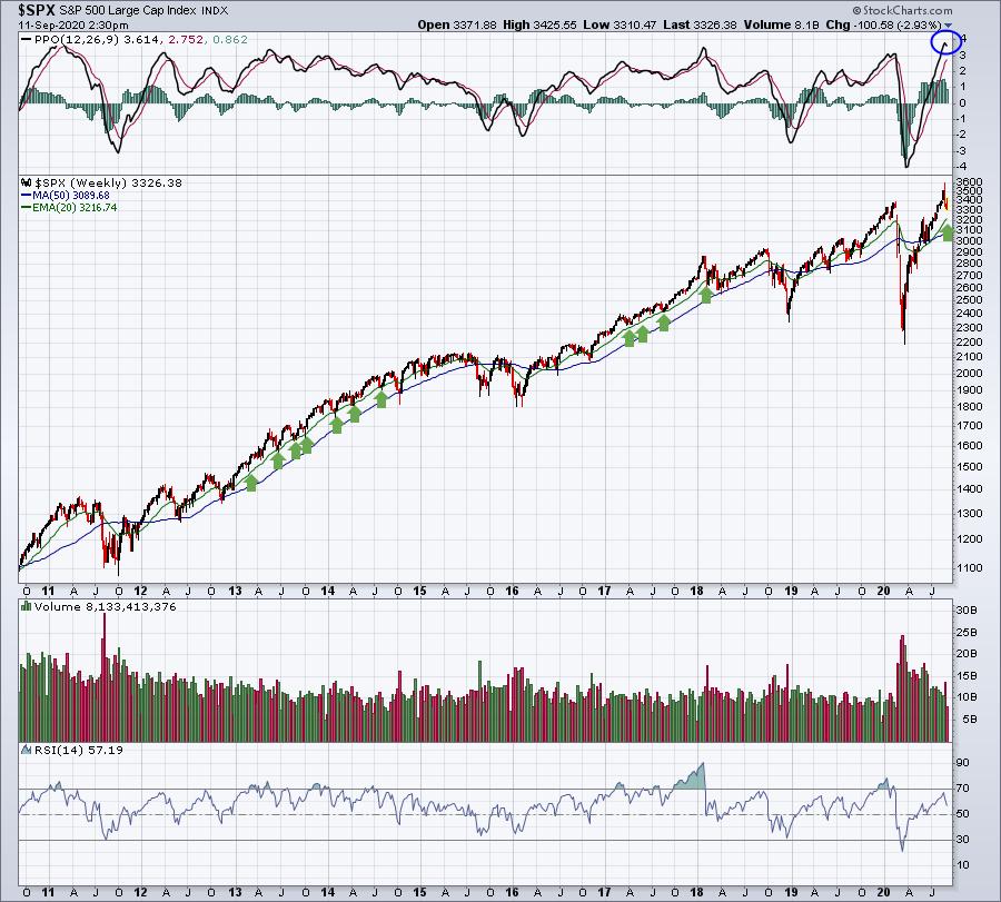
There are a few points to be made here:
(1) For those of you that are bearish longer-term, there is a broadening top pattern in place (higher highs, lower lows). This pattern would confirm if that March low was breached. I do not expect that to happen, but I thought I'd mention the pattern.
(2) I'm calling a weekly PPO top. I believe the PPO has topped out. First of all, a weekly PPO rarely reaches 4 and it's easiest to do so after a long brutal selloff. The resulting rebound tends to be extremely quick and can produce a surge in the weekly PPO. 2009 was a perfect example. 2020 is another. While the PPO will likely decline from here, that simply means that the rate of acceleration in prices will likely slow. It doesn't mean we'll move lower. Any positive PPO is a good PPO; I simply wouldn't be expecting a 50% gain in the S&P 500 over the next 6 months like we've seen over the past 6 months.
(3) Watch the rising 20-week EMA. I believe we'll see action like we saw in 2013, 2014 and 2017. I look for a continuing uptrend with support at that long-term moving average.
Downside Target Using S&P 500 20 Week EMA: 3217
To conclude, I'm looking for a bit more selling here in September. While it's possible we quickly resume the uptrend we've enjoyed off the March lows, I think the odds are greater that we'll see another low in September to possibly test the rising 20-week EMA, then another pre-earnings advance.
I'll be keeping our EarningsBeats.com community updated as I see more data. If you'd like to join our community, please SIGN UP for our free EB Digest newsletter, published 3x per week on Mondays, Wednesdays and Fridays.
Happy trading!
Tom
|
| READ ONLINE → |
|
|
|
| RRG Charts |
| Are We Just Coming Out of a Full Recession? |
| by Julius de Kempenaer |
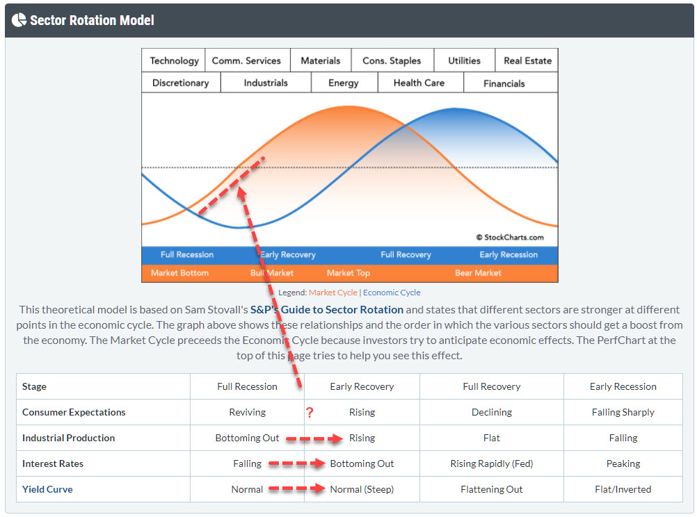 With markets flying everywhere from day to day, I want to take a step back in this article and look at the bigger economic cycle picture, in order to see if we can fit things into the "Sector Rotation Model" as it can bee seen under the PerfCharts. With markets flying everywhere from day to day, I want to take a step back in this article and look at the bigger economic cycle picture, in order to see if we can fit things into the "Sector Rotation Model" as it can bee seen under the PerfCharts.
This time, I will not be focusing on the performance of the various sectors in different parts of the economic cycle, but will try to paint a possible scenario from looking at the movement in the macroeconomic variables that are listed in the table below the cyclical graph.
There are various angles from which you can look at this model. One way I often use is to look at the actual rotations of the various sectors on a Relative Rotation Graph and see if I can find/match the economic condition that would be expected in that situation. For example, if Materials, Staples, Energy and Health Care are the strongest (out)performers and the other sectors are lagging, that suggests the market is at or approaching a top.
The angle I'd like to take here is to (also) look at the macroeconomic variables that dictate the phase of the cycle.
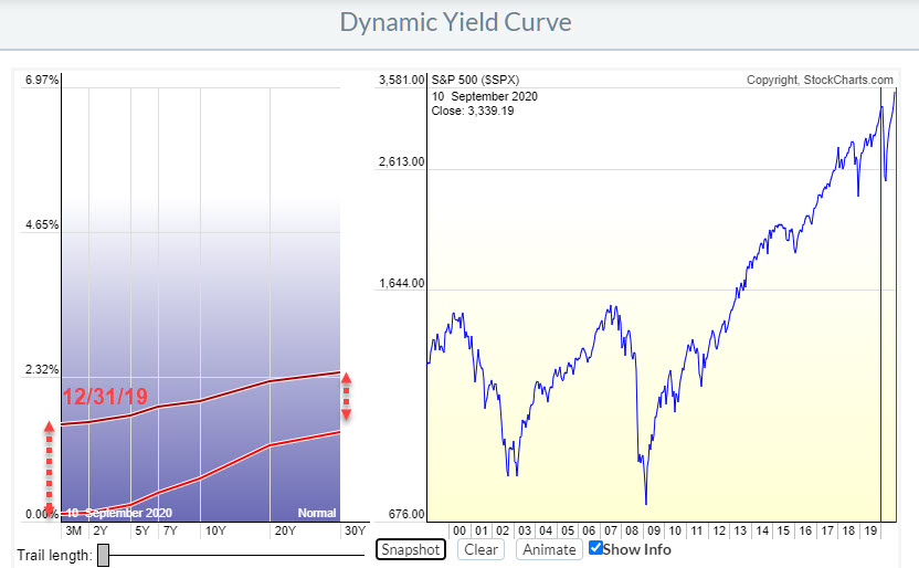
One of the things that I use a lot in terms of intermarket analysis and examining at the big picture is the yield curve. And StockCharts has a great "dynamic yield curve" tool which is, I think, underestimated and undervalued.

This Yield Curve chart above shows the YC as it was shaped at the end of last year (dark red) and how it is shaped now (light red).
What you can see is that yields in general have come down. The whole curve is lower, on all maturities, than it was 9 months ago. But the curve has also steepened. The decline at the shorter end of the curve is much bigger than the decline. If you would like to learn more about the dynamics of the yield curve you can find a ChartSchool article on the subject here.
Going back to the table, in the Sector Rotation Model we find that a steepening curve (moving from Normal to Normal (Steep)) is a characteristic that occurs during phase where the economy moves from Full Recession to Early Recovery.
Then there is the behavior of Interest Rates.

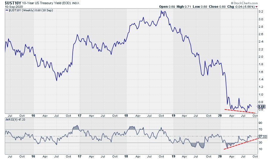
The chart above shows the yield on 10-year US Treasuries. And where it has come off hard since the end of 2018, it now looks as if markets are trying to find a floor around levels we have seen earlier in the year, and the positive divergence between RSI and yield is clearly visible.
I prefer to look at "tradable" instruments and so, for the interest rates, that means a bond chart.
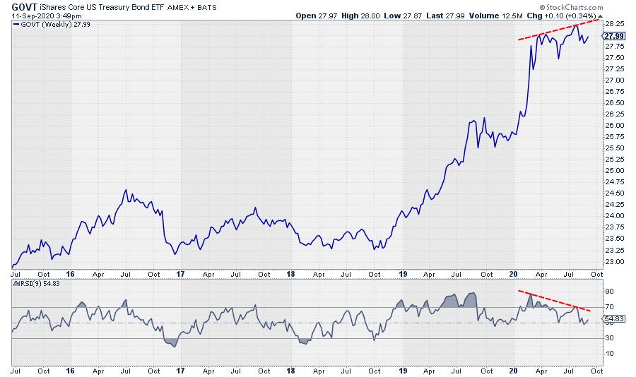
The chart below shows the price of the GOVT ETF, which is an ETF that covers all maturities on the curve.

Obviously, this chart is inverted from the yield chart, but certainly confirms the toppish characteristics of bonds at the moment. The divergence, in this case negative, is even more pronounced than on the yield chart. So it certainly looks as if yields are trying to put in a bottom and start moving higher - which is also a characteristic of an economy that is shifting from Full Recession towards Early Recovery.
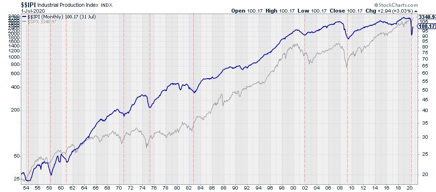
The third one is Industrial production. This is a metric that is a bit harder to analyze as it only has monthly data points, meaning it takes longer before trends become visible.

This chart shows $$IPI with the S&P 500 plotted behind it since 1954. I have eyeballed in a few vertical red dotted lines at the significant lows in the Industrial Production Index. These lows certainly do not match with lows in the market 100% of the time, but I think we can agree that it certainly is not a negative for the market.
As I said, this index is only updated only once a month, so we will have to see how this comes out on the next update and if it will still be rising, but, from a historical perspective, such a quick up-down swing does not seem to happen very often here.
Hence, this metric also suggests that the economy is moving from Full Recession to Early Recovery.
I'll be following these developments closely in coming weeks / months and see how things develop. But, for now, I am going to keep an open mind to the possibility of an extension of the rally that has been underway since March!
My regular blog is the RRG Charts blog. If you would like to receive a notification when a new article is published there, simply "Subscribe" with your email address.
|
| READ ONLINE → |
|
|
|
|
|
| The MEM Edge |
| Buffering Your Portfolio With Attractive High Yielders |
| by Mary Ellen McGonagle |
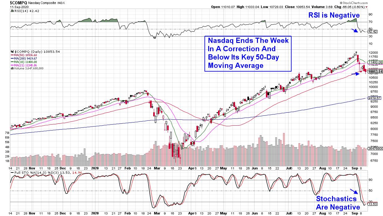
Fast moving Growth stocks have been taking it on the chin with the Tech-heavy Nasdaq now down over 10% from its recent peak in price. The drop puts this Index into a correction which has investors on the lookout for more potential downside.
DAILY CHART OF NASDAQ COMPOSITE

Those who follow my work at MEM Investment Research will know that we've been removing stocks from our Suggested Holdings List as they break below key support while staying with others where their charts remain positive.
Overall however, we may be in for continued bumpiness over the near-term and a move into stocks that provide a high yield as well as having growth prospects and an attractive chart, could well help weather any continued volatility.
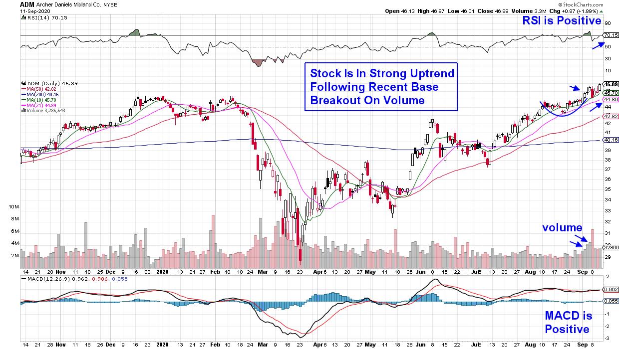
This would include stocks such as Archer Daniels Midland (ADM). The 3.1% yielder is a multinational food processing and commodities trading corporation that has recently seen its earnings estimates raised higher for both this year and next.
DAILY CHART OF ARCHER DANIELS MIDLAND (AMD)

The company expects a groundswell of export demand for the rest of 2020, led by robust purchases by China and elsewhere, as the coronavirus pandemic fuels food security concerns around the world. ADM is in a strong uptrend following a 1-month base breakout earlier this month. Look for a continued move higher given it $85 price target from Wall Street.
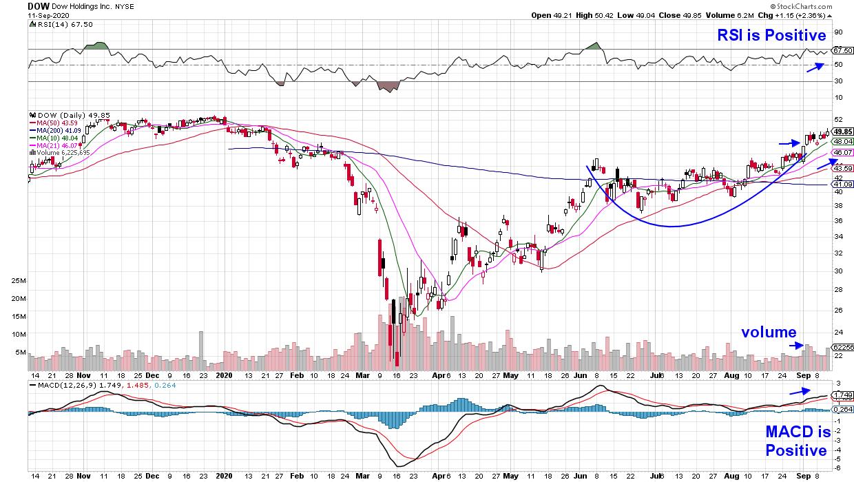
Dow Holdings (DOW) is another mega-cap yielder that has seen its estimates revised higher. In fact, the company is estimated to grow earnings by 184% next year due to their production of polypropylone which has seen its price rise due to distribution chain breakdown.
DAILY CHART OF DOW HOLDINGS, INC. (DOW)

The highly versatile plastic that DOW produces has seen demand grow; particularly in the automotive and construction industries which are seeing expansion. The stock broke out of a 3-month base on volume last week and is now in a confirmed uptrend. The stock was upgraded today with a $55 price target.
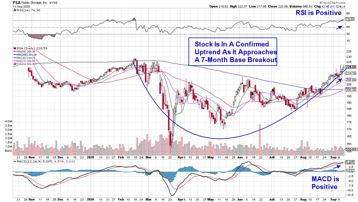
While most REIT stocks remain in a downtrend, self-storage facility provider Public Storage (PSA) has been in a stable uptrend of late as demand for their units has increased. Many once popular cities such as New York and San Francisco have seen an exodus of younger renters who have returned home and now need a place to store their belongings.

The 3.6% yielder has had a tough year however, estimates for next year are close to turning positive as analysts raise guidance. As you can see in the chart above, the stock is in a confirmed uptrend with a positive RSI and MACD pointing to further upside.
The good news is, each of these highlighted stocks are poised to trade higher due to improving growth prospects and their attractive yields make them even more compelling during this currently volatile environment.
From my work, I'm anticipating a move back into high growth stocks such as Technology and Internet Related areas particularly given their strong fundamentals due to high demand for their products. Great gains can be made following the pullback in leadership stocks.
If you'd like to be alerted to when these high growth areas turn near-term positive again, you'll want to subscribe to my bi-weekly MEM Edge Report. In addition to being provided with precise entry points, you'll be provided with insights into why that select stock is poised to trade higher.
You can use this link here to take a 4-week trial at a nominal fee.
Warmly,
Mary Ellen McGonagle
MEM Investment Research
|
| READ ONLINE → |
|
|
|
| SPECIAL EVENT |
 |
|
| MORE ARTICLES → |
|
 Chart 1
 Chart 2
 Chart 3
 Chart 4
 Chart 5


 With markets flying everywhere from day to day, I want to take a step back in this article and look at the bigger economic cycle picture, in order to see if we can fit things into the "