| THIS WEEK'S ARTICLES |
| The Market Message |
| Emerging Markets Achieve Bullish Breakout |
| by John Murphy |
The U.S. dollar continues to weaken against both developed and emerging market currencies. Chart 1 shows the Invesco Dollar Bullish Fund (UUP) nearing a test of its yearly low. A drop below that level would put the dollar at the lowest level since early 2018. One of the factors pushing the dollar lower is stronger stock prices. That's because stocks and the dollar have been trending in opposite directions since the spring. The chart shows the dollar surging during the spring (as stock prices were falling); and then peaking in late March (when stocks bottomed). The dollar has been falling since then as stocks have continued to rally. That's because the dollar is usually viewed as a global safe haven. As such, it often attracts money when stocks are under pressure; and weakens when stocks rise. This week's sharp global rally has pushed the dollar into a test of its 2020 low.
One of the most obvious implications of a falling dollar is that it usually boosts commodity prices, and precious metals in particular. Yesterday's message showed gold and its miners starting to rise this week as the dollar weakened. A weaker dollar has also boosted industrial metals like copper and stocks that produce them. My message from October 21 covered that inverse relationship between the dollar and metal markets; and also pointed out that a falling dollar is usually bullish for emerging markets which were nearing an upside breakout. That breakout in emerging markets has now taken place.
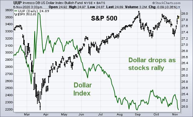 Chart 1The weekly bars in Chart 2 show the MSCI Emerging Markets iShares (EEM) breaking through their early 2020 high to reach the highest level since early 2018. That's a bullish breakout. The October 21 message also pointed out that EM markets were being led higher by stocks in Asia, and China in particular. Stock ETFs in China, South Korea, and Taiwan have all achieved upside breakouts. At the same time, the Chinese yuan has risen to a multi-year high against the dollar and has led a rally in emerging market currencies in general. That's another reason why a weaker dollar favors emerging markets. Chart 1The weekly bars in Chart 2 show the MSCI Emerging Markets iShares (EEM) breaking through their early 2020 high to reach the highest level since early 2018. That's a bullish breakout. The October 21 message also pointed out that EM markets were being led higher by stocks in Asia, and China in particular. Stock ETFs in China, South Korea, and Taiwan have all achieved upside breakouts. At the same time, the Chinese yuan has risen to a multi-year high against the dollar and has led a rally in emerging market currencies in general. That's another reason why a weaker dollar favors emerging markets.
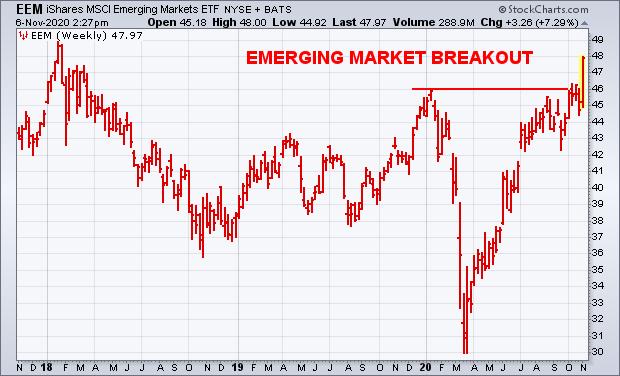 Chart 2 Chart 2
Chart 3 shows a generally inverse relationship between emerging markets and the dollar over the last four years. The falling dollar during 2017 coincided with rising EM markets; while a dollar bottom in early 2018 coincided with an EM peak (see arrows). The dollar spiked this spring while EM markets plunged. The falling dollar since the spring has coincided with strong emerging markets which are still rising. The EEM has just achieved a bullish breakout while the dollar is threatening its 2020 lows. One reason for their generally inverse relationship is that a falling dollar supports a more risk-on attitude for global stocks. A weaker dollar also supports emerging markets which generally carry a lot of dollar-denominated debt. A falling dollar makes it easier for them to finance that debt. So do rising emerging currencies.
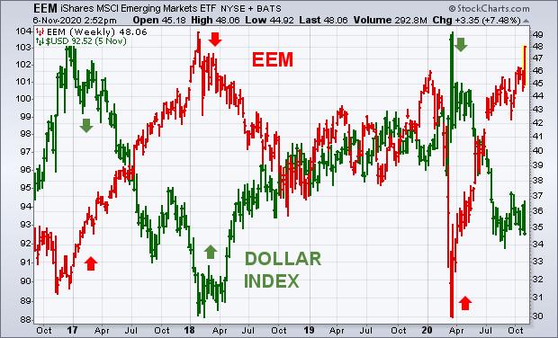 Chart 3EMERGING CURRENCIES ARE RISING AGAINST THE DOLLAR... China is leading an upturn in emerging market currencies against the dollar. Chart 4 shows the WisdomTree Emerging Currency Fund (CEW) rising this week to the highest level since March. Chart 5 shows the WisdomTree Chinese Yuan Fund (CYB) rising to the highest level in two years. Those gains are more direct results of a weaker dollar. That makes dollar-denominated debt more affordable for EM countries. A stronger Chinese yuan also makes global commodities more affordable. Stronger emerging currencies also boost the performance of Asian stock ETFs that are quoted in a weaker dollar. Chart 3EMERGING CURRENCIES ARE RISING AGAINST THE DOLLAR... China is leading an upturn in emerging market currencies against the dollar. Chart 4 shows the WisdomTree Emerging Currency Fund (CEW) rising this week to the highest level since March. Chart 5 shows the WisdomTree Chinese Yuan Fund (CYB) rising to the highest level in two years. Those gains are more direct results of a weaker dollar. That makes dollar-denominated debt more affordable for EM countries. A stronger Chinese yuan also makes global commodities more affordable. Stronger emerging currencies also boost the performance of Asian stock ETFs that are quoted in a weaker dollar.
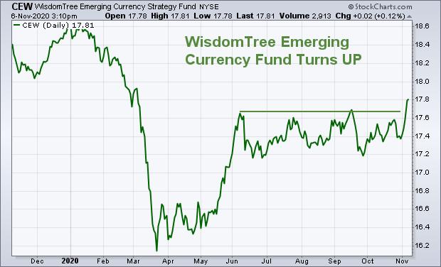 Chart 4 Chart 4
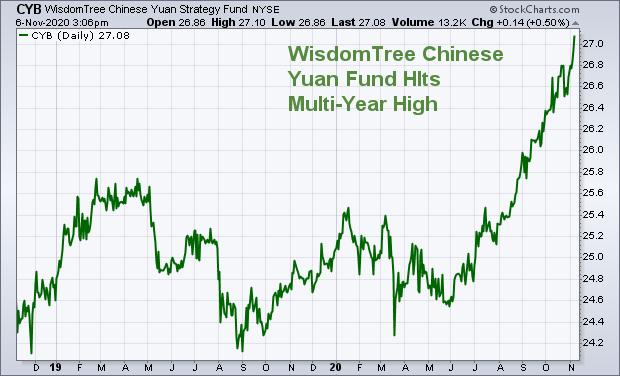 Chart 5 Chart 5
Editor's Note: This is an article that was originally published in John Murphy's Market Message on Friday, November 6th at 3:37pm ET.
|
| READ ONLINE → |
|
|
|
|
|
| The Mindful Investor |
| Bulls Need More New Highs |
| by David Keller |
The S&P 500 wrapped a rather volatile week by settling in at the upper end of the 3200-3600 range. One key breadth indicator shows clear similarities to the bull run in early October, and also provides a prescription for bulls looking for validation of further upside.
Breadth equals participation, which means it's a way to measure how the individual stocks that make up a broad index are performing relative to the index itself. For me, my order of operations is Price, then Breadth, then Sentiment.
First, let's establish what the price is doing in terms of defining the trend direction. Second, let's review the breadth characteristics and see how the components of the index are performing and whether there is narrow or broad participation in the trend.
A "narrow" advance suggests that, although the index is moving higher, it's a relatively small number of names that are doing the heavy lifting. On Wednesday of this week, we saw an example of a narrow advance, with the market moving higher, but just over 50% of NYSE listed stocks closing higher for the day.
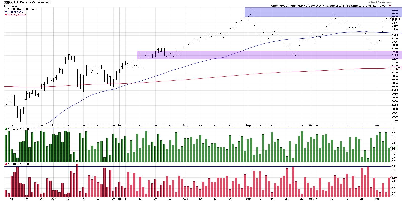
Even though the market finished solidly in the green, only half of the stocks, and indeed half of the 11 S&P sectors, finished positive for the day. This was a large move driven by a relatively small number of stocks, mostly the FANMAG names.
If you look at Thursday's bar and follow down to the panel at the bottom, you'll see that about 80% of stocks closed higher on that trading day. This is a good illustration of a "broad" advance, where the market moves up and is supported by an overwhelming number of stocks doing the same.
(To be clear, we're using these days purely for example purposes. This sort of discussion of broad and/or narrow advances is usually used to describe a pattern of these sorts of days over time.)
That brings us to a key breadth chart to watch going into next week. As the S&P 500 approached the resistance range around 3550-3600, we saw an expansion of new 52-week highs. This illustrates that, while the S&P 500 itself has not made a new 52-week high, about 15% of the S&P members were able to do so on Thursday of this week.
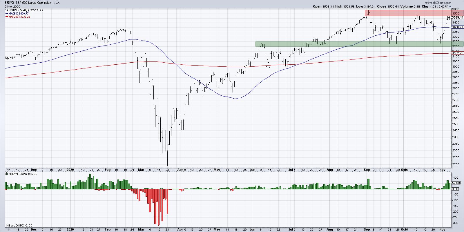
When the market is moving toward new highs, a healthy bull market means that plenty of individual stocks are making new highs before the index. These are the leadership names, breaking new ground and pushing the rest of the market higher.
As the S&P rallied in early October, we saw an increase in new 52-week highs as an increasing number of names were moving above their own resistance levels. We're now seeing a very similar pattern to early October, with the S&P testing the same resistance range and a similar pattern of increasing new highs. If this proves to be another failed bid for a broad market breakout, the new highs will evaporate as stocks retreat and the index "backs and fills" in the 3200-3600 range. From everything I'm seeing, including plenty of macro headwinds out there, this seems the most likely scenario.
If, however, the S&P is able to break above 3600 and the new highs reading continues to appreciate, this would speak to a broad advance with strong participation, along with strong likelihood that the market pushes ever higher into year-end.
For now, it's all about the resistance range and the new highs list. Are there enough leading stocks to push this market to uncharted territory?
RR#6,
Dave
David Keller, CMT
Chief Market Strategist
StockCharts.com
Disclaimer: This blog is for educational purposes only and should not be construed as financial advice. The ideas and strategies should never be used without first assessing your own personal and financial situation, or without consulting a financial professional.
The author does not have a position in mentioned securities at the time of publication. Any opinions expressed herein are solely those of the author, and do not in any way represent the views or opinions of any other person or entity.
|
| READ ONLINE → |
|
|
|
| Trading Places |
| Here's My Strategic Approach to Outperforming the S&P 500 - It Works in Any Market |
| by Tom Bowley |
Let me preface my article by saying that I'm very bullish. I mean, like, extremely bullish. No, really, I'm talking CRAZY bullish. Historically, we've just entered a period, October 27th close through January 18th close, where the S&P 500 has gained ground 61 of the last 70 years. There's a very high probability, based on history, that we're heading higher. Technically, I see higher prices ahead as well. But let's get back to that October 27th through January 18th period. You might be saying, "well, we haven't ever witnessed anything like this!" And you'd be correct. The political divide, the COVID-19 pandemic, record piles of national debt, millions of Americans still unemployed, etc. The list goes on and on. But we've had issues at every election. We can debate back and forth which ones are more serious, but the point is there's a list of big problems every year and every election.
Wall Street says WE DO NOT CARE. End of story.
The historical numbers speak for themselves. From the October 27th close, just before every presidential election, to the following January 18th, here are the actual election-year S&P 500 returns (since 1950):
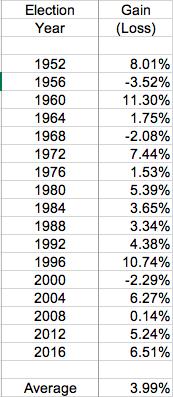
Of these 17 election years, 14 moved higher and the average gain of all 17 years was nearly 4%. Roughly half of these election years saw a gain of at least 5% and the two years with double digit returns - 1960 and 1996 - came in the midst of the last two secular bull markets. I believe we're in the midst of a secular bull market right now. In my opinion, history favors a post-election advance into 2021. Considering that we've had two cyclical bear markets in less than two years and we're approaching yet another all-time high, I believe it's difficult to refute the secular bull market theory.
So if we're truly heading higher, what's the best way to participate?
Stick With Leaders
We equal-weight 4 portfolios with 10 leading stocks every quarter. We've created these portfolios in the past couple years in order to help educate both professional and individual investors, showing that there's a better way to invest for your financial future than simply buying and holding a way-too-heavily-diversified ETF like the SPY (ETF that tracks the entire S&P 500). On the surface, buying the SPY seems great because you're investing in 500 of the largest companies in the world. But global economies, geopolitical concerns, currencies, central bank policies, management teams, etc. separate the strong from the weak. Take one look at the one-year performance of our 11 sectors:
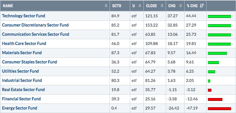
Which groups would you rather invest in? It's a pretty easy choice, isn't it? Energy (XLE), financials (XLF), real estate (XLRE), industrials (XLI) and utilities (XLU) have badly underperformed and are costing you thousands of dollars. Do you know their representation on that beautifully-diversified (sarcasm intended) SPY? The S&P 500 is market-cap weighted, so this isn't intended to be a depiction of weighting, but here are the number of companies included currently by sector:
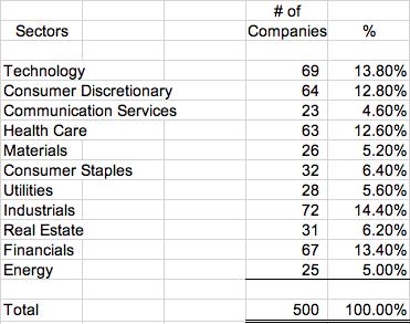
The S&P 500 has gained a little more than 14% over the past year. The bottom six sectors above underperformed that 14% level. So 255 companies on the S&P 500, or slightly more than half, belong to sectors that underperformed. Warren Buffett famously said, "diversification is a protection against ignorance." He didn't mean that in a derogatory manner; he was simply saying that if you do your homework, you can beat the market. At EarningsBeats.com, we do our homework. And, if you'd like, we'll do your homework for you. I believe we've developed a research platform that's unrivaled and we strive to improve it each and every day.
Let me give you a little bit of diversification perspective based on how we operate at EarningsBeats.com. I'll do so by breaking down our diversification over the past 4 quarters. Remember, we change our portfolios every 90 days and we include 10 equal-weighted stocks each quarter. So, over the past 4 quarters, we've included 40 stocks in our Model Portfolio. First, I'll show you our returns each quarter. (By the way, our quarters begin on November 19th, February 19th, May 19th, and August 19th. The reason for those dates is simple; we want to evaluate all of the latest earnings reports, with the majority of earnings season generally ending around that time of those four months.)
Here are the Model Portfolio results by quarter:
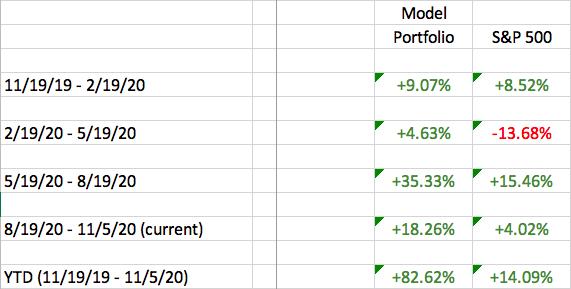
Our Model Portfolio is less than two weeks away from posting its 7th win vs. the S&P 500 in its 8 quarters since inception, including all four quarters in the past year. Unless we see a significant change in the next two weeks, our Model Portfolio will outperform the benchmark S&P 500 by DOUBLE DIGITS for the third consecutive quarter.
Now let's go back to that diversification table and take a look at the Model Portfolio's diversification vs. the S&P 500's:
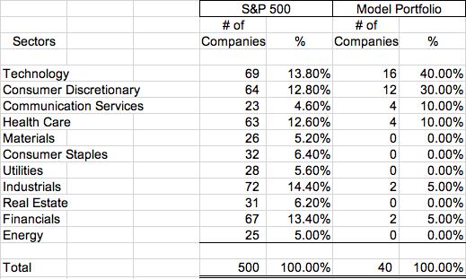
The significant outperformance that we've achieved is a direct result of doing our homework, following relative strength and riding the leaders. Has every stock worked out? Of course not. But we've had plenty of winners to offset those on the losing side.
If any of this is appealing to you, I encourage you to join me on Monday, November 9th, at 4:30pm ET for our "Sneak Preview: Top 10 Stocks" webinar. I'll go into much more detail into how we select our portfolios and provide various strategies to evaluate key sectors and industry groups. CLICK HERE for more information and to provide your name and email address to register for this event. We will email room instructions to everyone in our EarningsBeats.com community on Monday.
Happy trading!
Tom
|
| READ ONLINE → |
|
|
|
| RRG Charts |
| Did We Already See "The Dip" or Is There Risk Ahead? |
| by Julius de Kempenaer |
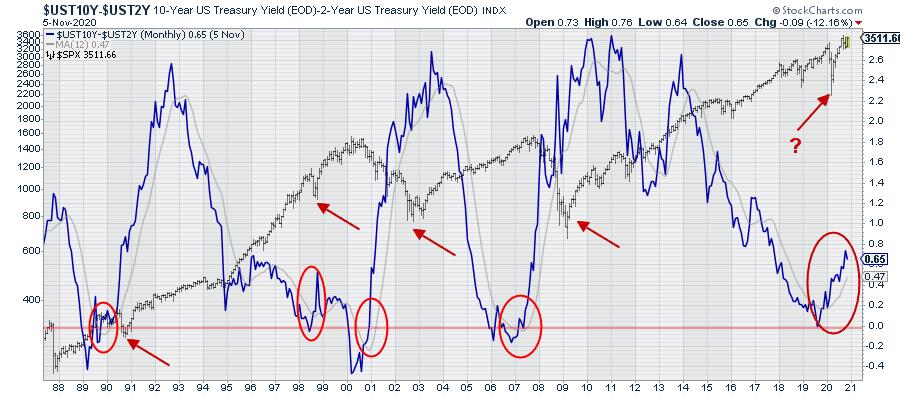
Every first Tuesday of the month in Sector Spotlight, I go over the completed monthly charts for the prior month.
Sometime mid-2019, when there was a lot of discussion on the yield curve being inverted, I started to include a long-term chart of the yield-curve in my monthly overviews. And, prior to that, I had already written a few articles on it as well.
Just to be clear when I talk about the "yield curve" when plotting "regular" charts, I refer to the difference between 10- and 2-year yields. The Yield Curve, as such, naturally includes all bond maturities at the same point in time, plotted on one graph. You can learn more about the yield curve and what it means in this ChartSchool article.
The chart above shows the 10-2 yield curve (difference) as the thick blue line, with a grey 12-month moving average. The horizontal red-line is plotted at zero. Below zero, the yield curve is "inverted."
Behind the yield curve chart, I have plotted the monthly bar-chart of the S&P 500 on a log-scale. The red oval annotations mark the times when the yield curve crossed back above zero after an inversion, while also moving above its twelve-month moving average and starting to accelerate.
Here's what I thought/think to note every time this sequence of events plays out:
- YC inversion
- YC back to normal
- YC crosses above its 12-month SMA
- YC starts to accelerate
The S&P goes into or is in a correction initially, then rallies when the pace of the steepening slows down, turns around and starts to flatten again.
As it is very long term and very rough analysis, it is hard, if not impossible, to accurately pinpoint a specific moment or signal, but I do feel it is something that we as analysts/investors at least should be aware of.
In the charts below, I have zoomed in on the individual occasions when this sequence of events played out.
1989-1990
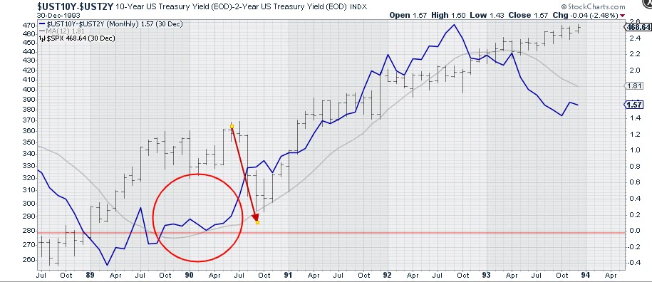
After the inversion in the first half of 1989, the yield curve turned back to flat/normal and, when the steepening started to accelerate, the market went through a decline. This was around the time of the first Gulf War.
1998-2000/2001
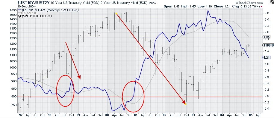
In 1998, we saw a short inversion and, when the acceleration of the steepening started, the decline was already underway and it ended rapidly. This was the first serious correction in what we know as the "tech-bubble."
A more serious inversion occurred in 2000. At the end of the year, the curve went back to flat/normal and started to accelerate higher after breaking above its 12-month SMA. The S&P already had started to decline off the peak a few months prior, but seriously accelerated lower from early 2001 onwards.
2007
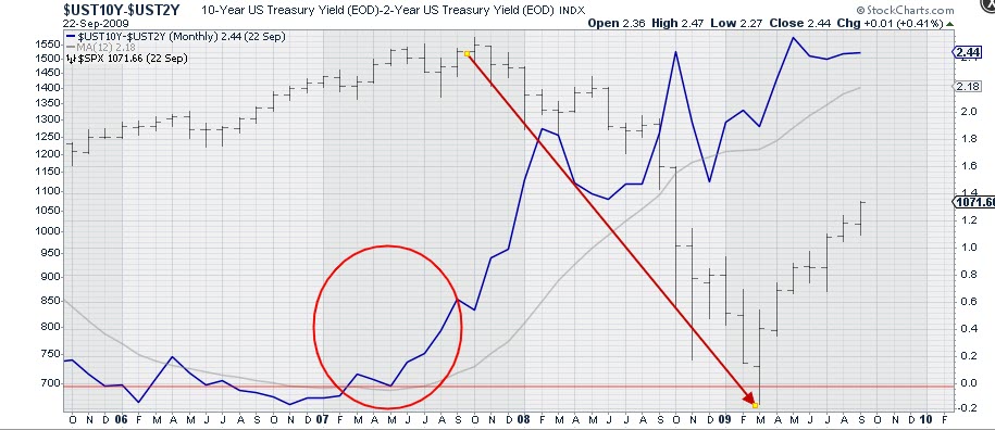
The sequence played out again in the first half of 2007. Coming out of inversion and breaking above its 12-month SMA, the 10-2 curve started to accelerate in the summer of 2007. The decline, as we know, started in the first half of 2008 and really accelerated in the second half of the year when the financial crisis hit hard.
2019-2020
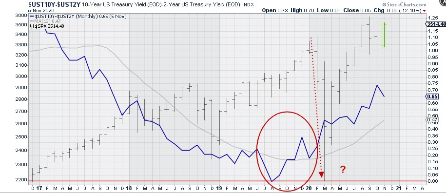
And now we are here. We saw an inversion of 10-2 year yield in the middle of 2019, albeit only minimal. In November, the 12-month SMA was broken upward and the curve started to steepen/accelerate just before the Feb/March decline occurred.
Since then, the S&P has rallied nicely, but the steepening of the curve also started to accelerate.
So what I am wondering now is -- was that Feb/March move "the decline"? Or do we have another (potentially more serious) dip ahead of us?
As I said, it's a very rough analysis and it's difficult to mark or pinpoint specific points based on this. From a high-level perspective, however, I do think it is something that we at least should be aware of, in order to be able to keep an open mind when this very strong market, because that is what it still is, starts sending us subtle messages that can easily be overlooked when assuming everything is looking good....
RRG
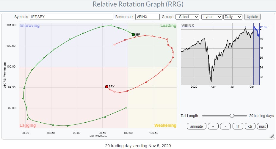
On the weekly RRG, stocks are still in a rotation through weakening at the right side of the graph, while bonds are in an opposite move within improving. The shorter daily RRG shows the last four weeks of rotation for both asset classes and the (temporary) relative weakness for stocks vs. bonds during that period.
But, as you can see, momentum has already started to pick up for stocks and (vice versa) drop off for bonds. Assuming a continuation of this rotation, the odds are in favor for stocks to complete a rotation at the right hand side of the RRG and rotate back to leading without hitting lagging.
So the bullish outlook for stocks and the stock/bond ratio in favor of stocks remains intact. Just be aware of the steepening yield curve that may throw a spanner in the works.
#StaySafe, --Julius
My regular blog is the RRG Charts blog. If you would like to receive a notification when a new article is published there, simply "Subscribe" with your email address.
|
| READ ONLINE → |
|
|
|
| The Traders Journal |
| Offense Continues To Lead Defense, But High Volatility Remains The "New Normal" | Your Daily Five (11.02.20) |
| by Grayson Roze |
 So I'm the lucky guy who gets to host "Your Daily Five" the day before election night. What a time to step in for a new show! So I'm the lucky guy who gets to host "Your Daily Five" the day before election night. What a time to step in for a new show!
It's been a fascinating few weeks for markets, which of course is only fitting given all of the madness we've seen here in 2020 more broadly. As we fly towards Tuesday night, there's certainly no shortage of crucial charts to watch right now. I gotta say, I had a blast this morning sitting down to share five of my top selections.
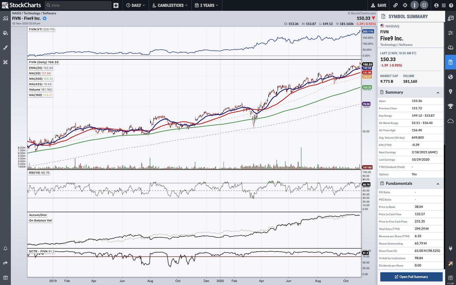
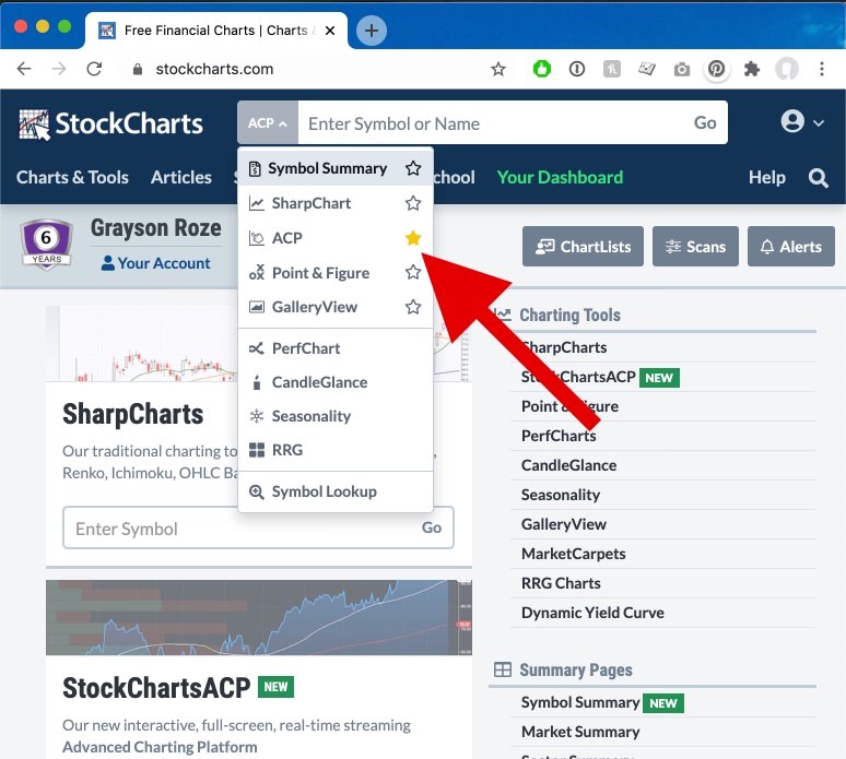
Even better, it was lots of fun to share all of these charts with you from StockChartsACP – our new full-screen, interactive Advanced Charting Platform. In particular, I highlighted a very cool new addition to the platform that just launched on Friday of last week. We've added a "Symbol Summary" view to the righthand side of the platform, which brings you tons of new data like after-hours prices, fundamentals, key technicals, earnings dates, corporate info and more. More on that in the video below!
Check out today's edition of "Your Daily Five" below:
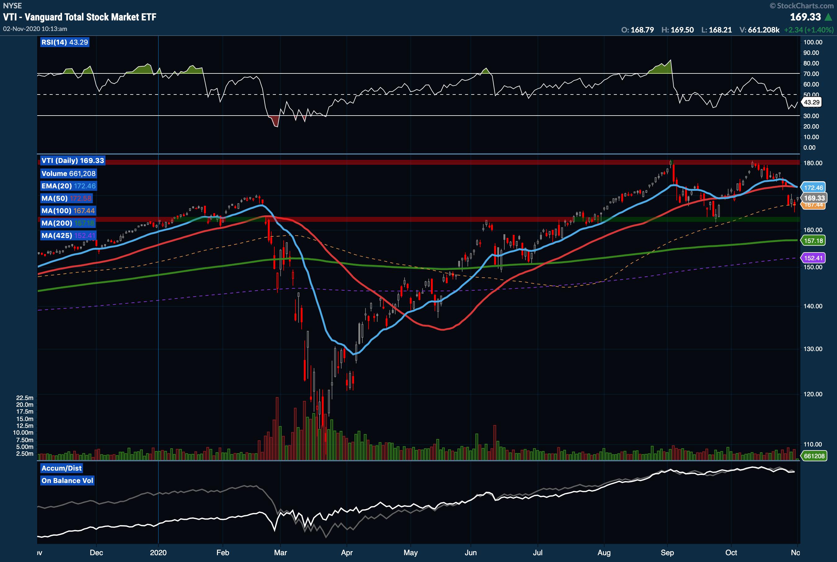
On this morning's edition, I started with a broad look at the total US stock market. One of the indexes I watch most closely is actually an ETF – the Vanguard Total Market index (VTI). While it is still a cap-weighted group that favors the largest stocks in the market, it does factor in smaller cap names in a way that a large-cap only index like the S&P 500 does not. As you can hear, I talked about some of the key levels I'm watching on VTI as the range bound sideways movement continues. However, I also noted last week's bounce off the 100-day Moving Average as an important bullish signal.

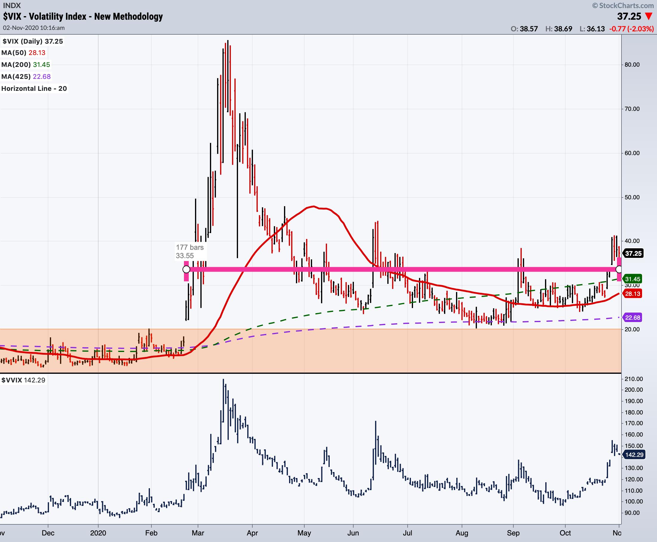
Next up, I took a look at the $VIX using the new "Auto Average" tool in StockChartsACP. As you can see from the pink line across the chart, the $VIX has remained highly elevated above 20 for the past 177 sessions, averaging 33.55 as of the time this chart was captured. It's a striking departure from what we've seen in the past few years, where the $VIX rarely found its way above that 20 level.

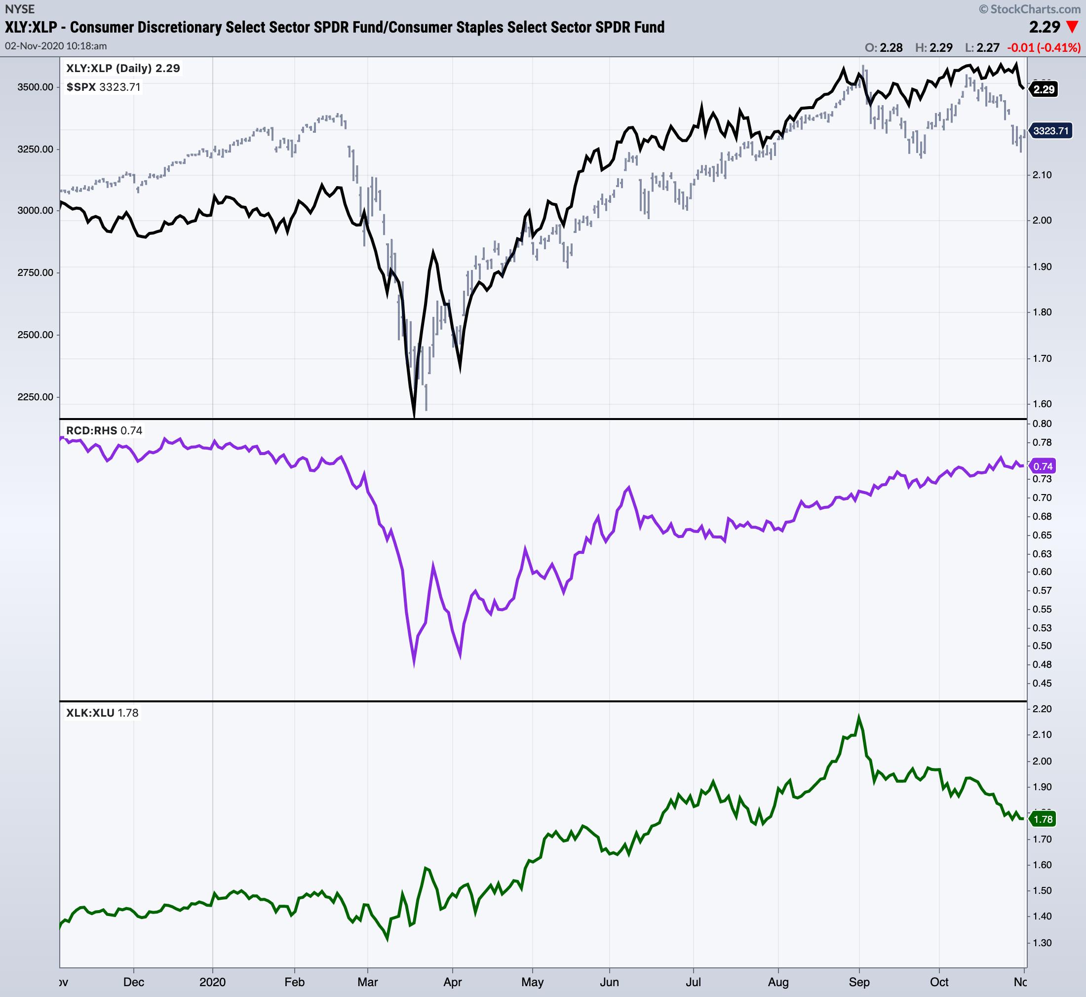
I also took a look at three charts I use to gauge whether the market is favoring "offense" or "defense". I pulled up two different flavors of the Consumer Discretionary vs. Consumer Staples ratio: the cap-weighted XLY:XLP and the equal-weighted RCD:RHS. Both show the market continuing to favor "offense" with these ratios moving higher overall. However, I also pulled up Technology vs. Utilities (XLK:XLU) in the panel at the bottom, which shows a substantial outperformance of Utilities over Tech. That goes firmly against the offensive leadership narrative, and it's definitely a point of concern for me at the moment.

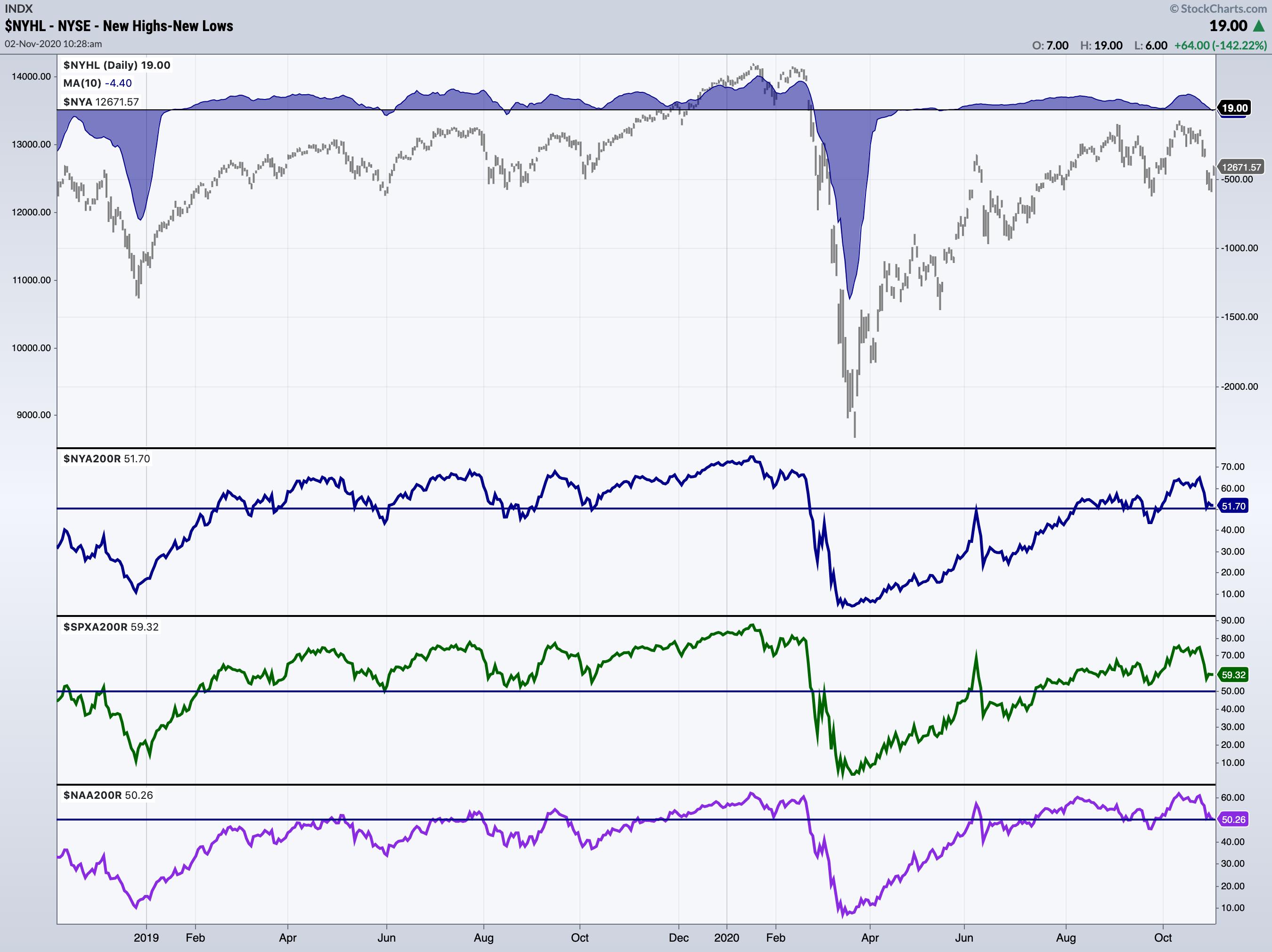
I wrapped up the show by sharing a look at some key breadth charts, which show a bit of deterioration but haven't quite reached levels that concern me too deeply. I also highlighted one stock that continues to show meaningful strength and tremendous outperformance: Five9 (FIVN).


Money In, Eyes Open.
- Grayson Roze
VP of Operations, StockCharts.com
Author, Trading For Dummies (Wiley, 2017)
Author, Tensile Trading: The 10 Essential Stages of Stock Market Mastery (Wiley, 2016)
StockMarketMastery.com
@GraysonRoze
|
| READ ONLINE → |
|
|
|
|
|
| The MEM Edge |
| Two Ways to Play the Current Bullish Uptrend – One Base Breakout to New Highs & A Long-Term Turnaround |
| by Mary Ellen McGonagle |
The markets posted their biggest weekly percentage gains since April as investors set their sights on a Biden win with a Republican-dominated U.S. Senate. This creates a gridlock in Washington and, as the CIO of Bank of America (BAC) puts it: "Gridlock = Goldilocks." A Republican-held Senate will mean no tax hikes and no outsized fiscal stimulus package which, in turn, would lead to more monetary easing and a weaker US dollar. The result is a stock market poised to trade higher.
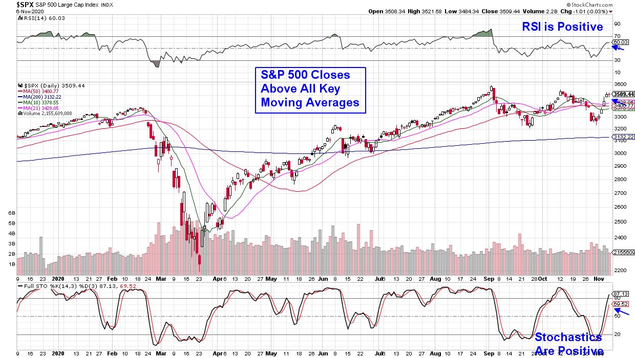
Last week, we experienced the beginning of this potential leg up, as a downtrend reversal on Wednesday pushed the S&P 500 back above its key 50-day moving average, with a positive RSI and Stochastics confirming a new uptrend.
DAILY CHART OF S&P 500 INDEX

Recently-beaten-down Technology stocks were the biggest winners as the possibility of no hike in corporate taxes pushed the sector up almost 10%. Within Tech, Semiconductor stocks rose over 12% amid a backdrop of increased chip demand due to the rollout of 5G, increased data center usage and streaming media that's keeping locked-down households entertained.
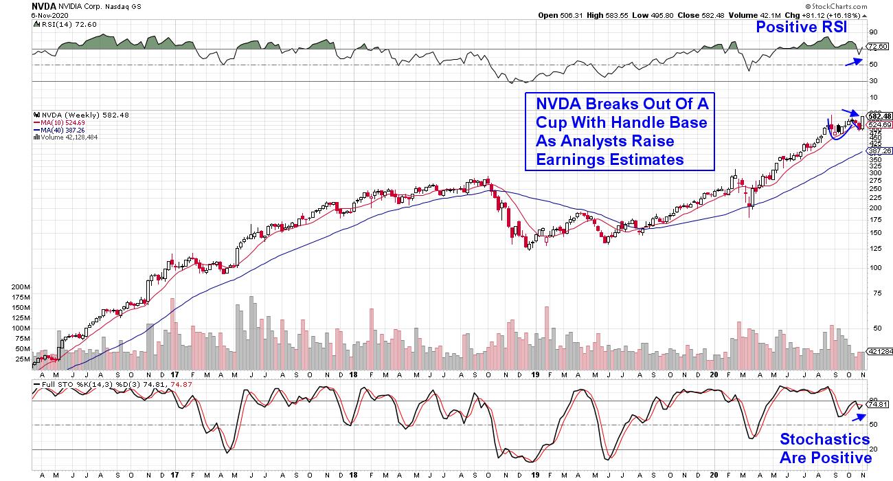
Graphic chip maker Nvidia (NVDA) is one of the leading Semiconductor stocks, led by strong sales in graphic processors for gaming PCs as well as data centers. The stock broke out of a cup-with-handle base today as analysts raise earnings estimates going into their 3rd quarter report later this month.
WEEKLY CHART OF NVIDIA CORP. (NVDA

Today's base breakout posted a bullish outside day on a daily chart, as the price had a higher high and a lower low than yesterday. Historically, this serves as a part of a continuation pattern in the direction of the last few price bars, which is upward. This, coupled with NVDA's base breakout, puts the stock in a strong buy zone.
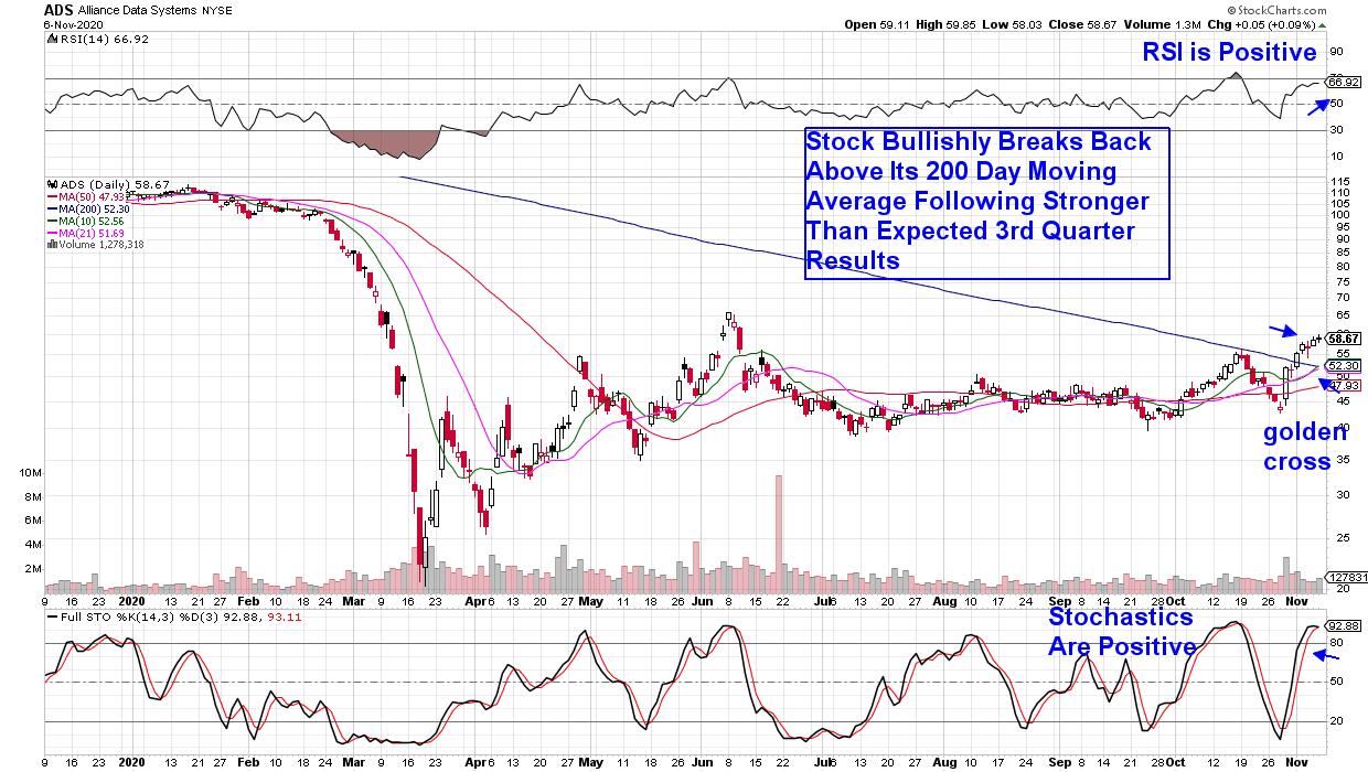
Next up is Alliance Data Systems (ADS), which has an entirely different chart. The stock is in the throes of reversing a 3-year downtrend following this week's break back above its 200-day moving average on heavy volume.
DAILY CHART OF ALLIANCE DATA SYSTEMS (ADS)

The company captures and analyzes purchase transaction data for over 140 credit and reward programs centered mostly on retailers. Their focus on brick-and-mortar companies going into the pandemic hurt ADS; however, cutbacks in operating expenses and a shift to targeted marketing among clients helped them post-Q3 results that were 53% above estimates.
J.P. Morgan (JPM) placed a $90 price target, while analysts elsewhere upgraded the stock and are calling for 49% growth next year. Last week's action has the shorter term 10-day (green line) and 21-day (purple line) simple moving averages poised to bullishly break above the 200-day (blue line) simple moving average. This would form a golden cross and, while it's a secondary signal, it's historically positive.
Many other areas of the market will also continue to do well if a gridlocked Washington comes to pass. Software and Healthcare stocks come to mind, as do select Retailers that have successfully pivoted to digital sales. With earnings season more than half over, ferreting out the next set of winners will, fortunately, be easier.
For those who'd like to be alerted to select stocks poised to outperform the broader markets right now, take a 4- week trial of my MEM Edge Report for a nominal fee. Longtime subscribers to this report were alerted to Nvidia (NVDA) a while ago and have enjoyed a 122% gain.
In addition, this bi-weekly report provides sector and market analysis not seen anywhere else. Take a look at a trial report by using this link here!
Warmly,
Mary Ellen McGonagle - MEM Investment Research
|
| READ ONLINE → |
|
|
|
|
|
| MORE ARTICLES → |
|
 Chart 1The weekly bars in Chart 2 show the MSCI Emerging Markets iShares (EEM) breaking through their early 2020 high to reach the highest level since early 2018. That's a bullish breakout. The October 21 message also pointed out that EM markets were being led higher by stocks in Asia, and China in particular. Stock ETFs in China, South Korea, and Taiwan have all achieved upside breakouts. At the same time, the Chinese yuan has risen to a multi-year high against the dollar and has led a rally in emerging market currencies in general. That's another reason why a weaker dollar favors emerging markets.
 Chart 2
 Chart 3EMERGING CURRENCIES ARE RISING AGAINST THE DOLLAR... China is leading an upturn in emerging market currencies against the dollar. Chart 4 shows the WisdomTree Emerging Currency Fund (CEW) rising this week to the highest level since March. Chart 5 shows the WisdomTree Chinese Yuan Fund (CYB) rising to the highest level in two years. Those gains are more direct results of a weaker dollar. That makes dollar-denominated debt more affordable for EM countries. A stronger Chinese yuan also makes global commodities more affordable. Stronger emerging currencies also boost the performance of Asian stock ETFs that are quoted in a weaker dollar.
 Chart 4
 Chart 5


 So I'm the lucky guy who gets to host