| THIS WEEK'S ARTICLES |
| The Market Message |
| Russell 2000 Hits New Record as Small Cap Leadership Continues |
| by John Murphy |
Stocks are ending the week on a firm note with the S&P 500 and Nasdaq trading in record territory. The Dow isn't far behind. Small cap stocks, however, continue to lead the market higher. The daily bars in Chart 1 show the Russell 2000 iShares (IWM) hitting a new record. Even more impressive is its rising relative strength line in the upper box. That upper line shows the IWM/SPX ratio rising for the last several months. That means that small cap stocks have been rising faster than large caps. A longer range look shows how impressive that performance has been on both an absolute and relative basis.
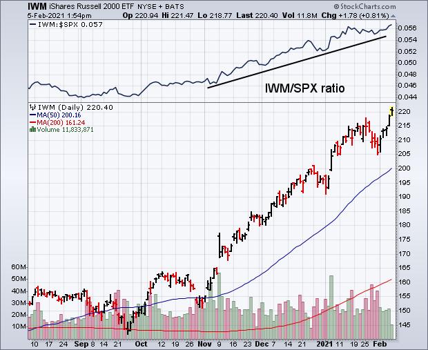 Chart 1 Chart 1
The weekly bars in Chart 2 show how strong the rally in small caps has been over the past few months. It shows the Russell 2000 iShares achieving a major bullish breakout last November (see circle) and rising almost in a straight line since then. It's trading in record territory today. The only potential negative on the chart is its 14-week RSI line having reached overbought territory over 70 which suggests that its uptrend may be stretched on the upside. The overall chart, however, shows a strong uptrend in place. What's especially impressive is how much small caps have outperformed large caps during that uptrend.
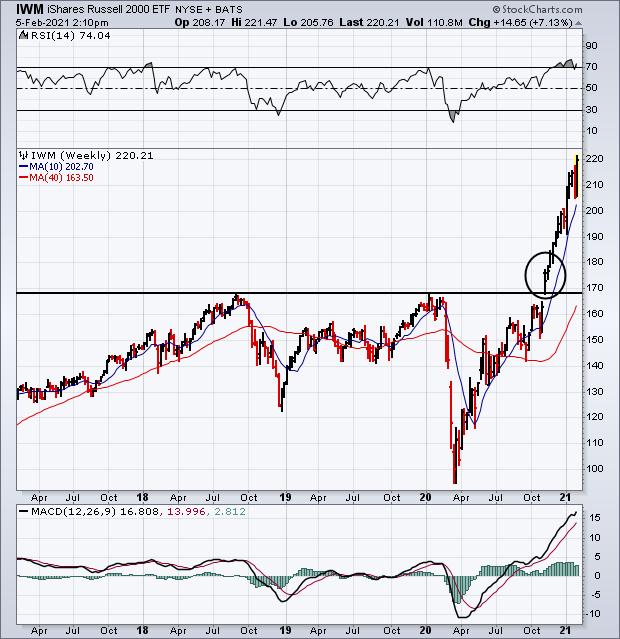 Chart 2 Chart 2
The black line in Chart 3 plots a relative strength ratio of the Russell 2000 iShares divided by the S&P 500 over the last ten years. Two things really jump out on the chart. The first is how badly small caps underperformed large caps during 2018 and 2019; and how much they've outperformed large caps over the last year. The chart shows small caps outperforming large caps by the widest margin in a decade. That's pretty impressive. Small cap strength is usually a sign of optimism on the direction of the U.S. economy. That's because small cap stocks are more dependent on the U.S economy than large cap stocks that do a lot of business overseas.
The green line in Chart 3 plots the 10-Year Treasury yield over the same ten years. It's interesting to see a generally positive correlation between the two lines. In other words, they've tended to rise and fall together. Falling yields have tended to coincide with weaker small caps which was especially true during 2019; rising yields have generally corresponded with stronger small cap performance. That's been the case over the last year as bond yields have started to climb along with small caps. That makes economic sense since rising bond yields usually signal more optimism on the U.S. economy which rises on expectations for stronger economic growth with higher inflation. In a climate of rising bond yields, money tends to rotate out of falling bond prices into rising stock prices. Rising commodity prices also put upward pressure on bond yields which hints at more inflation. Since rising bond yields hint at a stronger U.S. economy, it makes sense for domestic-oriented small cap stocks to do better in that environment.
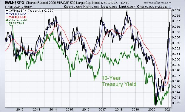 Chart 3 Chart 3
Editor's Note: This is an article that was originally published in John Murphy's Market Message on Friday, February 5th at 2:59pm ET.
|
| READ ONLINE → |
|
|
|
| Art's Charts |
| Seasonality Looks Weak, but Price Action is Strong |
| by Arthur Hill |
The seasonal patterns over the next two months are not very strong, but price action is strong with the S&P 500 hitting a new high. Price action is more important than the seasonal pattern because profits and losses are driven by price changes, not seasonal tendencies. Seasonality becomes a force when it aligns with price action. Let's investigate.
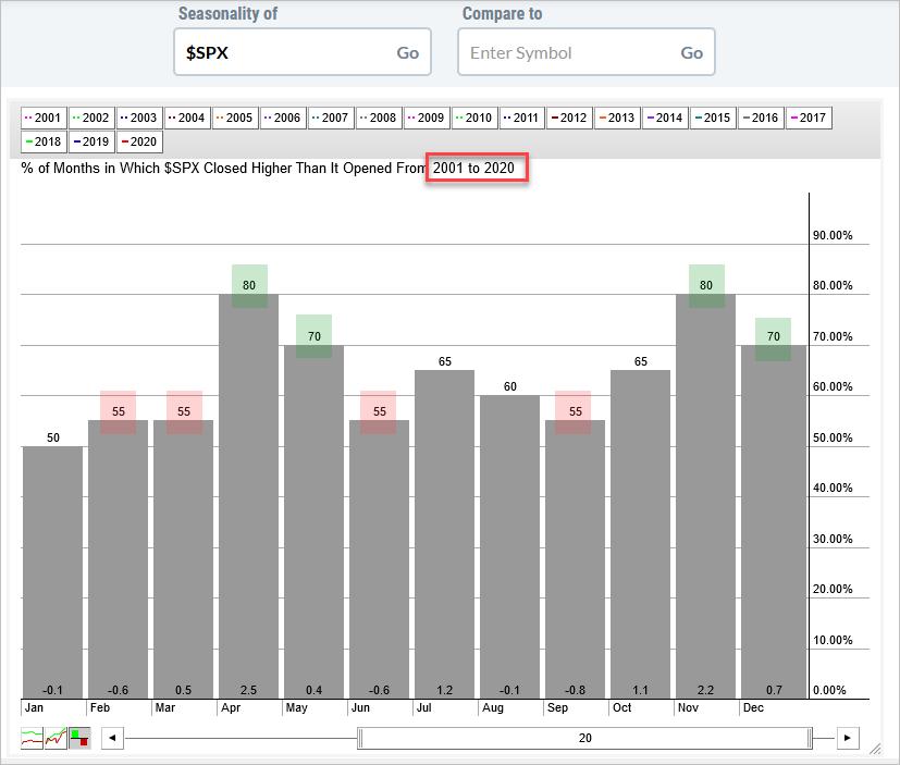
The chart below shows the seasonal patterns for the S&P 500 over the last twenty years (2001 to 2020). Note that I shifted the slider one year to the left to exclude 2021. Thus, data for January 2021 and February 2021 are not included.
Two months stick out like bulls on the beach: April and November. These two were by far the strongest months in the last twenty years. Both were up 80% of the time (16 of 20 years) and the average monthly gains were above 2%. Elsewhere, May and December were also strong as both showed gains 70% of the time.

55% is the next number that stands out because four months showed gains 55% of the time (February, March, June and September). Of these four months, the average gain was actually a loss for three (February, March, and June).
At this stage, I do not have June on my mind. However, looking out over the next three months, the seasonal patterns show a 50/50 chance for a correction of some sort in February and/or March. Such a correction could make for a great buying opportunity with April around the corner.

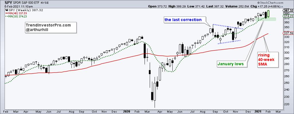
The price chart for SPY goes not confirm the seasonal pattern because the ETF hit a new high this week, as did QQQ and IWM. Thus, thoughts of a correction are on hold for now. With this week's big bounce, SPY established short-term support with the January lows. A break below these lows would show the most selling pressure since September and argue for a correction, especially with weak seasonality in February-March.
This week at TrendInvestorPro, I looked at seasonal patterns going back to 1950 and showed how these patterns can change by comparing two twenty year periods. I also looked at weekly seasonal patterns, the patterns for each month (beginning to end) and the first year after an election. Click here to subscribe and get immediate access to this report and more.
---------------------------------------------------
|
| READ ONLINE → |
|
|
|
| The Canadian Technician |
| Let Me Sleep On It |
| by Greg Schnell |
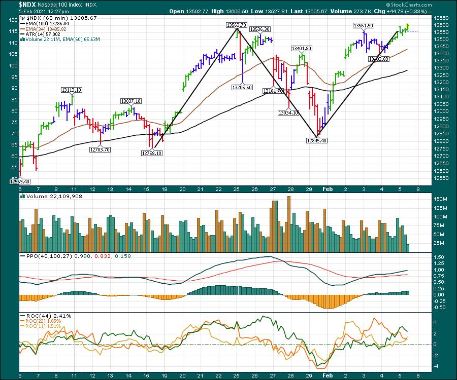
It has been a wobbly few weeks as the market has swung back and forth. The indexes are at their highs and mega-cap tech has reported strong numbers. The Nasdaq is looking to close out Friday at all-time highs.

I keep looking toward the travel and tourism area for the reopening trade. The airlines have been trying to move higher and I wrote two articles about that earlier (Airlines Struggle With Takeoff, Can Airlines Fly?).
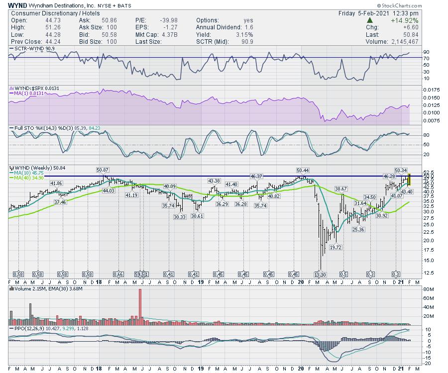
Wyndham Destinations (WYND) is up against the 2018 and 2019 resistance. To close out the week, it is sitting on the line. A breakout to multi-year highs looks to be coming up and it kicks out a 3% dividend. I could sleep on that.

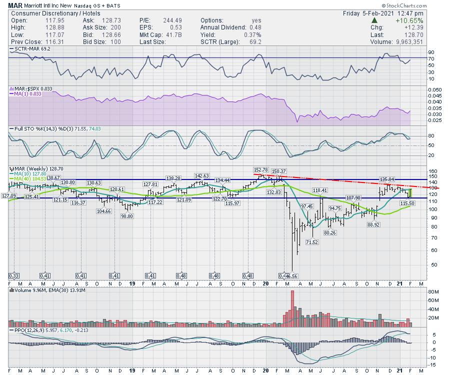
Marriott Hotels (MAR) bought Westin Hotels in 2016. The company has a massive number of brands under the umbrella. On the chart, Marriott is very close to breaking the one year downtrend. Multi-year resistance is at $145, but Marriott was just starting to breakout when COVID-19 hit. It looks like it is on its way after bouncing off horizontal support this week.

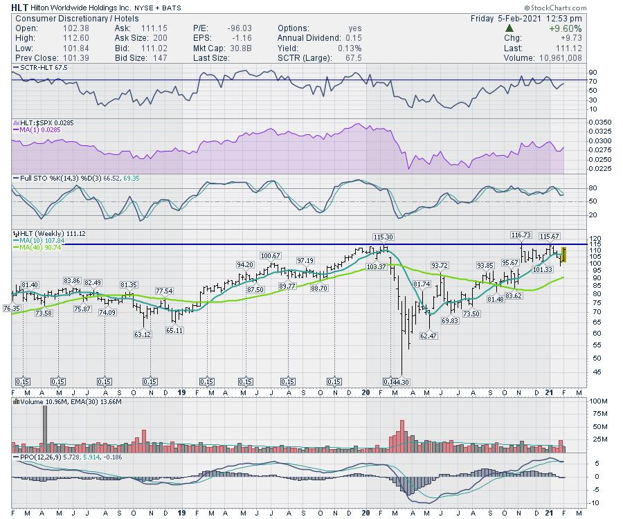
Lastly is Hilton Worldwide (HLT), which is pushing up against 2020 resistance at $115. Over the last three months, the stock has been consolidating. The PPO has been moving sideways on Hilton, but it appears to be gathering energy for its next push.

With the number of vaccinations passing the number of people with COVID-19 in the USA, it looks like this could be a nice inflection point for a move higher. I can't imagine the hotel business getting worse than 2020, so it looks like a nice place to consider. I'll sleep on it for a little while. Stay safe and have a good weekend.
|
| READ ONLINE → |
|
|
|
| DecisionPoint |
| A Tale of Two Sectors: Technology and Materials |
| by Erin Swenlin |
Today, I will weave a technical analysis tale of two sectors--one of the popular star that is beginning to lose its shine, the other about a possible Cinderella story sector.
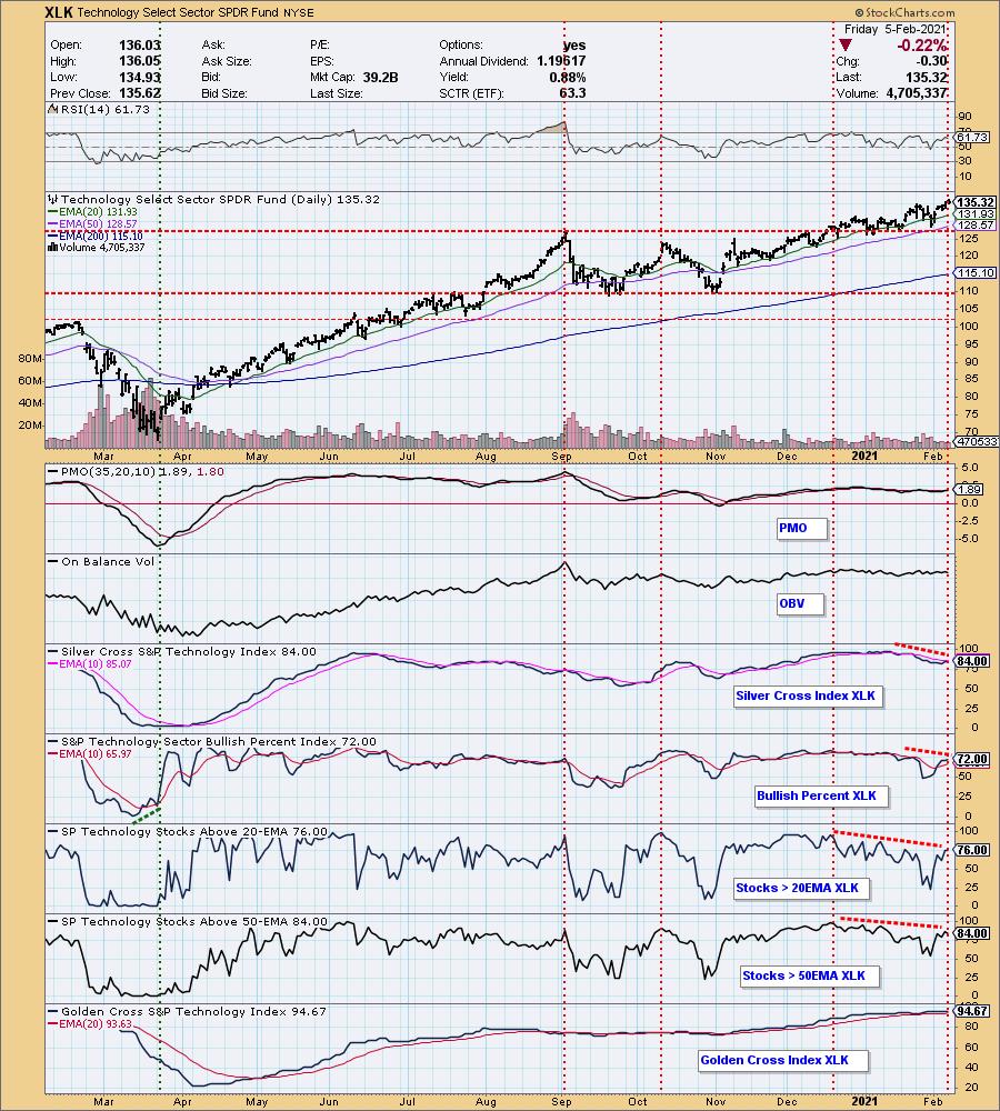
The popular star and doted-upon sector is Technology (XLK). It gets most of the love because, let's face it, it typically outperforms its brethren. The problem for our star is that it is could be losing its shine. Currently, XLK is sporting negative divergences on its indicators. Technology leads the market and it may be walking out on thin ice right alongside the SPY.
Many technicians are moving very bearish, including my "perma-bull" colleagues. Sentiment is contrarian, so it could mean we will be a "climbing the wall of worry" for the next week or so. However, these guys and gals are usually right at reversal points. This isn't a matter of capitulation at the end of a bear market; right now, it is a matter of ridiculous valuations and overbought price conditions that have us all at attention. Therefore, hearing the technicians that I trust becoming highly bearish concerns me.
We have annotated deep negative divergences in play on XLK. The Silver Cross Index (SCI), which measures how many XLK members have their 20-EMAs above their 50-EMAs, hasn't crossed above its signal line; in fact, it is topping below it. The Golden Cross Index (GCI), which measures how many of the XLK members have their 50-EMAs above their 200-EMAs, is extraordinarily overbought right now. The %Stocks > 50-EMA actually turned down today, even while XLK logged new all-time highs. Our star is losing followers.


SUBSCRIBE TO OUR BUNDLE TODAY and get one free week using the coupon code: DPTRIALCW. That is a $20 value for free! The last two weeks have been excellent for DP Diamonds subscribers, who got a jump on Home Builders, Natural Gas and Gambling stocks. A few good trades and Diamonds pay for themselves.
Now for our Cinderella story. It appears this sector's fairy godmother is waving her wand.
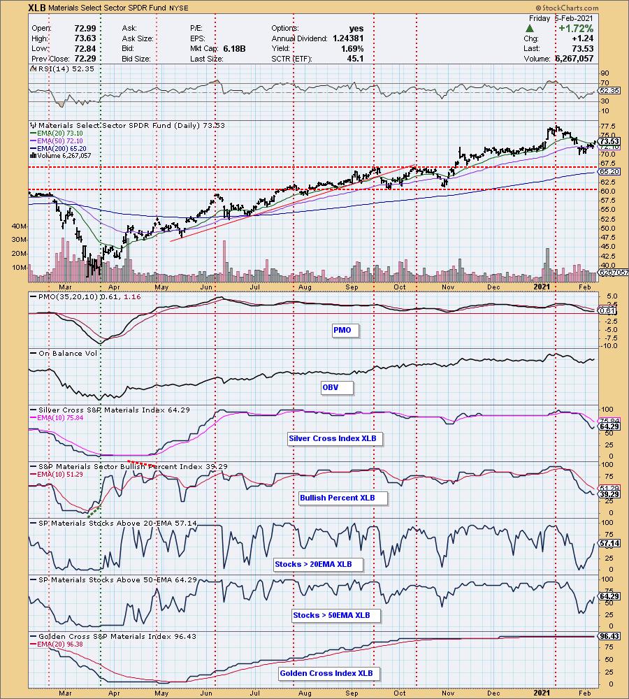
You'll see a far brighter picture on the Materials sector (XLB) chart. XLB has begun to rally and today closed above the 20-EMA. The PMO turned up just today; you can see that participation is improving and isn't overbought. There are no negative divergences, mainly because XLB has been in a downtrend. Overall, within this sector you'll find a few very strong-looking industry groups with excellent potential. Time to put Cinderella into her pumpkin coach. Subscribe to DP Diamonds and you'll see which industry groups in particular look to have a great week ahead.

Conclusion: In our two tales, today it is clear that our star XLK could be on the verge of dropping out of the sky, while our Cinderella story sector is poised to have a lovely evening at the ball. One warning, should the market begin to tumble hard, XLB may be drawn into the vortex. Cinderella could be on the side of the road with a broken pumpkin with only mice for company.

It's FREE!
Click here to register in advance for the recurring FREE DecisionPoint Trading Room! Recordings are available! Watch as Erin discusses the market and focuses on "trading" using your symbol requests and her analysis. She discusses how she times her entries and exits and scans the market for interesting opportunities!
Happy Charting! - Erin
Technical Analysis is a windsock, not a crystal ball.
Helpful DecisionPoint Links:
DecisionPoint Alert Chart List
DecisionPoint Golden Cross/Silver Cross Index Chart List
DecisionPoint Sector Chart List
DecisionPoint Chart Gallery
Trend Models
Price Momentum Oscillator (PMO)
On Balance Volume
Swenlin Trading Oscillators (STO-B and STO-V)
ITBM and ITVM
SCTR Ranking
DecisionPoint is not a registered investment advisor. Investment and trading decisions are solely your responsibility. DecisionPoint newsletters, blogs or website materials should NOT be interpreted as a recommendation or solicitation to buy or sell any security or to take any specific action.
|
| READ ONLINE → |
|
|
|
| ChartWatchers |
| GME, GME and... GME |
| by John Hopkins |
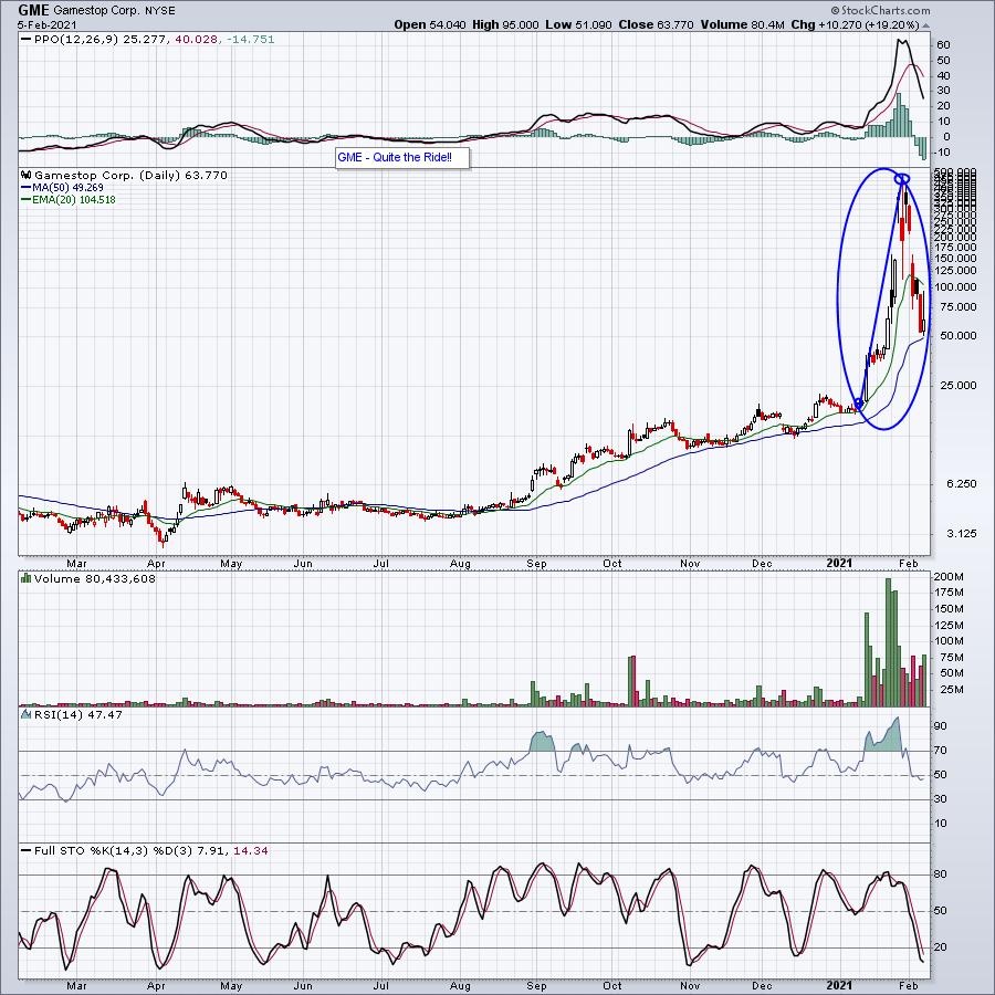
While the overall market was working its way to new highs, the entire investing world (and many who had never been involved in the market before) was tuning in daily to see what the price of Gamestop (GME) was. A stock that was trading at just over $19 a share on January 12 doubled overnight to $38. That, in and of itself, was worthy of a headline. But it didn't stop there. Just over a week later, the stock had doubled again to just under $77 per share. By then, things were just starting to heat up. In fact, when the weekend was over and Monday came around, it doubled again, getting as high as $159 before coming back down to earth and closing near $76.
"Game Over", right? Hardly. In fact, a few days later, the stock got as high as $380 a share and, the next day, $483 a share before falling back to earth again. It then got as low as $112 a share and closed at $193.
Now it's "Game Over", right? Nope. By the next day, the stock had risen to $414 per share. Finally, a week later, the stock had simply run out of gas, pulling back to the $60 range - but still a triple over a very short period of time.

Of course, anyone who has been investing/trading in the market long enough knew that this wild, awe-inspiring ride would come to an end. Or has it? What's to say GME won't rise again after coming back down to earth? No one really knows. And what stock might be next - to the upside or downside - if Herd Mentality and Social Media continue to play an outsized role on the success or failure of a company? What I do know is the meteoric rise in GME caused substantial pain to some very sophisticated Hedge Funds. Chalk one up to the little guy/gal. And it's likely to happen again.
The good news is that the off-the-charts volatility we've seen in stocks like GME and other heavily-shorted stocks is not likely to have the kind of negative impact on the overall market that many pundits have forecasted. How do I know this? Take a look at the record highs in the S&P and NASDAQ, which shows investors have shrugged it off.
However, there's always going to be great opportunities if you know how to spot them. For example, well before "short squeeze fever" kicked in, our Chief Market Strategist Tom Bowley had already provided our members with a "Short Squeeze ChartList" that included those stocks with a short float of at least 20%. And from that list, he narrowed it down further to 10 "hot stocks" he felt were primed to move higher, which included GME. And of those 10 stocks, the "worst" performer (based on the lowest price of a stock from the date added to the list to its high through this Friday) was 9.4%, with three of the stocks rising by over 100% and the Granddaddy of them all - GME - up a whopping 2400%. You can see the entire list and learn more about our biggest event of the year, where Tom will unveil his Top 10 Stock Picks in our 4 portfolios, 40 stocks in all, by clicking here.
Also, you can sign up for our FREE EarningsBeats Digest that comes out every M, W and F with market insights and expert analysis by our own Tom Bowley. Get started by clicking here.
Fundamental and technical analysis will continue to play a vital role in determining the value and possible direction of a company's stock price. But we should no longer be surprised when we see a situation like we did with GME pop up again. Just make sure you are on the right side of any trade involving a stock like GME or it could become devastatingly painful.
At your service,
John Hopkins
EarningsBeats.com
|
| READ ONLINE → |
|
|
|
|
|
| MORE ARTICLES → |
|
 Chart 1
 Chart 2
 Chart 3

