| THIS WEEK'S ARTICLES |
| John Murphy's Market Message |
| APPLE AND AMAZON MAY BE BOTTOMING |
| by John Murphy |
APPLE MAY BE BOTTOMING... Chart 1 shows Apple (AAPL) in a downside correction since late January. That correction has taken the stock back down to its 200-day moving average which has acted as a long-term support line. Assuming that its long-term trend is still up, this would be a logical spot for it to start doing better. And it is. Today's strong action is pushing the stock to the highest level in more than a month and, more importantly, back above its 50-day moving activity. Apple may also be benefitting from the recent rotation back into technology stocks that's been taking place over the past couple of weeks. A pullback in bond yields may also be contributing to those technology gains.
 Chart 1 Chart 1
AMAZON.COM BOUNCES OFF CHART SUPPORT... Here's another stock that may be bottoming. Chart 2 shows Amazon.com (AMZN) in a sideways trading range in effect since the end of August. The most important feature on the chart was the successful test of support that took place in early March when the stock bounced off its previous low formed during September. And over the past week it has climbed back above its 50- and 200-day moving averages. It still has a way to go to clear some overhead resistance barriers. But the chart suggests that a bottom may have been seen.
 Chart 2 Chart 2
|
| READ ONLINE → |
|
|
|
| ChartWatchers |
| A Battle for Breadth on Relative Rotation Graphs |
| by Julius de Kempenaer |

This past Thursday, I was one of the guest hosts to fill in for David Keller on The Final Bar, as Dave was enjoying a week off. Of course I brought RRG to the show, but I also wanted to add a bit of educational content on how to use RRG in a way that was somewhat outside the box.
Breadth Indexes on RRG
As Dave likes to track breadth through various metrics, I decided to brush off some work that I did in the past on using breadth data on a Relative Rotation Graph.
I wrote on this subject for the first time in November 2018 in an article titled "Plotting Breadth Indicators on Relative Rotation Graphs - Part I" and this search command gives you some more articles on the subject. The approached I used in those articles is to plot breadth metrics on a Relative Rotation Graph. The ones that seem most useful are the indicators that measure the percentage of stocks trading above their moving n-period EMA.
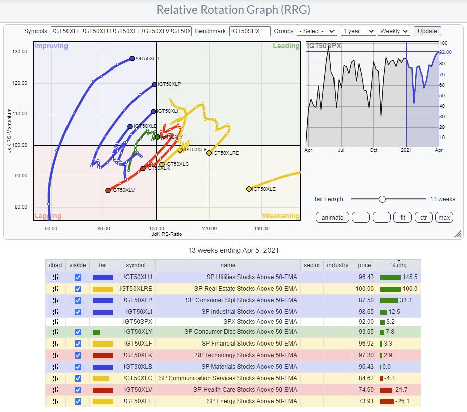
There are three sets of this indicator family on the site. Their symbols look like this:
!GT + #days + symbol
So !GT50XLI holds the percentage of stocks in the Industrials sector trading above their 50-day moving average.
The three sets hold data for the 20-, 50- and 200-day periods for all sectors, as well as the S&P 500. Obviously, they show long-, mid- and short-term trends, at least to some degree.

The RRG above shows the weekly rotation for the medium-term breadth per sector. The long tails, moving in a NW heading for more defensive sectors like Utilities, Staples and Industrials, are immediately visible -- as is the weak rotation for Health Care.
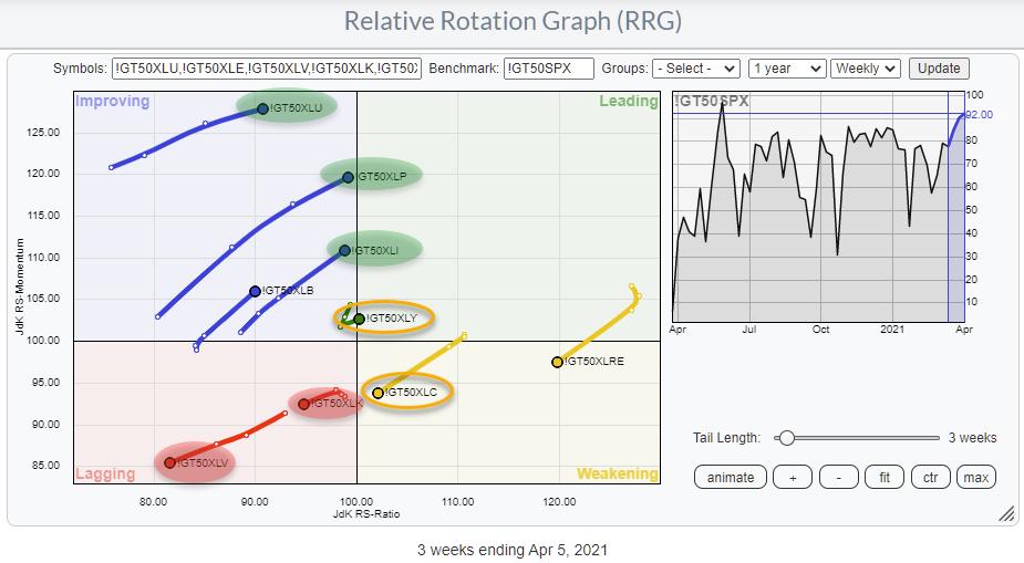
In order to get a better view of the other sector, I have to zoom in a bit more. Shortening the tails and hiding the less interesting rotations gives you the RRG below.

Health Care and Technology are now clearly visible inside the lagging quadrant and moving further into it. These rotations fit the rotation for these sectors on the regular RRG.

The discrepancies I see are for Consumer Discretionary and for Communication Services. The breadth for XLY has just turned right and back into the leading quadrant, albeit with a very short tail and very close to the benchmark.
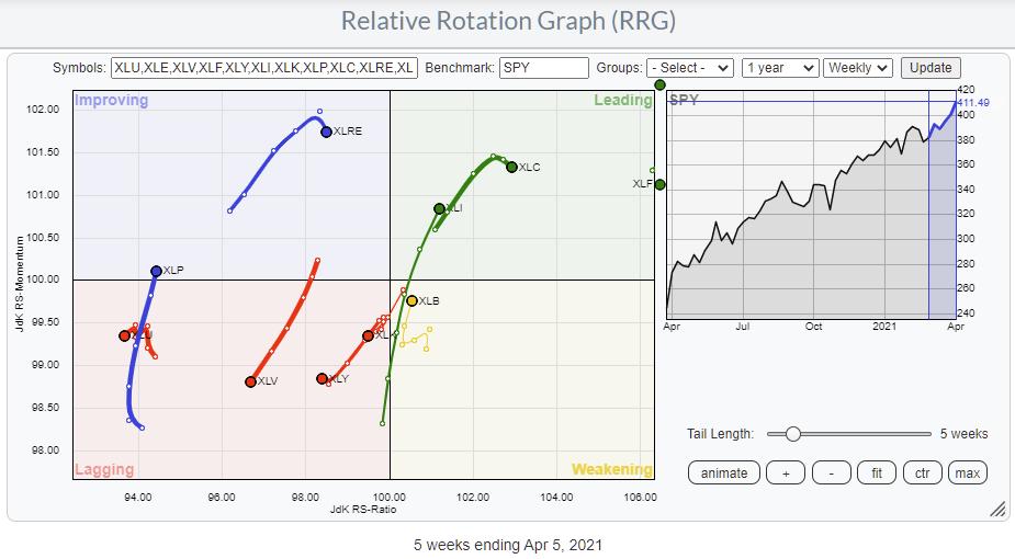
For XLC, the breadth is heading towards lagging while the price tail is inside leading but rolling over. A prelude??
RRG Rotation as a Measure of Breadth
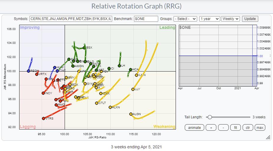
Another way of using RRG for breadth that I found useful is to load the members of a sector and, instead of using the sector index as the benchmark, switch to $ONE. I have introduced this benchmark in the past as a way to see absolute rotations instead of relative, which is an interesting way of looking at things for people who are more gearing towards absolute returns.
What you will see when you run an RRG against $ONE is that most members will move/rotate in a similar fashion. In strong sectors/markets, all members will gyrate to the right side of the RRG and v.v. in weak sectors/markets. But, recently, it dawned on me that we can use this setup also to eyeball and get a handle on breadth for sectors or markets.
For example, when a trend in price is still UP, but, on the RRG you see the majority of constituents roll over and/or rotate at a negative heading, I think that shows an underlying change of trend underway, which is exactly what breadth metrics help us find -- underlying movements that have not (or not completely) surfaced yet.
A good example can be seen in the Health Care sector.

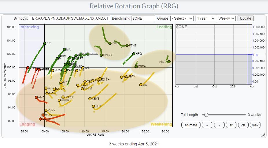
The individual stocks are mostly located at the right side of the graph, but the majority of the tails are pointing in a 180-270 degree heading, which signals a loss of momentum and (relative against a flat line) strength.
In Tech, it is a little less pronounced, but still visible. The majority are at the right, but a lot are rotating at a negative heading.

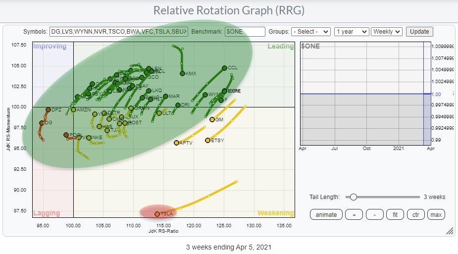
And finally, in Consumer Discretionary, this approach clearly shows how the negative rotation of one mega-cap stock can drag a sector down in price while the majority of constituents are still doing pretty well.

I hope this slightly different use of RRG will help you gain other insights somewhat off the beaten path and also hopefully give you a better understanding of what RRG is capable of doing/visualizing.
#StaySafe and have a great weekend! --Julius
My regular blog is the RRG Charts blog. If you would like to receive a notification when a new article is published there, simply "Subscribe" with your email address.
|
| READ ONLINE → |
|
|
|
| ChartWatchers |
| A Downtrending Stock Poised to Explode Higher - Get in Early |
| by Tom Bowley |
When I see a long-term winning stock sell off for a period of weeks, or even months, I always question the motive. If institutions want to buy a large position in a company, it takes time to do so. They don't simply put a market order in for 1 million shares. Market makers have the responsibility to purchase shares for institutions at the best possible price.
That's why I always roll my eyes when the media tries to convince us that growth stocks are in trouble with 10-year treasury yields ($TNX) rising from 1.00% to 1.75%. It doesn't make sense. But if the media says it, it must be true, right? Whatever.
I've spent time writing about companies like Tesla (TSLA) and Peloton (PTON) that are dealing with lengthy consolidation periods. Their price action says one thing as their recent downtrends are undeniable. But if you look at their accumulation/distribution lines (AD lines), they appear as though they're being accumulated. In many cases, looking at their "big picture" chart (10-year weekly chart) provides a completely different perspective as well.
In this article, I want to provide you a stock that look very attractive at its current price. I believe institutions are accumulating, so buying into current consolidation will likely pay off big time down the road.
Lululemon Athletica (LULU)
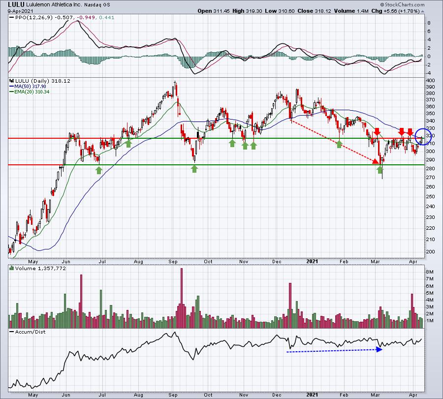
LULU has been consolidating since its September 2020 high. After an initial selloff during September, LULU rebounded in December to nearly reach its September high. That's when the recent 4-month downtrend began. Despite the drop from 387 in mid-December to its low of 269 on March 5th, LULU's AD line printed higher lows. If LULU was being heavily distributed by institutions, it certainly doesn't show up on this chart:

Price action is clearly trending lower (red-dotted directional line), but accumulation appears to be taking place (blue-dotted directional line). We're one or two good solid volume days away from a possible AD line breakout to the upside. I see LULU going much, much higher.
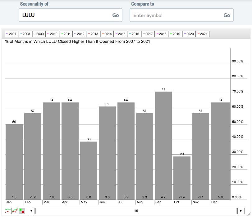
Also, seasonality favors LULU uptrending from here. Check out the average monthly returns by calendar month since LULU went public:

Over the past 15 years, the March to September period has averaged gaining 31.4%. Meanwhile, the October to February period has averaged gaining just 4.2% per year. Most stocks show their biggest gains beginning in October, but LULU's history has been quite the opposite of that. Knowing this seasonal information is important, as it suggests that March 5th low might have been the low for this year. The AD line confirms this by suggesting that institutions are gladly buying every share that the retail trader wants to sell.
I'm not a Registered Investment Advisor, so I'm not licensed to advise anyone to buy or sell a stock, but the information above certainly points to higher prices for LULU. Just my opinion.
If we do see LULU break out this week, pay attention to monthly options that will expire on Friday. That could play havoc with LULU and many other stocks next week, especially those that have run significantly higher or lower over the past few weeks. I'll be hosting our monthly max pain session on Tuesday afternoon for EarningsBeats.com members.
Also, if you prefer ETF investing, then you should consider our "Sneak Preview - Model ETF Portfolio" event on Monday, April 12th. This event is FREE to everyone, so mark your calendar for 4:30pm ET. For more information on both of these events, CLICK HERE.
Happy trading!
Tom
|
| READ ONLINE → |
|
|
|
|
|
| ChartWatchers |
| Institutions Have Raised $3 Trillion in Cash. They're Starting to Put That Money Back to Work |
| by Mary Ellen McGonagle |
Institutions have increased their cash balances by 9% since the beginning of this year*. This brings their total cash pile to $3 trillion, which represents lots of potential firepower for equity gains as this money gets put to work.
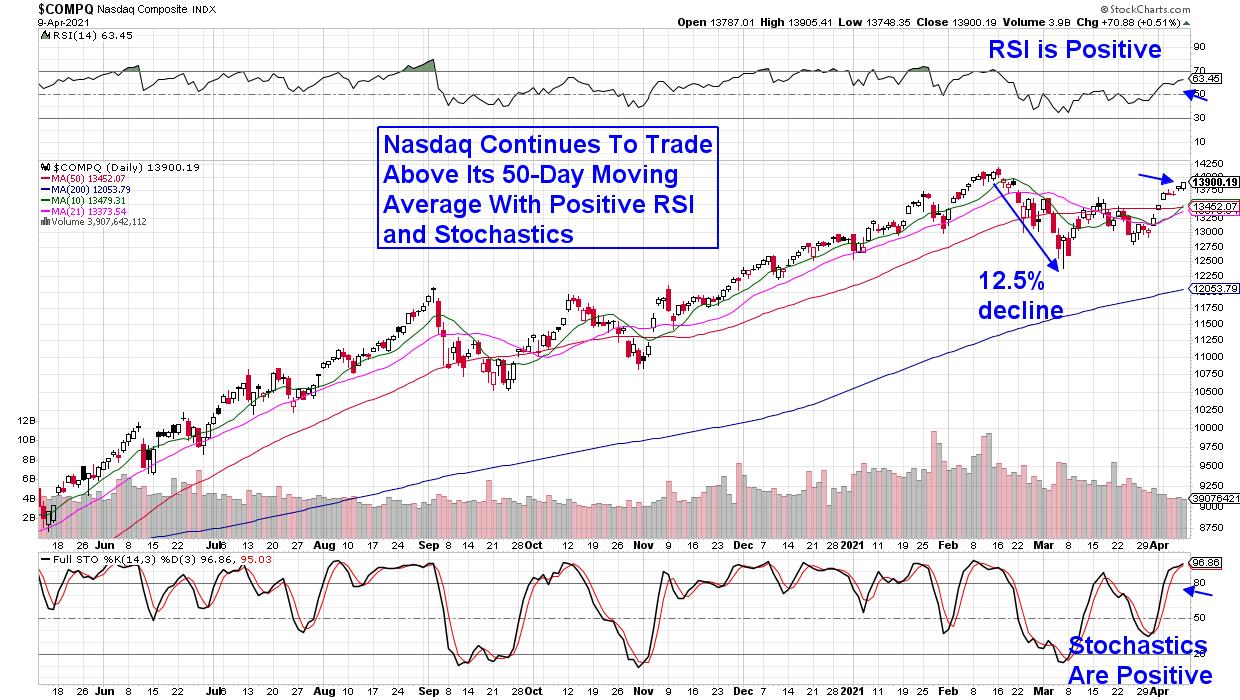
For those who follow the markets closely, you'll know that much of that cash came from the liquidation of Growth stocks that were sold in the face of higher taxes, as well as inflation fears. Excessive valuations after huge run ups out of the bear market also caused selling in growth stocks. The result was a recent correction in the tech-heavy Nasdaq, which fell 12.5% from its peak in price in mid-February.
DAILY CHART OF NASDAQ COMPOSITE INDEX

Over the past 2 weeks, investors are wading back into select areas of Technology, in a move that's pushed the Nasdaq into bullish territory following a break back above its 50-day moving average.
Judging by the resurgence in recently lagging FAANGM stocks, buying by Institutions is one reason for the Nasdaq's downtrend reversal. This is because the Money Flow Index (MFI) – thought of as one way to gauge institutional activity – is now positive for each of the FAANGM stocks. In addition, large Mutual Funds will typically purchase positive mega-cap stocks that can easily absorb big inflows as a way to participate in the markets as they trend higher.
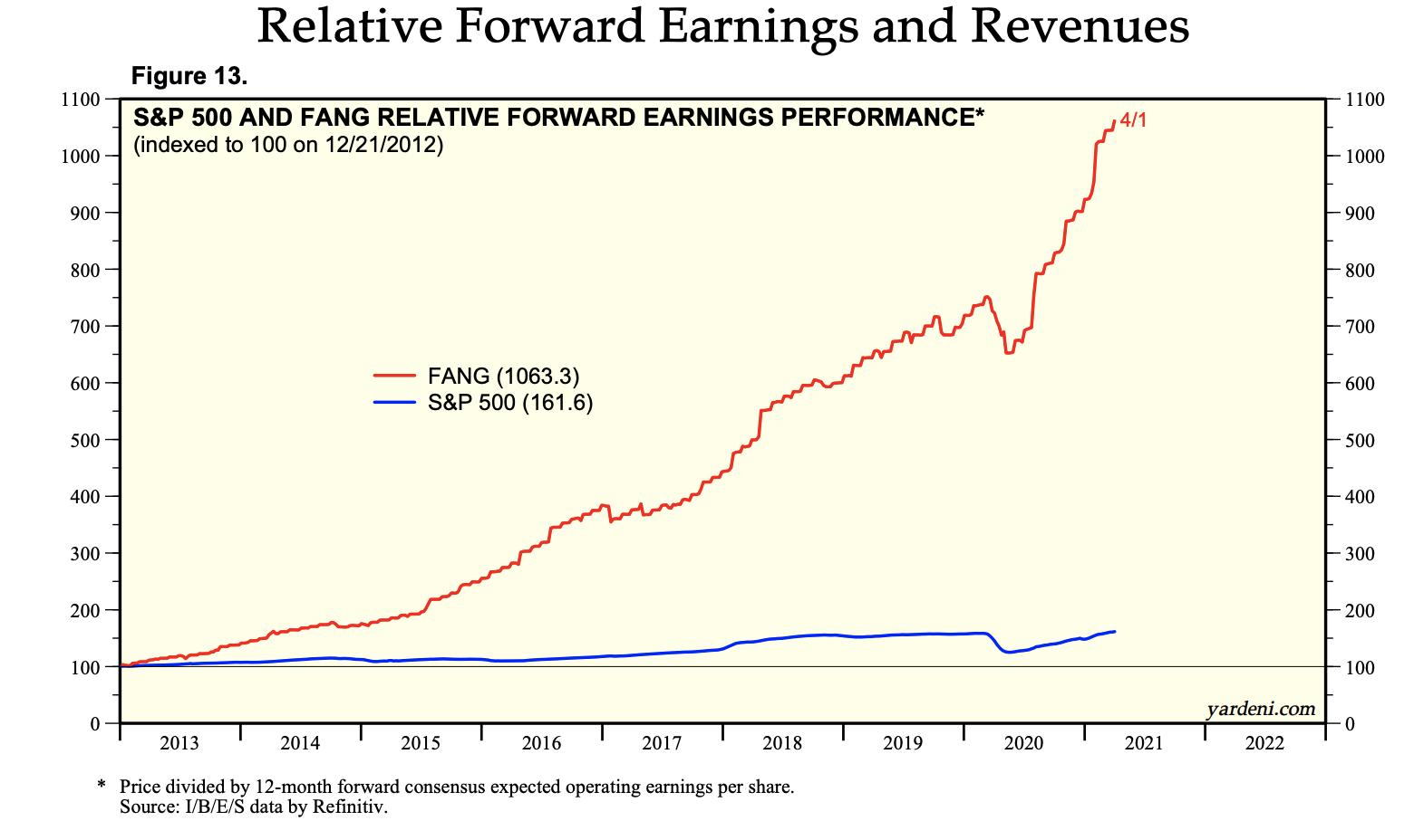
Below is a chart of the relative forward earnings performance for FANG stocks, and the expected growth is very exceptional. (Using Yardeni Research as well as I/B/E/S data). The O'Neil methodology, of which I'm very familiar, cites earnings growth as the number one driver of a stock's upward advance.

According to top money managers, the markets have discounted the growth capabilities in many areas of Tech – particularly following Biden's commitment to investing in high-growth Technology with his announced Infrastructure Plan earlier this month.
If you'd like to uncover our most favored FANMG stock, trial my bi-weekly MEM Edge Report for 4 weeks at a nominal fee. You'll also be alerted to additional high quality growth stocks as they reverse recent downtrends.
Current subscribers to this newsletter have been alerted to several Semi stocks with returns up to 25% over the past 3 weeks. In addition, they've received market and sector analysis not seen elsewhere. Take a look at a sample report here!
Warmly,
Mary Ellen McGonagle
Editor, MEM Edge Report
*Fund flow information data is from Fundstrat Research as of April 5, 2021
|
| READ ONLINE → |
|
|
|
| Mish's Market Minute |
| How to Navigate the Market with These 3 Symbols |
| by Mish Schneider |

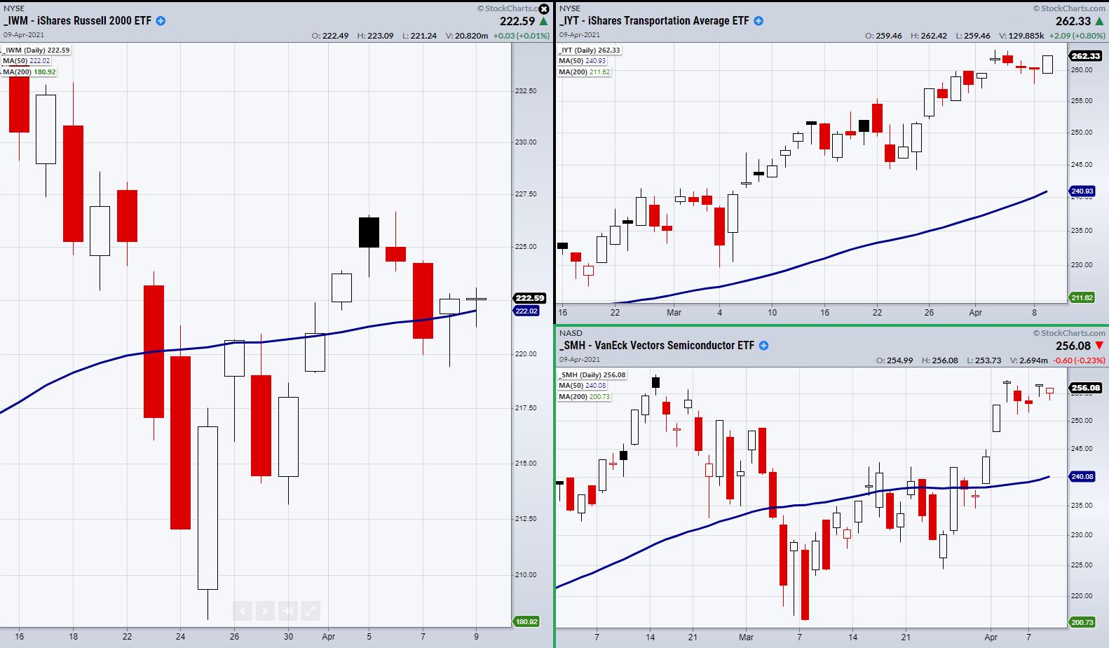
Last week's focus was the Russell 2000 (IWM), Transportation ETF (IYT) and Semiconductors ETF (SMH). IWM has shown us general market direction and sentiment as it contains 2000 small-cap U.S companies. IYT is the backbone or demand side of the economy as the U.S opens with the increasing vaccine deployment.
Then comes SMH, which has been involved in this year's tech boom, but also in one of this year's biggest supply chain disruptions. For a plethora of reasons, from car manufacturing to increasing computer needs from the work at home environment to crypto mining, the tech space has been hard pressed for computer chips to meet demands of large and growing tech companies.
From a technical standpoint, IWM continues to flirt with its 50-day moving average at $222.02. Last week, IYT started to drift lower, making it look worrisome when paired with IWM, which fluctuated between breaking its major moving average and holding its current price level. On top of that, SMH has been struggling to break through highs at 258.59.
With that said, raising worries of inflation linger in the background of many investors' minds. Therefore, we have been watching the dollar index (UUP) along with precious metal and food commodities, like Invesco Agricultural Fund ETF (DBA) and gold (GLD). If the dollar were to begin struggling and break the support of the 50-DMA, this could cause fear, as a weakening dollar buys less goods, thus increasing import prices which can lead to inflation.
DBA and GLD can also display signs of inflation, as investors flock to their safety as prices increase.
As for the Monday's game plan, we can watch for our 2 key ETFs and Index to hold, break or clear their current price levels. From a bullish standpoint, this means watching IWM to hold over its 50-DMA and for IYT and SMH to head back up to recent highs.
Watch Mish give market insight on Cheddar TV...
With dividends rising, stock buybacks returning and yields tightening, the banks are worth looking at for a few new long positions. In this week's edition of StockCharts TV's Mish's Market Minute, Mish looks at banks that offer commercial services in both FIAT, lending, and 24/7 liquidity.
ETF Summary
- S&P 500 (SPY): At all-time highs
- Russell 2000 (IWM): Watch to hold over the 50-DMA at 222.02
- Dow (DIA): 332.86 support
- Nasdaq (QQQ): 338.19 high to clear. Support 321.40
- KRE (Regional Banks): Support 64.77 the 50-DMA
- SMH (Semiconductors): 258.59 resistance
- IYT (Transportation): 263.33 high to clear
- IBB (Biotechnology): 145.50 support
- XRT (Retail): Needs to clear 93, then 96.27
Mish Schneider
MarketGauge.com
Director of Trading Research and Education
Forrest Crist-Ruiz
MarketGauge.com
Assistant Director of Trading Research and Education
|
| READ ONLINE → |
|
|
|
| DecisionPoint |
| S&P 500 Earnings 2020 Q4: Most Overvalued Advancing Market Ever |
| by Carl Swenlin |
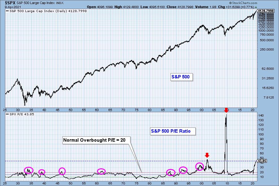
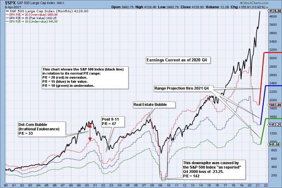
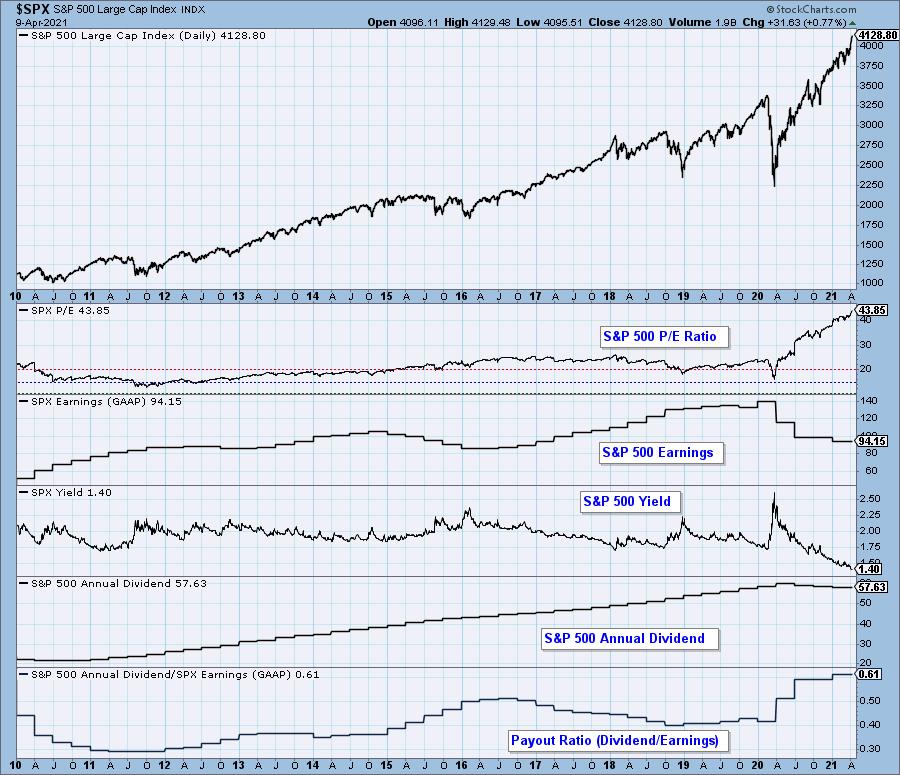
You may ask why I used the qualification of "the most overvalued advancing market." On the chart below the current P/E Ratio is only exceeded twice, but both times it happened while the market was crashing -- the dotcom crash from the 2000 top, and the financial crisis crash beginning 2007. There are two factors that can cause the P/E ratio to rise: (1) rising price and/or (2) falling earnings. In those two cases both factors were involved, it's just that prices fell faster than falling earnings could be reported. I have circled previous P/E peaks that have exceeded the normal overbought P/E level of 20, and we can see how far they have been exceeded this time.

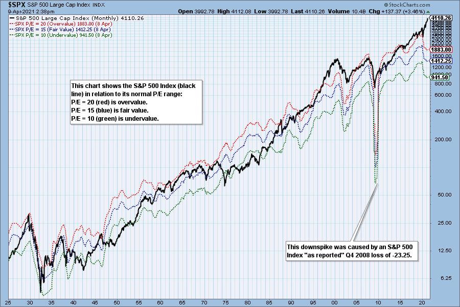
The following chart shows us the normal value range of the S&P 500 Index, indicating where the S&P 500 would have to be in order to have an overvalued P/E of 20 (red line), a fairly valued P/E of 15 (blue line), or an undervalued P/E of 10 (green line). Annotations on the right side of the chart show where the range is projected be based upon earnings estimates for the next four quarters, through 2021 Q4.


Historically, price has usually remained below the top of the normal value range (red line); however, since about 1998, it has not been uncommon for price to exceed normal overvalue levels, sometimes by a lot. The market has been mostly overvalued since 1992, and it has not been undervalued since 1984. We could say that this is the "new normal," except that it isn't normal by GAAP (Generally Accepted Accounting Principles) standards.

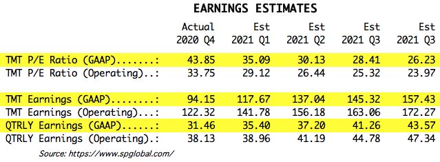
We use GAAP earnings as the basis for our analysis. The table below shows earnings projections through September 2021. Keep in mind that the P/E estimates are calculated based upon the S&P 500 close as of today. They will change daily depending on where the market goes from here.

The following table shows where the colored bands will be, based upon earnings estimates through 2021 Q3.. We can also see what the estimates were last quarter. (2021 Q3 is absent because they weren't estimating it three months ago.)

This DecisionPoint chart keeps track of S&P 500 fundamentals, and P/E and yield, and it is updated daily, not that you need to watch it that closely, but it is up to date when you need it.

CONCLUSION: Overvalued means that people are paying too much for stocks based upon traditional valuation measures. The excess of overvalued markets can persist for years and is not a condition that requires immediate correction. Overvaluation is, however, a condition that can exacerbate declines because there is no intrinsic "value" present to incentivize potential buyers. Overvaluation doesn't matter . . . until it does.
Technical Analysis is a windsock, not a crystal ball.
Helpful DecisionPoint Links:
DecisionPoint Alert Chart List
DecisionPoint Golden Cross/Silver Cross Index Chart List
DecisionPoint Sector Chart List
DecisionPoint Chart Gallery
Trend Models
Price Momentum Oscillator (PMO)
On Balance Volume
Swenlin Trading Oscillators (STO-B and STO-V)
ITBM and ITVM
SCTR Ranking
120
|
| READ ONLINE → |
|
|
|
| Top Advisors Corner |
| The Message of a Bumpy Summation Index |
| by Tom McClellan |

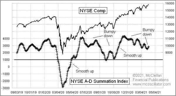
Indicators like the McClellan Summation Index can tell us a lot by the level they get to. But they can also tell us a lot based on the patterns they show, or, in some cases, the patterns they don't show.
A "smooth" move in the Summation Index is one that is nearly linear, and it conveys a message about strength for the direction of the move. So, in the case of this week's chart, we see smooth sustained up moves.
We also see some bumpy down moves. Bumpiness is an indication of weakness for the direction of the movement, and so a bumpy down move says that the bears are not very organized. The bears might still be trying hard, but they are not in charge.
So the combined message at the moment of a smooth-up and bumpy-down patterns says that the bulls are in charge and the bearish side is weak. That is a positive message for the stock market. If the bumpy down structure turns itself into a bumpy up, then that would be a notable change of message that we should pay attention to. That is not happening yet, but it is a useful teaching point about what could happen.
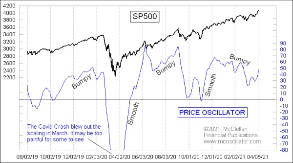
The McClellan Summation Index tracks the NYSE Advance-Decline (A-D) data. We see a similar smooth-up bumpy-down structure in the chart of the S&P 500's McClellan Price Oscillator.

Coming off of the pre-election price bottom in October 2020, this Price Oscillator saw a big smooth up move. It has been followed by a bumpy down message. The combined message is that the bulls are in charge and the bears are disorganized. So it is the same message we see in the Summation Index, which is like a Price Oscillator for the A-D Line.
Reading these indicators in this way is not always as easy as this. Sometimes the patterns are harder to interpret, which is the case with every other type of technical indicator. But we study the ideal examples in order to understand the principles, so that we can hope to use those principles to our advantage in the real world.
The bottom line for the moment from these indicators is that the bulls are in charge. That will change someday, but for now it is the way to bet.
|
| READ ONLINE → |
|
|
|
| MORE ARTICLES → |
|
 Chart 1
 Chart 2


