| THIS WEEK'S ARTICLES |
| ChartWatchers |
| Has the NASDAQ Lost its Mojo? |
| by Martin Pring |
The NASDAQ Composite peaked on February 16, sold off and subsequently rallied back to the February high last week. Chart 1 shows that it just missed the earlier peak by a smidgen, whereas the NASDAQ 100 (in the lower window) did marginally take out its February high. Taken together, the peaks of both series netted out at about the same level. That said, when we look under the hood, things are very different between February and April, thereby throwing up the question of whether the NASDAQ has lost its mojo. Let's consider relative action, price momentum, breadth and volume characteristics at both peaks and see where we come out.
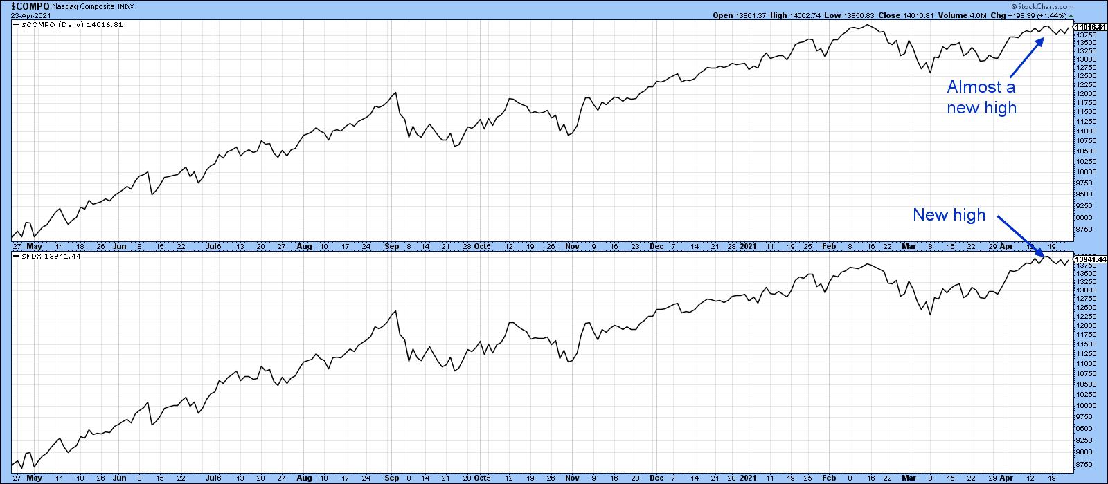 Chart 1 Chart 1
Relative Action
Chart 2 compares the NASDAQ to the S&P Composite. Note how the strong relative action at the beginning of the lockdown foreshadowed a strong performance by the Index itself. Compare that to this year's action. It's true that the April NASDAQ peak was slightly lower than the February one, so it's not strictly speaking a negative divergence. However, the weak relative April action tells us that the NASDAQ has fallen out of favor. The key will be to see if the RS line can hold above the red support trendline. It marks the base of what may turn out to be a head-and-shoulders top.
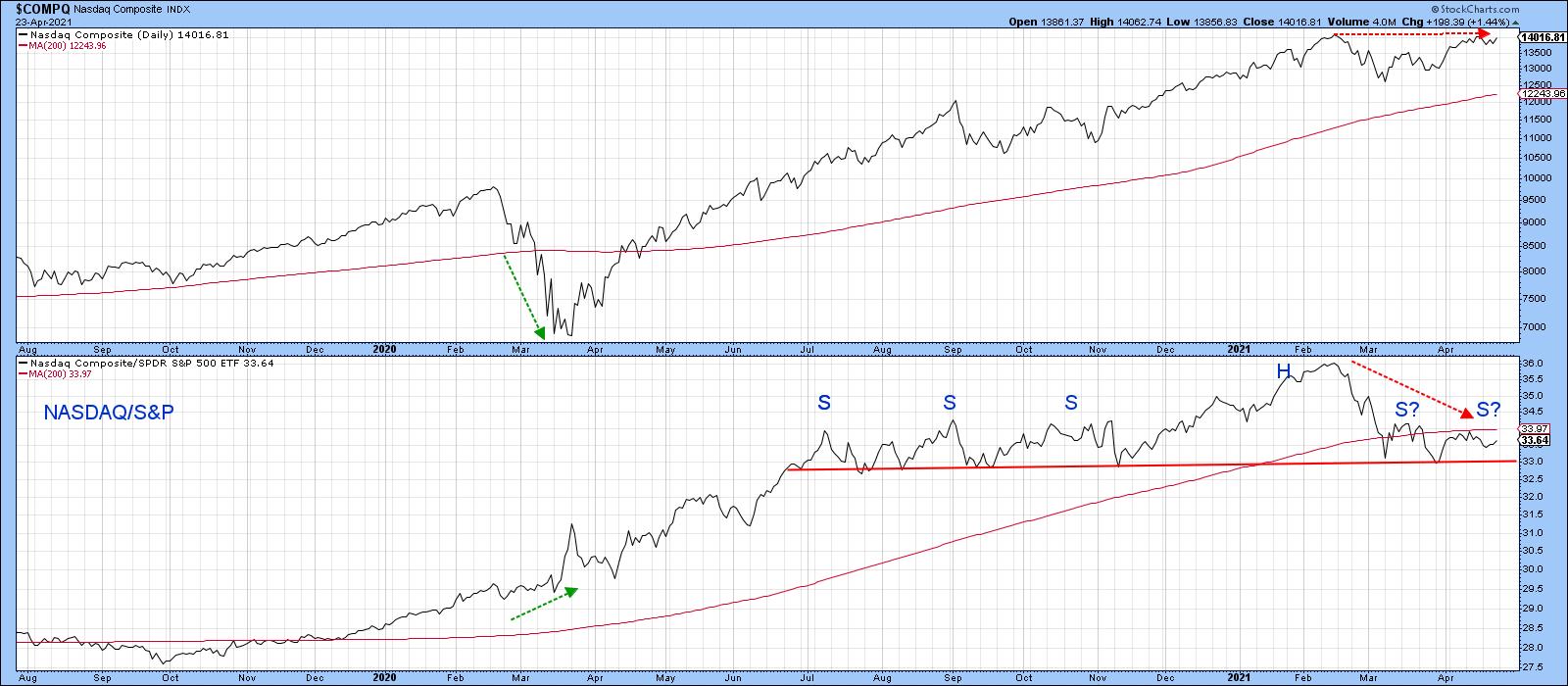 Chart 2 Chart 2
Note that the NASDAQ itself is comfortably above its 200-day MA. That indicates that the main upward trend is intact. However, the RS line is decisively below its MA, which will just increase the significance of any potential neckline downside penetration.
Price Momentum
Chart 3 features a 45-day ROC, which is showing that there was virtually no upside momentum at the April peak. That kind of situation, when confirmed by a trend break in the price, is often followed by an above-average decline. The benchmark I would look for in this case would be a decisive daily close below the two converging trendlines at 13,500. Until that happens, the divergence is inoperative.
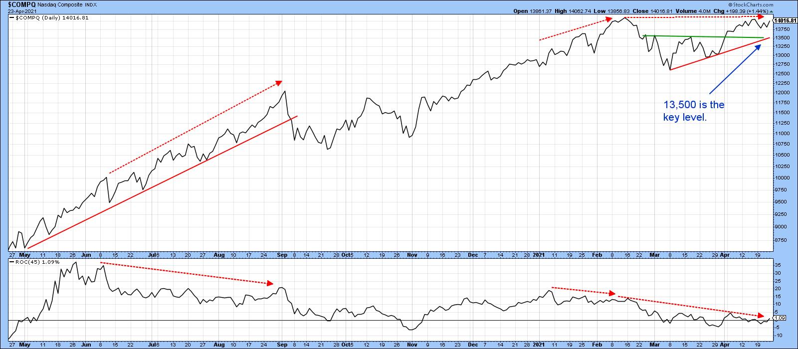 Chart 3 Chart 3
Breadth
Breadth can be measured in many ways, but the most common is through an advance/decline line, as displayed in Chart 4. Most of the time, both series move in tandem. Since February, though, the A/D line has clearly not managed to keep up with the Index. It may well be forming a top, but, until it is completed with a clear-cut penetration of the red support trendline that holds for couple of sessions, recent ranging action should be treated as a consolidation in an ongoing uptrend.
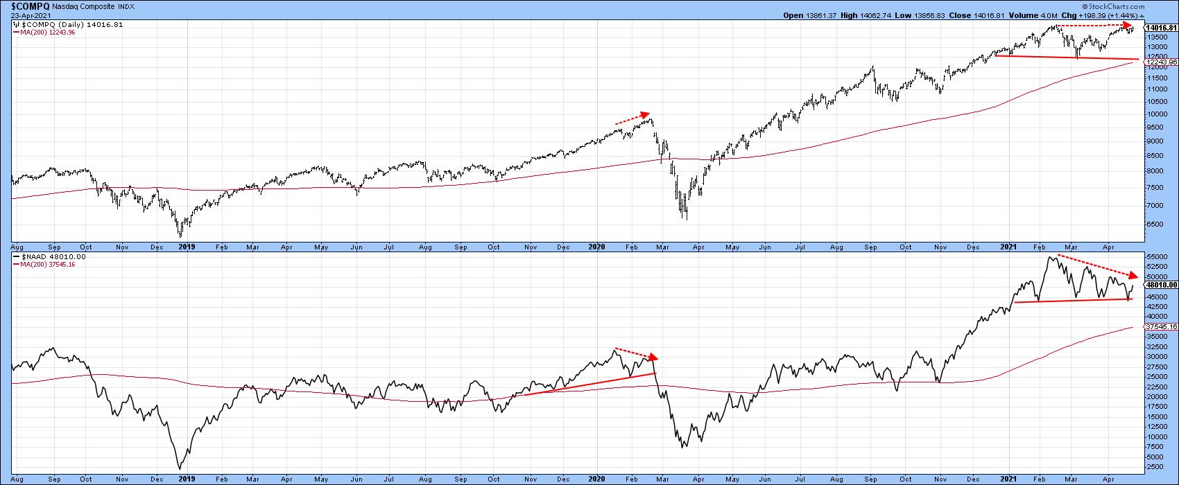 Chart 4 Chart 4
Chart 5 features a 30-day ratio of advances less declines. One thing that sticks out is the fact that the April top was accompanied by very little in the way of upside momentum. Note how a weak performance by this indicator foreshadowed the late 2018 and 2020 selloffs. Once again, we need confirmation, which requires a violation of that 2020-2021 up trendline.
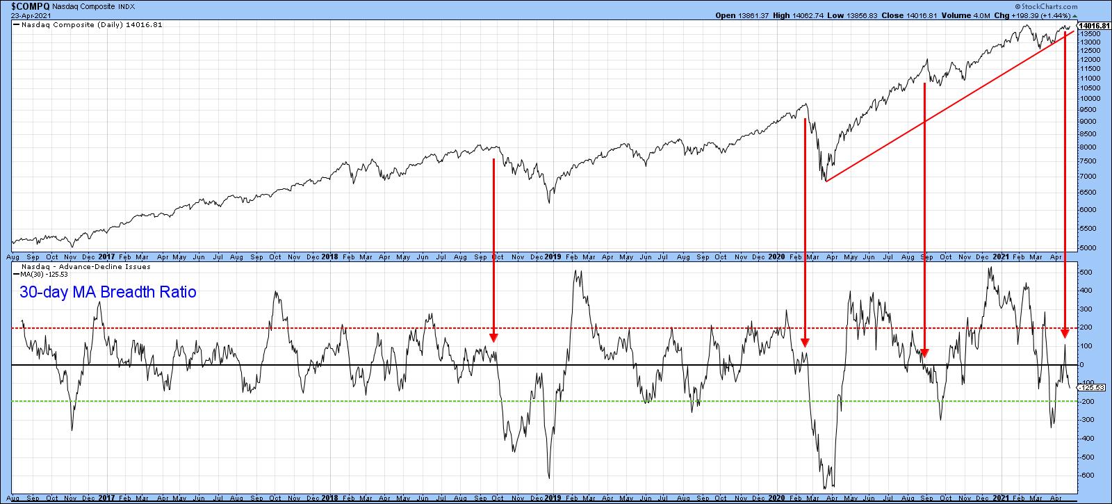 Chart 5 Chart 5
Another way of analyzing breadth is study net new high data. For example, an expanding number of issues touching new highs as the Index approaches a previous peak would be a positive sign. In this instance, we see quite the opposite, in that there was a a substantial shrinkage between the February and April peaks.
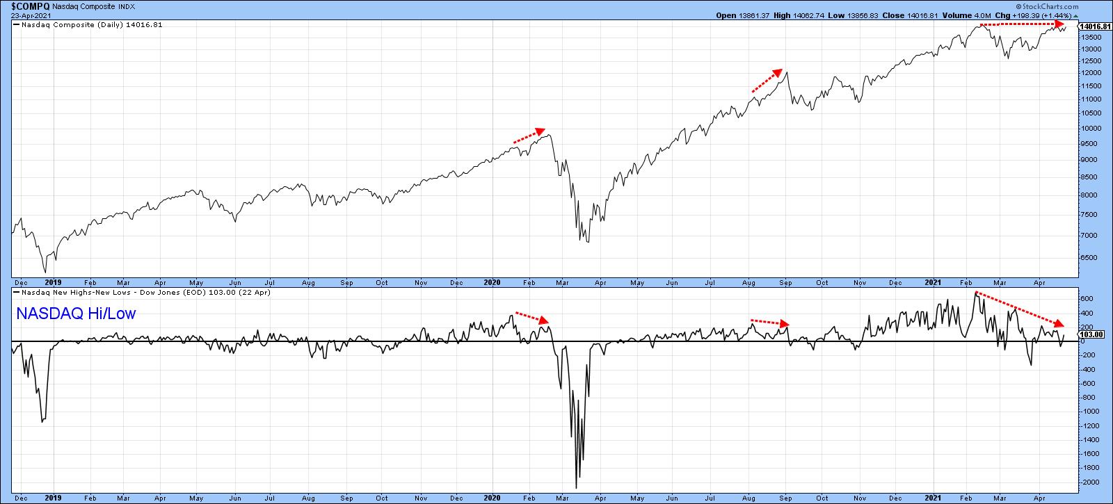 Chart 6 Chart 6
Finally, for breadth, Chart 7 features the NASDAQ bullish percent. Both the Index and the indicator violated up trendlines earlier in the year, thereby indicating a dissipation of upside momentum. Now the indicator is resting on key support in the form of the dashed up trendline. If it holds, that could presage another up leg in the bull market, but a break under the previous low would confirm a series of declining peaks and troughs, thereby suggesting additional weakness.
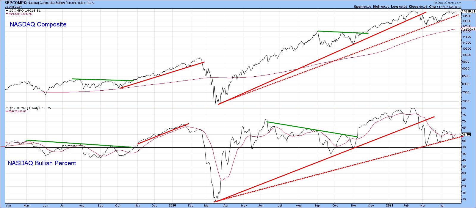 Chart 7 Chart 7
Volume
Chart 8 compares the NASDAQ Composite to a 10-day MA of the NASDAQ McClellan Volume Oscillator. The red arrows flag the principal tops that have developed in the last three years. They have one thing in common, which is that they all developed when the volume oscillator was at or below zero, indicating real lack of upside volume momentum. Currently, the oscillator is well below zero, which is not so good. On the other hand, one could also interpret this reading as being close to the oversold zone and therefore close to a buying opportunity. That was the case last September when the decline, though sharp, was relatively brief.
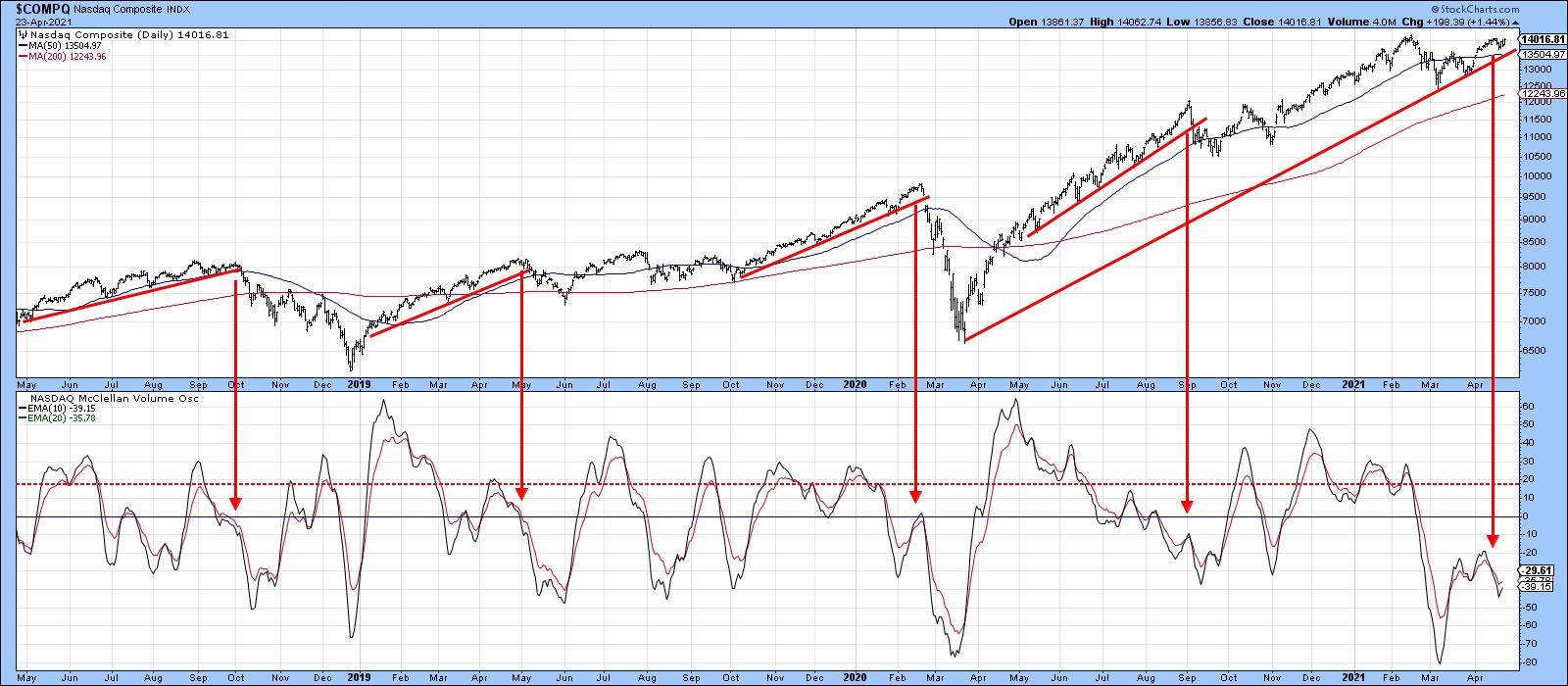 Chart 8 Chart 8
Finally, Chart 9 shows the possibility that the NASDAQ may be forming a double top. It certainly has the expected volume characteristics, with heavy activity on the initial peak and distinctly lower volume on the second. However, final confirmation requires a break below the March low, which has clearly not yet happened.
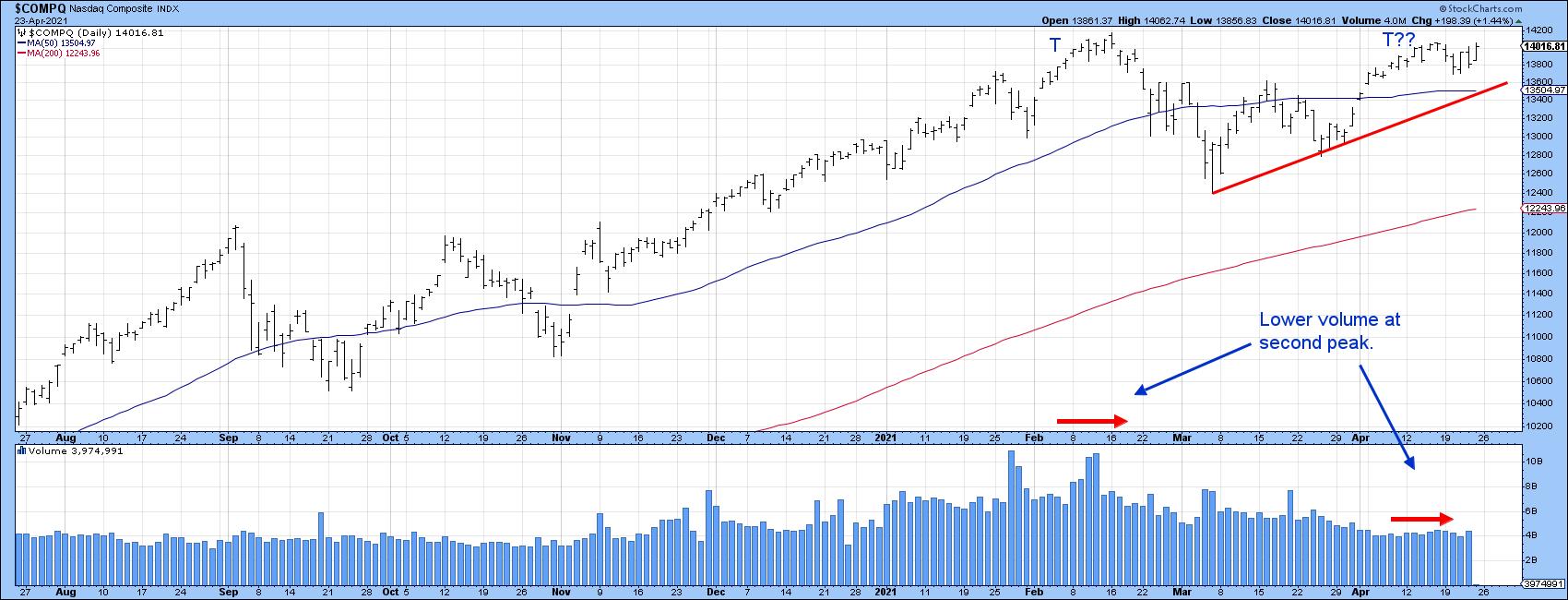 Chart 9 Chart 9
Conclusion
None of the long-term averages have yet been violated and long-term momentum remains in an uptrend, so the NASDAQ remains in a primary bull market. In that respect, higher prices are ultimately likely. That said, the NASDAQ Composite has lost its mojo on many fronts. If seasonal weakness takes hold this year, these charts are telling me that this area of the market could be a leader on the downside, provided that the 13,500 level and 2020-2021 up trendline are, along with the potential neckline in the RS line (Chart 2), both taken out first.
This is an updated version of an article previously published on Thursday, April 22nd at 11:43am ET in the member-exclusive blog Martin Pring's Market Roundup.
Good luck and good charting,
Martin J. Pring
The views expressed in this article are those of the author and do not necessarily reflect the position or opinion of Pring Turner Capital Group of Walnut Creek or its affiliates.
|
| READ ONLINE → |
|
|
|
| ChartWatchers |
| The Streaming Wars: T vs. NFLX |
| by David Keller |
It's been a heavy earnings week, with many stocks gapping higher or lower based on investors' reactions to their quarterly results. With two particular stocks, AT&T (T) and Netflix (NFLX), this week was less about their ability to grow earnings and more about their potential to grow subscriber numbers in the coming months and years.
In this piece, we'll look at both stocks from a technical perspective, focus on their trends leading into and out of their earnings reports and reflect on the differences between these two key charts.
Join us Tuesday, May 4th at 1:00pm ET for a FREE webinar: "Sell in May: Five Charts You Need to Review". We'll discuss what five key charts are showing as we approach the seasonally weakest part of the calendar. Sign up here!
First, let's review the chart of Netflix.
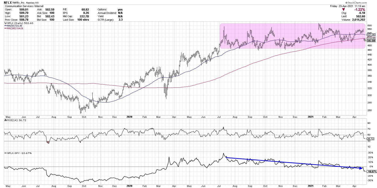
Netflix has essentially been "dead money" for the last eight months. Following a solid run to new all-time highs in July 2020, the stock has essentially been rangebound since then.
When we talk about the leadership and then laggardship of the FAANG trade, this chart of NFLX (in particular the relative strength line at the bottom) really tells the story of that leadership rotation. Following its earnings call on Tuesday, Netflix gapped down just below its 200-day moving average. NFLX has done this two times in the last two months, with two breaks below the 200-day in March being fairly short-lived.
Moving below this long-term smoothing mechanism was the first warning sign. If the stock breaks below the March lows around 500, that would indicate further price weakness. The most important "line in the sand" would be the bottom end of the eight-month price range around 460.
Now, let's look at the chart of AT&T, which owns the HBO Max service.
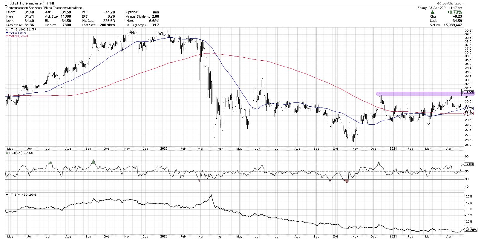
When you take the unadjusted price chart of AT&T, which removes the impact of a fairly large regular cash dividend, you can see that T has gapped up right to its Dec 2020 highs around 31.50. Given the strength this week, I would consider the path of least resistance to be higher, assuming the stock is able to make a new six-month price high. It's also worth noting that this is one of the highest dividend payers around, with a yield of around 6.6% given current price levels.
In recent weeks, AT&T had pulled back beautifully to an ascending 50-day moving average, which often serves as support during long-term uptrends. If the stock pulls back in the coming weeks, that moving average could serve as actionable support.
Overall, these two stocks have been all about the subscription trends for Netflix and for AT&T's HBO Max. While the earnings results this week provided a catalyst for price gaps on both charts, I would argue that signs of strength and weakness have been evident before this week.
Want to see this article in video format? Just check out my YouTube channel:
RR#6,
Dave
PS- Ready to upgrade your investment process? Check out my free course on behavioral investing!
David Keller, CMT
Chief Market Strategist
StockCharts.com
Disclaimer: This blog is for educational purposes only and should not be construed as financial advice. The ideas and strategies should never be used without first assessing your own personal and financial situation, or without consulting a financial professional.
The author does not have a position in mentioned securities at the time of publication. Any opinions expressed herein are solely those of the author, and do not in any way represent the views or opinions of any other person or entity.
|
| READ ONLINE → |
|
|
|
| ChartWatchers |
| Earnings Drive Equity Prices; Here Are My Two Favorite Earnings Reports This Quarter |
| by Tom Bowley |
Over the long haul, earnings and Fed policy have more to do with stock market direction than anything. Focus on these two and you'll be just fine. Tune everything else OUT. President Biden's possible tax hike on capital gains was a problem..... for an hour on Thursday. I didn't see the big deal on Thursday and I still don't. Raising taxes at the individual level has no impact on stock valuations whatsoever. I do realize it can impact the market if wealthy investors decide that the risk isn't worth the reward if taxes are too high, however. But I don't believe we're at that level just yet and a lot can happen between now and the passage of such a tax increase. Can the President actually garner enough support in the Senate to pass something of this nature? It's way too early to tell. But the market's action on Friday is about what I would have expected. It was a collective yawn.
So let's turn our attention to earnings. If you haven't been paying attention, the numbers have been astounding. Most companies are beating estimates by a mile, which is exactly why you should view PE ratios as useless. The "E" part of PE is exploding higher. There have been so many awesome quarterly reports out already, but I'll highlight two of my favorites:
Wells Fargo (WFC)
I've already written one article in my Trading Places blog regarding the stellar earnings report of WFC, so I won't spend a lot of time here discussing it, but let me say this: the long-term relative downtrend in WFC has ended. It's just my opinion, of course, but I honestly believe this will be a leading bank moving forward. Here were the latest quarterly numbers:
- Revenues: $18.06 billion (actual) vs. $17.50 billion (estimate)
- EPS: $1.05 (actual) vs. $0.69 (estimate)
WFC, perhaps more importantly, has now reached a 1-year relative high vs. its bank peers:
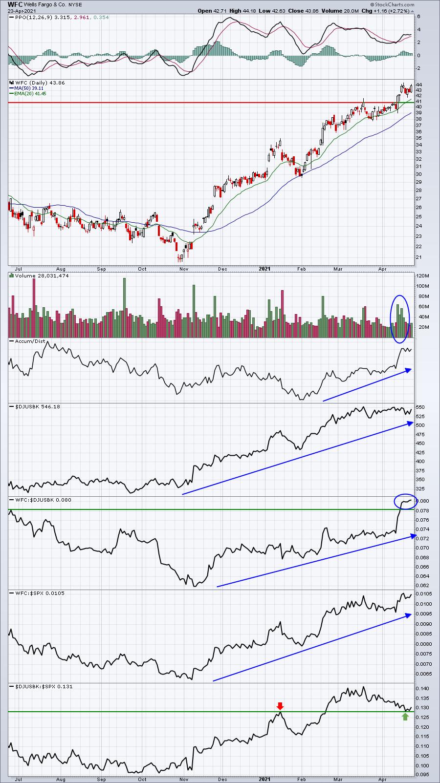
There's little to not like about this chart. The banking group has been strong and WFC is a leader, posting excellent quarterly results. Look for further strength ahead.
Intuitive Surgical (ISRG)
Talk about blowing numbers out of the water? Revenues weren't close. Neither were earnings. Check out these quarterly results:
- Revenues: $1.29 billion (actual) vs. $1.11 billion (estimate)
- EPS: $3.52 (actual) vs. $2.61 (estimate)
These numbers aren't close. You know that Wall Street will have to re-crunch their valuation numbers after this blowout; this is why PE ratios are meaningless right now. By definition, PE is price divided by earnings. The problem is that earnings are rising much, much faster than forecasts. As estimates are raised, PEs will fall... well, except that bull markets anticipate future earnings acceleration, so those following PE ratios will always be warning you to stay away from the market. And, in 10 years, those PE ratios will legitimately be too high. In the meantime, the 10-year treasury yield will net you 1.6%.
Technically, ISRG looks exceptionally strong as well. Check out the breakout that resulted from earnings earlier this week:
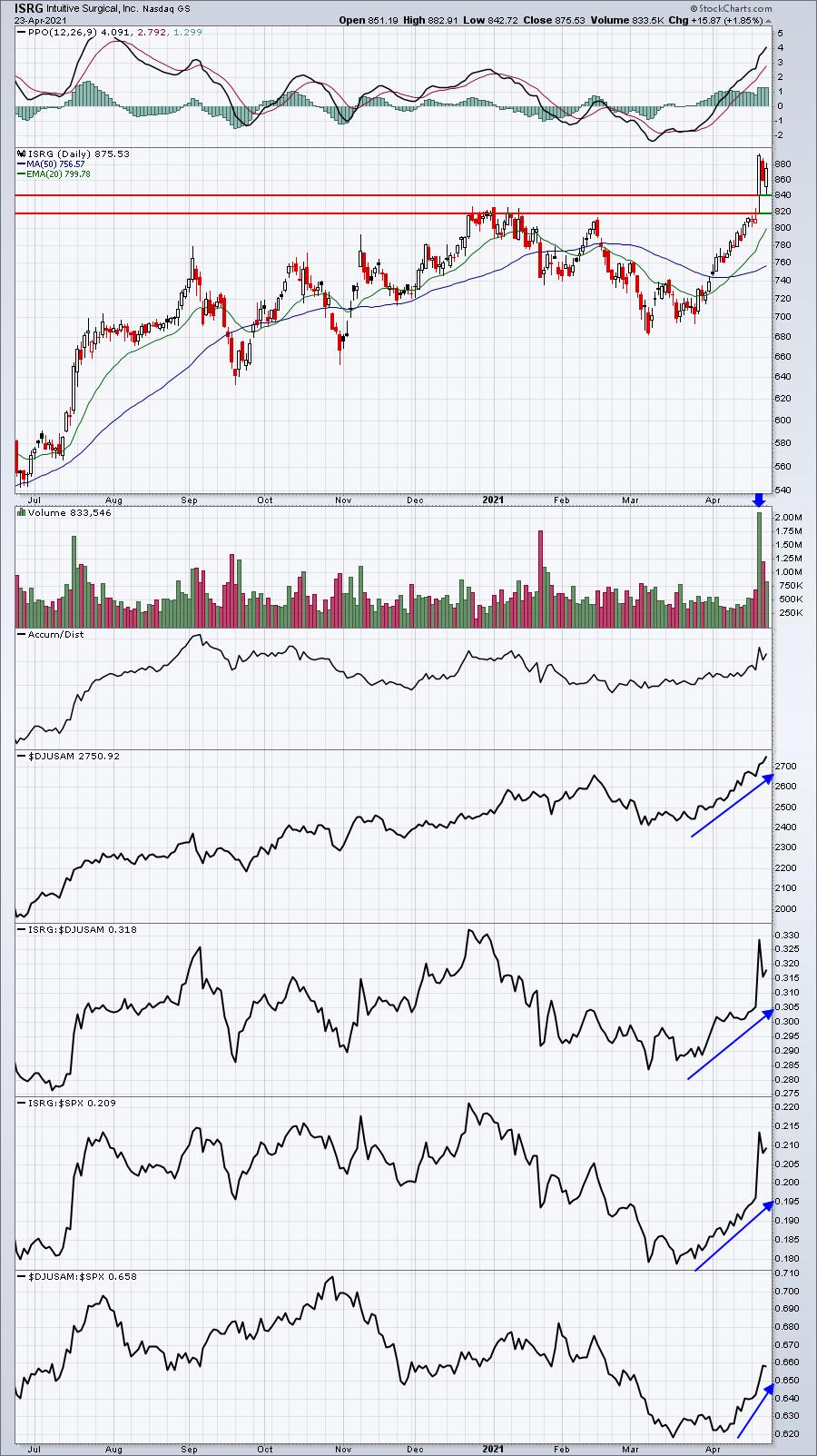
Medical equipment ($DJUSAM) has suddenly regained strength and it would be hard to find many stocks within this industry performing better than ISRG. I love to see large hollow candles on extremely heavy volume, as it suggests that demand was so overwhelming that market makers could not gain control of the action and likely had to cover their short positions at a loss, adding to the buying frenzy. The top of gap support is 840.92. I'd expect that level to provide excellent price support as we move forward.
On Monday, April 23, 2021, I'll provide you ALL of my favorite earnings reports released this quarter thus far, and I'll also provide you a look into the stocks that I believe will report blowout earnings results in the weeks to come. This webinar will be roughly an hour long and is an EarningsBeats.com members-only event. For more information on the event, CLICK HERE.
Also, we have a free EB Digest newsletter that's published 3x a week. There's no credit card required and you may unsubscribe at any time. You can enter your name and email address HERE to join!
Happy trading!
Tom
|
| READ ONLINE → |
|
|
|
|
|
| ChartWatchers |
| Forget Bitcoin, There is a New Kid on The Block(chain) |
| by Julius de Kempenaer |
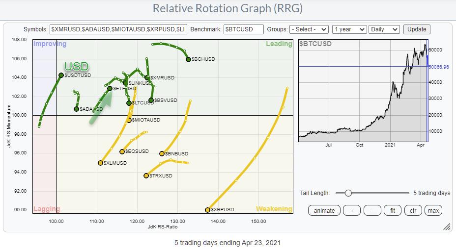
Another wild ride in crypto space this week. Bitcoin dropped almost 10% in value against the US Dollar in the past five days, while market darling DOGE lost a whopping 27%, as did TRON, Bitcoin SV, EOS and a few other major coins.
If you are ever looking for action, check out the crypto market, but be warned - it is not for the faint of heart!
With regard to the title of this article, I have to admit it was a bit of clickbait... I'm sorry. Bitcoin was and still is the benchmark for digital currencies and IMHO it will remain so for the foreseeable future. However, Bitcoin's price chart did get damaged last week.
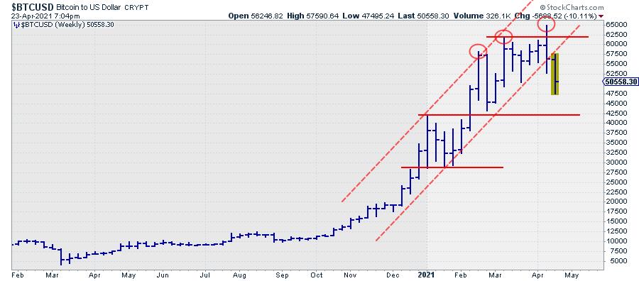
Until last week, the rhythm of higher highs and higher lows was still intact, but the last two highs were only marginally higher compared to the $58k peak in February. The push to a new high in the week of 12 April and the subsequent sharp decline marks the reversal from buyers pushing the market higher to sellers pushing the market lower.
With the setback continuing this week and a clear break of the rising support line that was in play since late last year, the path of least resistance is now to the downside, while the upside is sprinkled with resistance, most notably around $62.5k.
But Bitcoin is not the only cryptocurrency in town or in the StockCharts.com database. Very recently, the coverage of cryptocurrencies has broadened considerably. Take a look at stockcharts.com/crypto to find the complete list of digital currencies that are currently in the database. In total, it is around 150 coins, with a market capitalization above 1 billion USD. (At least at the time of inclusion, as I wouldn't be surprised to find out that a bunch has dropped back below 1BN after last week...)
I have been keeping an eye on the crypto market for a while now, as I am intrigued by how well these markets reflect fear and greed and are almost perfect for technical analysis. It's all about supply and demand. When I was working on the trading floors, people used to say "that's where you can learn it" on currency markets (fiat currencies that is, we're talking the 90's here). I think we can now safely change that to the digital currency market; it's pretty ruthless out there.
The RRG at the top of this article shows the rotations for the 15 biggest crypto names vs. Bitcoin as the benchmark. I have copied it again here for easier reference.
 What we see is that all tails are on the right side of the RRG, which means that all these cryptos are in an uptrend vs. BTC. In Crypto-Lingo, it is (or maybe it was) ALT-season... What we see is that all tails are on the right side of the RRG, which means that all these cryptos are in an uptrend vs. BTC. In Crypto-Lingo, it is (or maybe it was) ALT-season...
What is also visible is that almost all of the tails are rolling over or have already done so and are now at a negative RRG-Heading. That means Bitcoin is regaining some relative strength in this universe. But with Bitcoin dropping sharply, that only means that the others are dropping even faster.
Two tails on the RRG above stand out, as they have a tail traveling at a positive RRG-Heading. These are $USDTUSD and $ETHUSD. $USDTUSD is pegged to the USD and can be seen as the USD in crypto-space. The fact that the tail is heading into the leading quadrant shows the weakness of BTC against USD at the moment. Another way to visualize the rotations of cryptocurrencies against the USD is to load the predefined universe for crypto against USD.
More interesting, however, is the rotation of the tail on Ethereum ($ETHUSD). It is inside the leading quadrant and pushing further into it while gaining on both axes.

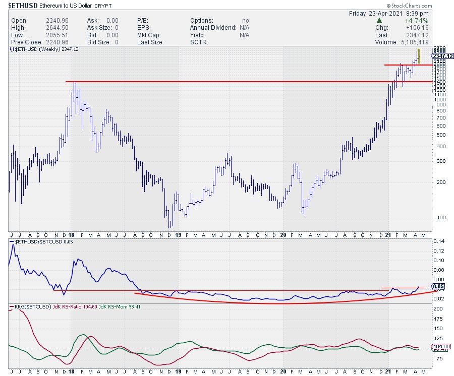
The chart of ETH is a bit longer-term and on a log scale, so we can better see the magnitude of the moves. It does limit the possibility of drawing angled trend lines, but it does give a good insight into how ETH is now managing to hold up above its Feb highs. Where BTC did not manage to hold above its previous highs, especially the FEB high, ETH remains comfortable above that breakout level, which shows that buyers are happy to pick up Ethereum above that $2k area. That possibly makes it THE strongest cryptocurrency at the moment.
Another benefit of this longer-term chart for ETH is that we can see the development against BTC over a longer period. After a decline in relative strength in 2017-2018, the negative momentum for ETH/BTC started to fade and, from late 2018 until now, ETH's relative strength vs. BTC slowly started to turn around. And, at the moment, ETH is breaking above that long-term overhead barrier, possibly igniting an acceleration of this strength.
For the time being, ETH is the new favorite kid on the block(chain).
#StaySafe, --Julius
My regular blog is the RRG Charts blog. If you would like to receive a notification when a new article is published there, simply "Subscribe" with your email address.
|
| READ ONLINE → |
|
|
|
| ChartWatchers |
| Will a Capital Gains Tax Take the Markets Down? |
| by Mary Ellen McGonagle |
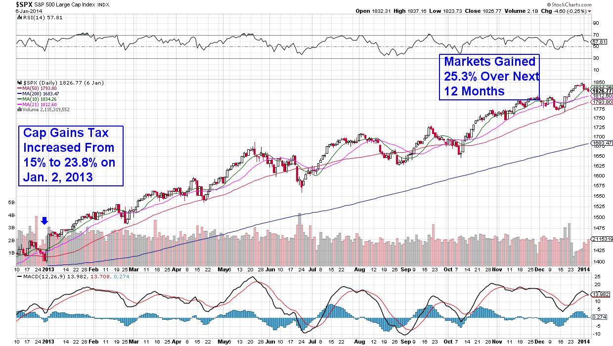
Next week, in a speech to Congress, Biden is likely to detail the tax plan he outlined during his campaign. Reports suggest that the capital-gains tax rate on people earning more than $1 million a year would increase from 20% to 39.6%. That would be the highest tax rate on investment gains since the 1920s, with the expected tax increases going to pay for proposed education and antipoverty programs.
At first glance, higher tax rates for capital gains may appear a bad thing for stocks. However, historical precedence doesn't bear this out, as the past two tax increases, in 1987 and 2013, were followed by a strong market for the following 6 months.
DAILY CHART OF S&P 500 JANUARY 2013 - JANUARY 2014

Similarly, the economy was healthy both those years, with an accommodating Federal Reserve as well as fiscal stimulus giving an edge to current economic conditions. Should we get a tax rate increase this year, analysts expect some selling towards the end of 2021, but overall, it's anticipated that the markets – which have already been forewarned of a tax hike – will be able to digest the news.
That's great news for subscribers of my MEM Edge Report, as, this weekend, I'll be revealing a stealth rotation that's taking place in the markets and the best stocks to take advantage of it.
If you'd like to receive this report on Sunday, take a 4-week trial of my MEM Edge Report for a nominal fee. Three of the top 10 Dow stocks as well as 3 of the top Nasdaq performers from today are on this report's Suggested Holdings List. Use this link here to view an example report!
Warmly,
Mary Ellen McGonagle
MEM Investment Research
|
| READ ONLINE → |
|
|
|
| The Canadian Technician |
| Bitcoin Under $50,000 - Opportunity? |
| by Greg Schnell |
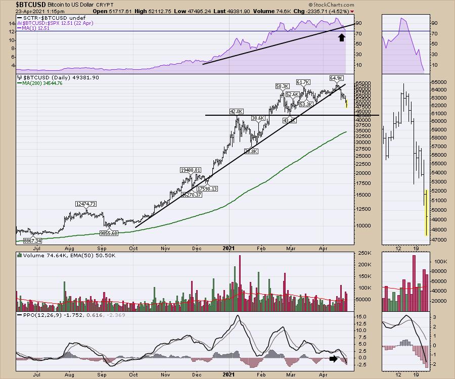
Friday morning saw Bitcoin's price bar dip under $47,500. This took out the March low, so we now have a lower low in place. While the Bitcoin bears have been clamouring to be right, the price move down of 27% from a week ago has given the opportunity to make money on the downside move of the coin price. Technicians will be looking at $42,000-$43,ooo as a support level. With Bitcoin ranging $5000 / day, that can be just a day away.

One of the things I am noticing is the momentum waves shown by the PPO are getting lower on every rally since the beginning of the year. It is also notable that the PPO is moving below zero for the first time since September. The real question is, does momentum dip like September and start to rally at $43,000 as support? Or has Bitcoin lost its momentum for a longer period of time, with $28,500 and $19,500 acting as the next support levels?
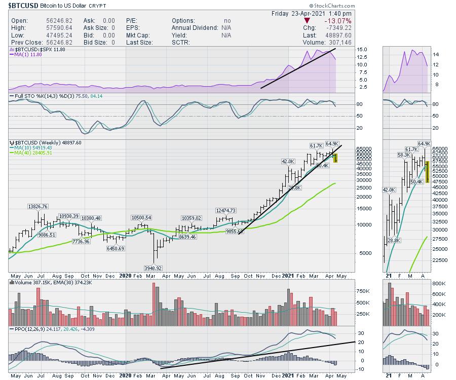
Using the weekly chart, the situation looks more significant than just a bounce at $43,000. When I see big changes in relative strength, that is a caution. The uptrend in relative strength is shown on the purple area chart. The real issue is that Bitcoin's outperformance has broken the uptrend. When something that was outperforming the S&P 500 significantly stops outperforming, that is a sell signal for me. Not only is it not trading in line with the S&P 500, it has started to underperform since the beginning of April. Now the price trendline is breaking and the PPO sell signal that we saw 4 weeks ago was a good signal to avoid a 27% move down.

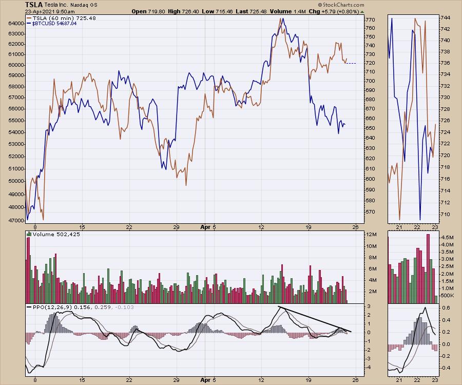
One of the concerns is that Bitcoin has been moving as a proxy for momentum trading or growth investing since the Nasdaq high in February. Some ways to view that are just simple line charts. Is Tesla (TSLA) starting to separate from Bitcoin?

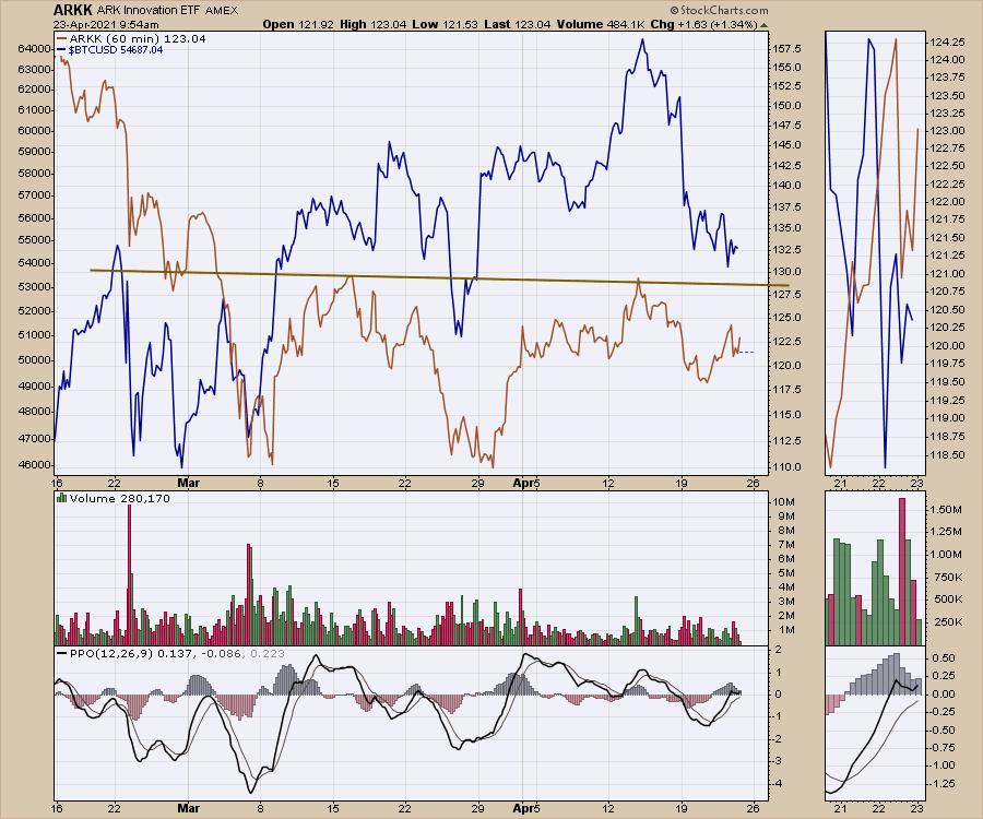
How about ARK funds? Here is Cathie's K fund (ARKK). The brown line represents resistance for the Innovation ETF. A break above $130 would create a higher high and a higher low, which is the definition of an uptrend.

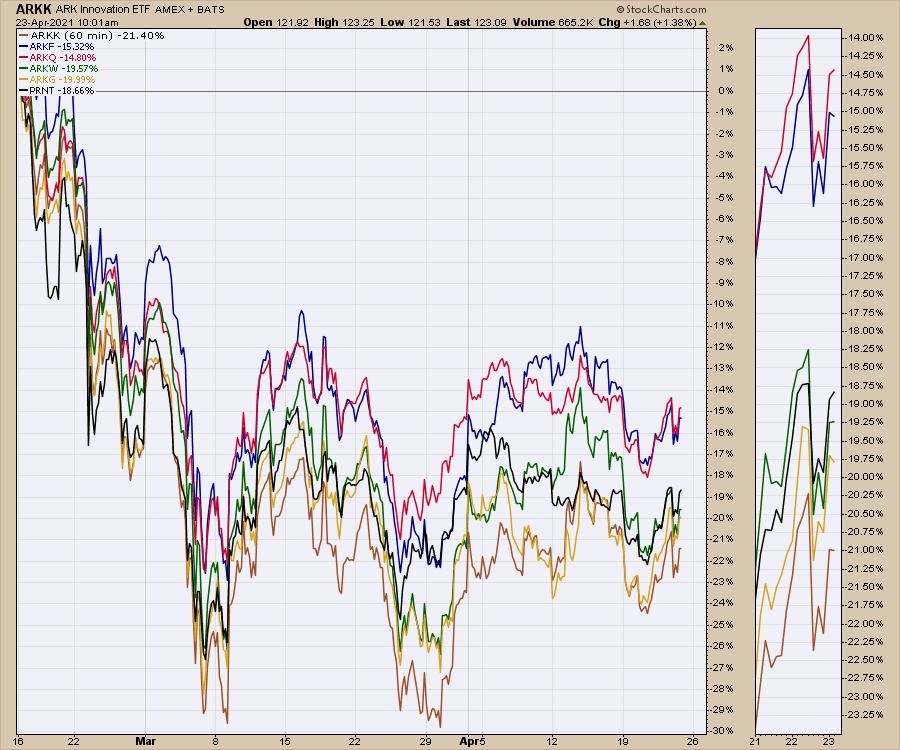
Probably the best view for a return to growth is the breakout in all of these ARK funds. It doesn't seem to matter what they are invested in; they are trading off the same computer algorithms.

So the view for Bitcoin is that it needs to build a base, and the ARK funds are also trying to build a base. A return to these more speculative/momentum investing styles is probably when the ARK funds break out of the base. Lots of stocks within the funds are concept stocks or stocks that are early in their growth with little to no positive earnings. As the market takes a risk-on approach, we should also see the volumes in the ARK funds increase, as the volume has been decreasing over the last two months, shown on the ARKK and Bitcoin chart (two charts up). Recently, the momentum has moved into the large-cap tech and, until these charts start to disrupt that flow, it would appear that the mega-cap names are the place to be hiding.
|
| READ ONLINE → |
|
|
|
| Dancing with the Trend |
| Choosing Frustration Over Devastation |
| by Grant Morris, Greg Morris |

Trend following can offer benefits as an investing approach even when not generating positive returns. Sometimes the benefit comes from not losing, or not losing as much as other investment approaches; other times the benefit comes from allowing you to sleep more soundly at night, as selling out of equity positions before the stock market goes into a correction or a bear market is much more comfortable and will reduce an investor's stress and anxiety.
While being defensive during market selloffs can be comfortable, a frustrating part of trend following is that you often have many small loss trades or miss out on some potential upside while being defensive. This must be tolerated to realize the long-term benefits of the approach. Investors who focus on every trade and very short-term results tend to not be good at trend following – they're usually the same investors that are not good at sticking with other approaches either. There is no such thing as a strategy that is going to be positive every day or in every trade. There is also no way to reliably "call" market tops and bottoms – many try to guess that certain days are a top or bottom, and sometimes are shown to be correct in hindsight, but they're really just guessing.
The last few months have been one of the frustrating periods in our trend following strategies, which focus specifically on the Nasdaq market (some of our reasons for focusing on the Nasdaq have been discussed in previous articles, like: Building a Rules-Based Trend Following Model - 6 | Dancing with the Trend | StockCharts.com). The Nasdaq Composite had a strong uptrend from early November to mid-February then rolled over and went into a correction in March, as investors were rotating out of tech and growth stocks and into value stocks. Investors watching only the S&P 500 Index or Dow Jones Industrials Average might not have noticed the correction since those indices were never down more than 5% while the Nasdaq Composite was down 10.54% on March 8th (and has yet to fully recover, although the closing value on 4/16 was close).
The purpose of our trend following approach is to participate in as much market upside as we can, but to avoid the devastation of large losses. Below is a graph of how our model handled this time period.

We participated in the uptrend from mid-November to mid-February and got stopped out of equity positions in late February as the Nasdaq was selling off. We were defensive (and sleeping comfortably at night) as the Nasdaq continued to sell off into correction territory in March. The Nasdaq began trending up on March 10th, but it took until April 5th for our model to indicate a buy signal, whereby we got back invested in equities just above the level at which we went defensive in February. While selling out of the equity ETFs to protect capital prior to the Nasdaq moving into a correction was beneficial to our sleep and our investor psyche, it ultimately did not boost returns. The defensive positions that we use in Trend Plus did not go up while we owned them since we never saw panic selling in equities or the flight-to-safety trade that usually causes those defensive positions to pay off. We also bought back into the equity ETFs at a higher level then we sold, so now, and ONLY with the benefit of hindsight, can we say we would have been better off not selling at all.
Why then do we move defensive during times when it often doesn't increase our returns? A bit too obvious to state but we'll do it anyway, every bear market starts first as a correction, and every correction starts first as a 5% pullback. If you want to run a tactical rules-based strategy, you must decide what size decline you are willing to withstand in an effort to deliver the results you want. This is a balancing act between selling early to avoid further losses and not selling too soon to allow participation in potential upside. The tighter your stops, the more whipsaw trades you will have but you'll also be getting out sooner when the 5% drawdown does turn into a 10% correction or a 20% or more bear market. Wider stops keep you invested longer with fewer whipsaw trades, but you move to protect your capital more slowly when the big pullbacks come. Deciding what stop level is best for you to use is as much about testing what worked in the markets historically as it is about making a behavioral assessment on what you (or clients) can tolerate. Our Trend strategies have stop levels that fluctuate between 1.25% and 6% and are dependent on our model readings of the strength of the uptrend.
Be careful about trying to calculate an "optimal" stop level based only on how it performed historically. This can be problematic because as soon as you start using it in live trading, it likely won't perform as optimally as your backtest and after a few painful whipsaw trades, you may decide a new "optimal" stop level is needed. Constantly tweaking your rules based on recent trades is the same as not having rules to begin with.
While sometimes our trend following approach can be frustrating, we'll take frustration over devastation every day of the week. Devastation is what you experience in a bear market. Riding the market down 20%, 30%, or 50% is not something we or many other investors can handle. Investors that use a buy & hold approach, or that always maintain a certain level of equity exposure, will be faced with significant drawdowns at some point, and maybe many times during their investment horizon. When the pain of those large losses is too great, investors always sell out of their equity positions. They are then too gun-shy to get back invested after a recovery takes hold, and their investment portfolios never recover. That is the devastation we aim to avoid.
The frustration that we accept in our approach, in place of this type of devastation, is having whipsaw trades, negative trades, accruing losses in defensive positions waiting for a new uptrend, and sometimes missing out on upside when benchmarks are making new highs (e.g., the S&P 500 made a new high on March 11th when we were still defensive). While never fun, the frustrating times in our Trend strategies are more than worth it based on the long-term results. Portfolios compound at a higher rate of return when you have good upside participation and can avoid large losses. We like those better long-term results and can sleep easier with avoiding panic selling in bear markets, not worrying about making money on every trade, and not focusing too much on short-term results.
If you like that too and are interested in using our trend following strategies, you can reach out to Grant directly by email (grant@mscm.net). Grant manages various tactical and trend following strategies at McElhenny Sheffield Capital Management for individual investors and other registered investment advisors, and Greg is a senior advisor to the firm.
Lastly, in our January article we mentioned a version of our trend following strategy that uses leverage, called Trend X. In this strategy, we invest in the TQQQ ETF when our model calls for equity exposure. TQQQ is an ETF that delivers three-times the daily return of the QQQ (Nasdaq 100) ETF. Leverage can be a powerful tool but comes with additional risk and it exacerbates moves to the downside. We don't think anyone should buy a levered ETF for long-term investing as the downside can be extreme. During the 2020 bear market, for example, TQQQ was down nearly 70%. In our Trend X strategy, however, we feel comfortable trading TQQQ because our model usually has us defensive during these extreme downside moves, and we get the benefit of the leverage compounding our returns in the uptrends. Below are the results of this approach, which provided a return of 101.1% in 2020, net of fees. This is a strategy that we can only offer to Qualified Clients, per SEC rules.
   
Dance with the Trend,
Greg Morris
Grant Morris
|
| READ ONLINE → |
|
|
|
| Mish's Market Minute |
| Are the Major Indices Poised for a Powerful Up Move Monday? |
| by Mish Schneider |

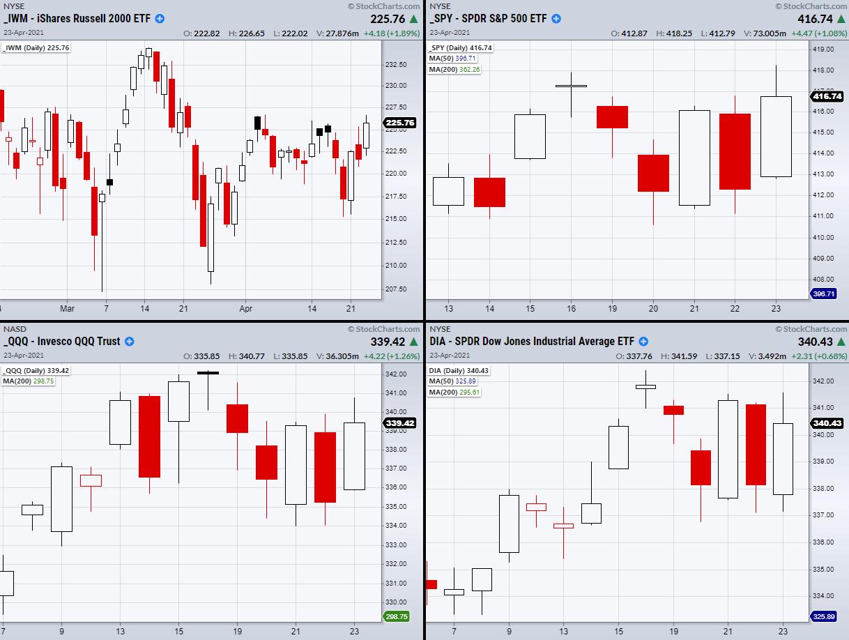
The Russell 2000 (IWM), Nasdaq 100 (QQQ), Dow Jones (DIA) and S&P 500 (SPY) all have the potential to make large moves Monday, if they clear their resistance levels together.
This month, the SPY, QQQ and DIA were able to make substantial gains. Currently, they sit close to new high territory. Additionally, each has resistance from a prior high created on Friday the 16th. However, IWM never made a move back towards all-time highs and has spent most of April struggling to hold over the 50-day moving average at $222.98. On Friday, IWM came close to clearing its monthly high at $226.69, but missed by 5 cents!
This makes Monday a pivotal day for the small-cap sector, as clearing the 226.69 price level will mean that IWM is finally looking to get back on track towards its all-time high price at $234.53. That would also be a great sign for the other indices that could use the boost of IWM's resistance break to push themselves higher.
It should also be noted that, because IWM spent most of its time trading sideways this month, it has the most potential for an explosive move higher when compared to the other indices. If the situation lines up, we could have a great continuation from Friday's bullish close.
With that said, we should be careful to set such high expectations, as the market plays by its own rules. This means that for Monday, we should look not only for a break of these key resistance points, but also for a large push in momentum through them. Some of the best breakouts can be confirmed with large amounts of volume to back them up.
Watch Mish use the Real Motion indicator to find hidden strength in stocks and ETFs in this week's episode of StockCharts TV's Mish's Market Minute!

ETF Summary
- S&P 500 (SPY): Needs to clear 417.91 and hold
- Russell 2000 (IWM): Resistance 226.69
- Dow (DIA): 342.43 resistance
- Nasdaq (QQQ): 342.23 resistance
- KRE (Regional Banks): Needs to clear 68.43 April's highs
- SMH (Semiconductors): Holding over 242.59 the 50-DMA
- IYT (Transportation): New highs
- IBB (Biotechnology): Second close over 50-DMA at 154.65 confirms bullish phase
- XRT (Retail): Cleared recent high of 93.33
Forrest Crist-Ruiz
MarketGauge.com
Assistant Director of Trading Research and Education
|
| READ ONLINE → |
|
|
|
| MORE ARTICLES → |
|
 Chart 1
 Chart 2
 Chart 3
 Chart 4
 Chart 5
 Chart 6
 Chart 7
 Chart 8
 Chart 9


 What we see is that all tails are on the right side of the RRG, which means that all these cryptos are in an uptrend vs. BTC. In Crypto-Lingo, it is (or maybe it was) ALT-season...