| THIS WEEK'S ARTICLES |
| John Murphy's Market Message |
| ECONOMICALLY-SENSITIVE STOCKS HAVE BEEN OUTPERFORMING TECHNOLOGY |
| by John Murphy |
TECHNOLOGY HAS BEEN A MARKET LAGGARD... With the economy showing signs of strength, money has been rotating into more economically-sensitive sectors at the expense of technology stocks. The table in Chart 1 shows materials, energy, and financials being the three strongest sectors over the last month, while technology has been the weakest. That explains why the tech-dominated Nasdaq market has been lagging behind the Dow and S&P 500. And explains why the chart of the Nasdaq market may hold important clues to stock market direction.  Chart 1 Chart 1
NASDAQ BOUNCES OFF CHART SUPPORT...Tuesday's message showed selling in the Nasdaq Composite Index testing two important levels of support. One was its 50-day moving average; and the other being potential support along its March high. Today's chart shows Invesco QQQ Trust bouncing off both support levels which is an encouraging sign for it and rest of the market. While that's happening, the Dow and S&P 500 are hitting record highs. Today's rally in stocks is coming despite a big miss in April's employment report.
 Chart 2 Chart 2
WEAK JOBS REPORT...The April jobs report released this morning showed only 266,000 new jobs created which was well below expectations for a million jobs. And the unemployment number increased to 6.1%. Stocks, however, have rallied on the disappointing report. The thinking appears to be that the weaker employment numbers reduced pressure on the Fed to hike interest rates anytime soon and to postpone any move to cut back on bond purchases which could push bond yields sharply higher. That latter point may also explains today's buying of technology shares. Bond yields initially fell on the jobs report, but have since rebounded. Chart 3 shows the 10-Year Treasury yield recovering from this morning's sharp drop.
 Chart 3 Chart 3
|
| READ ONLINE → |
|
|
|
| ChartWatchers |
| Putting Forward a Candidate to Take Over Tech Leadership |
| by Martin Pring |
A couple of weeks ago, I posted an article questioning whether the tech-dominated NASDAQ still had the mojo to lead the market higher. At the time, many sub-surface indicators, such as breadth, volume and relative action, looked weak. Several charts indicated that many of them had experienced multiple negative divergences, but none had yet broken the trend. When they did, that would be the time to anticipate some extended weakness. My conclusion was more oriented to relative as opposed to absolute performance.
In the intervening two weeks, the NASDAQ Composite has succeeded in edging out a marginal new high, but breadth, volume and especially relative action failed to confirm. This week's action has actually seen the violation of several important trendlines. We'll focus on some of those areas to start with, subsequently examining NASDAQ and tech relative action. Finally, I'll try and answer the question of, if tech has lost its relative mojo, which sector looks as though it may be taking over.
Questionable Internal NASDAQ Indicators
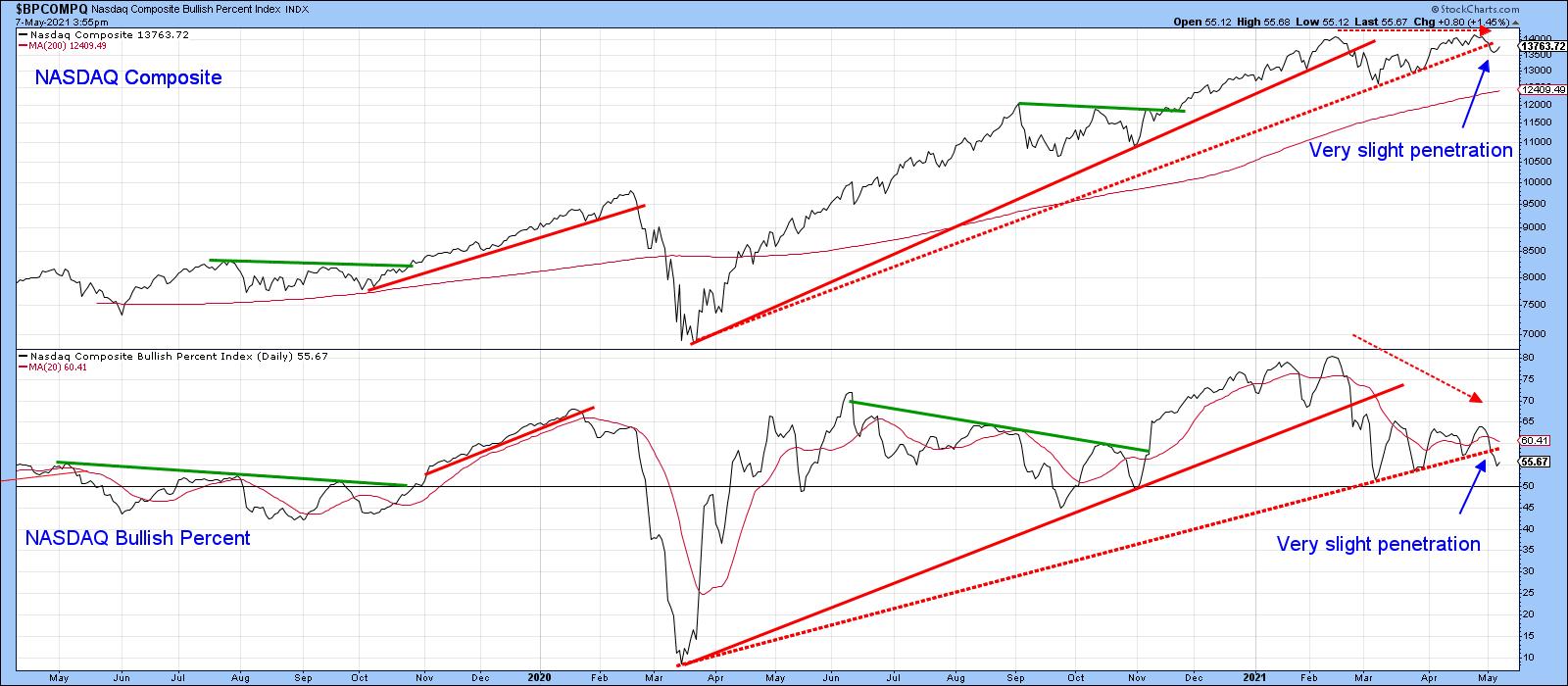
Chart 1 compares the NASDAQ Composite to its bullish percent indicator. I have plotted three sets of solid trendlines to show that joint breaks usually result in important changes in trend. The two dashed lines are now under threat, as the bullish percent has just begun to edge through its line and the Index is precariously balanced. Note that the late April high was accompanied by far fewer stocks in bullish trends than the February peak.
 Chart 1 Chart 1
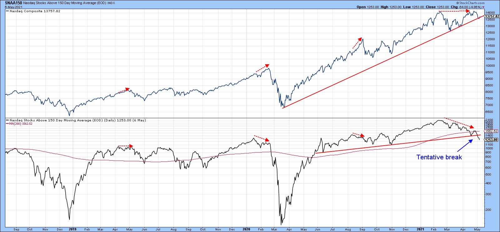
Chart 2 shows that three previous intermediate peaks were associated with a negative divergence between the Index and the number of NASDAQ stocks above their 150-day moving averages. Last week's high experienced the largest divergence of all. Now, the indicator has dropped below its 2020-2021 secondary up trendline and 200-day MA. The implication is that the number of stocks trading above their 150-day MA is likely to shrink, which should pull the Index down with it. Even if it does not and the NASDAQ moves higher, this deteriorating indicator points up the probability that it will be a progressively selective market.
 Chart 2 Chart 2
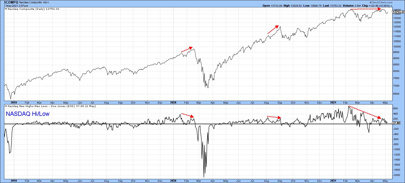
NASDAQ new high/low data is also sporting a negative divergence in a similar manner to the two 2020 peaks flagged in Chart 3.
 Chart 3 Chart 3
Tech Relative Strength is Weakening
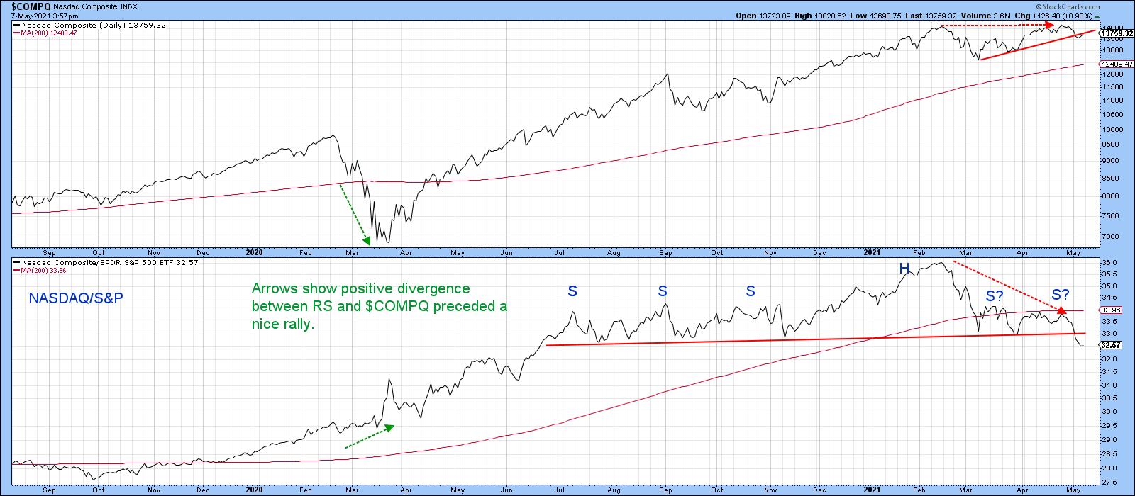
Chart 4 shows that a major negative divergence between the Index and its RS line against the S&P Composite has been building up since February. This indicates that the latest high developed from a strong market pulling the NASDAQ higher, as opposed to its ability to rally based on its own momentum. Now, the RS line has completed a one-year complex head-and-shoulders top. That does not mean that the NASDAQ Composite will decline in its own right. However, it strongly hints that this tech-dominated sector no longer has the ability to maintain its previous upside leadership. Relative weakness is not just concentrated in one area but also shows up in many tech sub-sectors. This contrasts with the positive RS action that preceded the March 2020 low and the huge tech-dominated NASDAQ rally that followed.
 Chart 4 Chart 4
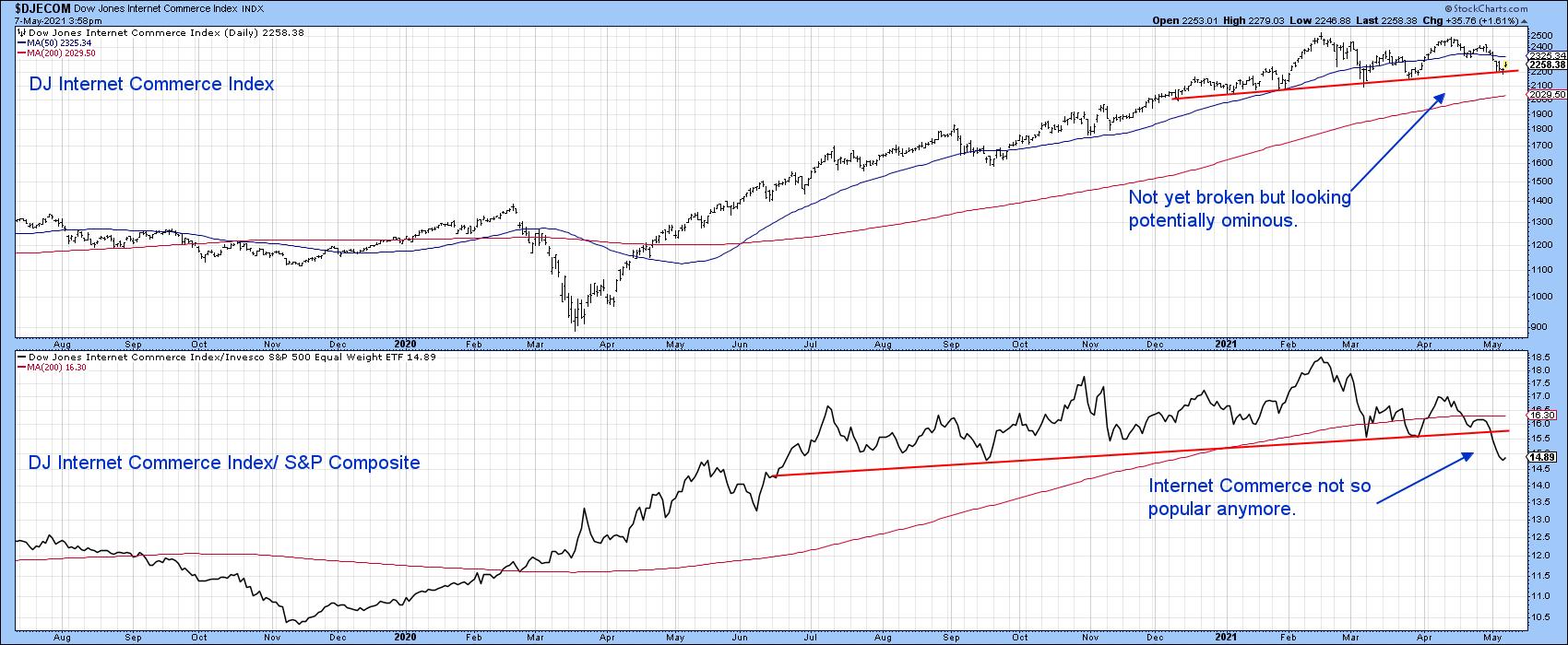
For example, the Dow Jones Internet Commerce Index (Chart 5) has been one of the stellar performers in the last decade or so. Its RS line has already penetrated the neckline of a head-and-shoulders top. The Index itself is right at the base of a smaller formation and has not yet broken down. It nonetheless looks potentially quite ominous.
 Chart 5 Chart 5
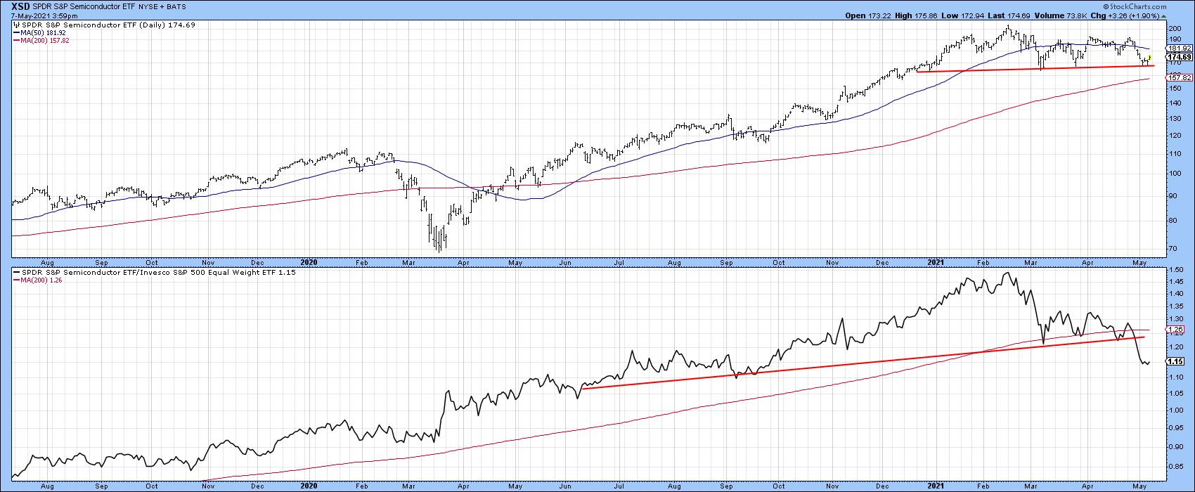
We hear a lot about chip shortages, which should be bullish for semiconductors. However, the SPDR Semiconductor ETF (XSD) has also completed a major RS top and dropped below its 200-day MA. For its part, the absolute price is still above its MA, but could easily violate that potential head-and-shoulders neckline.
 Chart 6 Chart 6
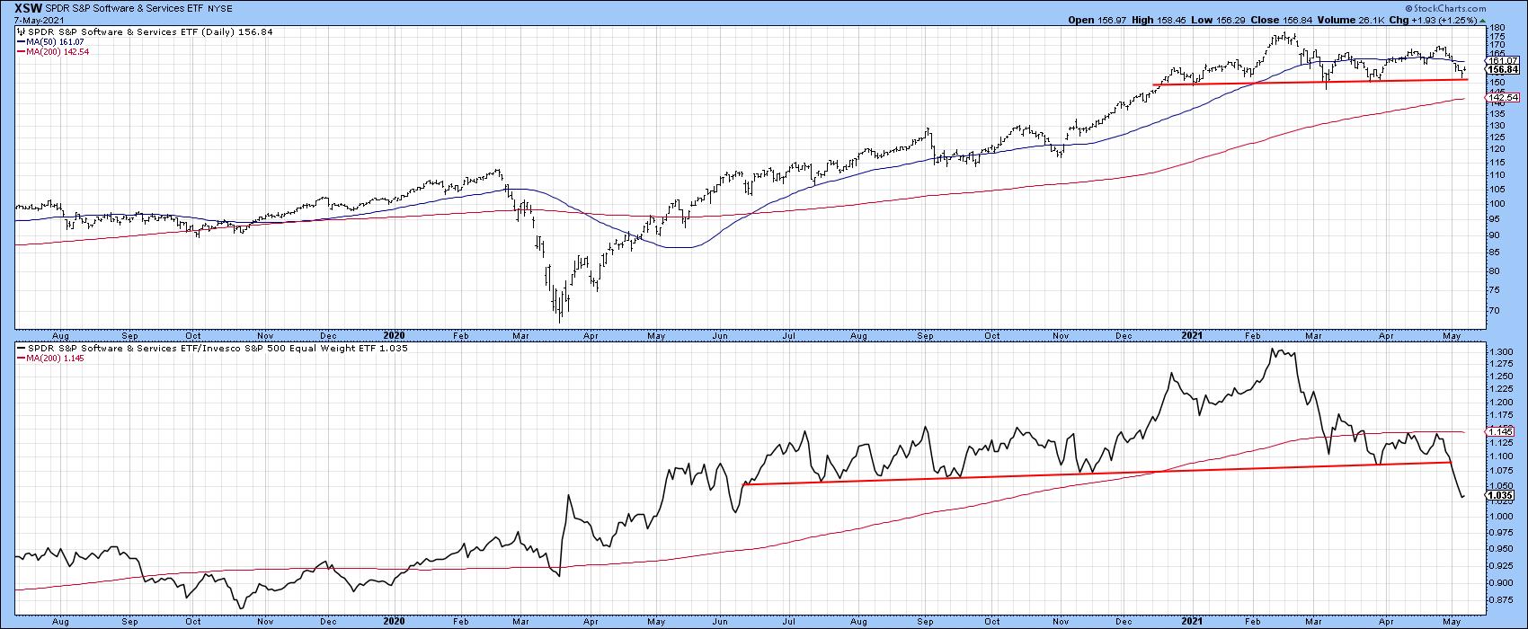
A similar picture is being painted in Chart 7 by the SPDR Software Services, as the RS line appears to be leading it lower.
 Chart 7 Chart 7
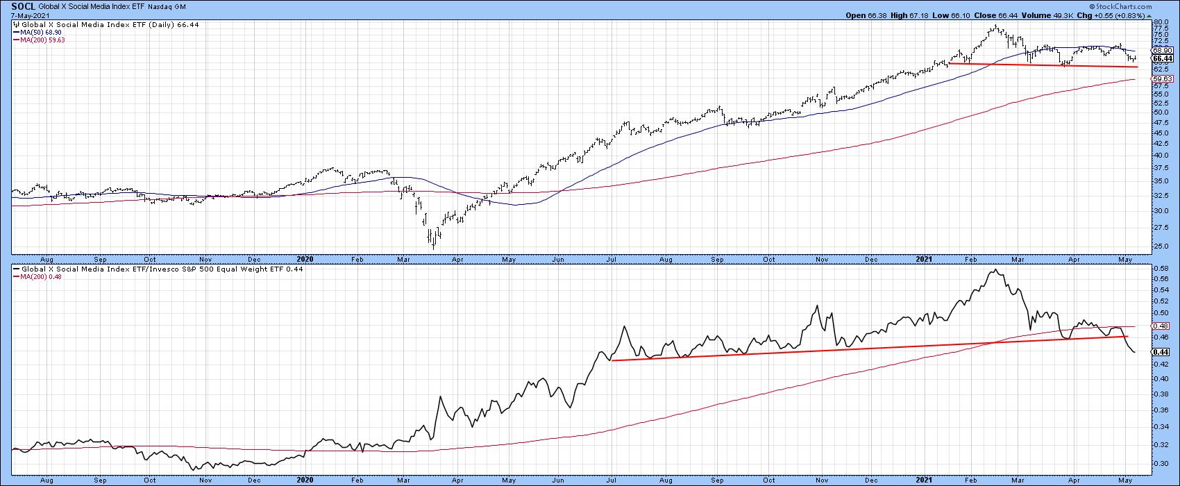
Finally, Chart 8 shows that the Global X Social Media ETF (SOCL) has joined the weakening relative strength party with a similar pattern to other tech areas.
 Chart 8 Chart 8
Where is the Next Leader?
There is always a bull market in relative strength because it rotates. If the tech-dominated NASDAQ has lost its mojo, it's worth answering the question, "What's likely to take over?"
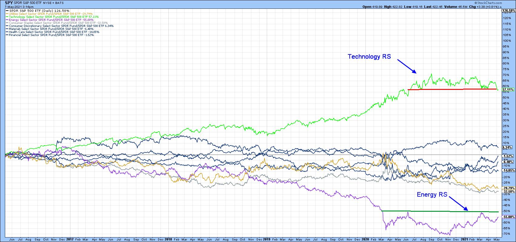
Chart 9 shows the relative performance of several key sectors over the last five-years. The two outstanding performers were tech on the upside and energy on the downside. The tech RS looks toppy, whereas energy is likely forming a base.
 Chart 9 Chart 9
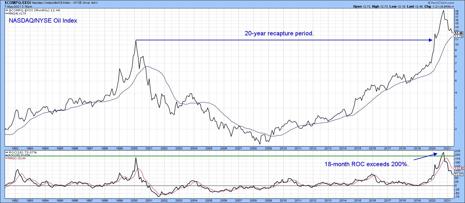
When we run a ratio between them two of them, as in Chart 10, you can see that technology recently experienced a record-level superior performance and has since reversed to the downside. Note that the 18-month ROC was recently trading at a reading slightly north of 200%. The last time it reversed from around that level, it took 20 years to recapture all the losses and move to a new high. That's exactly the same as the average of from 24 historic cases that I have been able to identify going back 50 years or so. Bottom line, if that 18-month ROC has peaked, history suggests that the ratio is unlikely to take out its 2021 high for many years to come.
 Chart 10 Chart 10
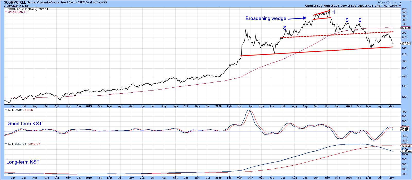
Finally, Chart 11 shows a similar ratio, substituting the SPDR Energy ETF for the $XOI. It throws open the possibility that this relationship is tracing out a large complex head-and-shoulders top. It's already completed a small distribution formation, dropped below its 200-day MA and triggered a long-term KST sell signal. We are likely to soon find out soon if that potential head-and-shoulders will be completed. That's because the short-term KST has just gone negative, therefore placing downside pressure on this key ratio.
 Chart 11 Chart 11
It's important to bear in mind that this is a relative relationship, so completion of the top would only point to the probability that energy will outperform the NASDAQ Composite. It does not speak to the direction of either of its components.
This is an updated version of an article previously published on Wednesday, May 5th at 11:34am ET in the member-exclusive blog Martin Pring's Market Roundup.
Good luck and good charting,
Martin J. Pring
The views expressed in this article are those of the author and do not necessarily reflect the position or opinion of Pring Turner Capital Group of Walnut Creek or its affiliates.Tech Leadership
|
| READ ONLINE → |
|
|
|
| ChartWatchers |
| One Industry That's Failed Miserably During Earnings Season |
| by Tom Bowley |
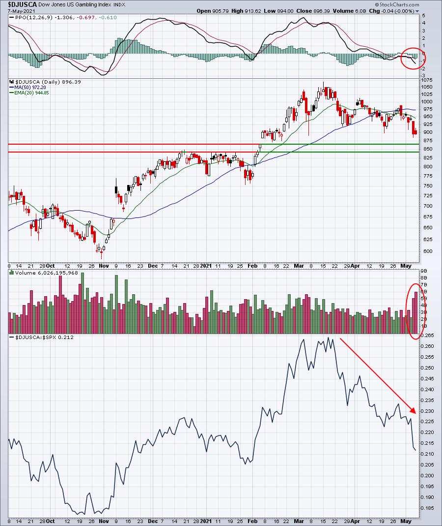
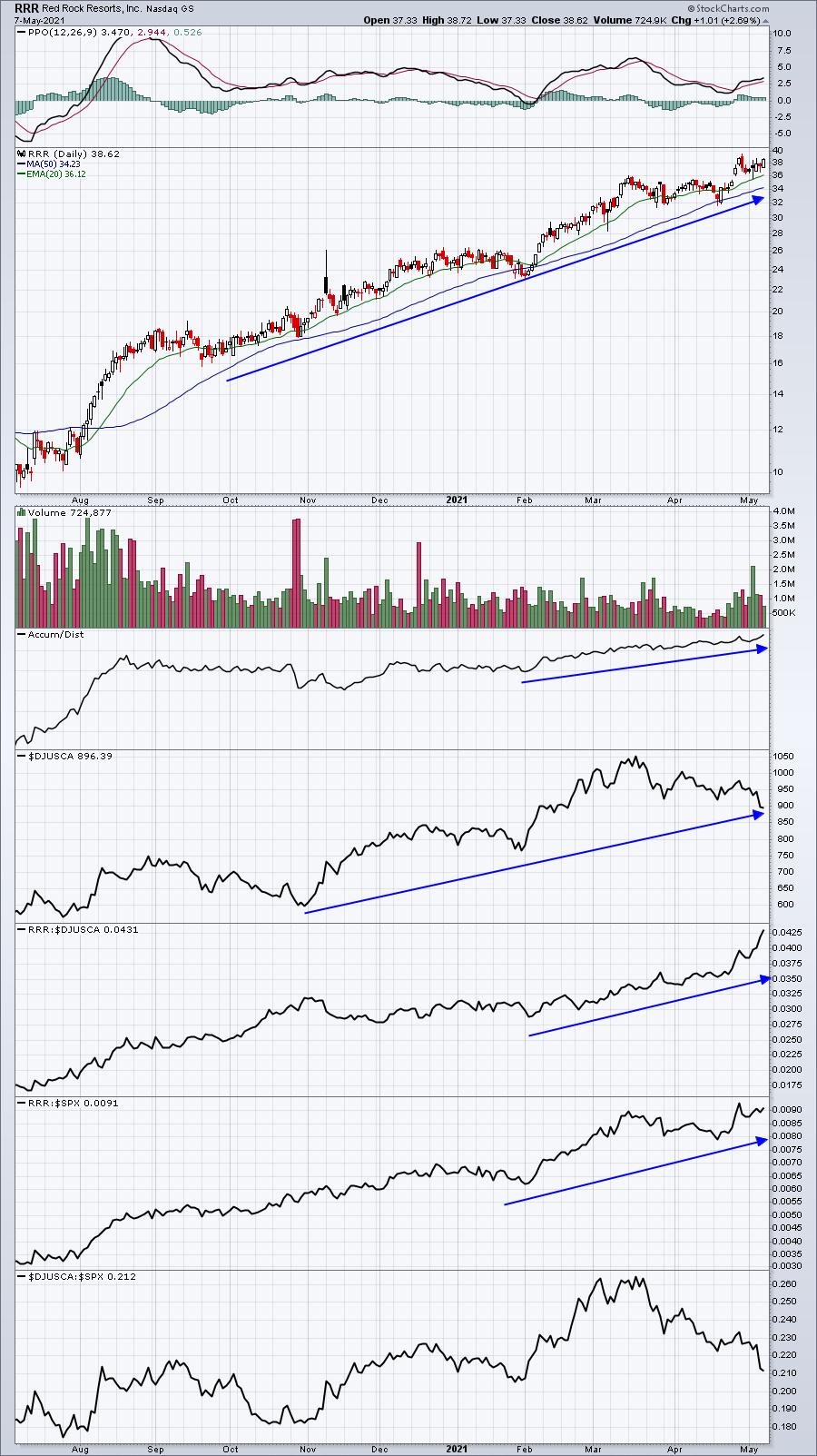
I could provide a solid list of earnings season failure nominees like semiconductors ($DJUSSC), software ($DJUSSW), and medical equipment ($DJUSAM). However, I'm going to give the award to gambling ($DJUSCA). Since the big banks kicked off earnings season on April 14th, we've seen 8 gambling stocks with market caps greater than $1 billion report their quarterly results and, quite honestly, Wall Street hasn't cared a bit. The initial reactions have been strong with 6 of the 8 gapping higher at the opening bell after reporting results, but by day's end, only 1 gambling stock was able to close above its open. And, on average, these 8 gambling stocks lost more than 4% from opening bell to closing bell. That's the opposite of accumulation and is cause for concern.
Technically, we saw the DJUSCA close on Friday at its lowest level in the past 2 1/2 months:

The daily PPO has taken a very bearish turn to the downside, while price support from recent lows has been lost. Throw in the deteriorating relative strength and it's easy to be bearish this group right now. The only gambling stock to have closed above its open - a possible sign of accumulation - is Red Rock Resorts (RRR). Everything on this chart remains very bullish. If you're going to own a stock in a week industry group, make it the one with the best relative strength - like RRR:

On Monday, May 10th at 4:30pm ET, I'll be discussing many areas of the market during our "Sneak Preview" webinar of our upcoming May 19th draft, when we select the 10 stocks that will be equal-weighted in each of our 4 portfolios. It's important to identify the leading areas and then further research to find the leading stocks within those areas. This will all be covered during our Sneak Preview webinar. For more information on how to register for this FREE event, CLICK HERE.
Happy trading!
Tom
|
| READ ONLINE → |
|
|
|
|
|
| ChartWatchers |
| RRG Tails Have a Story to Tell |
| by Julius de Kempenaer |

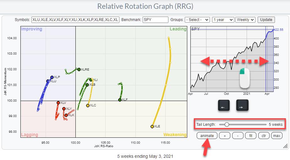
One of the main characteristics of a Relative Rotation Graph is the "tail," which shows us the sector's trajectory through recent history.
Tails illustrate how the security ended up in the position where it currently is, helping us to view current rotations and create a big picture/high-level overview of how all elements in the universe are behaving against the benchmark and each other. But that tail in itself holds a lot more information that we can use when analyzing/interpreting a Relative Rotation Graph.
Control and Animation

The observations on the canvas of the RRG are the result of plotting the JdK RS-Ratio values on the horizontal axis and the JdK RS-Momentum values on the vertical axis for every security for several historical observations, then "connecting" the dots per sector.
The "Tail length" setting determines the number of historical observations. In the chart above, it is at five weeks. Changing the tail length by dragging the slider only makes more or fewer data points visible; it does not impact the position of those data points. It is NOT a variable, a lookback period, a parameter, etc.
Setting the tail length is purely cosmetic. When you have only a few securities on the RRG, you can use longer tail lengths, as there is enough room for them to be visible. When the RRG is crowded, it is usually better to have shorter tail lengths. I am always trying to find a balance between the number of securities on the graph and the tail length to keep things readable.
The good news is that we can animate the history of the tail so we can still observe longer-term rotations even when we have a crowded RRG. There are three ways you can animate the rotations on the RRG.
- Clicking the animate button, which toggles between animate and pause so you can stop and go again.
- Clicking and holding the left mouse button, then dragging the shaded area in the benchmark chart.
- Using the arrow keys on your keyboard to step through history.

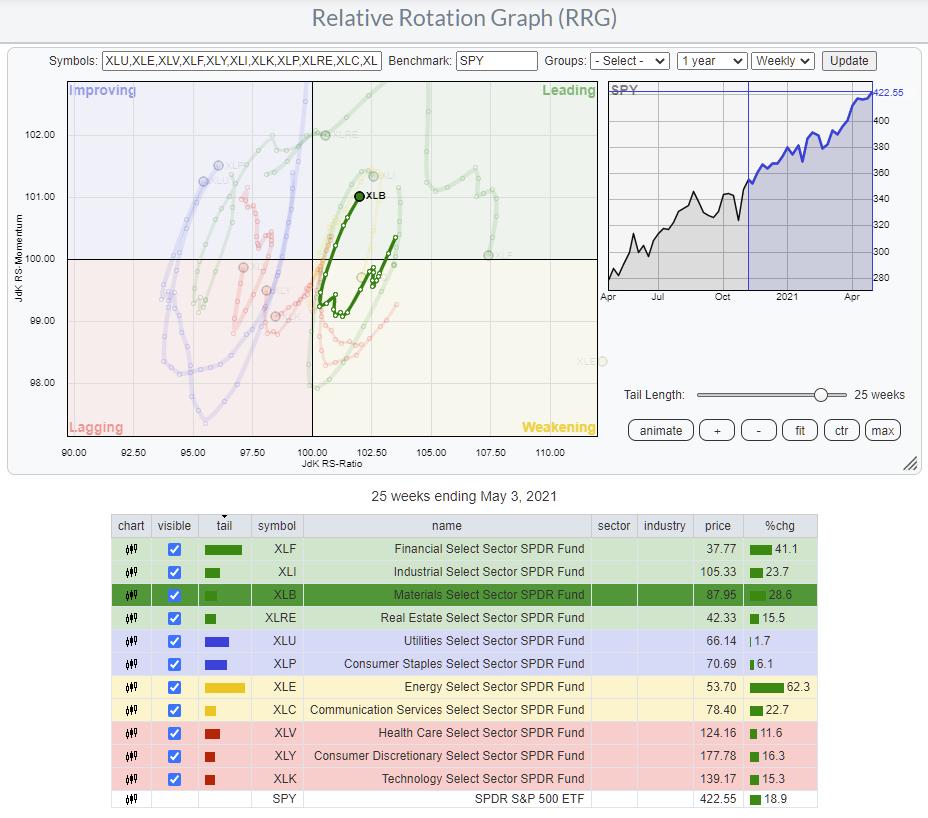
Another handy feature is the possibility of "highlighting" a tail on the RRG.
When you click on a line in the table below the graph, that security will be highlighted while all others are dimmed. This makes the selected security stand out clearly and allows you to study the rotation better.
As you can see, this also allows us to use longer tail lengths without the chart becoming unreadable.
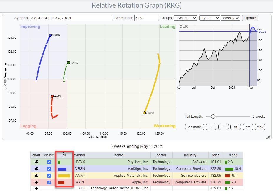
Thickness

If you watch closely, you may have noticed that the thickness of the tails is not always the same. The further away from the benchmark a tail, or better the last observation on a tail, is, the thicker the tail will be drawn.
In the example above, AMAT, inside the weakening quadrant, is furthest from the center and has the thickest tail. Also, note the bar length in the tail column in the table. The second furthest away is VRSN inside the improving quadrant, then AAPL inside lagging. PAYX, inside the leading quadrant, is closest to the benchmark and has the thinnest tail.
In general, securities that are moving or have moved far away from the benchmark have higher odds of turning around, mean-reverting, and therefore offer bigger opportunities to capture alpha vs. the benchmark.
Tail Length - RRG Velocity

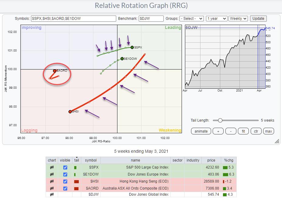
Another important source of information is the "length of the tail on the graph." Not the number of historical observations that are shown as discussed above, but the actual length of the tail on the graph.
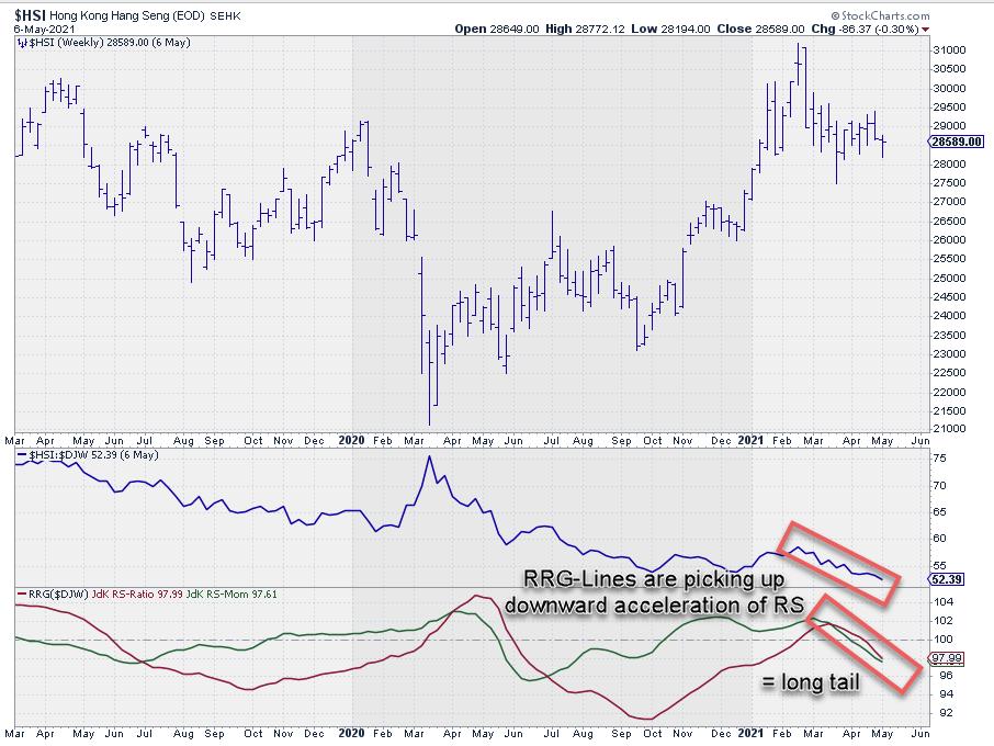
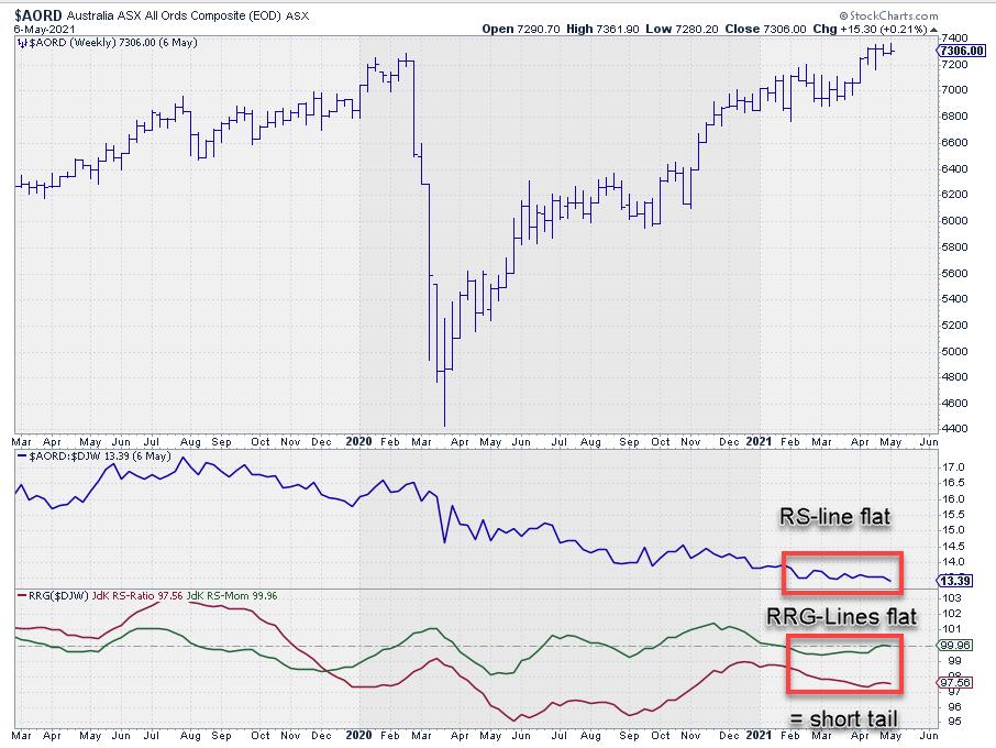
On the RRG above, the tail-length setting is at four weeks. So all four stock market indexes show four weeks of the historical rotation. But we can immediately see that the length of the tail for $HSI is much longer than the tail for $AORD.
The (in this case) five-week tail shows five weekly segments (six data points). The distance between two observations is called the RRG-Velocity. The sum of RRG-Velocity values over several periods gives the length of the tail on the graph. A long tail signals a strong move; it shows that there is momentum or power behind the move. A short tail, on the other hand, signals a stable trend.
 
Also, increasing RRG-Velocity -- the sections between observations getting longer -- signals an acceleration of a move/rotation, while decreasing RRG-Velocity signals a slow-down of a rotation.
RRG Heading

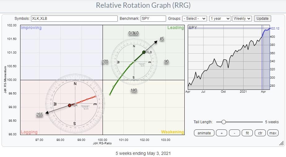
Finally, there is RRG-Heading. This RRG-Heading is a quantification of the direction in which the tail is traveling. The Heading is measured from the previous observation to the current observation using a compass.
On the RRG above, you see two tails; XLB inside the leading quadrant and XLK inside the lagging quadrant. On the XLB tail, I have positioned the compass with its center on the previous observation. Drawing an imaginary line from the center of the compass through the last observation of the tail gives the heading at the intersection with the compass. In this case, it is near 45 degrees. On the XLK tail, the Heading is around 255 degrees.
We have learned that an RRG-heading between 0-90 degrees, in general, is positive and leads to further strength, while headings between 180-270 degrees are a sign of weakness and generally lead to more weakness in the periods ahead. This is conceptually also easy to understand. A heading between 0-90 degrees means that the security is gaining on both axes, while the opposite is true when the heading is between 180-270.
The fact that tails can turn and start moving at or turning into another heading in any of the four quadrants is one of the unique features of Relative Rotation Graphs, which highlights turnaround situations in a very early stage which are very hard or impossible to detect on a regular chart.
If you would like a more visual and animated explanation, please check out the 4/20/21 episode of Sector Spotlight, in which I discuss "The Tale of the Tails."
The Tale of the Tails
#Please Stay Safe, --Julius
My regular blog is the RRG Charts blog. If you would like to receive a notification when a new article is published, "Subscribe" with your email address.
|
| READ ONLINE → |
|
|
|
| SPECIAL EVENT ANNOUNCEMENT |
| Don't miss your chance to hear our own David Keller at the upcoming MoneyShow Virtual Event, streaming LIVE May 11th - 13th. Click the banner below to learn more and register for the event. |
 |
| LEARN MORE → |
|
| DecisionPoint |
| ARK Innovation ETF (ARKK) Reaches Important Support Level |
| by Erin Swenlin |
This is an excerpt from today's subscriber-only DecisionPoint Alert report:
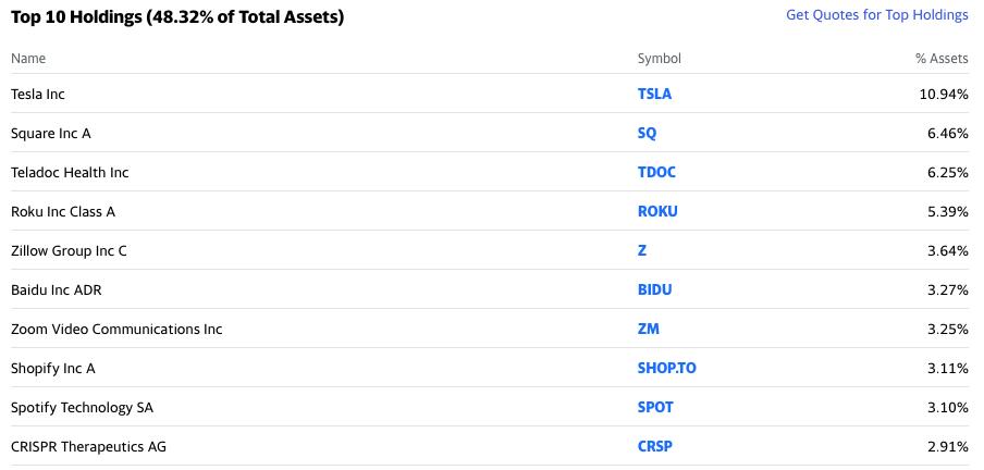
The family of ARK funds have received quite a bit of attention lately. In particular, the ARK Innovation ETF (ARKK) managed by phenom Cathie Wood, has been in the news for months. The fund is in what she calls the "disruptive innovation" companies. Their top ten holdings are below:

Given the Technology sector has been taking it on the chin, it doesn't surprise us that ARKK has been beaten up too. Unfortunately, the holdings above have not been performing well. According to the article today on CNBC, $290 million dollars left the fund last week.

Did you miss Monday's free DP Trading Room with Greg Schnell? No problem! Recording information is below:
Topic: DecisionPoint Trading Room with Greg Schnell
Start Time : May 3, 2021 08:46 AM
Meeting Recording Link.
Access Passcode: DP/May/03

Click here to register in advance for the recurring free DecisionPoint Trading Room! Recordings are available!
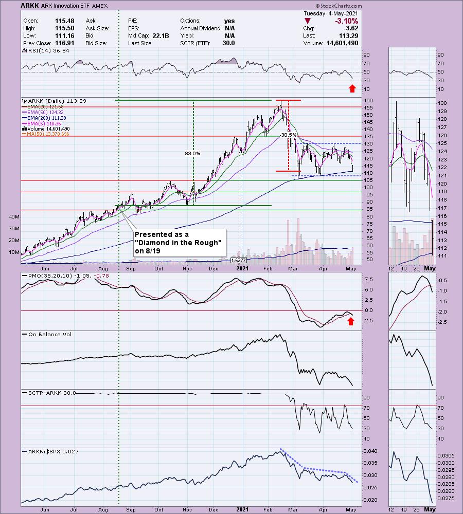
I actually presented ARKK to my Diamond subscribers back on August 19th 2020 (Diamonds subscribers can click here to view the report). The stop was never hit. Currently the position is up +29.5% since, but at the top, the position was up over 83%. Price is now testing the 200-EMA and the bottom of the current trading channel. Normally we would look at this as an entry to take advantage of the decline to this important area of support; however, the indicators are particularly ugly. The RSI is negative and not oversold yet. The PMO triggered a crossover SELL signal today well-beneath the zero line. It began underperforming the market late February and continues to underperform.

Conclusion: Given the very negative indicators, this is a high risk play despite price sitting on a support level that it previously rallied from. Consider this as well, she is adding more money to some of these positions in all of her funds. With the market beginning to top, I don't like it.
Happy Charting! - Erin
Technical Analysis is a windsock, not a crystal ball.
Helpful DecisionPoint Links:
DecisionPoint Alert Chart List
DecisionPoint Golden Cross/Silver Cross Index Chart List
DecisionPoint Sector Chart List
DecisionPoint Chart Gallery
Trend Models
Price Momentum Oscillator (PMO)
On Balance Volume
Swenlin Trading Oscillators (STO-B and STO-V)
ITBM and ITVM
SCTR Ranking
DecisionPoint is not a registered investment advisor. Investment and trading decisions are solely your responsibility. DecisionPoint newsletters, blogs or website materials should NOT be interpreted as a recommendation or solicitation to buy or sell any security or to take any specific action.
|
| READ ONLINE → |
|
|
|
| ChartWatchers |
| Base Breakouts Abound Amid Record First Quarter Earnings Season |
| by Mary Ellen McGonagle |
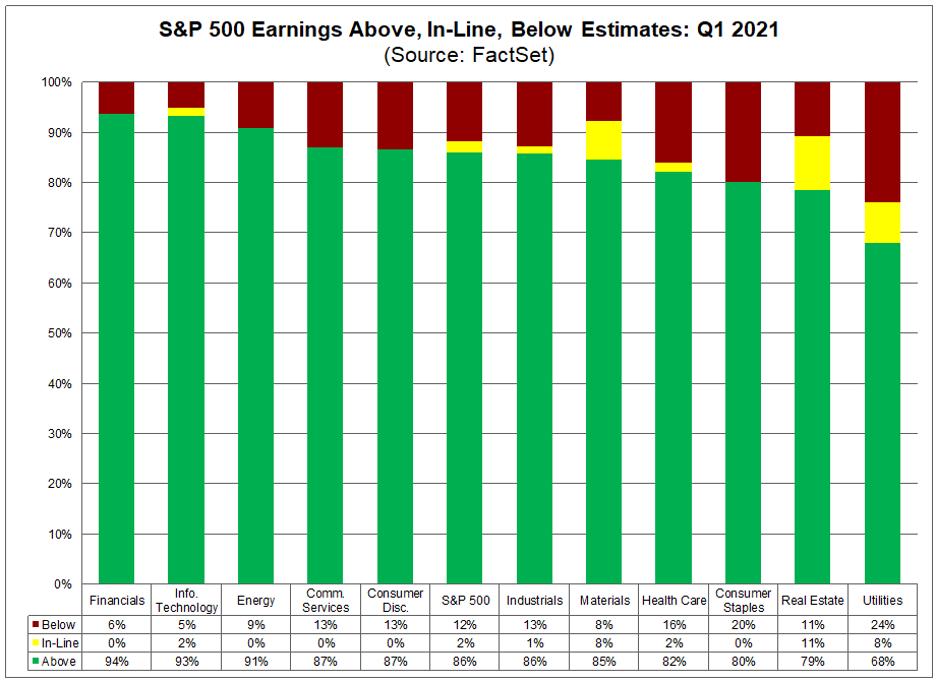
The S&P 500 is reporting the highest year-over-year earnings growth since the markets were emerging from the '08-'09 recession. In fact, over 85% of corporations are reporting first quarter results that are well above their estimates.
The chart below shows the percent of companies reporting earnings above their estimates by sector and, as you'll see, Financials, Technology and Energy are posting the strongest numbers.

Strong earnings results are one of the main ingredients in stocks that go on to far outpace the broader markets.
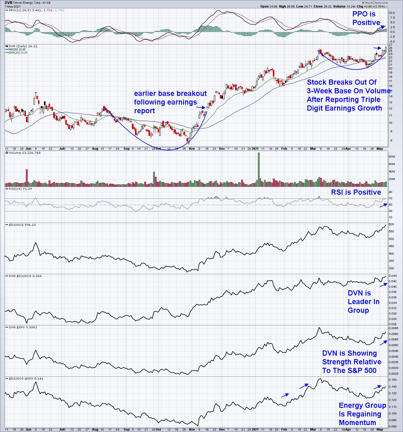
The second characteristic of a big winner is that it breaks out of a base on volume following the release of those strong year-over-year earnings. Below is a breakout stock from this week that also shows several secondary indications that you're in a name that's heading higher.
Oil and Gas producer Devon Energy (DVN) reported 1st quarter earnings late Wednesday that were 650% above last year's numbers. In addition, earnings were 37% above estimates.

Subscribers to my MEM Edge Report were first alerted to Devon Energy (DVN) last November after the company released strong earnings that helped the stock reverse a lengthy downtrend. Similar to last week, DVN broke out of a base on above-average volume.
High volume on your base breakout is a strong indication that your stock is likely to trade higher. This pickup in volume indicates that institutions want in, providing confidence that the breakout will take hold and turn into an uptrend.
Other characteristics highlighted above are a positive PPI and MACD, which indicate positive momentum and price action. This is along with the fact that your stock is in a strong industry group, which is shown in the bottom part of the chart above. In fact, industry group affiliation accounts for almost 50% of a stock's price movement, so you'll certainly want to make sure your stock is in a strong group.
If you'd like to be alerted to similar stocks, be sure and trial my MEM Edge Report for a nominal fee. Last week, several stocks from our select Suggested Holdings List bullishly had base breakouts following strong earnings. Sign up now to receive Sunday's report, which also includes in-depth market and sector analysis not found anywhere else.
Warmly,
Mary Ellen McGonagle, MEM Investment Research
|
| READ ONLINE → |
|
|
|
| Top Advisors Corner |
| Gold's 13 & 1/2 Month Cycle in Up Phase |
| by Tom McClellan |

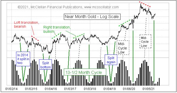
There is a dominant cycle in gold prices, with a period of 13 & 1/2 months. But its behavior is more complicated than just saying that gold makes a bottom every 13 & 1/2 months.
The first interesting aspect of this cycle is that, around the time of the cycle's peak, gold usually makes a mid-cycle low, like a camel with 2 humps. Even more interesting is the point that the arrangement of the tops on either side of that mid-cycle low gives us information about what lies ahead.
In a case of "right translation," the peak after the mid-cycle low is higher than the peak before it. That is a bullish configuration, and it says that the major cycle low might arrive at a higher level than the mid-cycle low. It also promises good things once the next cycle's new upward phase starts. In "left translation," the left peak is higher; what usually follows is that the major cycle low is at a lower price than the mid-cycle low.
One new development which has occurred several times in the past decade is that the major cycle low can split itself into two separate bottoms on either side of the ideal due date. That can be really frustrating to interpret if it is happening in real time.
The past two major cycle lows in gold prices have seen the price bottoms arrive pretty much on time, including the one that got magnified by the COVID Crash in the financial markets. The last cycle saw left translation and, sure enough, this latest major cycle low was lower than the mid-cycle low.
Now gold is in the ascending phase of the new cycle, which is when the best gains for gold prices are usually seen. Sometime this autumn, we will need to start worrying about the next mid-cycle low appearing, and thus to get a left-hand top before that mid-cycle low. And, much later on, we will get to make a determination about whether this new cycle will see right or left translation. For now, the mission is to ride the new uptrend.
|
| READ ONLINE → |
|
|
|
| Mish's Market Minute |
| Weekly Market Recap Based on 5 Key Sectors and 1 Index |
| by Mish Schneider |

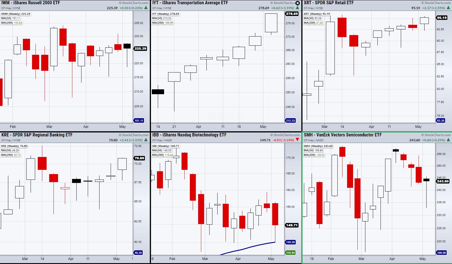
On Friday, non-farm payrolls were announced, with a disappointing 266,000 jobs created compared to the roughly 1 million that economists had predicted. However, the gap in expectations did not result in a market selloff. This could be showing that investors are giving more weight to the Fed's reaction to the report than the report itself. With that said, let us look at Mish's Economic Modern Family on a weekly basis to filter out market noise.
First off is the Transportation sector (IYT). IYT was the only sector to close at new highs. This is important because IYT has kept us from taking a bearish market stance based on its underlying strength when compared to the other Family members.
Next is the Russell 2000 (IWM) which closed roughly unchanged for the week. Currently, IWM is showing more consolidation within its current range of $215-$234. On the other hand, Retail (XRT) and Regional Banking (KRE) closed higher on the week and are sitting close to new highs. Additionally, the Biotech space (IBB) was able to hold its 50-week moving average at $145.17.
Last, we have the Semiconductors (SMH). Like, IWM it was relatively unchanged for the week, closing +0.25% on Friday. The important takeaway is that every Family member held over main support, with XRT and KRE sitting close to new highs, along with IYT placing another consecutive all-time high for the week.
Don't miss this week's episode of StockCharts TV's Mish's Market Minute! In the middle of earnings season, Mish walks you through a plethora of different sectors on stocks that reported, presenting actionable information on which ones to short, which ones to buy, and which ones to leave alone.

Also, join us on Clubhouse on May 13 @ 7:00pm EDT, as we discuss trading cryptocurrency using floor trading secrets!
ETF Summary
- S&P 500 (SPY): New all-time highs
- Russell 2000 (IWM): Cleared back over the 50-DMA at 223.33
- Dow (DIA): New highs
- Nasdaq (QQQ): Doji day. Resistance the 10-DMA at 336.01
- KRE (Regional Banks): 71.53 resistance
- SMH (Semiconductors): Watching for second close over the 50-DMA at 241.74
- IYT (Transportation): New highs
- IBB (Biotechnology): Next support 146.82
- XRT (Retail): Holding over the 10-DMA at 93.94
Forrest Crist-Ruiz
MarketGauge.com
Assistant Director of Trading Research and Education
|
| READ ONLINE → |
|
|
|
| MORE ARTICLES → |
|
 Chart 1
 Chart 2
 Chart 3

