| THIS WEEK'S ARTICLES |
| ChartWatchers |
| I Don't Know If the Correction Will Extend, But Here are Five Charts I'm Watching |
| by Martin Pring |
The Big Picture
Before we get into the subject of corrections, it's important to make sure that we do not lose focus on the big picture. For instance, take Chart 1, which features the Value Line Geometric Average. It reflects the performance of the average stock, as opposed to the big cap-weighted indexes. This series recently broke above a 23-year resistance trendline, which implies a multi-year advance. Perhaps we will see a pullback towards the breakout point, perhaps we will not. The point I am trying to make is that the big picture is bullish.
Getting hung up on a 5-10% correction does not make a lot of sense unless you are hugely leveraged and can't afford to endure the pain. Alternatively, lightening up in anticipation of a short- or even intermediate setback can be problematic, because things can abruptly reverse, leaving the unwary trader as a sold-out bull. Playing a counter-cyclical correction in a primary bull market is not unlike a youngster trying to build a small wall to protect his sandcastle against an incoming tide. It's generally a losing proposition.
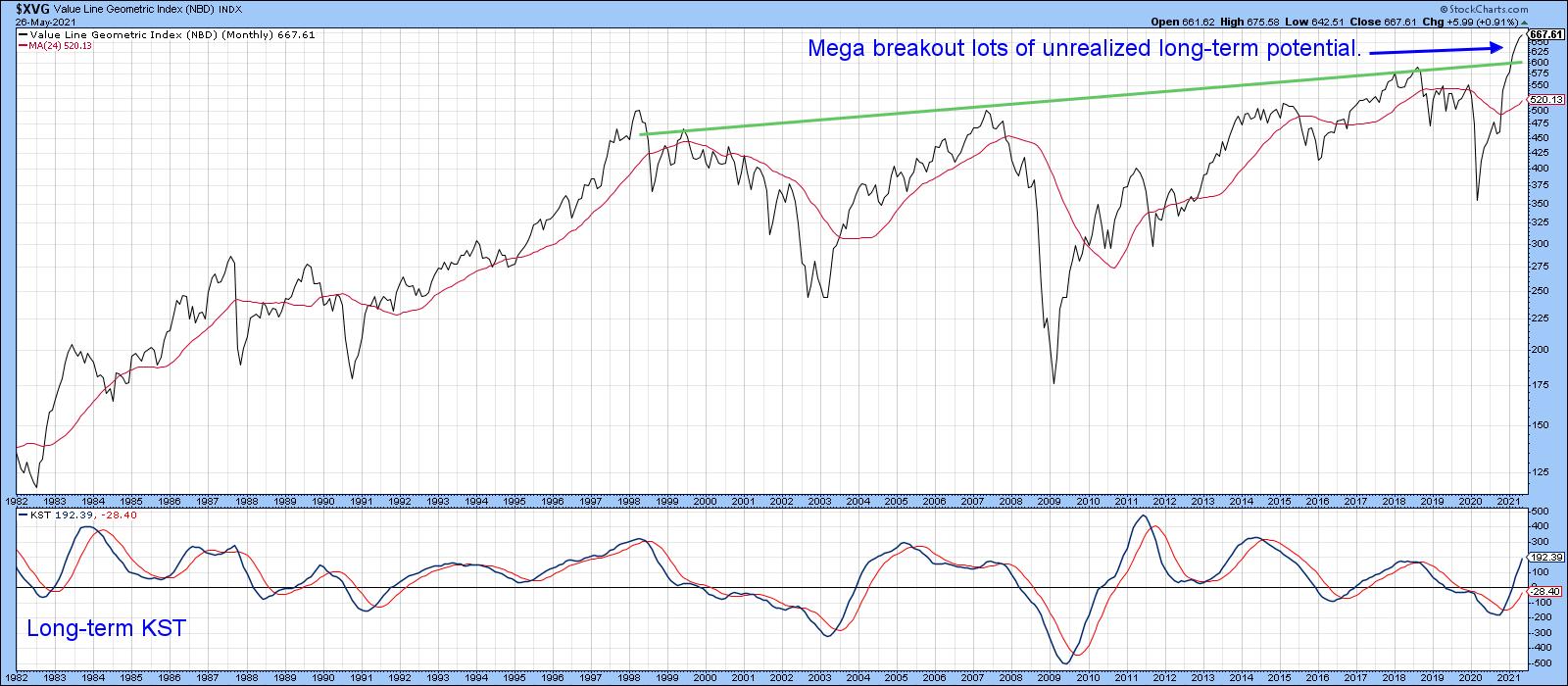 Chart 1Another indicator that has recently gone bullish is shown in Chart 2, where the S&P Composite is compared to the long-term KST for the relative action of the financial sector. The arrows demonstrate that improving relative action by the financials is generally a very positive sign for equities in general, notwithstanding corrections along the way. That indicator has only recently gone bullish. Bearing in mind its almost perfect track record in the last 25-years and the fact that a bullish signal has only recently been triggered, it reinforces the idea that equity prices are headed substantially higher over the next year or two. Chart 1Another indicator that has recently gone bullish is shown in Chart 2, where the S&P Composite is compared to the long-term KST for the relative action of the financial sector. The arrows demonstrate that improving relative action by the financials is generally a very positive sign for equities in general, notwithstanding corrections along the way. That indicator has only recently gone bullish. Bearing in mind its almost perfect track record in the last 25-years and the fact that a bullish signal has only recently been triggered, it reinforces the idea that equity prices are headed substantially higher over the next year or two.
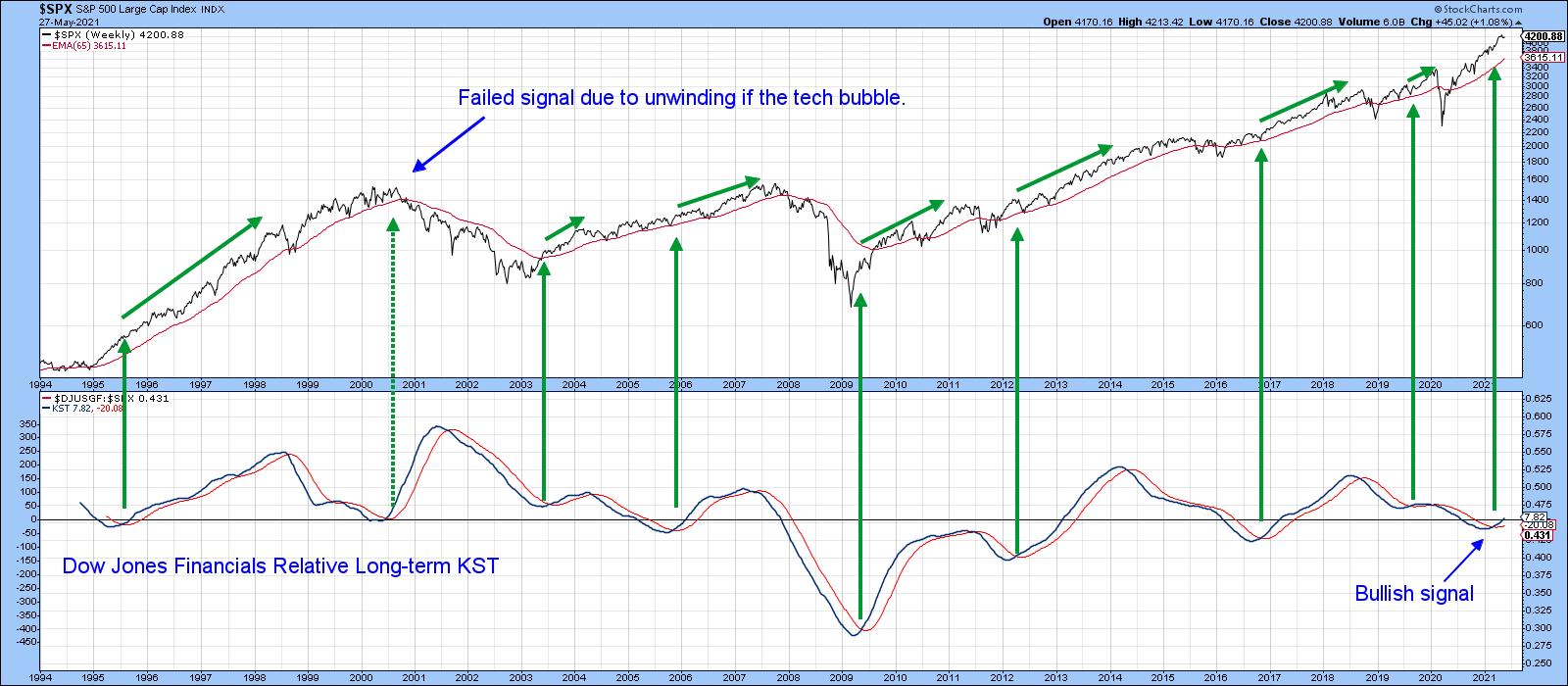 Chart 2Will the Recent Correction Extend? Five Charts to Monitor Chart 2Will the Recent Correction Extend? Five Charts to Monitor
The NASDAQ peaked in mid-February, followed by the NYSE and S&P Composites at the beginning of May. Since those dates, the three Indexes have been rangebound, with their 50-day MAs effectively serving as the bottom of these trading ranges. The following five charts are presented as worth watching to see if an extension to that corrective activity is likely.
Chart 3 shows that the S&P Composite can't decide whether to get back above its late October/May up trendline or not. Both the Common Stock and regular NYSE A/D lines remain above their equivalent up trendlines. Indeed, the series in the bottom panel actually registered a new bull market high this week. Until these two indicators break trend, it seems unlikely that the correction will extend.
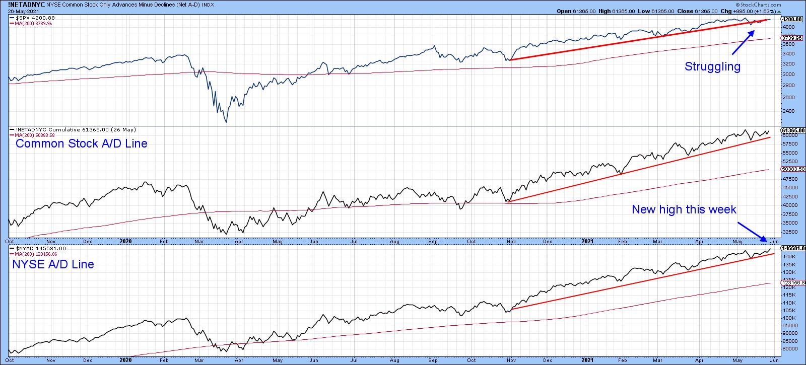 Chart 3The 10-day EMA of the number of NYSE stocks above their 50-day MAs, shown in Chart 4, has been in a declining trend since the beginning of the year. That tells us that, while the NYSE Composite itself has been rising, fewer and fewer stocks have actually been participating. Three instances of joint trendline penetrations in the past were followed by some kind of a setback. A fourth such setup developed in late March, but nothing untoward has yet occurred. Chart 3The 10-day EMA of the number of NYSE stocks above their 50-day MAs, shown in Chart 4, has been in a declining trend since the beginning of the year. That tells us that, while the NYSE Composite itself has been rising, fewer and fewer stocks have actually been participating. Three instances of joint trendline penetrations in the past were followed by some kind of a setback. A fourth such setup developed in late March, but nothing untoward has yet occurred.
I am watching that dashed line for the NYSE Composite very carefully, since a drop with a decisive close under 16,000 will complete a small top and confirm the 2020-2021 up trendline violation. The 65 level for the 10-day EMA of the indicator is also crucial. That's because a drop below it would re-confirm the pattern of declining lows that has been in force since February.
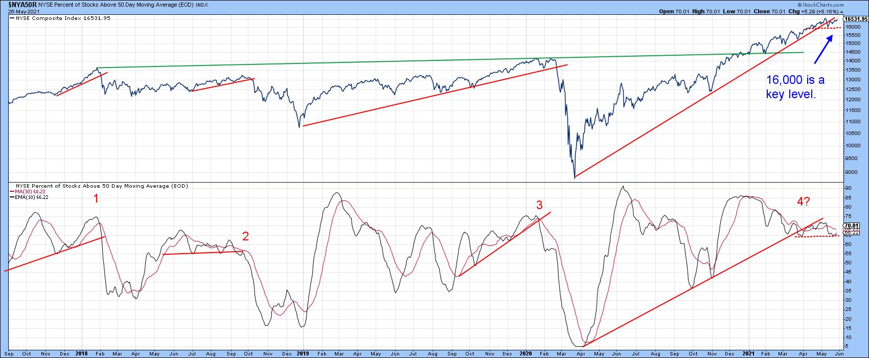 Chart 4Chart 5 plots the VIX inversely to correspond with swings in the NYSE Composite. In order to reduce unwanted volatility, it is also being displayed as a 10-day MA. There have been three occasions since 2015 when it has been possible to observe the violation of an up trendline for the inverted VIX. Each was followed by a correction of some kind. A fourth trendline, emanating at last March's low, is so far intact. Indeed, the MA is currently moving away from the line. As long as that is the case, an extension to the correction is unlikely. However, should this indicator revert to the downside in the immediate future, it would not take much to rupture that up trendline. Chart 4Chart 5 plots the VIX inversely to correspond with swings in the NYSE Composite. In order to reduce unwanted volatility, it is also being displayed as a 10-day MA. There have been three occasions since 2015 when it has been possible to observe the violation of an up trendline for the inverted VIX. Each was followed by a correction of some kind. A fourth trendline, emanating at last March's low, is so far intact. Indeed, the MA is currently moving away from the line. As long as that is the case, an extension to the correction is unlikely. However, should this indicator revert to the downside in the immediate future, it would not take much to rupture that up trendline.
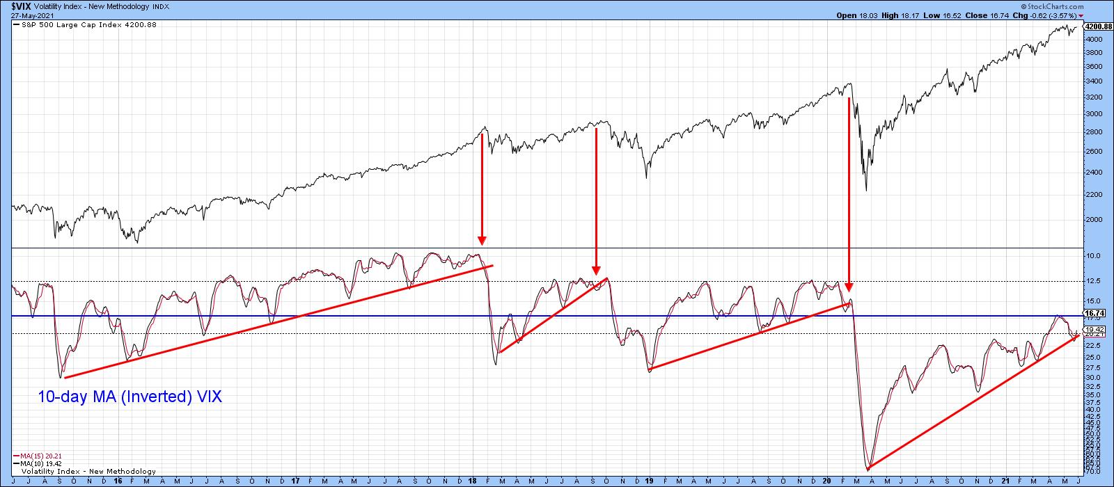 Chart 5Chart 6 shows that when the 45-day ROC of the S&P Composite drops decisively below zero after spending 6-months or more above, it's usually associated with a correction. Most times, the majority of the correction follows the signal, as was the case in February of last year. At other times, the bulk of the downside has already taken place, as in early 2018 and October of last year. This indicator has been above zero since last November, so it's certainly not yet bearish. Chart 5Chart 6 shows that when the 45-day ROC of the S&P Composite drops decisively below zero after spending 6-months or more above, it's usually associated with a correction. Most times, the majority of the correction follows the signal, as was the case in February of last year. At other times, the bulk of the downside has already taken place, as in early 2018 and October of last year. This indicator has been above zero since last November, so it's certainly not yet bearish.
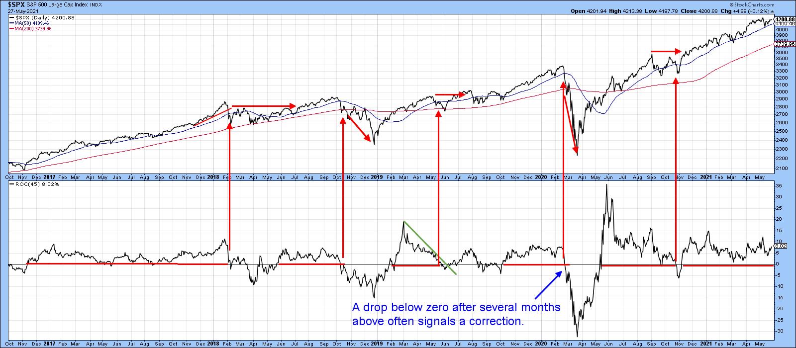 Chart 6Neither is the 10-day EMA for the percentage of NYSE stocks above their 200-day MA, though it's certainly overextended. The red arrows show that, when it crosses below the 80 level, this has often been associated with some kind of a correction. We have seen four successful signals since 2003 and one failure. At the current reading of 82.6, this 10-day EMA remains above the danger zone, but is so close that it is another one worth monitoring. Waiting for the actual signal certainly makes sense, as demonstrated by the 2004 and 2009 examples, where selling on an initial reading of 80 would have left a lot of profit on the table. Please don't forget that you can update any of these charts by simply clicking on them. Chart 6Neither is the 10-day EMA for the percentage of NYSE stocks above their 200-day MA, though it's certainly overextended. The red arrows show that, when it crosses below the 80 level, this has often been associated with some kind of a correction. We have seen four successful signals since 2003 and one failure. At the current reading of 82.6, this 10-day EMA remains above the danger zone, but is so close that it is another one worth monitoring. Waiting for the actual signal certainly makes sense, as demonstrated by the 2004 and 2009 examples, where selling on an initial reading of 80 would have left a lot of profit on the table. Please don't forget that you can update any of these charts by simply clicking on them.
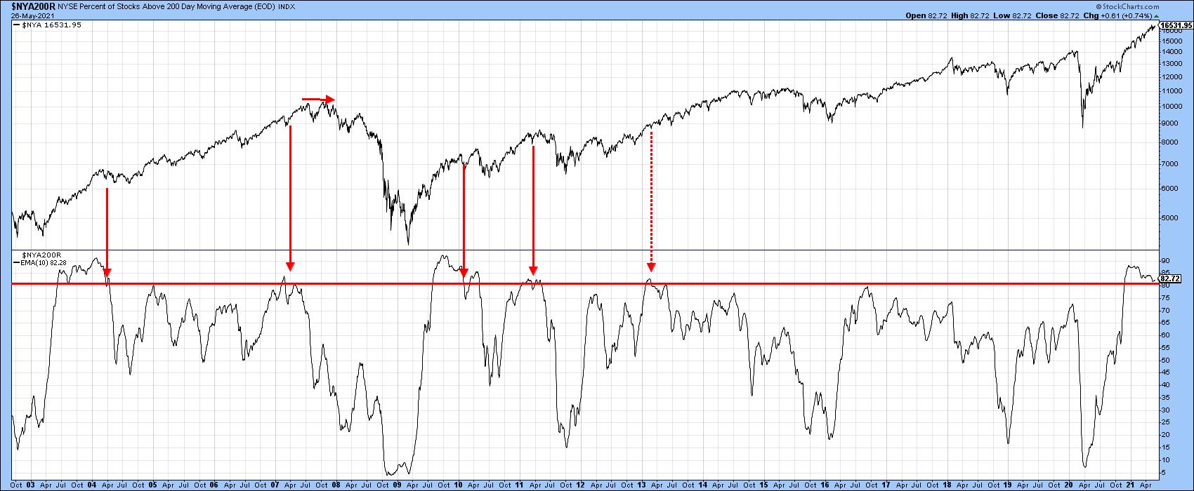 Chart 7 Chart 7
Good luck and good charting,
Martin J. Pring
This article was previously published on Thursday, May 27th at 6:20pm ET in the member-exclusive blog Martin Pring's Market Roundup.
The views expressed in this article are those of the author and do not necessarily reflect the position or opinion of Pring Turner Capital Group of Walnut Creek or its affiliates.
|
| READ ONLINE → |
|
|
|
| The Mindful Investor |
| Three Key Lines for Three Key Charts |
| by David Keller |
As I go through my normal routine of analyzing hundreds of charts every day, or when I'm preparing for my daily closing bell show, I often focus on the "line in the sand" for each chart. That is, what's the point at which you agree you need to exit your position, change your outlook or, at the very least, reevaluate your investment thesis?
You see, it's very easy to become emotionally connected to your investment decisions, which leaves you vulnerable for behavioral biases such as the endowment effect and confirmation bias. But why just focus on one specific price level or indicator? For me, it's all about simplicity. There are always nuances and subtleties and deeper levels of analysis. But, by boiling the chart down to one key level or line or indicator, it's something you can easily track in a spreadsheet or price alert. By simplifying, I can track lots of levels on lots of charts, all at the same time.
My weekly chart routine usually runs Thursday through Monday, and I generally follow the process of macro to micro. I begin with the macro charts in the Mindful Investor Live ChartList, which helps me prepare the Weekly Flight Plan for clients. Then, through the weekend into Monday, I dig deeper into sectors, industries, themes and, finally, with all 500 charts of the S&P 500 members. Whew.
Below, I'll talk about three charts that stood out to me this week, including the lines in the sand for each chart and why these levels are so important. First, let's look at Apple (AAPL), one of the largest benchmark names in the U.S.
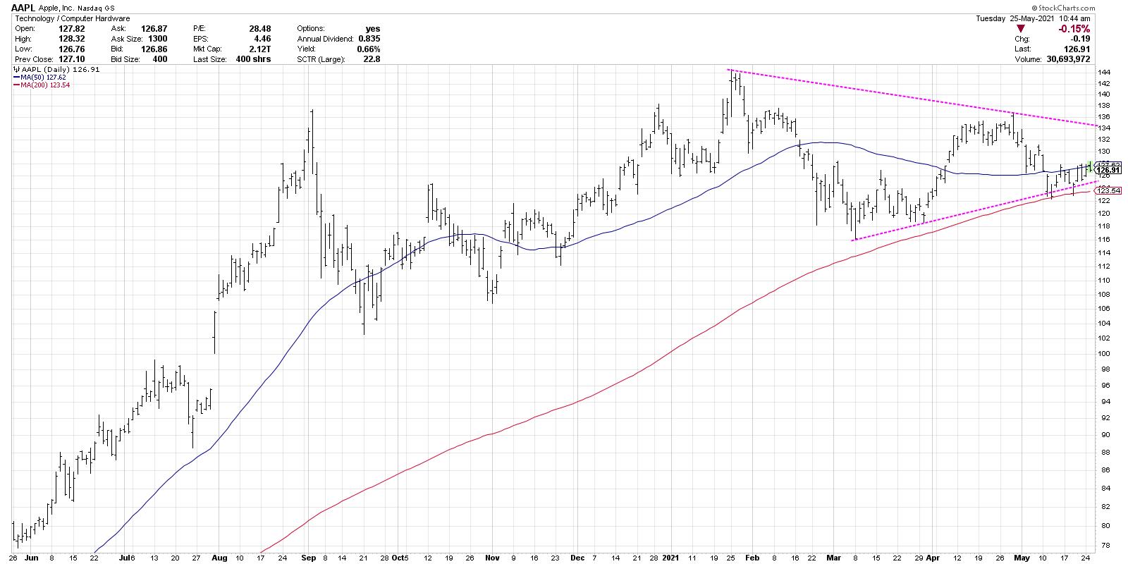
Since February, this chart has settled into a symmetrical triangle or "coil" pattern, with lower highs and higher lows over a four-month period. The good thing about this pattern is that it has to resolve either to the upside or downside before the pattern reaches its natural endpoint.
I would argue this may be the most important chart of all here. A break to the upside would indicate investor optimism, alleviate fears of inflation and suggest a major tailwind for growth stocks. A break to the downside, on the other hand, would indicate the evaporation of euphoric investor sentiment from recent months, and could potentially cause a flood to the exits as market participants realize that support levels are not holding as expected.
Next, let's review the chart of Tesla (TSLA).
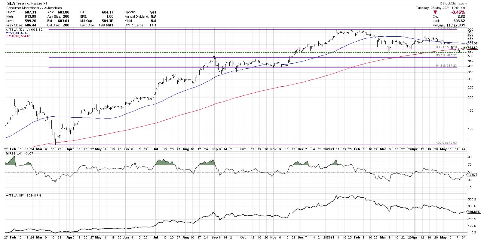
Tesla, in this case, represents a number of stocks in the consumer, technology and communication sectors that have rotated lower. Stocks like TSLA have already established a lower high, and are now testing price support that, if violated, would confirm broad head-and-shoulders top patterns that measure much lower than current levels.
If we take the March 2020 low and connect that to the January 2021 peak for Tesla, we can see that the price is once again testing the 38.2% retracement level. This support level was tested twice in March and represents a clear line in the sand for this chart. A close below $550 would complete the head-and-shoulders top, while also confirming a break below the 200-day moving average. The next downside objective using Fibonacci retracements would be around $400.
If, however, Tesla holds the current support level and rebounds higher, a trendline using the January and April highs may be a good way to confirm upside momentum. A higher low on a subsequent pullback would confirm a more bullish posture for the stock.
Finally, let's look at Facebook (FB), which has clearly the most bullish configurations of these three mega-cap names.
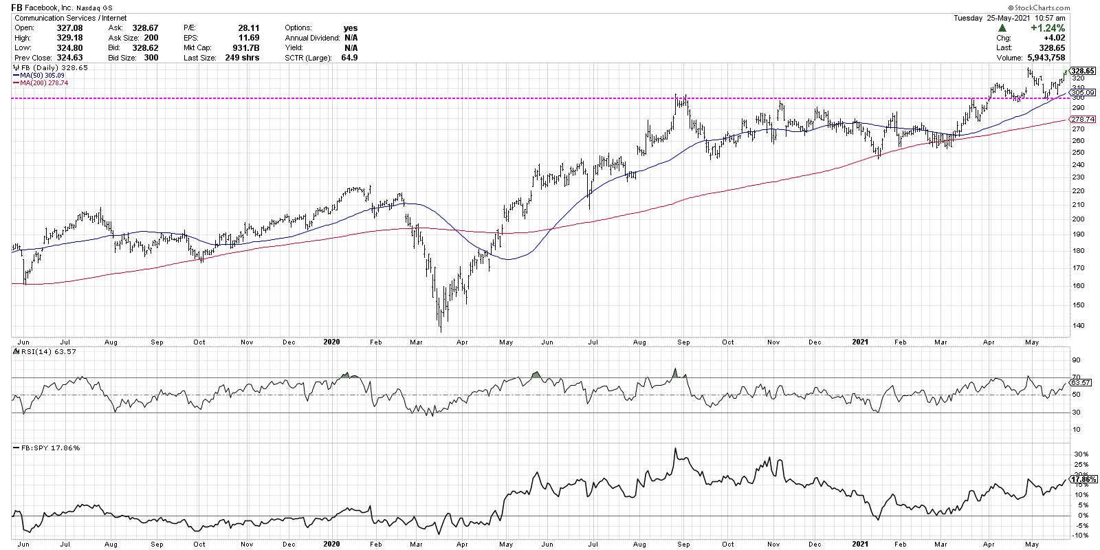
While our first two charts were names in transition, consolidating and testing support, this last chart has already broken above resistance. Facebook first reached the $300 level last August 2020, then tested that same level again in November 2020 and March 2021. In April, the stock broke above this level and then tested $300 from above before rotating higher. This is a classic base with a breakout and retest and indicates high potential for further upside.
At this point, FB is in a clear pattern of higher highs and higher lows, with improving relative strength. As long as this pattern continues, the path of least resistance appears higher from here.
What's the line in the sand that would suggest a reevaluation of that bullish thesis? Quite simply, a break back below support at $300, a level which has clearly become an important price point, would negate the bull case and indicate a more bearish posture, as the uptrend would no longer be in play.
I hope this article helps describe the value of simplicity by focusing on particular price levels to reevaluate your positions, and also gives you three key charts with key levels to watch in the coming weeks!
Want to explore this article in video format? Just click below.
RR#6,
Dave
P.S. Ready to upgrade your investment process? Check out my free course on behavioral investing!
David Keller, CMT
Chief Market Strategist
StockCharts.com
Disclaimer: This blog is for educational purposes only and should not be construed as financial advice. The ideas and strategies should never be used without first assessing your own personal and financial situation, or without consulting a financial professional.
The author does not have a position in mentioned securities at the time of publication. Any opinions expressed herein are solely those of the author, and do not in any way represent the views or opinions of any other person or entity.
|
| READ ONLINE → |
|
|
|
| ChartWatchers |
| CARZ Revs its Engine (while it Still Can) |
| by Arthur Hill |
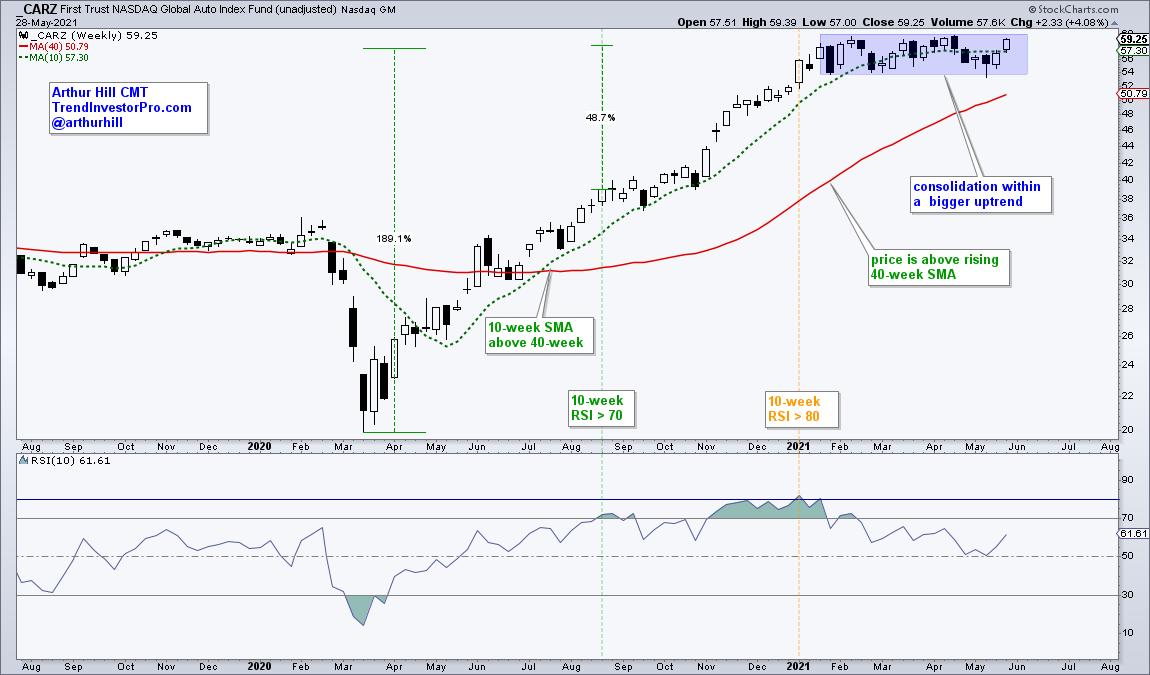
 Some of the old Ford and GM cars can still rev their engines, but the sound of a revving engine could go the way of the dodo with EVs. Perhaps, I should say that the Global Auto ETF (CARZ) price chart is revving its engine and poised for a breakout. Some of the old Ford and GM cars can still rev their engines, but the sound of a revving engine could go the way of the dodo with EVs. Perhaps, I should say that the Global Auto ETF (CARZ) price chart is revving its engine and poised for a breakout.
Like the Russell 2000 ETF and some growth-oriented groups, CARZ led the market in 2020 and then took a rest with a consolidation in 2021. The trend is clearly up because the 10-week SMA is above the 40-week, price is above the rising 40-week SMA and the ETF hit a new 52-week high in April. Evidence of a long-term uptrend means we want to focus on bullish setups and patterns. Why fight the trend.

Consolidations are necessary because they work off prior excesses and pave the way for the next move. Upside momentum is considered strong and healthy when weekly RSI(10) moves above 70. In contrast, a move above 80 indicates excess that can lead to a corrective period. Notice that RSI exceeded 70 in mid August and the ETF advanced another 48%. CARZ started its correction a few weeks after RSI exceeded 80, which was in early January. Most recently, RSI dipped back to the low 50s in June and this alleviated overbought conditions.
Returning to the pattern, a consolidation within a bigger uptrend is typically a bullish continuation pattern. This rectangle represents the pause that refreshes and a breakout would signal a continuation of the bigger uptrend. Chartists looking to get a jump on such breakouts can trade the swing within the consolidation using daily charts. This setup was featured at TrendInvestorPro in our reports on May 20th and 27th. Click here to subscribe and get immediate access to our reports and two bonus ChartLists.
--------------------------------------------------
|
| READ ONLINE → |
|
|
|
|
|
| ChartWatchers |
| Cannabis Stocks Going Higher - Opportunities Abound |
| by Erin Swenlin |
On Tuesday, I let DecisionPoint Diamonds subscribers know that weed stocks were the place to be. While this area can be speculative in nature, there are some strong winds at the back of these stocks. Technically, these charts look fantastic, but there is also news on the marijuana front.
A bill that would decriminalize marijuana is being reintroduced in Congress. You can read more about it in this article from the Newsweek website. This is a sweeping bill that has been introduced by two Republican congressmen. This tells me that, with the makeup of the House and Senate and the support of some Republican politicians, there is a very good chance that this will pass. It would open up financial institutions to bank with dispensaries, allow the VA to prescribe medical marijuana to their patients and take cannabis off the Schedule One controlled substances list, among other aggressive reforms. Currently, it sits alongside drugs like heroin and cocaine, which makes no sense.
I offered up two stocks on The Pitch yesterday, hosted by David Keller, CMT. Mary Ellen McGonagle and Danielle Shay also offered up their picks. Highly recommend you watch the show, here's a link.
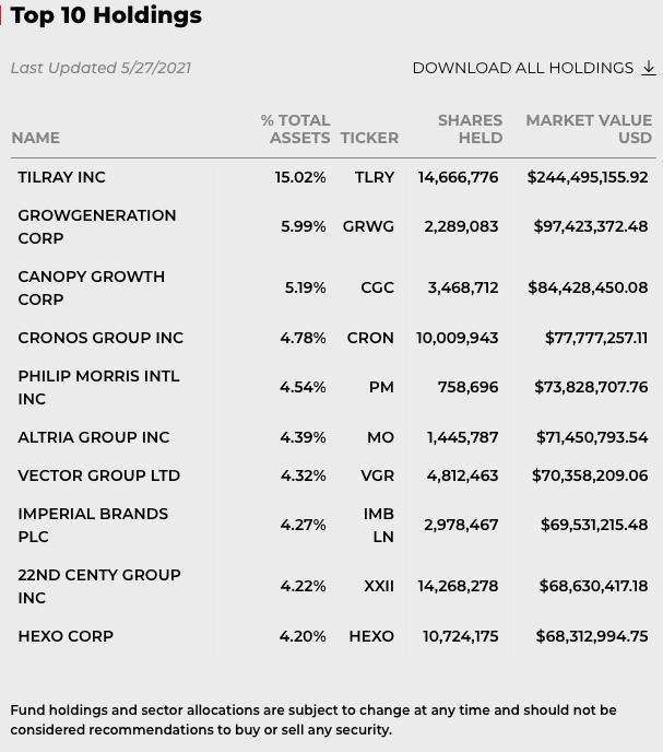
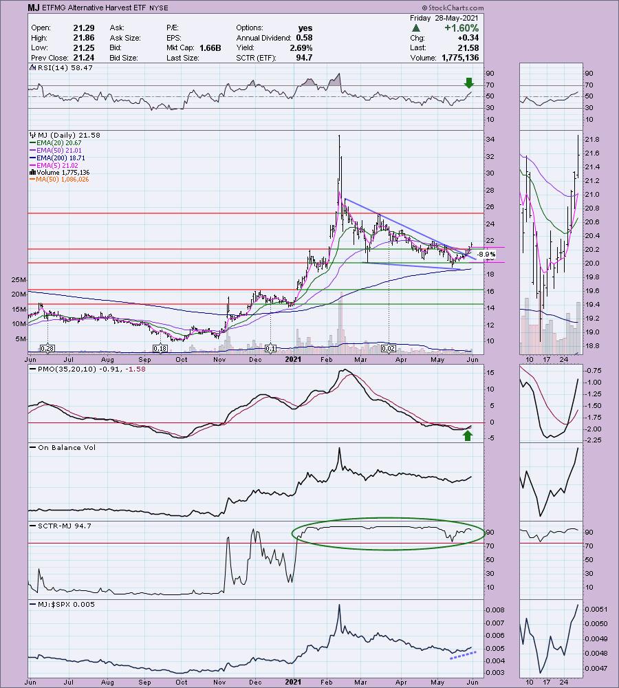
I'm going to start off by looking at the Alternative Harvest ETF (MJ). For those unfamiliar or uncomfortable investing in one stock in this area, the ETF is an excellent choice. It also reveals the strength in this area of the market. Three of these charts and the commentary are pulled from the Tuesday subscriber-only DP Diamonds Report, with MJ being picked yesterday. I have updated the charts and the commentary to reflect today's action.
ETFMG Alternative Harvest ETF (MJ)
EARNINGS: N/A
MJ tracks a market-cap-weighted index of global firms engaged in the legal cultivation, production, marketing or distribution of cannabis, cannabinoids or tobacco products.

MJ is currently down -1.30% in after-hours trading. If you're a little uncomfortable investing in individual cannabis stocks, then here a vehicle you can consider. There is a bullish falling wedge and price has executed it by resolving upward as expected. The RSI is in positive territory as price followed through on the recent close above the 50-EMA. The PMO is on a crossover BUY signal in oversold territory. It is in the top 5% of all ETFs tracked by StockCharts based on the SCTR of 96.1. The OBV is confirming the rally and this fund is beginning to outperform the SPX. The stop is aligned with the March low, but it can now be raised based on today's +1.60% rally.


Take advantage of our Spring special!
Get 50% off your first month of DecisionPoint:
Use coupon code: SAVE50 at checkout!


Arthur Hill, CMT in the free DecisionPoint Trading Room on June 7th!
Arthur Hill, CMT, is the Chief Technical Strategist and main author at TrendInvestorPro.com. Schooled in classical technical analysis, Arthur crossed over to the dark side, quantitative analysis, in 2012. Classical technical analysis provides a solid foundation for learning, but is largely subjective and discretionary in nature. Quantitative analysis puts classical technical indicators to the test with clear rules, signals and results. Taken together, classical chart analysis and quantitative analysis provide the basis for Arthur's systematic approach to analysis, trading and investing. Next level technical analysis.
Click here to register in advance for the recurring free DecisionPoint Trading Room! Recordings are available!
Here are three more stocks in this space. These are pulled from Tuesday's subscriber-only DecisionPoint Diamonds Report.
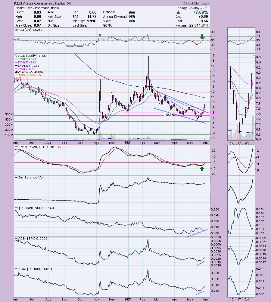
Aurora Cannabis Inc. (ACB)
EARNINGS: 9/21/2021 (AMC)
Aurora Cannabis, Inc. engages in the production, distribution and sale of cannabis products. It also produces and sells indoor cultivation systems and hemp-related food products. The company was founded by Terry Booth and Steve Dobler on December 21, 2006 and is headquartered in Calgary, Canada.
ACB is unchanged in after-hours trading. It is low-priced, so be sure to position size appropriately to manage risk. The RSI just entered positive territory and the PMO is on a BUY signal. There is a bullish falling wedge. When I presented this last Tuesday, it hadn't broken from the wedge pattern. I had liked the strong rally above the 20-EMA. Pharma is beginning to wane against the SPX near-term, but relative performance is still trending upward. ACB is outperforming both its group and the SPX. You can see where I picked this stock, near $8. I would move the stop up and make $8 your stop level. This was huge winner after I picked it. It is up +19.7% since Tuesday.
(Full disclosure: I own ACB)

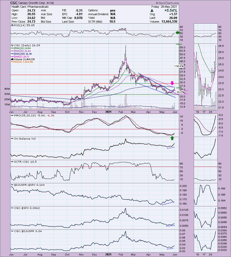
Canopy Growth Corp. (CGC)
EARNINGS: 6/1/2021 (BMO) ** REPORTED TUESDAY **
Canopy Growth Corp. engages in the production and sale of medical cannabis. The company offers products including oils and concentrates, soft gel capsules and hemp. It focuses on the treatment of chronic pain, seizures, muscle spasms, nausea and loss of appetite. The company was founded by Bruce Linton on August 5, 2009 and is headquartered in Smith Falls, Canada.
CGC is up +0.40% in after hours trading. Normally, I wouldn't present a chart like this one given the brand-new "death cross" of the 50-/200-EMAs, but I believe it is at a clear reversal point with upside potential that is staggering. The OBV is rising strongly, which is positive, and we do have a brand-new PMO crossover BUY signal. The RSI is beginning to rise again and is starting to outperform the group and the SPX. In the thumbnail, you can see a small bullish double-bottom. This week's rally pushed price above the confirmation line. Again, you can raise your stop level; this was the one I set on Tuesday. Since picking this one on Tuesday, it is up +8.03%.

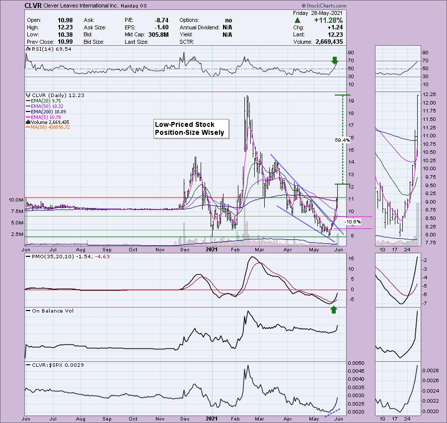
Clever Leaves International Inc. (CLVR)
EARNINGS: 8/12/2021 (AMC)
Clever Leaves Holdings, Inc. operates as a holding company. It produces pharmaceutical-grade cannabinoids. The company was founded on July 23, 2020 and is headquartered in New York, NY.
CLVR is down -1.88% in after hours trading. However, even with that drop, it easily remains above the 200-EMA.
There are plenty of positives on the chart. The RSI is in positive territory, although getting overbought. There is a large bullish falling wedge that resolved upward as expected. The PMO just triggered a crossover BUY signal. We did see very strong volume coming in on this recent rally out of the May low and today's volume was astounding. It is performing better than the SPX right now. I set the stop originally at 10.6%; currently, I would move it up to $11. Upside potential is huge. Since picking CLVR on Tuesday, it is up an unbelievable 27.4%!

My state, California, legalized marijuana for medical use years ago and just recently approved it for recreational use. It's a big business and, if dispensaries and growers are able to tap into the banks, this is an incredible area for growth.
I will be holding the free DP Trading Room on Monday's holiday, so if you're free at Noon ET, come check it out live! The registration link is HERE.
Arthur Hill, CMT will be joining me in the June 7th Trading Room! Once you register you don't have to again since this is a recurring webinar.
Happy Charting! - Erin
Technical Analysis is a windsock, not a crystal ball.
Helpful DecisionPoint Links:
DecisionPoint Alert Chart List
DecisionPoint Golden Cross/Silver Cross Index Chart List
DecisionPoint Sector Chart List
DecisionPoint Chart Gallery
Trend Models
Price Momentum Oscillator (PMO)
On Balance Volume
Swenlin Trading Oscillators (STO-B and STO-V)
ITBM and ITVM
SCTR Ranking
DecisionPoint is not a registered investment advisor. Investment and trading decisions are solely your responsibility. DecisionPoint newsletters, blogs or website materials should NOT be interpreted as a recommendation or solicitation to buy or sell any security or to take any specific action.
|
| READ ONLINE → |
|
|
|
| ChartWatchers |
| Is This Business About to Implode -- Or Rocket Higher? |
| by Greg Schnell |
This crazy world has so many unique twists and turns. The turn that absolutely baffles me is the move to green energy without the planning. Not just in one country, but worldwide.
President Biden suggested America would buy all the copper offshore rather than start new mines in America. But the planning isn't being done in the rest of the world either. The new IEA report might just be the most amazing politically-produced report, highlighting how vast the incompetence is of governments for the lack of broad planning before cancelling oil. But the report recommends cancelling oil immediately, knowing no replacement for that energy exists using electric power in any sort of time frame.
From a website I read that writes about all things energy, it takes on average 16 years to get a copper mine approved and into production in the world today. We want to be well on our way to green energy having completed the transition in 2050. 2021 + 16 = 2037. That gives us 13 short years before 2050 if we started approving mines today. But we want to have all electric cars by 2035 in some states.
If there is no hope for new energy transmission lines on a massive scale due to a shortage of Copper in the next 15 years, and you stop the production of liquid energy, what will people do? We saw the 4-day drought of gasoline in a few states caused by the cyber attack on the Colonial pipeline. Laws were instantly changes to allow other means of moving the oil. It took mere days to react to a shortage. Amazingly, it is reactive for something so important. The Texas power outages were another example. How will this energy system, urged to dramatically undersupply liquid energy, while dealing with a shortage of electric energy, create a conversion to electric without an immediate boost to new copper supply? How will it play out through 2025, then 2030, then 2035 before we see a meaningful increase in Copper supply?
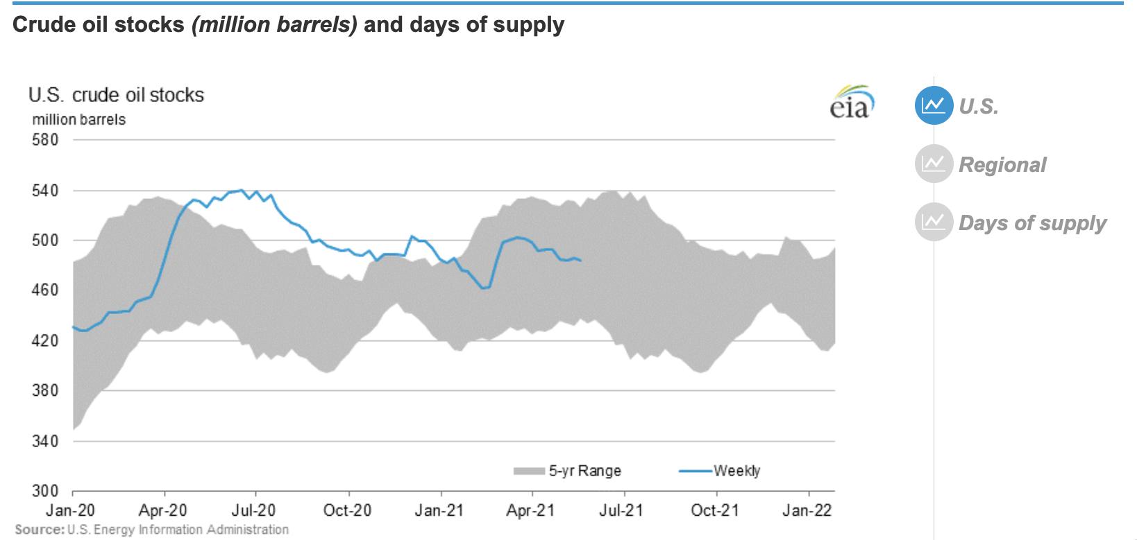
From the EIA reports this week (the next six charts are from EIA.gov):
It would appear we have an average supply of crude oil, remembering that last year we had huge amounts of crude in storage but no demand. The height of the top part of the grey area was influenced by last year's economic stoppage globally, where oil in storage surged to new highs. Remember how oil went to zero because there was no place to store it? So it would appear that we have abundance because we aren't on the south edge yet. That couldn't be more wrong. We are declining our inventory heading into the peak gasoline driving season. Globally, inventories are dropping quite quickly. We are currently 5% below the 5-year average.

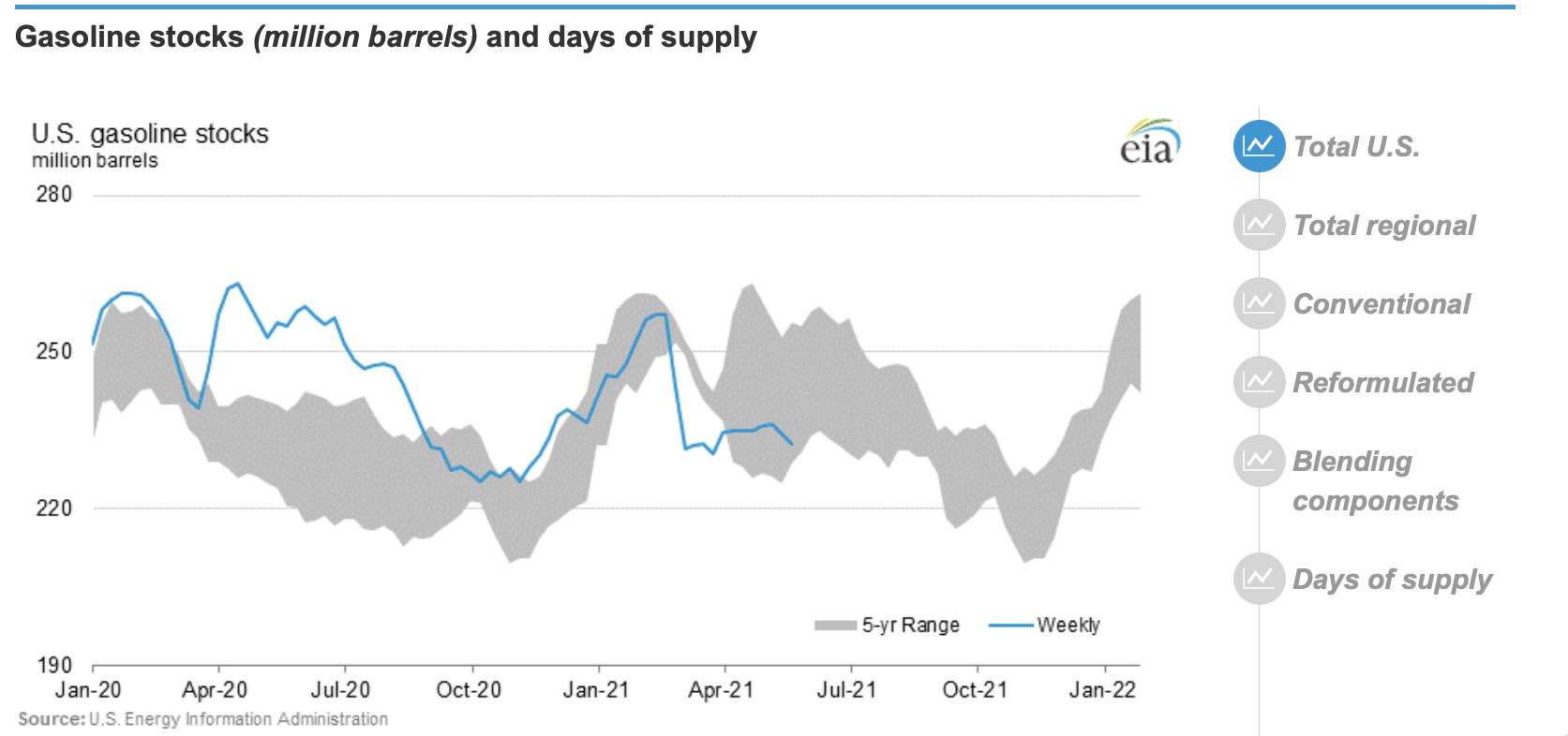
The next chart is gasoline supply. We are at the bottom of the five-year range and getting tighter on supply.

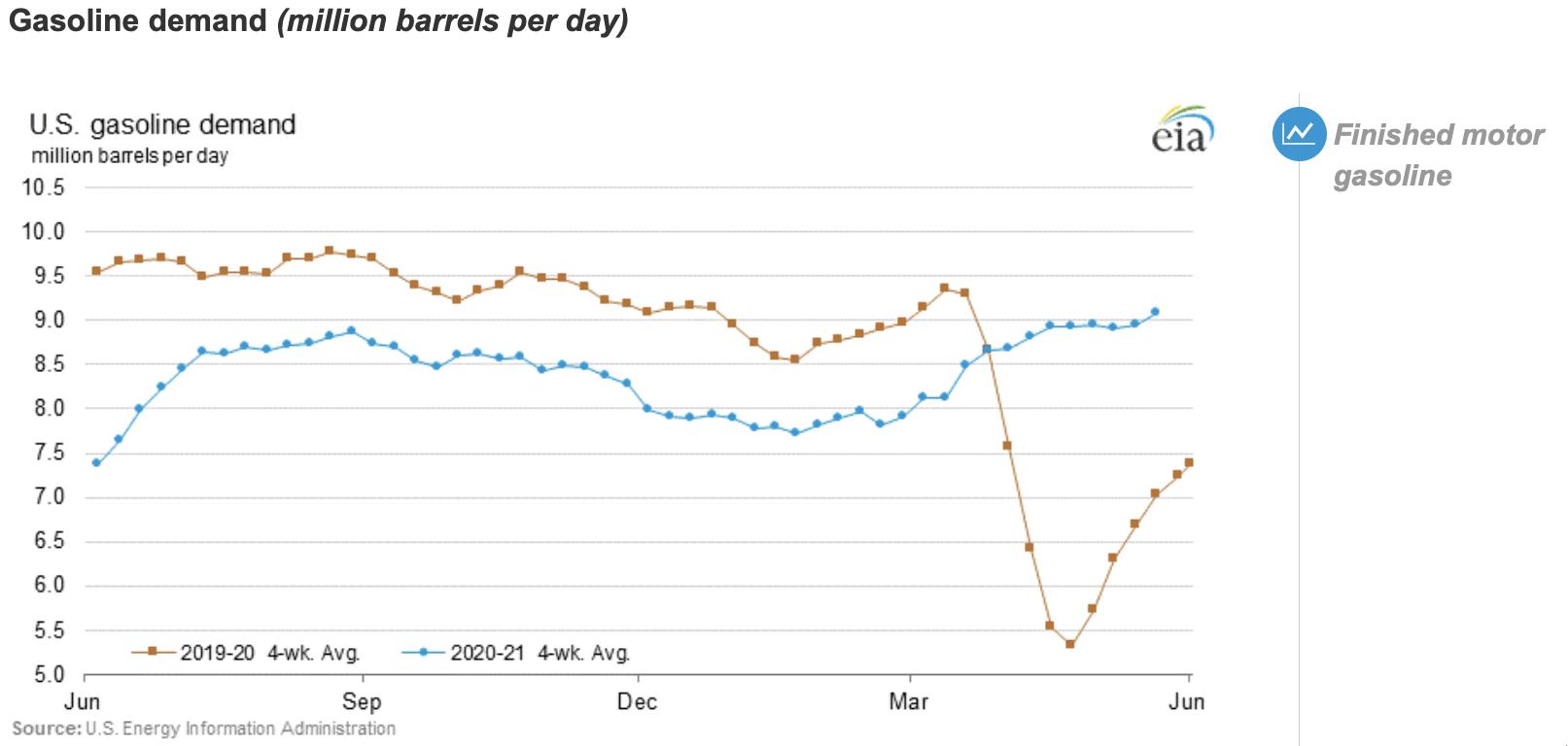
Gasoline demand? The blue line shows us returning to normal and still increasing. We have states that have not opened back up yet, like California, as a small example. Gasoline demand is 3% above the 5-year average.

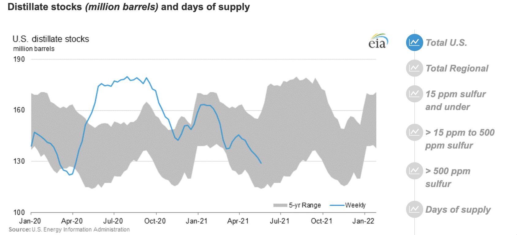
For distillate - read this as diesel fuel, home heating oil, jet fuel for simplicity - we are near 5-year lows and plummeting for supply.

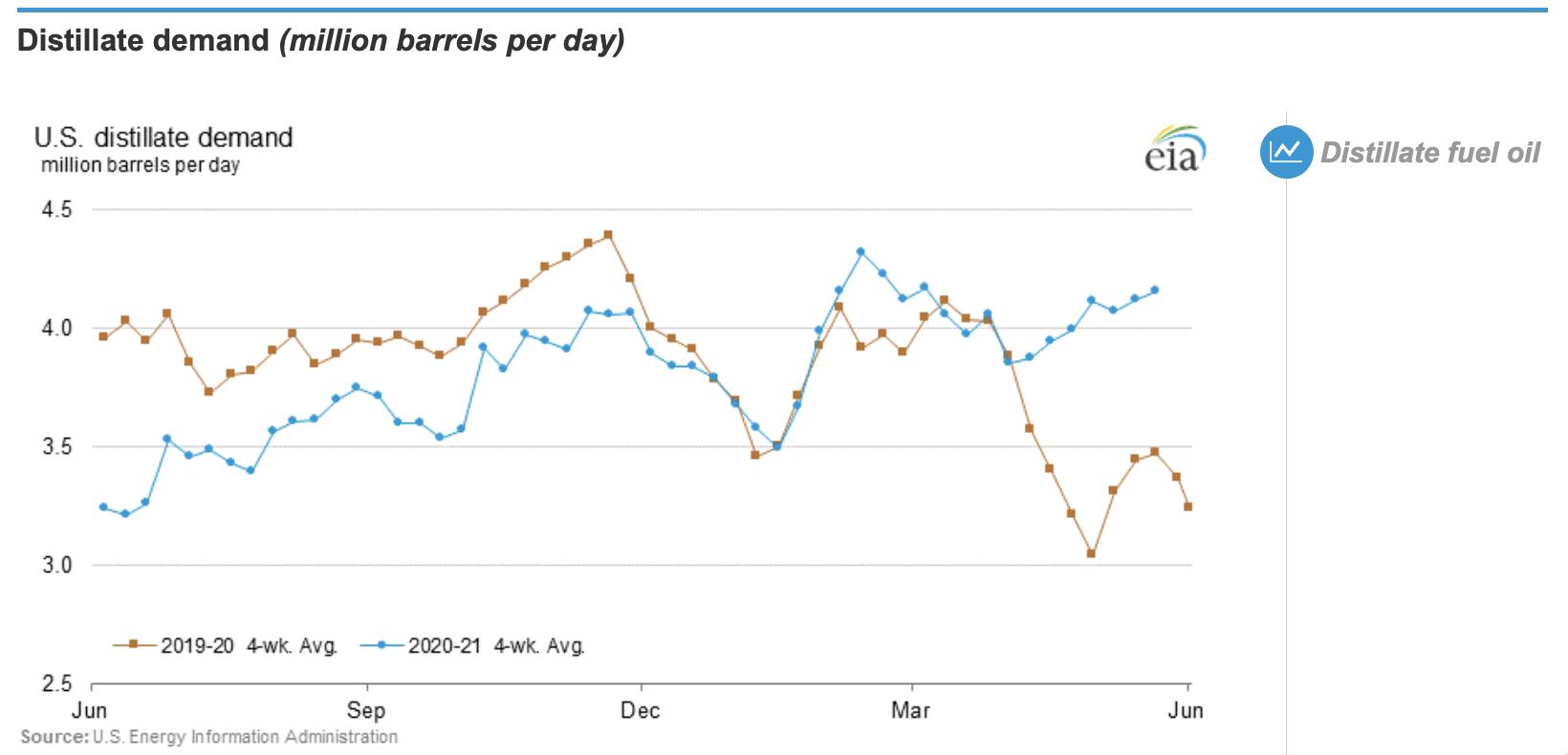
We are at the top of the range for distillate demand. I have seen other charts that suggest we are higher than the 5-year high for demand at this time of year. Distillate demand is 13% above the 5-year average.

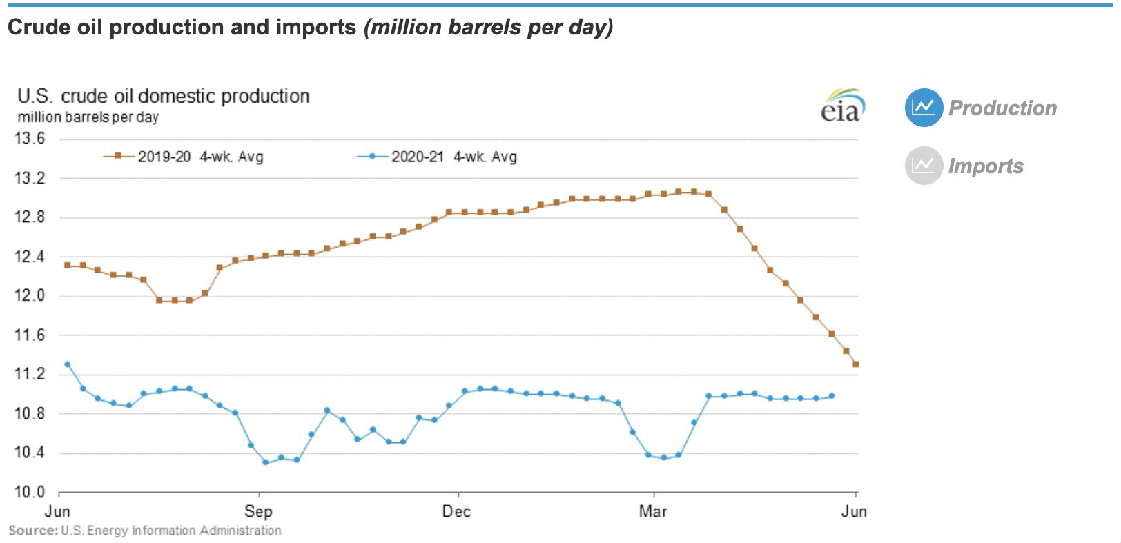
The refineries are going full blast at 87% trying to keep up, which is within 1% of the 5-year average. Congress has passed a law against countries holding back oil. But Congress itself is stopping oil flowing. US production used to be near 12.5 million barrels/day. It is down by at least 15% and closer to 20% from the prior highs.

You can start making a list of people who helped the world get into this shortage of energy, both liquid and electric. When there is an inquiry, they will be hiding. Wars have always been fought over lack of energy supply. During wars, many times it is the break in the supply chain that helps win the war.
Company after company is warning of supply shortages coming, but no one wants to hear it. Goldman Sachs, JPM, BAC and many others warn of critical supply shortages approaching over the next 18 months.
A new report from another bank titled their review of the IEA report "The Dangers of Fantasy Island". They comment that soaring crude oil prices are what the governments and environmentalists want to see. The bizarre aspect is why the leadership of government is not going all out, and from my view - ALL OUT - to make the transition to energy through copper a massive priority? This is economically fundamental and the traditional role of government.
The oil majors have stopped planning new projects. Exxon's board just had new members appointed who want to stop XOM from producing oil. Shell just got a ruling in the courts to change their business impossibly within 8.5 years. Who will invest in replacing the energy reserves depleting at 100 million barrels per day with a backdrop like that?
Be careful what we wish for. We saw how people were affected by shutting down the world due to the coronavirus. We have more violence on airlines than ever before by restricting liberties. Creating long-term energy shortages is not going to end well for governments or civilians without a major boost in immediate planning.
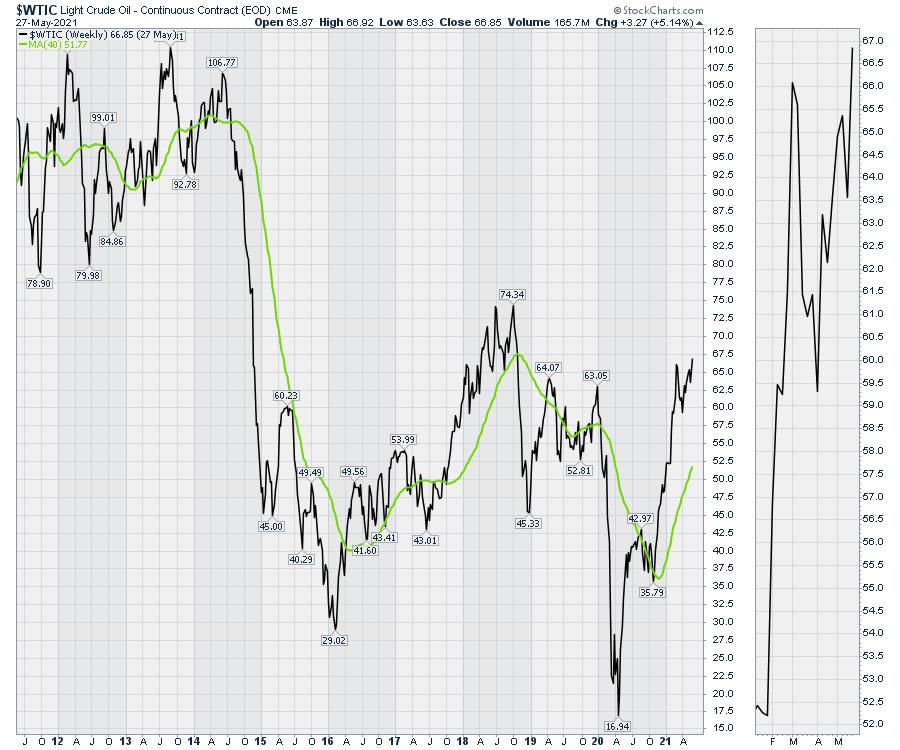
As oil moves above $67 to multi-year highs, it's about to get a lot more valuable.

|
| READ ONLINE → |
|
|
|
| Don't Ignore This Chart! |
| From Sector to Industry to Agilent Technologies |
| by Julius de Kempenaer |

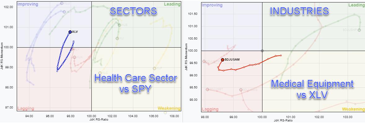
The Health Care sector is one of the defensive sectors in the S&P 500 which is on a positive trajectory inside the improving quadrant and heading towards leading. The RRG for sectors, highlighting XLV, is on the left above.
The RRG on the right shows the industries inside the Health Care sector against XLV, with the Medical Equipment group $DJUSAM highlighted. As you can see, the tail is still inside the lagging quadrant, but has started to curl back up and travel at a positive RRGH-Heading. By the way, when you plot these industries directly against SPY, pretty much all of them are at a strong RRG-Heading, and Medical Equipment is already well inside the leading quadrant.
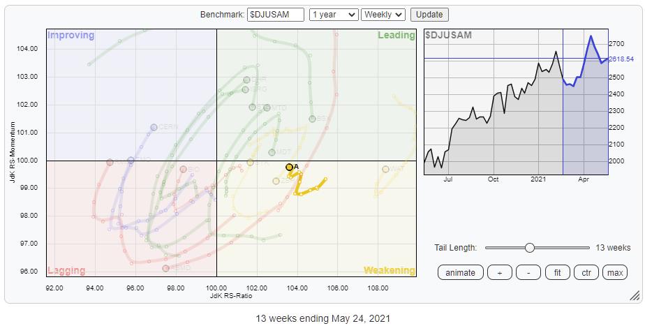
Working our way further top-down, the next chart is the RRG of the members of the Medical Equipment group against the Medical Equipment Index.
One of the stocks that is worth a closer look at is Agilent Technologies (A), which is inside the weakening quadrant, but has started to improve again after a downward rotation and is now on its way back towards the leading quadrant.

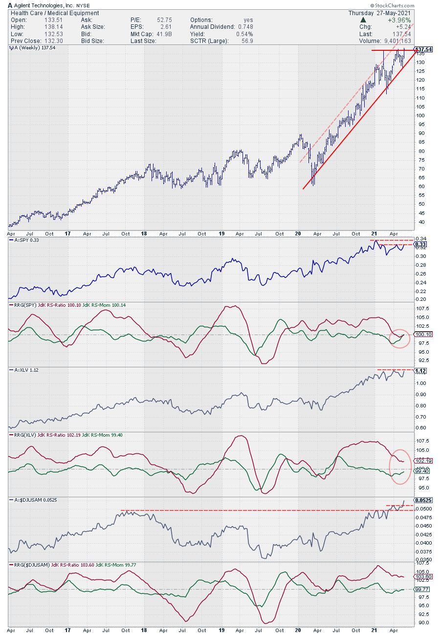
Looking at the price chart above in combination with relative strength confirms the bullish outlook for this stock. Price is moving inside the boundaries of a rising channel and currently about to break resistance offered by two of its recent highs around $ 137. Once Agilent can clear that overhead barrier, a further rise is likely. This will also have a positive impact on the relative strength of A vs. SPY and XLV.
In the panes below the price chart, I have plotted the raw RS of A and the resulting RRG-Lines against SPY, XLV, and $DJUSAM.
The upward break in RS vs the industry is clearly visible. This will most likely drive a further improvement of relative strength vs. the sector (XLV) and ultimately versus the market (SPY).
#StaySafe, --Julius
My regular blog is the RRG Charts blog. If you would like to receive a notification when a new article is published there, simply "Subscribe" with your email address.
|
| READ ONLINE → |
|
|
|
| ChartWatchers |
| Shorts Get Cooked Again! |
| by John Hopkins |
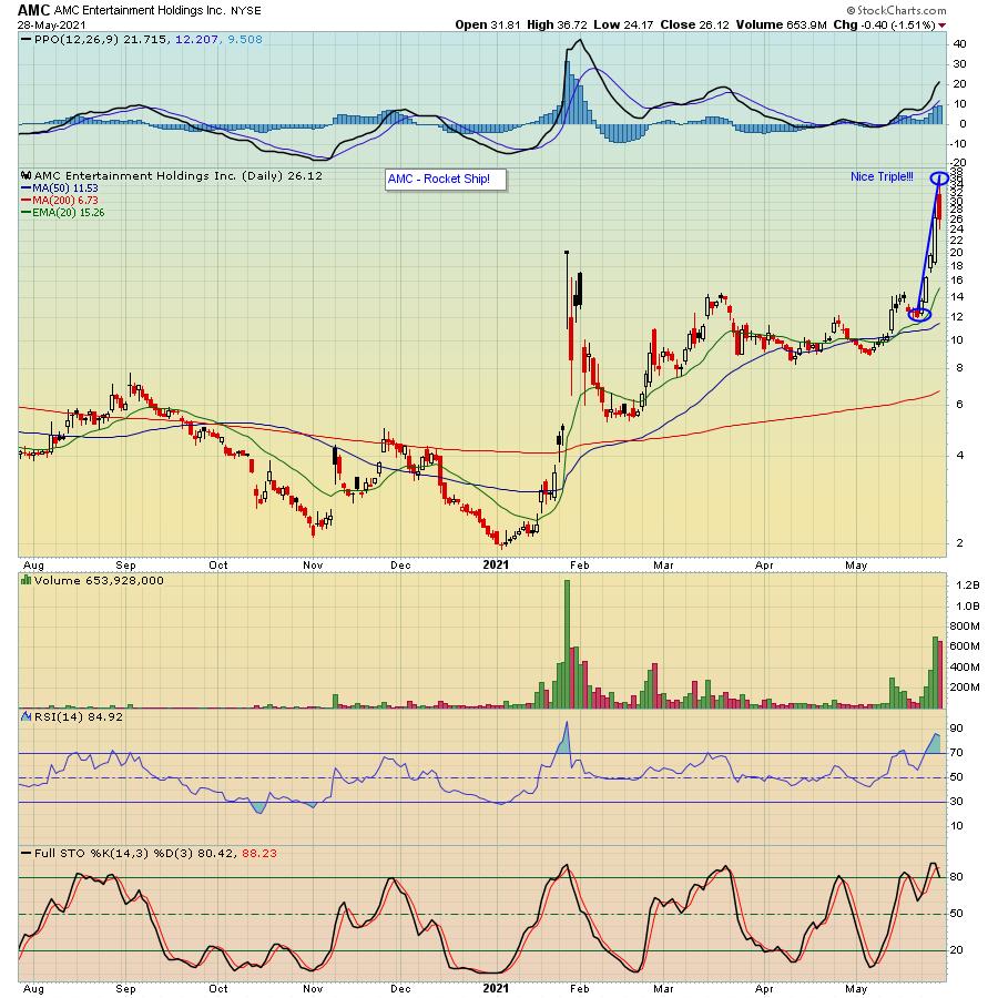
The Reddit crowd was at it again this past week as they mounted a full-out assault on short sellers, with some stocks making meteoric rises. The biggest example was AMC Entertainment (AMC), which tripled - repeat; tripled - over a one week period, rising from just over $12 to almost $37 at its high in the span of five days.

What stands out when looking at the chart above - even though the frenzy cooled off a bit by week's end - is the massive volume that poured into the stock. It didn't quite match the volume back in early January when it originally blasted off, but it was certainly enough to inflict some serious financial pain on those who were short the stock.
While the move in AMC has been stunning, there have been other stocks that made huge moves to the upside this past week. In fact, earlier this past week, our Chief Market Strategist Tom Bowley provided our members with a list of potential short candidates that he felt could make a significant move to the upside, which included AMC, BYND and KOSS, all of whom made substantial moves during the week to the upside as predicted.
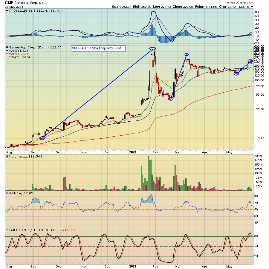
This recent spurt of short covering reminded me of our own Short Squeeze ChartList at EarningsBeats.com, which we developed late last year and provided to our members. In order to get on the list, a company's stock had to have short float of at least 20%. One of the stocks on our original list? GME, which at the time was trading under $10 a share. And of course, as you can see in the chart below, the rest was history.

In fact, Tom will be updating our Short Squeeze ChartList early next week and, if you would like to see which stocks are on the list, just click here to sign up for our FREE EarningsBeats Digest newsletter and we'll make sure you get a copy of this powerful list as soon as it is complete.
At your service,
John Hopkins
EarningsBeats.com
|
| READ ONLINE → |
|
|
|
| MORE ARTICLES → |
|
 Chart 1Another indicator that has recently gone bullish is shown in Chart 2, where the S&P Composite is compared to the long-term KST for the relative action of the financial sector. The arrows demonstrate that improving relative action by the financials is generally a very positive sign for equities in general, notwithstanding corrections along the way. That indicator has only recently gone bullish. Bearing in mind its almost perfect track record in the last 25-years and the fact that a bullish signal has only recently been triggered, it reinforces the idea that equity prices are headed substantially higher over the next year or two.
 Chart 2Will the Recent Correction Extend? Five Charts to Monitor
 Chart 3The 10-day EMA of the number of NYSE stocks above their 50-day MAs, shown in Chart 4, has been in a declining trend since the beginning of the year. That tells us that, while the NYSE Composite itself has been rising, fewer and fewer stocks have actually been participating. Three instances of joint trendline penetrations in the past were followed by some kind of a setback. A fourth such setup developed in late March, but nothing untoward has yet occurred.
 Chart 4Chart 5 plots the VIX inversely to correspond with swings in the NYSE Composite. In order to reduce unwanted volatility, it is also being displayed as a 10-day MA. There have been three occasions since 2015 when it has been possible to observe the violation of an up trendline for the inverted VIX. Each was followed by a correction of some kind. A fourth trendline, emanating at last March's low, is so far intact. Indeed, the MA is currently moving away from the line. As long as that is the case, an extension to the correction is unlikely. However, should this indicator revert to the downside in the immediate future, it would not take much to rupture that up trendline.
 Chart 5Chart 6 shows that when the 45-day ROC of the S&P Composite drops decisively below zero after spending 6-months or more above, it's usually associated with a correction. Most times, the majority of the correction follows the signal, as was the case in February of last year. At other times, the bulk of the downside has already taken place, as in early 2018 and October of last year. This indicator has been above zero since last November, so it's certainly not yet bearish.
 Chart 6Neither is the 10-day EMA for the percentage of NYSE stocks above their 200-day MA, though it's certainly overextended. The red arrows show that, when it crosses below the 80 level, this has often been associated with some kind of a correction. We have seen four successful signals since 2003 and one failure. At the current reading of 82.6, this 10-day EMA remains above the danger zone, but is so close that it is another one worth monitoring. Waiting for the actual signal certainly makes sense, as demonstrated by the 2004 and 2009 examples, where selling on an initial reading of 80 would have left a lot of profit on the table. Please don't forget that you can update any of these charts by simply clicking on them.
 Chart 7



 Some of the old Ford and GM cars can still rev their engines, but the sound of a revving engine could go the way of the dodo with EVs. Perhaps, I should say that the Global Auto ETF (CARZ) price chart is revving its engine and poised for a breakout.