| THIS WEEK'S ARTICLES |
| John Murphy's Market Message |
| APPLE MAY BE BREAKING OUT |
| by John Murphy |
TECH SECTOR SHOWS RELATIVE STRENGTH... Stocks are trading higher again today on the back of a stronger than expected jobs report. Eight of eleven market sectors are rising with technology in the lead. Relative strength by the tech sector is something we've been seeing a lot of lately. Chart 1 shows the Technology SPDR (XLK) hitting a new record again today. Its relative strength ratio in the upper box is rising as well. Some of the largest stocks in the XLK are also rising. One in particular may be scoring an upside breakout today.
 Chart 1 Chart 1
APPLE IS BREAKING OUT... Chart 2 shows Apple (AAPL) rising above its April peak to reach the highest level in five months. If those gains hold, that would constitute an upside breakout for the market's biggest stock.
 Chart 2 Chart 2
|
| READ ONLINE → |
|
|
|
| ChartWatchers |
| A Market with Bad Breadth is Still Going Up |
| by David Keller |
The S&P 500 is going higher. If you knew nothing else about the current market environment, you would consider that to be a bullish indication. As Paul Montgomery once said, "The most bullish thing the market can do is go up."
But if you look underneath the hood, you'll see the breadth measures are mixed to negative. Advancers-decliners are not confirming this week's new all-time highs on the major averages. Only 56% of the S&P members are above their 50-day moving averages. And the equal-weighted S&P is underperforming the cap-weighted S&P.
What does all the above mean? This is a narrowly led market driven by large cap growth stocks. The real question is, does it matter?
Let's review each of these three charts, talk about the current configuration and what we would need to see for a more bullish breadth picture. First, we have the cumulative advance-decline lines of the NYSE (common stock only), the S&P large-cap, mid-cap and small-cap indices.
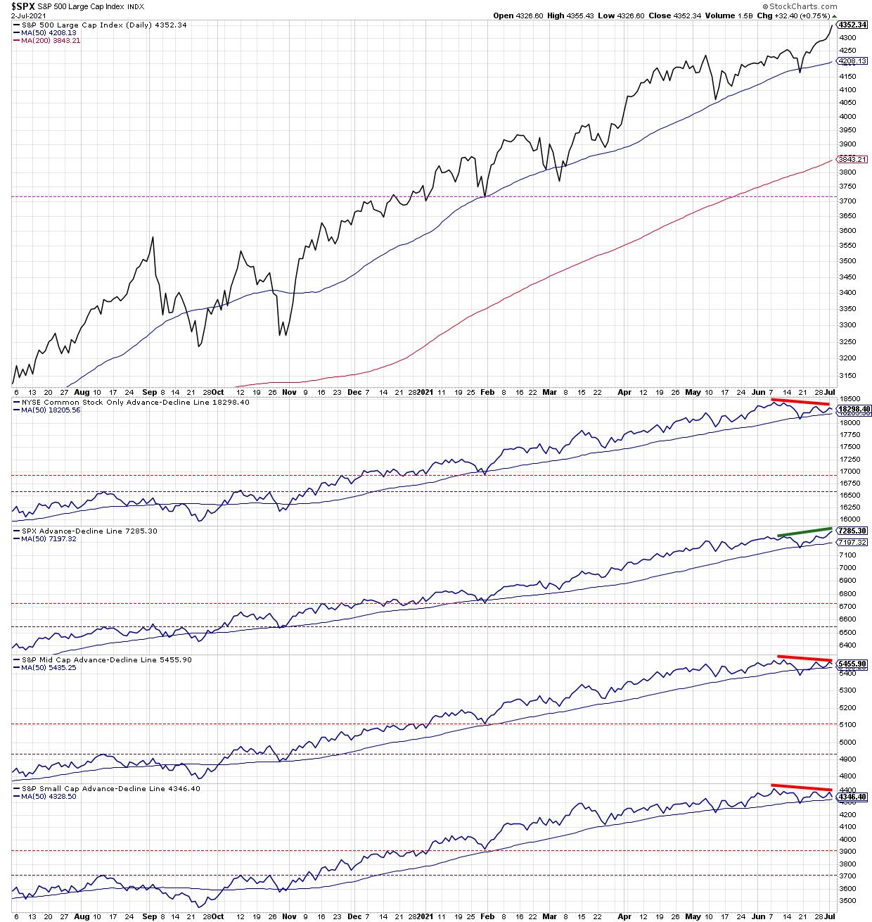
Only one of the four advance-decline lines has confirmed this week's new highs, and that's the one for the S&P 500 itself. That means that for mid-caps, small-caps and the broad NYSE common stock universe, we have made lower highs in terms of breadth. This suggests that while large-caps are pushing higher, lower-cap tiers are not participating in the most recent upswing.
What would cause this chart to turn more bullish? The other A-D lines would need to confirm new highs. Then the bearish divergence would be alleviated, and we would have a bullish confirmation.
Second, we have the percent of stocks above their key moving averages.
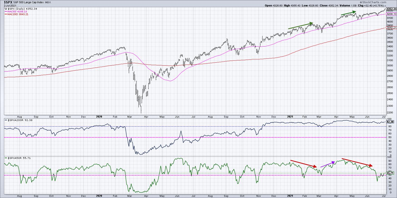
When the S&P made new all-time highs in April, about 92% of the S&P 500 members were above their 50-day moving average. The current reading is around 56%. In mid-June, that value was down around 32%. To put another way, a full 60% of the S&P 500 members broke their 50-day moving average from April to June. Since then, just under half of those breakdown names have recovered back above their 50-day.
Conclusion: many stocks have broken down and not yet recovered, even as the S&P and Nasdaq have pushed to new highs.
What would create a more bullish thesis on this chart? We would need to see continued increase in the number of stocks above their 50-day moving average. Given that most of the growth areas of the S&P have already done so, that would mean the cyclicals would need to rotate back above their 50-day and resume their uptrends.
Finally, we have the equal-weighted S&P versus the cap-weighted S&P.
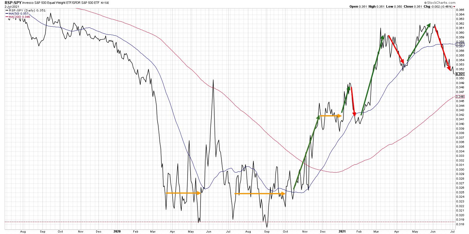
Just to review, the S&P 500 index is market cap-weighted, which means larger market cap stocks have a proportionally larger weight in the index. The equal-weighted S&P, on the other hand, treats each of the 500 stocks with the same weight. Most breadth measures, including the two we've discussed previously, are all equal-weighted indicators.
This ratio made a new high in early June but has since rotated much lower, as the S&P 500 has rallied higher more based on the strength of mega cap stocks like the FANMAG names. The ratio going lower on its own is not necessarily bearish, as it more describes the nature of leadership and where the strength is really coming from. But, in general, the market going higher with this ratio going lower tends to be a sign that many stocks are breaking down, even if the market itself is going higher.
Notice the downtrend in this ratio leading up to the 2020 market top, when the FANMAG stocks were driving the market onward and ever upward! This ratio turning higher, ideally confirming new price highs for the S&P 500, would certainly indicate more of a broad advance, with the mid-cap members of the S&P 500 participating in the market upswing.
So now, for the most important question: how much do all of the breadth readings matter, if the market continues to push higher?
The answer is that breadth really means participation. The indexes moving higher on weaker breadth suggest that there are less stocks participating in the up move. But it also means that the move is higher, and enough of the largest stocks are able to bring the entire market along for the ride.
The current situation reminds me to follow the trends (currently up), focus on risk management for charts breaking down (for example, airlines and cruise lines) and remember that the trend is your friend until the uptrend is exhausted!
RR#6,
Dave
P.S. Ready to upgrade your investment process? Check out my free course on behavioral investing!
David Keller, CMT
Chief Market Strategist
StockCharts.com
Disclaimer: This blog is for educational purposes only and should not be construed as financial advice. The ideas and strategies should never be used without first assessing your own personal and financial situation, or without consulting a financial professional.
The author does not have a position in mentioned securities at the time of publication. Any opinions expressed herein are solely those of the author, and do not in any way represent the views or opinions of any other person or entity.
|
| READ ONLINE → |
|
|
|
| ChartWatchers |
| Big Triangle Breakouts in Key Tech ETFs - How to Trade a Pullback |
| by Arthur Hill |
After leading the market into February 2020, tech-related ETFs were hit with strong selling pressure into March and extended their corrections into May. Large triangles formed in several and they broke out of these bullish continuation patterns with strong move the last seven weeks. A triangle within an uptrend represents a rest within that uptrend and it is considered a bullish continuation pattern. The breakouts, therefore, signal an end to the consolidations and a resumption of the bigger uptrends.
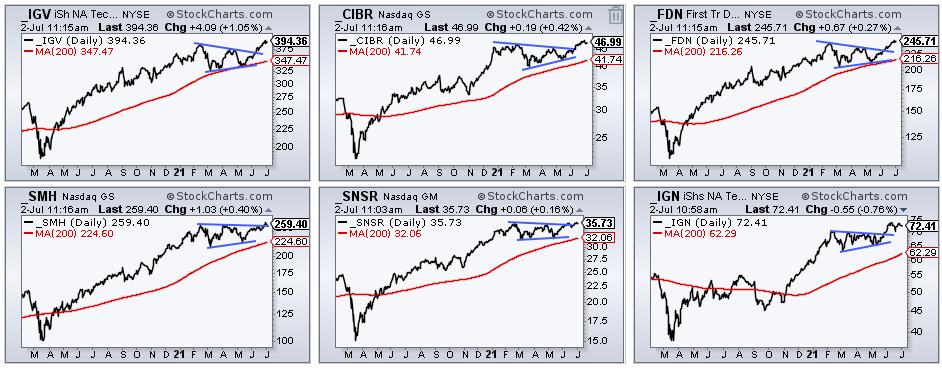
As the image above shows, there were triangle breakouts in the Software ETF (IGV), the Cyber Security ETF (CIBR), the Internet ETF (FDN), the Semiconductor ETF (SMH) , the Internet of Things ETF (SNSR) and the Networking ETF (IGN). These five ETFs also recorded new highs in June. Throw in new highs in the Technology SPDR (XLK) and Nasdaq 100 ETF (QQQ), and it is clear that tech-related stocks and ETFs are leading the market.
While the big triangle breakouts and new highs are long-term bullish, note that some of these ETFs are quite extended short-term. Of course, keep in mind that it takes strong upward momentum to become extended and this is more bullish than bearish. Trend-followers and momentum players usually don't worry about overbought conditions. Some traders may, however, wish to keep the powder dry and wait for a tradable pullback. The chart below shows IGV with a 19.5% gain since mid May and RSI above 70. Long-term strong and short-term extended.
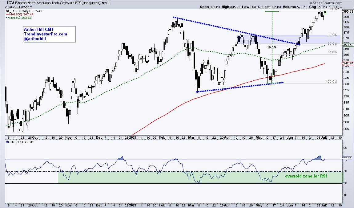
Chartists looking for an area of support after a pullback can focus on three things. First, the breakout zone turns into the first support zone to watch on a pullback. Second, it is not uncommon to see a pullback that retraces one to two thirds of the prior advance. A 38.2-50 percent retracement of the 19.5% advance would extend to the 363-373 area. Third, the rising 50-day SMA comes into play around 363. Taken together, a pullback into the 365-370 area could offer a second chance to partake in this uptrend. We, the royal "we" that is, at TrendInvestorPro.com will be watching these ETFs in the coming weeks and months. Also check out our favorites books (here).
---------------------------------------------------
|
| READ ONLINE → |
|
|
|
|
|
| ChartWatchers |
| Energy vs. Utilities: 2 Sectors, 8 Groups, 28 Stocks |
| by Julius de Kempenaer |
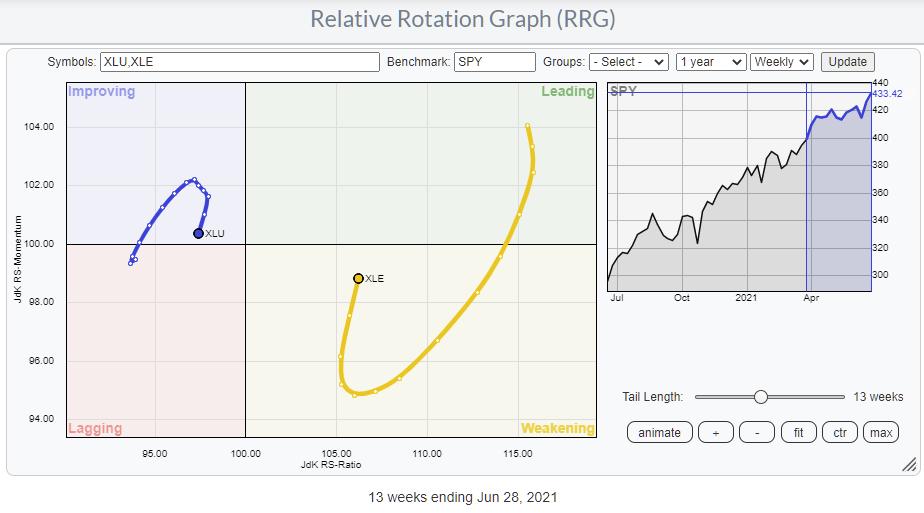
On the Sector RRG, the tails for Energy and Utilities stand out. The Utilities sector is positioned inside the improving quadrant, but started rolling over a few weeks ago and is now heading towards the lagging quadrant again. On the opposite side, Energy is inside the weakening quadrant, but is already heading back towards the leading quadrant. Both sectors seem to be embarking on a new leg in their respective relative trends; Energy upward, Utilities downward against the S&P.
The Groups
From the sector RRG, we can step down one level and look at the groups within those sectors.
UTILITIES
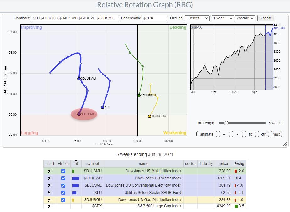 The Utilities sector consists of four groups, as seen in the RRG above. The benchmark for the RRG is $SPX, and XLU (the Utilities sector ETF) is included as a reference for the sector vs. $SPX. The Utilities sector consists of four groups, as seen in the RRG above. The benchmark for the RRG is $SPX, and XLU (the Utilities sector ETF) is included as a reference for the sector vs. $SPX.
On this RRG, the tail for Conventional Electricity ($DJUSVE) is about to rotate back into the lagging quadrant, making it the weakest group in (probably) the weakest sector, which is about to embark on a new leg down in an already established relative downtrend.
ENERGY

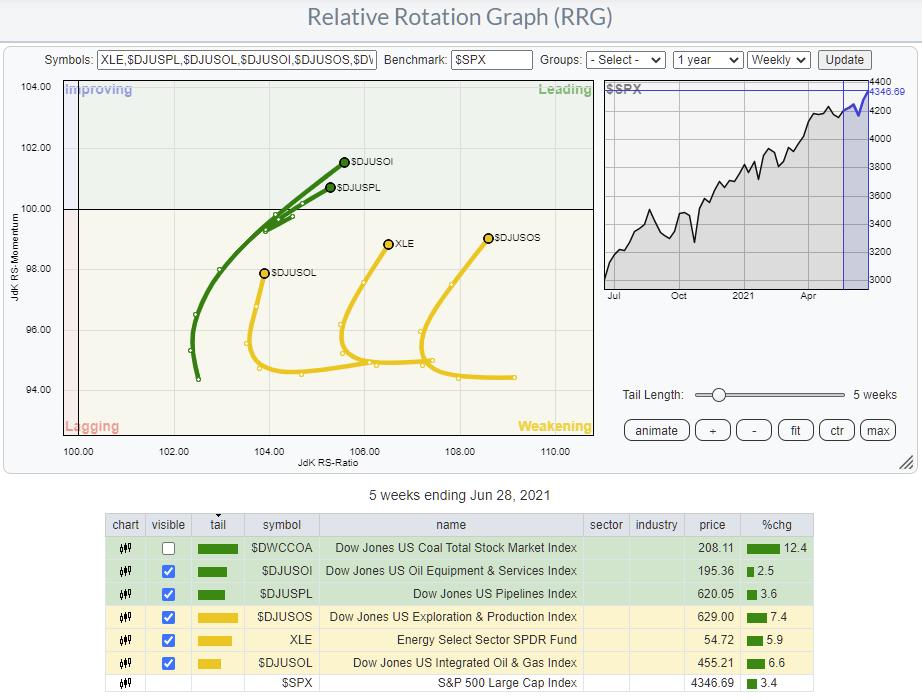
The Energy sector has five groups, as you can see in the table below the RRG. I have taken off the tail for Coal, as that group holds no stocks that are also inside the S&P 500. This leaves us with four groups on the RRG.
Using the same approach, we can identify the Exploration & Production Index as interesting because of its rotation back up towards the leading quadrant while inside weakening.
The Stocks
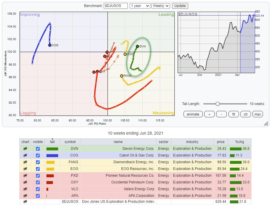
US Exploration & Production Index

This group holds eight stocks that are plotted on the RRG above against their group index $DJUSOS. One stock that really stands out in terms of rotation is DVN, Devon Energy Corp. DVN just returned back inside the leading quadrant at a strong RRG-Heading after having rotated through the weakening quadrant.

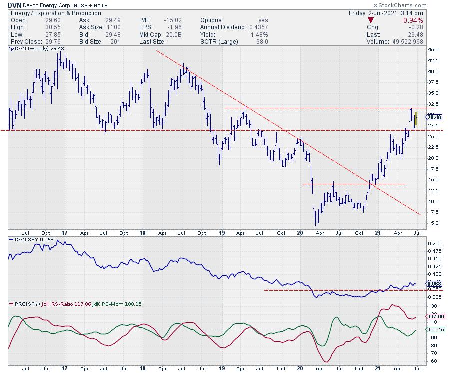
DVN started to trade higher in a new series of higher highs and higher lows at the end of 2020, when it broke a multi-year falling resistance line and, at the same time, completed a bottom formation in Relative Strength. That resulted in both RRG-Lines crossing above the 100-line and pushing DVN into the leading quadrant. After the initial break in RS, the consolidation and test of former resistance as support led to a rotation through the weakening quadrant, which is now about to get completed and bring DVN back into leading.
In terms of price, overhead supply is expected just below $32.50. Once that can be cleared upwardly, there is very little resistance left until the 2018 highs near $40.
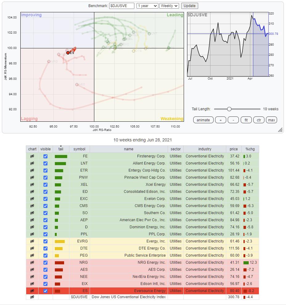
Conventional Electricity Index

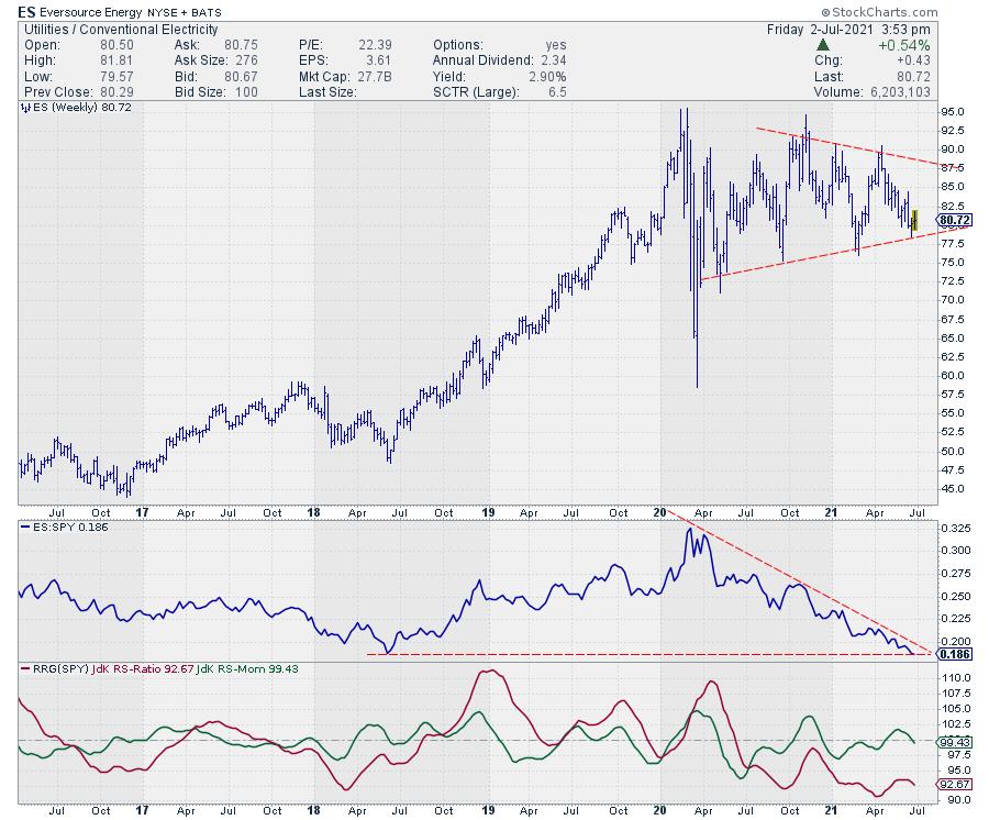
Conventional Electricity is a fairly large group with 20 constituents. On the RRG above, they are plotted against their group index $DJUSVE. I have isolated one tail because it would otherwise be hard to see. But ES, Eversource Energy, jack-knifed back into the lagging quadrant after a short move higher on the JdK RS-Momentum axis. The short tail, in comparison with the other stocks on the graph, indicates that it is a very stable relative downtrend.

After the big high-low swing at the start of 2020, ES ended up in a broad consolidation. What is more relevant for this analysis is the consistent downtrend in relative strength, which is about to break below its 2018 low. A downward break out of that big consolidation on the price chart will very likely cause an acceleration lower in both price and relative strength. That makes ES a very weak stock, in a weak group in a weak sector...
#StaySafe and have a great weekend, --Julius
My regular blog is the RRG Charts blog. If you would like to receive a notification when a new article is published there, "Subscribe" with your email address.
|
| READ ONLINE → |
|
|
|
| ChartWatchers |
| The Holiday Weekend Comes With Risks - Here's What You Need To Know |
| by Mary Ellen McGonagle |
The S&P 500 and the Nasdaq Composite both closed the week in new high ground as inflation fears continue to recede. Outside of the markets however, there's an increasing concern going into this long weekend, as health experts are eyeing an increase in the spread of the Delta variant of the COVID-19 virus. In fact, the Biden administration has readied "surge response teams" that will focus on high-risk areas that have lower-than-average vaccinations.
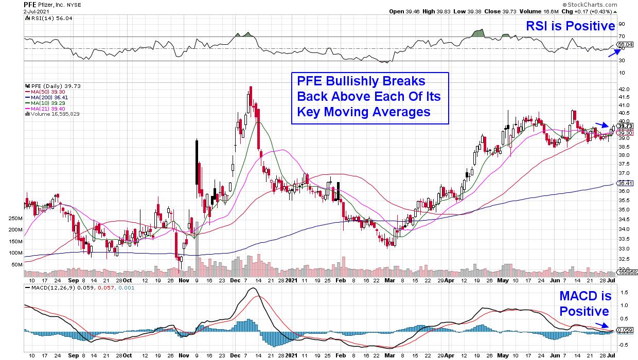
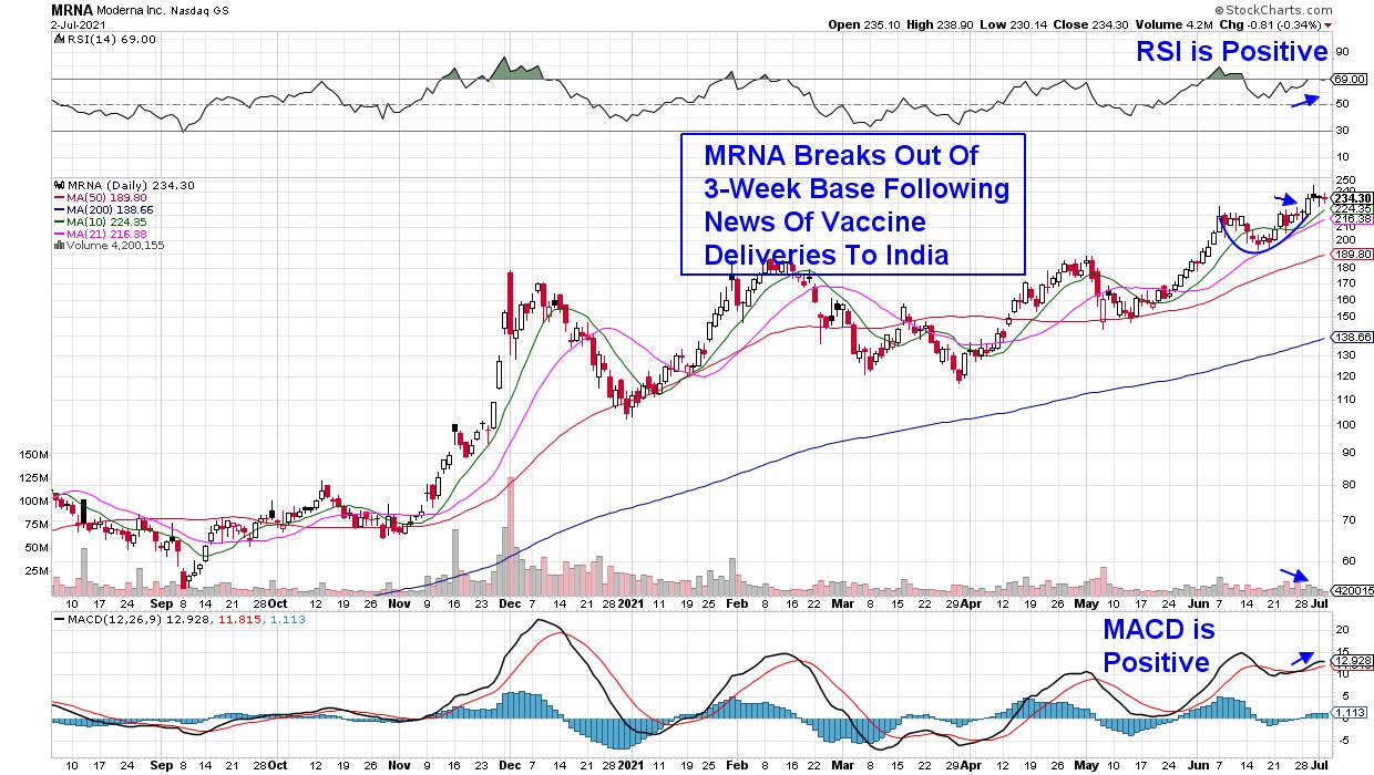
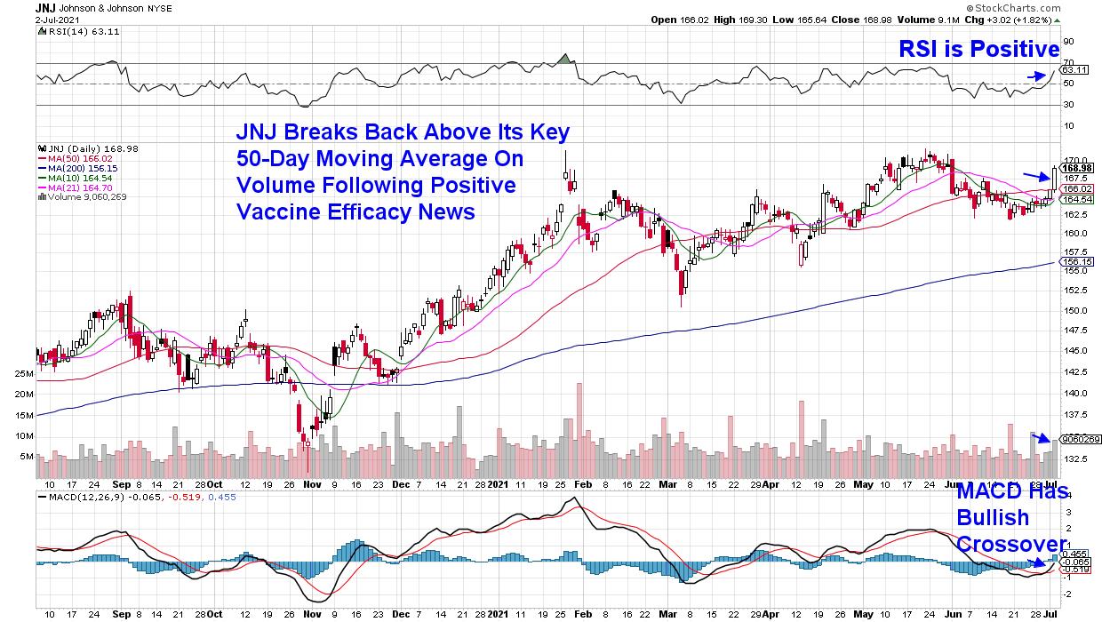
The Delta variant's takeover in the U.S. is viewed as inevitable, but there is good news for those already vaccinated by Pfizer (PFE), Johnson & Johnson (JNJ) or Moderna (MRNA)'s vaccine. Each company has announced at least a 90% protection rate against hospitalization from the Delta variant. The positive news has pushed Pfizer (PFE) and Johnson & Johnson (JNJ) back into uptrends, while Moderna (MRNA) experienced a bullish 3-week base breakout. These stocks each appear poised for further near-term upside.
Below is a daily chart of Pfizer (PFE). The company was the first to receive FDA emergency use for its COVID-19 vaccine last November in a move that shattered previous development records. Pfizer CEO Albert Bourla expects that we'll be using vaccines to keep the disease under control in the long-term, with data now showing that a third booster will be helpful for those who've received their first 2 shots. The company is currently estimated to grow earnings by 68% vs last year, and the 3.9%-yielder currently has positive momentum indicators that could point to a rally to its recent highs and beyond.
DAILY CHART OF PFIZER INC. (PFE)

Next up is Moderna (MRNA), which hit a record high in price last week following news of 2 positive developments. The company announced that its COVID-19 vaccine appears to protect against several new coronavirus strains including the Delta variant. In addition, MRNA reported that India granted Emergency Use Authorization for its vaccine.
Moderna's 3-week base breakout pushed the stock into an uptrend, and MRNA can be bought on a pullback to its 5-day simple moving average at the $232 level.
DAILY CHART OF MODERNA (MRNA)

Last up is single-shot COVID-19 vaccine provider Johnson & Johnson (JNJ) which also announced its ability to combat the Delta variant as well as other highly prevalent viral strains last week. In addition the World Bank announced a deal to fund JNJ's vaccine production in South Africa to help meet demand for billions of doses.
Johnson & Johnson bullishly broke back above its 50-day moving average following the positive news. With its RSI and MACD in positive territory, JNJ is now in an uptrend and can be bought.
DAILY CHART OF JOHNSON & JOHNSON (JNJ)

There is plenty of bullish action elsewhere in the markets as well, with Large-Cap Growth stocks leading the markets higher. Growth stocks fare well in a period of declining interest rates and, last week, we saw yields fall even further from their recent May highs.
Subscribers to my MEM Edge Report have been alerted to several big winners in the Technology area, such as Semiconductor stock Nvidia (NVDA), which has gained over 20% in the past four weeks. In addition, I'm continuing to monitor the broader markets for signs of a pullback in the S&P 500 following last week's move into an overbought position. If you'd like to have access to high level insights into sector rotation and stock's poised to outperform, use this link here to take a 4-week trial of my bi-weekly MEM Edge Report for a nominal fee!
Warmly,
Mary Ellen McGonagle, MEM Investment Research
|
| READ ONLINE → |
|
|
|
| ChartWatchers |
| How to Determine Which Companies Will Report Blowout Results |
| by Tom Bowley |
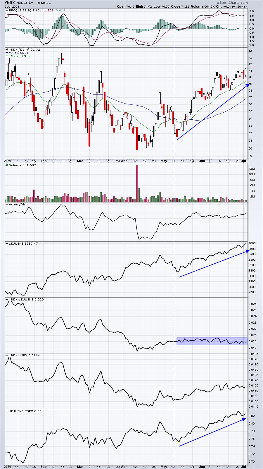
I view relative strength as one of the most important aspects of technical analysis. It helps me visualize where the money is going. When you review a price chart, it's very easy to see if a stock is going up or going down. As an example, let's look at internet stocks ($DJUSNS). This has been the 5th best industry group (out of 104) over the past three months. Yandex (YNDX) is in the internet space and has gained more than 15% over the past few months. Here's the chart:

Charts tell us stories, if we'll only listen. When I look at the above chart, I see a stock that's performing well primarily because the industry is performing well. It has nothing to do with its own relative leadership, it's simply being dragged higher by its group. So you can imagine what's likely to happen to the stock if the industry begins to trend lower. It's not likely to be pretty. Leaders within a strong group provide you the ability to outperform the S&P 500. That's how we strategize in our portfolios at EarningsBeats.com, which have crushed the benchmark over time.
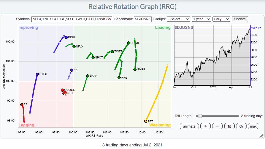
Using price relative charts like the one above can help us to visualize the merits of an investment, but another way to evaluate several companies within an industry group simultaneously is to use an RRG (relative rotation graph) chart. The internet group provides us many candidates to consider. As you look at the following RRG chart, I think it'll become clearer which stocks are the leaders within the space:

So, while the YNDX price chart looked pretty solid, uptrending nicely the past few months, the RRG chart shows us several internet names that are truly leading the index higher - and none of them are YNDX. Every stock that's on the right side of the vertical axis is showing relative strength. YNDX sits next to Alphabet (GOOGL), just left of the vertical axis, and also in the lagging quadrant. YNDX is moving higher because internet stocks are strong and carrying it higher. YNDX is not a leader.
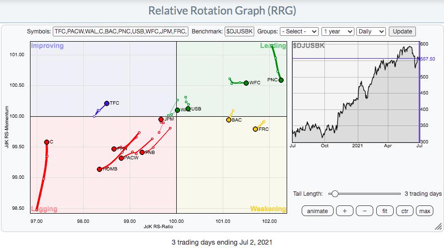
Now let's turn our attention to banks as they kick off earnings season in the next couple weeks. Which banks are Wall Street professionals favoring? Well, in my latest EB Digest newsletter article on Friday, I used price relative charts to show that Wells Fargo (WFC), Bank of America (BAC) and PNC Financial (PNC) are among the leaders. But let's add several more bank names that will be reporting earnings at the beginning of earnings season on an RRG chart to see which ones Wall Street is "banking" on:

The RRG chart is confirming exactly what I saw on the price relative charts. PNC, WFC and BAC are among the best bank names heading into earnings season. I expect excellent reports from these three. A fourth name to consider would be First Republic Bank San Francisco (FRC). Rotation has been swaying towards these stocks, which suggests to me that Wall Street likes what it's seen/heard from management over the past several weeks. Meanwhile, Citigroup (C) has been lagging badly and perhaps we'll find out why when they report their quarterly earnings on July 14th.
On Tuesday, July 6th, at 4:30pm ET, I'm hosting a "2021 2nd Half Market Outlook" webinar that will be open to the public. I plan to discuss several intermarket relationships that enable us to determine the sustainability of the current secular bull market advance. In addition, I'll be evaluating sectors, looking for those likely to lead during the second half of the year. Finally, I'll have additional RRG charts to help us visualize the true leaders of this rally. These are the companies that will help you beat the S&P 500. If you'd like to attend, you can save your spot by simply subscribing to our FREE EB Digest newsletter. There's no credit card required and you may unsubscribe at any time. We'll send out webinar instructions to our entire community on Tuesday. CLICK HERE to enter your name and email address and get your free subscription started!
Tom
|
| READ ONLINE → |
|
|
|
| DecisionPoint |
| 2021 Q1 Earnings Results: Still Massively Overvalued and Who Cares? |
| by Carl Swenlin |
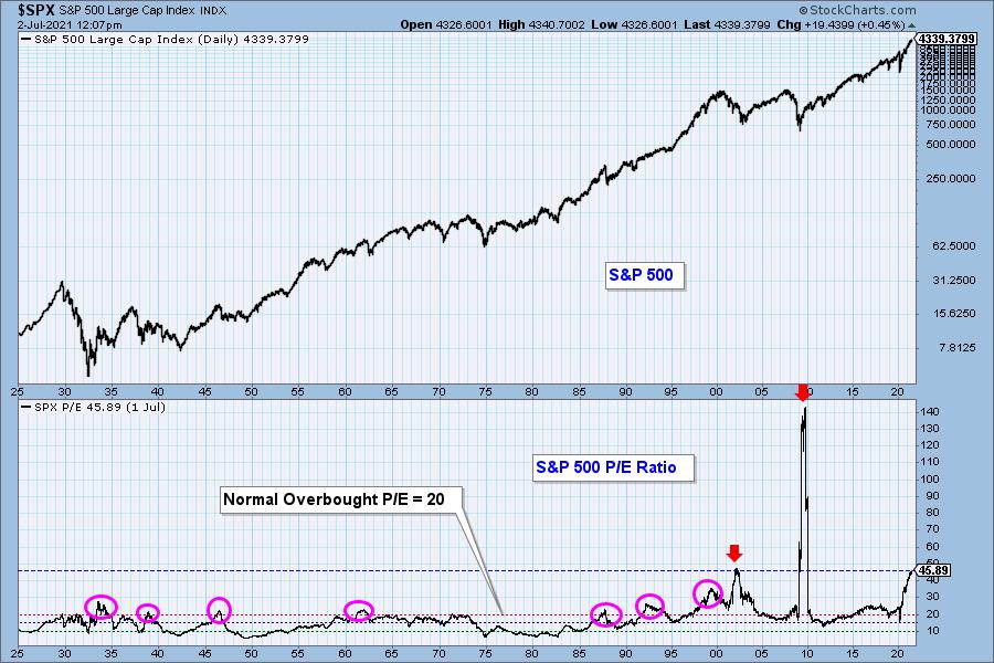
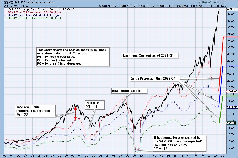
The normal P/E range for the S&P 500 is 10 (undervalued) to 20 (overvalued), but the P/E spike in 2009 nearly pushed that range into oblivion. The current P/E of 45.89 is the third highest in history, but it is the highest ever reached during a market advance. (The P/E peaks in 2002 and 2009 were reached after major market crashes.) There are two factors that can cause the P/E ratio to rise: (1) rising price and/or (2) falling earnings. Currently, prices and earnings are rising, but prices are rising much faster.

Overvalued means that people are paying too much for stocks based upon traditional valuation measures. The excess of overvalued markets can persist for years and is not a condition that requires immediate correction. Overvaluation is, however, a condition that can exacerbate declines because there is no intrinsic "value" present to incentivize potential buyers. Overvaluation doesn't matter . . . until it does.
The following chart shows us the normal value range of the S&P 500 Index, indicating where the S&P 500 would have to be in order to have an overvalued P/E of 20 (red line), a fairly valued P/E of 15 (blue line), or an undervalued P/E of 10 (green line). Annotations on the right side of the chart show where the range is projected be based upon earnings estimates for the next four quarters, through 2022 Q1.


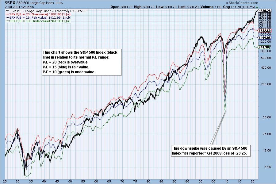
Historically, price has usually remained below the top of the normal value range (red line); however, since about 1998, it has not been uncommon for price to exceed normal overvalue levels, sometimes by a lot. The market has been mostly overvalued since 1992, and it has not been undervalued since 1984. We could say that this is the "new normal," except that it isn't normal by GAAP (Generally Accepted Accounting Principles) standards.

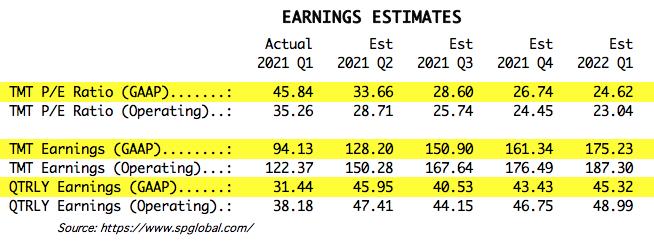
We use GAAP earnings as the basis for our analysis. The table below shows earnings projections through March 2022. Keep in mind that the P/E estimates are calculated based upon the S&P 500 close as of today. They will change daily depending on where the market goes from here.

The following table shows where the colored bands will be, based upon earnings estimates through 2022 Q1. We can also see what the estimates were last quarter.

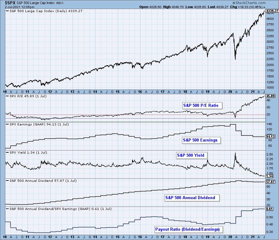
This DecisionPoint chart keeps track of S&P 500 fundamentals, P/E and yield, and it is updated daily -- not that you need to watch it that closely, but it is up-to-date when you need it.

CONCLUSION: This is the most overvalued market ever. While it doesn't require immediate correction, the amount of excess has got to be a major concern. But, who cares? Almost nobody.
(c) Copyright 2021 DecisionPoint.com
Technical Analysis is a windsock, not a crystal ball.
Helpful DecisionPoint Links:
DecisionPoint Alert Chart List
DecisionPoint Golden Cross/Silver Cross Index Chart List
DecisionPoint Sector Chart List
DecisionPoint Chart Gallery
Trend Models
Price Momentum Oscillator (PMO)
On Balance Volume
Swenlin Trading Oscillators (STO-B and STO-V)
ITBM and ITVM
SCTR Ranking
|
| READ ONLINE → |
|
|
|
| Top Advisors Corner |
| Gold and Dollar Share an 8-Year Cycle Period |
| by Tom McClellan |

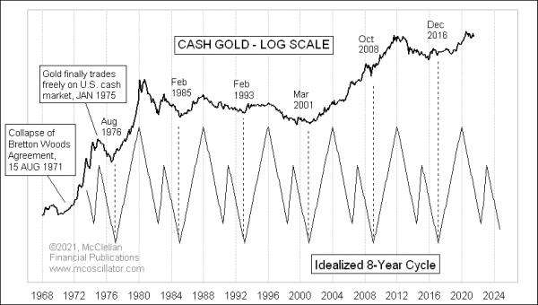
There is an important 8-year cycle operating in both gold prices and the Dollar. That part makes sense, since a rising Dollar tends to be harmful to gold's prospects. But it is more complicated and interesting than that. And it is not exactly the same 8-year cycle operating in both of them.
This week's lead chart shows my version of the ideal 8-year cycle pattern in gold prices. I first synthesized this back in 2003 and it has kept working pretty well since then, for the most part. It consists of a strong 3-year up phase, followed by a more complex 5-year downward phase. We are currently in the early portion of that 5-year downward phase right now. That means gold prices should ideally keep working their way lower toward an important bottom due in late 2024 to early 2025. The exact lows have ranged from August of the years divisible by 4 to February of the following year, at least during the period of time for which we have usable data. Gold only became tradable in the USA starting in January 1975.
The 2000s showed a unique anomaly which tests this pattern hypothesis. There were indeed bottoms in March 2001 and October 2008, which fit nicely with the 8-year cycle lows. But the 5-year downward phase did not really work then, as the artificially lowered interest rates courtesy of the Federal Reserve helped to fuel a major bull market in gold prices. The other cycles have seen the 5-year down phase work according to the pattern's hypothesis.
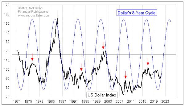
The Dollar Index seems to also follow its own 8-year cycle, albeit slightly out of phase with gold's version. And it is not the same 3-up, 5-down pattern. Here is the US Dollar Index, with a more conventional 8-year sine wave depiction.
This cycle suggests that the Dollar Index should be heading upward now toward a cycle top due around 2024. I could calculate it more precisely than that, but it would be rather pointless since the actual tops are not always terribly punctual.
A presumably rising Dollar value will put downward pressure on gold prices, since a more valuable Dollar can buy more gold, all other things being equal. So that fits with the 8-year cycle for gold prices, calling for a decline to a low due in 2024-25.
No one should expect that either trend, in gold or the Dollar, should be in a straight line. History shows that their trends do not work that way. But it is still worth knowing what the underlying trend is supposed to be, so that one can know whether to trade with that trend or against it.
|
| READ ONLINE → |
|
|
|
| MORE ARTICLES → |
|
 Chart 1
 Chart 2


 The Utilities sector consists of four groups, as seen in the RRG above. The benchmark for the RRG is $SPX, and XLU (the Utilities sector ETF) is included as a reference for the sector vs. $SPX.