| THIS WEEK'S ARTICLES |
| The Mindful Investor |
| Three Reasons I'm a Little Less Bearish |
| by David Keller |
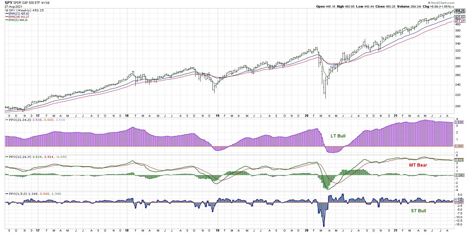
My medium-term Market Trend Model turned bearish in May and has remained consistently bearish ever since. The market hasn't seemed to notice and has continued to make new all-time highs in every subsequent month.
So how do we reconcile these two conflicting signals, with a model turned negative and the major indexes pushing higher?

I would argue that the markets have been in a "stealth correction" since May, when cyclicals ceased their run of outperformance and sectors like Energy and Financials started to roll over on a relative basis. While the major indexes have continued to push to new highs every month, many stocks have experienced 10%, 20% or even 30% pullbacks during that same period. So the correction has certainly been happening all the while.
I saw three things this week that encouraged me to be less bearish about the markets as a whole (although, to be clear, I am as cautious as ever about the potential for downside!) and more constructive on prospects for equities between now and year-end.
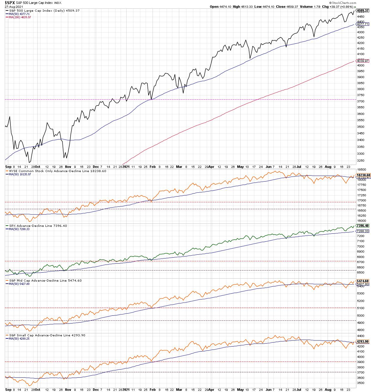
First, the breadth deterioration has become less negative and is back to neutral/bullish.

On The Final Bar earlier this week, my guest John Kosar from Asbury Research talked through his macro technical model, which recently rotated to all bullish signals. The last indicator to turn positive? The NYSE advance-decline line, which just rotated back above its 50-day moving average. While the S&P 500 advance-decline line has remained bullish through all of 2021, the mid- and small-cap names have experienced more drawdowns and thus the negative breadth picture. But that picture has become less negative this week.
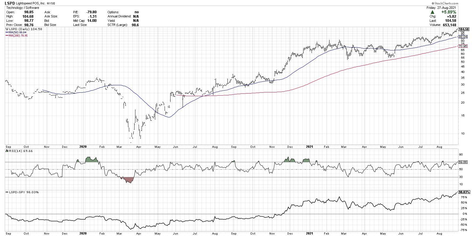
Second, I'm finding plenty of names making new highs, particularly in sectors like Technology.

I often screen for stocks making new three-month highs and lows, as this can help identify not only stocks in long-term trends, but also charts that are just starting to break out of bases or below key support levels.
This week, I focused on a number of tech names that broke out of established bases with improving price and relative profiles. Lightspeed POS (LSPD) is a good example of this type of chart. While this chart alone should not cause one to be broadly bullish, the fact that I'm finding plenty of stocks breaking to new highs (about a six-to-one ratio new highs to new lows on Thursday) suggests broad participation to the upside.
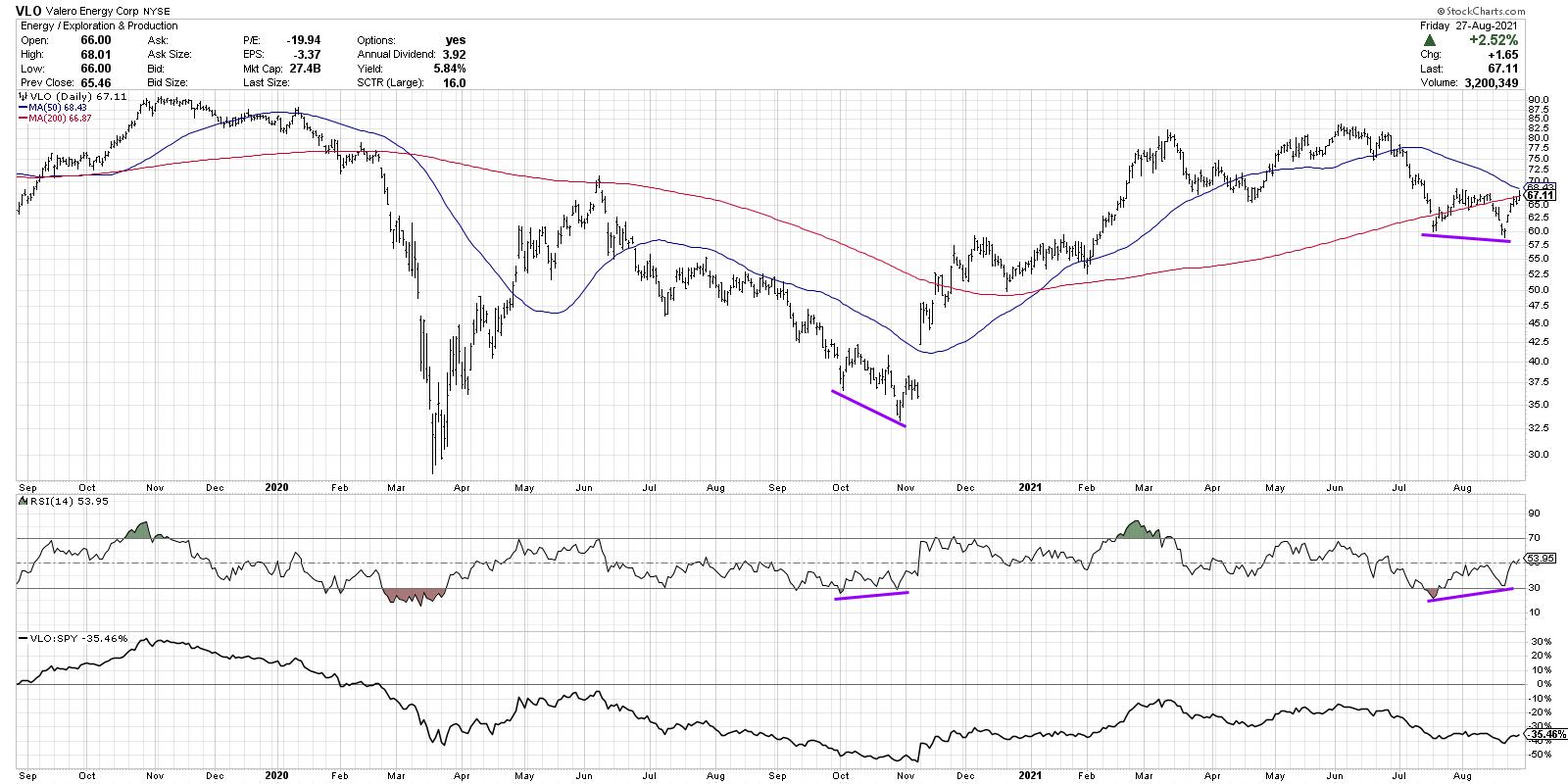
Finally, I've noticed bullish momentum divergences on key groups, particularly the Energy sector.

A bullish momentum divergence exists when price makes lower lows but an oscillator like RSI makes a higher low. We saw this back in October 2020 on stocks like VLO, when Energy was way off investors' radars after a run of underperformance. Soon after, Energy and Financial names rotated higher and outperformed growth sectors through the beginning of 2021. These stocks are now showing a very similar configuration, which suggests upside potential in a sector that has again lagged behind other stocks. This could suggest renewed leadership from cyclical sectors through year-end, as long as these stocks continue higher to validate this week's divergence.
One final note: I was recently asked about trailing stops and recorded a brief video about using support and resistance levels for charts like DIS to minimize downside risk. I also discussed the 50-day moving average, which, I would argue, is the most important line to watch for the S&P 500! More in the video below:
RR#6,
Dave
P.S. Ready to upgrade your investment process? Check out my free course on behavioral investing!
David Keller, CMT
Chief Market Strategist
StockCharts.com
Disclaimer: This blog is for educational purposes only and should not be construed as financial advice. The ideas and strategies should never be used without first assessing your own personal and financial situation, or without consulting a financial professional.
The author does not have a position in mentioned securities at the time of publication. Any opinions expressed herein are solely those of the author, and do not in any way represent the views or opinions of any other person or entity.
|
| READ ONLINE → |
|
|
|
| ChartWatchers |
| Making the Case for This Small Cap Software Stock to Explode |
| by Tom Bowley |
It wasn't too long ago that a $5 billion market cap company was considered a "mid-cap". But in today's mega-cap world of Apple (AAPL) and Microsoft (MSFT) sporting $2.46 trillion and $2.25 trillion market caps, respectively, $5 billion to them is spare change. So, in this land of giants, I thought I'd pour through all of my quarterly earnings research to try to find a $5 billion nugget that might soon grow to be a $10 billion nugget.
The Exhaustion Gap
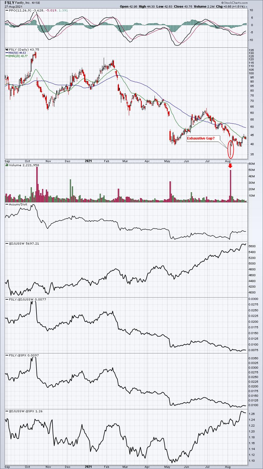
An exhaustion gap occurs at the end of a very strong and lengthy trend -- either to the upside or downside. It's typically characterized by extremely heavy volume. In my experience, an exhaustion gap that ends an uptrend is usually a black candle, which is a huge opening gap higher followed by intraday selling. Alternatively, in the case of a bottom, a huge opening gap lower, followed by intraday buying. Again, the key is for massive volume to accompany the day's price action. Enter Fastly (FSLY), which recently reported a revenue miss and lowered both revenue and EPS guidance for the upcoming quarter and fiscal year 2021. Longs were not happy and, based on the chart action, I'd say they threw in the towel:

Clearly, FSLY has been in a downtrend. But the "feel" of this latest drop and decline is different from those in recent months. This latest drop after earnings began with another HUGE opening gap lower, but it finished with a big hollow candle, meaning that its close was well above its opening price -- a sign of possible accumulation. Combine that with the next two days' candles, which were similarly hollow, and a case could be made that FSLY has run out of sellers. FSLY's AD line also recently moved to a 3-4 month high.
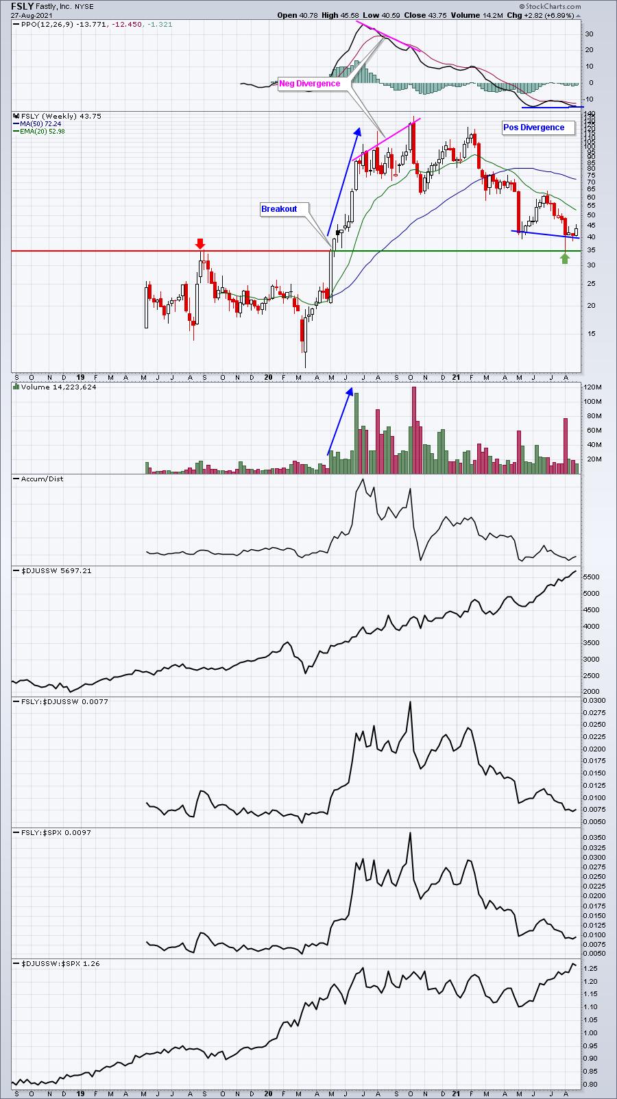
But there's one other bullish point to be made on FSLY's weekly chart:

FSLY's breakout past 35 in May 2020 had not been retested.....until that earnings-related gap lower. The weekly chart suggests 35 could definitely be a turning point and the exhaustion gap is adding to that possibility. Obviously, a close beneath 35 challenges this theory, but, until then, I'd be looking for higher prices ahead for FSLY -- potentially much higher prices.
Another software stock gapped lower with its earnings, printing a double bottom, before rallying strongly. I believe it's in a bottoming phase as well and will feature it in our free EB Digest newsletter on Monday morning. If you're not already a free subscriber (no credit card required), CLICK HERE to register with your name and email address.
Happy trading!
Tom Bowley, Chief Market Strategist
EarningsBeats.com
|
| READ ONLINE → |
|
|
|
| ChartWatchers |
| RRG's Road to StockCharts.com |
| by Julius de Kempenaer |

This month marks exactly seven years ago that I started contributing to the StockCharts website, after Relative Rotation Graphs were added to the graphical toolbox in July 2014.
As the number of eyeballs on RRGs, the blog and the weekly episodes of Sector Spotlight has grown substantially over these years, I thought it would be cool to recycle an updated version of my very first blog article, describing how Relative Rotation Graphs made their way to the StockCharts platform.
I am pretty sure that many of today's readers may have missed that introduction and the backstory. So here is an updated version!
As of last Saturday (19 July, 2014), StockCharts.com has launched Relative Rotation Graphs as part of their web-based charting services.
The past few months here at RRG Research, we have been working hard with the StockCharts.com staff to implement Relative Rotation Graphs in their web-based charting service. And, I must say, we're very impressed with their professionalism. They have created a very nice web-based version of RRG. All this hard work has now led to the official launch of RRGs on StockCharts.com. Needless to say, it's something we're very proud of.
As you may know, RRGs have been available on the Bloomberg terminal since January 2011 and on Thomson Reuters EIKON (now Refinitive) terminals since late 2013. Market Analyst International (now Optuma Software) has also been offering an RRG toolbox as an add-on for their Market Analyst v7 software since early 2013.
Hence, RRGs were only available on professional systems and a high-end technical analysis software package..... that is, until now!
It All Started in 2009
The relationship with StockCharts.com goes back to 2009. In November of that year, I presented Relative Rotation Graphs for the first time at a major conference, the annual IFTA conference in Chicago.
In the room was Greg Morris, someone I only knew from his books until then, he approached me after my talk and told me: "this was the first time in 25 years someone actually showed me something 'new.'" (Editor's Note: That sounds like something Greg would say.) When we found out that, besides a passion for technical analysis we also shared a military/air force background, the day was too short and the bar did not carry enough bottles of beer for us.
At some stage, Greg asked me what I wanted to do with RRG. I told him I was already talking to Bloomberg for them to have RRGs on their professional terminal, but that I would be very interested to be introduced to StockCharts.com to get the tool on a service like theirs. Before I was back in Amsterdam, Greg had connected me with Chip Anderson, the President of StockCharts.com.
Too Early
Following that introduction, Chip and I started to chat about having RRG on the SCC platform. In hindsight, that discussion was probably too early. RRGs were still "too rough" at the time and not very well known yet.
Remember, they would only be introduced on the Bloomberg platform two years later in 2011. After our initial conversations, I stayed in touch with Chip, who proved to be a valuable resource, and I learned a lot about servicing retail clients and web-based charting platforms.
The basic message he gave me was "It's a great tool, but it needs (much) more recognition and visibility before I can do anything with it on StockCharts.com." Wise words indeed. You can only "introduce" something once... and it has to be done properly right from the bat.
From San Francisco to New York
Our connection was then renewed during the 2013 IFTA conference in San Francisco, where Trevor Neil and I sat down with Chip again. Trevor is my partner in RRG Research and is based in London, UK.
At that stage, we already started to receive messages from visitors to our website - www.relativerotationgraphs.com - saying things like "please make RRGs available via sites like StockCharts.com." By the way, that website is now getting really old, and we are working on a new version which I hope will be released in the next few months. From November 2013 until April 2014, we stayed in touch discussing our potential cooperation, which was then sealed with a handshake and finalized during the MTA symposium in New York.
From May to July, we worked together on the implementation. That period was nothing but professional "fun" and it resulted in a very good-looking and, more importantly, a very functional implementation of Relative Rotation Graphs on the platform.
For me, it's always fun to work with programmers and see how they implement certain things slightly different than others, but most of all how they can get carried away thinking of all the "stuff" they can do based on the RRG concept. Pete Behmer, the programmer in charge of RRG on SCC, was no different, and Chip told me he had to slow Pete down a few times because "otherwise we would still be coding up all kinds of cool functionality and not have a product out for the users."
Since then, I have met with Pete in the (old) StockCharts office in Redmond and I can totally understand Chip's words.
Ready for Launch in July
In the second week of July 2014, Chip declared RRG ready for launch and, subsequently, the first version of the tool was introduced for StockCharts users on Saturday, 19 July 2014. And, reading from the first reactions, I think we can call it a success. I hope that the RRG tool on SCC will be picked up by its users like it is picked up on the other platforms where RRG is available.
Ongoing Interaction
As regulars will know and can attest to, I love to get feedback and learn from it or help you to get your questions answered. So please continue to feel free to put up any questions or discussions in the forums or comment on any (blog) post or video. And I will continue to personally answer them.
I am pretty sure I have not answered every email that came in, but after a quick look in my mailbox and doing some rough calculations, I think that, over in the past seven years, I have received and answered somewhere around 4000 emails, comments, etc. following 283 blog articles and 93 episodes of Sector Spotlight. I am looking forward to the next 4000 messages ;)
If you have not seen RRG on the StockCharts platform yet, you can check it out here.
Shortly after the introduction, we wrote an RRG section in ChartSchool, which you can find here, as well as a support article here describing the different functionalities of the RRG implementation.
The first sketches for RRG in ACP are ready and some initial Proof of Concept coding is underway. There is no timeline yet, but a newer and, very likely, upgraded version of RRG will certainly make its way to ACP in the future. So please stay tuned and stay in touch.
--Julius
|
| READ ONLINE → |
|
|
|
|
|
| Martin Pring's Market Roundup |
| Dollar Index Breakout Trick or Treat? |
| by Martin Pring |
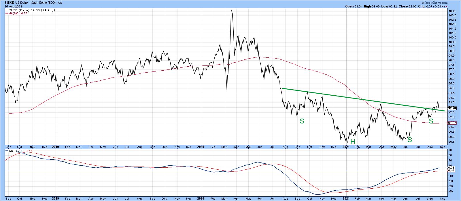
Back in June, I wrote about the possibility that a major reversal in the dollar could be underway, but that certain things had to happen before we could come to a firm conclusion. One of those conditions was a Dollar Index daily close above 93.5, as that would complete what was then a potential inverse head-and-shoulders pattern. Some may interpret that pattern as a double bottom due to the very low positioning of the right shoulder. I don't think it's important either way, because it still represents a battle between buyers and sellers, which was resolved in favor of the buyers -- or was it?
 Chart 1 Chart 1
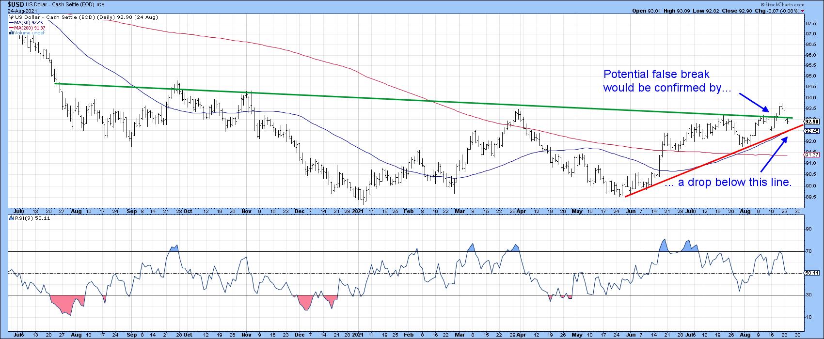
Chart 2 indicates that, when looked at from a bar chart aspect, the breakout did not hold. There is a chance, then, that it will turn out to be false. For the bulls, the breakout could turn out to be a trick rather than a treat!
While that's definitely a possibility, in technical analysis it's important to look at the weight of the evidence rather than basing decisions on one event or indicator. In that respect, I have a rule that states that a valid false breakout needs to be confirmed before the odds favor it being valid. In that way, the potential false breakout represents one piece of evidence, the other being provided by some form of trend confirmation, such as a trendline violation or reliable moving average crossover. In the current situation, that confirmation would come from a break below the red trendline. That line takes on greater significance as a support level since it is intersecting with the 50-day MA, which is why you can't see the latest plots. The average is currently at 92.45.
 Chart 2 Chart 2
The Long-Term Picture Reversing
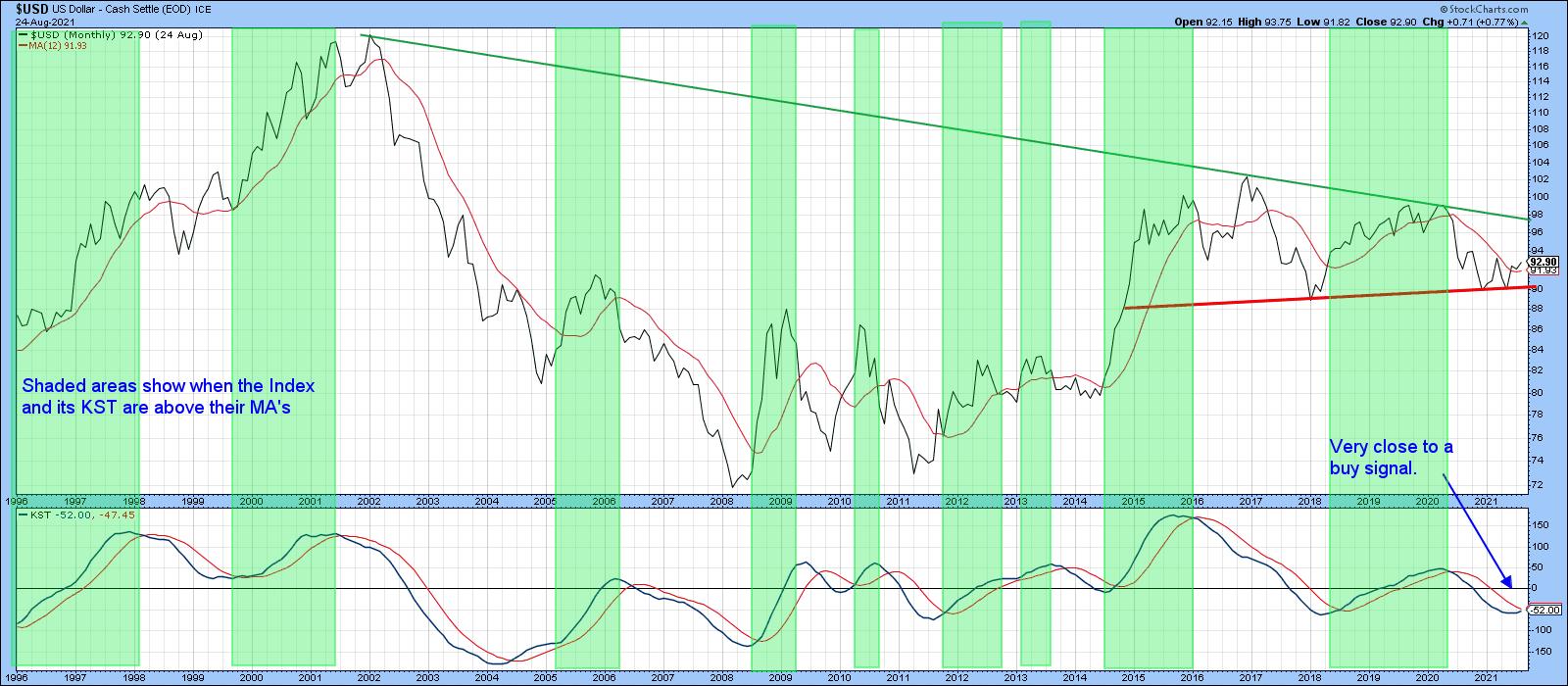
Taking a longer view, several indicators have gone bullish since my mid-June piece on the dollar. One of those is the position of the Index relative to its 12-month MA. Chart 3 shows that it has been bullish for a couple of months, though the crossover is not yet decisive. The shaded areas demonstrate those periods when both series are above their respective moving averages. A bullish signal looks to be pretty close, as the KST has already been rising and reversals of this nature usually offer a firm indication of a change in trend.
 Chart 3 Chart 3
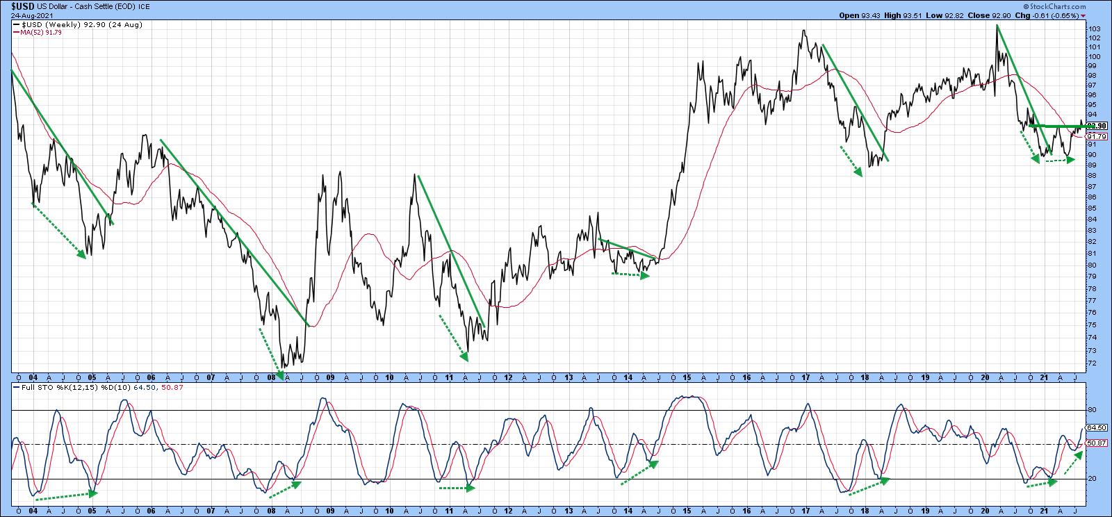
Chart 4 features a long-term weekly stochastic using the 12, 15 and 10 parameters. The dashed green arrows show positive divergences that have taken place over the last 15 or so years. When confirmed by a trendline break in the Index, these setups have resulted in some nice dollar rallies. Another positive divergence developed at late last year. That was immediately followed by a break above the sharp 2020 down trendline and a subsequent test of last October's low. As that was happening, the stochastic diverged positively again and the Index broke to the upside. Note that there was very little downside stochastic momentum at the 2021 May/June low, which is a positive sign going forwards.
 Chart 4 Chart 4
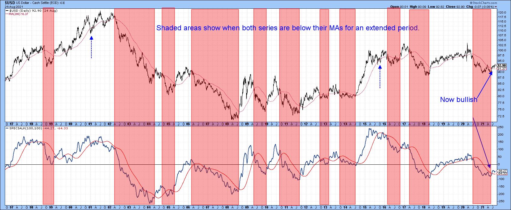
Chart 5 compares the Dollar Index to the Special K indicator (SPK), which you can read about here. The pink shadings flag periods when the Index is below its 200-day MA and the SPK is under red signal line. The two dashed blue arrows tell us that, occasionally, this approach results in whipsaw signals. By and large, though, the shaded periods catch the majority of the declines and the unshaded ones the rallies. In the last few days, both series have decisively surpassed their moving averages, thereby triggering an intermediate-to-long-term buy signal. Remember, these Special K signal line crossovers do not happen that often, so they are usually a big deal. By way of example, there has only been one positive crossover since 2017.
 Chart 5 Chart 5
The Dollar vs. Dollar Sympathy Relationships
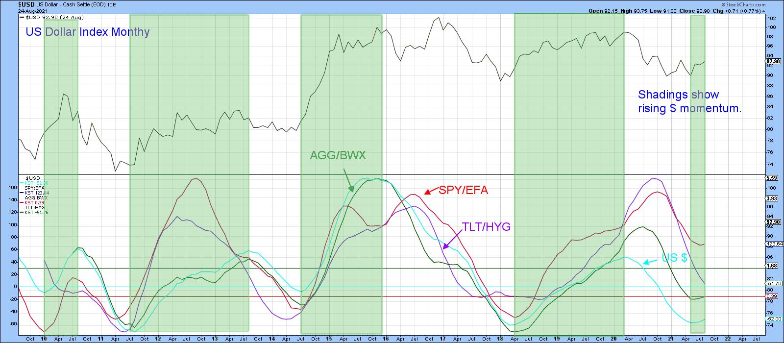
Finally, it's often a good idea to compare the performance of the dollar to various intermarket relationships that typically move in sympathy with swings in the Index. If the majority do not, then this throws some doubt on the trend being signaled by the Index itself. These relationships include US versus foreign stocks and bonds, as well as US credit spreads and inverted commodities. Three of those four relationships are featured in Chart 5 in long-term KST format.
The green shadings indicate when the (turquoise) KST for the dollar is in a rising mode. Note that it is normal for these sympathy relationships to move with it. That's exactly what began to happen in the last month.
 Chart 6 Chart 6
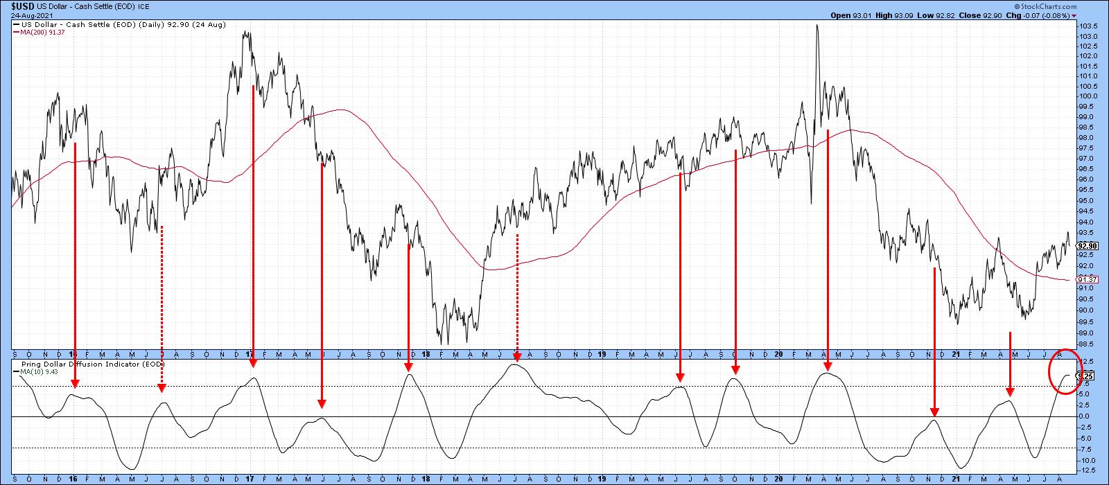
Dollar Diffusion a Problem
So far, the charts featured in this article look as if they are in the process of turning to the upside. That said, Chart 6 could be a problem. It features a diffusion indicator monitoring a universe of cross-dollar relationships in a positive trend. The solid red arrows tell us that, when it reverses from a position at or above zero, the risks of a correction, and in this case a false breakout, increase. The dashed arrow was an exception because it developed at the beginning of a mini-bull market. Given the emergingly bullish trend of the long-term indicators already described, that could well apply to the current situation. Consequently, I'm expecting the bull market scenario. However, if that breakout fails to hold in any serious way, the likelihood of a further test of the 2020 and 2021 lows would increase.
 Chart 7 Chart 7
Remember, you can update any of these charts going forwards simply by clicking on them. StockCharts will do the rest!
Good luck and good charting,
Martin J. Pring
The views expressed in this article are those of the author and do not necessarily reflect the position or opinion of Pring Turner Capital Group of Walnut Creek or its affiliates.
|
| READ ONLINE → |
|
|
|
| ChartWatchers |
| This Group Has Much Further Upside Ahead -- Here Are Stocks Set to Benefit |
| by Mary Ellen McGonagle |
Last week was an eventful period for the markets, as two highly impactful news items converged in a perfect storm that could push the markets higher over the near-term and beyond.
At the beginning of the week, Pfizer's COVID-19 vaccine was fully approved by the FDA. The news set off a flood of employers announcing vaccine mandates for workers. While we're still a long way from a potential herd-immunity rate of ~80%, increases in inoculations since the announcement are pushing economically sensitive areas of the market higher on renewed hopes of a successful reopening of the economy.
Later in the week, Fed Chair Powell signaled that the Fed may begin to pull back from their generous monetary policy by year-end. He also stated that he's in no rush, which was just what the markets wanted to hear. Growth stocks outperformed the most on the news.
The result was a broadening out of the markets to include most areas, which is quite positive.
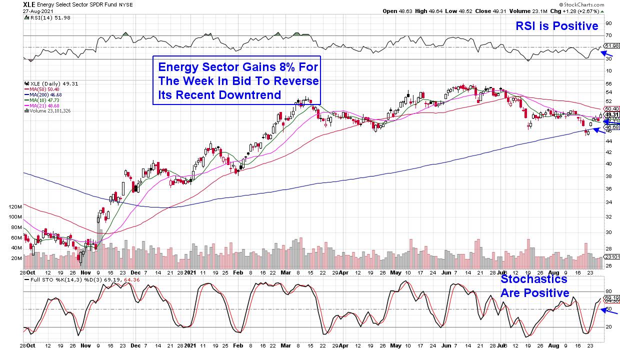
The best performing sector last week was Energy, which gained far more than the broader markets. Most stocks in this sector were in a bear market before this week's rally, despite posting solid quarterly results and increasing their dividends.
DAILY CHART OF ENERGY SECTOR (XLE)

Last week's sharp gains in Energy stocks pushed select names into an uptrend, with others flashing signals that they're poised to follow suit. Below are two names that have more work to do, but are in the beginning stages of reversing their downtrends.
Getting into downtrend reversals early in their upside advance can be very lucrative. Subscribers to my MEM Edge Report are very aware of this, as we identified the turnaround in Energy last Fall while also alerting them to the top names that went on to gain over 100%.
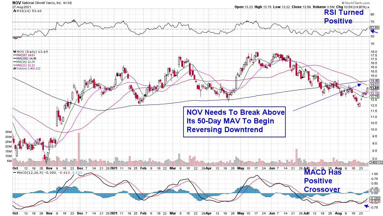
DAILY CHART OF NATIONAL OILWELL VARCO (NOV)

Above is a chart of National Oilwell Varco (NOV), which supplies parts and services to the energy sector. As you can see, this week the stock has rallied from a near-term low in price which, in turn, has pushed the stock above both its 10- and 21-day moving averages.
This is the first step to reversing its downtrend, as further upside price action will pull these shorter-term moving averages into an uptrend so that they can then act as support. From here, NOV will need to break back above its 50- and 200-day moving averages as well, before entering an uptrend.
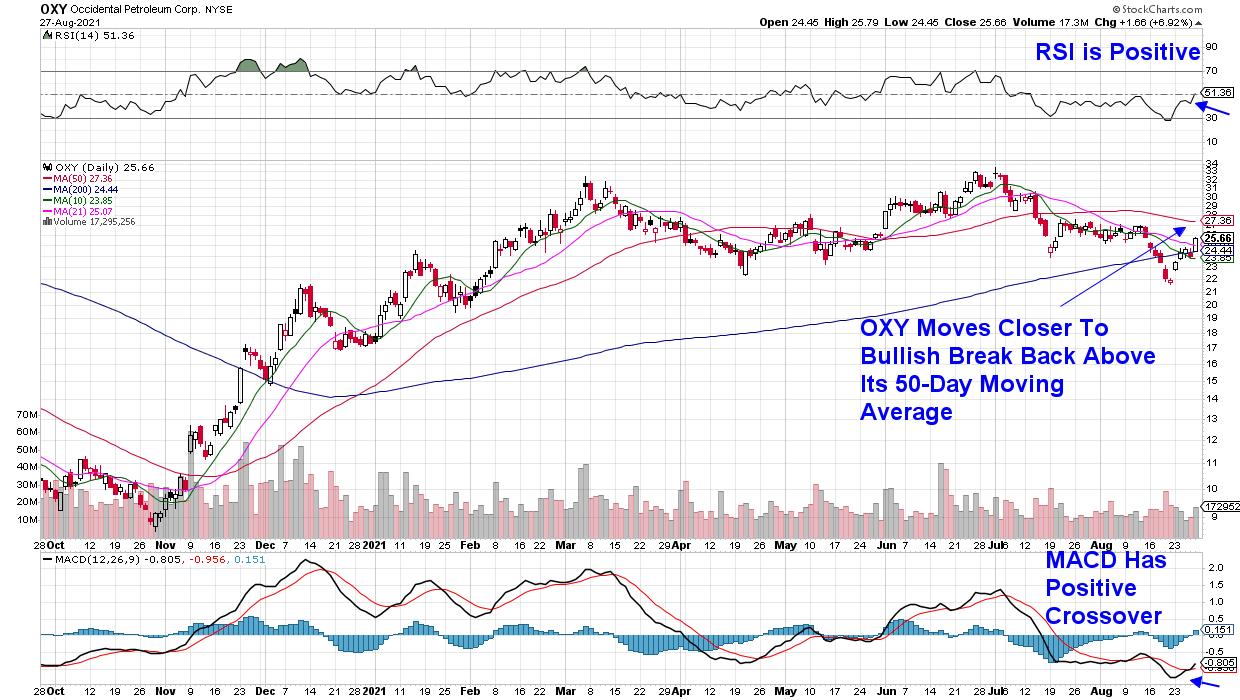
DAILY CHART OF OCCIDENTAL PETROLEUM (OXY)

Next up is Occidental Petroleum (OXY) which is in a more constructive position as the selloff from its peak in price in late June was not as severe. Historically, downtrends that last longer and experience a larger percent loss will take longer to reverse.
Occidental has been investing in strengthening their operations, which helped the company report earnings and sales earlier this month that were ahead of estimates. This week's rally has pushed the stock above most of its moving averages, with the RSI turning positive while the MACD had a positive crossover. A push back above its 50-day moving average on volume would put the stock in a position to go much higher.
In addition to the possibility of increased oil usage, another key consideration with Energy stocks is the actual price of oil. Last week, Brent Crude oil rose over 11% for the week to put the per-barrel price at $73. This is very constructive as higher oil prices translate into more revenues for these companies.
If you'd like to be alerted to Oil stocks that are already in an uptrend and poised to trade higher, use this link to take a 4-week trial of my bi-weekly MEM Edge Report. This Sunday, we're adding a new stock from this area to our Suggested Holdings List.
As mentioned, Growth stocks are continuing their advance to greater heights and my MEM Edge Report will put you in front of the top Tech stocks as well. I hope you'll take advantage of my special offer!
In this week's episode of StockCharts TV's The MEM Edge, I review shifting dynamics in the market after several impactful news items were released. I also share a major group that's just now turning bullish with much further upside ahead.
Warmly,
Mary Ellen McGonagle
MEM Investment Research
|
| READ ONLINE → |
|
|
|
| Mish's Market Minute |
| The Market Boasts Strength While the Dollar Drops and Gold Rises |
| by Mish Schneider |

On Friday, the Fed's Jackson Hole symposium stimulated the market, with all 4 major indices closing positive. Due to the improvement in the economy, the Fed feels more comfortable with tapering monetary policy possibly near the end of 2021. This means the Fed would begin to reduce the $120 billion monthly bond-buying program. Additionally, the Fed will continue to keep interest rates low as it looks for further growth in the jobs market. In terms of the COVID-19 delta variant, the Fed believes that while, it could hinder short-term growth, the long-term recovery is still intact.
With that said, one controversial matter the Fed has stuck to its guns on is that inflation is only transitory. Transitory inflation could stem from their view that supply-chain disruptions are under pressure from a surge in demand and will naturally adjust with time. It could also be that the Fed does not account for Food and Energy when looking at inflation numbers.
However, inflation can become very complex when the U.S relies on a vast number of imports while we continue to see shortages, stalling not only in the auto and tech industry, but also the retail space while stores struggle to keep inventory. On top of that, the current administration continues to push multi-trillion-dollar bills and budget resolutions. While more spending comes with positive intentions of helping social safety policy and furthering an economic recovery, many are worried about where the money will come from, and its effect on inflation and the dollar.
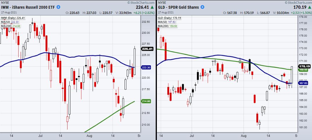
On Friday, both gold and the dollar made decent moves, with Invesco DB Us Dollar Index (UUP) selling off while SPDR Gold Shares (GLD) rose 1.4%, clearing over its 200-DMA at 169.68. On the other hand, the market is taking a higher note, with the major indices including the S&P 500 (SPY) and Nasdaq 100 (QQQ) clearing all-time highs. Additionally, the small-cap Russell 2000 index (IWM) has finally cleared a major resistance level of $225. With a strong close at $226.37, IWM now can run towards highs at $234.
Therefore, while the short-term market looks strong, enjoy the run. Nonetheless, we should keep inflation in mind, as it has yet to be dealt with or even fully acknowledged.
Follow Mish on Twitter @marketminute for stock picks and more. Follow Mish on Instagram (mishschneider) for daily morning videos. To see updated media clips, click here.
On this week's edition of StockCharts TV's Mish's Market Minute, Mish goes over how to pick stocks using the Momentum Indicator on StockCharts.com.
ETF Summary
- S&P 500 (SPY): New highs.
- Russell 2000 (IWM): Needs to hold over 225 as new support.
- Dow (DIA): 356.60 high to clear.
- Nasdaq (QQQ): New highs.
- KRE (Regional Banks): 67.22 recent high to clear.
- SMH (Semiconductors): 271.79 cleared. Watching to hold over 272.
- IYT (Transportation): Needs a second close over the 50-DMA at 255.76 to confirm a phase change.
- IBB (Biotechnology): Doji day. 164.27 support.
- XRT (Retail): Needs to get over 97 and hold.
Forrest Crist-Ruiz
MarketGauge.com
Assistant Director of Trading Research and Education
|
| READ ONLINE → |
|
|
|
| Top Advisors Corner |
| A-D Line's Troubling Divergence |
| by Tom McClellan |

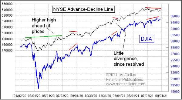
When last I wrote here about the NYSE Advance-Decline (A-D) Line in March 2021, there had just been a little divergence, which had resolved itself by the A-D Line moving to a higher high. That's one of the points about such divergences; they can be rehabilitated, and, when they are, that is a really bullish sign.
Now, we are seeing another bearish divergence that has developed at the right end of the chart; so far, this one has not yet been rehabilitated. It still could be, but, for the moment, it is a problem for the market to have higher price highs that are still unconfirmed by the A-D Line. And this comes in tandem with last week's article about a similar-looking divergence in the behavior of the stocks that make up the Nasdaq 100 Index.
Watching the A-D Line is important because it can give us hints about problems with financial market liquidity ahead of those problems affecting the big-cap stocks. Everyone knows that indices like the S&P 500 are dominated by a handful of really big capitalization stocks. But the smaller ones fight for liquidity in the same market, and they are often the first ones to suffer when liquidity starts to dry up.
It is the same principle as the canaries that used to be used in coal mines a couple of centuries ago. These small birds were more sensitive to the presence of toxic gases, and so if the canaries keeled over, then the big burly coal miners needed to get themselves out of the mine before they succumbed.
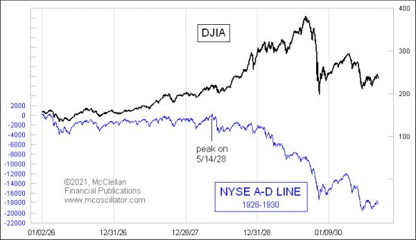
The first analysts to study the A-D data in depth were Leonard Ayres and James Hughes of the Cleveland Trust Company. They wondered starting in 1926 what it meant to have more or fewer stocks going up or down each day, so they started gathering the data. If only chartists could have known about the concept of an A-D Line divergence back in the late 1920s, perhaps there could have been better warnings ahead of the 1929 crash.

We saw A-D Line divergences that were important in the 2000s, although not as much as the 1929 example. At the big October 2007 price top, the A-D Line was already in a downtrend, having topped out 4 months before. That was a pretty ominous warning of trouble, and it was right.

In the current time frame, it is still possible that the A-D numbers could improve and produce a rehabilitated divergence. That is possible, and I will be on the lookout for it. For now, though, it is giving us a big warning of trouble, saying that, in spite of the Fed still buying $120 billion a month of bonds, liquidity is starting to dry up. Just imagine what will happen if/when the Fed starts its taper.
|
| READ ONLINE → |
|
|
|
| MORE ARTICLES → |
|
