| THIS WEEK'S ARTICLES |
| ChartWatchers |
| Nine Country ETFs That are Starting to Emerge |
| by Martin Pring |
Chart 1 shows that the US stock market is in a long-term uptrend relative to the rest of the world. The upper window compares the S&P to the Vanguard All-World ex-US ETF and indicates a recent breakout from a consolidation reverse head-and-shoulders. The lower panel substitutes the S&P Equal Weight ETF; it, too, is in an uptrend against the rest of the world.
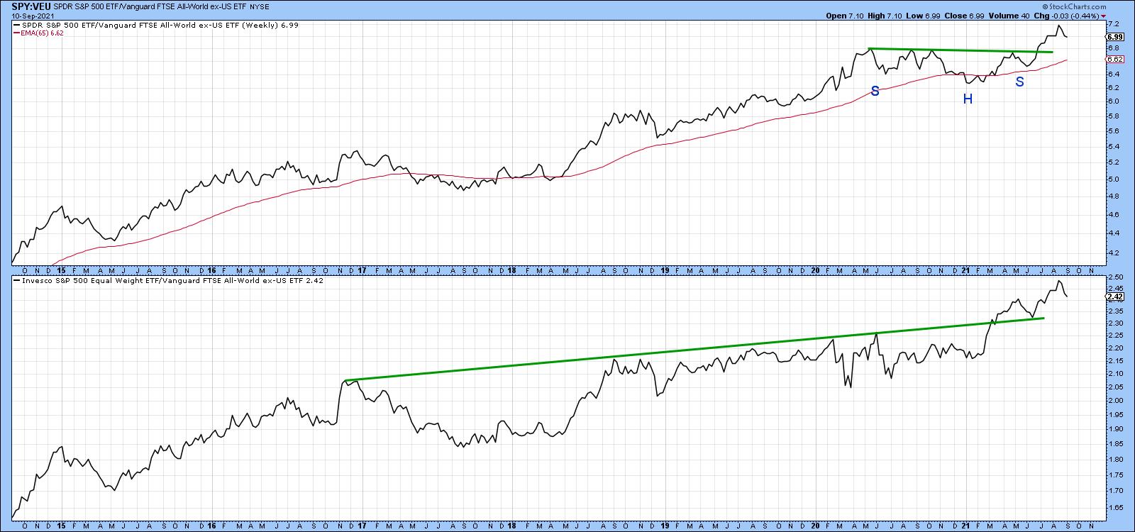 Chart 1 Chart 1
You may be asking the question, "If the US is the place to be, why look at anything else?" The answer lies in the fact that individual country ETFs, like sectors, are continually rotating in popularity amongst investors and traders. Since there are always new ones emerging or fading, the point of this article is to draw your attention to some interesting funds that may be about to emerge. In that respect, I am really referring to relative action, as the vast majority of country ETFs are already in established uptrends from an absolute price aspect. Consequently, we can refer to these ETFs as relative sleepers, which are positioned to potentially take over from the US leadership in the event that it should start to falter.
Israel
Israel is a great example of this positive absolute/weak-but-stabilizing RS combination, as the price has clearly managed to break above its 2014-2020 resistance trendline and 65-week EMA. Since the long-term KST, which you can read about here, is also positive, there is little doubt that this ETF is in a primary uptrend. The bottom two windows, like all the remaining charts, display the relative line to the iShares MSCI World Stock ETF (ACWI) together with its long-term KST for relative action. In Israel's case, the situation is mixed but promising. That's because the RS KST has just gone positive, but the relative line itself is just below its 2015-2021 down trendline and 65-week EMA.
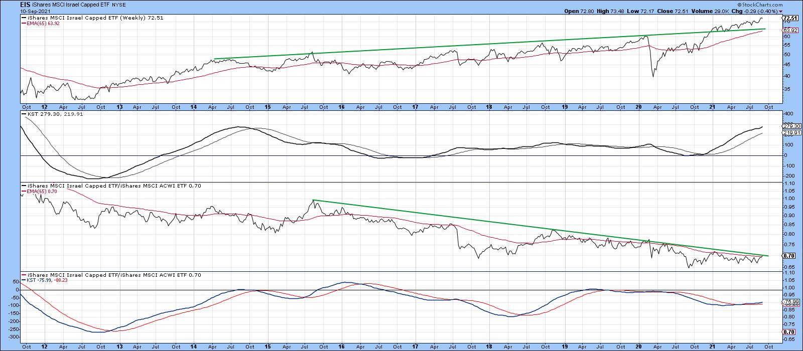 Chart 2Europe Chart 2Europe
Europe has been a relative laggard for some time, although some areas, notably Scandinavia and the Netherlands, have outperformed the world over the last few years. The UK, Norway and Italy may be set to follow suit.
Chart 3 shows that the UK ETF (EWU) has recently cleared a trendline, joining the 2014, 2018 and 2020 peaks. The price is comfortably above its 65-week EMA and the KST is positive. Its failure arises from the fact that the RS line has been unable to seriously clear its 65-week EMA since 2014. It's also significant that the EMA is currently trading at the same level as the dashed-green trendline. The effect is that they reinforce each other as an area of resistance, which, if bettered, would represent a very bullish signal, especially as the KST for relative action is already positive.
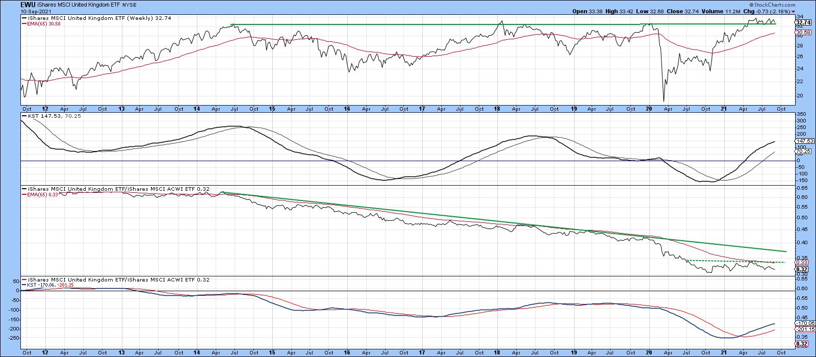 Chart 3The Norwegian ETF (NORW) is in a very similar position to that of the EWU, in that the price has already cleared long-term resistance. Unlike its other Scandinavian counterparts, NORW has not yet been able to establish a trend of improving relative action, though it is very close to its 2014-2021 down trendline. The rising KST for relative action is encouraging from that aspect. Chart 3The Norwegian ETF (NORW) is in a very similar position to that of the EWU, in that the price has already cleared long-term resistance. Unlike its other Scandinavian counterparts, NORW has not yet been able to establish a trend of improving relative action, though it is very close to its 2014-2021 down trendline. The rising KST for relative action is encouraging from that aspect.
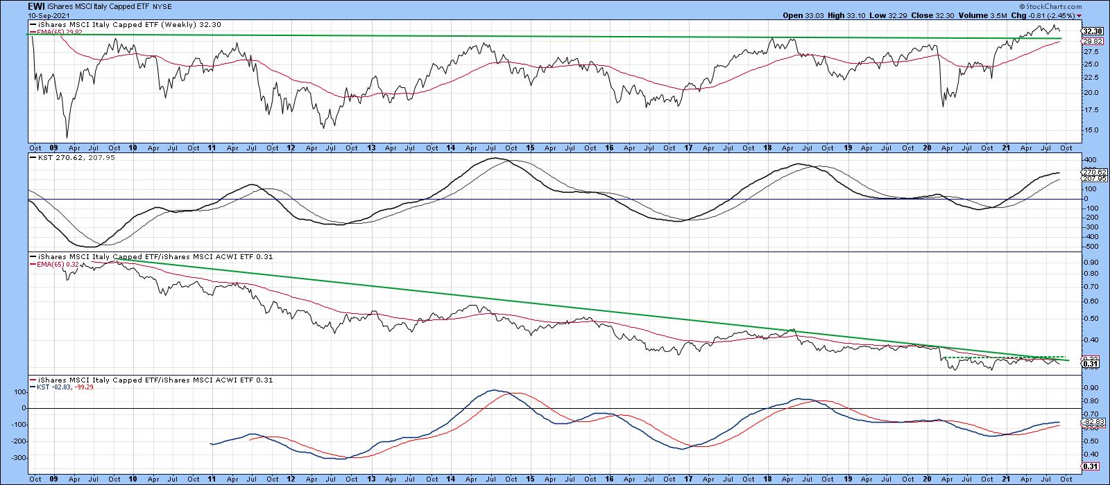 Chart 4The Italian ETF, the EWI, tried seven times to clear the 2009-2021 resistance trendline, shown in Chart 5. It finally did it earlier this year. The trend of relative action has gone flat since April of 2020, with the result being that the RS line is right at the convergence of two trendlines and its 65-week EMA. Since the KST for relative action is in a rising trend, it seems likely that this formidable resistance will be successfully overcome. Chart 4The Italian ETF, the EWI, tried seven times to clear the 2009-2021 resistance trendline, shown in Chart 5. It finally did it earlier this year. The trend of relative action has gone flat since April of 2020, with the result being that the RS line is right at the convergence of two trendlines and its 65-week EMA. Since the KST for relative action is in a rising trend, it seems likely that this formidable resistance will be successfully overcome.
 Chart 5Latin America Chart 5Latin America
In 2020, Mexico (EWW) broke below significant support in the form of the horizontal dashed red trendline in Chart 6. However, the break turned out to be a whipsaw. That meant that a powerful rally was likely to follow, as market participants scrambled to get back on the right side of the market. We have already seen an advance, which has resulted in a decisive break above the 2014-2021 down trendline. However, the size of that false downside break should enable the price to power still higher. Note that the RS line is close to its 65-week EMA and 2013-2021 down trendline. It has also gone extremely quiet, all of which suggests that, when it does break to the upside, a very powerful RS rally will follow. The positive RS KST argues for an eventual bullish relative break.
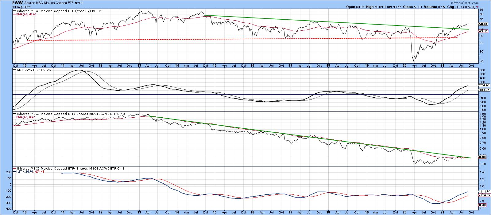 Chart 6 Chart 6
Further south, the Global X Argentina ETF has completed an inverse head-and-shoulders for both the absolute and relative prices. The two KSTs are also in the black.
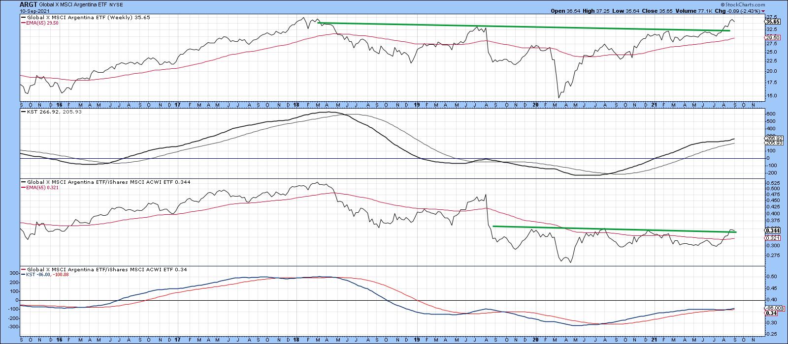 Chart 7 Chart 7
Frontier Markets
The iShares MSCI Frontier 100 ETF (FM) recently broke to a new all-time high. Just as impressive was the ability of the RS line to clear its 2018-2021 down trendline and complete a small base. A little more improvement in relative action will place the overall technical position in a solidly positive light.
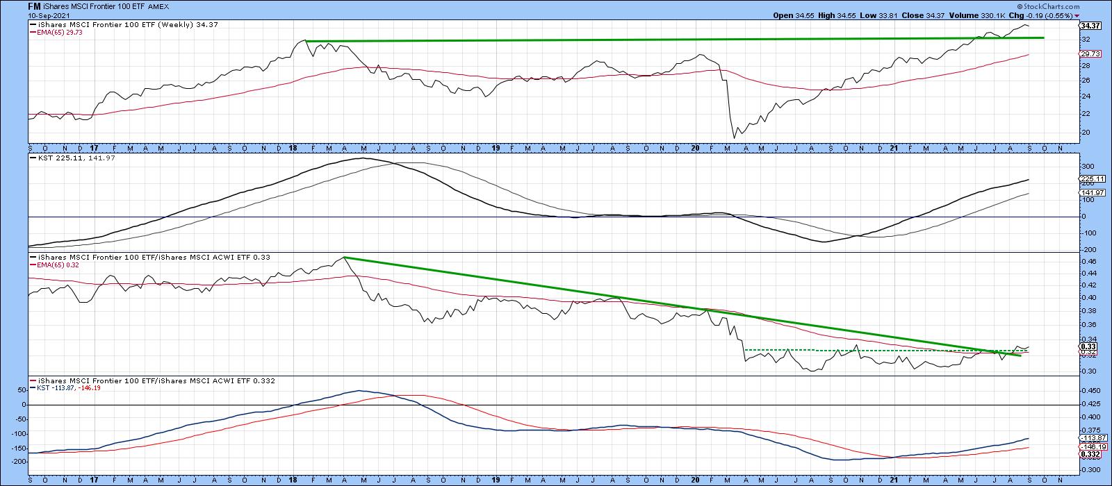 Chart 8The largest country holding for the Frontier Markets ETF is in Vietnam. The VanEck Vectors Vietnam ETF (VNM) is featured in Chart 9. Its technical picture is very similar to the European ETFs described earlier, whereby the price itself has broken above significant resistance and the RS line is poised to violate its long-term down trendline. Chart 8The largest country holding for the Frontier Markets ETF is in Vietnam. The VanEck Vectors Vietnam ETF (VNM) is featured in Chart 9. Its technical picture is very similar to the European ETFs described earlier, whereby the price itself has broken above significant resistance and the RS line is poised to violate its long-term down trendline.
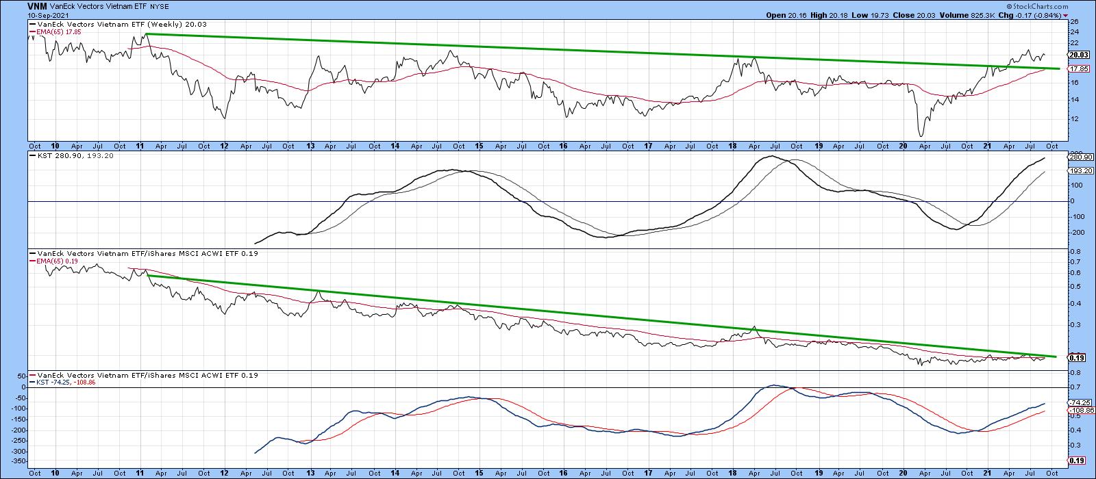 Chart 9Egypt has tentatively violated its 65-week EMA and 2014-2021 down trendline. It needs to be watched closely, since the long-term KST for the absolute price (and that of the relative one) are not yet in a uniform ally bullish trend. The overall technical action, though, does qualify as a potential sleeper. Chart 9Egypt has tentatively violated its 65-week EMA and 2014-2021 down trendline. It needs to be watched closely, since the long-term KST for the absolute price (and that of the relative one) are not yet in a uniform ally bullish trend. The overall technical action, though, does qualify as a potential sleeper.
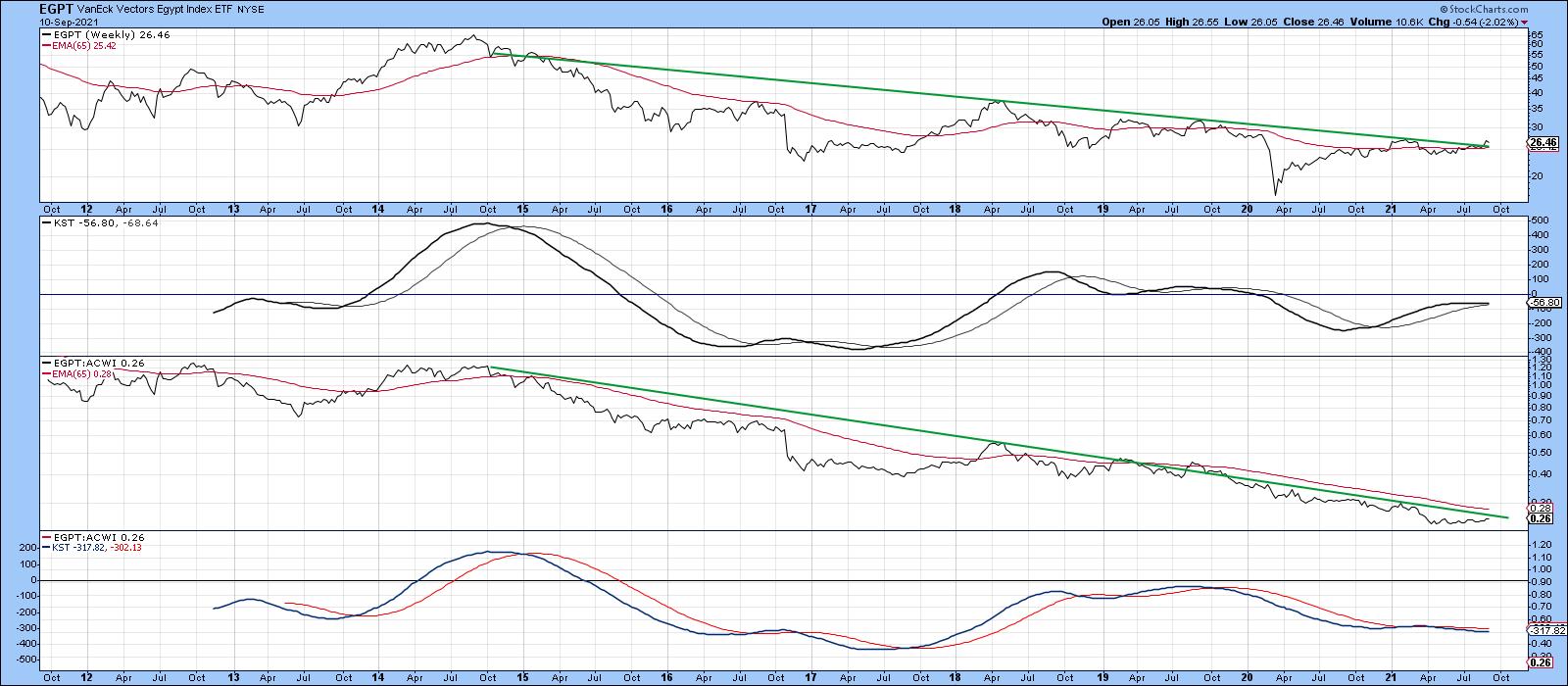 Chart 10Good luck and good charting, Chart 10Good luck and good charting,
Martin J. Pring
This article is an updated version of an article previously published on Tuesday, September 7th at 6:55pm ET in the member-exclusive blog Martin Pring's Market Roundup.
The views expressed in this article are those of the author and do not necessarily reflect the position or opinion of Pring Turner Capital Group of Walnut Creek or its affiliates.
|
| READ ONLINE → |
|
|
|
| The Mindful Investor |
| Four Signs the Bull Market is Over |
| by David Keller |
"Technical analysis is a windsock, not a crystal ball." - Carl Swenlin
For me, technical analysis is not about trying to predict the future. So when I'm asked to give my S&P 500 target for year-end, I try not to giggle as I answer. Because at the end of the day, anything I could say is simply a guess.
To be clear, any predictions of where a particular asset will be at some point in the future, based on technical or fundamental data, is pure speculation. So what's the point of all this?
I learned technical analysis in the early 2000s, and my introduction to investing was watching the tech bubble burst. I saw how some investors were completely caught off guard by the rotation from bull phase to bear phase. At the same time, I was impressed by technically-oriented investors that saw clear signs of deterioration that suggested increased risk.
In other words, you don't need to predict the future. You just need to follow the trends!
I'm presenting a FREE webinar on Tuesday, September 14th at 1:00pm ET called "How to Avoid Confirmation Bias". We'll discuss how confirmation bias can creep into your investment process and how to minimize its impact by focusing on the evidence using charts. Sign up HERE for this free webinar!
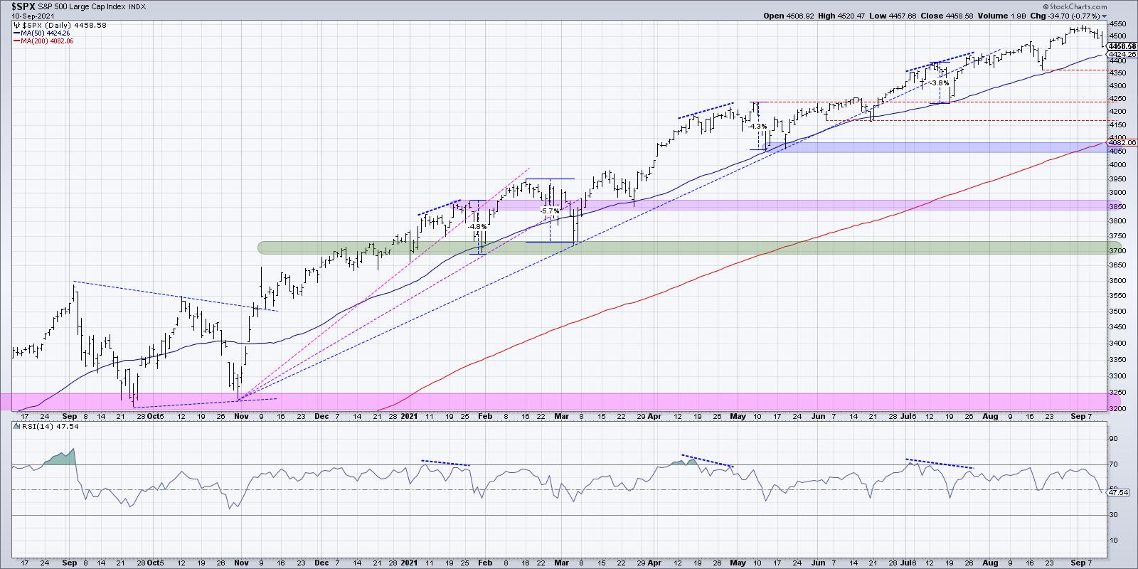
That brings me to the current chart of the S&P 500. The major equity indexes have made new all-time highs every month so far in 2021. Charles Dow taught us over 100 years ago that an uptrend is comprised of higher highs and higher lows, and the recent market activity has been exactly what Dow was talking about.

As a student pilot, I was taught to always be prepared for an emergency. And the best time to prepare for emergencies was when everything was going just fine, the plane was operating well and you were flying straight and level.
On that note, here are four key signals that would indicate to me that the bullish phase has indeed exhausted.
First, the S&P 500 would fail to make a higher high. Each new month has seen the S&P break to new highs as stocks have traded onward and ever upward. If the index would attempt to make yet another new high and fail, it could indicate that the buying power from earlier in the year has dissipated. It's worth noting that technical indicators like head-and-shoulders patterns and even Elliott Wave have a foundation in this basic concept of identifying when highs are no longer eclipsing the previously established high.
Second, as you may guess from the Charles Dow comments, would be a lower low. A break below the most recent swing low (top red line around 4360) would mean that the most recent support level was not holding. That could suggest an exhaustion of buyers and/or increased selling pressure.
Third, the 50-day moving average, which has served as consistent support through 2021, would need to fail. One of the most widely acknowledged technical patterns in 2021 has been the 50-day moving average and its ability to repel numerous tests during this bull market phase. The consistency of this moving average would tell me that a pullback to the 50-day is most likely a "buy on the dip" opportunity, as it has been all through this year.
But what if this widely followed support level actually fails? What if the price breaks the 50-day moving average and then continues lower? Once investors realize that the assumed support is no longer going to hold, I could see a scenario where a flood to the exits causes a sudden and significant drop in the S&P 500.
Finally, we'd need to see the RSI break below 40. In bull market phases, the RSI tends to become overbought during upswings (see the January, April and July peaks) and remain above 40 on any pullbacks. Five of the seven brief pullbacks in 2021 have seen the RSI come right down to 40 before bouncing higher. If the RSI would break below 40, this could indicate what I call a "change of character" where the configuration of the chart evolves to the point that you have to acknowledge a change in overall trend.
This last week was a "digestion week" where investors processed the strong gains in previous weeks and needed to reset before another move higher. As Greg Morris once said, "New highs are almost always good news; it's just the last one that is not."
The good news is you don't have to know ahead of time which new high will be the last one. You just need to have a good exit strategy in place and let the chart tell you when the conditions have changed!
Want to experience this article in video form? Just click below.
RR#6,
Dave
P.S. Ready to upgrade your investment process? Check out my free course on behavioral investing!
David Keller, CMT
Chief Market Strategist
StockCharts.com
Disclaimer: This blog is for educational purposes only and should not be construed as financial advice. The ideas and strategies should never be used without first assessing your own personal and financial situation, or without consulting a financial professional.
The author does not have a position in mentioned securities at the time of publication. Any opinions expressed herein are solely those of the author, and do not in any way represent the views or opinions of any other person or entity.
|
| READ ONLINE → |
|
|
|
| ChartWatchers |
| What You Need to Know About September Weakness |
| by Tom Bowley |
Congratulations! We've made it through the first 10 days of September mostly unscathed. At the time of this writing, the S&P 500 is down slightly more than 0.50% month-to-date. Momentum remains fairly strong and the trend is up, so why should we worry? Well, let's cast aside the historical consequences of September for a moment and simply focus on next week -- options expiration week.
Options Expiration Effect
When the stock market rises continually, there is typically a TON of net in-the-money call premium on the table as we approach earnings expiration Friday each calendar month. While I'd suspect that market makers go long individual stocks to protect themselves as they sell calls to retail buyers, there's still the opportunity to make money on the long side with these stocks as they move higher into options expiration, then sell their positions and even begin shorting to create overhead supply. This very short-term supply vs. demand imbalance sends stocks lower, and market makers cash in on the short side. So they make money on their long positions as stocks rise, then take those profits by selling and create temporary oversupply from shorting and making money as prices drop. And guess what? That fall in price eliminates significant amounts of net in-the-money call premium. It's a magic show and market makers are Houdini.
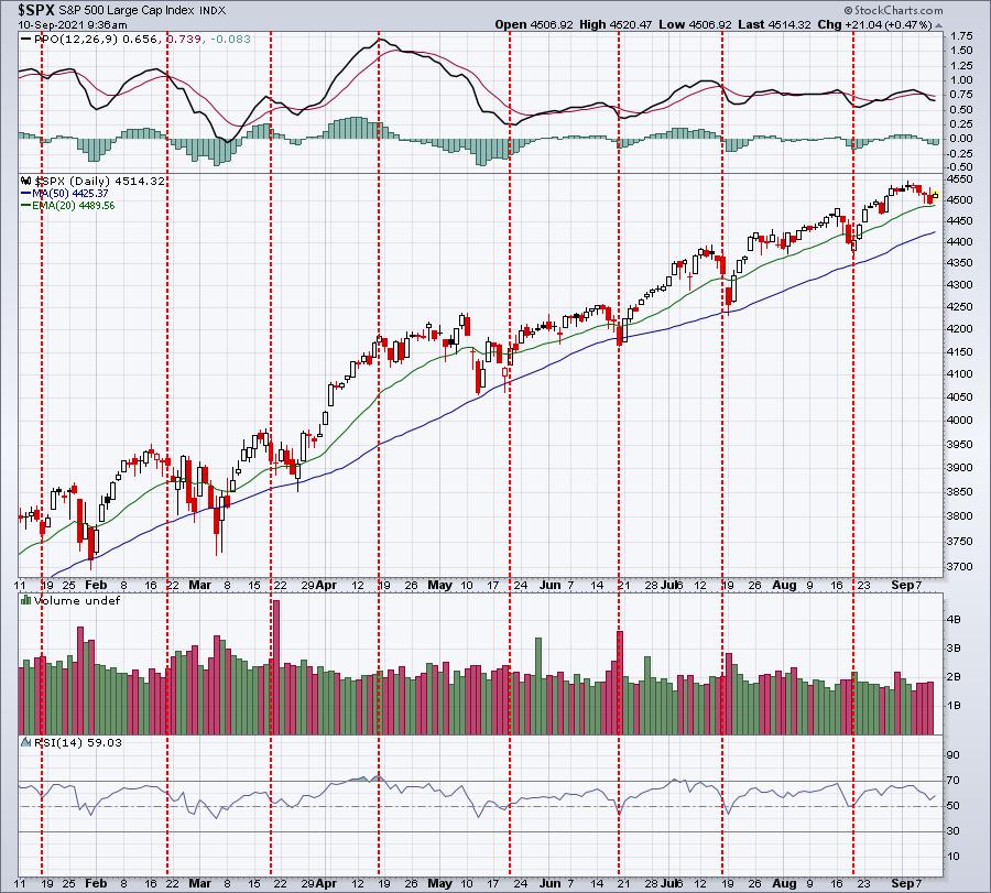
Visually, you can see it take place nearly every month in 2021. Here's a 1-year chart of the S&P 500:

The red-dotted vertical lines highlight Friday options expiration day each month. Just take a moment to look at where most of the profit taking occurs. It's either just before options expiration.....or sometimes just after. If you're asking why would selling occur after options expire, you need to simply remind yourself of what happens at options expiration. Call buyers have the option of exercising their options and buying the stock at their strike price. Market makers, who sold the call, become short sellers of that security when calls are exercised. They make money when the stock later moves lower, which is why the stock market can struggle during the week after options expire.
Since 1950, the S&P 500 has produced annualized returns as follows throughout the calendar month (all calendar months, not just September):
- 26th through 6th: +21.77%
- 7th through 10th: -4.04%
- 11th through 18th: +13.29%
- 19th through 25th: -8.51%
There is an ABSOLUTE pattern that has been in play for DECADES. Ignore it at your own risk. I've discussed the reasoning behind these trading patterns in other articles.
Again, congratulations to all for escaping the wrath of September thus far, but just keep in mind that one factor that hasn't kicked in just yet is options expiration. That's next week, so any extended selling, in my opinion, will likely occur over the next 1-2 weeks based on historical performance around monthly options expiration.
September History
Okay, fasten your seat belts because this isn't pretty. The first thing to understand about September is that it's the only calendar month that has ended lower than it began more often than the other way around. September has finished the month higher 32 times and lower 38 times over the past 70 years. So those odds alone suggest we have a higher probability of moving lower, right? Even during the current secular bull market, which I believe started on April 10, 2013, the day that the S&P 500 cleared the double top from 2000 and 2007, September has provided challenges. Since 2013, September has ended higher 4 times and lower 4 times. The average return has been -0.15%. Keep in mind that we've been in an excellent bull market since 2013, despite suffering through two cyclical bear markets (Q4 2018 trade war and the pandemic-related 2020 selloff). The only calendar month that's been worse than September during the current secular bull market has been March.
But not every day or week in September has performed equally. In fact, since 1950, here's the annualized return in September, broken down by the first and second halves:
- September 1-16: +9.98%
- September 17-30: -22.49%
If we look at the current secular bull market (2013-2020), the annualized returns for these same two periods is as follows:
- September 1-16: +12.54%
- September 17-30: -15.34%
So while we've been in this very bullish secular bull market, the September "first half vs. second half" pattern has continued. It's a reason to at least be cautious, especially as we approach the end of next week (next Friday - options expiration day - is September 17th, which marks the beginning of this bearish 2nd half of September period).
But even within the "second half" of September, the truly bearish period runs from September 20th through September 26th. That marks the ONLY 7 consecutive-day period throughout the year where annualized returns are negative EVERY day. The annualized return just for these 7 calendar days?
- Since 1950: -38.89%
- Since 2013 (current secular bull market period): -36.46%
Protecting Against September Weakness
The obvious question, after digesting all of the above information, is "what should we do to protect ourselves and our portfolios?" First, let me say that history does not guarantee us anything. There have been years when September has not been bearish at all. During the late-1990s secular bull market, September was stellar, rising every year from 1995 through 1998. While the September 20th through September 26th period overall has been extremely bearish, there have been exceptions to the rule. And while the S&P 500 has dropped 7 of 8 years since 2013 during that September 20th through September 26th period, most of the drops have been 1% or less. That equates to perhaps a 45-point drop in the S&P 500, so I'm not talking about an upcoming crash. It's just that the tendency has clearly been to the downside.
If this downward tendency is concerning to you, there are ways to mitigate the risk. The first and most obvious way is to simply build cash around the middle of the month so that you have less exposure. If you want to remain invested, then possibly consider the historical performance of the various sectors. I calculated the annualized returns of all sectors during the September periods I've been discussing, but only during the secular bull market since 2013, so we can compare these sector results against the benchmark S&P 500. Let's start with the first half vs. second half of September -- annualized returns (the S&P 500 return is in bold for comparison purposes):
September 1-16:
- Industrials (XLI): +50.30%
- Materials (XLB): +33.14%
- Health Care (XLV): +25.48%
- Financials (XLF): +23.03%
- Energy (XLE): +17.06%
- Consumer Staples (XLP): +14.65%
- Consumer Discretionary (XLY): +14.43%
- S&P 500 ($SPX): +12.54%
- Utilities (XLU): +7.68%
- Real estate (XLRE): +5.22%
- Communication Services (XLC): +4.26%
- Technology (XLK): -2.73%
September 17-30:
- Technology (XLK): -5.32%
- Consumer Discretionary (XLY): -13.35%
- Utilities (XLU): -13.75%
- S&P 500 ($SPX): -15.34%
- Communication Services (XLC): -15.70%
- Real Estate (XLRE): -17.67%
- Consumer Staples (XLP): -26.63%
- Industrials (XLI): -27.74%
- Financials (XLF): -31.58%
- Health Care (XLV): -37.88%
- Materials (XLB): -42.61%
- Energy (XLE): -65.70%
There are a few things that stand out to me. First, and perhaps surprisingly, technology (XLK) is the only sector that historically doesn't gain ground in the first half of September. The second is maybe even more surprising. When S&P 500 performance turns ugly in the 2nd half, the XLK is the BEST performing sector by a fairly wide margin. It's as if any selling of technology by retail traders is scooped up by professionals, knowing that Q3 earnings results are just around the corner in October. My third takeaway is that investing in defensive sectors really offers little protection, as utilities (XLU) is the only defensive sector that has outperformed the benchmark in that latter half of September.
Conclusion
Based on all of the above, I'd definitely consider some precautions over the next couple weeks. Make no mistake about it, I remain VERY bullish through year-end. At the beginning of 2021, I provided a year-end target of 4700 on the S&P 500 and I believe we'll get there. I think there's even an outside shot of approaching 5000 before year-end. Few analysts have been more bullish than me. But it would be irresponsible to ignore the historical trends that we've seen in September. For that reason, I'd consider raising more cash into next week, especially those with a short-term mindset. We are likely to see significant selling at some point over the next couple weeks based on options expiration and seasonality, and I want to have cash on hand to grab some bargains on any selling.
As we move into October, I fully expect that we'll see yet another pre-earnings surge in U.S. equities as companies continue to bury revenue and EPS estimates that are ridiculously low-balled.
If you're interested in taking advantage of market maker related manipulation around options expiration, then consider joining me for my monthly "Max Pain" webinar that will be held on Tuesday, September 14th at 4:30pm ET. Last month, we nailed several trading candidates and we'll be looking for another batch of trading candidates for this week. CLICK HERE to start your FREE 30-day trial. We'll send out room instructions to all of our members, including trial members, on Tuesday.
We also have a free newsletter, our EB Digest, that's published 3x per week. There's no credit card required and you may unsubscribe at any time. I'll be providing our community a historical trading stat that all traders absolutely should be aware of. Simply provide us your name and email address HERE and I'll get that newsletter and historical fact out to you on Monday!
Happy trading!
Tom
|
| READ ONLINE → |
|
|
|
|
|
| ChartWatchers |
| An International Perspective on (Stock) Markets From RRG |
| by Julius de Kempenaer |

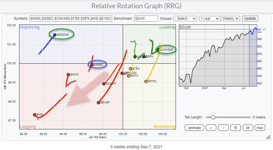
With the SPY/SPX chart sending curveballs, sector rotation on Relative Rotation Graphs is sending conflicting signals. With breadth continuing to deteriorate as the S&P continues to creep higher, getting a handle on the markets is not getting any easier. So instead of focusing on the S&P/US market, I started to look at how things are going in the rest of the world.
The starting point is the RRG, printed above, which shows the rotation for a group of major stock market indexes around the world against the DJ Global index as the benchmark. The first observation on this chart is that the dominant RRG heading is negative, i.e. between 180-270 degrees. Also, there are only three indexes inside the leading quadrant, and only one of them (India) is traveling at a positive RRG-Heading.
The S&P/US is inside the leading quadrant, but has very recently also started to roll over. This means that, so far, the US was/is still in a relative uptrend vs. most parts of the world, but is now also losing strength.
I shared the chart for the DJ Global Index in my DITC article "Pressure Continues to Build for Global Markets" yesterday. The divergence and the loss/fading of upward momentum is clearly visible on that chart. Some of the indexes on the RRG above are showing very similar charts.


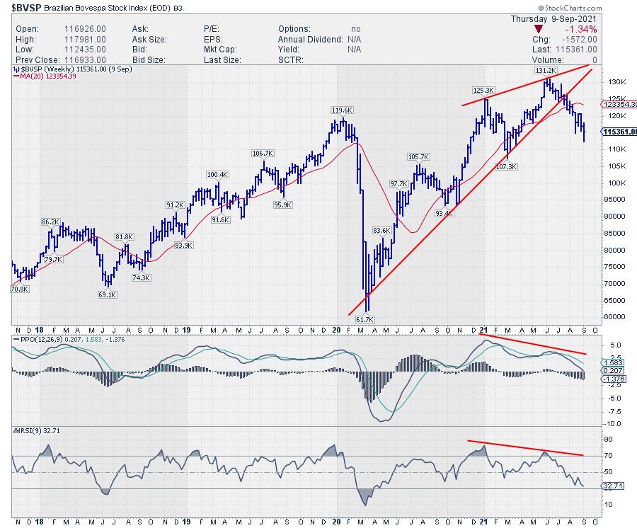
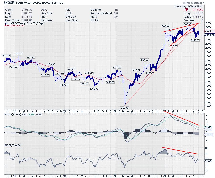
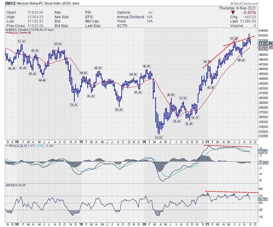
The indexes for Brazil, Mexico, and Korea are showing the strongest examples of pressure mounting and weakness underway.

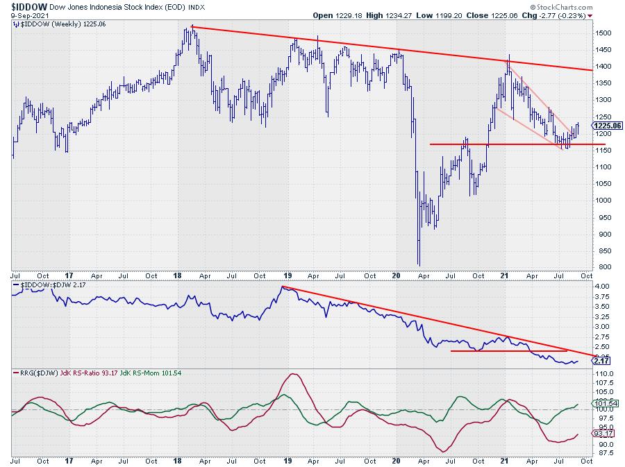
The index for Indonesia, $IDDOW, is currently inside the improving quadrant and at a strong heading. However, it is still far to the left with a very low reading on the RS-Ratio scale. This makes it difficult to maintain that momentum and travel all the way towards and into the leading quadrant. There is a very good chance that this tail will roll over while inside the improving quadrant and rotate back towards the lagging quadrant.
As you can see on the chart above, $IDDOW has not been able to take out former highs, which date back to 2018. A quick look at the raw RS-Line vs. $DJW confirms that the relative downtrend is still in full force.

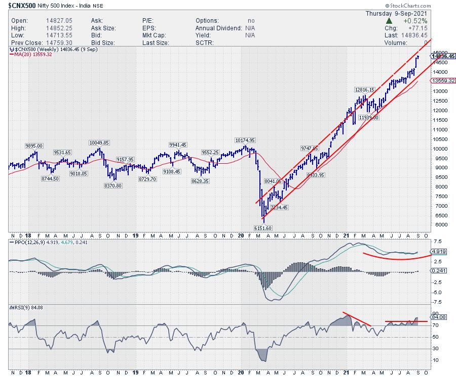
Pretty much the only index that seems to be able to abstract itself from all this weakness at the moment is the Indian Nifty 500 index. It is positioned inside the leading quadrant and recently hooked sharply back up to travel further into the leading quadrant at a strong heading.
The negative divergences that were also present in this market seem to be resolving without any meaningful correction as the Nifty continues to climb higher within the boundaries of its rising channel.
Just to be clear, it is possible that such a scenario will be playing out for the S&P 500, but, given all the observations as described above, I don't see that as the primary scenario at the moment.
#StaySafe and have a great weekend, --Julius
My regular blog is the RRG Charts blog. If you would like to receive a notification when a new article is published there, "Subscribe" with your email address.
|
| READ ONLINE → |
|
|
|
| DecisionPoint |
| Rydex Ratio Reaching Historically Overbought Territory |
| by Erin Swenlin |
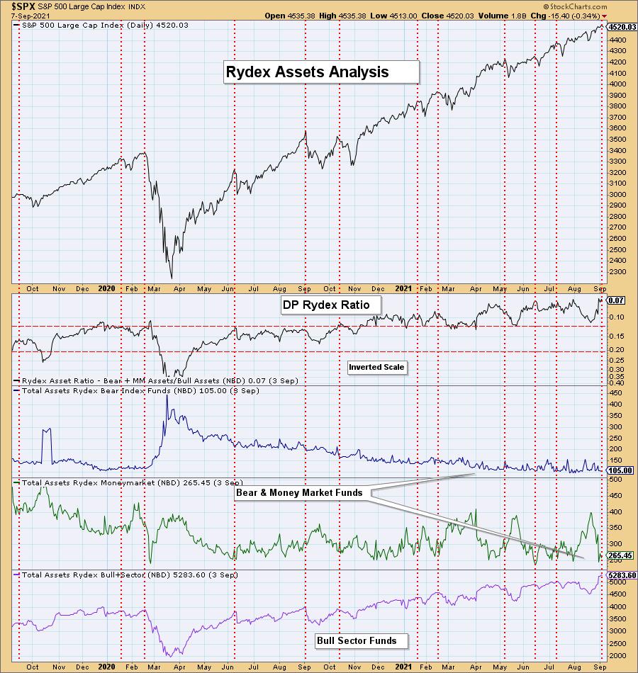
I haven't reviewed the Rydex Ratio chart in some time, mainly because what used to be considered overbought territory became the "new" oversold territory and I wanted to see how it behaved moving forward.
A quick refresher on what the Rydex Ratio tracks. We compare the total assets in money market and bear funds to the total assets in the bull and sector funds. These numbers are gathered in the evening after the market close (hence the 9/3 readings being the most current). The smaller this ratio becomes, the more bullish the sentiment reading. Sentiment is a "contrarian" indicator; the more bullish the sentiment, the more bearish the outlook becomes for price. The idea is that, when everyone is bullish, that is when you will see the downside reversal.
Check out the chart below!
Build Wealth & Generate Income - Download the FREE eBook!
That's a bold claim - right?
Well, take a look at this and support my endeavors by downloading this eBook where I and my peers do just that!

Listen To These 11 Women
These 11 women have more than 221 years combined experience in trading...
Which is why you should pay close attention to what they have to say.

If you ever wondered how to build wealth and generate income with less risk...
Or if there were simple tools that traders use to find profitable "big move trades" without risking all their capital...
My video chapter on Using Momentum and Relative Strength to Find the Best Trades shares how this smart woman is beating the markets.
Plus, you'll discover how to use moving averages to enhance your investing potential (you won't believe how simple this is)!
And how to profit with macro-to-micro trading using the best trend-trading indicator (that you have probably never heard of)!
But that's not all... there's so much more... support me...
>>> Click Here for Your Free eBook and see what these 11 women have to say!
You can see that it danced around previously overbought territory from November 2020 through the first part of 2021. However, we are now starting to see oscillation in its new post-bear market range.
Note the dotted vertical lines align with "cardinal" tops. I have also annotated a vertical line at our last all-time high for the SPX. A Rydex Ratio in overbought territory generally accompanies market tops. Currently, we are seeing one of the lowest readings on record for the Rydex Ratio. This means that participants who are "voting with their money" are extremely bullish.

Conclusion: Sentiment based on the Rydex Ratio is extraordinarily bullish given the historically low reading. Given sentiment is contrarian, there is now a bearish price bias based on "real money" trading.
Technical Analysis is a windsock, not a crystal ball.
-- Erin Swenlin
(c) Copyright 2021 DecisionPoint.com
Helpful DecisionPoint Links:
DecisionPoint Alert Chart List
DecisionPoint Golden Cross/Silver Cross Index Chart List
DecisionPoint Sector Chart List
DecisionPoint Chart Gallery
Trend Models
Price Momentum Oscillator (PMO)
On Balance Volume
Swenlin Trading Oscillators (STO-B and STO-V)
ITBM and ITVM
SCTR Ranking
DecisionPoint is not a registered investment advisor. Investment and trading decisions are solely your responsibility. DecisionPoint newsletters, blogs or website materials should NOT be interpreted as a recommendation or solicitation to buy or sell any security or to take any specific action.
|
| READ ONLINE → |
|
|
|
| Top Advisors Corner |
| High Yield Bond A-D Line Resolves Divergence |
| by Tom McClellan |

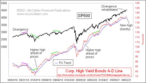
High yield corporate bonds (AKA junk bonds) trade more like the stock market than like T-Bonds. They are considered to be more subject to default risk and, thus, to the forces of financial market liquidity that drive the stock market up and down. That liquidity is the important factor, and thus the HY bonds can give us another viewpoint into understanding the health of the liquidity stream.
Just a few weeks ago, there developed a troubling divergence between the HY Bond A-D Line and the S&P 500. It said that there was trouble in liquidityville, and that such trouble might eventually come around to bite the big cap stocks which drive the S&P 500. A similar divergence developed before the ugliness of late 2018, seen at the left end of the chart. And an even worse looking one appeared in 2007 (not shown here) ahead of the final October 2007 stock market top. So these divergences can be a big deal.
It is also a big deal when an apparent divergence gets rehabilitated, which can happen, and which has happened in this current case. The HY Bond A-D data were looking bad, but suddenly started improving. This A-D Line has now resolved its divergence and moved ahead to a higher high.
The message is that whatever liquidity problem was happening before has now been resolved and liquidity is restored. For how long is a separate question. It is possible that another divergence could develop and point to a major top in the weeks ahead, and, if that happens I will be calling attention to it in The McClellan Market Report and The Daily Edition. It is worth noting that the NYSE's Daily A-D Line has still not made a higher high.
|
| READ ONLINE → |
|
|
|
| MORE ARTICLES → |
|
 Chart 1
 Chart 2Europe
 Chart 3The Norwegian ETF (NORW) is in a very similar position to that of the EWU, in that the price has already cleared long-term resistance. Unlike its other Scandinavian counterparts, NORW has not yet been able to establish a trend of improving relative action, though it is very close to its 2014-2021 down trendline. The rising KST for relative action is encouraging from that aspect.
 Chart 4The Italian ETF, the EWI, tried seven times to clear the 2009-2021 resistance trendline, shown in Chart 5. It finally did it earlier this year. The trend of relative action has gone flat since April of 2020, with the result being that the RS line is right at the convergence of two trendlines and its 65-week EMA. Since the KST for relative action is in a rising trend, it seems likely that this formidable resistance will be successfully overcome.
 Chart 5Latin America
 Chart 6
 Chart 7
 Chart 8The largest country holding for the Frontier Markets ETF is in Vietnam. The VanEck Vectors Vietnam ETF (VNM) is featured in Chart 9. Its technical picture is very similar to the European ETFs described earlier, whereby the price itself has broken above significant resistance and the RS line is poised to violate its long-term down trendline.
 Chart 9Egypt has tentatively violated its 65-week EMA and 2014-2021 down trendline. It needs to be watched closely, since the long-term KST for the absolute price (and that of the relative one) are not yet in a uniform ally bullish trend. The overall technical action, though, does qualify as a potential sleeper.
 Chart 10Good luck and good charting,

