| THIS WEEK'S ARTICLES |
| ChartWatchers |
| Step Aside Chairman Powell, Mr. Market is Tightening for You |
| by Martin Pring |
Last week, the Fed announced that tapering is likely to begin later in the year, to be later followed by a leisurely hike in rates. As usual, those pesky impatient markets have decided to raise rates now rather than wait for the clobbering they know they will get later. It can all be seen in the charts and it's happening across the board except for money market yields, which is the area that the central bank controls best.
Five-Year and Lower Maturities
Take Chart 1, for instance, which features the 5-year yield together with its long-term KST. I am starting off with this maturity as it, to some extent, forms a bridge between short- and longer-term ones. The yield was already above its 12-month MA, but the process of registering a new recovery high has begun a series of rising peaks and troughs. Since this is a monthly chart based on month-end closes, the latest one won't be official until Thursday's (month-end) close.
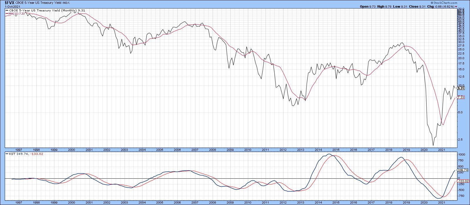 Chart 1 Chart 1
What is already official, though, is the fact that the yield has broken out on a weekly basis, as shown in Chart 2. Note also that the 9-week RSI has cleared its 6-month down trendline.
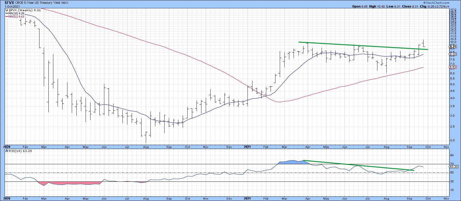 Chart 2Moving down to the 2-year maturity, which typically moves ahead of Fed policy changes, we see that recent action has caused it to edge to a new recovery high. It will encounter some resistance at the 65-week EMA, but the unanimously bullish KSTs suggest that it won't have much of a problem clearing it. Chart 2Moving down to the 2-year maturity, which typically moves ahead of Fed policy changes, we see that recent action has caused it to edge to a new recovery high. It will encounter some resistance at the 65-week EMA, but the unanimously bullish KSTs suggest that it won't have much of a problem clearing it.
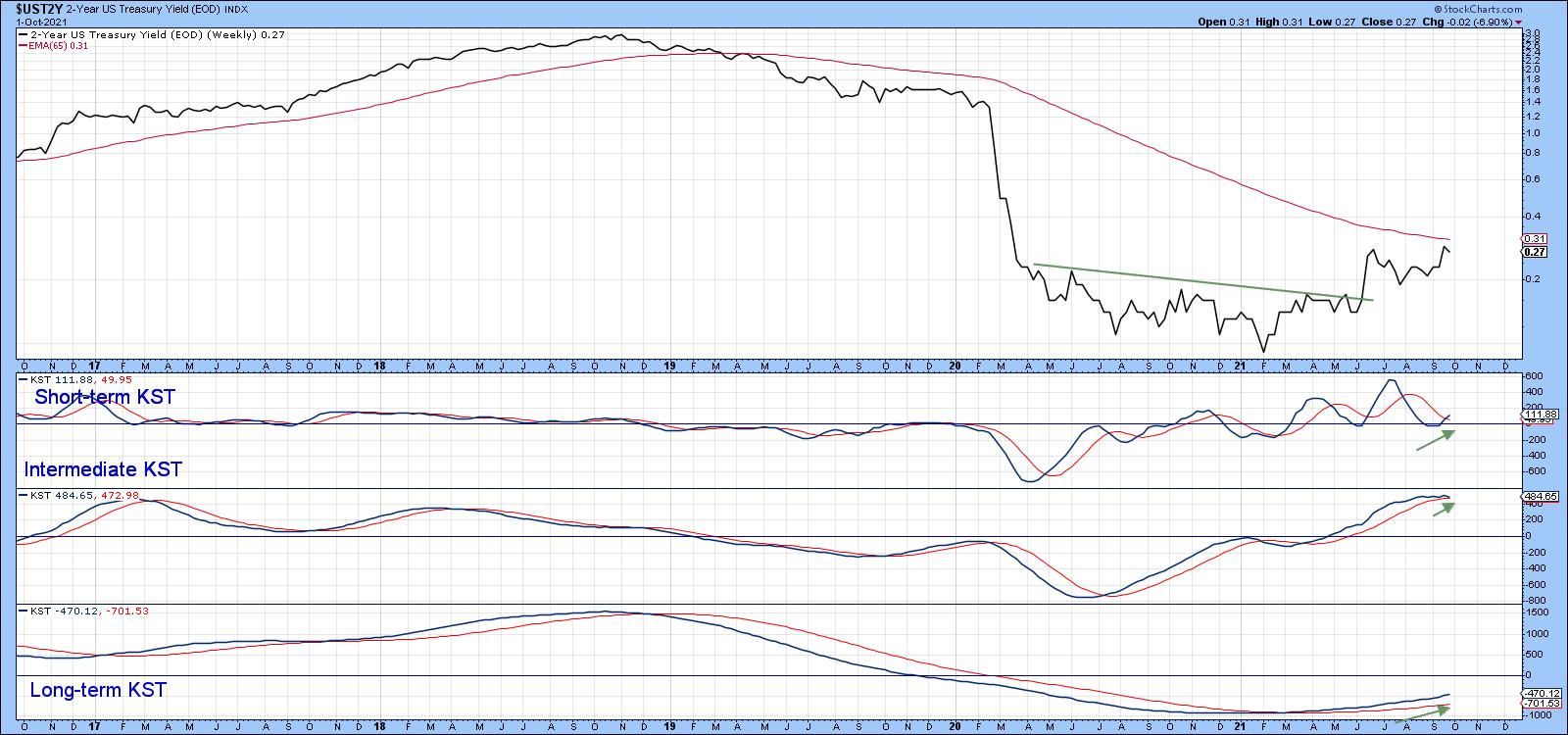 Chart 3Even the 3-month Libor, which is very much influenced by Fed actions, has started to perk up and currently sports three rising momentum series. That positive momentum suggests that the 2010-2021 down trendline will soon be breached. Chart 3Even the 3-month Libor, which is very much influenced by Fed actions, has started to perk up and currently sports three rising momentum series. That positive momentum suggests that the 2010-2021 down trendline will soon be breached.
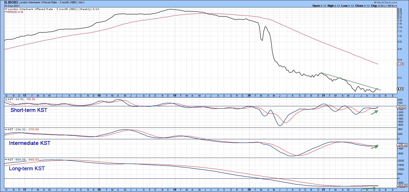 Chart 4Longer-Term Maturities Chart 4Longer-Term Maturities
As we move out to longer-term maturities, the recent rise becomes progressively more subdued. You can see that from the fact that the 10-year in Chart 5 is well above its 65-week EMA, compared to the 30-year series in the bottom window, which is right at it. They all throw out the possibility of a reverse head-and-shoulders formation, but, for the time, being the bull market in yields is being led by shorter-term maturities.
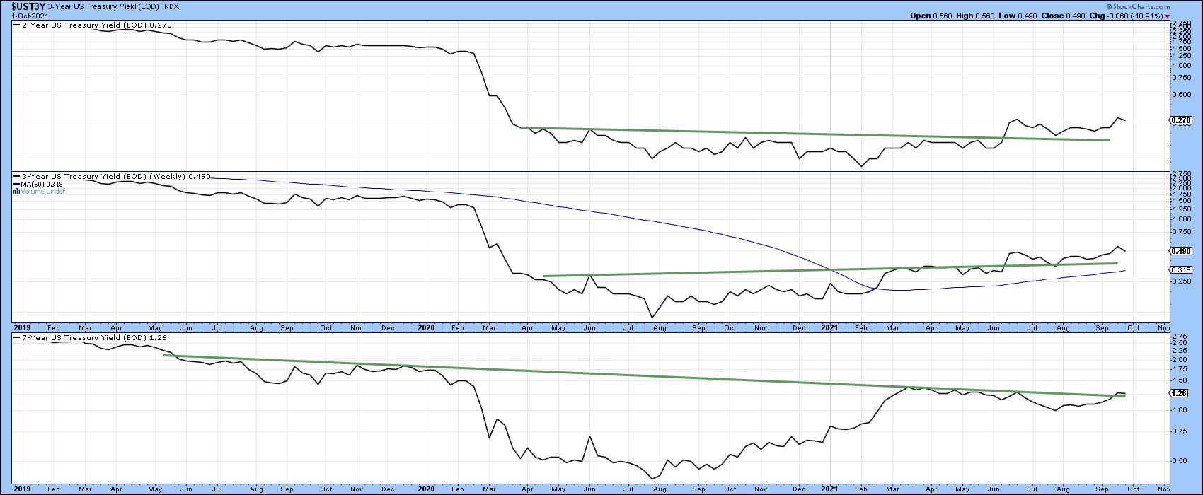 Chart 5Commodities Driving up Rates? Chart 5Commodities Driving up Rates?
Last week, I pointed out that commodities could be vulnerable, as the Bloomberg Commodity ETN (the DJP) had experienced a false breakout to the upside. Chart 6 is a great example of how markets reflect people in action and that people can and do change their minds. You can see this from the fact that the false breakout has now been eclipsed by the price breaking to a new bull market high.
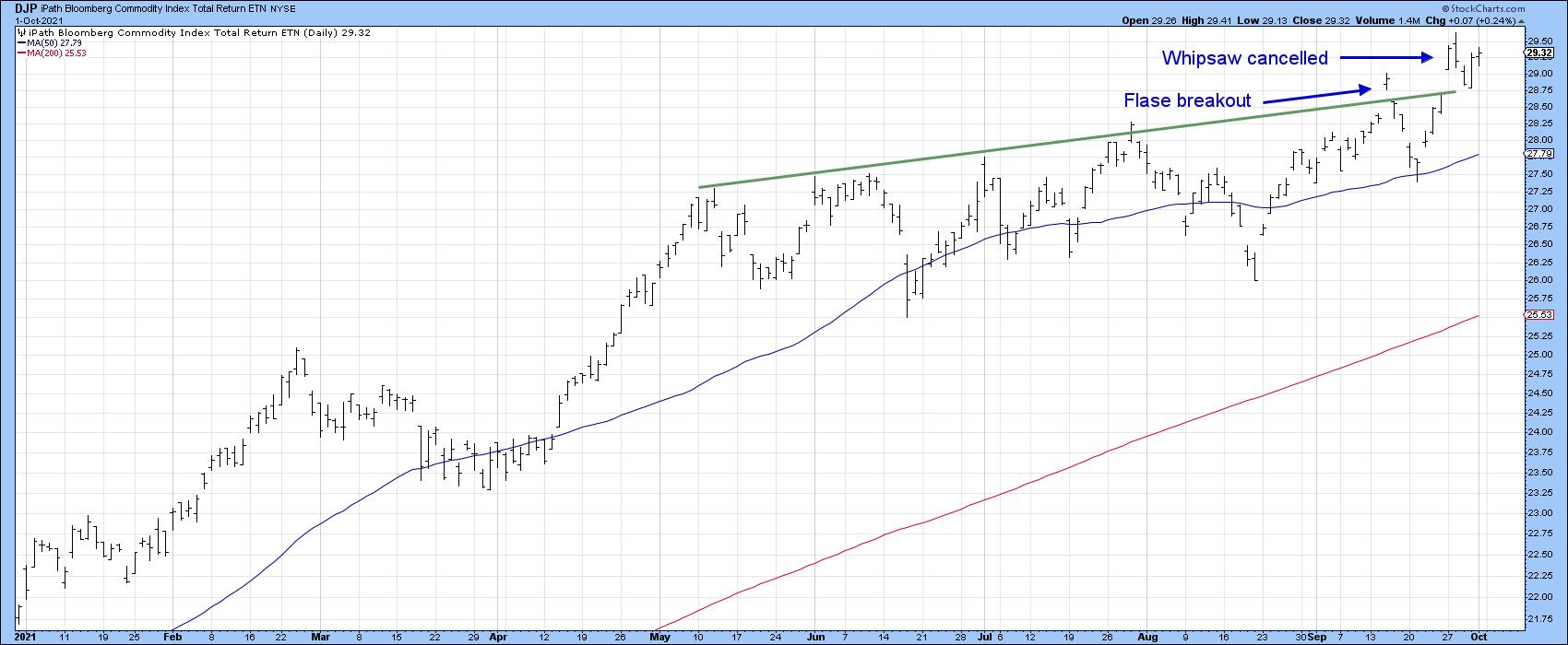 Chart 6I did not expect this to happen, but did point out that, in the event that it did, the likely commodity leader would be energy. In that respect, Chart 7 shows that the DB Energy ETN has already registered a new high. The US Oil Fund, Chart 8, has also broken out from a consolidation reverse head-and-shoulders. Energy stocks could be a close follower, as the VanEck Vectors Unconventional Oil and Gas ETF (FRAK), Chart 9, has jumped above its previous high. Chart 6I did not expect this to happen, but did point out that, in the event that it did, the likely commodity leader would be energy. In that respect, Chart 7 shows that the DB Energy ETN has already registered a new high. The US Oil Fund, Chart 8, has also broken out from a consolidation reverse head-and-shoulders. Energy stocks could be a close follower, as the VanEck Vectors Unconventional Oil and Gas ETF (FRAK), Chart 9, has jumped above its previous high.
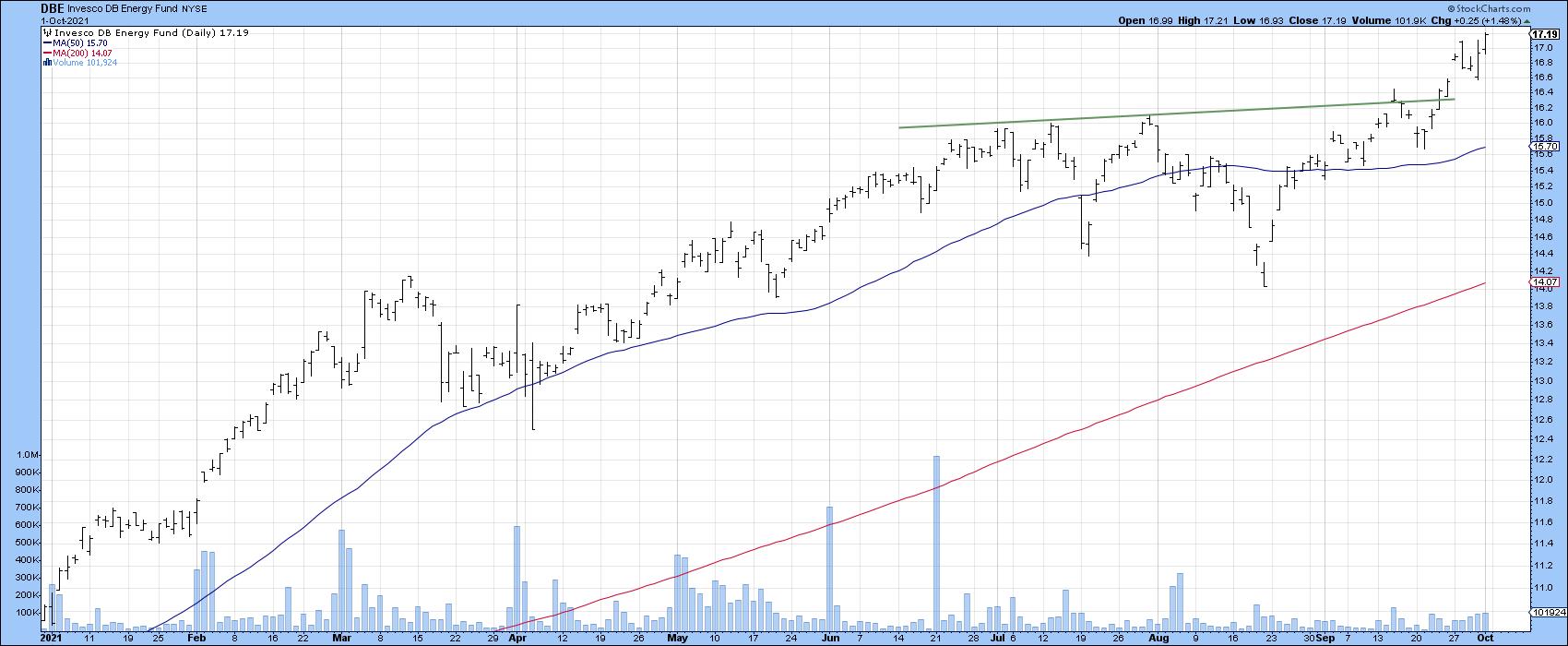 Chart 7 Chart 7
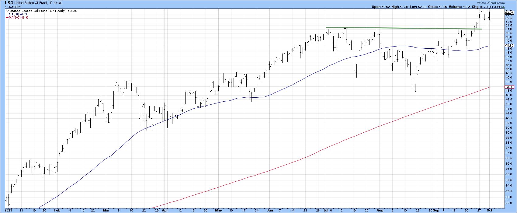 Chart 8 Chart 8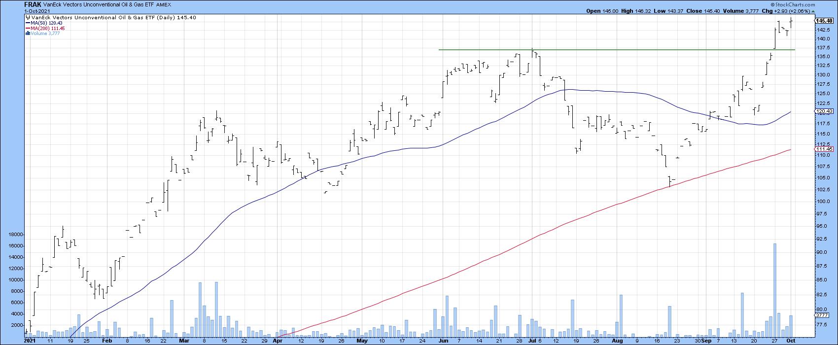 Chart 9Financials Like Rising Rates Chart 9Financials Like Rising Rates
Rising rates have been driving up financials Chart 10, as investors anticipate widening margins. As a result, the SPDR financial ETF (the XLF) is flirting with a new bull market high. One of the leading sub-groups appears to be Full Line Life Insurance, shown in Chart 11, along with a nice breakout in relative action.
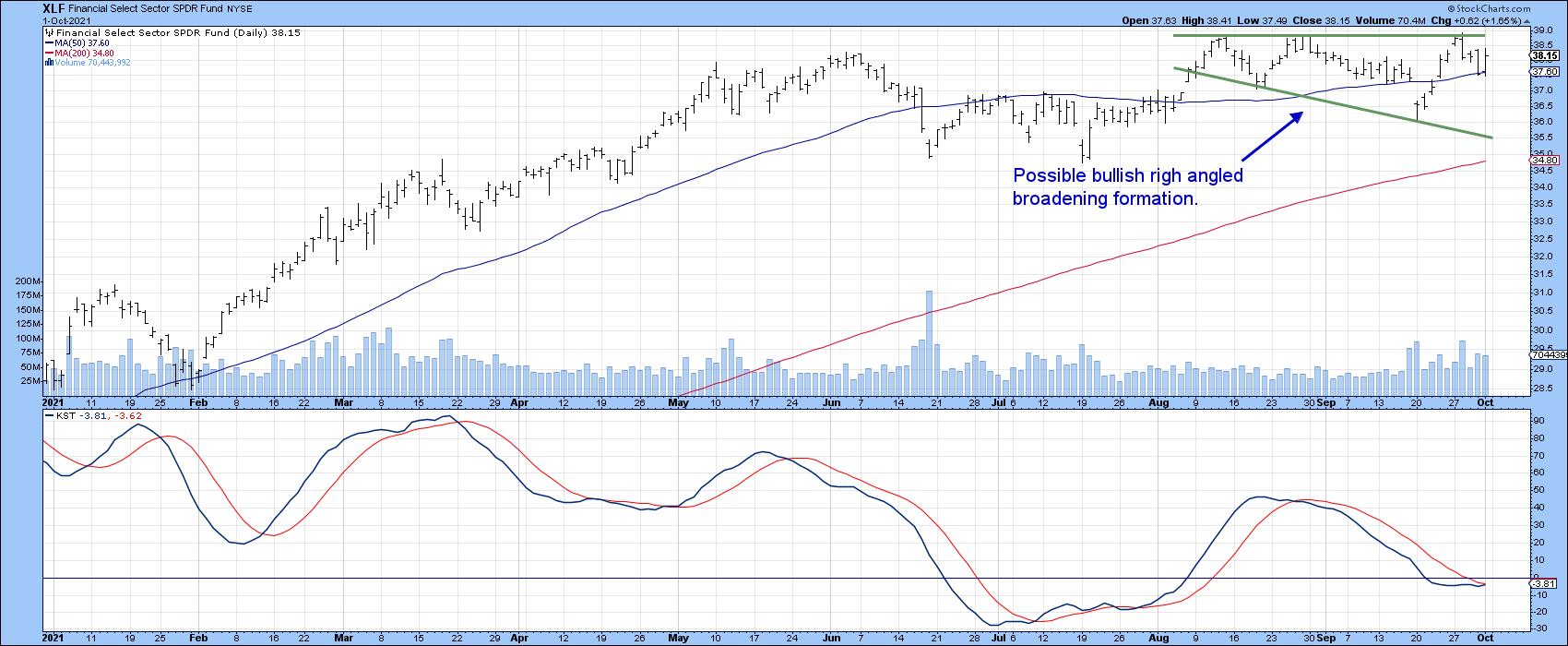 Chart 10 Chart 10
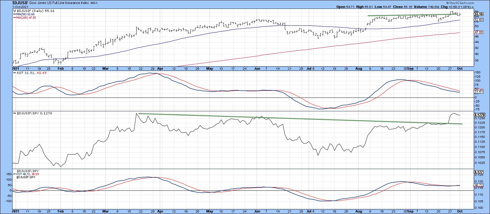 Chart 11 Chart 11
Good luck and good charting,
Martin J. Pring
This article is an updated version of an article previously published on Monday, September 27th at 6:55pm ET in the member-exclusive blog Martin Pring's Market Roundup.
The views expressed in this article are those of the author and do not necessarily reflect the position or opinion of Pring Turner Capital Group of Walnut Creek or its affiliates.
|
| READ ONLINE → |
|
|
|
| ChartWatchers |
| A Strong Uptrend and Bullish Continuation Pattern for this Agriculture ETF |
| by Arthur Hill |
 Chartists looking to trade in the direction of the bigger trend have two options. First, take trend signals and act when the trend turns up. Once an uptrend is underway, chartists must then rely on pullbacks, short-term oversold conditions and bullish continuation patterns to hitch a ride. Today's article will put these two options into action using the DB Agriculture ETF (DBA). Chartists looking to trade in the direction of the bigger trend have two options. First, take trend signals and act when the trend turns up. Once an uptrend is underway, chartists must then rely on pullbacks, short-term oversold conditions and bullish continuation patterns to hitch a ride. Today's article will put these two options into action using the DB Agriculture ETF (DBA).
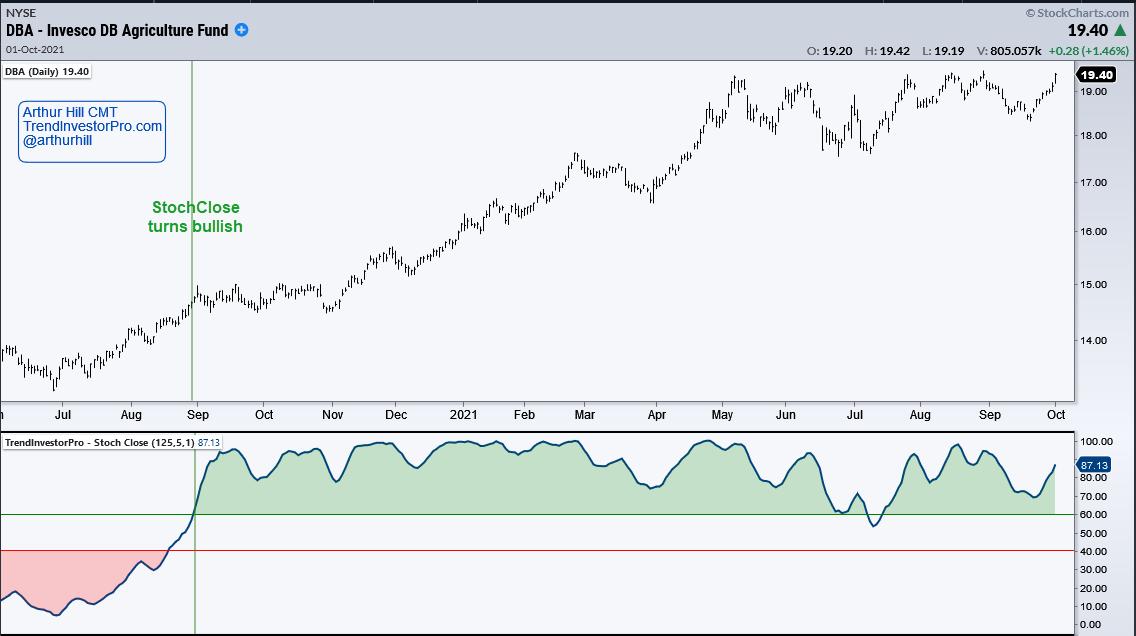
First and foremost, the long-term trend is up for the DB Agriculture ETF (DBA). Price is near a 52-week high and StochClose (125,5) has been bullish since August 31st (green vertical line). This trend-following indicator turns bullish (green) with a move above 60 and remains bullish until a downtrend signals with a move below 40 (turns red). This indicator is part of the TIP Indicator Edge Plugin for StockCharts ACP.

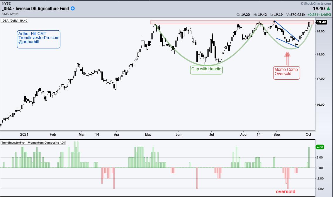
In addition to the uptrend, there is a large bullish continuation pattern and a small wedge breakout within this pattern. First, the green arcs mark the cup and handle of a cup-with-handle pattern, which is a bullish continuation pattern popularized by William O'Neil of IBD. The red shading marks rim resistance and a breakout would signal a continuation of the bigger uptrend. Within the handle, we can see a small wedge and a breakout on September 23rd. This was the early jump on the bigger breakout, which I expect.

The indicator window shows the Momentum Composite, which aggregates signals in five momentum oscillators. This indicator hit -3 and -4 as the wedge formed and this denotes a short-term oversold condition. Such conditions alert traders to watch for a bullish catalyst or short-term breakout, such as the wedge breakout.
Looking for more uptrends and bullish setups within these uptrends? TrendInvestorPro specializes in trend identification and finding short-term bullish setups within the bigger uptrend. Using StochClose, the Momentum Composite, RSI and classic pattern analysis, we monitor a core ETF list with over 120 names to bring you trend signals and mean-reversion setups. Click here to take your analysis process to the next level.
*****************************
|
| READ ONLINE → |
|
|
|
| ChartWatchers |
| Two More Climax Days Last Week That Were on the Mark |
| by Erin Swenlin |
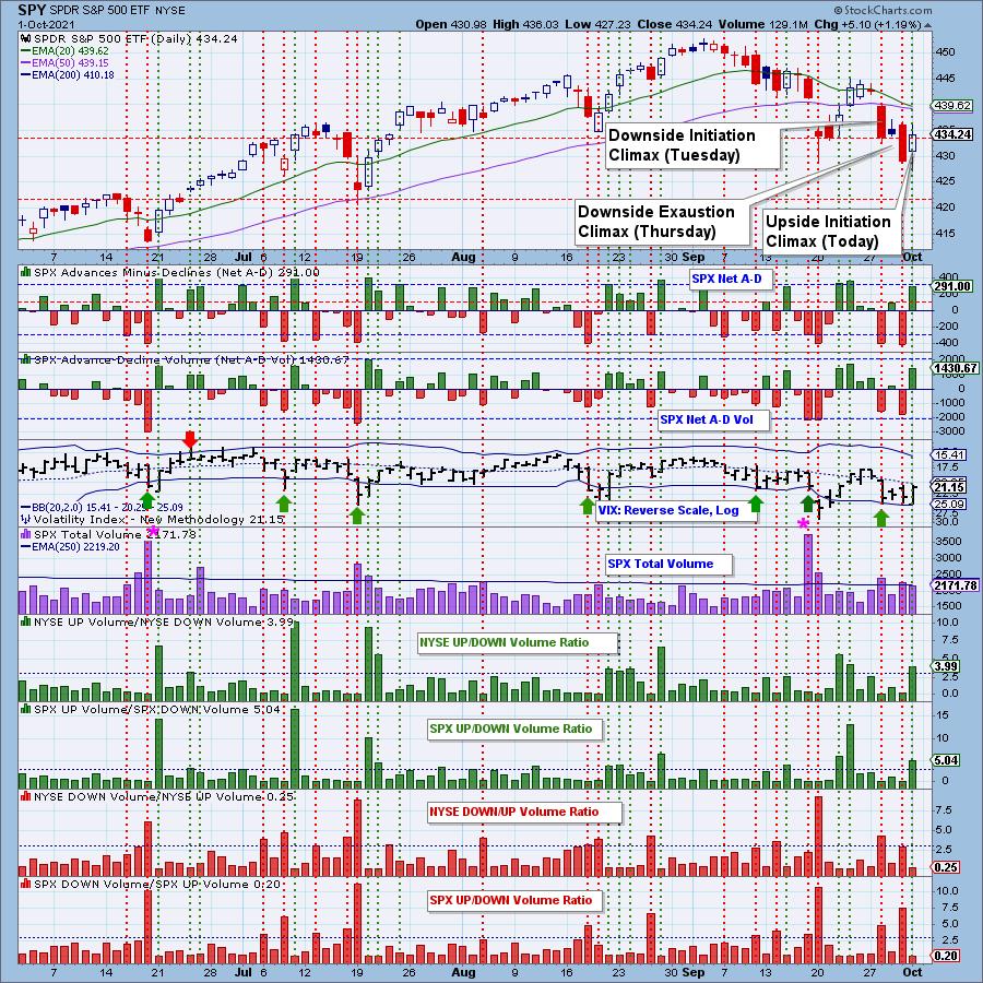
In last week's ChartWatchers newsletter, I wrote about the climax days that occurred the previous week. We saw two more last week and I'll give you the heads up that today we saw an upside initiation climax.
Here's a refresher on what a "climax" is:
A climax is a one-day event when market action generates very high readings in (primarily) breadth and volume indicators. We also include the VIX, watching for it to penetrate outside the Bollinger Band envelope. The vertical dotted lines mark climax days -- red for downside climaxes and green for upside. Climaxes are either initiation or exhaustion.
If you want a more in depth discussion of climax analysis, you can read last week's ChartWatchers article here. Additionally, here is a link to the DecisionPoint show where I discussed climax analysis.
Let's review Tuesday:
You can see that, on the gap down selling, we saw elevated readings on the Volume Ratios, as well as outside readings on many of our indicators. This was an initiation because it arrived at a market top and it followed an upside exhaustion climax the previous week. We didn't see much follow-through on Wednesday, but we definitely saw major selling on Thursday to confirm it. Now we will talk about the climaxes from yesterday and today...

Be alerted after the market close to "Climax Days"! Subscribe to the DecisionPoint Alert!

Try us out for a week! Subscribe to the Bundle package and use Coupon Code: DPTRIAL
On Thursday (yesterday):
We had elevated downside readings on Volume Ratios and Net A-D. This time, it followed that downside initiation. Therefore, we considered it a downside "exhaustion" climax day. We did see follow-through today with a positive close, but we also have a lower low and a lower high. Not particularly impressive. Which leads us into today's upside "initiation" climax.
On Friday (today):
We had robust Volume Ratio readings to the upside. While this was not accompanied by outside readings on Net A-D and Net A-D Volume, those readings were elevated enough to consider this a climax day. It is coming off yesterday's downside "exhaustion" climax, so we believe it to be an upside "initiation" climax, meaning we should look for either sideways churn or higher prices to start the week.
Conclusion: Climax analysis alerts us to very short-term market pivot points. Last week's downside initiation and downside exhaustion climaxes played out as we expected. Today's upside initiation climax holds promise, but we are dealing with a very weak market so we would expect to see churn more than a strong rally early next week.

Click here to register in advance for the recurring free DecisionPoint Trading Room! Recordings are available!
Technical Analysis is a windsock, not a crystal ball.
--Carl Swenlin
(c) Copyright 2021 DecisionPoint.com
Helpful DecisionPoint Links:
DecisionPoint Alert Chart List
DecisionPoint Golden Cross/Silver Cross Index Chart List
DecisionPoint Sector Chart List
DecisionPoint Chart Gallery
Trend Models
Price Momentum Oscillator (PMO)
On Balance Volume
Swenlin Trading Oscillators (STO-B and STO-V)
ITBM and ITVM
SCTR Ranking
DecisionPoint is not a registered investment advisor. Investment and trading decisions are solely your responsibility. DecisionPoint newsletters, blogs or website materials should NOT be interpreted as a recommendation or solicitation to buy or sell any security or to take any specific action.
|
| READ ONLINE → |
|
|
|
|
|
| ChartWatchers |
| Setting Up The Fourth Quarter |
| by Greg Schnell |
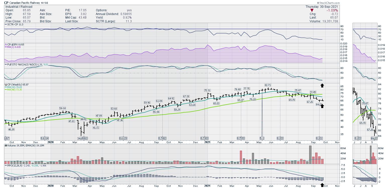
I rode the rails through western Canada last week on the Rocky Mountaineer. This particular tour uses the freight railway lines that run through the Rockies; I traveled on the CP Rail line as well as the CN Rail line. Railways are a great clue to the health of the economy.
 Photo: Greg Schnell Photo: Greg Schnell
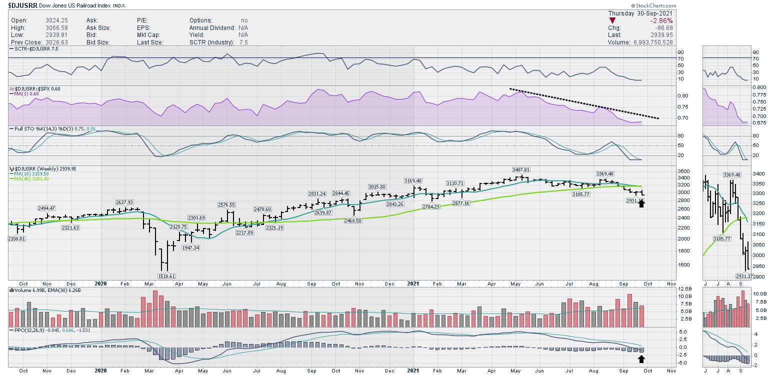
Looking at the railway index, it has been sliding lower.

September saw the end of the takeover battle for Kansas City Southern railway. The winner would have a rail network traveling from Mexico to Canada; CP Rail was bidding against CN Rail. CP finally succeeded in the takeover, which removes one of the companies (KSU) from the rail index.

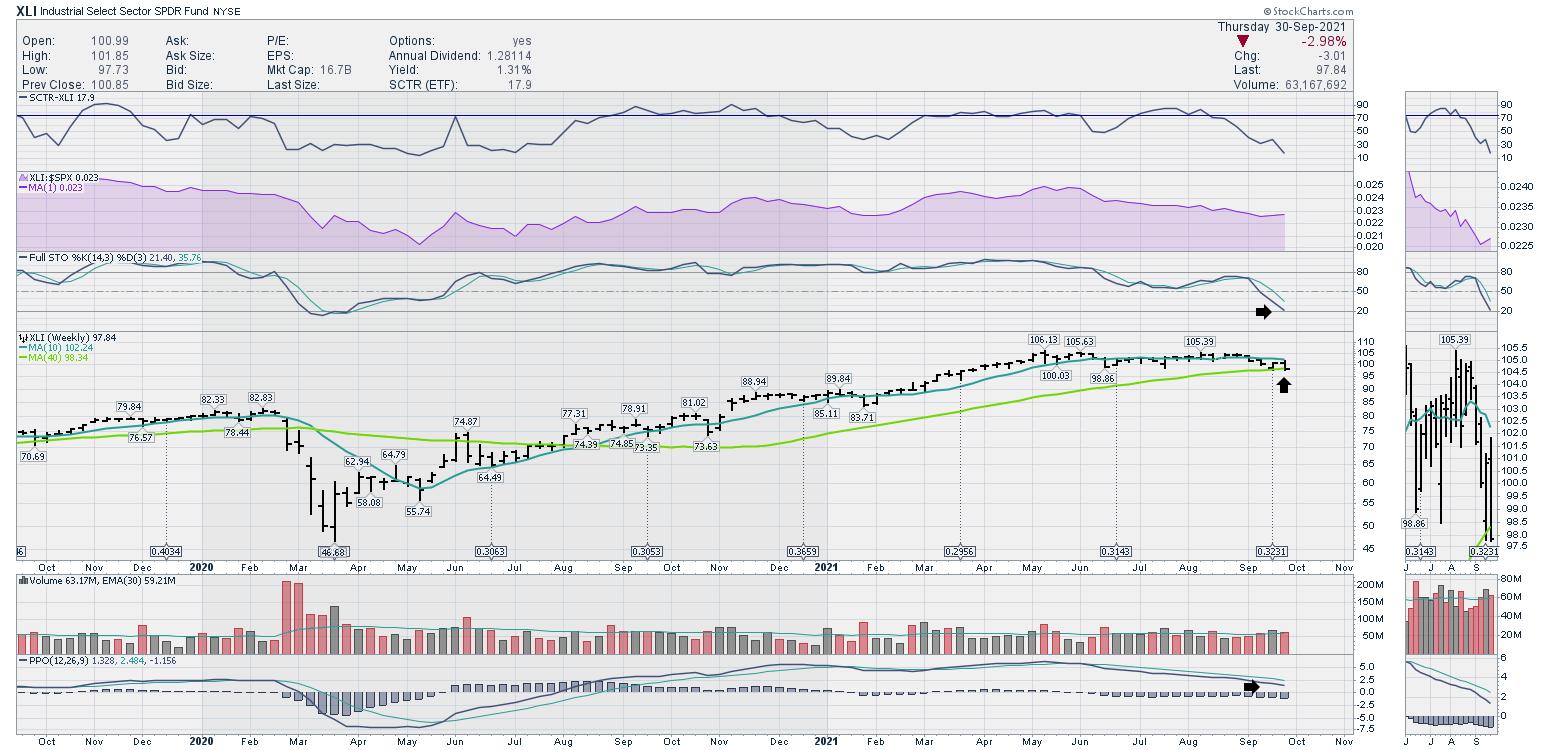
The railways have been telling us that something is amiss, and the industrials chart confirmed that with the breakdown in September. It is trying to hold the six month lows. This Industrials chart finished September resting on the 40-week moving average.

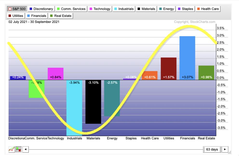
I was looking through the sector performance for the last three months, and it was really surprising to see how the defensive sectors have led. Even with the huge bounce in energy names through September, the defensive side of the market outperformed in a very uniform fashion.

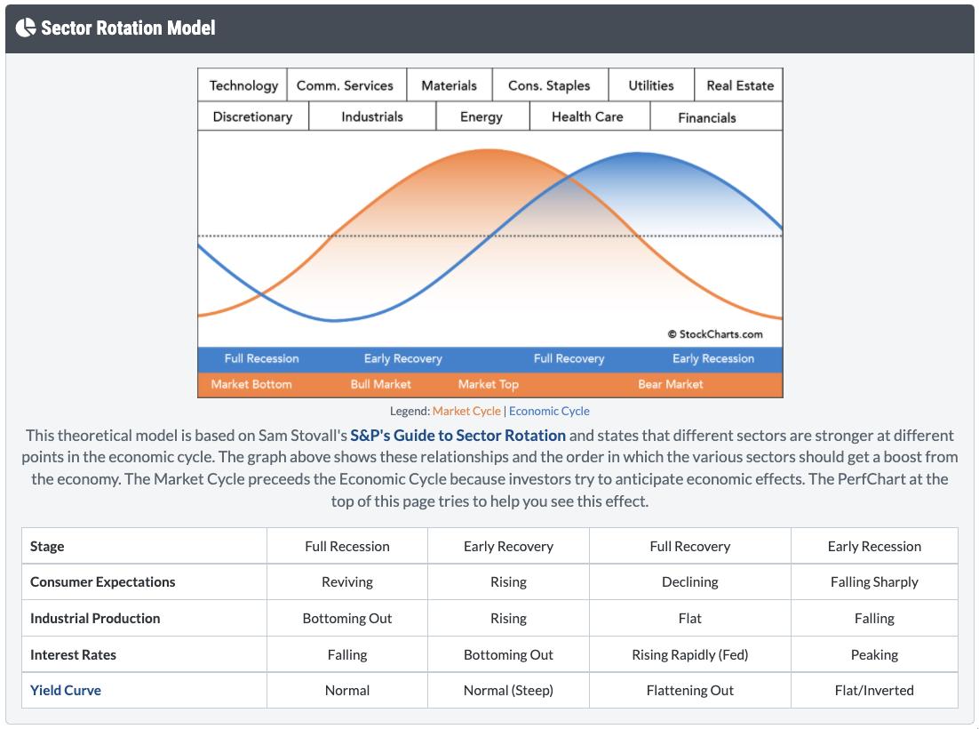
The picture below shows the typical template for the market. The stock market in orange should provide a clue as to where we are in the cycle. Notice the industrials, materials and energy are the weakest performers in the third quarter. By having the defensive sectors leading, it may suggest the market is topping out for a while.

This is suggesting we may have hit an interim peak in the market; we will need to watch for a rotation into Discretionary, Communications and Technology to start the next rally. I'll be hosting a conference call with clients of GregSchnell.com on Saturday morning. If you would like to listen in, take a free trial at GregSchnell.com/Explore, where a subscription is 40% off. Your credit card will not be charged for the period through the free trial.
Here is an example of some unique views about the sector and industry performance.
- Green: Very strong price action
- Blue: Solid price action
- Yellow: Weak price action
- Red: Extremely weak price action

I do not expect the red bars to start soaring higher, but this helps explain why the market is moving lower to end September when 50% of the industry and index charts reviewed are weak or very weak.
|
| READ ONLINE → |
|
|
|
|
|
| ChartWatchers |
| Let Charts Help You Identify Possible Winners - And Losers |
| by John Hopkins |
With Q3 earnings season kicking off over the next few weeks, it's important to try to identify those companies that might shine and those that might suffer once they release their earnings. It's true that you cannot rely solely on one company's chart to determine how the market might react to numbers, but you can certainly get a feel for which ones might rise or fall once numbers are released.
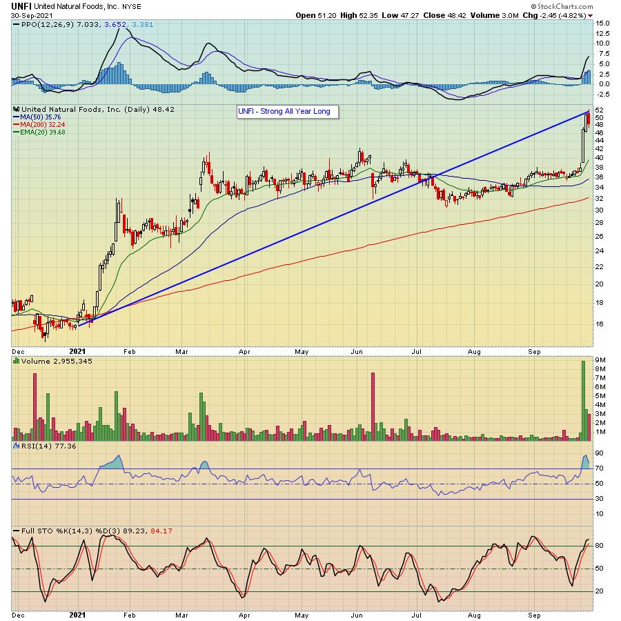
To illustrate, let's start with United Natural Foods (UNFI) that reported its earnings last Tuesday.

As you can see, the stock rose sharply, gaining almost 10% within two days of releasing earnings.
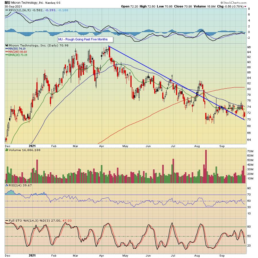
On the other hand, Micron (MU) reported its earnings after the bell on Tuesday and, though it only fell by 4%, it fell nonetheless.

Again, there was no way to know how the market might react to either UNFI's or MU's earnings, but, if you look at each chart, you can see that UNFI has been performing very well going back to the beginning of the year, whereas MU has been in decline mode since mid-April. So, if you had to make an educated guess as to how the market might react to the respective earnings, you might have given the odds to UNFI having the better outcome.
Realizing that studying a chart on a company prior to its earnings report might increase the odds of predicting its likely direction, we created a ChartList for EarningsBeats members, our "Strong Future Earnings ChartList". It currently contains 284 companies that belong to strong industry groups and have SCTR scores >80 -- in other words, companies currently favored by Wall Street, suggesting perhaps we'll see better than expected quarterly revenues and earnings as we approach their respective earnings dates. In fact, if you would like to see a sample ChartList, just click here to sign up for our FREE newsletter, the "EarningsBeats Digest" and we will feature some stocks in this Monday's edition.
Earnings Season brings with it great opportunities to profit from those companies that beat earnings expectations. Zeroing in on those companies that have the greatest prospects should be a part of your trading toolbox.
At your service,
John Hopkins
EarningsBeats.com
|
| READ ONLINE → |
|
|
|
| Mish's Market Minute |
| Mish: The U.S. Dollar Has Had Its Day |
| by Mish Schneider |

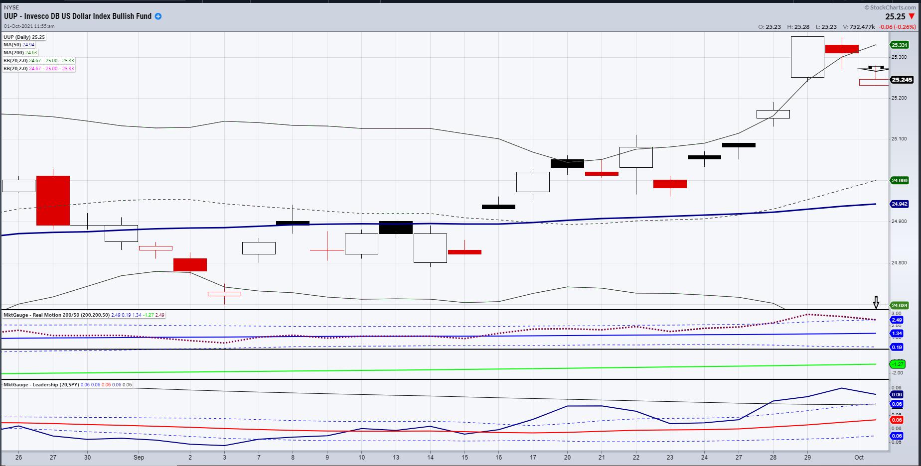
The U.S. Dollar chart, as represented by the Invesco DB US Dollar ETF (UUP), shows some classic signs of a top.
Before I delve deeper into the technicals though, let's look at the fundamental reasons for the dollar rally last week. For starters, China's slowing growth turned the US dollar into a safe haven. The dollar becomes a safe haven as the world's reserve currency. This flight to safety happens when another country (especially China) faces political or economic uncertainty.
Secondly, a decline in debt purchases by the Fed is widely considered positive for the dollar. The Fed is expected to raise U.S. government bond yields, making it more attractive for investors to hold dollar-denominated assets. While a robust dollar can be a sign of economic strength, a too-rapid rally in the currency can also hit the balance sheets of U.S. exporters by making their products less competitive and more expensive abroad.
Interestingly, the dollar rising too fast is nearly as inflationary as when it is falling too fast. In the current environment, goods are scarce to begin with, and now are even more expensive with a stronger dollar.
With all that said, the week ended with four technical reasons the dollar might have stopped going up.
Before we explore the technicals, what are some reasons the dollar might have topped out? The news from China is in the market. Yields fell in the face of some risk in the market, even though the market saw a decent recovery off the lows late Friday. The debt ceiling has yet to be resolved. Perhaps the market is sensing an infrastructure bill passing, that will increase spending thereby adding fuel to the inflation fire. Or maybe it was just too much too soon for the dollar to get so happy, considering that Bitcoin and other cryptocurrencies woke up on Friday along with the overall market.
Here's what we see technically in the dollar and UUP:
- A blow off rally September 29th with high volume.
- A run to the 80-month MA resistance (not seen on the chart shown), that it broke down from.
- A mean reversion setup in both price and momentum-overbought and failure to follow through Bollinger Bands.
- A new 60+ day high and reversal top confirmation.
This coming week, we will continue to focus on if the dollar breaks down further or not. We will also watch the Transportation sector (IYT) to clear 252 or show that Friday was a one-day wonder. Finally, we will watch Junk Bonds (JNK), as they did indeed break down. However, JNK closed over the 200-DMA and like IYT, held the 50-WMA.
Hence, with some real levels and context to watch for, we have a gameplan regardless of the direction the market runs.
Follow Mish on Twitter @marketminute for stock picks and more. Follow Mish on Instagram (mishschneider) for daily morning videos. To see updated media clips, click here.
On this week's edition of StockCharts TV's Mish's Market Minute, Mish looks at some top symbols held by Horizon Kinetics Inflation Beneficiaries for new ideas for inflation plays. Of course, Mish adds a few of her own picks as other possible options for an inflationary environment.
ETF Summary
- S&P 500 (SPY): Watch to clear the 10-DMA at 436.81.
- Russell 2000 (IWM): 225 resistance area.
- Dow (DIA): Flirting with the 10-DMA at 343.37.
- Nasdaq (QQQ): Needs to get back over 361.
- KRE (Regional Banks): 67 support area. 70 resistance.
- SMH (Semiconductors): Needs to hold 255.77.
- IYT (Transportation): 250 resistance.
- IBB (Biotechnology): Needs to get back over 160 area.
- XRT (Retail): 88.47 the 200-DMA.
Mish Schneider
MarketGauge.com
Director of Trading Research and Education
|
| READ ONLINE → |
|
|
|
| RRG Charts |
| This Tech Stock Breaks Out And Is Added To The RRG Long Basket |
| by Julius de Kempenaer |
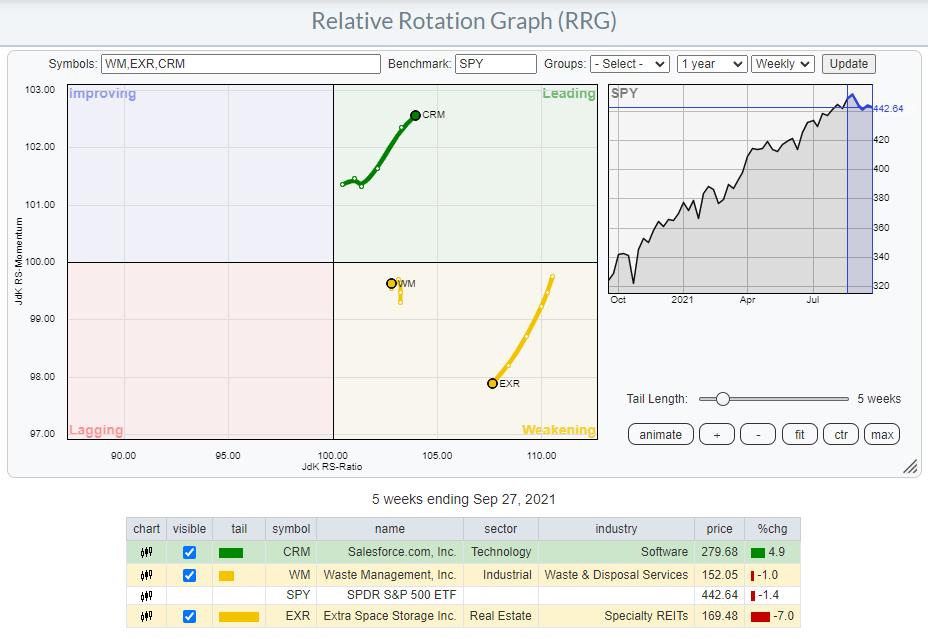
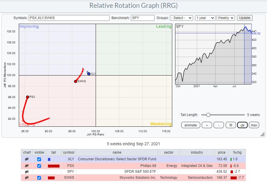
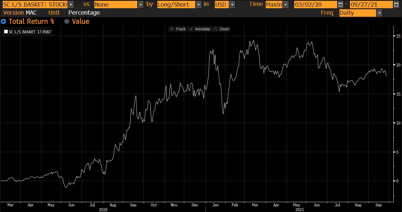
After the last update of the RRG Baskets we were left with 3 shorts and 3 longs:
LONG : EXR, WM, CRM
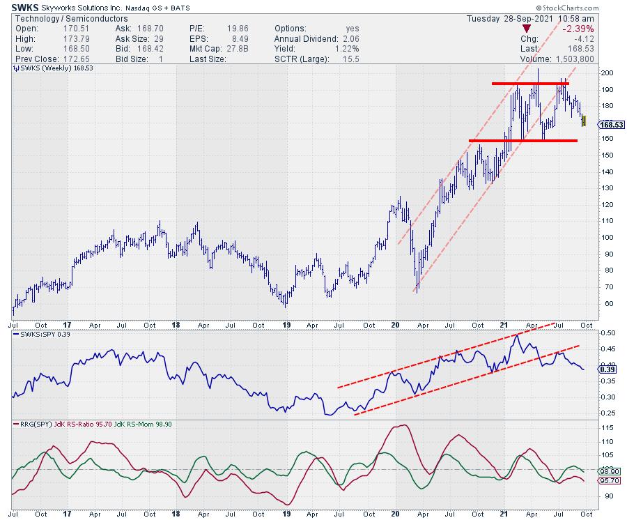
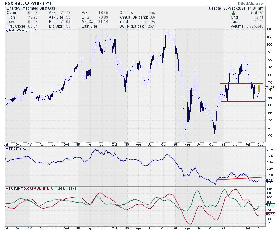
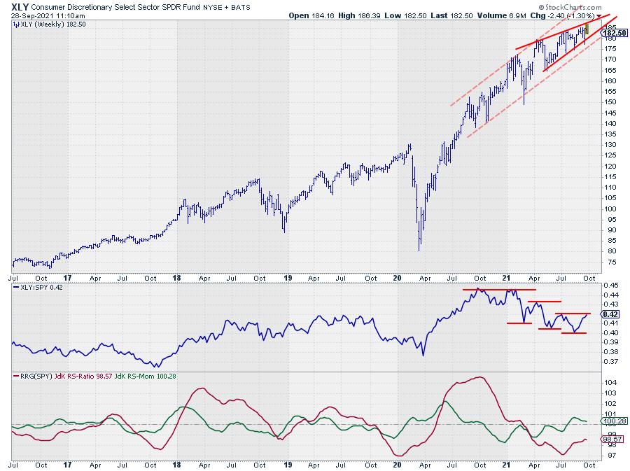
SHORT: XLY, SWKS, PSX
LONG

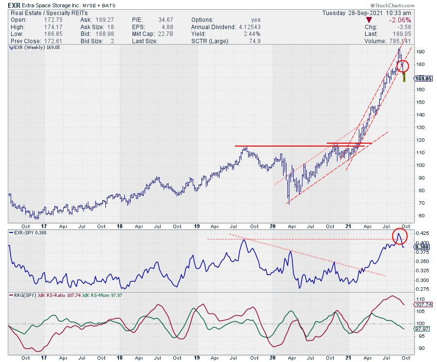
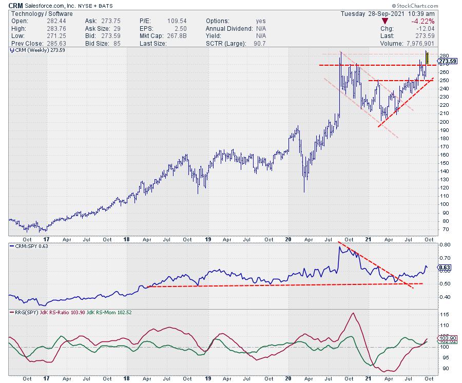
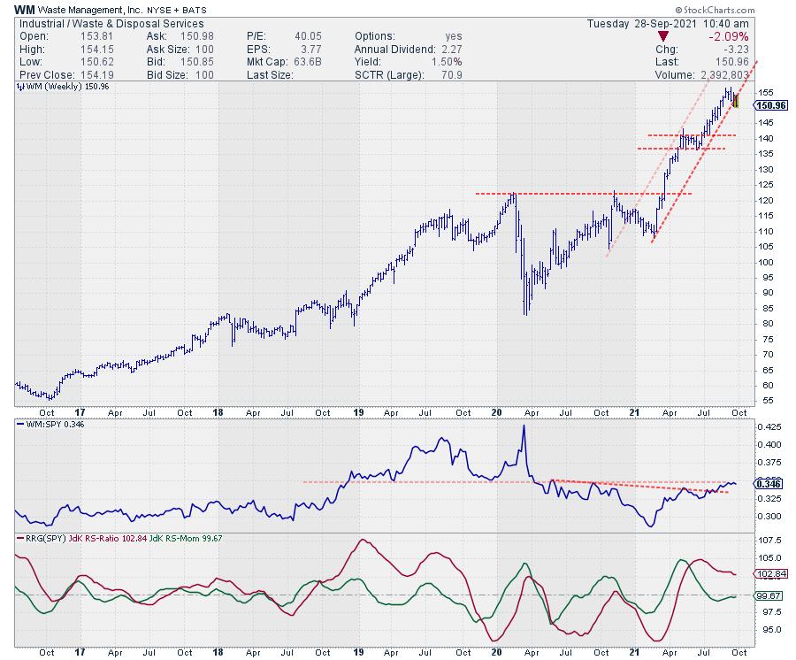
Looking at the recent performance for the members of the long basket we see CRM and WM holding up well vs the S&P 500. EXR, however, underperformed the benchmark significantly over the last five weeks, despite its high reading on the RS-Ratio scale.
EXR

On the price chart, EXR dropped out of its steep rising channel while the RS-Line tried to break higher but failed to hold up and dropped back below that breakout level. That is sending the RRG-Lines lower and positioning the stock inside the weakening quadrant at a negative RRG-Heading.
With little to no support nearby for both price and relative strength, I am removing EXR from the long side.
CRM

CRM is now pushing against overhead resistance near 280 while relative strength is holding up well. A break beyond 280 will certainly help a further strengthening in relative terms. So far, so good.
WM

WM is struggling to hold the rising support line that marks the lower boundary of the rising channel. So far relative strength has managed to hold up above its first breakout level and is now trying to break above the next horizontal barrier.
The short tail, inside the weakening quadrant, indicates that the relative uptrend is stable. A push above the horizontal resistance in relative strength would give a bit more comfort but keeping WM for the time being.
Short

Of the three stocks in the short basket, SWKS moved nicely lower over the last few weeks. PSX did drop in price but not enough to underperform the S&P 500 yet which dropped 2.7% vs -0.8 for PSX.
XLY, the consumer discretionary ETF picked up 1% in the last five weeks but remains at the left of the graph with a very short tail and heading towards the lagging quadrant.
SWKS

SWKS is falling further after the test of overhead resistance and breaking below rising support while relative strength follows a similar path.
With the rotation from improving back into lagging on the RRG, SWKS remains in the short basket.
PSX

After testing support around 62.50 on the price chart, PSX bounced higher. Around 75 lies the former support area which, very likely, will be hard to break at the moment.
A new lower high below 75 will confirm the weakness in PSX and will very likely also cause more weakness in relative strength, bringing PSX back as an underperformed in coming weeks.
XLY

The relative strength for XLY vs SPY is showing a series of lower highs and lower lows which is what we want to see for shorts. The last relative rally managed to get back to the level of the previous high which is stronger than expected.
That recent hiccup in relative strength also clashes with the price pattern that seems to be forming on the price chart. Since April/May a rising wedge seems to be in the making. After an uptrend, that qualifies as a reversal pattern when executed, usually followed by an acceleration lower.
That wedge pattern will be complete on the break below the support line that marks the lower boundary of the formation. As you can see, the lower boundary of the rising channel, light shaded support line, is nearby. Breaking that support as well will only add to the confirmation that the trend has reversed.
I am watching 175, at a Friday close, as the trigger for an acceleration lower. For the time being XLY can stay in the short basket.
ORCL to Replace EXR

In today's episode of Sector Spotlight, I highlight the Technology sector as potentially interesting from a seasonal point of view but mentioned the rotation on the RRG not being too supportive (yet). With today's knowledge (S&P down 1.8%, and XLK down 2.5%, as I am writing this, that caveat seems to step to the forefront.
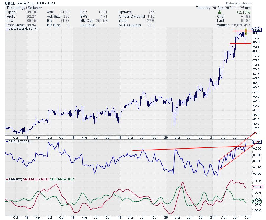
However, when diving into the tech sector at the individual stock level there are still some interesting rotations to be found. One of those is for ORCL.
On the RRG, ORCL is inside the weakening quadrant after a strong rotation through leading but is now rapidly picking up both relative strength and relative momentum again, putting the tail back on track for a rotation towards leading again.
The price chart above shows that ORCL is now breaking to new highs which in itself is already a strong sign of (relative) strength when the sector it belongs to drops 2.5%.
Based on this strength and the expected seasonal strength for the sector, although it does not look as if that will apply to the entire sector this year, I am adding ORCL to the long basket, replacing EXR.
Current Basket
LONG : WM, CRM, ORCL
SHORT: XLY, SWKS, PSX

#StaySafe, --Julius
|
| READ ONLINE → |
|
|
|
| MORE ARTICLES → |
|
 Chart 1
 Chart 2Moving down to the 2-year maturity, which typically moves ahead of Fed policy changes, we see that recent action has caused it to edge to a new recovery high. It will encounter some resistance at the 65-week EMA, but the unanimously bullish KSTs suggest that it won't have much of a problem clearing it.
 Chart 3Even the 3-month Libor, which is very much influenced by Fed actions, has started to perk up and currently sports three rising momentum series. That positive momentum suggests that the 2010-2021 down trendline will soon be breached.
 Chart 4Longer-Term Maturities
 Chart 5Commodities Driving up Rates?
 Chart 6I did not expect this to happen, but did point out that, in the event that it did, the likely commodity leader would be energy. In that respect, Chart 7 shows that the DB Energy ETN has already registered a new high. The US Oil Fund, Chart 8, has also broken out from a consolidation reverse head-and-shoulders. Energy stocks could be a close follower, as the VanEck Vectors Unconventional Oil and Gas ETF (FRAK), Chart 9, has jumped above its previous high.
 Chart 7
 Chart 8
 Chart 9Financials Like Rising Rates
 Chart 10
 Chart 11

 Chartists looking to trade in the direction of the bigger trend have two options. First, take trend signals and act when the trend turns up. Once an uptrend is underway, chartists must then rely on pullbacks, short-term oversold conditions and bullish continuation patterns to hitch a ride. Today's article will put these two options into action using the DB Agriculture ETF (DBA).