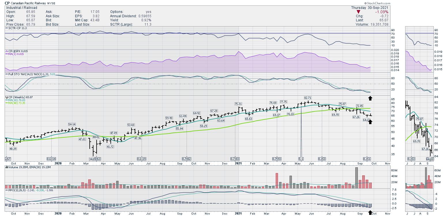
I rode the rails through western Canada last week on the Rocky Mountaineer. This particular tour uses the freight railway lines that run through the Rockies; I traveled on the CP Rail line as well as the CN Rail line. Railways are a great clue to the health of the economy.
 Photo: Greg Schnell
Looking at the railway index, it has been sliding lower.
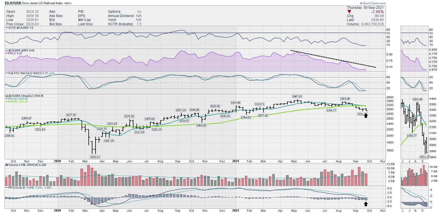
September saw the end of the takeover battle for Kansas City Southern railway. The winner would have a rail network traveling from Mexico to Canada; CP Rail was bidding against CN Rail. CP finally succeeded in the takeover, which removes one of the companies (KSU) from the rail index.
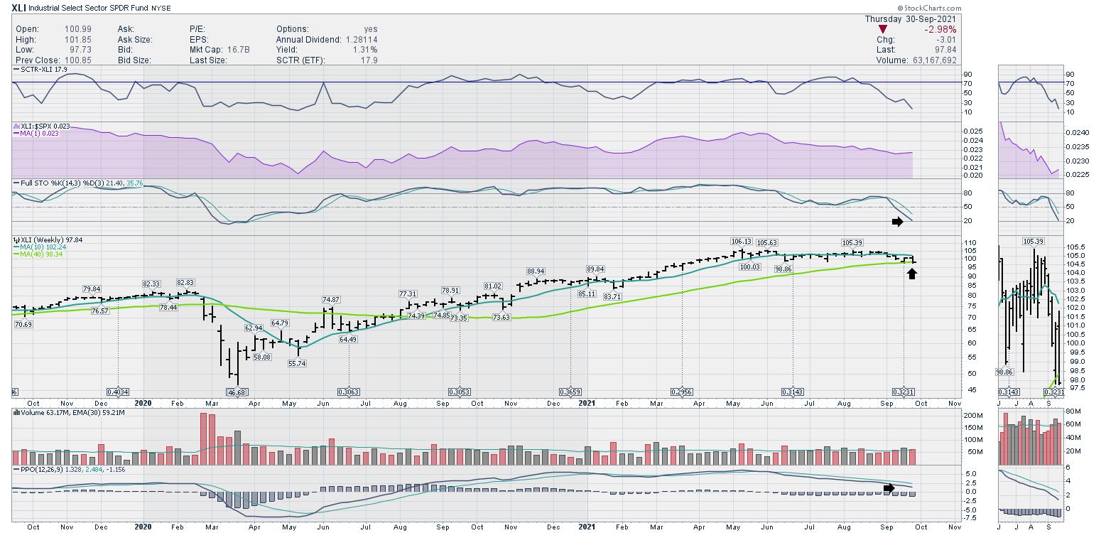
The railways have been telling us that something is amiss, and the industrials chart confirmed that with the breakdown in September. It is trying to hold the six month lows. This Industrials chart finished September resting on the 40-week moving average.
I was looking through the sector performance for the last three months, and it was really surprising to see how the defensive sectors have led. Even with the huge bounce in energy names through September, the defensive side of the market outperformed in a very uniform fashion.
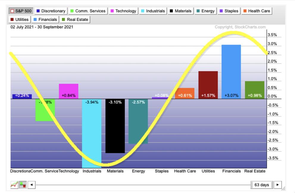
The picture below shows the typical template for the market. The stock market in orange should provide a clue as to where we are in the cycle. Notice the industrials, materials and energy are the weakest performers in the third quarter. By having the defensive sectors leading, it may suggest the market is topping out for a while.
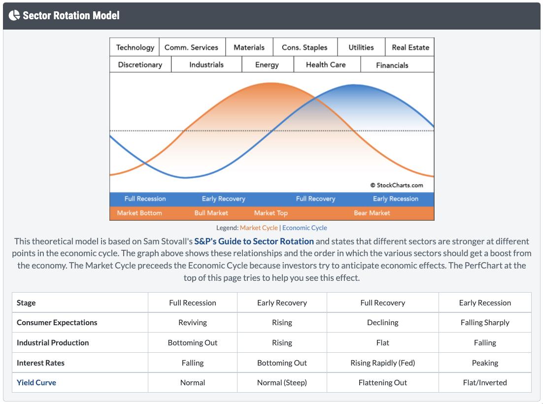
This is suggesting we may have hit an interim peak in the market; we will need to watch for a rotation into Discretionary, Communications and Technology to start the next rally. I'll be hosting a conference call with clients of GregSchnell.com on Saturday morning. If you would like to listen in, take a free trial at GregSchnell.com/Explore, where a subscription is 40% off. Your credit card will not be charged for the period through the free trial.
Here is an example of some unique views about the sector and industry performance.
- Green: Very strong price action
- Blue: Solid price action
- Yellow: Weak price action
- Red: Extremely weak price action
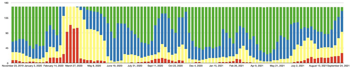
I do not expect the red bars to start soaring higher, but this helps explain why the market is moving lower to end September when 50% of the industry and index charts reviewed are weak or very weak.
Good trading,
Greg Schnell, CMT, MFTA
Senior Technical Analyst, StockCharts.com
Author, Stock Charts For Dummies
Want to stay on top of the market's latest intermarket signals?
– Follow @SchnellInvestor on Twitter
– Connect with Greg on LinkedIn
– Subscribe to The Canadian Technician
– Email at info@gregschnell.com