| THIS WEEK'S ARTICLES |
| John Murphy's Market Message |
| RAILS AND TRUCKERS LEAD THE TRANSPORTS HIGHER |
| by John Murphy |
DOW TRANSPORTS CONTINUE TO RALLY... While the Dow Industrials continue to test their old highs, transportation stocks continue to act much stronger. Chart 1 shows the Dow Transports rising today to the highest level in nearly five months. That shouldn't be too surprising with companies dealing with supply chain bottlenecks and the need to move goods around the country. It's also not surprising to see rails and truckers leading the transportation rally.
RAILS HIT NEW RECORD... Chart 2 shows the Dow Jones Railroad Index moving above its May high to establish a new record. Rails are the strongest part of the transportation group. And the leader in that group is also shown. Chart 3 shows Union Pacific (UNP) rising further into record territory. Truckers are also rallying.
 Chart 1 Chart 1
 Chart 2 Chart 2
 Chart 3 Chart 3
TRUCKING LEADERS... Some trucking stocks have also been showing up in the transport leader board. Chart 4 shows J.B. Hunt (JBHT) moving further into record territory after exceeding its May/September highs. Chart 5 shows Landstar (LSTR) trading above its early September peak near 173 to reach the highest level in five months.
 Chart 4 Chart 4
 Chart 5 Chart 5
|
| READ ONLINE → |
|
|
|
| The Mindful Investor |
| Why Breadth Matters as S&P Tests 4550 |
| by David Keller |
The worst crime that an analyst can commit is remaining bearish in the face of a rising market. -Richard Russell
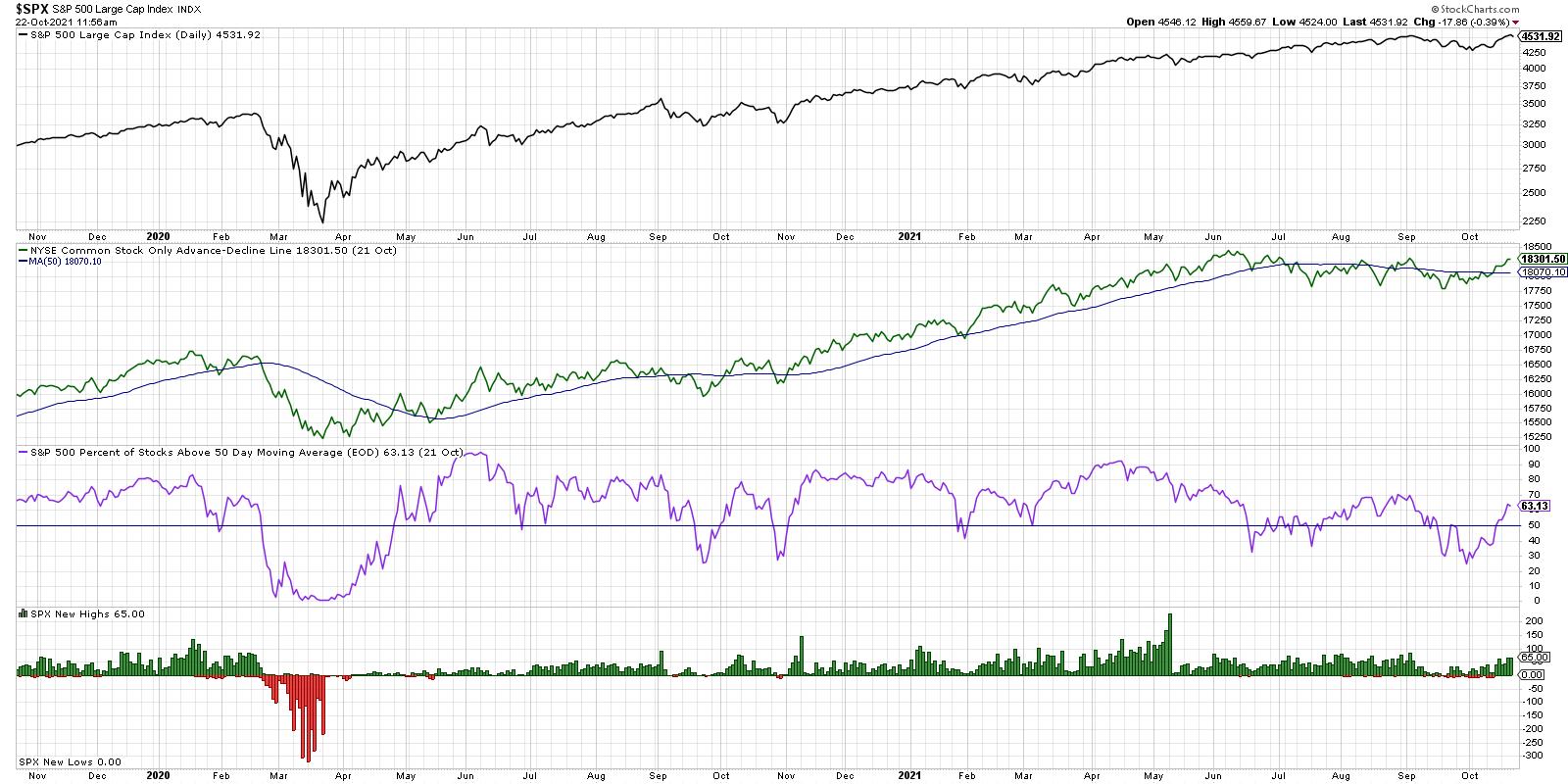
The S&P 500 has now round tripped from its early September high around 4550 and the low around 4300 in early October. Will there be enough buying power next week and beyond to propel the index beyond 4550 to further new highs?
My mentors in the financial industry would tell me to focus on the chart of the S&P 500. Or to speak more broadly, focus on price. Price will tell you most of what you need to know about any financial asset.
But for indexes like the S&P 500, we can look "under the hood" and analyze market breadth indicators. Breadth speaks to participation. If the index is doing one thing, what about the hundreds of stocks that comprise that index?

From the top, we have the S&P 500 on a closing basis testing all-time highs from early September. Let's be clear. As Paul Montgomery used to say, "The most bullish thing the market can do is go up." Having said that, let's go through each breadth indicator and see what we can conclude.
The second panel down in green is the cumulative advance-decline line for the NYSE using only common stocks. This is also testing the September high, and a break above this level would certainly seem to confirm that the current rally is part of a broader advance. The more stocks that close higher, the more this line will reflect that by pushing higher as well.
Next in purple we have the percent of S&P 500 names above their 50-day moving average. This was down to around 25% in late September, and now has rotated to over 64%. That means about 40% of S&P 500 members, about 200 names, have rotated back above their 50-day moving average so far in October.
In a healthy bull market phase, this indicator tends to remain above 50% which tells us that over of the stocks in the index are above this trend-following mechanism. When the market goes higher, and this indicator does not confirm that up move, it's time to get skeptical.
Finally, we have the number of new 52-week highs and lows for the S&P 500. A healthy bull market phase involves an expansion in new highs. For the S&P to go materially higher than present levels, you would need to see an increasing number of new highs. The more stocks like HD and UNP and NFLX break out, the more likely the S&P 500 index is to do the same.
Is market breadth confirming this new bull market phase or not? At this point, the results are inconclusive. But this is one chart I'll be watching in the coming weeks to make that determination. More color and details in the video below!
RR#6,
Dave
PS- Ready to upgrade your investment process? Check out my free course on behavioral investing!
David Keller, CMT
Chief Market Strategist
StockCharts.com
Disclaimer: This blog is for educational purposes only and should not be construed as financial advice. The ideas and strategies should never be used without first assessing your own personal and financial situation, or without consulting a financial professional.
The author does not have a position in mentioned securities at the time of publication. Any opinions expressed herein are solely those of the author, and do not in any way represent the views or opinions of any other person or entity.
|
| READ ONLINE → |
|
|
|
| Trading Places with Tom Bowley |
| Could We Have Just Topped? |
| by Tom Bowley |
I guess the first question I'd ask is, "Are we talking about the short-term or the long-term?" Because I'd say there's very little chance that we've just reached a long-term top. But could this be a short-term top? Absolutely. Let me explain two reasons why a quick selloff is a definite possibility.
Critical Price Resistance Tested
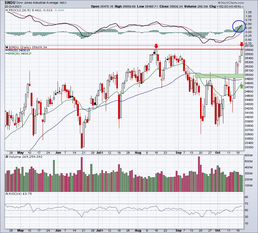
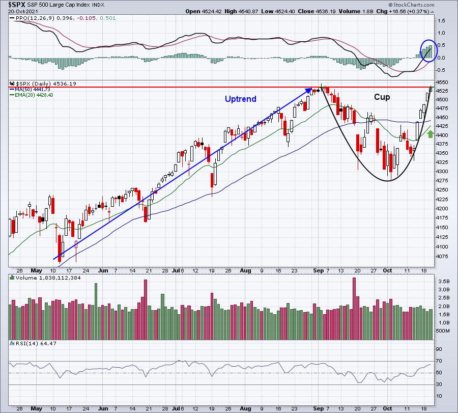
Both the Dow Jones and S&P 500 tested all-time high closes yesterday, before falling just shy at the close. Failed breakouts can result in short-term selling. Here are the two charts:
Dow Jones:

I love the look of this chart, but yesterday the Dow Jones hit a record intraday high at 36,669.69, besting its August 16th intraday high. The problem is that it didn't hold that high into the close, finishing just beneath August 16th's close. That has the look of a short-term top. The good news for bulls is that the PPO is showing accelerating bullish momentum, so any test of the rising 20-day EMA is likely to hold. But we could we see a quick 1-2% drop? Sure.
S&P 500:

Does that not look like a perfect cup to you? It comes after a prior uptrend, so I'd be treating this as a very bullish cup with handle continuation pattern. But we're missing one thing. The handle. So could I see the S&P 500 pulling back to test the rising 20-day EMA to print a handle? Most definitely.
I'm not saying that a pullback is guaranteed. I believe most of you know how bullish I have been for YEARS. I've said to ignore the media headlines and stay invested in this secular bull market. But pullbacks do occur and this would be a technical opportunity for a shallow one.
History Is Flashing A Caution Light
I have a spreadsheet that has every trading day on the S&P 500 and NASDAQ since 1950 and 1971, respectively. I love to analyze and I can assure you I've analyzed the heck out of these numbers. One historical fact is that, at the close today, we will be entering the worst historical week of the year. The October 21st close through the October 27th close has a tendency to show weakness. Before I show you the numbers, keep in mind that the 19th through 25th of EVERY calendar month has produced annualized returns of -8% on the S&P 500 since 1950. So this October weakness is really nothing new. It just happens to be the worst of the bunch. Below are the annualized returns by calendar day on the S&P 500, followed by the NASDAQ:
S&P 500:
- October 22: -91.85%
- October 23: -5.14%
- October 24: -39.18%
- October 25: -48.74%
- October 26: -55.45%
- October 27: -19.51%
NASDAQ:
- October 22: -55.71%
- October 23: -48.75%
- October 24: -72.45%
- October 25: -48.57%
- October 26: -86.88%
- October 27: -75.47%
But here's the good news. Once we get past this October 22-27 period, the market skies turn a very bright blue (or maybe green in stock market terms). Check out the historical returns for October 28th through November 5th on the S&P 500 since 1950:
- October 28: +114.31%
- October 29: +78.05%
- October 30: +55.50%
- October 31: +19.81%
- November 1: +45.47%
- November 2: +86.10%
- November 3: +101.54%
- November 4: +45.52%
- November 5: +72.52%
It's like the water faucet is turned from ice cold to scorching hot at the October 27th close. So, if we do pullback in the short-term, don't lose sight of what's on the horizon historically.
If you like stats, I have a doozy for you on Friday morning in our EB Digest newsletter. You won't believe the winning streak that this area of the market has during the month of November. It's been like printing money since this bull market began. Our EB Digest newsletter is FREE (no credit card required) and you may unsubscribe at any time. Register with your name and email address HERE. Then enjoy this amazing stat in tomorrow's edition!
Happy trading!
Tom
|
| READ ONLINE → |
|
|
|
|
|
| Martin Pring's Market Roundup |
| Which Asset Class is Likely to Outperform Going Forwards? |
| by Martin Pring |
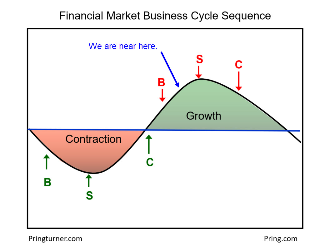
The business cycle undergoes a set series of chronological sequences, just like the calendar year goes through seasons. Over the course of many decades, economists have recognized this phenomenon and devised composite indicators to follow this progression. By way of an example, the Conference Board publishes leading, coincident and lagging indexes. They are named that way for a reason. Some sectors of the economy lead, others (such as GDP) coincide and, finally, lagging indicators come to life, just as the economy is slowing down or starting to contract.
At Pring Turner Capital we follow this stuff very closely, as the primary trend peaks and troughs of bonds, stocks and commodities are part of the chronological sequence, which is idealized in Figure 1. Our estimate is that we are currently positioned somewhere between the peak in bond prices and that of equities.
 Figure 1 Figure 1
The diagram shows that identifying the current phase of the cycle is hugely important (detailed explanation here). First off, each "season" in the business cycle is suitable for a different asset mix. Second, having an informed view on the prevailing phase helps you to anticipate what might be coming next.
At first glance, this may sound a bit complex. Fear not -- I have a quick fix that will help us get there. It's based on relative action between the three asset classes.
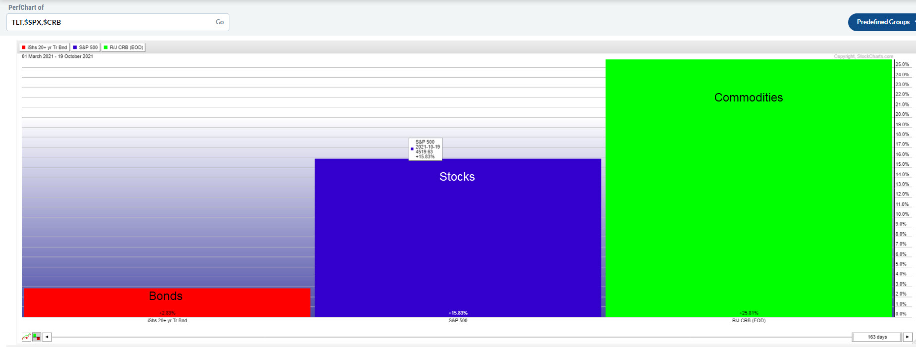
 Chart 1 Chart 1
To start with, Chart 1 shows their performance since early May, which, based on several internal indicators, broadly approximates when the correction began. Since that time, commodities and stocks have been the leaders, with bonds following up in the rear. Now it's time to tune into some of these cross relationships to identify where we are in the cycle and which asset class might outperform in the period ahead.
Stocks vs. Bonds
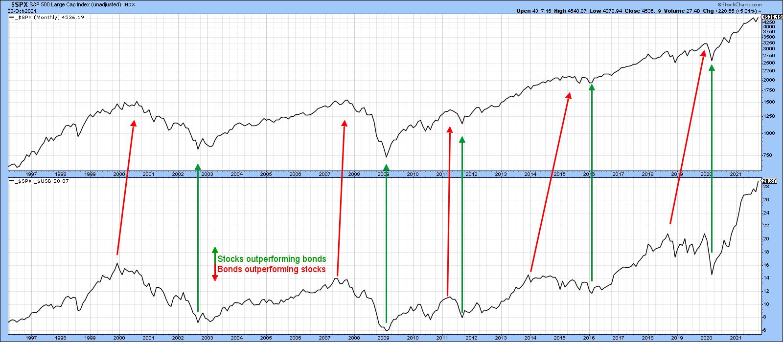
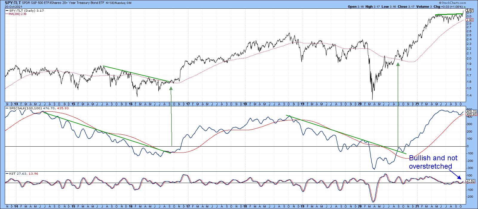
Chart 2 compares the S&P to the ratio between it and the price of the 30-year Bond ($SPX:$USB). The red arrows generally lean to the right, indicating that stocks usually begin to underperform bonds prior to a bull market high. That ratio is currently at a new high; Chart 3 shows that it has broken out from a trading range and looks set to move even higher. The only negative is that momentum, as measured by the Special K, is overextended.
 Chart 2 Chart 2
 Chart 3 Chart 3
Stocks vs. Commodities
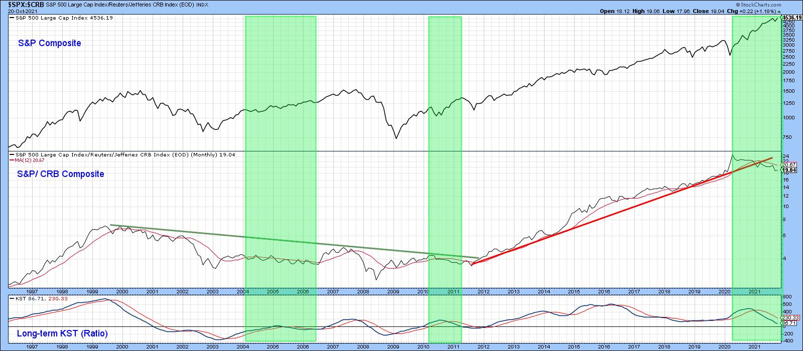
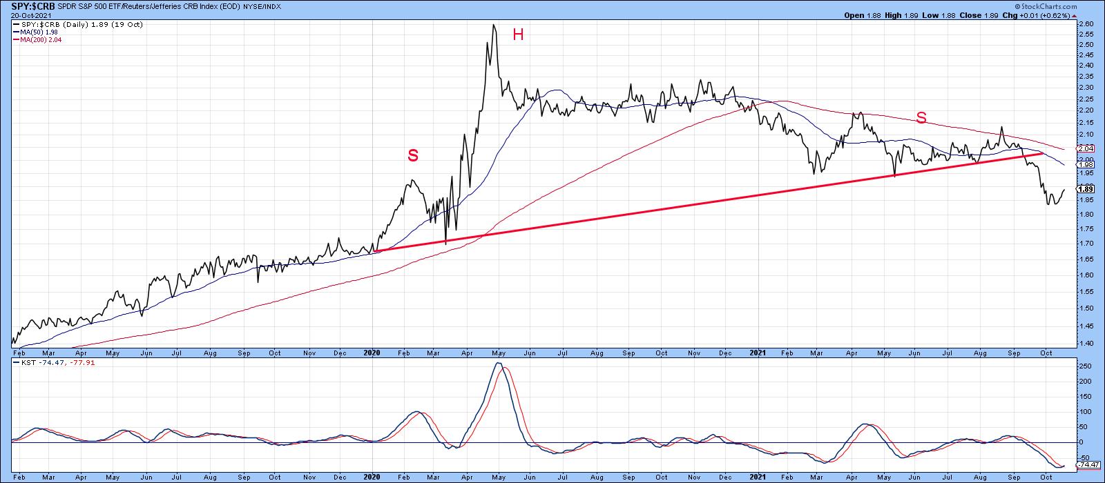
The stock/commodity ratio peaked in April 2020 and has been zig-zagging down ever since. As a result, it decisively violated the 2011-2021 up trendline and is now below its declining 12-month MA. A falling ratio does not mean that stocks will decline in their own right, just underperform commodities. The green-shaded areas point out periods when the ratio fell but stocks rallied. Since last year, for instance, the ratio has dropped, but both stock and commodities have been on a tear.
 Chart 4 Chart 4
Chart 5 monitors the more recent period, where the ratio has recently completed an upward-sloping head-and-shoulders pattern. That said, this week's daily KST buy signal suggests a near-term bounce favoring stocks may be in the cards. If my assumption of an overall trend favoring commodities proves to be correct, then it is likely that earnings-driven sectors in general, such as basic industry and commodity-sensitive will outperform their liquidity-driven (defensive) counterparts, such as utilities, telecom and consumer staples.
 Chart 5 Chart 5
Commodities vs. Bonds
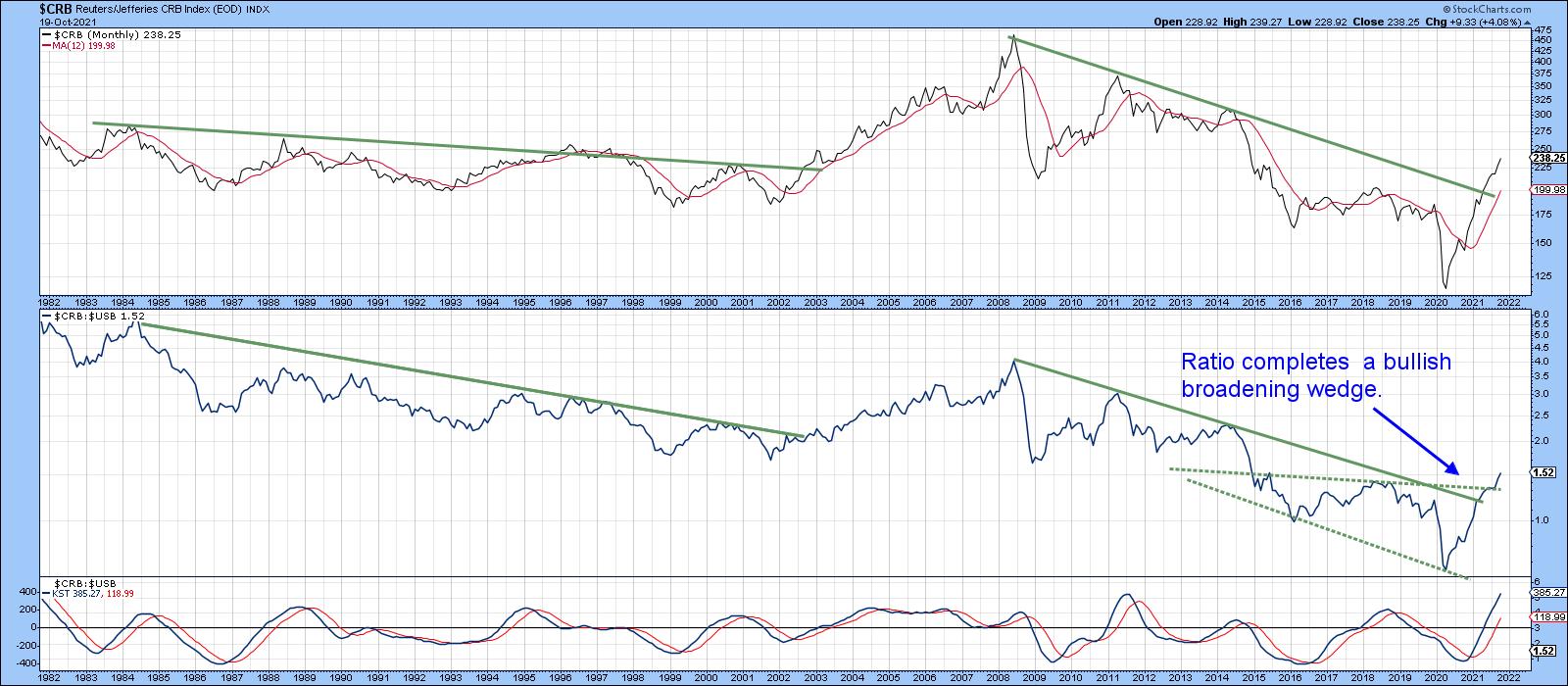
Our final area for consideration comes from the ultimate inflation/deflation relationship, that between bonds and commodities ($CRB/$USB). This ratio has been moving up sharply since the recession ended and has now violated its secular down trendline and completed a very bullish broadening wedge.
 Chart 6 Chart 6
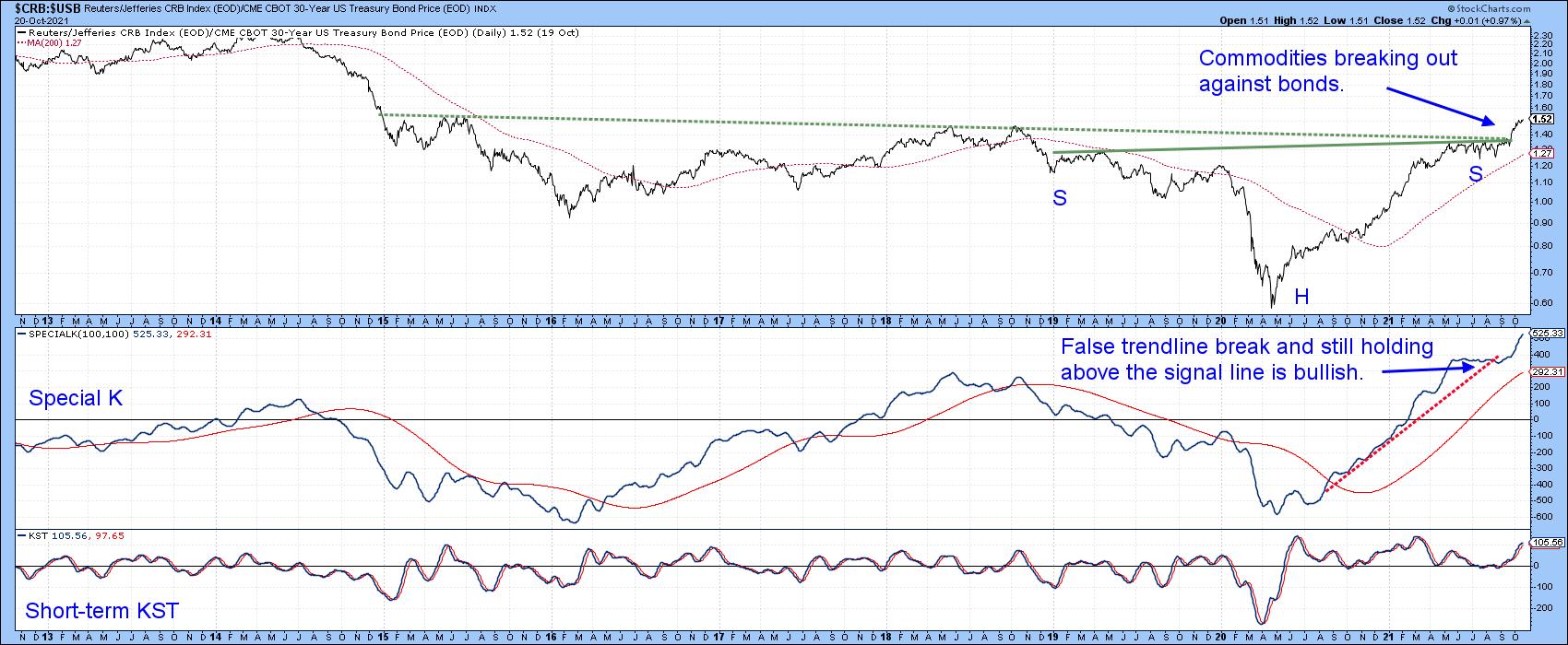
Daily data in Chart 7 shows that the ratio has just broken out from an inverse head-and-shoulders. It's also true that the Special K is very overextended. However, it recently moved back above the dashed up trendline and remained north of its signal line, price action that suggests very strong underlying momentum for this inflation/deflation relationship.
 Chart 7 Chart 7
Conclusion
- An examination of several cross-asset relationships suggests that the current cycle position lies somewhere between the peak in bonds and stocks, as shown in Figure 1.
- Even though they are getting overextended on a primary trend basis, commodities will continue to outperform both bonds and stocks.
- The probabilities favor equities themselves extending their bull market until commodities really accelerate on the upside.
Good luck and good charting,
Martin J. Pring
The views expressed in this article are those of the author and do not necessarily reflect the position or opinion of Pring Turner Capital Group of Walnut Creek or its affiliates.
|
| READ ONLINE → |
|
|
|
| ChartWatchers |
| What You Need to Know About Universes and Benchmarks on RRG |
| by Julius de Kempenaer |
The two crucial elements of a Relative Rotation Graph (RRG) are the "universe" and the "benchmark".
The Benchmark
The benchmark for a Relative Rotation Graph is the common denominator for all securities that are present in the universe. Theoretically, the benchmark can be any index or security but usually, and most useful, it is an index or security that has a relation with the securities in the universe.
On the RRG that shows the 11 sectors for the S&P 500 for example, it is clear that the S&P500 index is the obvious benchmark for that security.

For stocks in a specific sector, you can opt for the S&P 500 as the benchmark or the sector index to which those stocks belong. The results on the graph can be quite different.
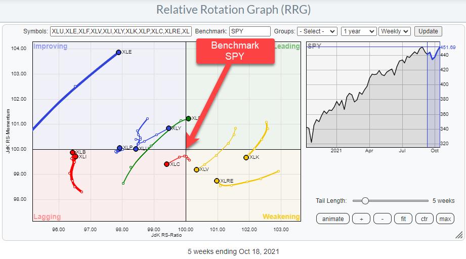
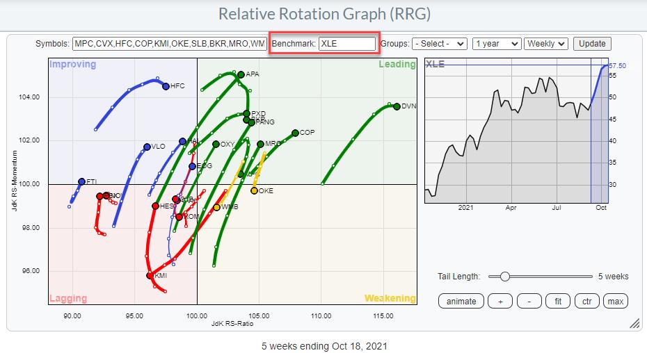
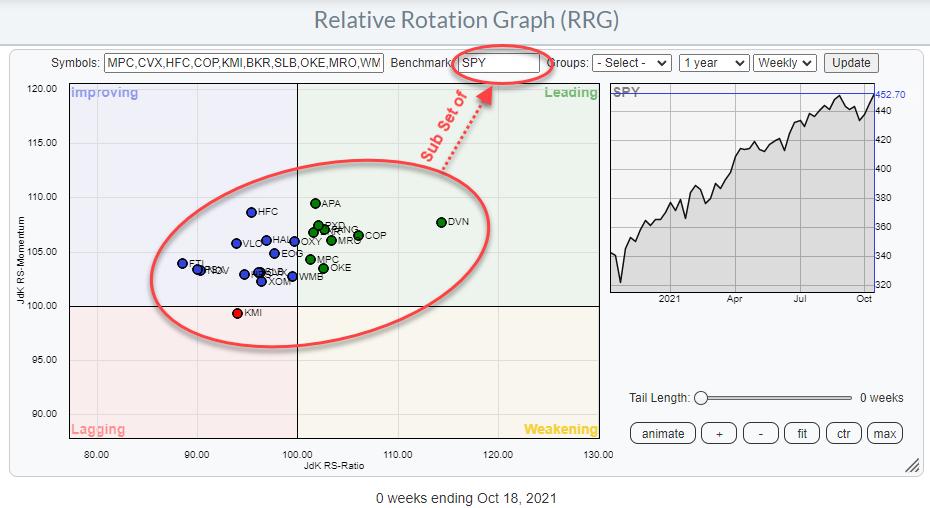
Take for example the Energy sector. The RRG below shows all the stocks inside the energy sector with XLE, the ETF that tracks the Energy Sector Index, as the benchmark.

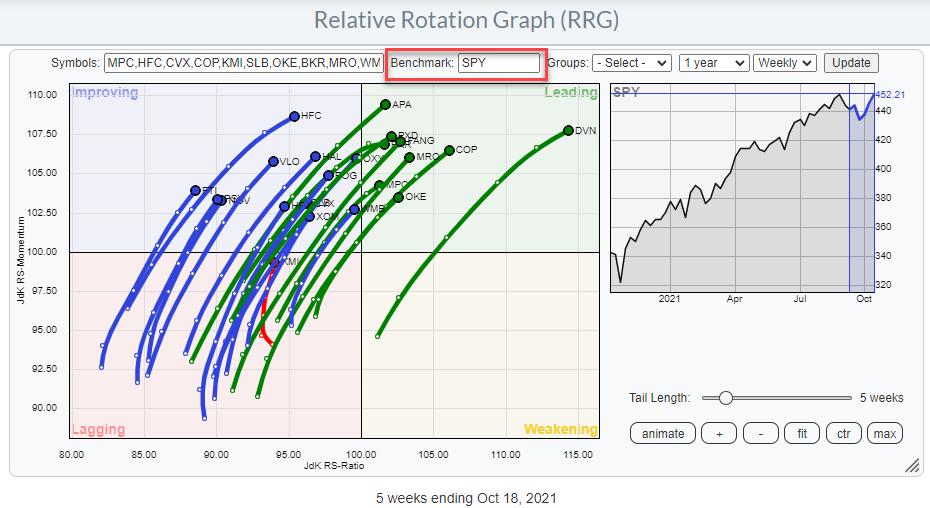
When we change the benchmark from XLE to SPY we get the RRG below

Needless to say that these two RRGs look quite different just by changing the benchmark.
For a group of indexes or securities that represent different asset classes, one could look for an index that combines performances of different asset classes.
Especially for currencies, the benchmark is a tricky one, because currencies are always already a relative expression. $EURUSD is EURos expressed in USDollars. $USDJPY is USDollars expressed in Japanese Yen. The problem here is clear. When the USD gets stronger $EURUSD will drop while $USDJPY will rise.
Hence in order to get a proper picture, when evaluating currencies on an RRG, all currency pairs in the universe should hold the same denominator. It does not matter which currency you choose as the base currency as long as it is the same for all pairs on the graph. Probably wises thing to do is make the currency of your portfolio or bank account the base currency of the RRG.
Because of the fact that all elements in the universe are already expressed as relative, we need a special benchmark. This is ticker symbol $ONE. This is a price series that is always 1.
This article here explains the working of a currency rotation graph more in-depth.
Another use of $ONE can be to take the relative effect out of a relative rotation graph and look at absolute price movements for a group of securities. The result here will be that a group of related securities will most likely all move in the same direction instead of being scattered around the plot when looking from a relative perspective.
The universe
The universe is the group of securities that will be plotted on the canvas of the RRG. This can literally be any group of securities.
Best known is the RRG that shows the 11 sectors that make up the S&P 500 index. But an RRG can also show a universe of individual stocks, (crypto-)currencies, country indexes, bonds, asset class indexes, etc. And any combination of all of the above.
The only thing that you need to keep in mind, or be careful with, is when you are working with data series that contain yields. The problem with yields is that they move inversely with price. So combining price-based series with yield-based series will be confusing.
Understanding the universe that you are working with is important to understand and interpret the resulting Relative Rotation Graph.
CLOSED Universe
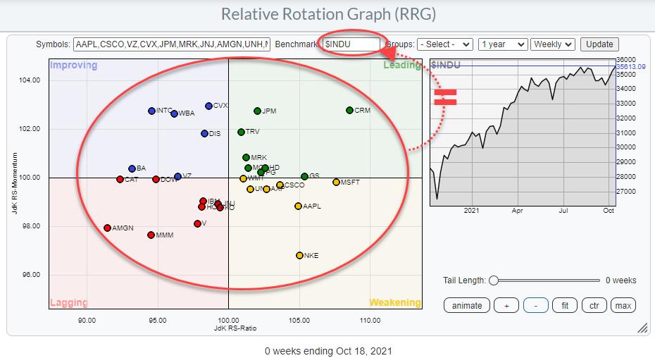
The RRG of the 11 sectors against SPY and the stocks in the Energy sector against XLE are so-called "closed universes". But also the RRG of the 30 stocks in the DJ Industrials index is a closed universe.

A closed universe is a universe in which the benchmark holds exactly the same securities as the universe.
OPEN Universe
An open universe is a universe that holds a group of securities that is not (exactly) the same as the benchmark to which the securities are compared on the RRG.
For open universes there are three options:
Extended
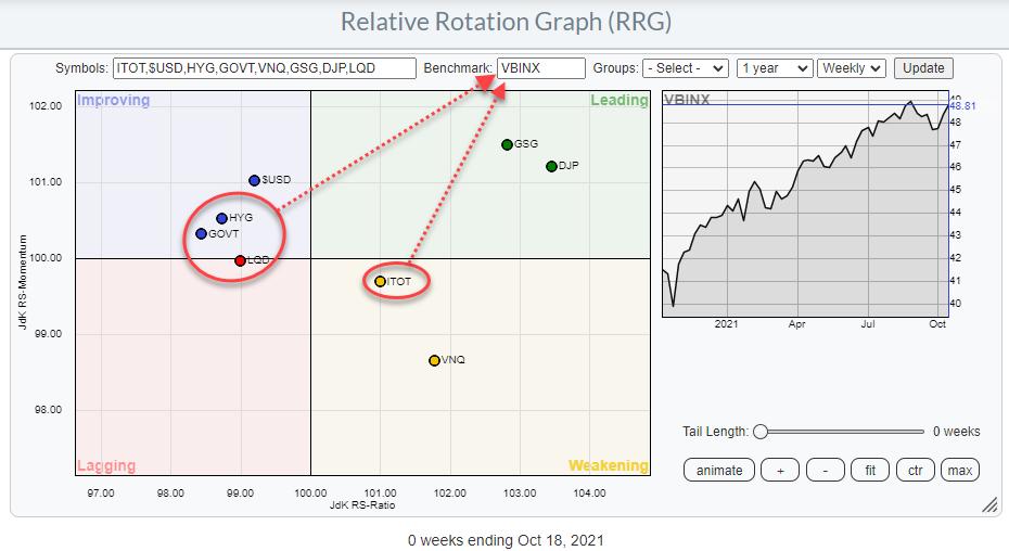
This is a universe that holds all members of the benchmark index plus some securities that are not included in that benchmark. An example of an extended universe is the universe I always use for asset allocation in my blogs. It uses the VBINX fund as the benchmark. This is a balanced index fund comprised of 60% equities and 40% bonds. But on the RRG are also commodities, real estate, and the USD (cash).

Partial
This is a universe that is a subset of the benchmark to which it is compared. For example, the members of a sector compared to an overall market index. ie all stocks in the Energy sector compared to the S&P 500 as shown again below

The stocks on the graph are all in the S&P 500 index but there are many more stocks in that index as well so the Energy stocks are only a part of the group represented by the benchmark.
Mixed
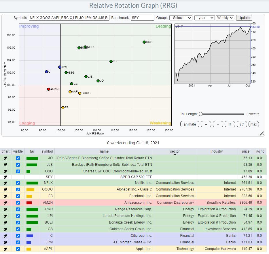
This is a universe that holds both a subset of the benchmark index as well as securities that are not included in the benchmark. This could be, for example, a portfolio of holdings compared to a general benchmark.
I.e. a portfolio of an investor who holds some individual small-cap energy stocks, all FANG stocks, a selection of large-cap banks, and three commodities-related ETFs and uses the S&P 500 index as the benchmark for that portfolio.
The small-cap stocks and the commodity ETFs are not included in the benchmark and the FANG stocks together with large-cap banks are only a subset of the S&P 500.

The relationship between the universe and the benchmark dictates whether it is an open or a closed universe
and
Knowing the details of what you are looking at on a Relative Rotation Graph will help you to better understand and interpret the message that the RRG is sending.
Have a great weekend!
#StaySafe, --Julius
My regular blog is the RRG Charts blog. If you would like to receive a notification when a new article is published there, "Subscribe" with your email address.
|
| READ ONLINE → |
|
|
|
| ChartWatchers |
| Fed Chair Fears Inflation - Here's An Uptrending Area And Stocks That Are A Great Hedge |
| by Mary Ellen McGonagle |
Fed Chair Powell signaled new concerns about inflation today after remarking that global supply-chain constraints and shortages that have led to elevated inflation "are likely to last longer than previously expected". He also added that "it is still the most likely case" that it will last well into next year.
Investors are watching closely as well, as September's Consumer Price Index report puts the pace of inflation at 5.4%. That's more than double the Federal Reserve's 2% target.
One area of the market that provides natural protection against inflation are REITs. These Real Estate Investment Trusts have underlying real estate holdings that increase in value during inflation; as does the rent that tenants have to pay. This is because many leases are tied to inflation, and the result is REIT dividend growth that provides a reliable stream of income.
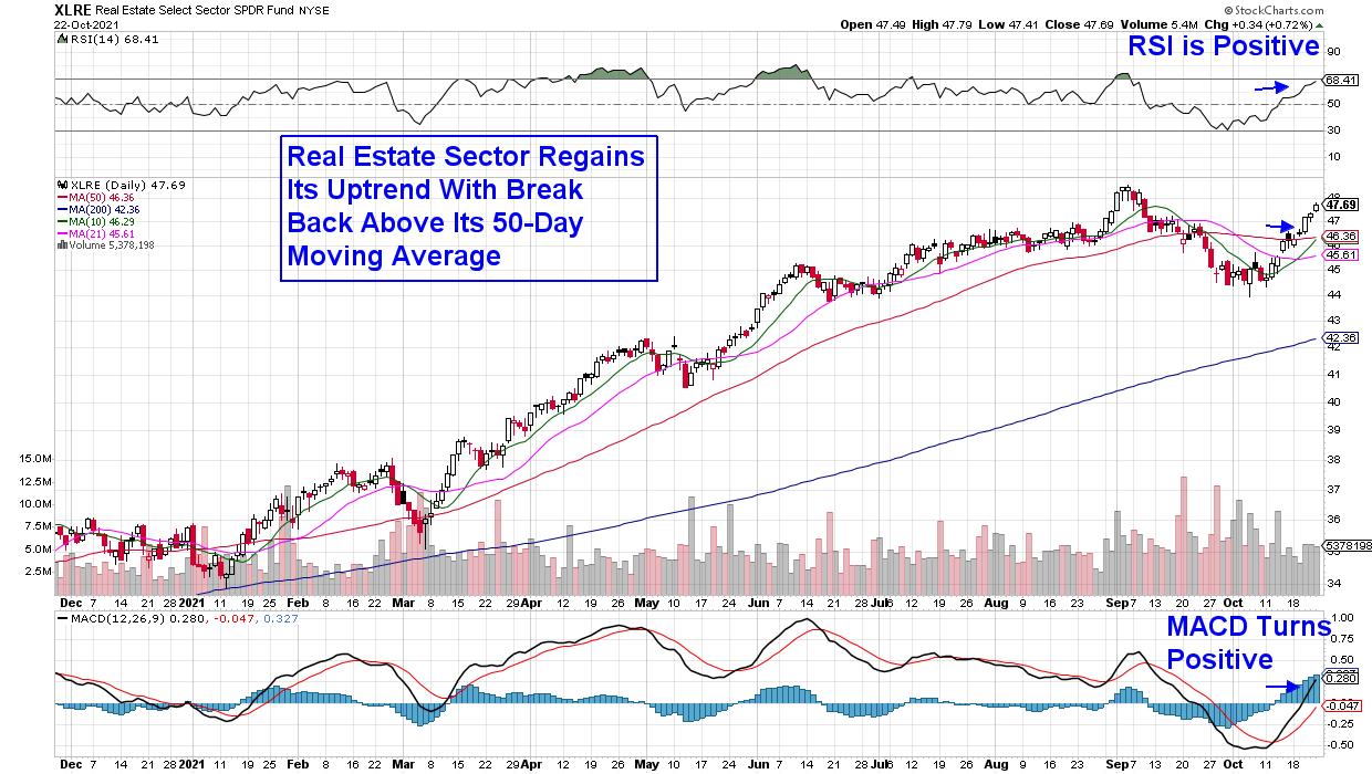
DAILY CHART OF REAL ESTATE SECTOR (XLRE)
The good news is, REIT stocks are in a confirmed uptrend following this week's break back above their 50-day moving average that in turn, pushed the group's RSI and MACD into positive territory. Below are 3 stocks poised to benefit from this bullish move.
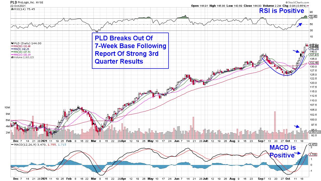
DAILY CHART OF PROLOGIS, INC. (PLD)
Prologis (PLD) is a prime example of a company that performs well during an inflationary period. They reported third quarter results last week that were above estimates amid record increases in market rents and property valuations. PLD is focused on leasing logistics facilities to major retailers and their vacancy rates are at unprecedented lows.
The stock traded higher positive report and last week's gains pushed the stock out of a 7-week base on above average volume. The move put the RSI into an oversold position however, which points to a possible period of consolidation before resuming its uptrend.
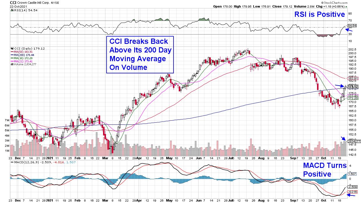
DAILY CHART OF CROWN CASTLE INTL. (CCI)
Increased rents helped REIT stock Crown Castle (CCI) as well, as they reported results that were ahead of analysts estimates on Thursday. In addition, CCI increased their dividend by 11% amid a robust leasing environment. The company owns wireless towers that are instrumental in helping telecom companies deploy 5G networks around the world.
Last week's news helped push the stock back above its 200-day moving average in a bid to reverse its recent downtrend. With the RSI in positive territory and the MACD posting a bullish crossover signal, a move back above its 50-day moving average would confirm a new uptrend.
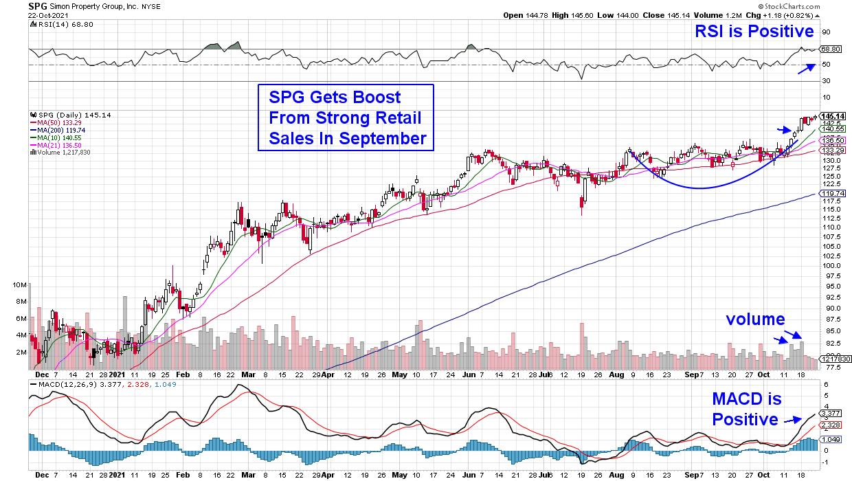
DAILY CHART OF SIMON PROPERTY GROUP, INC. (SPG)
Last up is mall landlord Simon Property Group (SPG), which is still in the throes of recovering from the early stages of the pandemic. The good news is, the company has increased its earnings guidance in both the first and second quarters. The company derives a portion of their rent based on sales of their Retail tenants and if this holiday season is strong, they'll see a big boost to 4th quarter results.
SPG rallied last week after an unexpected rise in Retail Sales for September showed that consumers are continuing to spend despite increased prices. The news pushed the stock out of a 2-month base and into an uptrend. This 4.2% yielder is due to report their 3rd quarter results on November 1st.
Other areas of the market are also in an uptrend as factors such as higher interest rates and strong earnings are pushing stocks higher. This week, 20% of the select stocks on my MEM Edge Report were top gainers in the market this week after rallying over 5%. I'd love to share these and other top performing stocks with you.
If you use this link here, you can trial my bi-weekly MEM Edge Report for 4 weeks at a nominal fee. In addition to being provided select stocks poised to outperform, you'll also receive sector and market insights not found anywhere else. Use the link above for immediate access!
Warmly,
Mary Ellen McGonagle
President, MEM Investment Research
|
| READ ONLINE → |
|
|
|
| ChartWatchers |
| Earnings Season Presents Great Buying Opportunities |
| by John Hopkins |
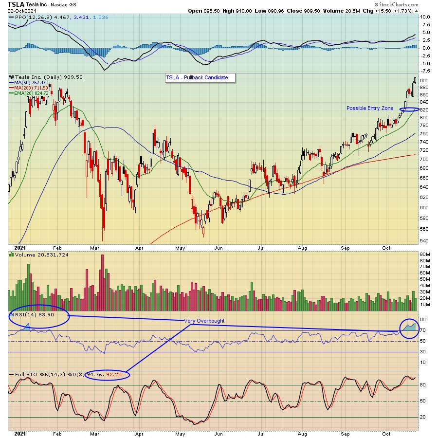
Tesla (TSLA) reported its earnings last week with the stock getting a nice boost in spite of a steady move higher since its mid May low. In fact, the company notched an all-time high on Friday as it exceeded $900 for the first time.

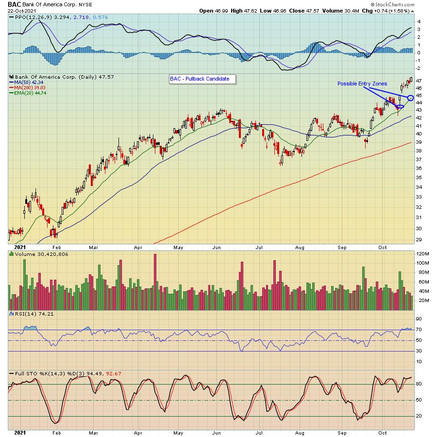
TSLA wasn't the only company to reach a new all-time high last week. Bank of America (BAC) - yes, a bank - also hit a new all-time high this past week following its earnings report.

So, what do a car/tech company and an old-line bank have in common? They show that investors continue to be attracted to businesses that beat earnings expectations, no matter the industry. And in both cases, if you happened to be on the sidelines when they reported, there's a good chance you will get another shot at buying stock in both companies at lower levels.
One can argue that both companies are overbought. For example, TSLA has stochastics in the mid 90's and a RSI approaching the mid 80's; it's very stretched as a result of its non-stop journey higher. In the case of BAC, it's climbed higher by almost 25% over the past month, also showing signs of being overbought.
The good news is we're likely to see some profit taking before long that could set up some nice trading opportunities. For example, just a very normal pullback on TSLA to its 20 day moving average would take it back down to the $825 range which is also near price support. In the case of BAC, a pullback to its 20 day or even slightly lower to price support could set up a nice trade.
Believe me, there will be a TON of stocks that look similar to TSLA and BAC over the next few weeks as thousands of companies report their numbers. The key is to be patient; watch how the market reacts to a company's earnings report, let the euphoria wear off then look at getting involved on a pullback to key technical or price support. In fact, we regularly provide our members with a "Strong Earnings ChartList" of companies that have beaten Wall Street consensus estimates as to both revenues and earnings, are liquid and have solid technical charts. This list is particularly useful to those who have a StockCharts.com Extra level or higher membership as you can download the ChartList directly into your account in an interactive format. Powerful! If you would like to get access to the current ChartList that contains 522 companies that meet our criteria, just click here for a FREE trial. You can also sign up for our FREE newsletter, the EarningsBeats Digest, that includes timely and insightful earnings and market related information from our Chief Market Strategist Tom Bowley. Just click here to get started.
At your service,
John Hopkins
EarningsBeats.com
|
| READ ONLINE → |
|
|
|
| Mish's Market Minute |
| Did Jerome Powell Jump Scare the Major Stock Indices? |
| by Mish Schneider |

Friday, the chair of the Federal Reserve –Jerome Powell spooked the market when he announced that the Fed would keep rates near zero and continue with its tapering schedule. Though the market cannot blame Powell for stating already well-known information, it was enough to help create an intra-day selloff.
While the market steadied itself in the latter half of the day, the selloff reveals how nervous the market is at its current price level.
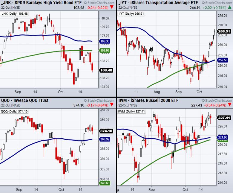
So far, both the S&P 500 (SPY) and the Dow Jones (DIA) cleared all-time highs on Friday but only the DIA was able to hold them.
On the other hand, the tech-heavy Nasdaq 100 (QQQ) and the small-cap Russell 2000 (IWM) traded within their weekly range showing consolidative price action.
Commonly watched market strength indicators such as High Yield Corporate Debt (JNK) and the Transportation sector ETF (IYT) are also giving mixed points of view with JNK breaking underneath its 10-DMA at $108.69 while IYT continues its rally.
Watching the demand side of the economy through IYT's strength is a bullish sign while investors' selling high yield debt indicates a risk-off scenario. However, JNK does have more support to watch at $108.06.
Furthermore, traders will need to stay frosty as the market continues to sit in a pivotal area and monitor both JNK and IYT along with the major indices for any potential shift in sentiment come Monday.
Follow Mish on Twitter @marketminute for stock picks and more. Follow Mish on Instagram (mishschneider) for daily morning videos. To see updated media clips, click here.
Get ready to make some money! On this week's edition of StockCharts TV's Mish's Market Minute, as earning season begins, Mish shows you stocks that have already reported and a whole bunch that are set to report next week.
ETF Summary
- S&P 500 (SPY) 454.05 resistance area.
- Russell 2000 (IWM) 229.84 to clear.
- Dow (DIA) 356.60 needs to hold as new support.
- Nasdaq (QQQ) 369.92 support the 50-DMA.
- KRE (Regional Banks) 71.60 new support area.
- SMH (Semiconductors) 264.46 support the 50-DMA.
- IYT (Transportation) 270 next resistance area.
- IBB (Biotechnology) 160.13 resistance. 153.38 support.
- XRT (Retail) 93.47 support from 50-DMA.
Forrest Crist-Ruiz
MarketGauge.com
Assistant Director of Trading Research and Education
|
| READ ONLINE → |
|
|
|
| MORE ARTICLES → |
|
 Chart 1
 Chart 2
 Chart 3
 Chart 4
 Chart 5

