| THIS WEEK'S ARTICLES |
| Martin Pring's Market Roundup |
| Are Commodities Losing their Mojo? |
| by Martin Pring |
Commodities have been on a tear since their lows set in the spring of 2020, but every news outlet you tune into these days is talking about inflation, gasoline in particular. That does not mean that prices cannot go higher. Over the long-term, that's probably a realistic scenario. However, on pure contrary grounds, it's important to examine the technical structure, in order to see if there is any justification for at least some temporary relief from higher commodity prices. We should not overlook the old adage that says "whenever everyone thinks alike, its probably time for a change."
Confidence in the Balance
A lot of it comes down to confidence, or lack thereof. In that respect, Chart 1 compares the CRB Composite to the ratio between the iBoxx High Yield and iShares 7-10-year Treasury (HYG/IEF). A rising relationship indicates growing confidence, as investors are happy to accept the higher-yielding junk over the less risky and lower-yielding government paper. The reason is that they are downplaying the possibility of a weaker economy and a high level of defaults. The arrows show that rising confidence goes hand in hand with buoyant commodity prices and vice versa.
For the last year and a half, the ratio has been moving sideways in the face of advancing prices. However, it is now very close to the lower boundary of that 2021-2022 trading range. Given its past relationship with commodity price swings, a drop would not only be bearish for commodities, but the economy itself. It's something worth keeping an eye on. Remember, you can update the chart in future by simply clicking on it.
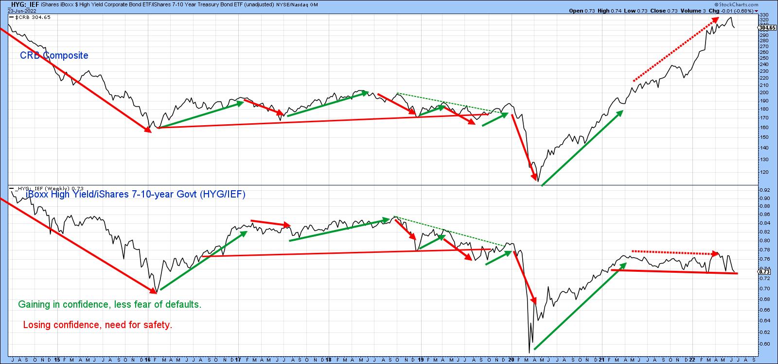 Chart 1 Chart 1
The Canadian and Australian Dollars Do Not Believe the Commodity Bull Market
The Canadian and Australian dollars, because of their natural resource base, are sensitive to commodity prices, as is evident in Charts 2 and 3 respectively. Chart 2 compares the Canadian buck to the CRB Composite. Note the arrows marking the peaks and troughs mostly slant to the right, thereby demonstrating that the currency usually leads. Recently, the CRB has been rallying sharply and the dollar has not, all of which argues in favor of the CRB soon weakening.
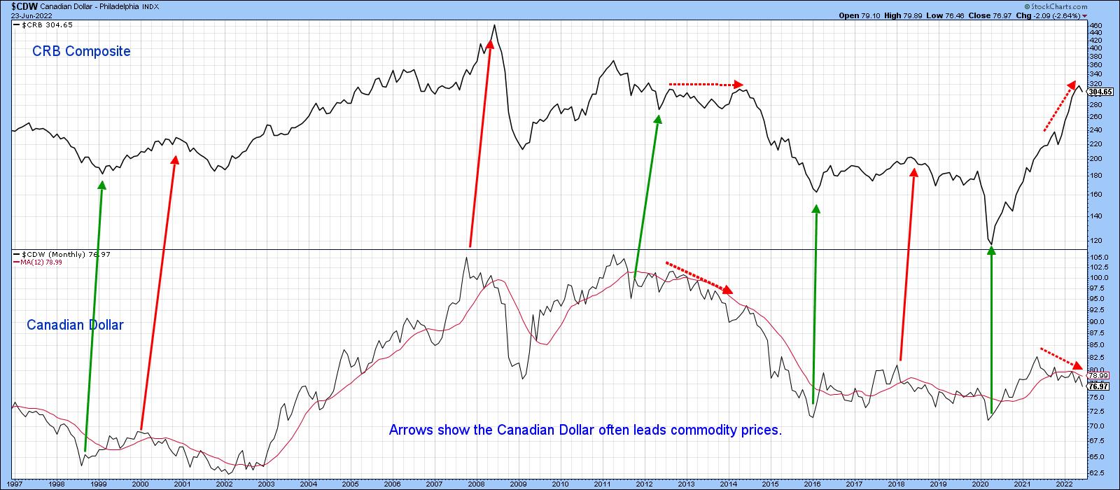 Chart 2 Chart 2
Chart 3 takes this a step further, with the Aussie dollar by showing that joint trendline breaks have reliably signaled commodity reversals in both directions. Once again, we see a set of negative divergences between the two series that have been developing since mid-2021. Sell signals for the currency's long-term KST have been quite helpful in signaling commodity reversals. One false negative developed in 2004. The current CRB trend is upward. However, a drop below the sharp 2020-2022 up trendline, which is currently at 275, would confirm the negative divergence between the Index and the currency, with clear bearish implications for commodity prices.
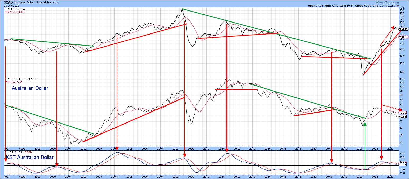 Chart 3 Chart 3
Commodities are Way Overextended
Chart 4 features the CRB Spot Raw Industrials together with an 18-month ROC. This Index is useful because it only has one weather-driven component, cotton. Furthermore, it does not include many commodities traded on a public exchange. A lot of speculative activity, which often causes prices to overshoot, is therefore filtered out. The arrows indicate when the ROC peaks from, or very close to, the overstretched line at around +30%. Only once, in 2004, did this approach fail to identify a peak in the Raw Industrials. Consequently, the tentative 12-month MA crossover and the obvious topping-out action of the ROC argue for a bear move developing in the period ahead.
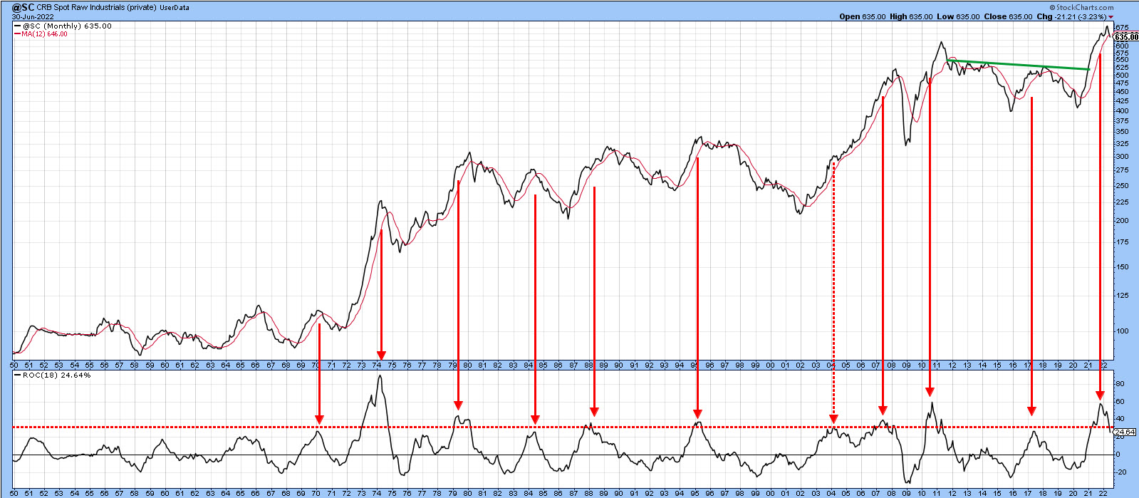 Chart 4 Chart 4
That's also the impression we get from the CRB Composite, which has a large energy, as well as an agricultural component not included in the Raw Industrials. It is featured in Chart 5, where a recent post-1958 record momentum high has recently been seen. There is nothing in the rule book says it can't move higher, but the odds don't favor such a scenario this side of a mini-bear market or extended correction. It's also worth noting that the Index itself has run into resistance at its 2014 high, which could also impede further gains.
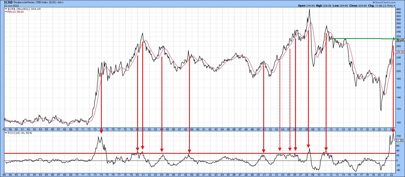 Chart 5 Chart 5
Copper usually swings in a similar direction to the CRB Spot Index, so it is worth corroborating what is going on with the Index. The price of the red metal, along with its Special K, is shown in Chart 6. Both series have completed tops and look headed lower.
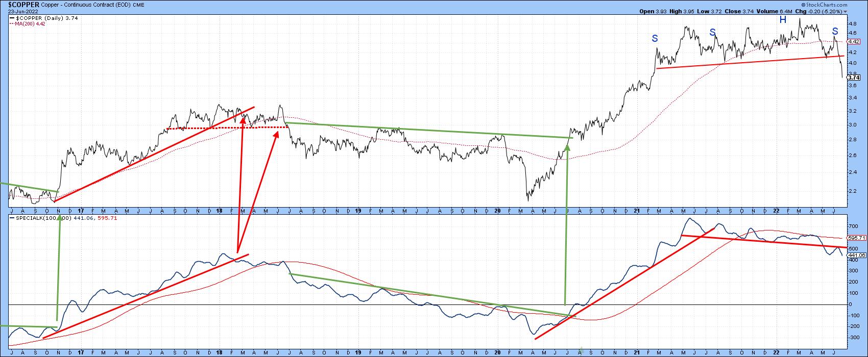 Chart 6 Chart 6
Chart 7 compares the long-term KST of copper to that for crude oil. The arrows tell us that, in most cycles, copper is the leader. It is currently on track to repeat this sequence again.
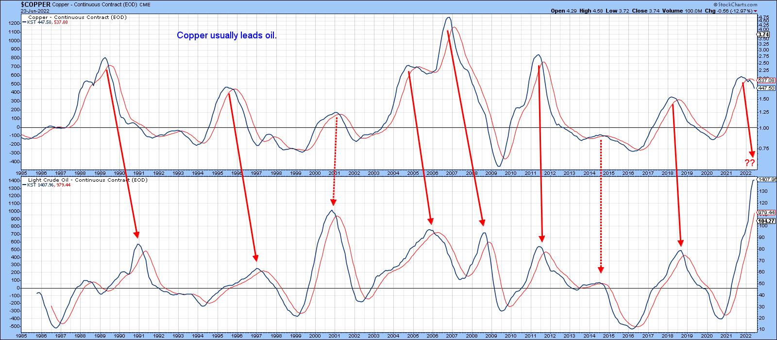 Chart 7 Chart 7
Chart 8 features a similar Special K setup as that for copper. In this instance, both series are in a confirmed uptrend. The chart is also indicating that crude has experienced a slight penetration of its 2021-2022 up trendline, so it's not unreasonable to expect a challenge of the bull market trendline and 200-day MA around $91.
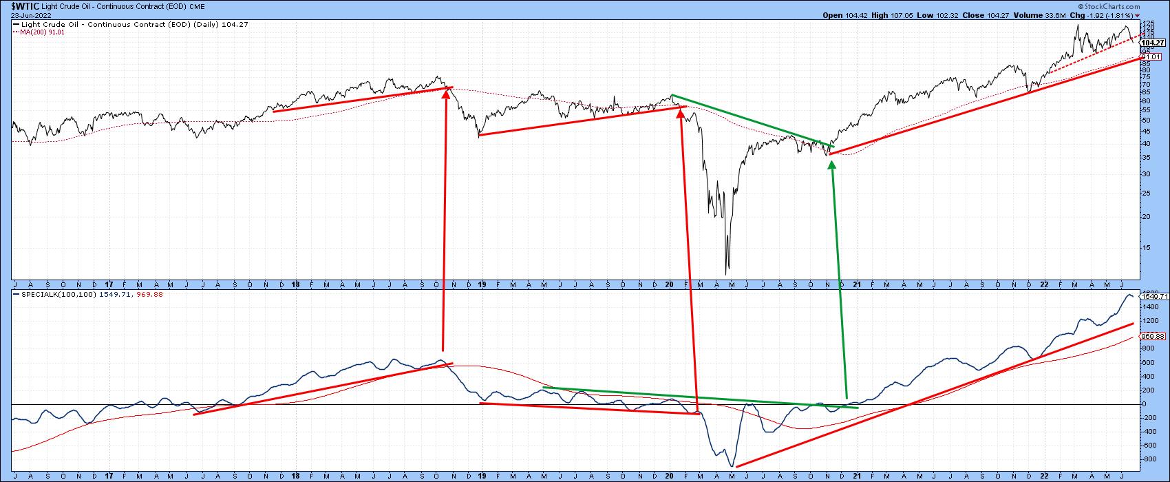 Chart 8 Chart 8
Finally, Chart 9 indicates the technical position for the DB Commodity ETF (DBC) is looking shaky. That's because volume has been expanding on the downside since the June peak. Rising volume and falling prices is often a characteristic of a primary bear market. Note also that the price recently experienced a false upside breakout, an event that is typically followed by an above-average price move in the opposite direction to the break. With the vast majority of traders looking up, an above-average move to the downside is not an improbable scenario!
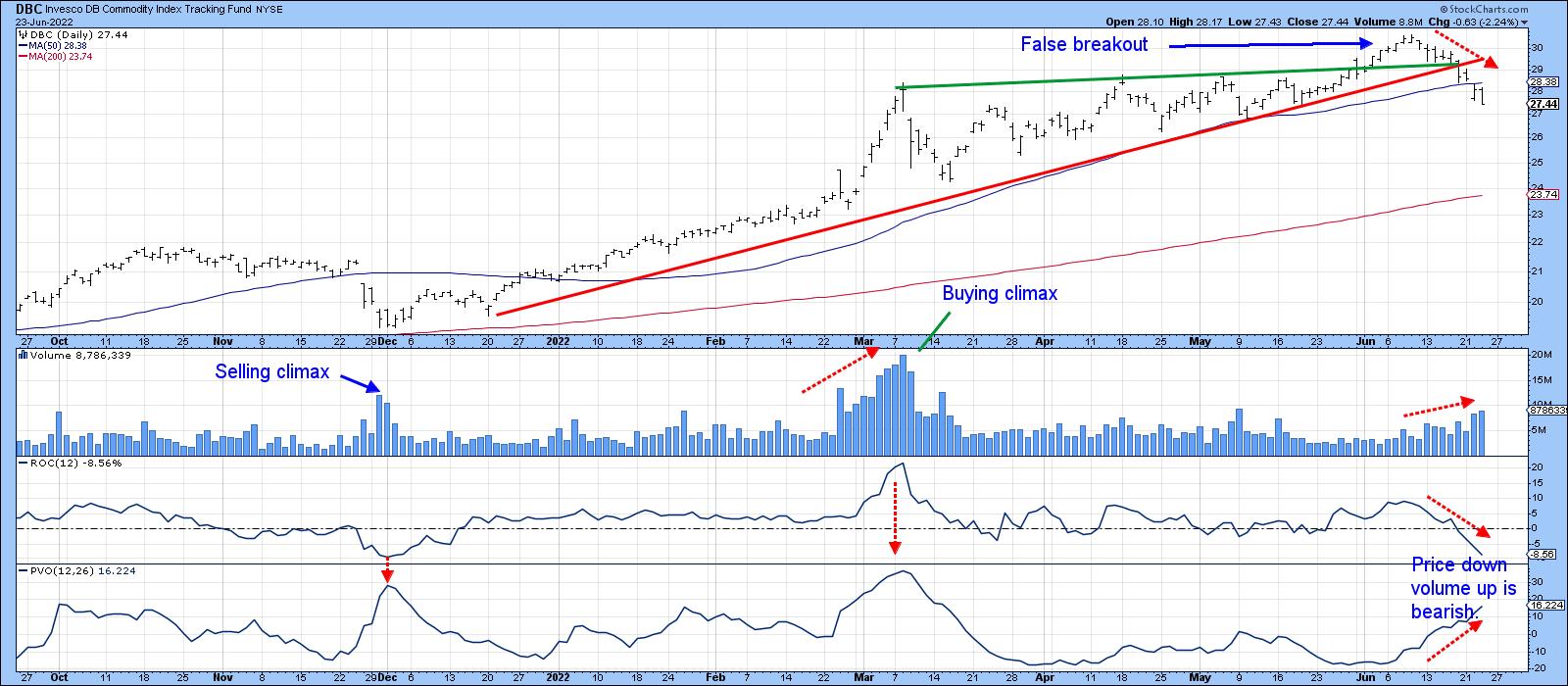 Chart 9 Chart 9
Good luck and good charting,
Martin J. Pring
The views expressed in this article are those of the author and do not necessarily reflect the position or opinion of Pring Turner Capital Group of Walnut Creek or its affiliates.
|
| READ ONLINE → |
|
|
|
| The Mindful Investor |
| All Eyes on Technology Stocks |
| by David Keller |
Most of my conversations this week on The Final Bar were related to the tactical upswing in risk assets this week, paired with the realities of a long-term bear market phase. At what point does the market rally enough that a short-term gain becomes more of a long-term recovery?
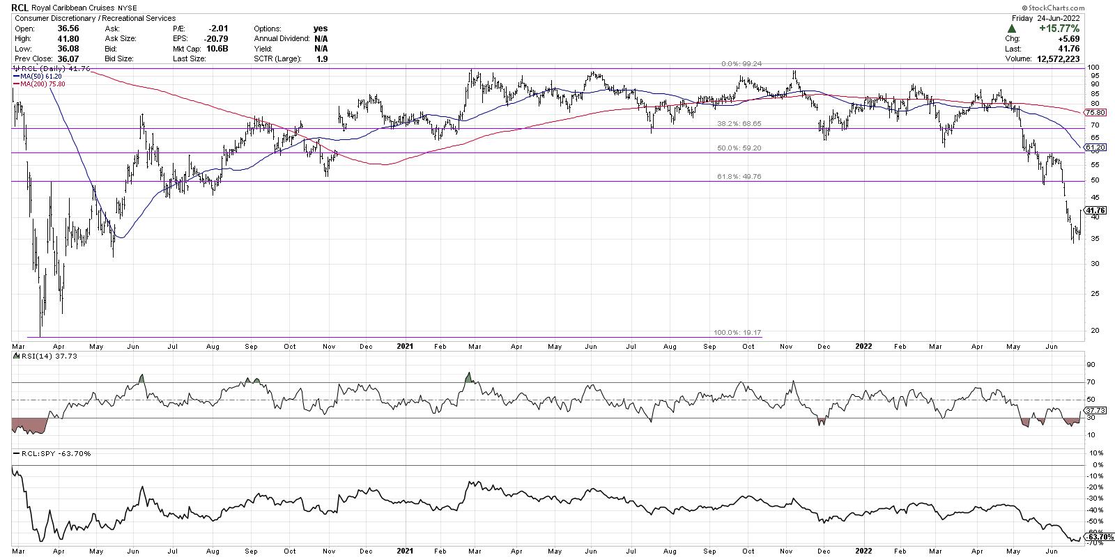
Well, first we would need to see stocks not just rallying off extreme low levels, but actually making new swing highs and higher lows. Cruise lines like RCL are a perfect illustration of buyers coming in on extreme weakness.

While the short-term strength here is certainly impressive (up over 15% on Friday!), the stock is still down 46% for the year. Bear market rallies can be sudden, severe and seductive. Bull market rallies, by contrast, take time to develop and be confirmed!
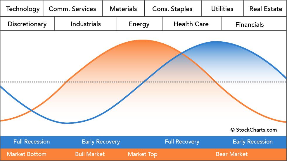
If the markets would establish a bear market bottom in June and begin to move higher, where would we expect to see leadership? This is where I like to reflect on Sam Stovall's idealized chart of sector rotation, found on our Sector PerfChart page on StockCharts.

Once a market bottom has occurred, and a new uptrend is beginning, the two sectors that tend to lead are Technology and Consumer Discretionary. These growth-oriented sectors tend to take over leadership from defensive sectors like Utilities and Real Estate, as investors rotate to a more "risk on" positioning.
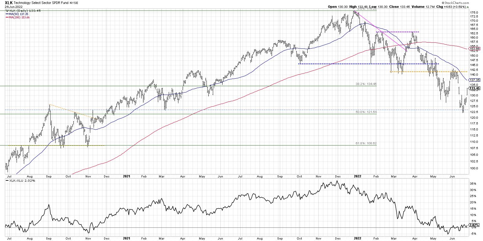
Let's review the chart of the Technology Sector SPDR and evaluate the trend and relative strength.

Notice how 2022 has been marked by frequent breakdowns of established support levels. The October 2021 low was retested a number of times before finally being broken in May 2022. The March lows were retested from below in early June before XLK resolved to the downside. We have seen a consistent pattern of lower lows and lower highs, mirroring Charles Dow's classic definition of a downtrend phase. So while this week's bounce was a strong one, the price is still well below its recent high around $142. I would need to see a break above that previous resistance level to confirm a bullish rotation.
At the bottom of that chart, we're showing the relative strength of Technology (XLK) vs. Utilities (XLU). This is a brilliant way to demonstrate a potential rotation from bear market leadership to new bull market leadership. Here, we see that the ratio has been trending higher, favoring Tech over Utes, for the last four weeks. To complete a bullish rotation, this ratio would need to continue higher to demonstrate emerging strength in Technology as investors "step on the accelerator" and take on additional risk.
I would also point out that there is very little chance that our major benchmarks could mount any significant rally without the support of the FAANG stocks, due to their outsized influence on the indexes.

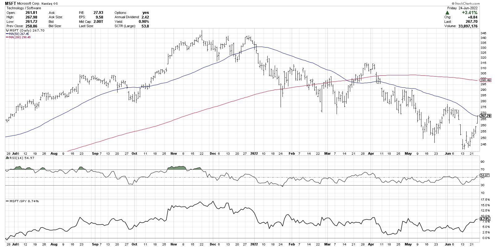
After a strong upside reversal this week, MSFT is once again testing its 50-day moving average from below. Can the price solidify a confirmed break above this level? If so, can MSFT clear its previous swing high around $275? What about the 200-day moving average, currently just below $300?
The most important indicator on the Microsoft chart would be the RSI, which has been in a bearish phase for all of 2022. Strong charts have strong momentum. MSFT is still showing momentum readings characteristic of a bear market phase! Look for the RSI to get above 60 to confirm an influx of buyers. Signals like that in names like MSFT could confirm enough buying power to propel the major averages into a new bull market phase.
Want to digest this article in video format? Head over to my YouTube channel.
RR#6,
Dave
P.S. Ready to upgrade your investment process? Check out my YouTube channel!
David Keller, CMT
Chief Market Strategist
StockCharts.com
Disclaimer: This blog is for educational purposes only and should not be construed as financial advice. The ideas and strategies should never be used without first assessing your own personal and financial situation, or without consulting a financial professional.
The author does not have a position in mentioned securities at the time of publication. Any opinions expressed herein are solely those of the author, and do not in any way represent the views or opinions of any other person or entity.
|
| READ ONLINE → |
|
|
|
| DecisionPoint |
| Golden Cross and Silver Cross Indexes Deeply Oversold |
| by Carl Swenlin |
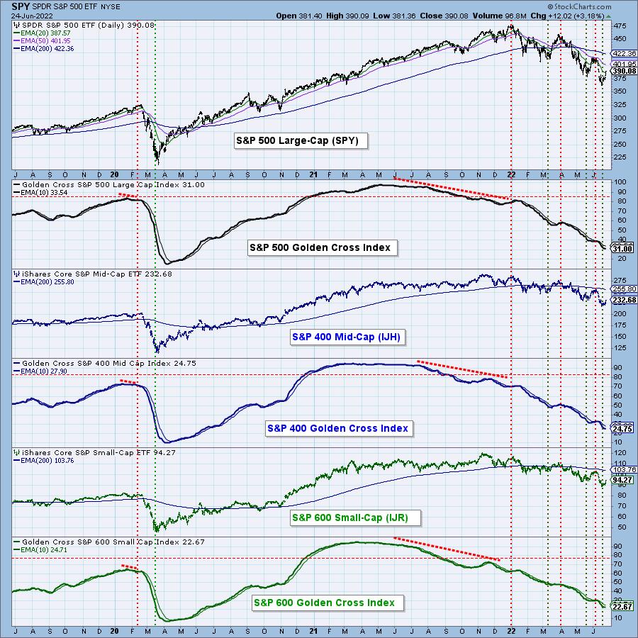
When the 50-EMA crosses up through the 200-EMA, it is commonly known as a Golden Cross, because it infers a positive long-term price trend. Our Golden Cross Index (GCI) shows the percentage of stocks in a given index with a golden cross condition. This chart shows the GCI readings for the S&P 500 Large-Cap, S&P 400 Mid-Cap and S&P 600 Small-Cap Indexes, which are (rounded) 32, 25 and 23, respectively. We consider a reading below 50 to indicate a bear market, and we are well below that in all three groups. Nevertheless, the readings are still not as low as they got during the 2020 Bear Market. Note how all the GCIs dropped lower in 2021 (negative divergence) as the market reached all-time highs.


Now more than ever, you need DecisionPoint analysis! Let us help you maneuver through treacherous market conditions! We have put together a "Bear Market" discount. Right now, using Coupon Code: BEARS, you can get your first month of the "Bundle" package for only $14 (regularly $68)! Cancel anytime! If you decide you only want just the DP Alert or just DP Diamonds, notify us and we'll adjust your account.
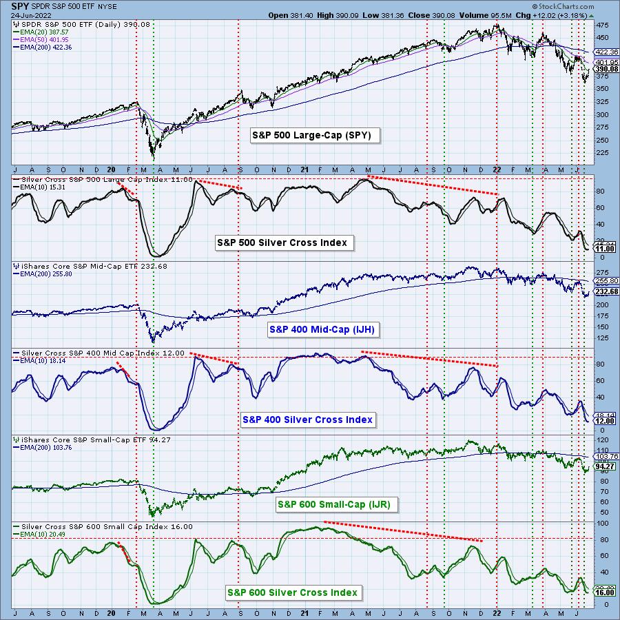
For years, we have used the 20-EMA and 50-EMA upside crossover as an indication of intermediate-term bullishness (we call it the "Silver Cross," indicating that it is a companion for the Golden Cross Index), and we have created the Silver Cross Index (SCI) to reflect the intermediate-term condition of market indexes. This chart shows the SCI readings for the S&P 500, 400 and 600 Indexes, which are 10, 12 and 16 respectively. Again, those readings are not as bad as 2020, but they are dismal nonetheless.

For the last four days, the market has been rallying, so we will probably see both the GCI and SCI turn up soon. With these and other indicators being at such oversold levels, the rally could be quite persistent. We shall see.
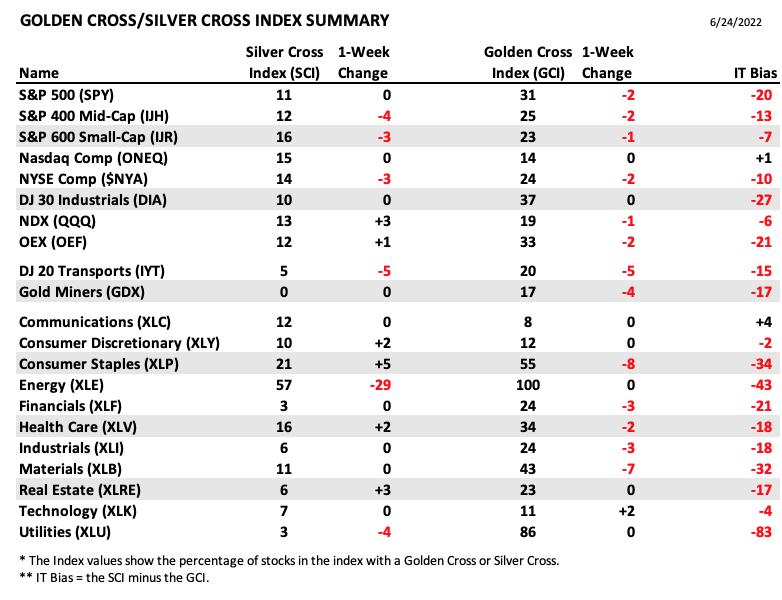
Conclusion: The Golden Cross and Silver Cross Indexes provide an excellent, in-depth assessment of the long-term and intermediate-term condition of the market. They show us how many stocks are participating in price movement up or down. We have these indicators for 21 market and sector indexes. Here is our table with the latest results:

Technical Analysis is a windsock, not a crystal ball. --Carl Swenlin
(c) Copyright 2022 DecisionPoint.com
Helpful DecisionPoint Links:
DecisionPoint Alert Chart List
DecisionPoint Golden Cross/Silver Cross Index Chart List
DecisionPoint Sector Chart List
DecisionPoint Chart Gallery
Trend Models
Price Momentum Oscillator (PMO)
On Balance Volume
Swenlin Trading Oscillators (STO-B and STO-V)
ITBM and ITVM
SCTR Ranking
Bear Market Rules
DecisionPoint is not a registered investment advisor. Investment and trading decisions are solely your responsibility. DecisionPoint newsletters, blogs or website materials should NOT be interpreted as a recommendation or solicitation to buy or sell any security or to take any specific action.
|
| READ ONLINE → |
|
|
|
| Top Advisors Corner |
| "Enough is Enough," Bulls Declare |
| by John Hopkins |
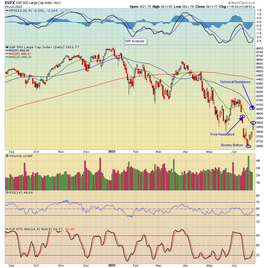
The bears have been in charge of the market for months now, going back to the beginning of January when the S&P topped out at 4818, just as our Chief Market Strategist Tom Bowley warned our members that a market storm was about to begin. Since then, the bulls had failed to gain the upper hand. Finally, when the S&P touched 3636 last Friday, the bulls put their collective feet down and went to work, with the S&P gaining 7.5% since Friday's low.

That 7.5% pop was most welcomed, as the S&P had lost almost 25% since that January high. And, in fact, when the S&P hit that low of 3636, Tom declared that the "Bowley Bottom" was in, citing factors such as a very high put/call ratio (most bets on the short side), a consistently high VIX (tons of fear) and the realization that Wall Street had finally turned its attention to beaten-down, high-growth stocks.
Of course, we can't be certain if a final bottom is in place. However, just this past week, we saw yields on government bonds fall sharply, along with oil and other commodity prices that have been pegged to high inflation, with all combined giving the bulls some confidence that the worst of the selling has already taken place.
What might be next? First, as you can see in the chart above, the S&P closed back above its 20-day moving average of 3893, which was the first key level of technical resistance. The next level of price resistance is 3974, while the next key level of technical resistance is at the 50-day, currently at 4065. And we'll want to pay attention in case the S&P falls back below that 20-day moving average of 3893 which could indicate some profit-taking could be in store.
You'll hear a lot of analysis next week questioning whether or not this past week was a bear market rally or the beginning of a new bull run. But, as Tom pointed out to our members this past week, we likely have seen the bottom and could see traders start to move away from "sell any rallies" to "buy the dips." In the meantime, if you would like to begin to receive our FREE newsletter, the EB Digest (EBD), just click here and you will get insightful, useful market-related information from Tom every M, W and F.
At your service,
John Hopkins
EarningsBeats.com
|
| READ ONLINE → |
|
|
|
| RRG Charts |
| The Battle Between Musk & Ma |
| by Julius de Kempenaer |
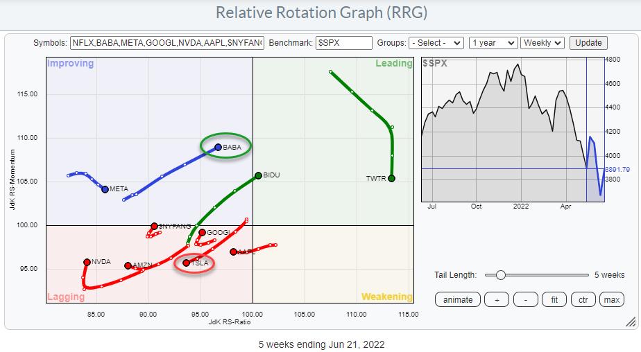
Following the recent bounce in the stock market, predominantly driven by growth stocks, I wanted to investigate the rotations within the NYFANG+ index (or should it be NYMANA, nowadays?). This is a group of mega-cap stocks from the technology, consumer discretionary and communication services sectors.

When we look at the Relative Rotation Graph above, which shows this universe against the S&P 500, we still see a big concentration of tails inside the lagging quadrant. Recently, however, a few of them started to show improving RRG headings.
On the RRG, I have disabled the tail for Netflix because it is so deep inside the lagging quadrant that it distorts the other tails on the graph. The graph shows the individual members of the index, as well as the index itself. You can find the $NYFANG index around the 100 level between the lagging and the improving quadrant, showing a very short tail which has just turned into a positive RRG heading. This means that the universe as a whole is in a relative downtrend versus the S&P 500, but has just started to show some signs of (relative) improvement. We will have to wait and see whether this is a temporary hiccup within the existing downtrend or the start of a turnaround into a new period of relative strength for mega-cap growth stocks.

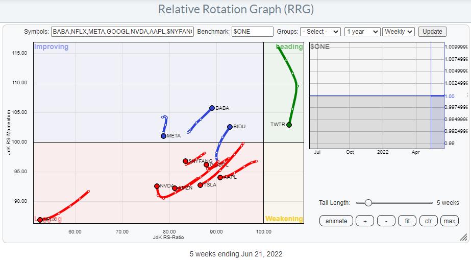
When we plot the same universe against $ONE to get a handle on price trends, I think we can safely conclude that it will take some time before we can really call for a new uptrend in terms of price.
Pair Trades
Regular readers of the RRG blog and watchers of Sector Spotlight on StockCharts TV will know that Relative Rotation Graphs are very well suited to look for pair-trading opportunities. As you know, in order to do that, we are looking for tails that move in opposite directions.
On this weekly version of the RRG, a few opportunities float to the surface. Potential candidates for (more or less aggressive) long positions are BABA, BIDU, GOOGL and NVDA. BABA and BIDU are rapidly moving towards the leading quadrant while showing long tails and a strong RRG heading. GOOGL and NVDA are more aggressive plays, as they are still inside the lagging quadrant but have just turned up into a strong RG heading.
Potential short candidates are META, AAPL and TSLA. META is inside the improving quadrant, but rolled over and is now heading back towards the lagging quadrant. AAPL has just moved from weakening into lagging and seems to be moving deeper into that quadrant. Finally, TSLA rotated from improving back towards lagging. moving deeper into it at a negative RRG heading.
Out of these potential candidates, I am particularly interested in BABA as a long position and TSLA on the other side. This is primarily because they are roughly at the same JdK RS-Ratio level while moving in opposite directions.
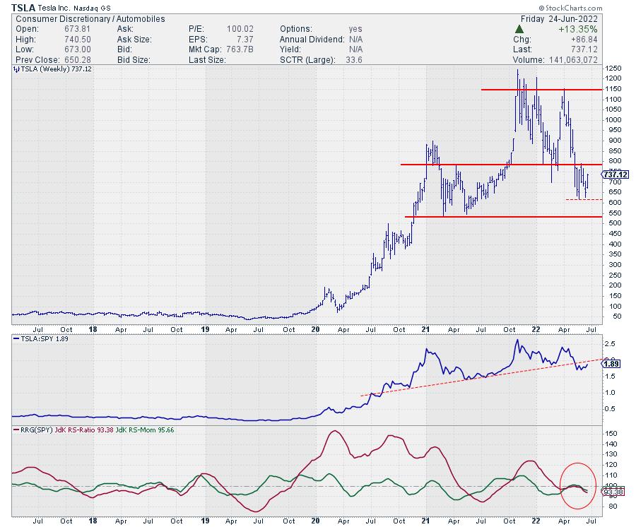
TSLA

After a massive run higher in 2020 and again in 2021, Tesla recently completed a massive top formation when it broke below support around 800, starting a new series of lower highs and lower lows. This means that the upside is now limited, with a lot of resistance to be expected in that 800 area, while downside risk is clearly present.
From a relative perspective, the RS line is in a pattern of lower highs and lower lows, which sends both RRG lines lower, pushing TSLA deeper into the lagging quadrant and making it a good candidate for the short side of a pair trade.
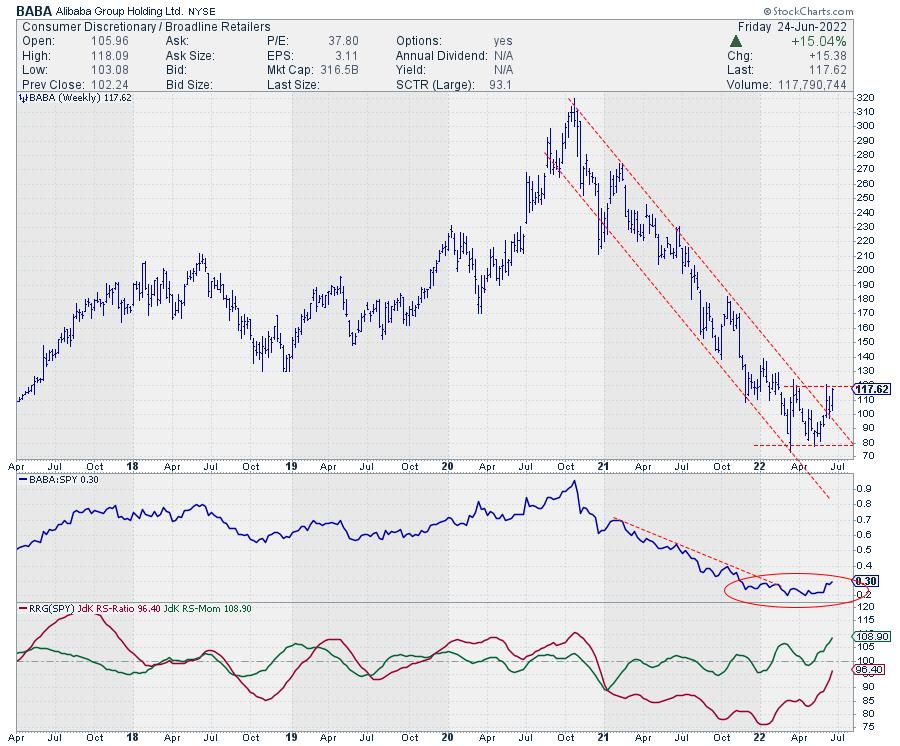
BABA

BABA, on the other hand, lost around 75% of its value, from the peak of around 320 at the end of 2020 to the low of around 80 a few weeks ago.
This entire downtrend was captured within the boundaries of a falling channel and a very regular pattern of lower highs and lower lows. After failing to break below support around 80 and pushing above the falling resistance line, BABA's declining relative strength versus the S&P 500 first stalled, then started to pick up momentum. With price now pushing against resistance just below 120 and relative strength on the rise, BABA could be a strong candidate for a long position in a pair trade against TSLA.
BABA:TSLA

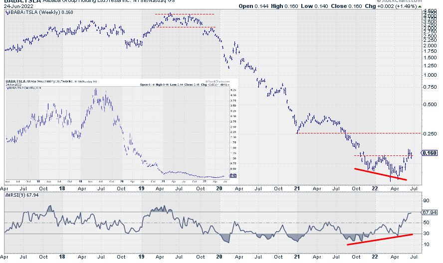
Finally, this is what you get when you put BABA (Jack Ma) and TSLA (Elon Musk) against each other 1-1. The massive downtrend from the peaks around 4 in 2019 towards the lows around 0.1 a few weeks ago is clearly visible and amounts to roughly 97.5%.
As this chart is plotted on a semi-log scale, I am reluctant to draw a falling trendline over the peaks since 2019. Although it looks to fit nicely, it would not be correct, IMHO, as the line would need to be curved. See the arithmetic chart on the inset.
That massive trend in favor of TSLA over BABA now seems to be reversing, as the ratio has broken its previous high and a positive divergence between the ratio and its RSI has started to work. From its current level at 0.16 to the next resistance level near 0.25 is already more than 50% upside potential.
For three years, Musk has shown Ma all corners of the ring, but that situation seems to be changing now.
|
| READ ONLINE → |
|
|
|
| The Canadian Technician |
| An Investor's Look Back for 2022 |
| by Greg Schnell |
As we approach the end of June, now is a good time to look back over the market to see what has been happening.
The price action is in the bottom right corner of the charts, whereas, at the end of 2021, it was in the top right corner of the charts. Who could have seen the problems coming? I think the technical analysis arena did an excellent job of showing the risks for downside momentum to increase.
On December 17th, I recorded a video about the technical problems aligning in the market and how they created the situation for a rough start to 2022.
A historical look back
In six-month increments, let's take an educational look back on what has been happening.
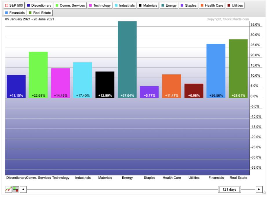
June 2021
Starting in June 2021, we came off the effervescent high of the SPAC boom. As the book Reminiscences of A Stock Operator highlights so clearly, when there is an abundance of money trying to enter the market, the bankers will respond with new offerings. Nowadays, venture capitalists have all the data they need to be ready to hand over these companies at lofty valuations and step aside for the downside slide. By June 2021, the SPAC announcements had slowed to a relative crawl compared to the 4th quarter of 2020 and the first quarter of 2021.
The defensive side of the market was out of favour, still showing positive returns to their investors, but vastly underperforming. Energy raged forward as the vaccines were rolling out, suggesting the economy would surge with post-pandemic freedom. More on that later. Real Estate and financials were on fire. Interestingly, the growth areas of discretionary, communications and technology were middle of the pack.

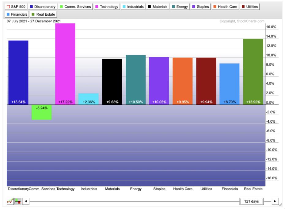
December 2021
As the second half of 2021 rolled in, the market changed significantly. Communications and industrials vastly underperformed everything. Technology was back to a glory story, while discretionary and real estate continued to flourish. Financials were in the bottom third. Materials, energy and defensive names were middle of the pack.

By late December, we were also narrowing our focus on the Sexy Six large cap names that kept holding up, even while there was a large breakdown in many of the trendy areas of the market. We didn't know it at the time, but the November high in the Nasdaq was behind us. The move to electric cars and the investment theme around them came and went. Copper made a high in May 2021 and most of the metals moved sideways for the remainder of the year. Oil continued its steady climb in a big bull market that kicked off with the vaccine announcements fourteen months prior.
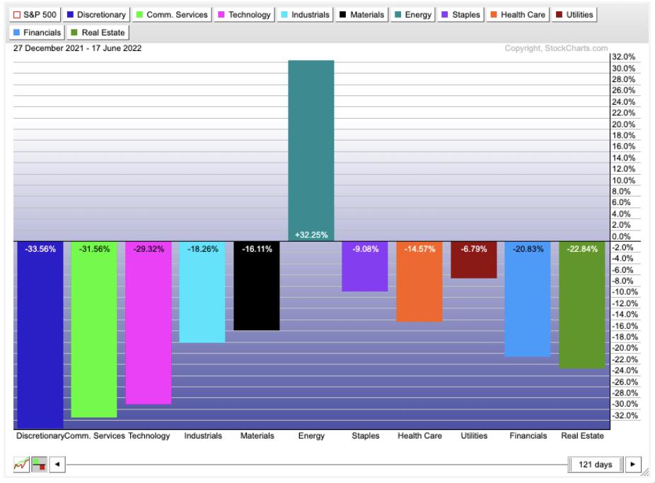
June 2022
As we turned the corner into 2022, almost all of the upward momentum was focused in energy. Technology stocks, including semiconductors and software, moved down meaningfully as the sexy six slowly let go. Alphabet, Meta and Amazon were the early leaders to the downside. Consumer discretionary and communications dropped hard.
By the end of June, the continuous slow demise of investors' love for the technology space came to the fore. By March, investors were touting the start of a new bull market in Energy. After a 1000% gain in the oil and coal stocks, the relative strength community reluctantly decided it was a new bull market in fossil fuel energy. (You can't make that stuff up!) Still, the technology investment community has been reluctant to dive into the dark side. While the tiger cubs watched 50% of their asset valuations disappear, they couldn't muster a shift into the best performing sector for the past 18 months.

To end the quarter, the financials wobbled sideways but slowly moved lower. On Friday, June 17th, the bank ETF closed at new 52-week lows. Commodity stock markets like Australia and Canada dropped meaningfully as oil names sold off hard. Oil stocks quickly plummeted for 10 days from new highs to their 200-day moving averages, casting down 25%. The technology names continue to be sold as inflation roars. The Fed is speeding up their time line for rate hikes as the economy slows quickly under the pressure of firm gasoline prices and rising food prices.
What's next?
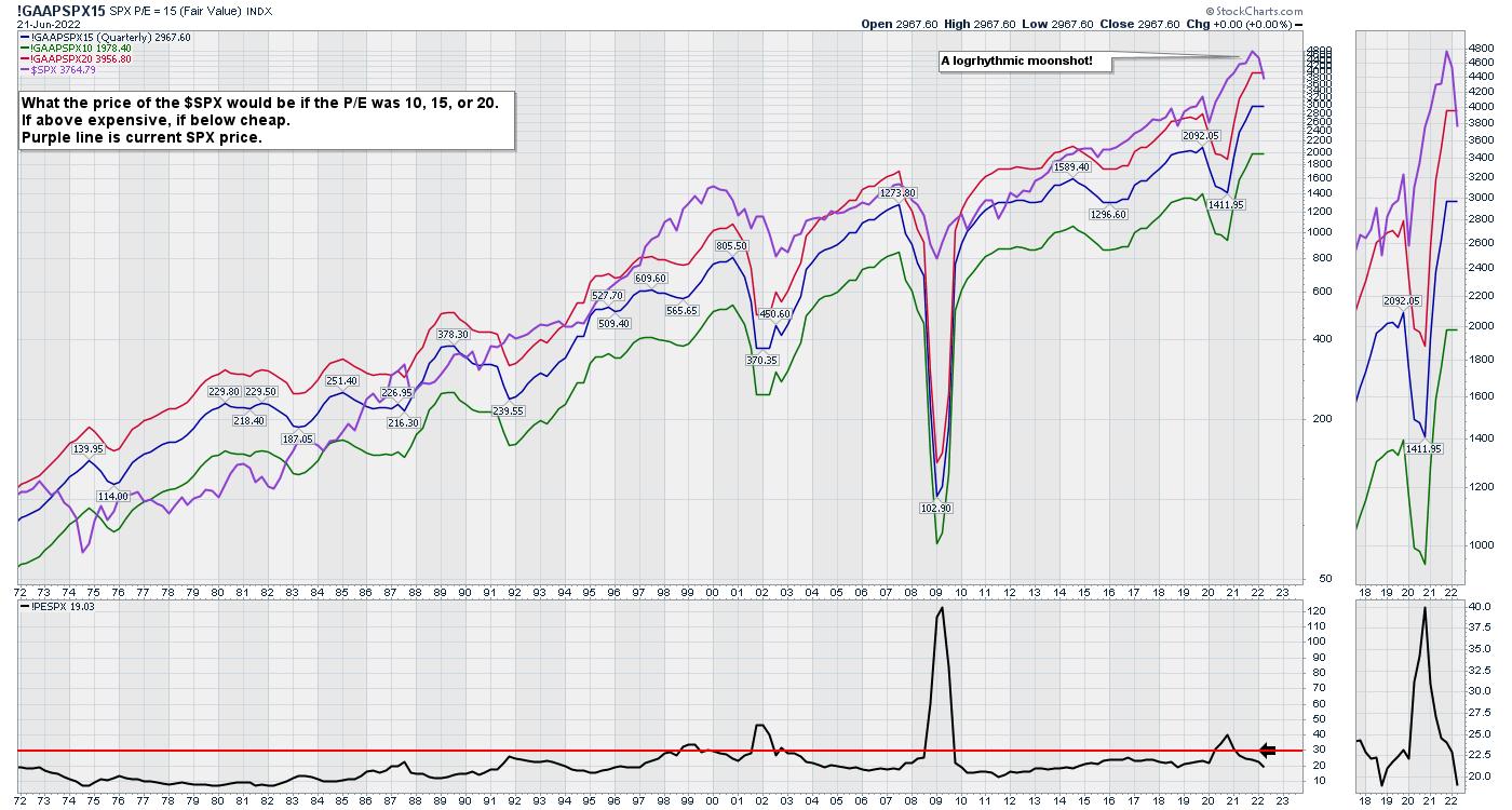
The graph below shows the stock market price/earnings ratio (P/E) ticking down over the past 6 months. The move down is a 20% drop from all-time highs. Because this is a 100-year chart, the log scale makes the move down look small. An arithmetic chart would show this as a 20% plunge of the entire chart height. With the Fed continuously providing a trampoline for the markets from 2008 to 2022, the market has stretched into higher and more extreme valuations compared to history. Since the early nineties, the market has hugged the red line a lot more than the middle of the range at the blue line. Now that we are below the red line, we are in a relative value area for investment managers, as they have seen the market above the 20 P/E level most of their careers.

The next move for the market is unknown, but the fight between the headwinds of inflation forces and the desire for investment managers to make money before year-end should be an epic battle. Throw in the US Mid-terms and that adds more pressure.
The strength indexes we use at the Osprey Strategic website to evaluate when to put money to work are trying to turn up. If you are interested in getting help evaluating the market, check out the one-month trial at $7 on the homepage of OspreyStrategic.org. We are looking for the fourth buy point of the year right now. The last three were very short. Will this one be the one that extends into the next bull market?
|
| READ ONLINE → |
|
|
|
| Mish's Market Minute |
| Mish's Daily: Technical Bounce or New Bullish Breakout? |
| by Mish Schneider |
I woke up these headlines on my Twitter feed Friday morning: "POWELL: US HAS A VERY STRONG, WELL RECOVERED ECONOMY."
Jerome Powell said a soft landing is still "possible," but conceded recession was also a possibility in his congressional testimony last week. He noted that it is difficult for anyone to forecast a recession. He also testified the Fed is hitting the appropriate balance between combating inflation and slowing the economy. Some stock pundits agree that inflation will be under control in a few months and the Fed's approach is working, pointing to oil retreating and copper prices declining.
As I've previously mentioned, there are several domestic and international causes of inflation, most notably food and energy prices with geopolitical and environmental influences. The prospect of a global recession caused the commodity markets to shake, with wheat, for example, falling about 20%-25% from its peak. Meanwhile, equities rallied 6% or so off the lows. Most of the gains were seen in biotechnology and mega-cap tech, more defensive than risk.
So the new sense of hope saw liquidation in the commodities market and a move for retail investors to buy in the equities market. Does that make this rally a technical bounce or a new bullish breakout?
Let Price Guide Our Trading
First off, the quarter ends this week. Last quarter, the market rallied 13% in 6 days before falling back to new yearly lows. Second, if we are repeating history, we could rally another 7% or so in the coming week for quarterly rebalancing.
Looking at the Economic Modern Family, this whole rally (as we wrote about) began with Granny Retail, followed by Big Brother Biotechnology. Then, after perceived dovish comments by Powell and decent earnings in FedEx, Transportation took off, followed by Regional Banks and Semiconductors. Although we should note that SMH had an inside week (traded within the range of the week before).
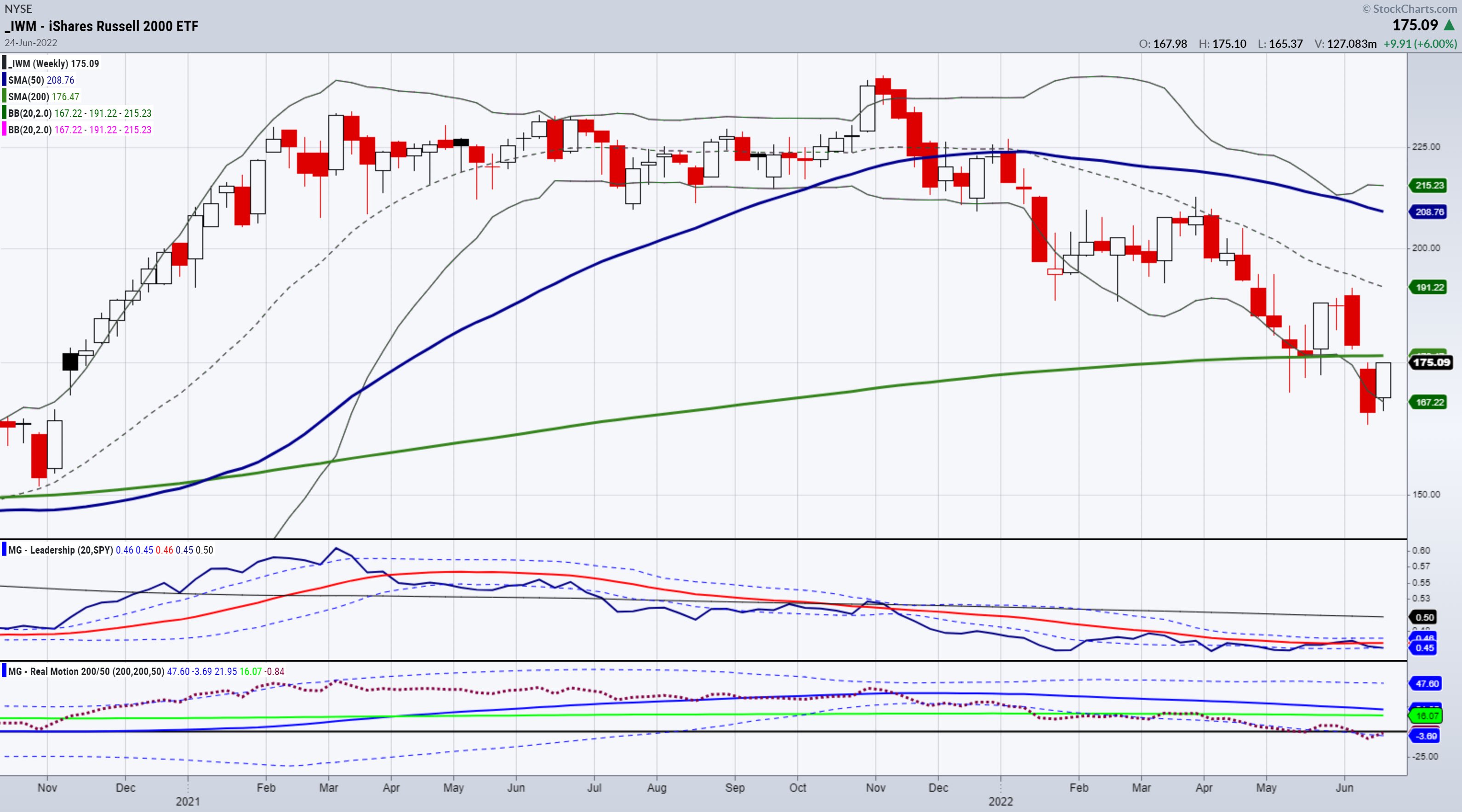
IWM is the key to watch and is the only one in the economic family that remains under its 200-WMA. That will resolve one way or another and provide important clues.
Junk bonds rallied, which is risk-on, having an inside week and trading within the range, so lots of uncertainty and follow through still needed.

Things I am Watching
The Fed's balance sheet increased this week, which likely surprised many people, including me.
The University of Michigan Consumer Sentiment index plunged to 50 Friday. Consumer sentiment has not been this bad since the early 1980s. Since the Supreme Court just overturned Roe v. Wade, political differences, worries about inflation, growing income division all remain front-of-mind.
As mentioned, I am keeping my eyes on the modern economic family, most notably the Russell 2000 (IWM), the Transportation sector (IYT) and Granny Retail (XRT).
Follow Mish on Twitter @marketminute for stock picks and more. Follow Mish on Instagram (mishschneider) for daily morning videos. To see updated media clips, click here.
Mish in the Media
Mish on Charles Payne:
Mish on BNN Bloomberg:
Mish on Cavuto:
Click here for Mish's appearance on UBS!
Read Mish's latest article for CMC Markets, "The American Stock Market's Last Great Rally?", available here.
Watch Mish cover her Economic Family on the Money Show!
Mish sit downs with Jared Blikre to discuss her history, investing and the future in this video from Yahoo Finance!

ETF Summary
- S&P 500 (SPY): Filled a gap from June 9th making 380-383 viable support. Next resistance 50-DMA 406.90.
- Russell 2000 (IWM): Needs to clear the 200-WMA at 176.47 to see more rally. Support is 170.
- Dow (DIA): 50-DMA above at 325.25 and support now at 309-310.
- Nasdaq (QQQ): 50-DMA at 305.40, support 295.
- KRE (Regional Banks): Inside week 56 the 200-WMA, 60 resistance.
- SMH (Semiconductors): Inside week. 230.76 50-DMA and support at 212.
- IYT (Transportation): Big reversal, now needs to hold 211.90 with resistance at the 50-DMA of 231.70.
- IBB (Biotechnology): Thanks this for helping this week - Above the 50-DMA with resistance on weekly chart at 121.15.
- XRT (Retail): Started the party holding the 200-WMA. Now, 50-DMA resistance at 67.00.
Mish Schneider
MarketGauge.com
Director of Trading Research and Education
|
| READ ONLINE → |
|
|
|
| Dancing with the Trend |
| Bear Market Blues but Trend Follower's Good News! |
| by Grant Morris, Greg Morris |

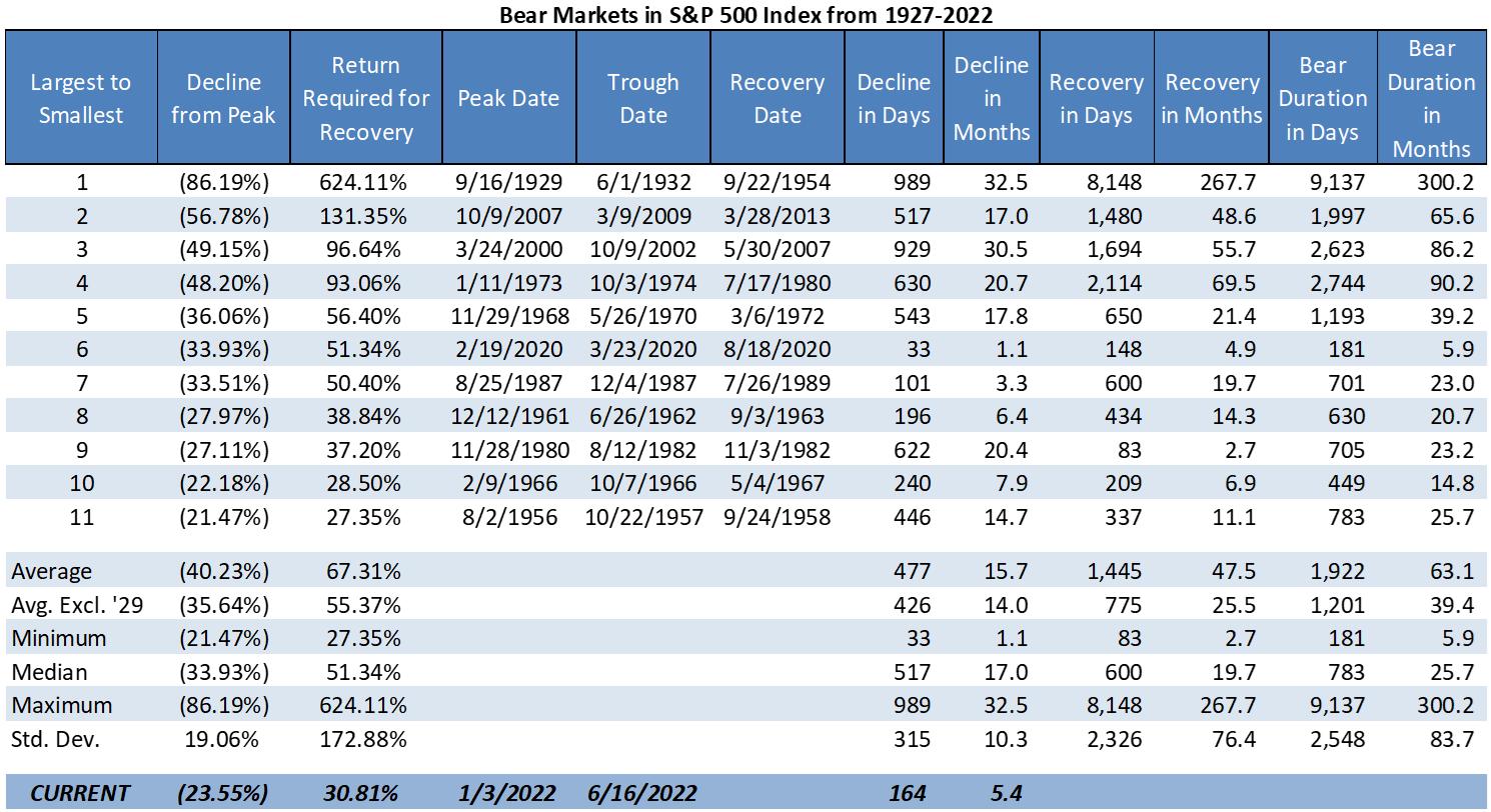
Investors may have the blues right now because we find ourselves in another bear market just 17 months after recovering from the prior one. The last bear market started on 2/19/2020 and ended on 8/18/2020 and was the 6th worst bear market since 1927 (of the S&P 500 Index and predecessor indices), dropping over 33.9% at its lowest point. It was however the quickest bear market by far, taking less than 6 months from when the selling started before the S&P 500 attained a new all-time high.
Below is our updated bear markets table showing the prior 11 bear markets ranked by the magnitude of their decline from largest to smallest. The bear market that we currently find ourselves in is tracked in the bottom row "CURRENT" and shows that we've dropped over 23.5% so far over the last 5.4 months; January 3rd being the prior peak in the S&P500.

We've mentioned in previous articles (Trend and Trend Plus – Drawdown | Dancing with the Trend) and will reiterate here – the magnitude of the drop during bear markets isn't the only factor that destroys the wealth of investors – it is also the duration of the bear market; the length of time it takes the market to fully recover from being in a bear market. If you are in a mild bear market that lasts a few years and must make monthly withdrawals from your account to pay for retirement living expenses, the long duration of the bear market can do more to destroy your wealth than would a higher magnitude bear market that recovers much more quickly. The amount of withdrawals made during the bear market greatly exacerbates the impact to your portfolio; this impact was also discussed in a prior article (Old Bear, New Trick | Dancing with the Trend).
If we exclude the crash of 1929 for being an extreme outlier in the data, the average bear market drops 35.6% (magnitude) and lasts 39.4 months (duration) – that's more than 3 years and 3 months! The bear market of 2020 had close to average magnitude but its duration was so short you could blink and miss it. If you didn't keep up with the financial news during that time and only reviewed quarterly account statements, you had only one quarter where things looked bad (1Q20), by the next quarter you were down less than 10% (2Q20), and during the third quarter you went back to all-time highs (3Q20). That is not a normal bear market by any stretch and investors should not look at that as an example of what we're going through today.
The current bear market already has duration about as long as the one from 2020 and it looks as though we are still heading down. Nobody knows where the bottom will be and how long it will take to get there, and nobody knows how long it will take to recover from the low point either! If someone tells you that they "know" how this bear market will play out, you should ask for their verified track record on all their other market guesses – they likely have made hundreds of market calls in an effort to be correct on just a few! Not the type of person that should be trusted with investments. We would also not make a bet with investment capital that the Fed can orchestrate a soft landing for the economy, i.e., bringing inflation into normal ranges without stifling the economy. Their track-record on this is abysmal.
Since we feel strongly that nobody can reliably predict when bear markets will occur, how far down they'll go, how long they'll last, or what will cause the next one (or much of anything else regarding financial markets), we use rules-based trend following to avoid the constant need to make guesses about the future. We don't have to guess and hope to be correct about the market, economy, Fed policy, inflation, corporate earnings, government policy, or anything else. We agree that these things likely matter to stock market performance, but not that you can "solve" the riddle of the markets based on these forecasts to make sound investment decisions. Additionally, the behavioral aspects of investing and that humans are notoriously poor decision makers when faced with uncertainty also supports the folly of trying to invest based on forecasts, predictions, or guesses about the future.
Instead, we follow rules that react to what the market is actually doing – that's it. If the market is moving up, we try to participate, but when we detect breaks in the uptrend and the market moves through our stop level, we sell out of equity positions and stay defensive to protect clients' capital. The mere existence of bear markets (not what causes them or how bad they will be) is one of the reasons we prefer rules-based trend following to other forms of money management. The fact that bear markets exist and that trend following does a good job of avoiding them, along with our expectation that bear markets will continue to occur in the future, is what makes trend following a very useful approach to managing serious money. Over full market cycles we've found trend following can deliver significant returns while suffering much lower volatility and drawdowns than the broad market, ultimately compounding capital at a higher rate for investors – that should be "good news" for trend followers.
Buy and hold approaches to investing (either active or passive forms) that maintain fairly constant equity exposure during bear markets don't employ any real risk management techniques. The only way one attempts to lower the risk of these strategic asset allocation portfolios is by mixing in larger allocations to bonds to hopefully de-risk the equity allocation. Sometimes this works and sometimes it doesn't, ultimately the bond exposure is usually a drag on returns while providing very limited downside protection. In 2022 the bond allocation in most strategic asset allocation portfolios is suffering almost as much as the equity portion. In a rising rate environment this is likely to continue.
Instead of using bonds to de-risk, our trend following approach is fully tactical in that it can move from being 100% invested in the stock market to being 100% defensive with no exposure to the stock market; and our defensive holdings can vary from cash to gold to short and intermediate Treasuries – assets that often perform very well during equity bear markets and market environments that see panic selling. We believe that this form of risk management, being tactical and using stops to get out of the way of bear markets, is much better for investors as large drawdowns are far too difficult for most investors to tolerate. Investors always think they can hold their positions thorough any level of downturn and make it out the other side. Bear markets prove time and time again that investors abandon their investment plans at various levels of drawdown and then have no plan on how to re-allocate once the bear market is over. Remember, buy & hold only works if you can accomplish the "hold" part.
Below is the 2022 view of the Nasdaq Composite chart we've shown often that illustrates the times that our trend model has us invested (green) and the times that it has us defensive (red). Previous articles show the same chart for 2021, 2020, and older periods. You can see from this chart that our model got us defensive very early in the year, and other than a quick trade at the end of March, has been defensive all year – avoiding the devastation to wealth that comes with bear markets.

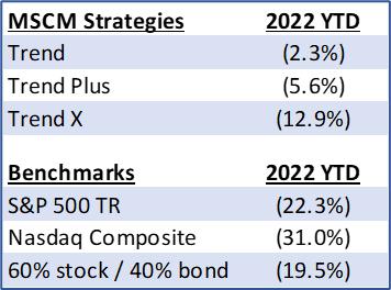
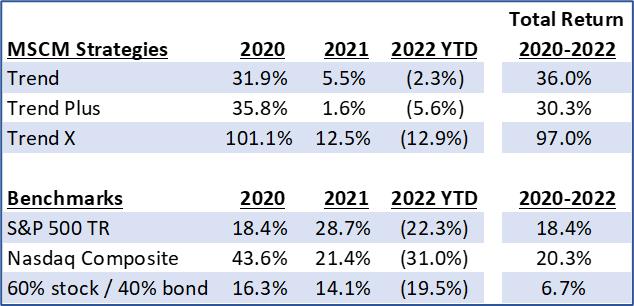
The defensive positions have had mixed results so far this year. Below are the year-to-date returns (net of fees) of the main strategies that follow this model so far in 2022 (as of June 17th) compared to some benchmark returns:

Avoiding the market this year with the move into defensive positions has clearly provided a significant amount of outperformance for investors.
Making the same comparison since 2020 when we had the last bear market, and even though 2020 and 2021 provided strong returns in the benchmarks, the power of not losing in the bad times keeps trend following ahead, and all along investors experienced much lower levels of drawdown during the two bear markets:

Admittedly, 2021 results were not great on their own and the large underperformance to the market was difficult to tolerate for many investors; however, we are not investing with a focus on any single year or specific timeframe. Many investors get impatient with the results during the ho-hum years like 2021 when trend following is underperforming the market. We've discussed this in many prior articles. Losing sight of the long-term results that trend following can provide, and of their long-term goals for investing, causes investors to chase performance and abandon trend following to move into the group of funds or strategies that just had the best recent performance – selling what they owned and don't like anymore to buy what they wish they had owned – in essence, selling low and buying high. Last I checked that was a fairly poor investment plan, and sadly professional advisors are guilty of doing this for their client portfolios, too.
We think it is better to understand what market environments will cause underperformance in trend following and accept that "bad" as a tradeoff for the "good" that it provides at other times, i.e., don't give up on trend following in times of underperformance to assure you receive the benefit it provides in times of outperformance, namely during painful bear markets when other strategies and investment approaches are doing so poorly.
If this current bear market is giving you the investing blues and you have struggled to develop your own trend following or tactical investing approach, you may be interested in the rules-based tactical strategies offered by McElhenny Sheffield Capital Management (mscm.net/strategies/), or the ETF that is based on MSCM's primary tactical strategies, Trend Plus and Sector Rotation, MSMR (mscmfunds.com). You can reach out to Grant directly by email (grant@mscm.net) for more information.
We strongly believe that all clients should have an allocation to trend following and other tactical strategies for the good news they deliver to investors during bear markets.
Dance with the Trend,
Greg Morris
Grant Morris
Grant manages various tactical strategies at MSCM for individual investors and other registered investment advisors, and Greg is a senior advisor to the firm. The content of this article is for general informational purposes only. Nothing contained should be construed as an offer to sell or a solicitation to buy any security or other financial instrument or product offered or managed by MSCM or any other issuer or company. The provision of this information does not constitute the rendering of investment, consulting, legal, accounting, tax, or other advice or services. Past performance is no guarantee of future results.
|
| READ ONLINE → |
|
|
|
| MORE ARTICLES → |
|
 Chart 1
 Chart 2
 Chart 3
 Chart 4
 Chart 5
 Chart 6
 Chart 7
 Chart 8
 Chart 9
