| THIS WEEK'S ARTICLES |
| John Murphy's Market Message |
| Stocks Fall Sharply at Key Resistance Levels: Year End Rally May Have Run Its Course |
| by John Murphy |
STOCK INDEXES ARE FAILING AT OVERHEAD RESISTANCE LEVELS...
The year-end stock market rally appears to have run its course. A more hawkish Fed on Wednesday suggesting that rates will be higher for longer started the stock selling. This mornings's economic reports for November showed a drop in retail sales and manufacturing which raised fears of a weakening economy. Falling bond yields are also hinting at a recession in the coming year as are falling commodity prices. Stock indexes are falling sharply today and appear to be failing a test of key overhead resistance levels.
Chart 1 shows the Dow Jones Industrial Average ($INDU) falling sharply to the lowest level in a month after two failed attempts to clear their August peak. Chart 2 shows the S&P 500 Index ($SPX) falling to a monthly low after failing a couple of tests of its 200-day moving average (MA). The $SPX is heading toward a test of its 50-day MA. A close below that support line would be further confirmation of a rally failure. Chart 3 shows Invesco QQQ Trust ETF (QQQ) trading beneath its 50-day MA. The Nasdaq remains the weakest of the three major indexes owing to the relative weakness in technology stocks.
SECTOR RANKINGS SHOW LACK OF CONFIDENCE...
All 11 stock sectors are in the red today with the biggest losers in Communication Services and Technology. The more defensive sectors like Utilities and Healthcare are holding up a little better along with Energy. For the month, sector leadership by Utilities, Healthcare, and Consumer Staples show that the year-end rally has been on a weak technical footing. So has relative weakness in Energy (due to falling energy prices) and economically-sensitive Consumer Discretionary stocks which were the month's two weakest sectors.
 Chart 1 Chart 1
 Chart 2 Chart 2
 Chart 3 Chart 3
|
| READ ONLINE → |
|
|
|
|
|
| The Mindful Investor |
| The End of Another Bear Market Rally? |
| by David Keller |
I am convinced that charts give you a window into the collective psychological state of investors. Are people excited or panicky? Euphoric or despondent? Optimistic or pessimistic? All of that is embedded in price action, if you know how to analyze the trends.
As the market rallied strongly off the October lows, fueled by a collapse in the US Dollar and falling interest rates, it felt as if the market could be building enough momentum to rally straight through the new year. If I took anything away from this week, it was that this "uber bullish" scenario is highly unlikely.
What has changed? Well, to put it simply, the market has stopped going higher.
Your Final Score: Resistance 4 – S&P 500 0
Legendary technical analyst Paul Montgomery, who published a newsletter called "Universal Economics" for over 50 years, once wrote, "The most bullish thing the market can do is go up."
So when the market failed this week to follow through with a move above its own 200-day moving average, and also failed to break above trendline resistance using the 2022 highs, this suggested to me that the bear market rally from October through December may have exhausted its upside potential.
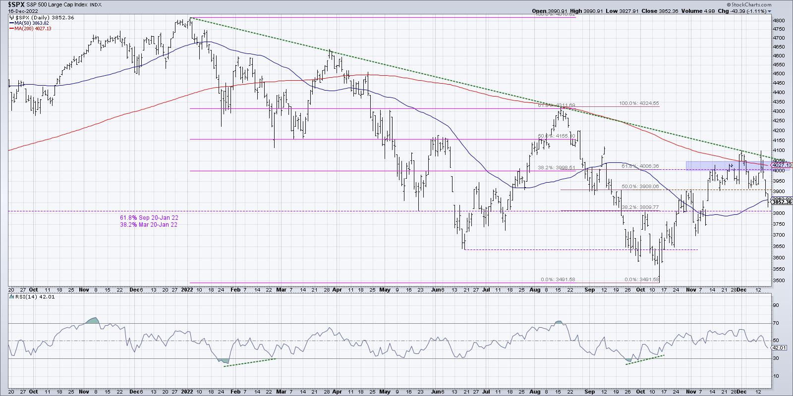
Here, we see how the S&P 500 first reached a resistance area in the 4000-4050 area in mid-November, then went zero for four in following through on a move above this resistance range. What's compelling about the timing of this price failure? Seasonally speaking, November and December are two of the strongest months of the year.
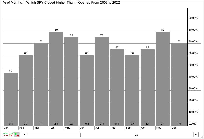
Over the last 20 years, November has been up 80% of the time for an average return of 2.1%. December has been positive 70% of the time, with an average return of 1.0%. Now, it's worth noting that this means, 30% of the time (or six years out of 20), December has actually been a down month.
Seasonal tendencies are just that--tendencies. Not absolutes, not guaranteed moves, but tendencies. Or as I like to think of them (to use flying as a constant analogy for investing), tailwinds vs. headwinds.
Breadth Indicators Echo Caution For Next Week
By analyzing patterns in breadth indicators like the advance-decline lines, we can see how the stocks that comprise the major indexes are performing relative to the index charts themselves. One of my favorite ways to measure breadth is by looking at the percent of stocks above key moving averages. Are individual names above or below their short-term and long-term trend barometers?
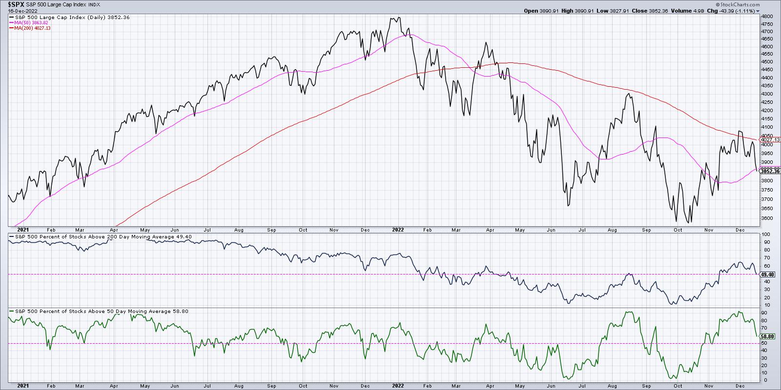
As of Friday's close, 49% of S&P 500 members remain above their 200-day moving average. That's down from around 65% at the end of November. Similarly, only 59% of S&P 500 stocks are above their 50-day moving average, down from just above 90% at the end of November.
On this chart, I have pink horizontal lines at 50%, as I have found that the market often follows the trend of the bulk of the index. So if most stocks are in an uptrend, defined as being above the moving averages, then the market conditions are overall bullish. Now that more than half of the SPX stocks are below their 200-day moving average, just as the S&P 500 itself is below its own 200-day moving average, it's hard for me to take that as anything but a bearish signal.
The most bullish thing the market can do is go up. And based on measures we've discussed based on price, trend, and breadth, that no longer appears to be the case.
RR#6,
Dave
P.S. Ready to upgrade your investment process? Check out my YouTube channel!
David Keller, CMT
Chief Market Strategist
StockCharts.com
Disclaimer: This blog is for educational purposes only and should not be construed as financial advice. The ideas and strategies should never be used without first assessing your own personal and financial situation, or without consulting a financial professional.
The author does not have a position in mentioned securities at the time of publication. Any opinions expressed herein are solely those of the author, and do not in any way represent the views or opinions of any other person or entity.
|
| READ ONLINE → |
|
|
|
| Art's Charts |
| It's Like Déjà Vu, All Over Again for SPY |
| by Arthur Hill |
 The SPDR S&P 500 exchange-traded fund (SPY) surged from mid-October to early December, but this advance was considered a counter-trend bounce within a bigger downtrend. And this week, SPY reversed its short-term uptrend and the bearish technical setup was similar to the last two reversals. The SPDR S&P 500 exchange-traded fund (SPY) surged from mid-October to early December, but this advance was considered a counter-trend bounce within a bigger downtrend. And this week, SPY reversed its short-term uptrend and the bearish technical setup was similar to the last two reversals.
First and foremost, the long-term trend is down and has been down since mid-April, if not earlier. SPY forged lower lows in March and June, and then 52-week lows in late September and mid-October. The red dashed line shows lower highs since March and the ETF has been below its falling 200-day simple moving average (SMA) for most of the last eight months. I quantified 200-day SMA signals in my article two weeks ago and showed how to improve performance.
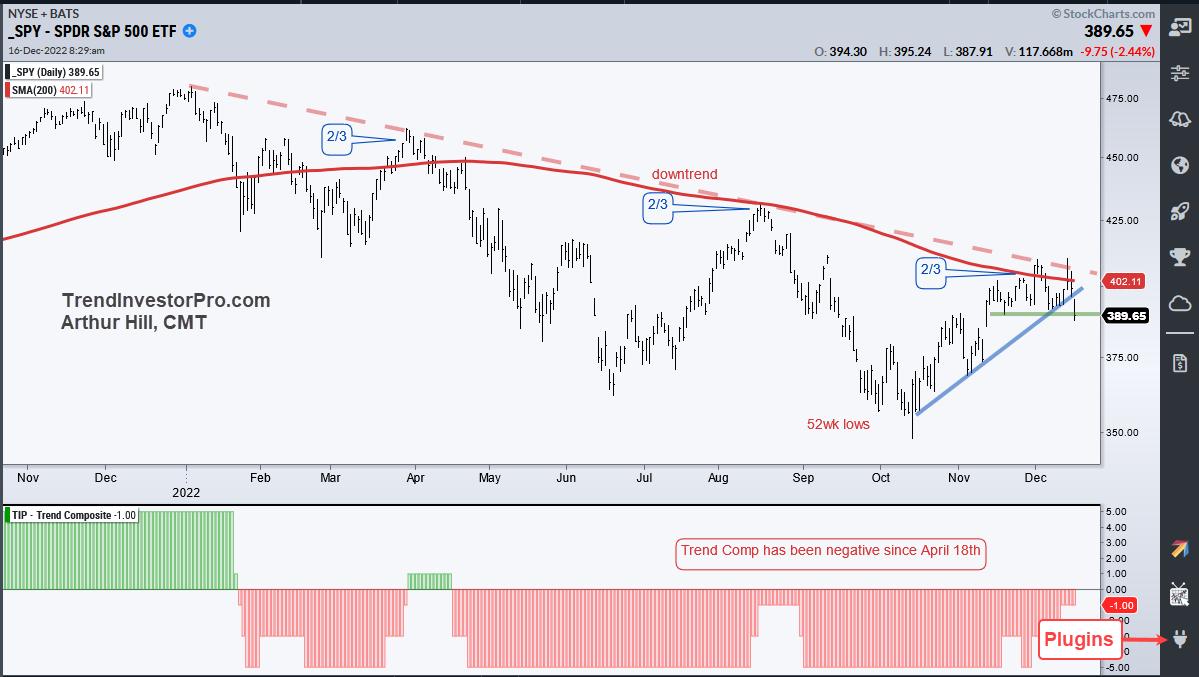
CHART 1: ARE WE SEEING A BEAR MARKET BOUNCE? Given that SPY hasn't broken above its August high, a continuation of the larger downtrend is possible. Chart source: StockChartsACP from StockCharts.com. For illustrative purposes only.
The October–December advance seemed strong, but a little context showed it to be a bear market bounce. Notice that this advance retraced around 2/3 of the prior decline and SPY reversed the short-term uptrend with a sharp decline the last two days. The March–April and June–August counter-trend bounces also retraced around 2/3 of the prior decline before reversing (see the 2/3 markers in the chart above). This is not a coincidence. Charles Dow notes that secondary advances often retrace one-to-two thirds of their prior declines with 50% being the base case. Think of it as two steps down and one step up.
A downtrend remains in force as long as lower lows and lower highs persist (two down, one up). SPY hit a 52-week low in October, which was a lower low. The current advance fell short of the August high so we have yet to see a higher high. This week's short-term support break and trend reversal signal a continuation of the bigger downtrend and I expect a test of the fall lows, at the very least. My only concern is that this seems to be the consensus opinion! In any case, the chart is bearish until proven otherwise.
TrendInvestorPro was monitoring this counter-trend bounce as SPY entered the resistance-reversal zone. A short-term breadth indicator triggered bearish on December 6 for the early warning and Thursday's support break confirms this signal. We are also watching counter-trend move ETFs related to semiconductors, retail, and industrials, as well as the breakdowns in ETFs related to small-caps, financials, and banks. Click here for immediate access to our weekly reports and videos.
The Trend Composite, Momentum Composite, ATR Trailing Stop, and eight other indicators are part of the TrendInvestorPro Indicator Edge Plugin for StockCharts ACP. Click here to learn more and take your analysis process to the next level.
---------------------------------------
|
| READ ONLINE → |
|
|
|
| ChartWatchers |
| The January Effect: Will Small-Cap Stocks Outperform Large Caps? |
| by Jayanthi Gopalakrishnan |

You've probably heard of the January effect—that is, when small-cap stocks show strong performance during the first trading month of the year. But don't let it throw you off; it doesn't necessarily mean you'll see the action in January. According to the Stock Trader's Almanac, the January effect now starts in mid-December. Does that mean that small-cap stocks will start showing their strength just about now?
Wait: Let's Pause For a Moment...
The general big picture of the stock markets is that, during most of the year, small-cap stocks are ignored as the stocks of large companies get all the attention. However, around early November, the small caps start getting some love and, by the time mid-December rolls around, the smaller company stocks are in the spotlight.

Why does this happen? The general point of view is that individual investors sell their losing stocks so they can claim capital losses on their tax returns. Using the capital from the sale of the stocks and expected year-end bonuses received from their employers, these investors turn around and reinvest.
This year, 2022, has been a bit of an anomaly, given that inflation and interest rates are front and center in investors' minds. When the Fed suggests they may be slowing the pace of their rate hikes or if inflation is cooling, investors get optimistic and stock prices rise.
Keep Small Cap Stocks On Your Radar
So far, small caps haven't started to show muscle, but there's a chance they may show up a little later. So it's worth watching their performance as we finish out the year. One way to do this is to look at the ratio of small-caps to large-caps using exchange-traded funds (ETFs), such as the iShares Russell 2000 (IWM) and iShares Russell 1000 ETF (IWB). The Russell 2000 is made up of smaller companies, whereas the Russell 1000 is made up of larger companies.
Generally, companies with a market capitalization between $300 million and $2 billion are considered small caps. Companies with a market capitalization greater than $10 billion are considered large caps.
To see the top holdings of the IWM and IWB:
- Select Symbol Summary from Your Dashboard.
- Enter the symbol on the top right symbol box, then select Go or hit the enter or return key.
- Scroll down to Profile and visit the link that provides the fund details.
In your StockCharts platform, enter IWM:IWB in the symbol box (see chart below). Note that you can use other ETFs for your analysis or combine an ETF with an index. This gives you a general idea of how small caps performed compared to large caps. When the yellow line trends down, it indicates large caps were outperforming small caps and, when the line is trending up, small caps are outperforming large caps.
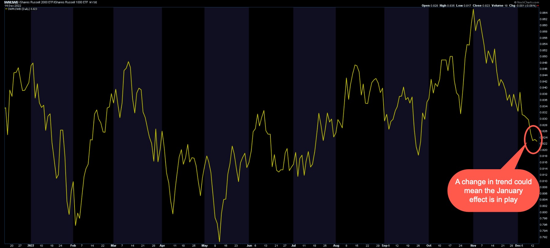
CHART 1: RATIO OF SMALL CAP STOCKS TO LARGE CAP STOCKS. Viewing the ratio of IWM to IWB shows the performance of small-cap stocks against large-cap ones. As of now, large caps are still stronger than small caps. It'll be interesting to see if this trend reverses. Chart source: StockCharts.com. For illustrative purposes only.
What's interesting is that, in 2022, from mid-May to early November, small caps were performing better than large caps. If you bring up a chart of the S&P 500 Index ($SPX), you'll see that mid-May is around the time investors were concerned about the equity markets. This continued until early November, which is when Fed chairman Jerome Powell put investors at ease by suggesting that interest rate hikes could start slowing.
Fed's Rate Decision: The Market's Reaction
As expected, the Fed raised rates by 50 basis points, or half a percentage point. But the Fed's outlook continues to be hawkish—interest rates could go higher than 5%. Inflation risks are still on the upside. The Fed's "dot plot" outlook for the Fed funds rate (terminal rate) ranges from 5.1 to 5.4% in 2023, 4.1% in 2024, and 3.1% in 2025. In short, rates could still go higher before they start coming down.
Comments from Chairman Powell suggested that the Fed is committed to bringing inflation down to its 2% goal, which will take some time. The Fed also wants to restore price stability to the U.S. economy and reduce its balance sheet. Although the Fed has raised rates, the effects are yet to be felt. The U.S. economy has slowed, but growth in spending and production has been modest, and consumer spending has lowered. But the labor market is still tight.
It's pretty clear that investors are still focused on what the Fed says. This is clear in the market's initial reaction to the news—the equity market softened and the 10-year Treasury yields popped. But the markets reversed direction, with equities recovering some of their losses and yields retreating. Interestingly, the IWM:IWB chart turned to the upside when the equity markets reacted to the interest rate decision, but turned lower at the close of trading.
What's Ahead for January?
It remains to be seen if small caps or large caps will reign in January. We could still see the January effect come into play. If it does, there's a chance that small-cap stocks could perform well up until early May. According to the Stock Trader's Almanac, the small-cap advantage has waned during major bull moves and intensified during periods of uncertainty, as traders may begin bargain-hunting early. So, exercise patience and keep an eye on the performance of large-cap to small-cap stocks.

Jayanthi Gopalakrishnan
Director, Site Content
StockCharts.com
Disclaimer: This blog is for educational purposes only and should not be construed as financial advice. The ideas and strategies should never be used without first assessing your own personal and financial situation, or without consulting a financial professional.
|
| READ ONLINE → |
|
|
|
| The Canadian Technician |
| Can Energy Bounce? |
| by Greg Schnell |
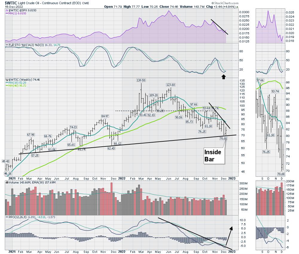
The oil sector has pulled back roughly 20% over the last 4 weeks. It's been an aggressive move down, and I was interested to hear that Mark Fisher thinks the bottom is in for oil. MBF trading is a big deal. He is a brilliant man, so I definitely want to check my work.
When I see the crude oil chart, it is on what, for me, is a sell signal. But the price action this week was pretty strong compared to the rest of the market. The relative strength downtrend in purple did try to tick up this week. The Full Sto is turning up onto a buy signal.
Price is making an inside bar, which I like to think of as indecision. If we can start to make higher highs here, that would be a textbook bounce off the uptrend. The PPO is at one of the most interesting points where I like to buy. When it breaks above this long 6-month PPO downtrend, I would rather be long.
$CRB
When I look at the $CRB chart, it is broken. But if it was to reverse higher here, it would be a false break down. When a breakdown reverses, that is very bullish.
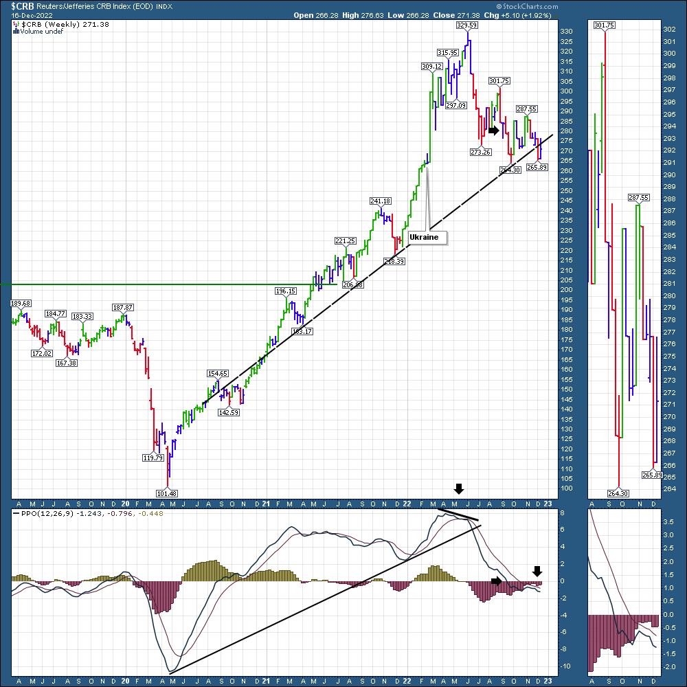
I like to buy commodities near the lows. If these charts can improve, that would be bullish. The stock market last year dropped through the first quarter, but the oil markets kept rallying. The real question is, if that same market action is to be endured, whether oil can rally in the face of the slow economy.
XOP
The Oil Exploration and Production ETF is hanging on the trend line. Right now, everything on the chart is pointed down. The fast move from $160 to $130 could be a normal pullback in an uptrend, but, if the price does not hold this trend, it can move down extremely fast. Last December, the indicators were in a similar position, and they all started to turn up from there on a nice rally.
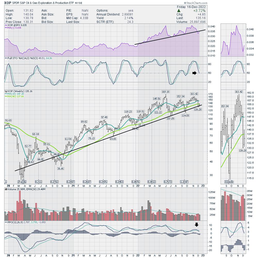
With the overall stock market failing, it really is a tough call. But, for investors that like to buy at the trend line with a close stop, this looks like a nice location. I think the close stop is critical. If this chart continued to make lower lows, I would not be looking at it. It is the indecision at the trend line that suggests this might be ready to turn higher.
|
| READ ONLINE → |
|
|
|
| Martin Pring's Market Roundup |
| The Business Cycle Is Poised for a Stage 1 Signal |
| by Martin Pring |
One of my favorite chart lists is one called Interasset Ratios. As the name implies, it contains a library of charts that plot various long-term relationships between asset classes, such as the stock/bond ratio, bond/commodity relationship, and so forth. It's not something you want to focus on every day; occasionally, though, these interasset relationships come up with some insightful signals that help identify the prevailing phase of the business cycle and, more importantly, which asset classes look attractive going forward.
The Business Cycle, In Theory
By way of background, Figure 1 shows an idealized business cycle, with the expected chronological peaks and troughs for bonds, stocks, and commodities indicated by the letters B, S, and C. There are three markets, each with two turning points, a top, and a bottom. That means there are six stages to the cycle, each of which has a different investment environment. For example, the diagram shows the current phase, as determined by my models, to be Stage 6. That's one that has historically proved challenging for all asset classes. You can read more about the Six Stages and how they are identified at this link. This approach is also followed closely in my monthly Intermarket Review and is a guiding principle for managing accounts at Pring Turner.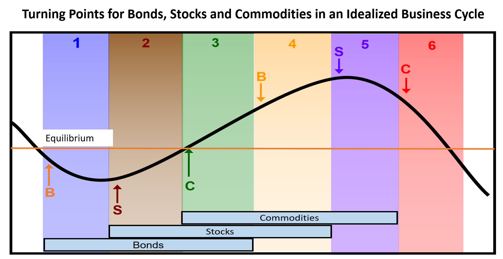
Analyzing interasset relationships helps in determining the current stage of the cycle and what to look for next. For example, if the models are correct, and the current environment is indeed a Stage 6, the next step in the sequence should be a transition to Stage 1. The word "should" is emphasized because, in the real world, the cycle does not always progress in an expected way. For example, of the 13 identified cases of a Stage 6 since the mid-1950s, six moved directly into a (bullish for bonds) Stage 1. However, four instances skipped over Stage 1 and went directly to Stage 2, which is bullish for stocks and bonds. The remaining four examples retrograded to Stage 5, where only commodities are positive.
Indications of a Move to Stage 1
If we are close to Stage 1, it would be realistic to see a couple of things happen. First, bonds, which are the only bullish market in Stage 1, should be outperforming commodities.
The reason why bond prices have fallen during and prior to Stage 6 is because of building inflationary pressures. Consequently, if a bond bull market is to get underway, it's important to see those inflationary pressures dissipate and transition to deflationary ones. In that respect, Chart 1 features a long-term KST of the ratio between bonds and commodities. Rising momentum is deflationary because it shows that bonds are outperforming commodities. The green arrows indicate that bottoms in the KST for the $USB/CRB ratio represent good buying opportunities for bonds. The indicator has already begun to turn up, which suggests a likely bottoming, but we really need to see a move above the MA.
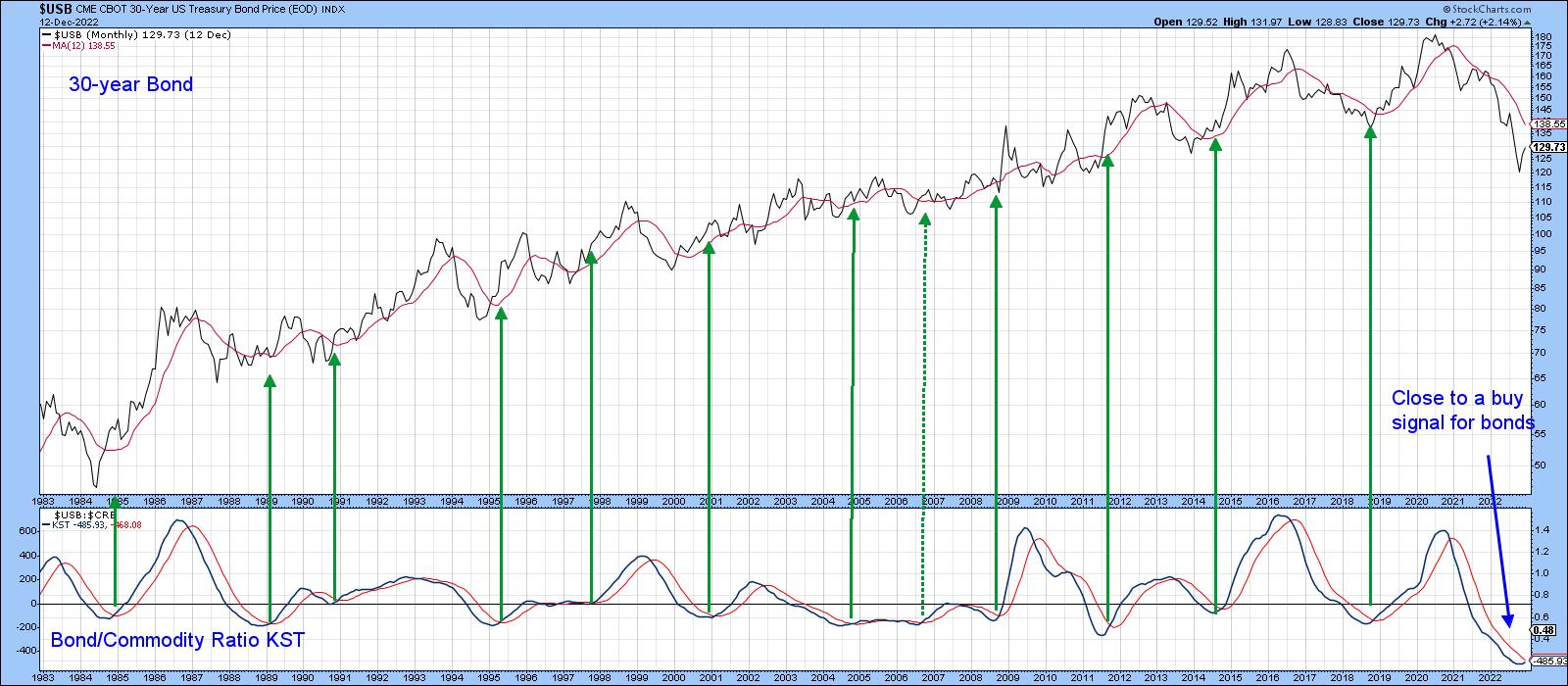 Chart 1 Chart 1
Chart 2 features the actual ratio, together with a Special K (SPK) indicator. The ratio looks like it has bottomed since it has crossed above its 200-day moving average (MA) and surpassed the 2020–2022 down trendline. The SPK has also violated a down trendline. More importantly, it has rallied above its signal line and begun a series of rising peaks and troughs. Given this combination, the odds are strongly in favor of a deflationary trend going forward, which is certainly consistent with a late Stage 6 or early Stage 1.
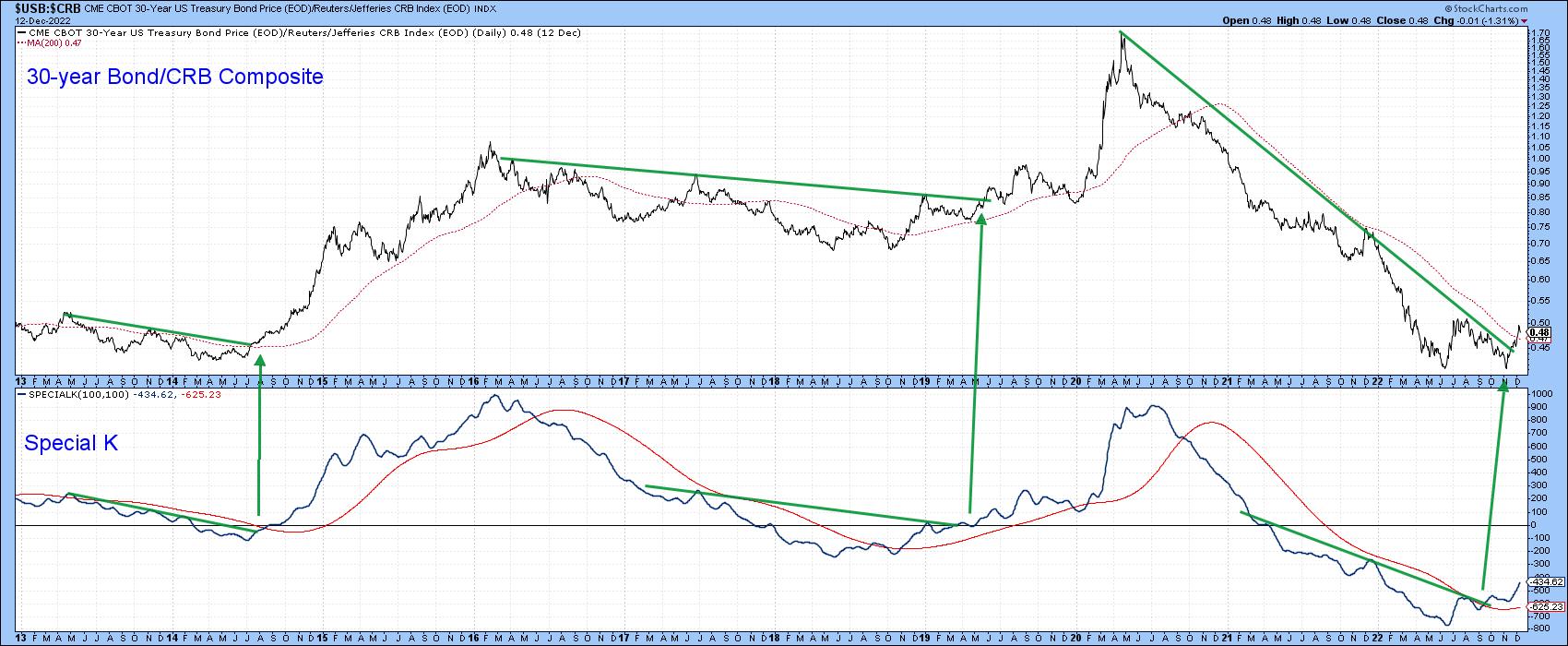 Chart 2 Chart 2
We can also turn this around and look at it from a pure commodity aspect, as in Chart 3, where peaks in the commodity/bond KST can be seen to forecast lower commodity prices in most cases. The peaking action of smoothed momentum suggests commodities are still vulnerable.
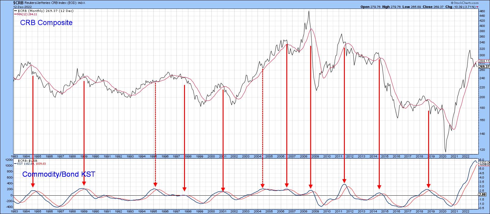 Chart 3 Chart 3
Possibility of a Direct Move to Stage 2?
In Stage 2, stocks are rallying and commodities are falling. That means that if the ratio between them is advancing, there is a good chance the cycle may have reached Stage 2. Chart 4 demonstrates that such a transition is possible in the current environment. It features a long-term KST for the stock/commodity ratio. The green arrows tell us when it crosses above its MA for a buy signal. Since 1960, there have been 17 of them, and only one, during the 2007–2009 bear market turned out to be a false positive. In the last month, this momentum indicator has started to flatten, which could be a prelude to an actual upside reversal and positive MA crossover. Stocks look like they are very oversold relative to commodities and are due for a reversal.
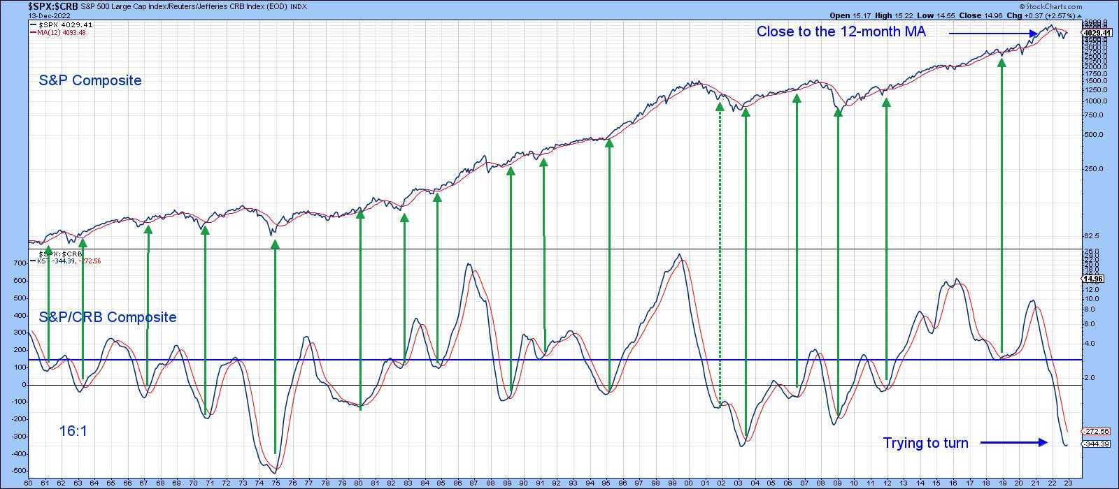 Chart 4 Chart 4
Chart 5, which zeros in on the ratio itself, indicates that it has just broken out from a downward-sloping reverse head-and-shoulders. Furthermore, its SPK has also violated a down trendline and crossed above its signal line. All of this suggests that stocks have halted their cyclical decline against commodities.
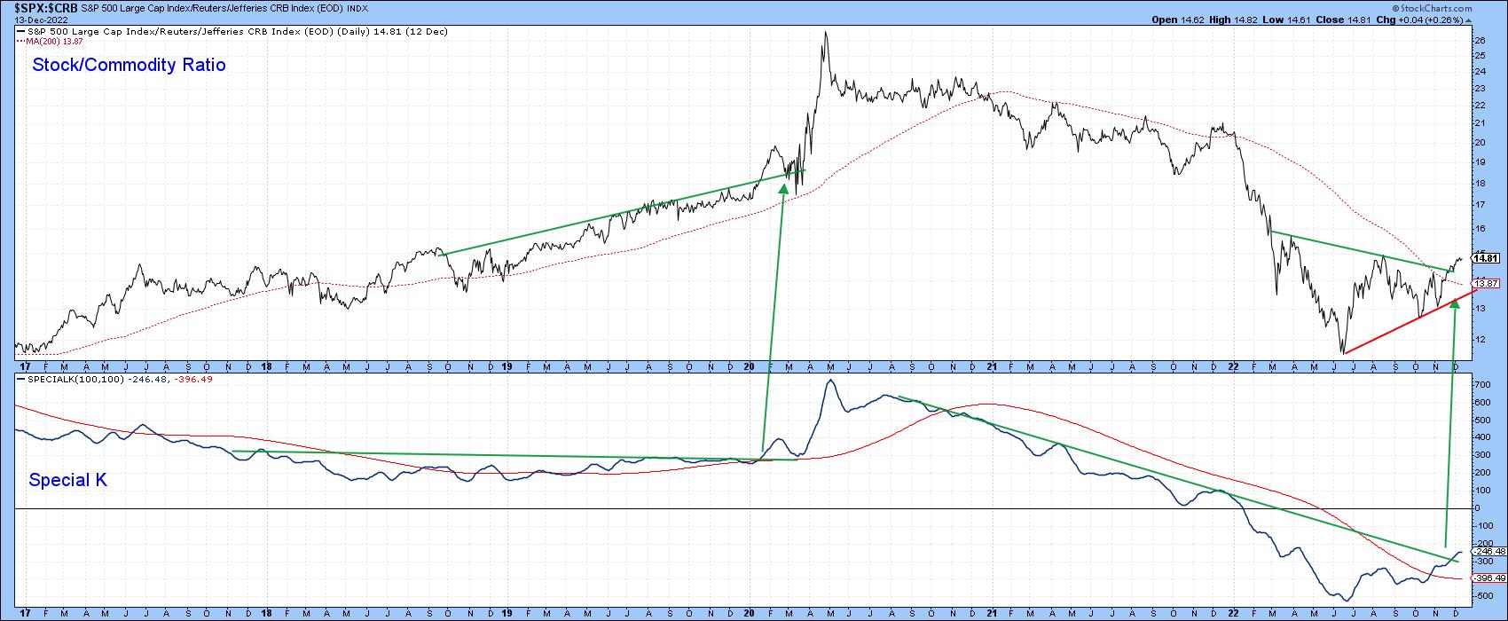 Chart 5 Chart 5
Are Stocks at a Turning Point?
Weakening inflationary forces, as evidenced by the relationship between commodities and bonds, suggest that a Stage 1 environment could be close at hand. Moving directly to a Stage 2 phase of the cycle is also a possibility, as the KST for the relationship between stocks and commodities looks as though it may be bottoming. While this is a very reliable indicator, it did disappoint in 2008. At that time, the S&P 500 Index failed to cross above its 12-month MA. It's currently a tad below the average, thereby indicating a very finely balanced technical position that could easily turn in either direction.
Good luck and good charting,
Martin J. Pring
The views expressed in this article are those of the author and do not necessarily reflect the position or opinion of Pring Turner Capital Group of Walnut Creek or its affiliates.
|
| READ ONLINE → |
|
|
|
| RRG Charts |
| How to Benefit From a Two-Stock Wrecking Ball |
| by Julius de Kempenaer |
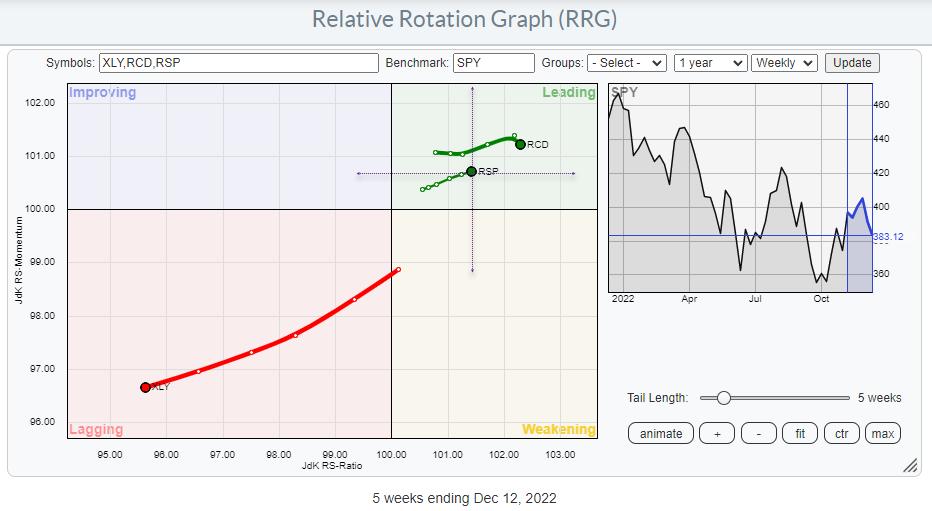
The Relative Rotation Graph above shows an intriguing picture.
Opposite Rotations
Last week in Sector Spotlight, I discussed the opposite rotations for XLY and its equal-weight counterpart RSP vs. their respective benchmarks (SPY and RSP). When you bring up the Relative Rotation Graphs for Cap-Weighted S&P sectors alongside the Equal-Weight version of that graph, you will note that most sectors are generally moving similarly on both charts. The big exception is the Consumer Discretionary Sector, with XLY on the cap-weighted RRG rapidly moves deeper into the lagging quadrant, exhibiting an obvious relative downtrend vs. SPY. RCD, on the equal-weight RRG, is stable inside the leading quadrant vs. RSP.
The RRG above merges both versions of RRG. The center of the chart is SPY, so XLY is clearly moving into the lagging quadrant. RSP, the equal-weight S&P 500, is inside the leading quadrant vs. SPY. This is already an interesting observation, as it shows that the equal-weight S&P 500 is in a relative uptrend vs. the cap-weighted version.
The dotted crosshairs with RSP in the center represent the RRG for the cap-weighted universe. RCD shows up inside the leading quadrant vs. that benchmark as well. This means that the EW S&P 500 is in a relative uptrend vs. the cap-weighted S&P 500, but the EW Consumer Discretionary sector is also in the leading quadrant vs. RSP.
The difference in the rotation could not be more prominent.
Stock Rotation Inside the Sector
The explanation lies in the rotation of the individual stocks in that sector.
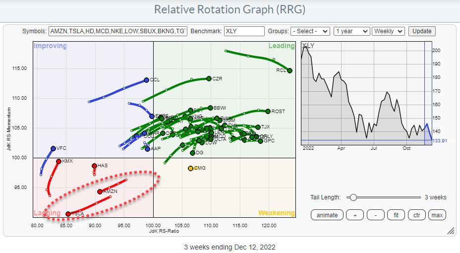
This RRG shows the rotation of the individual stocks in the sector against XLY as the benchmark. There is no question about which stocks are dragging this sector down in price and relative terms. AMZN (18.3%) and TSLA (13.5%) together comprise almost 1/3 of the Discretionary sector; the strong down moves in both stocks seriously impact the sector's performance, and even the S&P 500 (2.4% and 1.3%).
Moving To the Equal Weight Universe
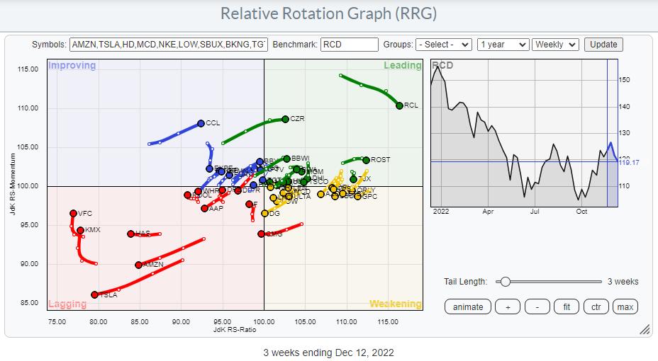
The RRG, which uses RCD (EW Consumer Discretionary sector index) as the benchmark, shows a significantly different rotational image. Still, AMZN and TSLA are deep inside the lagging quadrant and heading deeper into it. But the remaining stocks in the universe are much more evenly spread out over the RRG, providing a better picture of the underlying rotations for this sector.
Weakness Even in Price Trends
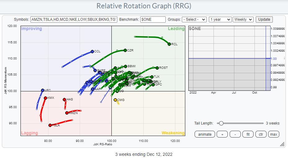
Finally, we can look at the sector breakdown against $ONE as the benchmark. And this shows that most of the stocks in this sector are showing a positive price trend. Only a handful are inside the lagging quadrant, and AMZN and TSLA are the only two still on a negative RRG-Heading.
Way To Play
The good news is that such evident discrepancies are offering investors great trading opportunities.
The base scenario here would be to create short exposure to AMZN and TSLA and long exposure to the remaining stocks in the sector to benefit from the spread in performance. When you can short stocks in your account, you could BUY XLY shares and calculate the effective number of shares of AMZN and TSLA in that XLY position and short those.
At the moment, XLY is trading at $ 134. In this price, 18.3% or $24.5 is AMZN and 13.5% or $18.1 is TSLA.
Therefore, when you BUY 100 XLY @ $134 = $13.400, you would need to short :
0.183 * $ 13.400 = $ 2.452 : $ 88 (current price AMZN) ~ 28 shares of AMZN
and
0.135 * $ 13.400 = $ 1.809 : $ 150 (current price TSLA) ~ 12 shares of TSLA
Another way to play this would be by using options. There are many different option combinations possible to create this type of exposure, but some basic approaches could be:
BUY CALLS XLY and BUY PUTS AMZN and TSLA
or
BUY CALLS XLY and SELL CALLS AMZN and TSLA
You can use the DELTA of the various legs in the option combinations to determine how many contracts you would need to buy or sell, and at which strikes and expirations, using the same exposure values as calculated using the direct shorting of stocks.
#StaySafe and have a great weekend, --Julius
|
| READ ONLINE → |
|
|
|
| The MEM Edge |
| The Markets are Oversold -- Will This Provide a Window for Santa? |
| by Mary Ellen McGonagle |
Statistics show that December has the highest probability of a positive return over every other month of the year, and by a fair margin, with the odds of a positive return for U.S. Large Caps being 77.9% using data from 1926 to 2020.
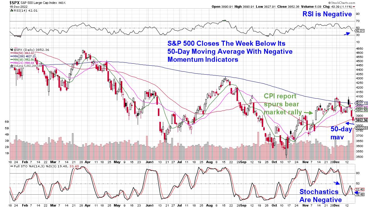
The markets will have some work to do this year for this trend to hold true, however, as the S&P 500 is down 5.6% over the first two weeks of December. In fact, last week's drubbing pushed the S&P 500 below its key 50-day moving average, with both the RSI and Stochastics now in negative territory. This price action put a halt to the bear market rally that began on November 10th, after a positive CPI report showed much lower inflation than expected.
DAILY CHART OF S&P 500 INDEX
Investors have been selling stocks recently due to fears of a recession, driven by the Federal Reserve's intent to keep interest rates high well into next year, in an effort to get inflation levels closer to their 2% target. Just last week, the Fed lowered their forecast for growth in the U.S. next year to 0.5%, and they see the jobless rate rising to 4.6% by year end.
This fear of a recession among investors has pushed stocks into an oversold position in the near term, and we may see a bounce next week. Keep in mind, however, that any bounce is expected to be short-lived, as the overall bear market trend remains in place.
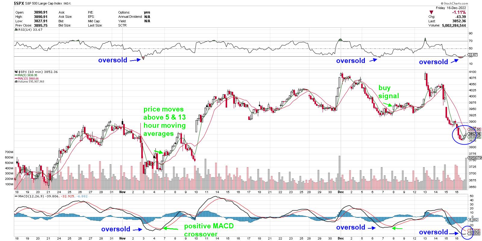
Below is a shorter-term, 1-hour chart of the S&P 500 that highlights the RSI below 30 and the MACD below zero during periods of an oversold condition in November, as well as earlier this month. In order to expect any rally, the Index would need to trade back above its 5- and 13-hour moving averages, with the MACD experiencing a bullish crossover of its black line moving up through the red line.
INTRADAY, 1-HOUR CHART OF S&P 500 INDEX
While this shorter-term timeframe of investing is not for everyone, quick profits can be made if the correct area of the markets are in focus and then, from there, top candidates are chosen. For my work, I've been favoring Healthcare stocks longer-term, as they have a defensive bias with select areas faring well amid prospects for increased earnings growth.
These same stocks stand to fare well in a shorter-term rally period as well, and if you'd like immediate access to my Suggested Holdings List, you can use this link here and access my most recent MEM Edge Report at a nominal cost. The MEM Edge Report will also keep you on top of the rotation that's taking place away from areas of the market that fare poorly in the face of a possible recession. Be sure and use the link above so you can exit positions that are at the most risk while also being alerted to shifts in the broader market.
Warmly,
Mary Ellen McGonagle, MEM Investment Research
|
| READ ONLINE → |
|
|
|
| DecisionPoint |
| Two Index ETFs with Rising Momentum |
| by Erin Swenlin |
We were somewhat surprised today when we reviewed the index ETFs. Two ETFs actually show rising momentum. Don't get too excited, there are problems on both of their charts. For comparison, SP500 (SPY), Dow (DIA), Nasdaq 100 (QQQ), SP100 (OEX) and Nasdaq (COMPQ) all have negative momentum and are on SELL signals. Those are just a few, I'm sure we could dig up others.
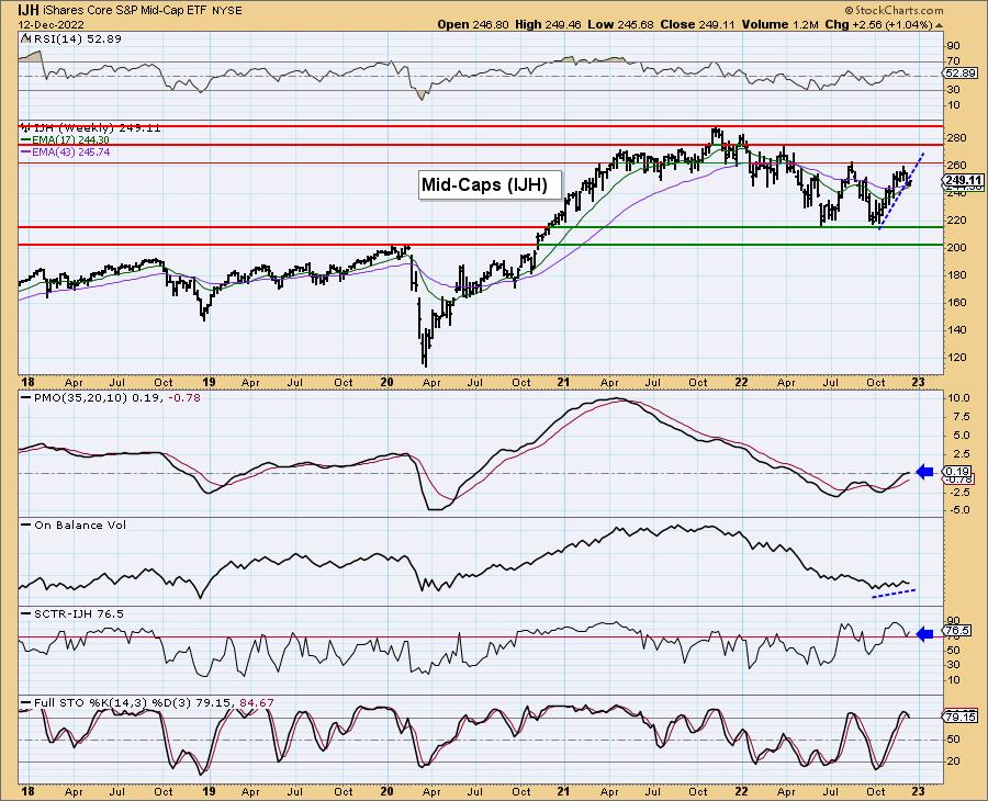
First is the SP400 (IJH). Notice that not only is the Price Momentum Oscillator (PMO) rising, it just hurdled the zero line. The RSI turned up on today's rally, keeping it in positive territory and the OBV is rising with price. Additionally, the StockCharts Technical Rank (SCTR) is above 70 or in the "hot zone". The "hot zone" is territory above 70%. That indicates that based on trend and condition in the intermediate and long terms, a stock or ETF is in the top 1/3rd of its universe. In this case, the universe is ETFs.
Two problems here: 1) Stochastics have topped and moved below 80 and 2) The short-term rising trend has been broken and even with today's rally, not recaptured.
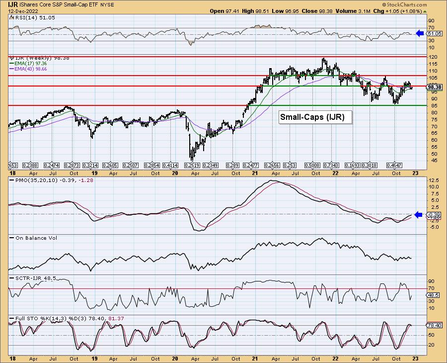
Second is the SP600 (IJR). The PMO is decelerating, but still rising toward the zero line. The RSI remained positive with today's rally. Unfortunately, like IJH, Stochastics have topped and are below 80 and the short-term rising trend as well as horizontal support have been broken and not recaptured. IJR also has the issue of a SCTR that is well below the "hot zone" above 70%.
While it may appear that small- and mid-caps are a great place to be, looking at the Russell 2000 (IWM), this is not the case. When you add all of the other "cats and dogs" that are in IWM, the picture is not so bright. There is a rounded top, the RSI is negative, the PMO is on a SELL signal and declining. Stochastics have turned up in oversold territory, but it is way too early to trust them. The relative strength line tells the story of IWM and gives us a pretty good idea where it is headed.
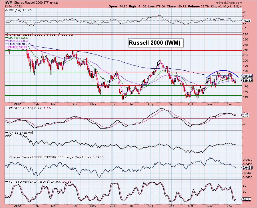
Conclusion: While IJH and IJR look somewhat bullish, IWM is a disaster. A rising tide may lift all boats, but we don't see IJH and IJR leading that charge.
Watch the latest episode of DecisionPoint on StockCharts TV's YouTube channel here!
Don't miss our Super Secret Sale! Prices Go Up in January!
We've decided to keep our "Super Secret Sale" running for a few days longer. It is ONLY for those who follow DecisionPoint.com blogs, shows and free email list subscribers (sign up on our homepage!). Subscribe HERE!
Buy one month and get your second free until December 15th!
Our prices will be going up substantially in January, but you can lock in our current low rates by subscribing now! Our Bundle is $68/mo, it will be going up to $119/mo! Current subscribers have locked in their low rates, time for you to lock in those rates! Subscribe HERE!
Technical Analysis is a windsock, not a crystal ball. --Carl Swenlin
(c) Copyright 2022 DecisionPoint.com
Helpful DecisionPoint Links:
DecisionPoint Alert Chart List
DecisionPoint Golden Cross/Silver Cross Index Chart List
DecisionPoint Sector Chart List
DecisionPoint Chart Gallery
Trend Models
Price Momentum Oscillator (PMO)
On Balance Volume
Swenlin Trading Oscillators (STO-B and STO-V)
ITBM and ITVM
SCTR Ranking
Bear Market Rules
DecisionPoint is not a registered investment advisor. Investment and trading decisions are solely your responsibility. DecisionPoint newsletters, blogs or website materials should NOT be interpreted as a recommendation or solicitation to buy or sell any security or to take any specific action.
|
| READ ONLINE → |
|
|
|
| StockCharts In Focus |
| Calling All StockCharts Members: Make Sure To Check This One Thing in Your Account |
| by Sarah Fung |
If you're an existing StockCharts member, you're probably familiar with some of the major features we offer—SharpCharts, StockChartsACP, and others. But do you know how to check the status of your account?
We make a conscious effort to make your account details accessible, but sometimes it's helpful to know where to find them. So, we highly encourage you to regularly check your account status so you can make sure we're serving you in the most effective way possible. We'll show you how!
To make sure your account is free of any unwanted errors, you'll start on the homepage and find your name in the top right of your screen. Click on your name and a dropdown menu will open. There's an option for "Your Account" (see below).
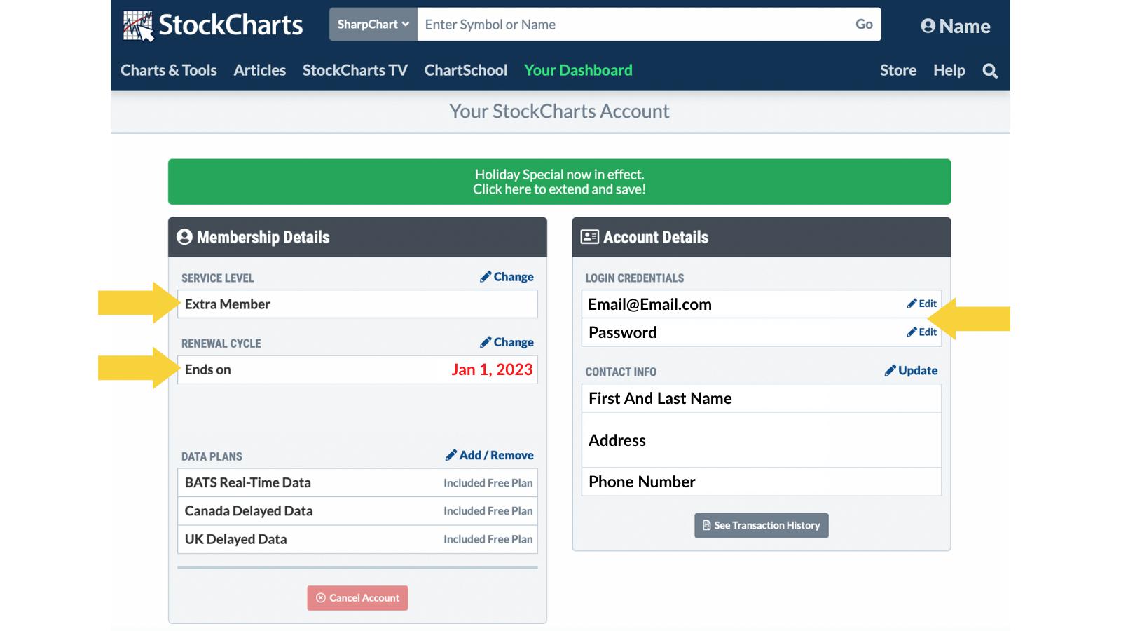
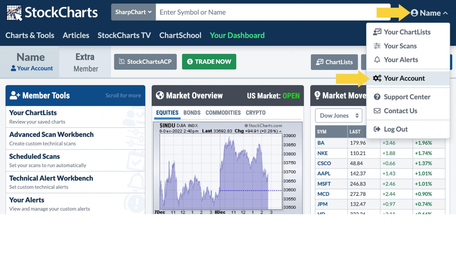 Once you select "Your Account", the details of your account will load. Here, you can check on your service level, login credentials, and expiration date. Once you select "Your Account", the details of your account will load. Here, you can check on your service level, login credentials, and expiration date.

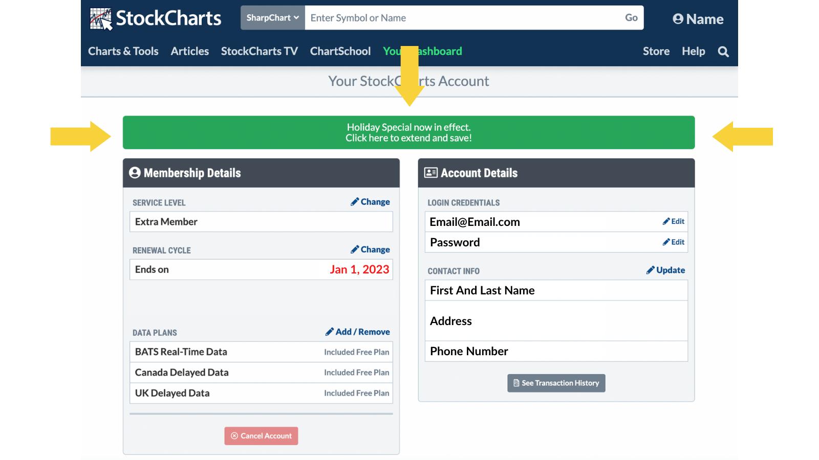
But did you catch the new button that appeared at the top of your membership? It's easy to miss!

Right now, we are running a limited-time deal where you could earn up to 3 months FREE!
Why is this important?
It has to do with your membership expiration date. While we're excited to offer you savings, our Holiday Special won't last long. That's why we are encouraging all members to double-check the expiration dates. If your membership expires within the next six months, right now is the **absolute best time to renew**. Simply click the green button on your accounts page, or click here to learn more.
Six months might sound like a while away, but you won't have another chance for savings like this. Does your membership expire within six months? If so, choose to extend now, and your future self will thank you later!
Talk soon,
StockCharts

|
| READ ONLINE → |
|
|
|
| MORE ARTICLES → |
|
 Chart 1
 Chart 2
 Chart 3


 The SPDR S&P 500 exchange-traded fund (SPY) surged from mid-October to early December, but this advance was considered a counter-trend bounce within a bigger downtrend. And this week, SPY reversed its short-term uptrend and the bearish technical setup was similar to the last two reversals.


 Once you select "Your Account", the details of your account will load. Here, you can check on your service level, login credentials, and expiration date.