| THIS WEEK'S ARTICLES |
| John Murphy's Market Message |
| INTEREST RATES RISE ON INFLATION REPORTS |
| by John Murphy |
TEN-YEAR YIELD TESTS 3.90%... Bond yields climbed this week on two reports showing that inflation gained during January. Chart 1 shows the 10-Year Treasury yield testing some resistance at 3.90% formed at the end of December. A close above that level would put the TNX at the highest level in three months. The 2-Year yield which is more sensitive to expected Fed hikes has already reached the highest level since November. That combination of rising rates caused more profit-taking in stocks. No trend changes, however, have taken place.
 Chart 1 Chart 1
S&P 500 TESTS 50% RETRACEMENT LINE... Last week's message showed Russell 2000 iShares which track small cap stocks backing off from resistance at its August peak. The S&P 500 hasn't reached its August high but is testing another resistance line. Chart 2 applies Fibonacci lines to the S&P 500 measured from last January's high to its October low. And it shows the SPX meeting resistance at its 50% retracement line (middle line). That's a normal spot to expect some profit-taking. The SPX, however, remains above its moving average lines which keeps its 2023 uptrend intact. Despite this week's uptick in CPI and PPI inflation, commodity prices remain on the defensive.
 Chart 2 Chart 2
COMMODITY PRICES DROP... We normally look to commodity prices to help determine the path of inflation. Chart 3 shows the S&P GSCI Commodity Index dropping this week and nearing a possible test of its recent lows. No signs of inflation there. What's interesting is that commodity prices and bond yields often trend in the same direction. That's because higher commodity prices usually signal higher inflation. Their different direction was highlighted this week with bond yields rising with falling commodities. In fact, they've been trending in opposite directions for most of the last year. It remains to be seen which one is right about the path of inflation.
 Chart 3 Chart 3
LONGER TERM VIEW... The monthly bars in Chart 4 shows bond yields and commodity prices trending in the same direction of most of the last ten years. After falling together during 2019, they bottomed together during 2020 and rose together during 2021. In fact, it was the sharp rise in commodity prices that warned of rising inflation pressures which helped push bond yields higher. To the upper right, however, commodity prices dropped for most of the last year while bond yields gained. While falling commodity prices may be signaling that inflation prices are easing, that could also be a sign that the economy is weakening. Commodity prices normally weaken along with the economy during a recession.
 Chart 4 Chart 4
ENERGY SPDR FALLS WITH COMMODITY... Speaking of weaker commodities, crude oil lost -3% of its value this past week which helped make energy shares the week's worst sector. Chart 5 shows the Energy Sector SPDR (XLE) falling to the lowest level in six weeks. Last week's message suggested that the XLE might be forming a potential "triangular" formation as shown by the converging trendlines. This week's lower price action, however, is testing that view. The Dollar Index rose to a six-week high this week which may also be putting downside pressure on commodity prices.
 Chart 5 Chart 5
|
| READ ONLINE → |
|
|
|
| The Mindful Investor |
| The Bullish Case for Gold |
| by David Keller |
People absolutely love to not love gold. When I post bullish gold comments on social media, I am guaranteed to get some not-so-constructive pushback on an optimistic thesis.
Why do people love to hate the gold trade? Well, for starters, it hasn't worked in a long time. But that all may be changing in 2023.
The Long-Term Struggles of the Yellow Metal
Investors have a great long-term memory of painful investment experiences. And the fact that gold performed so abysmally from 2011-2018 certainly didn't win over any investors looking for long-term gains.

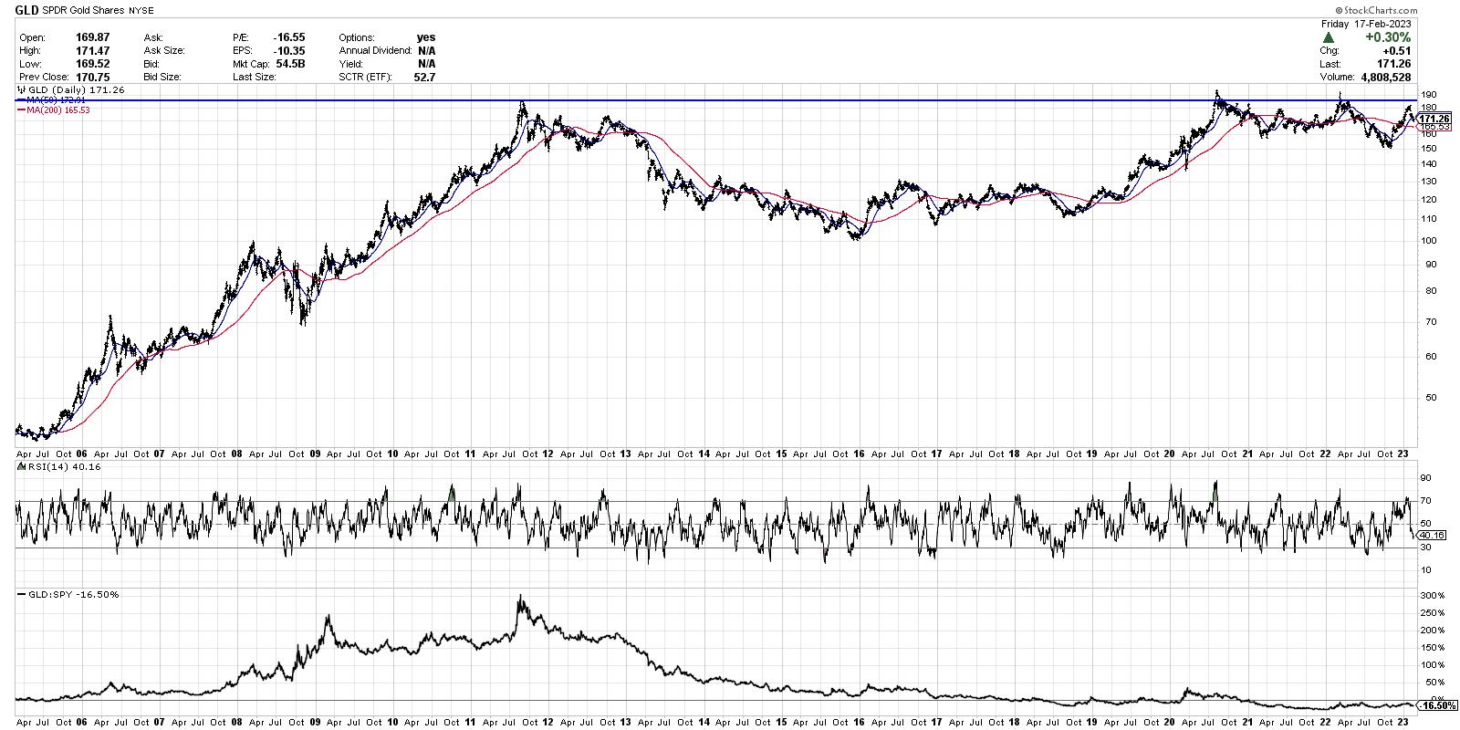
Here, we're looking at the gold ETF which shows a peak in 2011 around $185. Note how gold struggled through the mid-2010s, as the S&P 500 and Nasdaq were basically in the middle innings of a cyclical bull market phase.
At the bottom of the chart, we have the relative performance of GLD versus SPY. By owning gold during this period, you were basically guaranteed to underperform, because you were allocated away from top-performing stocks and ETFs.
But From the Ashes Emerges Strength
Gold actually did fairly well in 2018-2019, with the GLD outperforming the S&P 500 index coming out of the 2018 lows. While gold held up pretty well during the early days of the COVID era, stocks outperformed the yellow metal through the course of 2020 and 2021.
Are you ready for a deep dive into breadth indicators? In our latest FREE webcast on Tuesday February 21, we'll show you how they're constructed, how they generate buy and sell signals, and what they're telling us about the current markets. Sign up HERE for this free event, Five Favorite Breadth Indicators!
The GLD ended up testing resistance around $185 in 2020 and again in early 2022, further solidifying the importance of this upside price objective. This coincides with about $2000/oz on the chart of spot gold. How bullish do we want to be on gold if it can't get above resistance?
But do you notice the cup-and-handle pattern that has played out over the last 10-11 years? That's where you have a long rounded bottoming pattern, a retest of the resistance level forming the right side of the cup, and finally a shallower pullback to create the handle.
This emerging pattern suggests a long-term base with strong upside potential, but if and only if the price can break above and follow-through beyond this resistance level. If that were to occur, the height of the pattern suggests an upside target around $344, which would equate to around $3700/oz for spot gold.
Connecting the Short-Term to the Long-Term
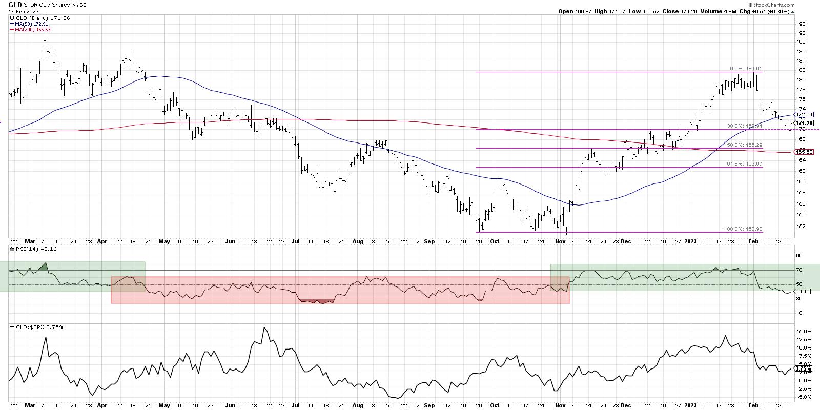
Now let's review what's happened so far in 2023. Gold spent most of 2022 in a bearish momentum phase, with the RSI ranging from oversold on downswings to only 60 on upswings. This is classic behavior for a downtrend phase. But something changed in the fourth quarter, just as we saw for equities.

In November, the GLD broke to a new swing high and the RSI finally pushed above 60 to reach the overbought level around 70. This influx of positive momentum suggested a "change of character," or a rotation from distribution to accumulation phase.
After testing $182 at the end of January, the GLD has now pulled back to retrace about 38.2% of the way back down to the October 2022 low. While gold did break below its 50-day moving average (which is less than ideal), I'm encouraged by the fact that the price has so far held the first Fibonacci retracement level, with the RSI remaining just above 40.
In the short-term, if you assume downside risk to the 200-day moving average around 165.50, that would mean about a 2.5 to 1 risk/reward if you expect a retest of the January peak.
Given the uncertainty in the equity markets, the big unknown in terms of the schedule of Fed rate hikes, and the weakness in growth names this week, perhaps gold deserves a second look as a hedge against further downside for stocks.
Did you miss my latest YouTube video analyzing a chart like NVDA to identify potential entry points? I got you covered.
RR#6,
Dave
P.S. Ready to upgrade your investment process? Check out my free behavioral investing course!
David Keller, CMT
Chief Market Strategist
StockCharts.com
Disclaimer: This blog is for educational purposes only and should not be construed as financial advice. The ideas and strategies should never be used without first assessing your own personal and financial situation, or without consulting a financial professional.
The author does not have a position in mentioned securities at the time of publication. Any opinions expressed herein are solely those of the author and do not in any way represent the views or opinions of any other person or entity.
|
| READ ONLINE → |
|
|
|
| Martin Pring's Market Roundup |
| Trying to Unravel the Enigma of the US Dollar |
| by Martin Pring |
The US Dollar Index ($USD) has taken a hit in the last few months, causing many commentators to cry "bear market." However, an examination of the long-term indicators doesn't indicate a consensus pointing in a southerly direction. Neither is there unanimity that the recent setback represents a counter-cyclical correction in an ongoing bull market.
The Very Long View
The US Dollar Index chart (see Chart 1) plots $USD on a quarterly basis, together with its nine-quarter moving average (MA). It also displays the Coppock Curve. Currently, this oscillator is above its MA, and $USD itself is trading north of its 36-quarter (nine-year) MA. Even though these are not the world's timeliest indicators, they place $USD in a positive very long-term trend. If you look carefully at the action since the low in 2008, you will also see that $USD has succeeded in tracing out a series of rising peaks and troughs. That pattern remains intact. Finally, $USD has decisively ruptured its secular down trendline, featured in Chart 2.
 Chart 1 Chart 1
The Long View
That same monthly chart also displays the long-term KST and 12-month MA for $USD. The pink shadings display when both series were below their MAs for an extended period. The KST is overstretched but remains bullishly above its average. However, it has begun to stabilize, as a likely prelude to a decline and negative MA crossover. Finally, $USD itself has dropped below its 12-month MA, which is never a healthy sign.
 Chart 2 Chart 2
Chart 3 compares the Index to a PPO incorporating the six- and 15-month parameters. This time, the green-shaded areas reflect periods when the oscillator is bullish. That's when the shorter-term exponential MA is above its longer-term counterpart, i.e. when the indicator is above zero. Right now, this technique is in a positive mode, but the oscillator is falling sharply toward the equilibrium point. Based on its current trajectory, a negative crossover is likely to develop within 90 days.
 Chart 3 Chart 3
Chart 4 offers a more pessimistic view since $USD is below its 200-day MA. In addition, the Special K (SPK) is below its signal line. The pink shadings flag previous instances when both series have been negatively positioned against their moving averages for an extended period. The violations of two bull market trendlines add to the chart's negative vibes.
 Chart 4 Chart 4
It's also possible that the 2022 decline represents the first down leg of what may turn out to be a multi-year trading range. That outcome would fit in with the positive longer-term outlook provided by Chart 1 and the violation of the secular down trendline in Chart 2. The floor would likely be the recent low and the horizontal trendline in Chart 4.
The Intermediate View
It seems likely an intermediate rally began in mid-January. First, the weekly stochastic oscillator, using the 12, 15, and 10 parameters, is almost as deeply oversold as it can get. Sometimes, as you can see from the dashed green arrows, a positive divergence is required to reverse the trend. However, when $USD recently fell into its oversold zone, it also reached a major support level, as indicated in Charts 4 and 5 by the horizontal green lines. An oversold market touching major support is usually followed by a bounce.
 Chart 5 Chart 5
Finally, Chart 6 monitors daily activity through my Dollar Diffusion indicator. This series calculates the number of cross rates in a positive trend and is currently in a deeply oversold condition. The solid arrows flag valid upside oversold reversals; the dashed ones flag failed rallies and false positives. It's obviously not perfect, but, in most situations, it signals the end of a decline reasonably accurately. Its current overstretched condition, in conjunction with support at the green line and 400-day MA, suggests a worthwhile retracement rally of some kind is in the cards.
 Chart 6 Chart 6
Where to for the Dollar
The long-term indicators are mixed, but not that far from a consensus bear market signal. On the other hand, the US Dollar Index has reached support at a time when it's deeply oversold. That means, if it's in a bear market, we're not likely to find out until the current intermediate oversold condition has been relieved. Prices trend up, and prices trend down, but, occasionally, things are resolved with a multi-month or multi-year trading range. Such a frustrating outlook may well turn out to be a reality for the balance of the year.
Good luck and good charting,
Martin J. Pring
The views expressed in this article are those of the author and do not necessarily reflect the position or opinion of Pring Turner Capital Group of Walnut Creek or its affiliates.
|
| READ ONLINE → |
|
|
|
|
|
| Art's Charts |
| Year of the Big Swing and Month of the Small Flag |
| by Arthur Hill |
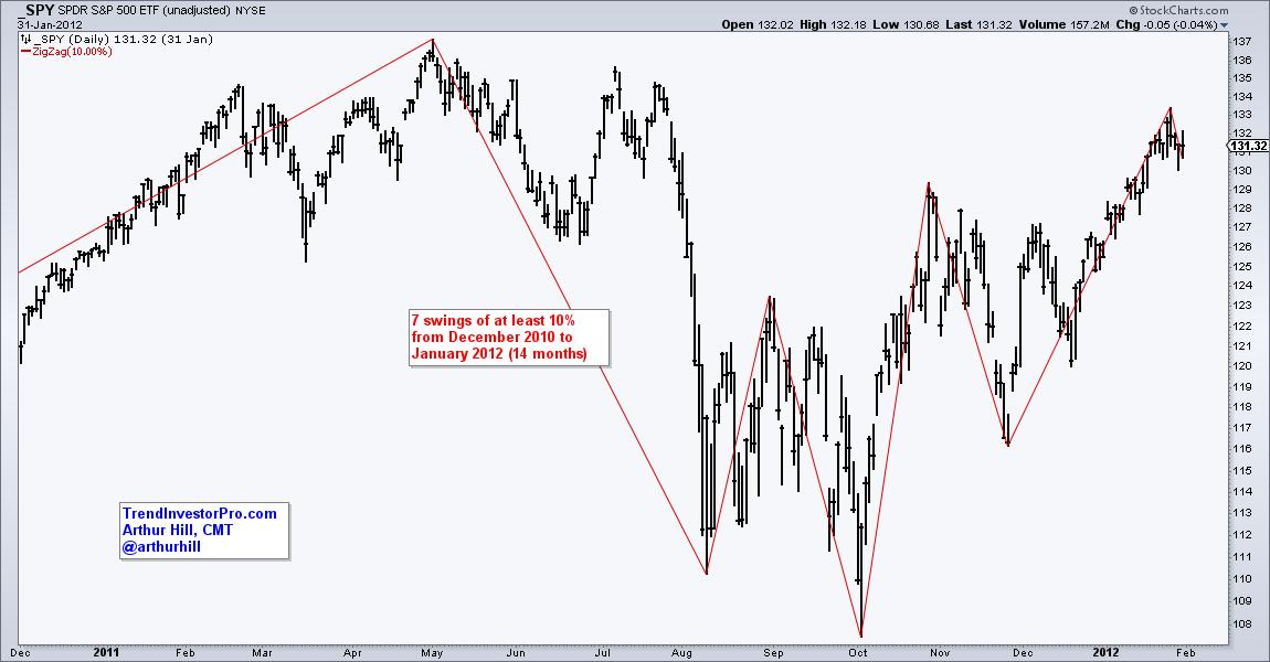
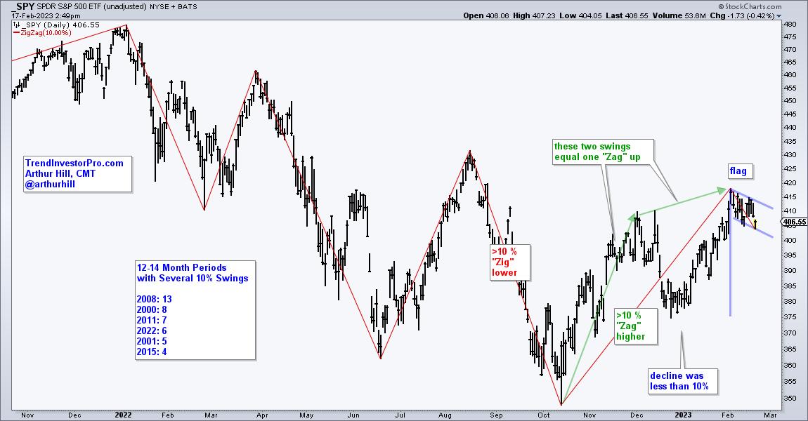
The S&P 500 SPDR (SPY) is a period of big swings and above average volatility. There were six swings of at least 10% from late January to early February 2023. Looking at other 12-14 month periods, this is the fourth most in the last 23 years. There were 13 in 2008, 8 in 2000 and 6 in 2011. 2008 marked the Global Financial Crisis, while 2000-2001 marked a bear market. 2011 was a chaotic period when the European Sovereign Debt crisis rocked the markets. Note that I am not using exact calendar years. I added a month or two of padding to show the general idea.

The chart below shows the swings from January 2022 to February 2023. Most recently, there was a 10% upswing from mid October to mid December and then an 8.8% downswing. This decline does not count as a 10% swing so the Zigzag did not draw a line down. This means the October to February swing is one big "zag" higher.

So what does this mean? It means that volatility is above average, which increases the chances of a reversal and another big swing. SPY broke above its December high and has an uptrend working since October (higher low and higher high). Volatility remains a concern going forward and a short-term reversal at this point could lead to another sizable downswing. Friday's report at TrendInvestor set the key levels to watch and two indicators for long-term signals. Short-term, SPY a falling flag is taking shape and a breakout at 415 would be bullish.
TrendInvestorPro is currently working with three quantified strategies for trading ETFs. We have a Bull-Bear Strategy trading the All Weather List, a Trend-Momentum Strategy Trading stock-related ETFs and a Mean-Reversion Strategy. Each strategy has a detailed article and signal tables are updated daily. Click here to learn more.
The Trend Composite, Momentum Composite, ATR Trailing Stop and eight other indicators are part of the TrendInvestorPro Indicator Edge Plugin for StockCharts ACP. Click here to learn more and take your analysis process to the next level.
---------------------------------------
|
| READ ONLINE → |
|
|
|
| The Canadian Technician |
| This Bull Market Should Be Doing What? |
| by Greg Schnell |
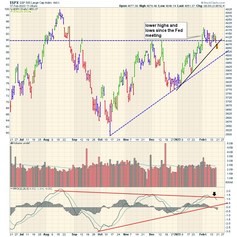
Every bull market always has something that is missing. The market starts in a narrow group of industries, then broadens out. Since October, the market has been rallying, and February has seen a sideways trend develop.

One of the big opportunities we are facing as a society is the rate of change moving from fossil fuels to electric. I continue to expect an oil supply short fall to be a problem, as old fields expire and new exploration is not being pursued. Marginal production from reservoirs like the Bakken and Permian are topping out at this price level.
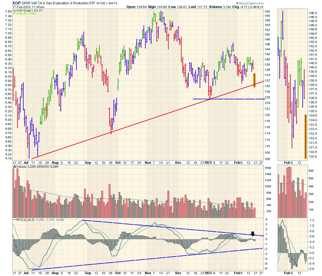
The chart of the exploration and production ETF is testing the uptrend line to end the week on options expiration day. Is there enough oil and gas demand to get this trend of lower highs since November to reverse? The larger picture shows declining volume, suggesting investors are focused elsewhere for more gains.

The PPO has rolled over at zero and is in negative territory again. The PPO wave in January barely made it into positive territory. So far, the chart looks concerning. Do we buy it on the test of the uptrend, or is the economy weakening under the surface, limiting demand and upside for the liquid energy industry group?
Globally, we are seeing demand come off, with inventory builds starting to show up. Analysis groups like the IEA are predicting increased demand. In my opinion, it is very odd to see the oil charts come off, especially with a tight supply backdrop, if the economy is as strong as we are seeing by labor and spending.
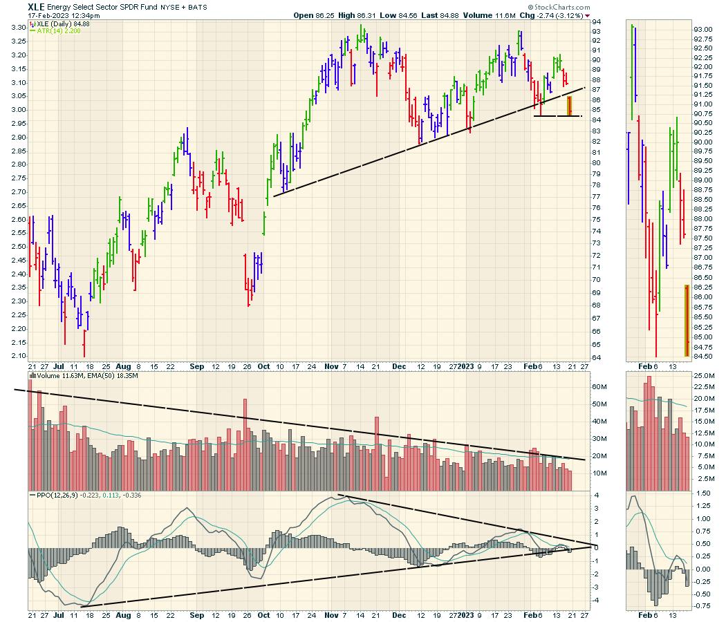
When we broaden out a little to the rest of the XLE, it's a similar look, but testing the recent low. The uptrend seems clearly broken on this chart. The PPO is rolling over at zero, suggesting more weakness ahead. Volume is declining. The PPO trend is being threatened right at the zero level.

For me, I keep wondering, "Why isn't energy part of the rally?" That will continue to bother me. Oil is the world's largest economic indicator, so it needs to revert higher soon if this bull market is going to continue. If it doesn't, does that mean the Fed is starting to succeed at slowing the economy? Good questions that we'll know the answer to shortly.
The Nasdaq 100 and the S&P 500 are both closing near three-week lows on the weekly chart. Stay tuned to see if the economy is weakening as oil suggests.
|
| READ ONLINE → |
|
|
|
| The MEM Edge |
| Here's How to Build Your Watch List for the End of Q4 Earnings |
| by Mary Ellen McGonagle |
Earnings season is close to ending, as over 80% of companies in the S&P 500 have reported their 4th quarter results already. The largest percent gainers among stocks over the past four weeks have been those that reported strong earnings or where management guided growth estimates higher going forward. With this all in mind, savvy investors should be putting a watch list together to take advantage of the potential outperformance among companies that have yet to report.
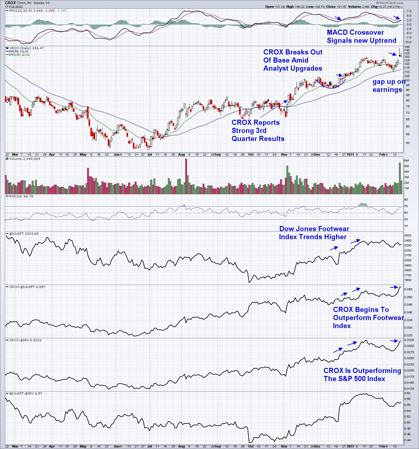
An example of one such outperformer is Crocs (CROX), which gained 14% last week after a rally into earnings that was capped by a 4.5% gap up after reporting results that were above estimates. Subscribers to my MEM Edge Report were alerted to CROX last December after it broke out of a 3-week base amid analyst upgrades.
DAILY CHART OF CROCS INC. (CROX)

Analyst upgrades going into earnings is one item to watch out for as you put together your watchlist. This is because Wall Street researchers often have access to more detailed information relative to individual investors, and they're unlikely to put their neck on the line with an upgrade that's not well researched. You can stay on top of upgrades and downgrades to estimates with services such as MarketWatch.
Tuning into the strength of a stock's industry group is another way to uncover candidates for your watch list. You'll want your company to be in an area where other stocks are trending higher as well, as, most likely, there's growth taking place across the industry. This industry group strength can easily be uncovered using StockCharts.com's SCTR rating under the Sector Summary sub Industry Group list.
In addition, your best watchlist candidates will be top performers within their group, as their winning ways will often continue after they report positive results. Again, the SCTR rating of stocks within an industry group is an ideal way to uncover the relative outperformers with the best-looking charts.
From here, you'll want to pay attention to the stocks earnings releases from the past as, statistically, a company that has a history of reporting results above estimates will continue to do so. This was true of CROX, shown above.
DAILY CHART OF S&P RETAIL ETF (XRT)

Over the next several weeks, many retailers will be revealing their quarterly earnings and sales results, as they are the last area to report. The good news is Retail Sales surged in January, which will improve the possibility of a positive outlook for growth going forward. A close look at Wednesday's Retail Sales shows that food service led all major categories after increasing by 7.2%.
Next week, one of the eleven stocks on the Suggested Holdings List of my MEM Edge Report is due to report their earnings. Not only is it in the Restaurant group, where the largest surge in retail sales occurred, but it is the top relative performer amid analyst upgrades. You can get immediate access to this stock by using this link here. You'll also receive 4 weeks of this highly-regarded, twice-weekly report delivered directly to your email going forward.
While not mentioned above, the status of the broader markets is one of the most important aspects to determine if you should get involved with a stock. The MEM Edge Report provides a detailed outlook of the markets as well. I hope you'll join the many pleased subscribers to this report so that you, too, can invest successfully and with confidence.
Warmly,
Mary Ellen McGonagle, MEM Investment Research
|
| READ ONLINE → |
|
|
|
| DecisionPoint |
| It's Hard to Fight This Current |
| by Carl Swenlin |
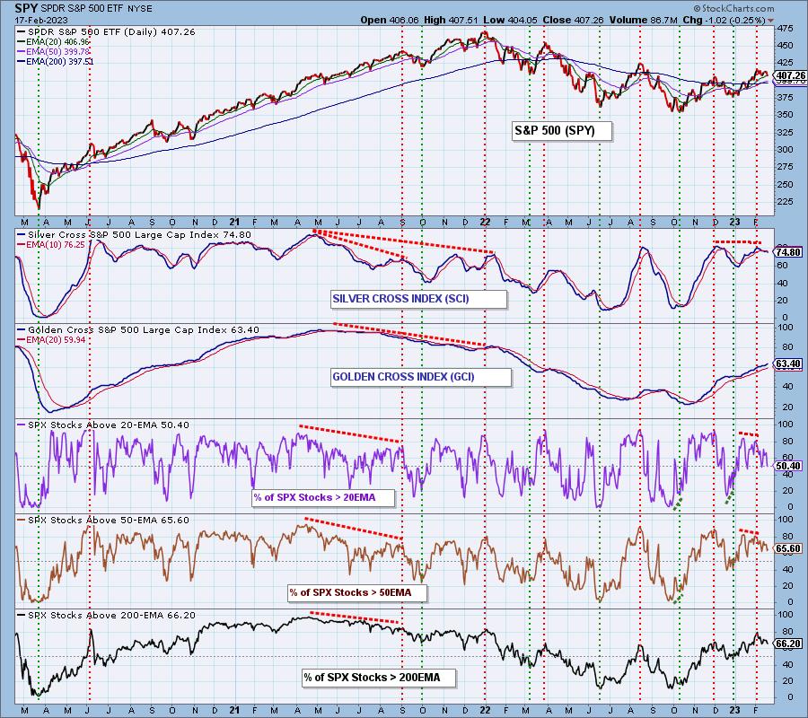
The market is currently topping because the Silver Cross Index (SCI), which expresses intermediate-term participation, is overbought and topping. A Silver Cross is when the 20-EMA of a price index crosses up through the 50-EMA. The Silver Cross Index shows the percentage of stocks in a market or sector index that have a made a Silver Cross. The SCI currently has a reading of 75 percent, having fallen from a top of about 80.
On the chart below, we also have the source indicators for the Silver Cross Index. The Percent Stocks Above 20-EMA reads 50 percent, and the Percent Stocks Above 50-EMA reads 66 percent. If this configuration is maintained, the SCI will necessarily fall to about 66. Such a drop in participation will likely have a negative effect on price.

The Golden Cross Index (GCI) tracks the percentage of stocks in the index with a Golden Cross, which is when the 50-EMA crosses up through the 200-EMA. This is an expression of long-term participation. Currently, the source indicators show the Percent Stocks Above 50-EMA at 66 percent, and the Percent Stocks Above 200-EMA at 66 percent. If this configuration is maintained, the GCI has no upside potential.
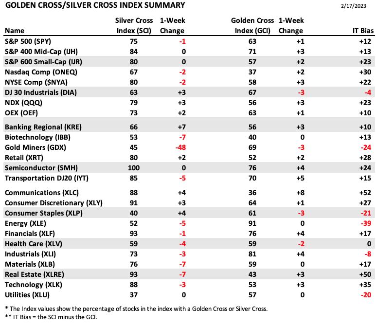
DecisionPoint tracks the Silver Cross and Golden Cross Indexes for 25 market indexes, sectors, and industry groups, and we publish this table in the DecisionPoint ALERT weekly.

CONCLUSION: Deterioration of participation (the SCI) is likely to cause further price decay in the intermediate-term, which will likely see stalled long-term participation (the GCI) begin to decline as well.
Watch the latest episode of DecisionPoint on StockCharts TV's YouTube channel here!

Technical Analysis is a windsock, not a crystal ball. --Carl Swenlin
(c) Copyright 2023 DecisionPoint.com
Helpful DecisionPoint Links:
DecisionPoint Alert Chart List
DecisionPoint Golden Cross/Silver Cross Index Chart List
DecisionPoint Sector Chart List
DecisionPoint Chart Gallery
Trend Models
Price Momentum Oscillator (PMO)
On Balance Volume
Swenlin Trading Oscillators (STO-B and STO-V)
ITBM and ITVM
SCTR Ranking
Bear Market Rules
DecisionPoint is not a registered investment advisor. Investment and trading decisions are solely your responsibility. DecisionPoint newsletters, blogs or website materials should NOT be interpreted as a recommendation or solicitation to buy or sell any security or to take any specific action. Current
|
| READ ONLINE → |
|
|
|
| ChartWatchers |
| Four Charts To Keep Inflation at Bay |
| by Jayanthi Gopalakrishnan |

The US consumer price index (CPI) came in slightly higher than expected; the market's been pretty chill about it so far. But will that change?
Inflation may be eating into your bank account, but you can stop it from taking a chunk out of your portfolio returns. Since the last Fed interest rate decision, investors have been looking forward to a Fed pivot. But the big question is when's that likely to happen. Inflation in the US is still high, and, when that's the case, it's natural for investors to be hesitant about investing in the stock market. The Fed indicated in their last meeting that they'd likely be slowing the pace of rate hikes, but will inflation numbers support this idea?
Every Inflation Is Different
Two inflationary periods aren't alike. Some interesting data points rise to the surface when you take a deeper dive into the January CPI data. Even though inflation is trending lower, rent remains very high. Shelter prices were up the most in January. Food and gas prices were also high, as was natural gas ($NATGAS), although that may come down in February, given that nat gas prices went through a steep slide.

The upside—shelter costs have been declining. Rent has been coming down, and we've seen a little softening in housing demand, although not enough to warrant shelter prices coming down. Core services such as healthcare, personal care, and home services have also been pretty high. Then there's the job market, which continues to be tight. To give weight to some of these areas that are still seeing higher prices, the Fed gave importance to the buzzword "supercore inflation," a term we're likely to hear a lot of this year.
Inflation can be tricky to keep track of. It's got a lot of moving parts and unique circumstances. We'll leave the data digging and interpretation to the experts and focus on how to keep track of inflation at a high level so our portfolio returns don't erode.
Four Charts to Check for Inflation
The next scheduled Fed interest rate decision is on March 22. Till then, we'll get more economic data, which could change things if the data deviates widely from expectations, or the market could continue moving sideways until there's more certainty about inflation. To get a high-level view of inflation's impact on the stock markets, it's a good idea to set up your ChartLists or layouts that include a broad equity index such as the S&P 500 index, Treasury yields, the US dollar, and gold futures.
The S&P 500 Index
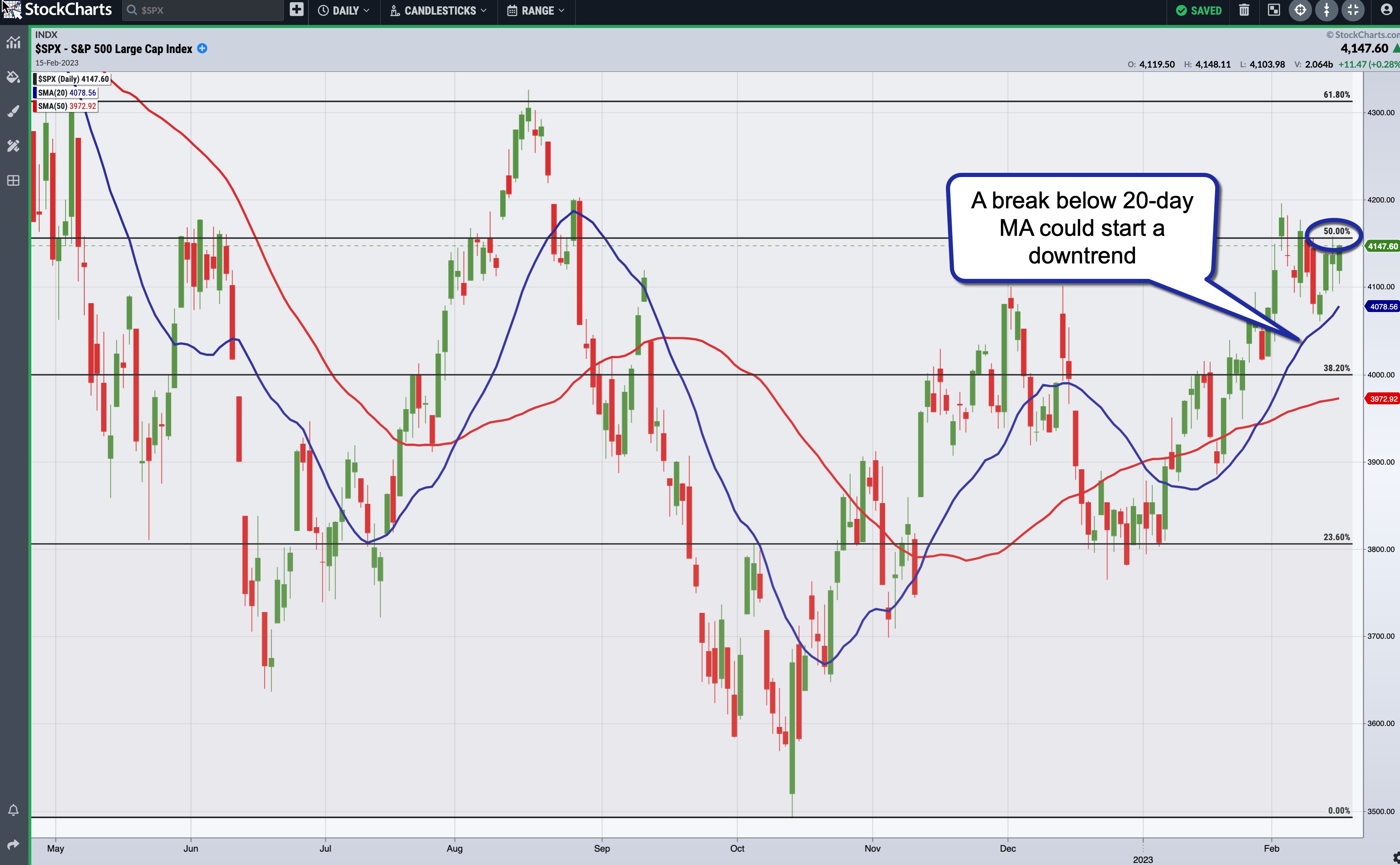
The S&P 500 index ($SPX) looks like it's hesitant to break above its 50% Fibonacci retracement level (from the January 4, 2022, high to the October 13, 2022 low). There's not much volatility, probably because traders and investors are waiting on the sidelines for some certainty. A break above the 50% retracement level could take the S&P 500 to its August high of around 4,300, but there's an equal chance the S&P 500 index could drop to around 4,000, or its 38.2% retracement level.

CHART 1: SUPPORT AND RESISTANCE LEVELS IN THE S&P 500 INDEX. A break above the 50% Fibonacci retracement level could take the S&P 500 index higher toward its August high.Chart source: StockChartsACP. For educational purposes only.
The 20-day simple moving average (SMA) is trending higher and is acting as a valid support level in the uptrend from mid-January. If the S&P 500 were to fall below its 20-day SMA, it could signal the start of a downtrend.
10-Year US Treasury Yield Index
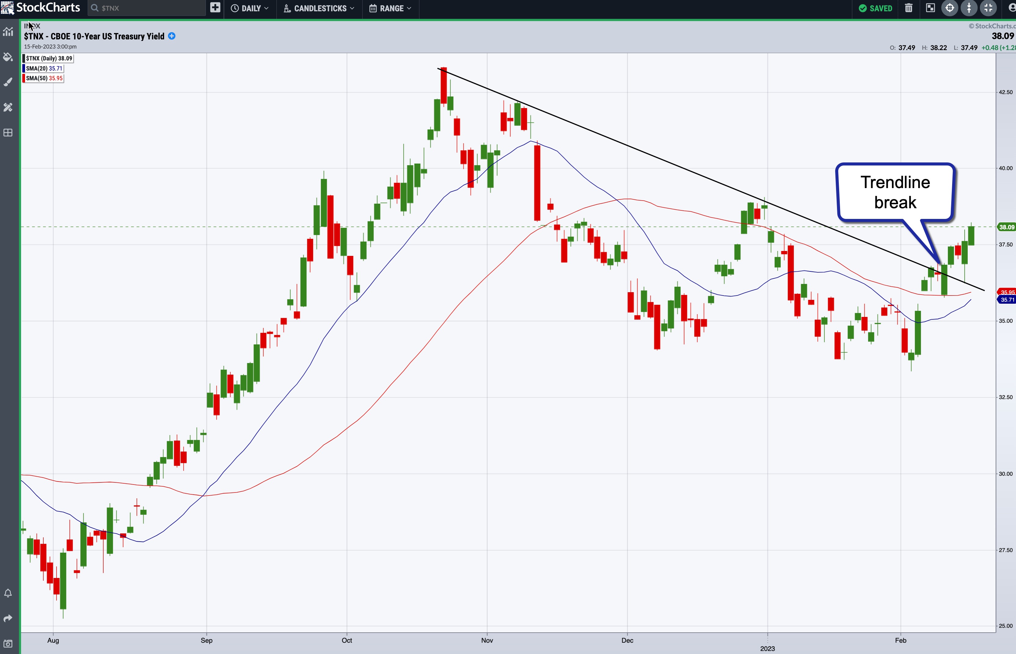
Like stock prices, bond prices are impacted by inflation. After trending lower since October 21, 2022, the 10-year US Treasury Yield index ($TNX) broke the downward trendline on February 10, 2023.

CHART 2: 10-YEAR TREASURY YIELD INDEX. The 10-year yields broke above a downward-sloping trendline and look to have started an uptrend, although that could change if there's certainty that interest rate rises will start tapering.Chart source: StockChartsACP. For educational purposes only.
Another point to note on the chart is that the 20-period moving average is getting close to crossing above the 50-day moving average. If the cross does take place, it could signal that yields may move higher. This could change in a snap if inflation numbers support a tapering or pivot in the future.
The US Dollar
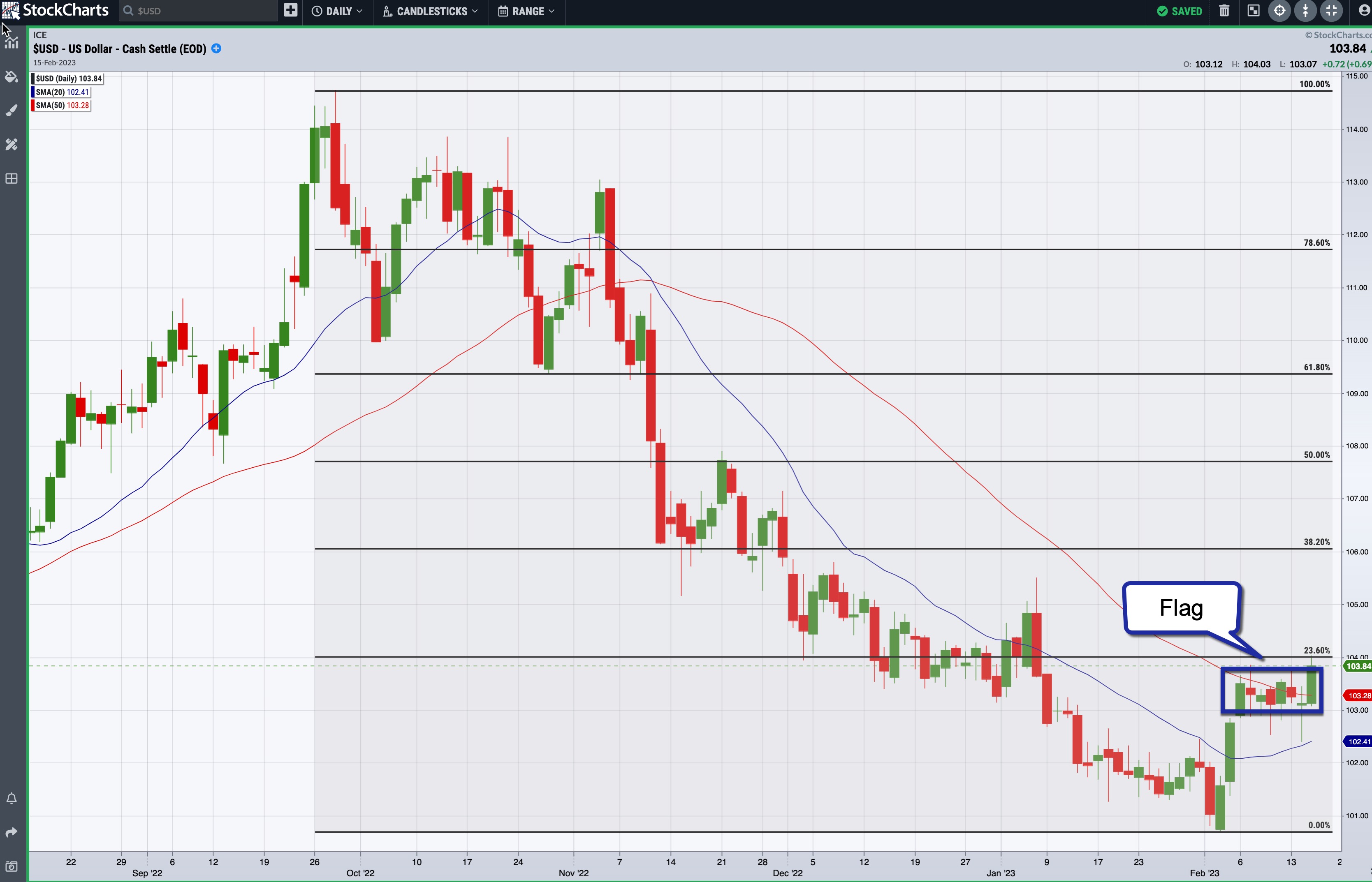
After the January CPI release, the dollar spiked, but pulled back relatively quickly. The dollar has been in a trading range since February 6 and is in the middle of a flag formation. Although there's still time before the next Fed meeting, it's worth keeping an eye on the top and bottom of the flag.

CHART 3: THE US DOLLAR. The dollar tends to be sensitive to inflation. A break above the flag formation could mean a rally in the dollar, but it could also go back down toward its February low.Chart source: StockChartsACP. For educational purposes only.
Using Fibonacci retracement levels from the September 28 high to the February 2 low shows that a break above the flag would take it to the 23.6% Fibonacci retracement level. That's not too far away from where the dollar is trading, so a break above the top of the flag could take the dollar to its next resistance level—the 38.2% level. And if it breaks below the flag, the US Dollar index could head back to its February low of 100.68.
Gold Futures
Gold is considered a risk-off asset. When stocks fall, investors often invest in risk-off assets, such as gold. In inflationary times, gold is considered a hedge.
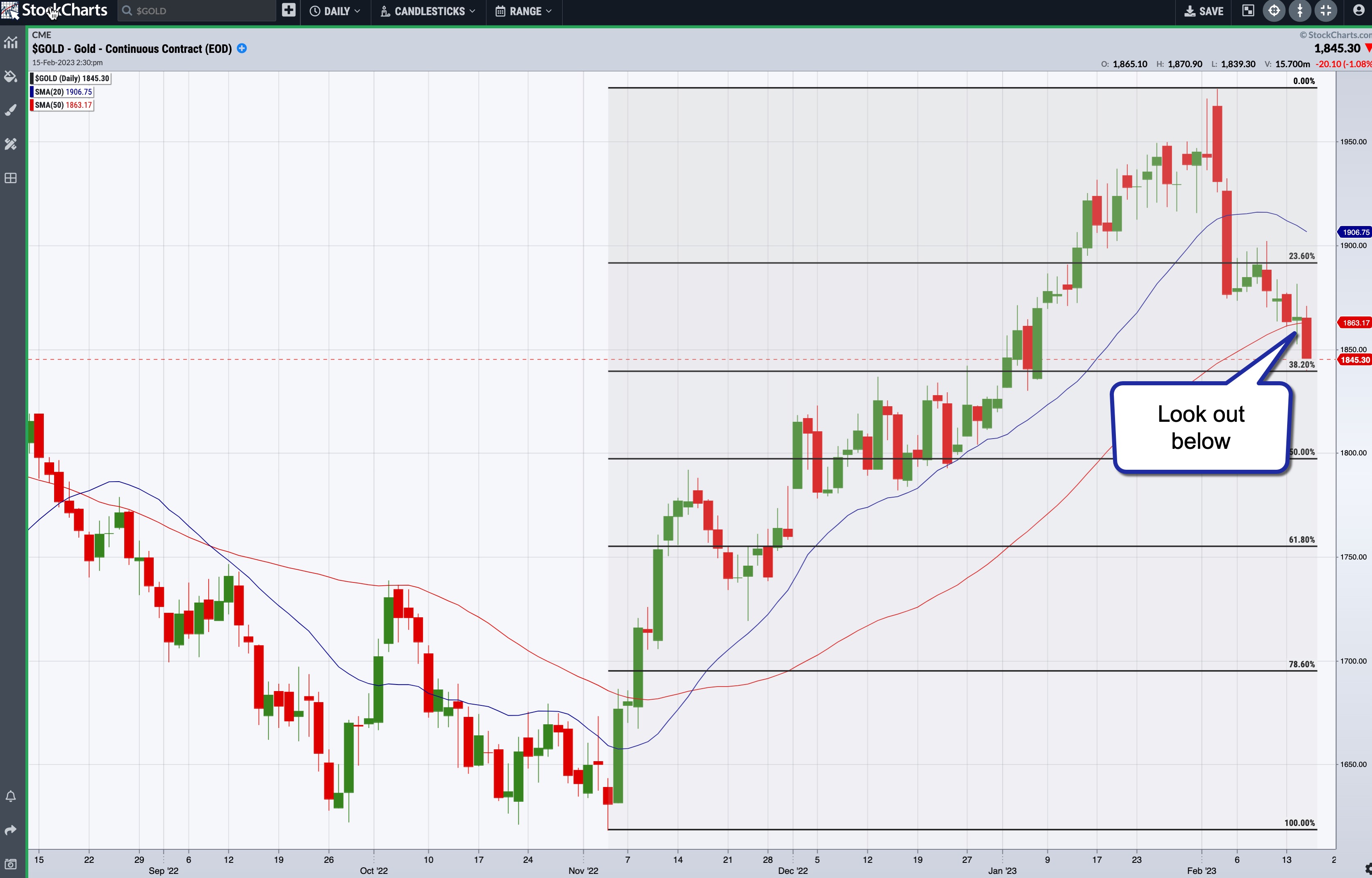
After reaching a high in early February, gold prices have seen a steep fall. Gold is now between its 23.65 and 38.2% Fib retracement levels and has fallen below its 50-day SMA. This increases the probability of gold falling even further. If it breaks below its 38.2% Fib retracement level, look for it to go to its 50% retracement level. But if inflation becomes a concern again, gold could move back up toward its February high.
 CHART 4: GOLD FUTURES BROKE BELOW 50-DAY MOVING AVERAGE. Gold prices could fall further if the inflation data support interest rate tapering.Chart source: StockChartsACP. For educational purposes only. CHART 4: GOLD FUTURES BROKE BELOW 50-DAY MOVING AVERAGE. Gold prices could fall further if the inflation data support interest rate tapering.Chart source: StockChartsACP. For educational purposes only.
Mixed Messages?
The S&P 500 index and the US dollar are at a critical juncture. 10-year yields are trending higher, although that could change quickly when inflation concerns ease. Gold prices seem to be moving to the downside, which is an indication that investors aren't rushing to risk-off assets.
The next piece of data to focus on is the January producer price index (PPI) data, and keeping these charts—S&P 500, 10-year yields, US dollar, and gold—on your radar will keep you in tune with the market's reaction to inflation data.
If you're a StockChartsACP user, have four charts displayed on one screen using the layout feature. On SharpCharts, save these charts in a ChartList and view them in any format that you prefer.
Disclaimer: This blog is for educational purposes only and should not be construed as financial advice. The ideas and strategies should never be used without first assessing your personal and financial situation, or without consulting a financial professional.
|
| READ ONLINE → |
|
|
|
| Don't Ignore This Chart! |
| Roblox Bounces Back: Is It Worth Buying? |
| by Karl Montevirgen |
Roblox (RBLX) may still be considered by some on Wall Street as a relative "noob," but the company's plans and ambitions are catching the attention of investors as its most recent Q4 22 earnings and guidance laid out a much clearer picture of its perceived arena.
Bricks Beyond the Game Space
In the past quarter of 2022, Roblox missed analyst expectations on earnings per share but beat consensus on revenue. The company reported 58.5 million daily users, a 19% increase of new "Robloxians" year-over-year.
But the most exciting thing is what it revealed about its playbook moving forward. During its quarterly analyst conference call, CEO Dave Baszucki emphasized the advantage of being able to focus on "one product, one platform." And with that singular platform, Roblox aims not only to expand its geographical and "age" reach, but beyond the gaming space toward education, concerts, and (general) communication. And with hardly any cash burn in 2022, the company sees acceleration as it heads into the first quarter of 2023.
The technicals appear to paint a similar picture.
The Technical Picture
In the last week, Roblox's StockCharts Technical Ranking (SCTR) score made a drastic jump from below 10 (Oof!) to 84.1, although it dropped a bit since then.

Chart source: StockCharts.com. For illustrative purposes only.
Let's take a look at the Roblox stock chart below. What do you see?

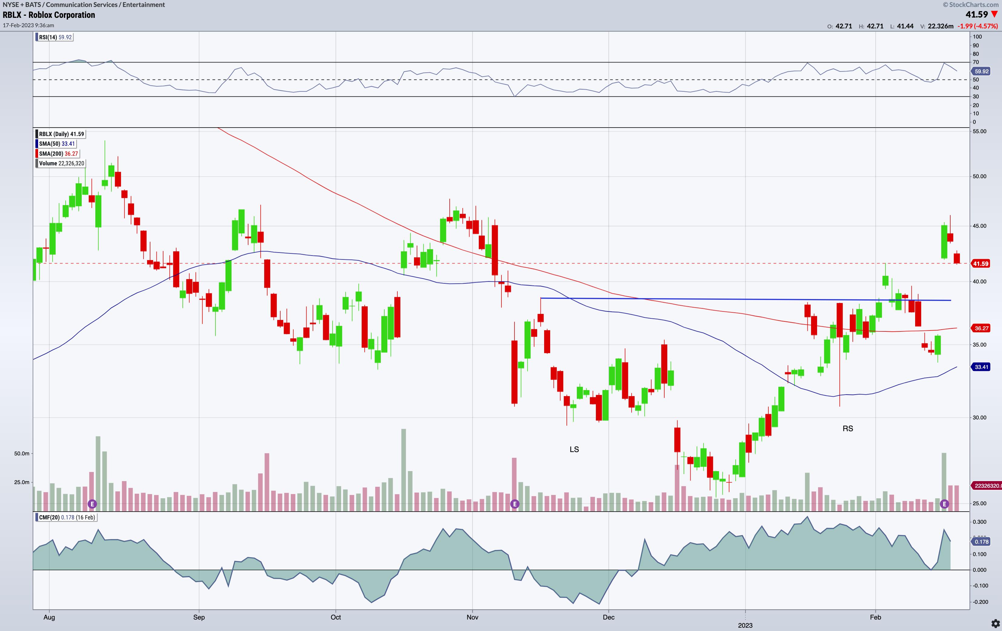
CHART 1: ROBLOX STOCK PRICE. A breakaway gap after earnings, a reverse head and shoulders pattern, and a potential Golden Cross are three things Roblox stock has going for it. Chart source: StockChartsACP. For illustrative purposes only.
A Breakaway Gap. RBLX jumped over 31% the day after earnings forming a breakaway gap above its 41.58 hurdle (resistance). If you're not familiar with this term. Breakaway gaps are pretty exciting events if only because it's fascinating to see an asset's price catapult itself beyond a level of congestion or trading range. But the congestion area, itself, is also pretty interesting, and that leads to the next point.
A Reverse Head & Shoulders. Take a look at November 21 - 30, December 23, and January 24. This should correspond respectively, to an LS, H, and an RS—in short, a reverse head and shoulders pattern. The neckline is a little messy but it also corresponds to the gap space, which often gets filled or retested.
Recovering from a Death Cross? RBLX experienced a Death Cross event on Valentine's Day 2022 (no love from Wall Street last year). The 50-day moving average (MA) is still below the 200-day MA. But with RBLX's newfound momentum, you might want to pay attention to see if a Golden Cross might be on the horizon.
Chaikin Money Flow. A great indicator for estimating buying/selling pressure, the Chaikin Money Flow indicator has been in the green (above the zero line) since early December. Though it threatened to get "pwned" (in Roblocian speak) toward negative space in the day before earnings, the indicator spiked following RBLX's jump in price. Note a slight divergence in price and money flow reading. Technically, the divergence gives us a warning signal that price is bound for a potential pullback. It's possible, especially considering the gap and the H&S neckline, but now you have to weigh this against the company's guidance, fundamentals, and market sentiment, which currently seems bullish.
Trading Roblox Stock
If you're looking to open a position in RBLX, note the technical conditions mentioned above. Plus the range between 29.45 and 30.65 seems to be appropriate stop-loss levels if you're going long (those are the "shoulder" lows). If you're basing your trading decision on the fundamental picture, be sure to bear in mind the latest producer price index (PPI) and consumer price index (CPI) reports. Both came in hotter than expected. And the PPI threatens a delayed response in transferring cost increases from manufacturers to consumers. In short, the Fed is likely to continue raising rates. More importantly, the broader market may react negatively to this news. And when the broader market falls, it tends to take most assets with it.

Disclaimer: This blog is for educational purposes only and should not be construed as financial advice. The ideas and strategies should never be used without first assessing your personal and financial situation, or without consulting a financial professional.
|
| READ ONLINE → |
|
|
|
| MORE ARTICLES → |
|
 Chart 1
 Chart 2
 Chart 3
 Chart 4
 Chart 5

