| THIS WEEK'S ARTICLES |
| John Murphy's Market Message |
| ECONOMICALLY-SENSITIVE STOCKS OUTPERFORM |
| by John Murphy |
TRANSPORTS GAIN, UTILITIES LOSE... Chart 1 shows transportation stocks rising while utilities are falling. The significance of the chart is that it suggests that investors are turning more positive. That's because stronger transports suggest a stronger economy while falling utilities show that investors are turning less defensive. Airlines and truckers are leading the transports higher. Utilities are also more closely tied to bond prices which have been falling. According to Dow Theory, the stock market is also stronger when the Dow Transports are rising in sync with Dow Industrials which they're now doing. We get the same message from stronger consumer cyclicals and weaker staples.
 Chart 1 Chart 1
CYCLICALS OUTPERFORM STAPLES... Chart 2 shows the Consumer Discretionary SPDR (XLY) rising while Consumer Staples (XLP) have been falling since the start of May. That's another positive sign because it shows investors favoring economically-sensitive stocks over more defensive ones. That's essentially the same positive message shown in Chart 1.
 Chart 2 Chart 2
XLB NEARS UPSIDE BREAKOUT... Materials have also been gaining ground during June and may be on the verge of an upside breakout. Chart 3 shows the Materials Sector SPDR (XLB) testing its April high. A close above that high would be a positive sign for this economically-sensitive sector. Stocks tied to steel have been leading it higher. Chart 4 shows Nucor (NUE) already trading at the highest level in four months. It's also been the strongest stock in the XLB over the last month. Copper stocks are the sector's second strongest group.
 Chart 3 Chart 3
 Chart 4 Chart 4
JUNE SECTOR PERFORMANCE... Chart 5 ranks sector performance for the month of June. And it confirms what we've seen in the above charts. Consumer discretionary stocks have been the month's strongest sector while consumer staples and utilities have been the two weakest. Industrial stocks are in second place and have been led higher by airline stocks (as in the Dow Transports). Materials are in third place and on the verge of an upside breakout as shown in Chart 3.
 sChart 5 sChart 5
|
| READ ONLINE → |
|
|
|
|
|
| The Mindful Investor |
| What's Next for QQQ: Super Bullish to Super Bearish |
| by David Keller |
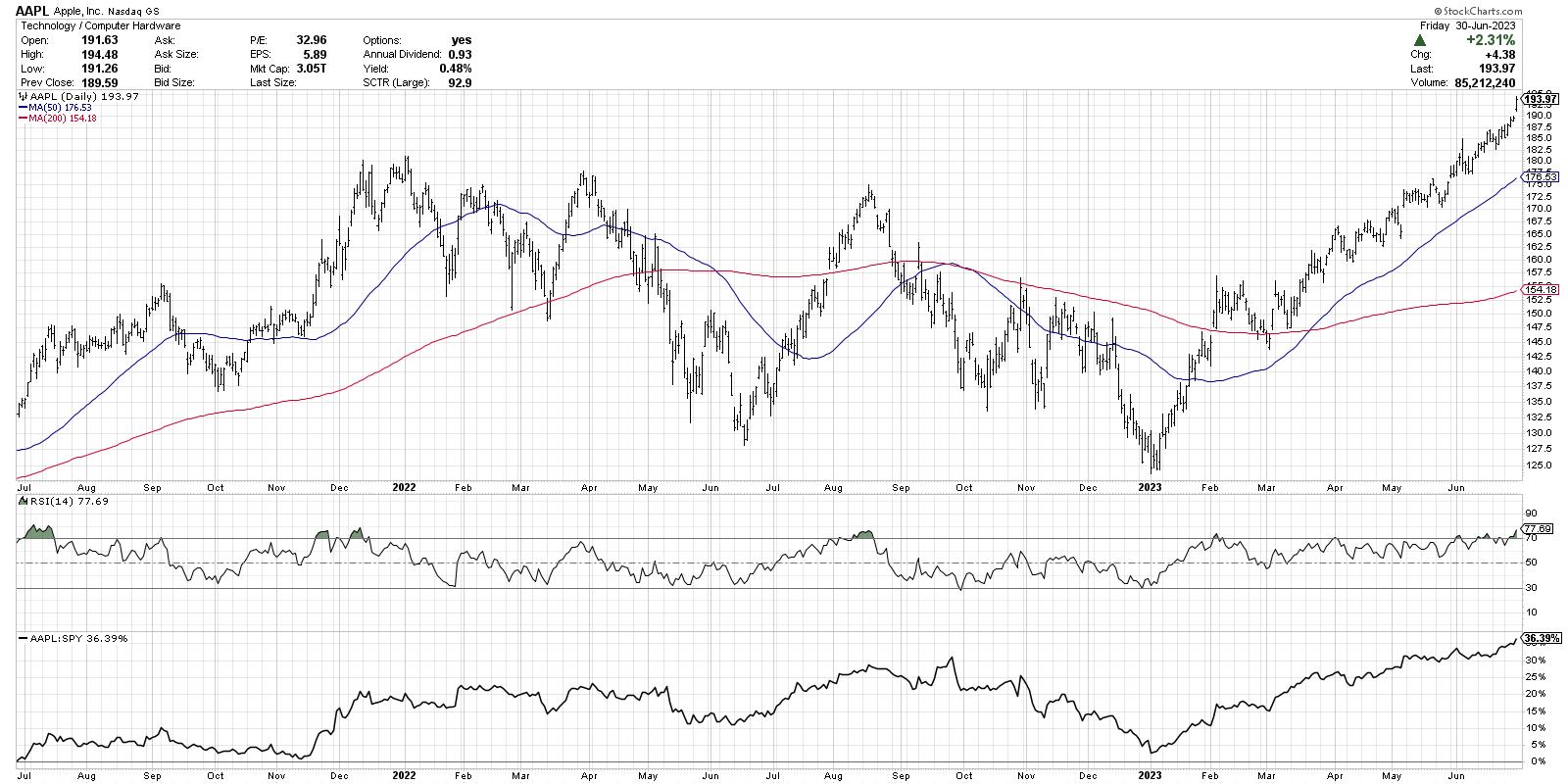
Exactly how long is this raging bull market driven by mega-cap growth stocks supposed to last? I was taught that, when price trends higher over time, there would often be brief countertrend pullbacks along the way. Apple (AAPL) has completely ignored that market truism and managed to ride this unrelenting ascent to above the definitely-not-frothy three trillion market cap.

At some point, I would expect that this persistent market incline will take a pause and allow some other sectors to take over in the leadership role. It's worth noting that cyclical sectors, like Energy and Materials outperformed the growth sectors this week, which could be an early sign of a further rotation.
So what's next for the Nasdaq 100? Further upside to all-new highs as the FAANG stocks continue their dominance, or a steep correction that forces us to have the "will we retest the October 2022 lows" conversation when we end the third quarter?
Did you miss our webcast this week, "The Market Top Checklist Revisited"? We shared our seven steps to watch for to confirm a potential market top and compared current conditions to previous bull market cycles. You can still access the replay through the end of next week!
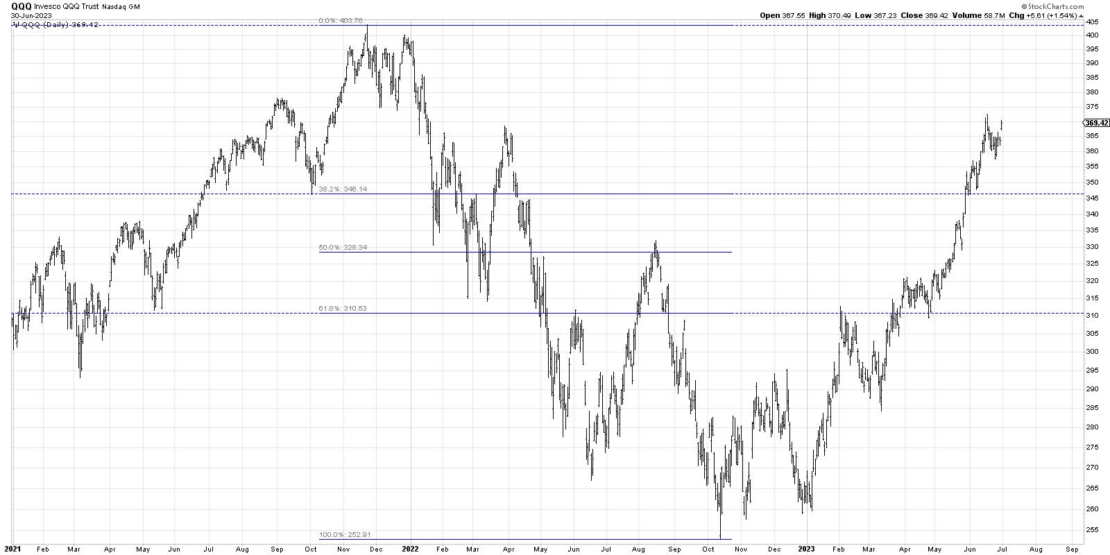
Here's a basic daily of the QQQ, including a simple Fibonacci framework using the November 2021 all-time high and the October 2022 low.

After pulling back from the 38.2% Fibonacci level in February, the QQQ pushed back above this resistance level and continued much higher. In the last six weeks, the Nasdaq 100 has now pushed above the 61.8% retracement level and is once again threatening to make another new high for 2023.
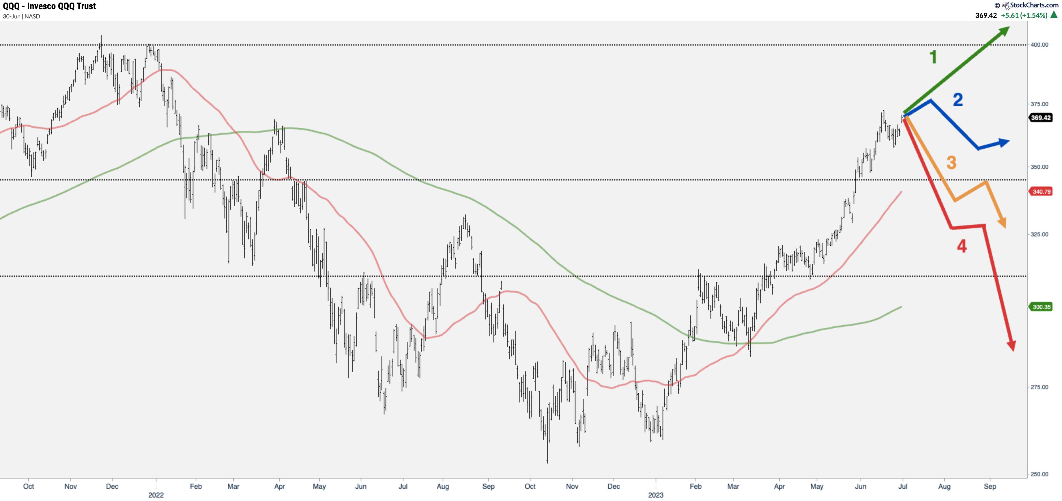
I feel these Fibonacci levels, along with the key support and resistance levels established over the last 18 months, provide a good structure with which to consider these four scenarios in the coming months.
Back in early June, we introduced the concept of probabilistic analysis and explained the benefits of considering four potential scenarios for the S&P 500 index. By thinking through four different future paths, it can help you to better anticipate what comes next and be way better prepared for the unexpected.
Today, we'll focus on the tech-heavy Nasdaq 100 index and present four different pictures of how the next six to eight weeks will play out. And remember, the point of this exercise is threefold:
- Consider all four potential future paths for the index, think about what would cause each scenario to unfold in terms of the macro drivers, and review what signals/patterns/indicators would confirm the scenario.
- Decide which scenario you feel is most likely, and why you think that's the case. Don't forget to drop me a comment and let me know your vote!
- Think about each of the four scenarios would impact your current portfolio. How would you manage risk in each case? How and when would you take action to adapt to this new reality?
Let's start with the most optimistic scenario, where the Nasdaq would make a new all-time in the third quarter of 2023.
Scenario #1: The Super Bullish Scenario
The QQQ spent pretty much all of May and June in strong uptrend phase. This most bullish scenario would imply that the recent trend just continues on unabated. Given a similar trajectory, that would push the Nasdaq to a new all-time high by the end of August.
Leadership stocks like META and AAPL would have to push even higher, and we'd soon be talking about the next stock to hit the $3 trillion market cap threshold. Other sectors like Industrials and Materials would need to start participating as well, as the market presses the long side and the strongest names get even stronger.
Scenario #2: The Mildly Bullish Scenario
What if the uptrend continues, but just at a much slower pace? Or there's a 5-10% correction as investors take profits and initiate a pullback down to that 61.8% retracement level around $346?
The second potential scenario would most likely involve leading growth stocks to take a big-time breather, as a rotation to other sectors is good for those sectors but not as good for our heavily-growth-tilted benchmarks. We'd still call this a bull market, but a much less exciting one.
Scenario #3: The Mildly Bearish Scenario
The next option is a decline, but not an overly painful one. What if a pullback starts to really take hold, and that Fibonacci level around $346 fails to stop the decline? If investors really get anxious, I could see deeper retracement, which brings the whole "bull market" thing into question.
This scenario would probably mean that the growth leadership pulls back, but also there's a broader rotation to more risk-off positions. Defensive sectors like Consumer Staples and Utilities would thrive as the AI-driven growth trade is declared over and done.
Scenario #4: The Super Bearish Scenario
You always have to consider a really negative scenario, if only to provide a stark contrast to the most optimistic options. But it is theoretically possible that we've seen the top for 2023. What if that was it, and we have some five-standard deviation event that drops the market into a free fall?
If this AI-driven rally ends up being a massive bubble which pops colossally in the next few weeks, then we could be talking about a potential retest of the 2022 lows. Investors would flock to gold and treasury bonds as literally nothing else seems like a good option here.

Okay, so have you decided which of these four potential scenarios is most likely based on your analysis? Head over to my YouTube channel and drop a comment with your vote along with why you see that as the most likely outcome.
And don't forget to think through all the other scenarios as well. The goal here is not just to "be right", but to force yourself out of any preconceived biases and open your mind to different possibilities!
RR#6,
Dave
P.S. Ready to upgrade your investment process? Check out my free behavioral investing course!
David Keller, CMT
Chief Market Strategist
StockCharts.com
Disclaimer: This blog is for educational purposes only and should not be construed as financial advice. The ideas and strategies should never be used without first assessing your own personal and financial situation, or without consulting a financial professional.
The author does not have a position in mentioned securities at the time of publication. Any opinions expressed herein are solely those of the author and do not in any way represent the views or opinions of any other person or entity.
|
| READ ONLINE → |
|
|
|
| Martin Pring's Market Roundup |
| These Charts Explain Why Stocks Have Been Rallying Since October |
| by Martin Pring |
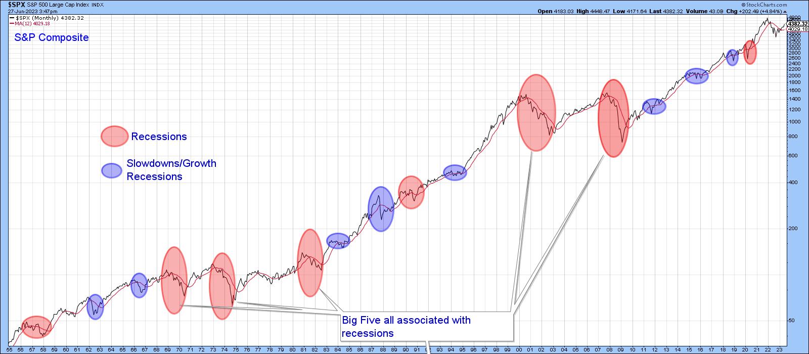
The ellipses in Chart 1 reflect economic events that have adversely affected the stock market since the 1950s. The pink ones reflect recessions, and those colored in blue indicate setbacks that anticipated economic slowdowns. Slowdowns develop when some economic sectors slip into recession, but that weakness is insufficient to push the aggregate economy into an economic contraction. The whole point of the chart is to demonstrate it is normal for stocks to move ahead of the economy. Hence, stocks decline ahead of both recessions and slowdowns, but since the latter are "soft landings", the magnitude and duration of the decline is far more contained than under recessionary conditions. Chart 1 Chart 1
The word normal has been italicized because economic fluctuations account for the vast majority of bear markets, but exceptions occasionally arise. For example, the market correctly anticipated a recession in 2001, but, instead of immediately discounting the recovery, as is typically the case, the S&P proceeded to decline in the ensuing couple of quarters following the ending of the business cycle contraction. My rationale for this aberration is that the market was too busy unwinding the tech bubble to be concerned with any economic progress that might have been taking place at the time. To find a similar disconnect between the market and the economy, we have to go back to the late 1920's, where an unflinching equity market looked straight through a recession on its way the final peak in 1929.
It's worth noting that the S&P never dropped below its 12-month MA in the bullish late 1920s. Neither did it move above it in the late 2001-2002 bearish period, all of which brings us to the current situation and where we stand between the economy and the market.
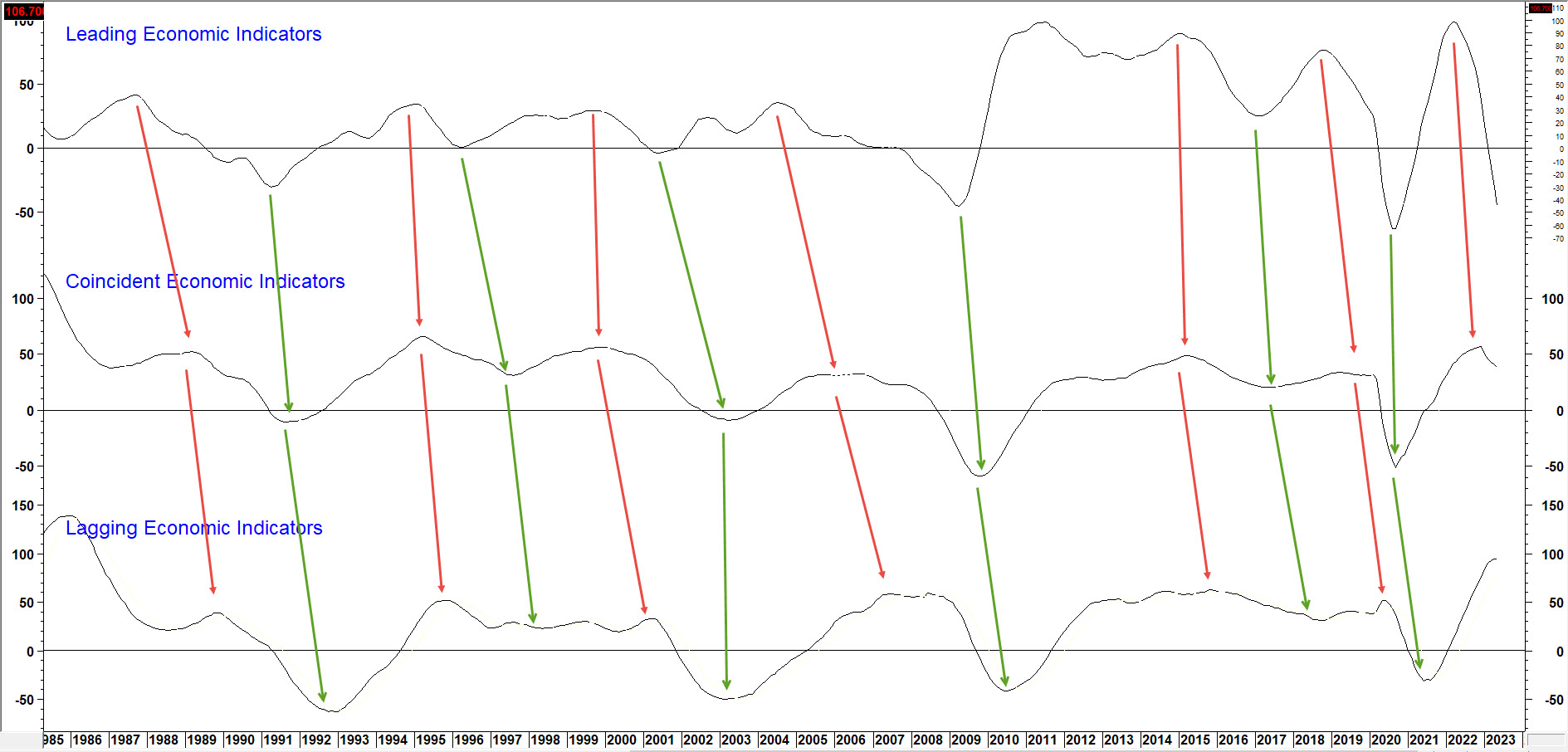
First, it's important to understand that there is no such thing as "the economy" in the sense that everything moves up and down simultaneously. That's because the economy is really a set series of chronological events that are continually repeating, as in Figure 1 featuring long-term momentum for the Conference Board's Leading, Coincident and Lagging economic indicators.
The Chronological Sequence Between Economic Indicators
 Figure 1 Figure 1
You can read about it here.
Just like a train begins with an engine and ends with a caboose, each recovery starts with the highly interest-sensitive housing market and works its way through to capital spending. It's our guiding light for managing portfolios at Pring Turner Capital and allocating capital in my monthly Intermarket Review.
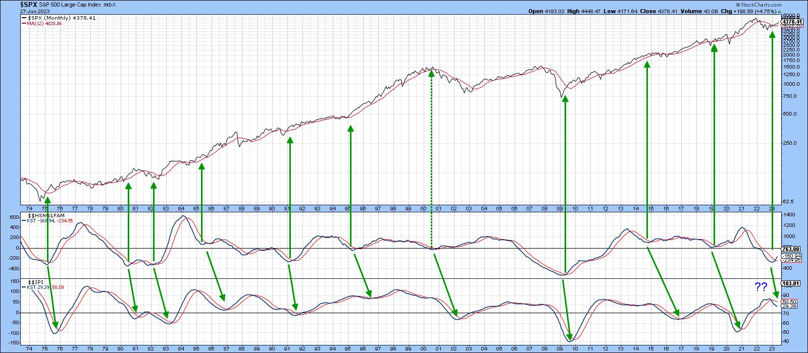
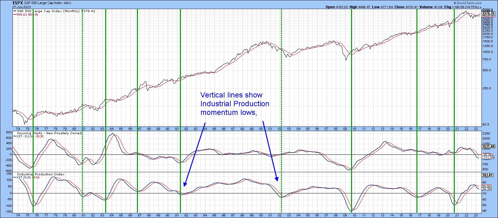
"The economy", if there is one, refers to the middle carriages on a train, in this case things like GDP and industrial production. StockCharts has a small universe of economic indicators on its database prefaced with the $$ symbol. For example, Chart 2 compares the momentum of new homes sold ($$HSNG1FAM) to that for industrial production ($$IPI). The arrows slant to the right because the purchase of new homes moves ahead of industrial production in the business cycle chronological sequence. The leads and lags vary, of course, but there can be no mistaking that home sales precede reversals in the manufacturing sector.
The arrows pointing to the S&P also tell us lows in the home sales momentum represent good buying opportunities for stocks. The 2001 period was a notable exception. New home sales momentum bottomed around the turn of the year. The chart does not reflect the May increase of 763,000 over April's 680,000, which was reported earlier today, but it certainly helps explain why stocks have been rising.
 Chart 2 Chart 2
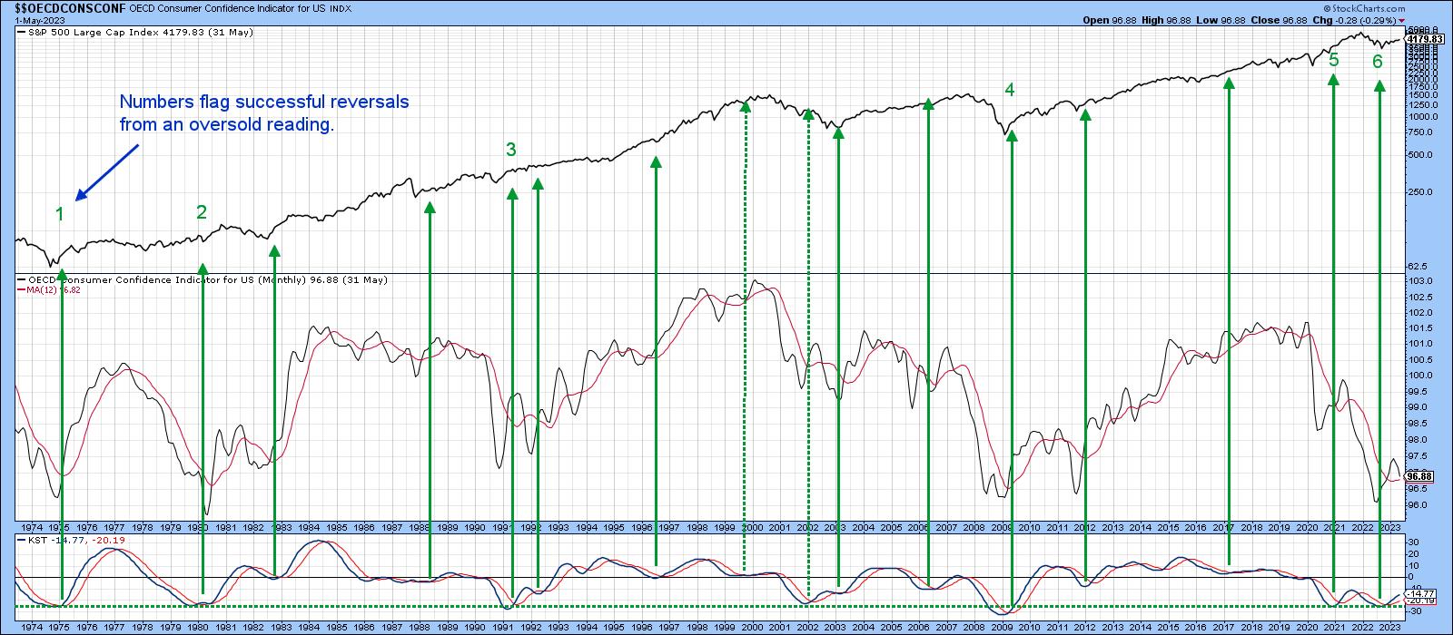
So does Chart 3, which features sentiment as monitored by the University of Michigan ($$UMCSENT), another economic series available on the StockCharts database. I find the raw data to be far too jagged to run a moving average through and come away with timely signals for the stock market. However, calculating a long-term KST and using sub-zero momentum reversals does provide an early-bird buying opportunity. Previous instances have been flagged with upward-pointing green arrows. Note that this series bottomed several months ago, thereby triggering a stock market buying opportunity.
 Chart 3 Chart 3
Momentum for both the homes sold and sentiment indicators are currently registering subdued readings. That suggests further ultimate gains are likely. By way of reassurance, Chart 4 returns to our business cycle sequence concept. I have already noted that the housing industry leads manufacturing at cyclic lows. However, the chart demonstrates that the same leading relationship applies to Housing Starts ($$HSNGSTARTS) at cyclical peaks. Equally important, as demonstrated by the vertical lines, is the fact that when industrial production momentum bottoms, the bull market in equities usually has much further to run. At this point, industrial production momentum is showing no signs of an upside reversal. That does not guarantee an extension of the trend of higher stock prices, but it certainly puts the odds strongly in its favor. Put another way, until industrial production momentum troughs out, it's still pretty early in the cycle.
 Chart 4 Chart 4
Good luck and good charting,
Martin J. Pring
The views expressed in this article are those of the author and do not necessarily reflect the position or opinion of Pring Turner Capital Group of Walnut Creek or its affiliates.
|
| READ ONLINE → |
|
|
|
| ChartWatchers |
| Is the Stock Market Overvalued? Here's How To Know |
| by Jayanthi Gopalakrishnan |

The first half of 2023 is ending on a positive note—inflation was cooler than expected. But a few days ago, the market wasn't so optimistic.
In an economic forum, Fed Chairman Jerome Powell suggested that two more interest rate hikes are likely this year. This was based on the thought that the last 10 rate hikes may not have worked their way through the economy. Overall, economic data supports this idea. The labor market is still strong, the US economy is growing (Q1 GDP was revised to 2% from 1.3%), and big banks passed the stress test. But the core personal consumption expenditures price index came in lower than expected, a sign that inflation is cooling.
Does that mean the Fed will stop tightening? The stock market may think so, but one piece of data isn't enough to sway the Fed. The CME FedWatch Tool shows an 86.8% probability of a 25 basis point rate hike in its July meeting.
The Stock Market's First Half of 2023
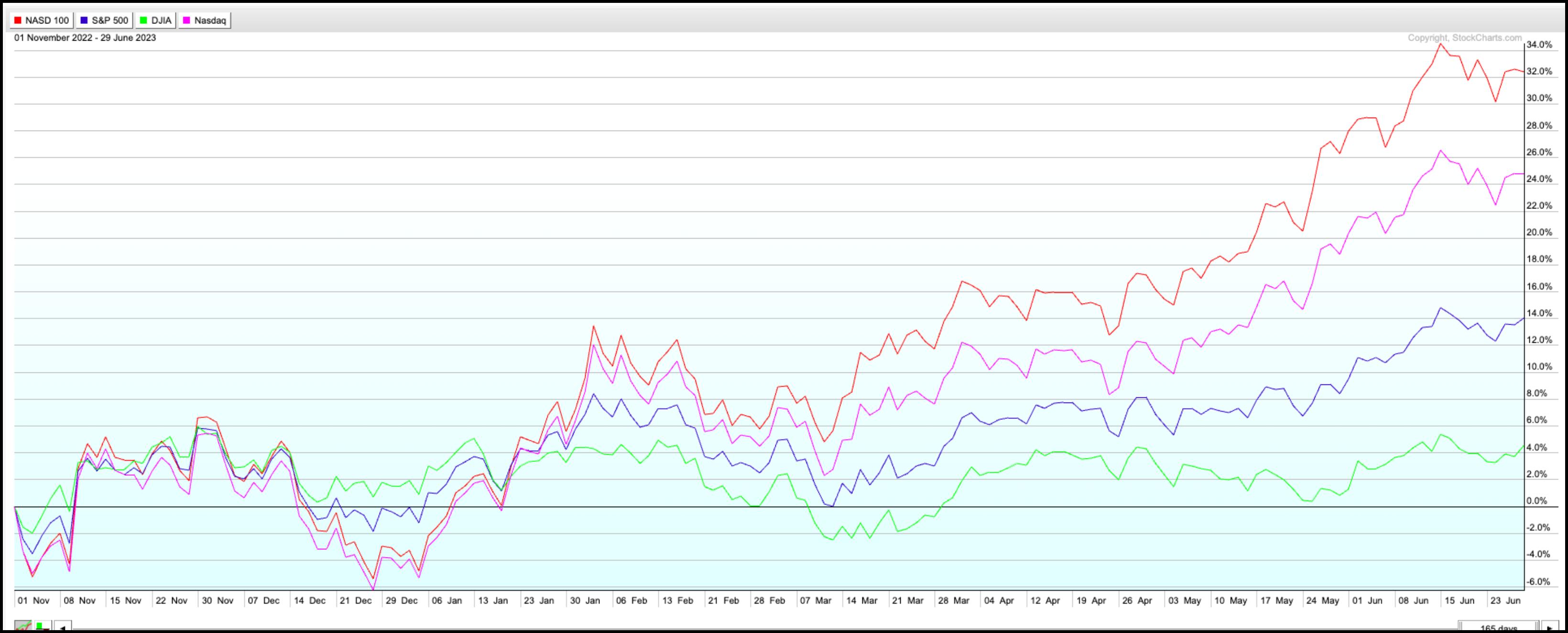
If you were focused on the broader equity indexes, you wouldn't think the markets are worried. Equity values keep moving higher, driven mostly by the Technology sector. The PerfChart below shows that the Nasdaq 100 index ($NDX) outperformed the S&P 500 index ($SPX), the Dow Jones Industrial Average ($INDU), and the Nasdaq Composite ($COMPQ) in the first half of 2023.

CHART 1. STOCKCHARTS PERFCHARTS OF BROADER INDEXES. The Nasdaq 100 Index is the clear leader. Chart source: StockCharts.com. For educational purposes only.
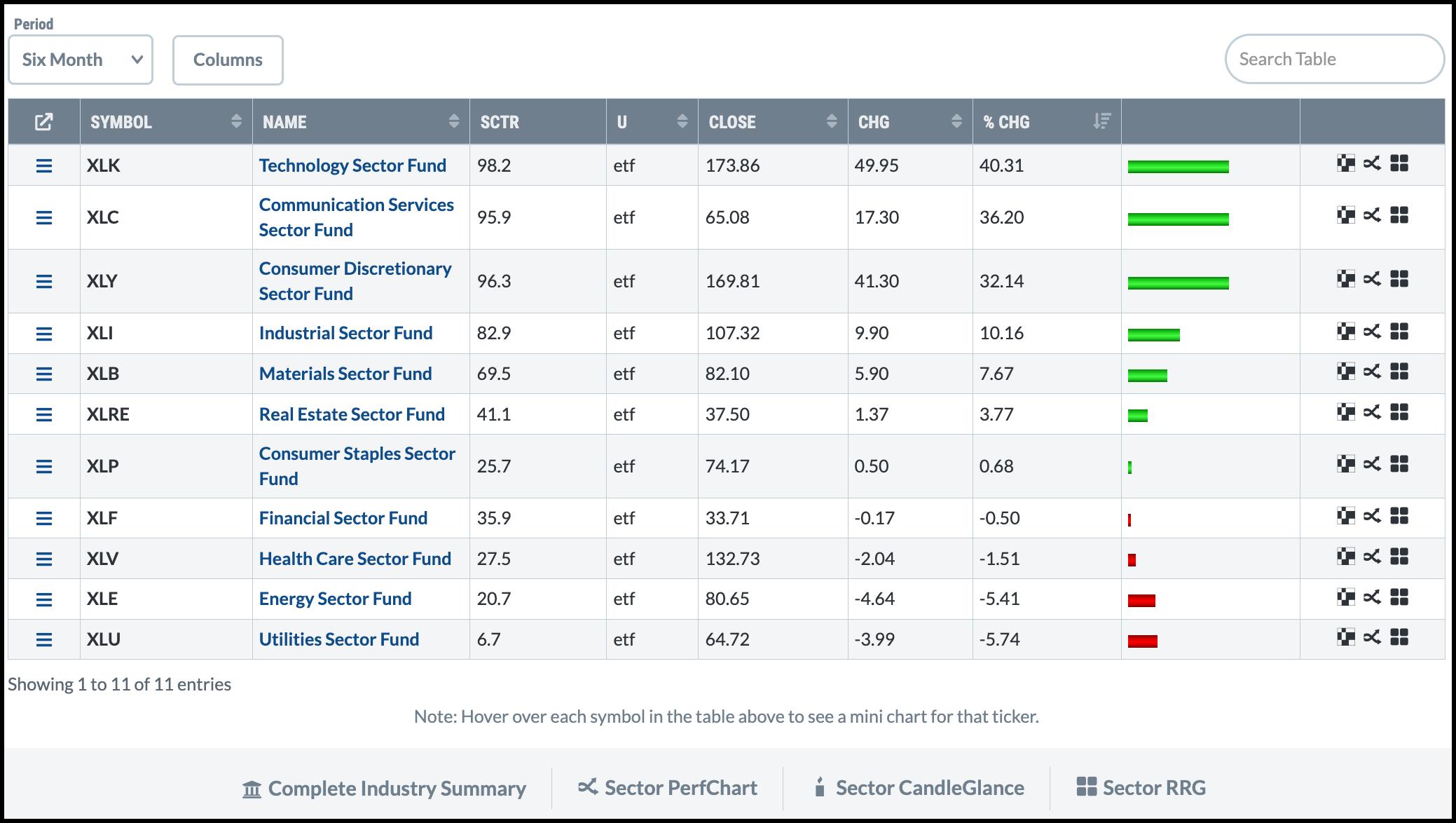
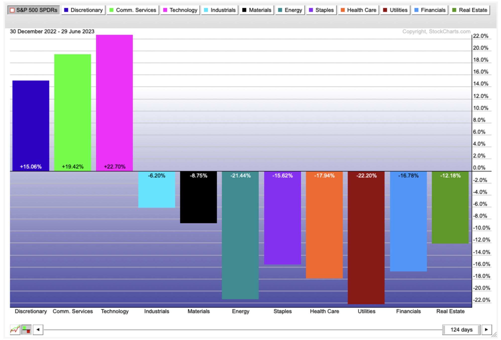
The S&P Sector Summary also supports the outperformance in tech stocks. The three top-performing sectors in the last six months were Technology, Communication Services, and Consumer Discretionary. This suggests investors are gravitating toward growth stocks.

CHART 2: SECTOR SUMMARY (PAST SIX MONTHS). Technology, Communication Services, and Consumer Discretionary are the top three performing sectors. Chart source: StockCharts.com. For educational purposes only.
Bond Market Watch
But if the Fed raises interest rates a couple more times this year, does it change the economic picture? It could, which is why it may be worth watching the bond markets. An inverted yield curve can be a sign that bond investors may be worried.
What is an inverted yield curve? In a nutshell, it's when shorter-dated Treasury yields are above longer-term yields.
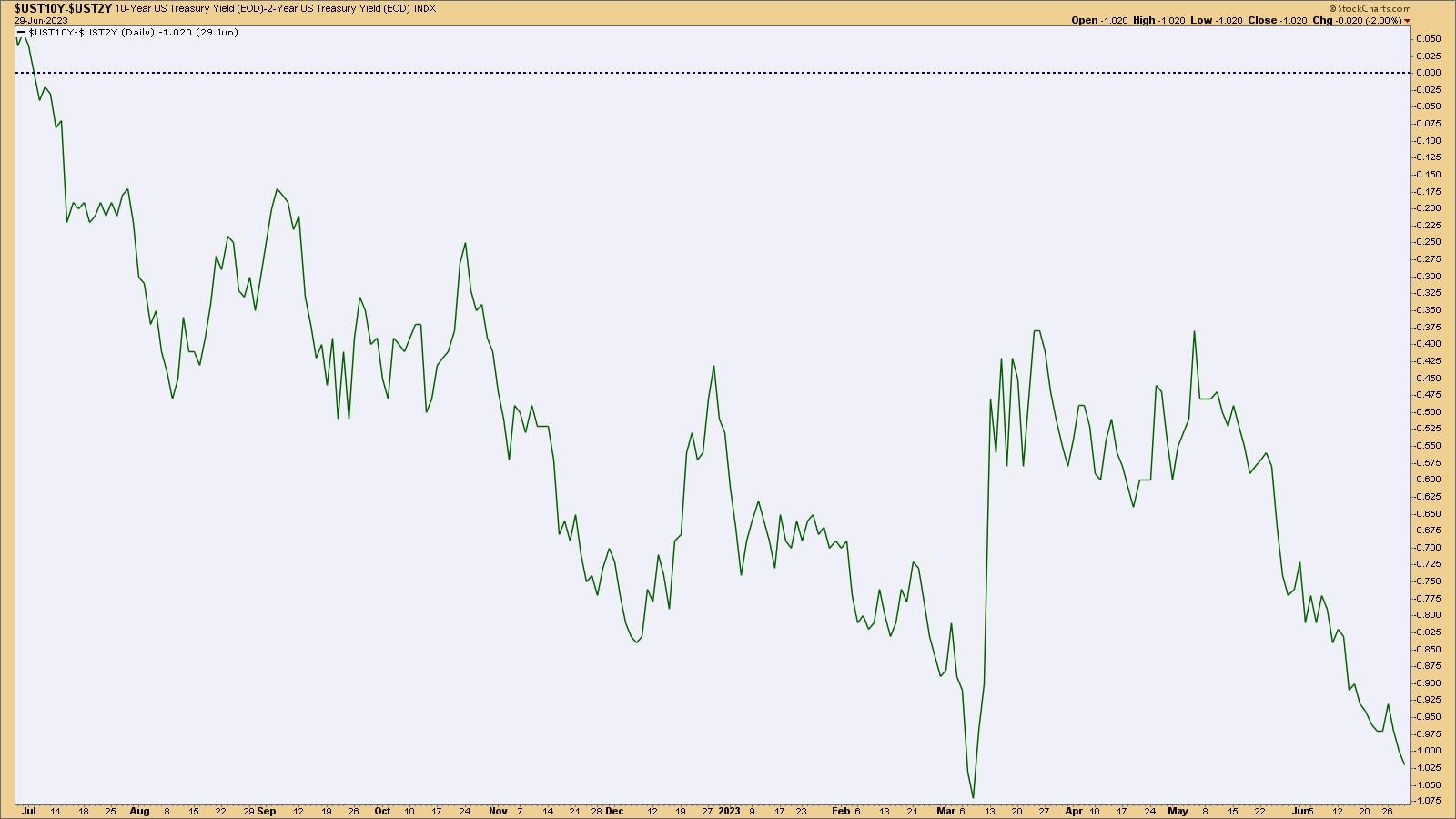
The difference between the 10-year Treasury yield and the 2-year Treasury yield (2/10 Treasury spread) has been below 0 since July 2022 (see chart below). The spread has almost reached the March low, which is around the time when the S&P 500 started gaining bullish momentum. When Fed Chairman Jerome Powell indicated the central bank would likely raise rates two more times this year, the 2/10 spread fell lower. And if short-term rates go higher, the spread could fall even lower.

CHART 3: THE 2/10 TREASURY SPREAD. The spread between the 10 and 2-year Treasury yields is approaching March lows. You might want to keep an eye on this spread. Chart source: StockCharts.com (click on chart for live version). For educational purposes only.
Does this mean a recession is a possibility? While an inverted yield curve could mean a recession is possible, it's not guaranteed. If inflation has peaked and moves toward the Fed's 2% target, it's possible that the US may avoid a recession. It's too early to tell, and it takes a while for the effects of interest rate tightening to weave their way into the economy. Until then, keep your eyes peeled on the broader market.
Nasdaq 100 Technical Outlook
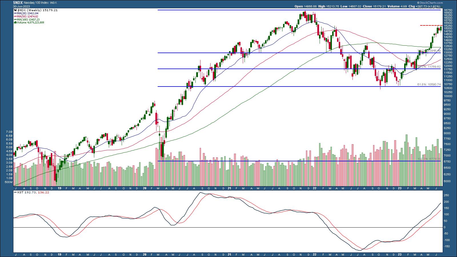
Since the Nasdaq 100 index led in performance, it's worth taking a closer look at its chart. The weekly chart of $NDX below shows that the index is close to its all-time high of just above 16,000. But before it gets there, it has to cross over its June 12 high of 15,284 (red dashed line). If it does, there may be a few more hurdles to pass. The question is, will there be enough momentum to push the NDX higher? To answer this question, it's helpful to add a momentum indicator to the chart.

CHART 4: WEEKLY CHART OF NASDAQ 100 INDEX. NDX has a few headwinds to go through before reaching its all-time highs. Chart source: StockCharts.com (click on chart for live version). For educational purposes only.
StockCharts has a huge collection of momentum indicators to choose from. One that combines different cycles is the Know Sure Thing (KST), which is displayed in the panel below the price chart. The KST indicator is in positive territory and moving higher, which suggests that momentum is still strong. There's no sign of KST falling below its signal line on the weekly chart.
It also helps to add Fibonacci retracement levels to the chart. If NDX falls lower, the 38.2% retracement level could also be a potential support level.
But what about the daily chart?

CHART 5: DAILY CHART OF NASDAQ 100 INDEX. NDX could pull back if momentum starts to slow. Chart source: StockCharts.com (click on chart for live version). For educational purposes only.
On the daily chart, NDX has bounced off its 20-day simple moving average (SMA), but KST has crossed below its signal line. It would be worth watching this indicator since NDX could pull back to its 20-day SMA and either bounce off it or go below it.
So even though Tech stocks have been on a bullish rally, there's the risk of overvaluation. There's also the possibility of a couple interest rate hikes this year, which could deepen the yield curve inversion. So, going forward, even if equities continue to rally, it's best to keep an eye on momentum. If it starts weakening, look at other parts of the market like bonds. What's the yield curve scenario? What about commodities? Or emerging markets?

Keep an eye on the big picture by setting up Your Dashboard to include Market Overview, Sector Summary, Market Movers, and SCTR Reports.
Final Thoughts
Now that the first half of 2023 is behind us, it's a good time to do a mid-year portfolio checkup. Has your portfolio returned as much or better than a benchmark index such as the S&P 500? If not, it may be worth analyzing the different asset classes you own to identify what needs to be fixed and why. This can help you make strategic changes if necessary. Let's hope for a strong second half, but, with the markets, anything is possible. Keeping an eye on the various moving parts like momentum, the yield curve, and overall economic indicators would make you a more astute investor.
End-of-Week Wrap Up
US equity indexes up; volatility up
- $SPX up 1.23% at 4450.38, $INDU up 0.84% at 34,407.60; $COMPQ up 1.45% at 13787.92
- $VIX up at 13.59
- Best performing sector for the week: Real Estate
- Worst performing sector for the week: Consumer Staples
- Top 5 Large Cap SCTR stocks: NVDA, CCL, IOT, PLTR, MDB
On the Radar Next Week
- June ISM Manufacturing PMI
- FOMC Minutes
- May JOLTs Jobs report
- Mortgage rates
- June Nonfarm payrolls (NFPs)

Disclaimer: This blog is for educational purposes only and should not be construed as financial advice. The ideas and strategies should never be used without first assessing your own personal and financial situation, or without consulting a financial professional.
|
| READ ONLINE → |
|
|
|
| RRG Charts |
| Small Cap Value Stocks Unexpected Driver for Market |
| by Julius de Kempenaer |

Growth, Value, Size
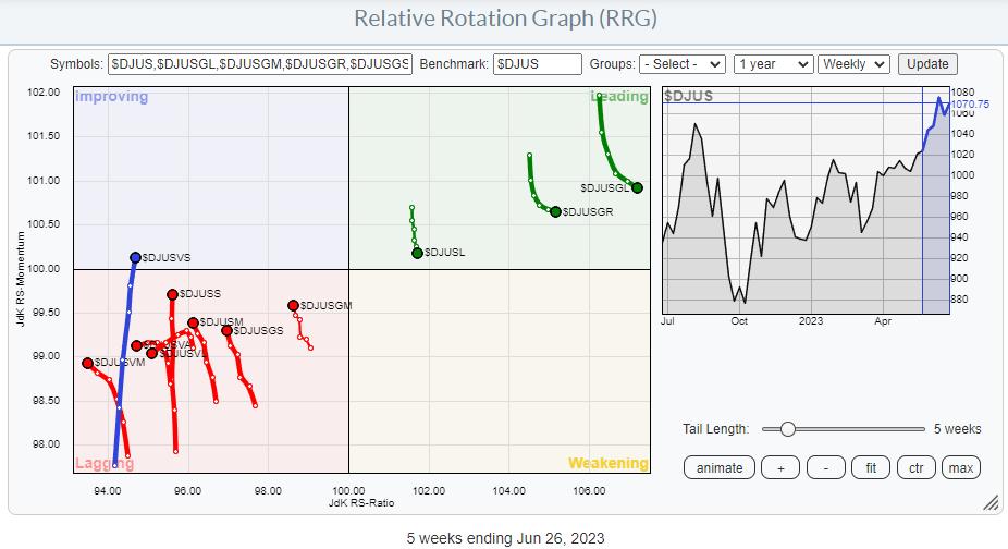
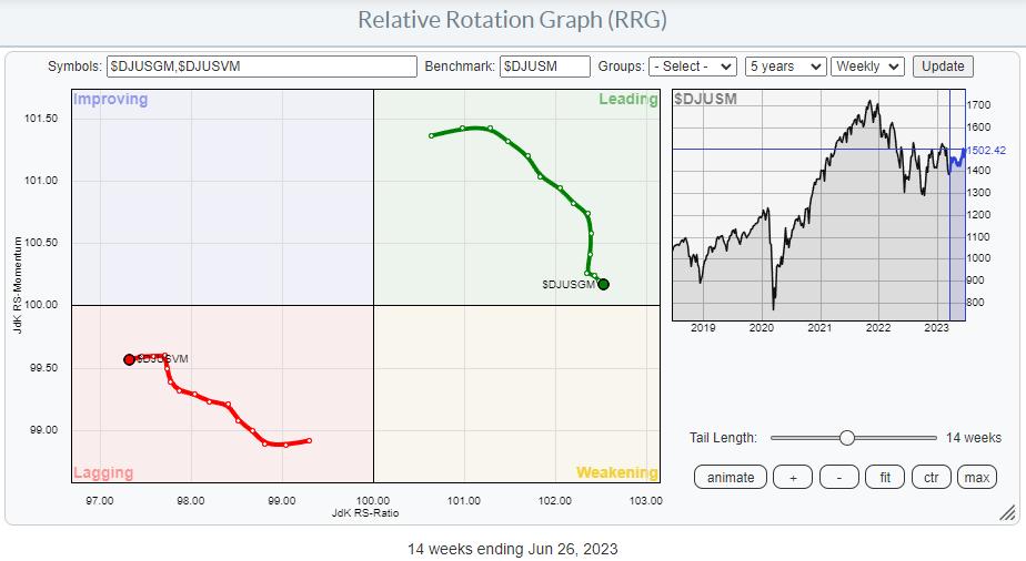
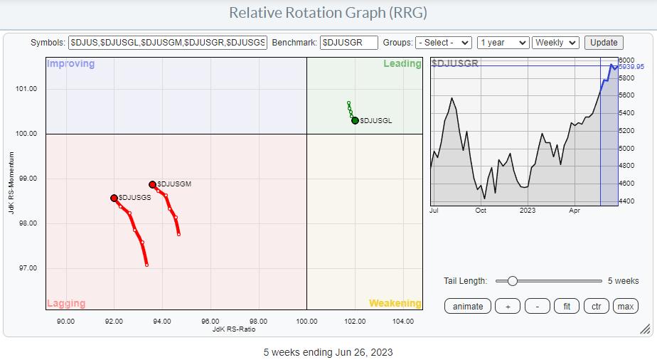
It has been a while since I addressed the rotations of Growth vs. Value and their different size variations. The RRG above shows these rotations on the weekly timeframe.
My first observation is the limited number of tails inside the leading quadrant and the big cluster inside lagging, with tails pointing in more or less opposite directions. And, of course, the lone ranger which is just entering the improving quadrant.
The immediate takeaway from this observation is that large-cap stocks have been leading the market higher over the last few months. The tails inside the leading quadrant are "Large-Cap," "Growth," and "Large-Cap Growth." Nothing new here.
What we currently see is that these tails recently have started to lose some relative momentum, which was picked up on the other side by almost all other indexes on the plot. The interesting thing is that, despite the loss of relative momentum, these stocks hardly lost any relative strength, remaining at roughly the same RS-Ratio readings and even gaining a bit. This serves to underscore that they are still in strong relative uptrends vs $DJUS (Dow Jones US Index).
In order to get a better handle on these rotations, I am going to separate them into three different RRGs.
Large Cap: Growth - Value

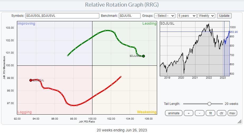
This RRG shows the rotation of Growth vs. Value for Large Cap stocks. The benchmark is The Dow Jones Large Cap index. So this is a closed universe.
With growth on the right and moving higher on the RS-Ratio scale and Value moving in the opposite direction, this is clearly pointing to a continued preference for growth stocks over value. Despite the loss of relative momentum since the beginning of April, Growth has managed to rise 17.7%, while Value picked up only 4.3%. This is a good example of a relative trend producing continued outperformance while losing relative momentum.

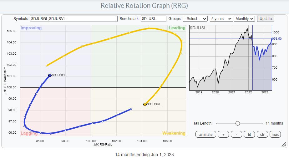
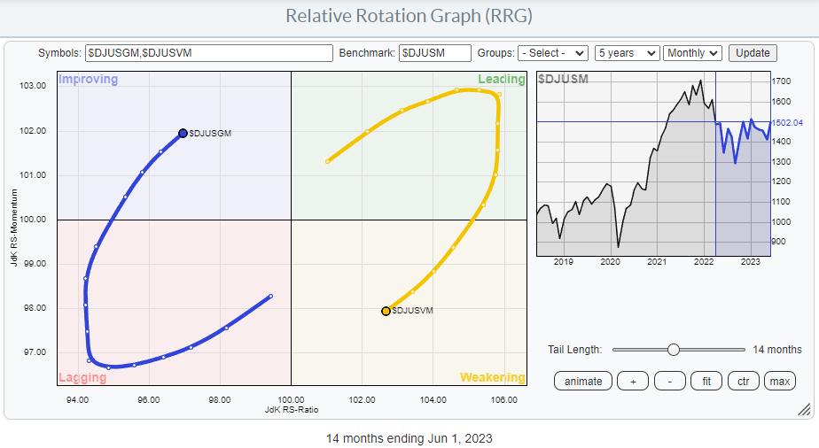
The monthly RRG for this relationship shows the Large Cap Growth tail entering the improving quadrant, while Value has moved into the weakening quadrant on the other side. The combination of these weekly and monthly tails suggests that there is more upside potential left for growth stocks in terms of relative strength, and that the recent loss of momentum on the weekly RRG should be seen as temporary.
Mid-Cap: Growth - Value

Running the same RRG for the Mid-Cap section shows a fairly similar rotational pattern. Growth is beating Value while dropping some relative momentum over the last few months.
Since the beginning of April, Growth rose 5% while Value lost 0.4%.

But a strong rotation in favor of Growth is picking up speed inside the improving quadrant on the monthly RRG.
With the growth tail on the weekly RRG starting to pick up on the RS-Ratio scale again and Value moving lower, the conclusion is similar. More upside relative potential for Mid-Cap stocks and the recent loss of relative momentum has to be seen as temporary.
Small-Cap: Growth-Value

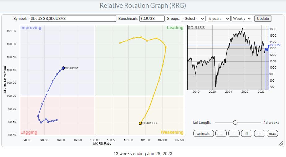
The Growth-Value rotation in the small-cap segment shows a different picture.
Growth is still on the right-hand side inside weakening, while value is on the left-hand side and improving. However, here the Growth tail has started to move lower on the RS-Ratio scale, and Value has started to move upward. This is a clear difference compared with the growth-value rotations in the Large- and Mid-cap segments.
The start of the loss of relative momentum in the small-cap segment only started at the start of May, and since then, Value has picked up 6.5% vs. 5.8 for growth.

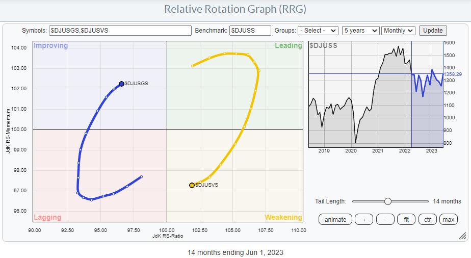
Bringing this segment to the monthly RRG shows a rotational pattern similar to the Large- and Mid-Cap segments again.
Growth: Size

Another way to slice this universe of Value-Growth-Size indices is by plotting the size segments of the growth indices against the DJ Growth index, as seen above. Despite the recent loss (small) of relative momentum for the Large Cap Growth index inside the leading quadrant, the preference is clearly visible.
Value: Size

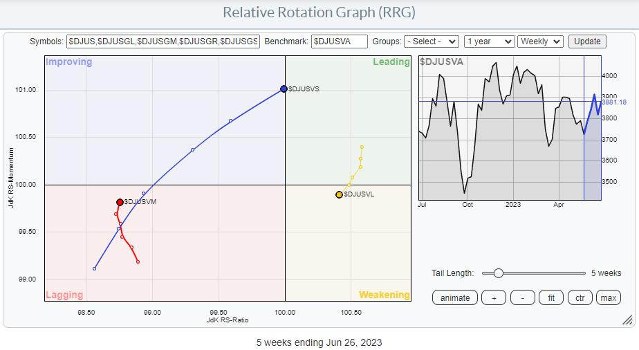
How different does the same chart look when plotting the value size segments against the DJ Value index? The strength of small-cap value stocks is remarkable, and something to keep an eye on in the coming weeks, IMHO.
Main Chart to Watch

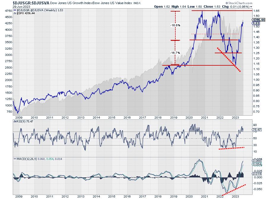
The main chart to watch is plotted above, and it shows the ratio between DJ US Growth vs DJ US Value.
After completing a massive double top and reaching its minimum target, this ratio started to rise rapidly at the start of this year. Now back above resistance offered by the 2021 low, there is room for further appreciation towards the peaks of 2020 and late 2021.
Conclusion
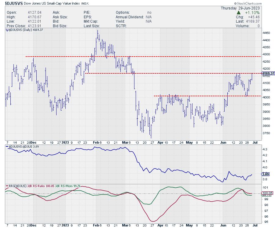
All-in-all, the growth-value rotation seems to be back on track in favor of growth in the coming weeks. The odd segment to watch is small-cap value stocks, which are showing remarkable relative strength compared to their Mid- and Large-Cap counterparts.

On the daily chart, this index is pushing against resistance at 4170. Once that gives way, the next level to watch will be near 4290.
#StayAlert, --Julius
|
| READ ONLINE → |
|
|
|
| Mish's Market Minute |
| U.S. Oil Reserves Drop to 40-Year Lows |
| by Mish Schneider |

On June 12th, Goldman Sachs (GS) came out stating how bearish they are on oil. I wrote a Daily about it on June 20th.
It's not uncommon for me to stick my neck out and go against the big analysts. Heck, I have made a career out of looking at the economy and the market differently. Plus, those who know me know that I often make bold calls. However, not so fast on bragging rights just yet.
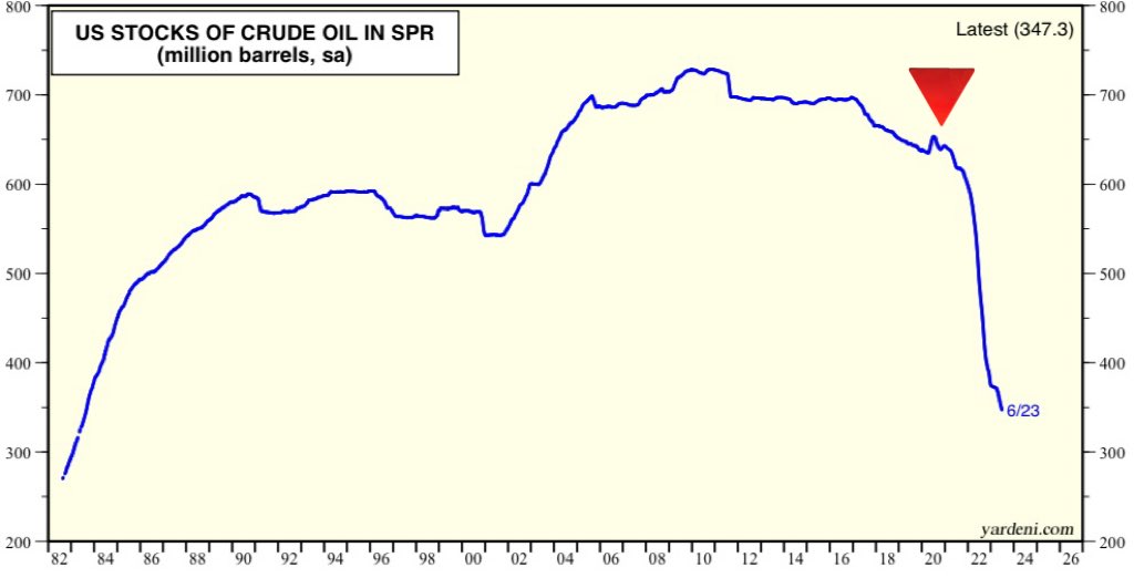
Nonetheless, with oil inventories hitting the tape today, it does make one wonder what planet these analysts live on? I guess the one where the government did not drain reserves to lower costs and then neglected to replace those reserves.
We live on the planet that this chart shows quite clearly, an alarming drop in reserves after a huge government drain. The lowest amount of oil in reserves since 1983. Plus, the analysts talk about a lack of demand, just as airline stocks are flying along with the Transportation Sector -- as we discussed in another Daily featured this week.

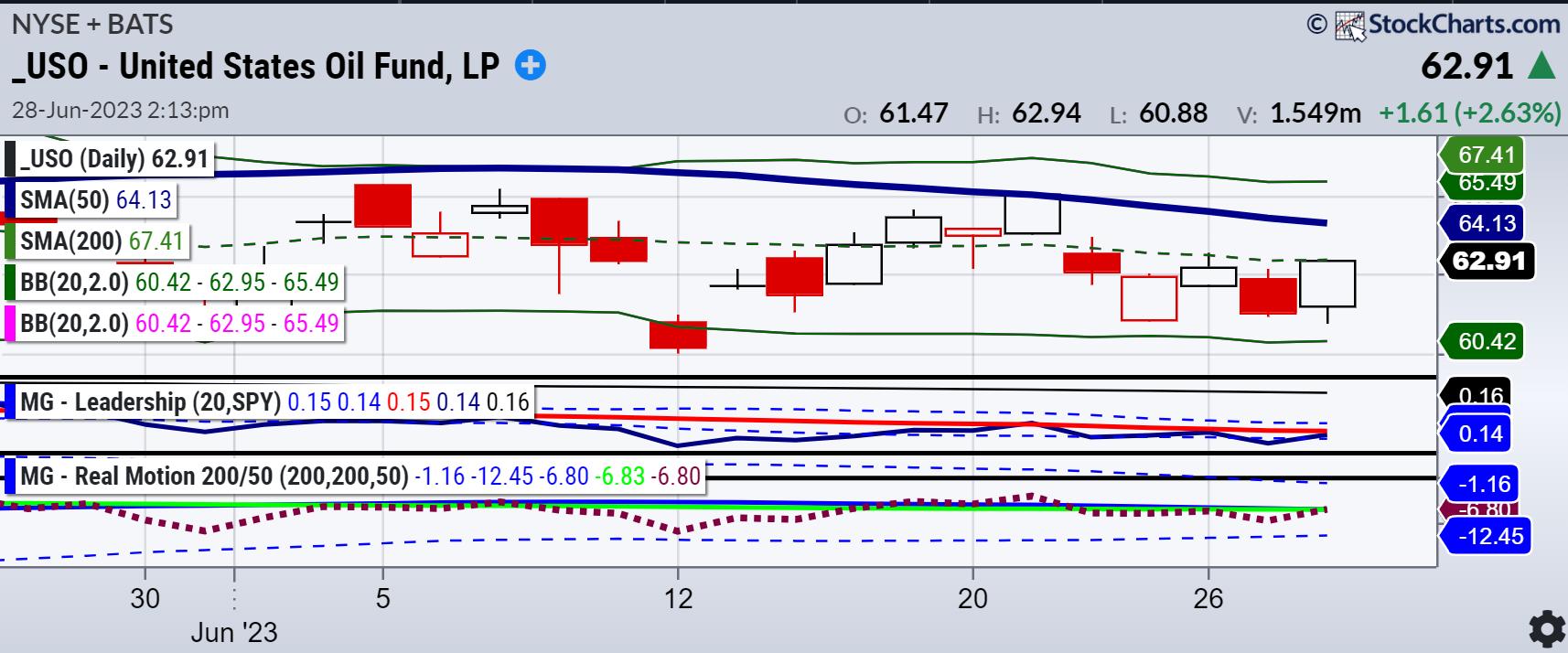
First off, note June 12th. THE LOW (so far).
Note June 20th. A rally into resistance (so far).
Hence, not bragging rights at this point.
Move to today's price action and we see some resistance to clear over 63.00.
The Leadership Indicator is very interesting. The blue line as measured by the benchmark or red line, looks like potential change in leadership. Should oil begin to outperform the S&P 500, not only will the Fed get concerned, but so should the deflationists.
Real Motion, or the momentum, is even more interesting. The 50 (blue) sits atop the 200-DMA (green). Momentum is gaining and could easily go back to a bullish divergence, just like it did briefly after June 20th. Momentum fell though since, so again, no bragging yet.
Last night's Daily was about the Energy sector.
Maybe it's nothing. Or then again, at the very least, it is worth watching... especially ahead of a holiday weekend.
For more detailed trading information about our blended models, tools and trader education courses, contact Rob Quinn, our Chief Strategy Consultant, to learn more.

"I grew my money tree and so can you!" - Mish Schneider
Get your copy of Plant Your Money Tree: A Guide to Growing Your Wealth and a special bonus here.
Follow Mish on Twitter @marketminute for stock picks and more. Follow Mish on Instagram (mishschneider) for daily morning videos. To see updated media clips, click here.
Mish shares why the transportation ETF is such an important measure of economic strength and how retail stocks (XRT) continue to underwhelm on the Tuesday, June 27 edition of StockCharts TV's The Final Bar with David Keller.
Mish discusses how business have been watching Russia in this appearance on Business First AM.
Read Mish's commentary on how the situation in Russia impacts the markets in this article from Kitco.
Watch Mish's 45-minute coaching session for MarketGauge's comprehensive product for discretionary traders, the Complete Trader.
On the Friday, June 23 edition of StockCharts TV's Your Daily Five, Mish covers a variety of stocks and ETFs, with eyes on the retail sector for best clues in market direction.
Read Mish's interview with CMC Markets for "Tricks of the Trade: Interviews with World-Class Traders" here!
Mish delves into the potential next market moves for several key markets, including USD/JPY, Gold and West Texas crude oil in this appearance on CMC Markets.
Mish and Dale Pinkert cover the macro, the geopolitical backdrop, commodities, and stocks to watch on FACE Live Market Analysis and Interviews.
Mish and Ashley discuss buying raw materials and keeping an eye on Biotech on Fox Business's Making Money with Charles Payne.
Coming Up:
June 29: Twitter Spaces with Wolf Financial (12pm ET) & CNBC Asia (9pm ET)
June 30: Benzinga Pre-Market Prep
July 6: Yahoo Finance
July 7: TD Ameritrade
ETF Summary
- S&P 500 (SPY): 430-437 tight range.
- Russell 2000 (IWM): 180 held; can we get back over 185?
- Dow (DIA): 33,500 the 23-month MA now back above.
- Nasdaq (QQQ): 360 support and an inside week.
- Regional Banks (KRE): Back over 40, so now we need a new move over 42.
- Semiconductors (SMH): 150 back to pivotal.
- Transportation (IYT): New yearly highs; think impact on oil
- Biotechnology (IBB): 121-135 range.
- Retail (XRT): 63 pivotal.
Mish Schneider
MarketGauge.com
Director of Trading Research and Education
|
| READ ONLINE → |
|
|
|
| The Canadian Technician |
| The Second Half Equities Super Bowl |
| by Greg Schnell |
The 2023 Super Bowl was a great one. It started with a strong first half for the Philadelphia Eagles. The Eagles fans were soaring with delight as the teams headed to the locker rooms, while KC fans were dejected by the outstanding performance of Jalen Hurts. With Kansas City down 10 points and Mahomes on a damaged ankle, it looked best to stay with what was working and winning.
Then Rihanna performed the halftime show in a larger than life production, complete with floating platforms.

Image by Greg Schnell
In hindsight, it looked like each platform was placed for the odds of an Eagles win. The top of the arc was the half time show and each successive KC touchdown dropped the Eagles' odds of winning.
In the second half, Kansas City scored 3 touchdowns and Philadelphia scored 11 points to make it a tie ball game with a couple of minutes to go. It all came down to the final field goal, and KC kicked to win with 8 seconds left.

Image by Greg Schnell
It was a thriller. An emotional roller coaster. It came up just short of being the highest-scoring Super Bowl of all time. It had it all. Foregone conclusions, one-sided performances, new names jumping to the top of football lore. It had close calls, bad calls, heartbreaking moments, and stunning redemption.
In a way, it reminds me of the first half of 2023 for the investing landscape.
The first half of investing for 2023
We have seen one of the best Nasdaq first-half performances since the 1980s. The foregone conclusion of a recession has been invisible. One-sided performances were in the mega-cap names, while other markets like the Russell 2000 didn't go anywhere.
The technology and discretionary sectors were strong leaders, but who expected Meta (META) in the communications sector to be one of the crazy winners? Meta went from $380 down to $90, and then ran up the field to $290. AI became the new buzzword. Software and semiconductors had their redemption after an awful 2022.
Banks looked like they were going to plummet under the weight of the sudden interest rate increases, but it was a close call that didn't unwind any further.
The first half of the 2023 investing season was dominated by the large-cap players. Apple (AAPL) tagged the $3 trillion market cap on the last play of the half. Compared to the $SPX, the leadership was focused on the first three sectors for a bull market.

I think it is important to notice the industrials and materials were the next-best performers. This chart has the growth sectors on the left, and the defensive sectors are on the right. Energy and utilities were the worst, but financials and healthcare were not far behind.
The Second Half Group of the Growth Sectors
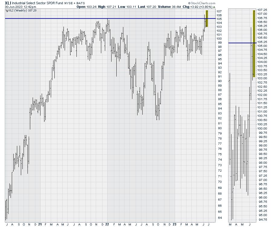
Looking in on the next sectors after the winning three, there are some positive signs emerging. An example would be the industrial chart breaking out to new highs to start the second half.

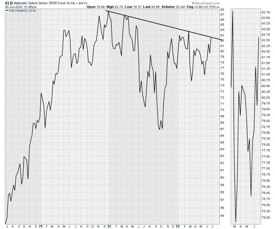
XLB is threatening to break the downtrend to kick off the third quarter. I've used a line chart, as there were a couple of extra-long intraweek price bars that didn't look like part of the trend. Both charts, bar and line charts, convey the same message. We are close to an upside breakout.

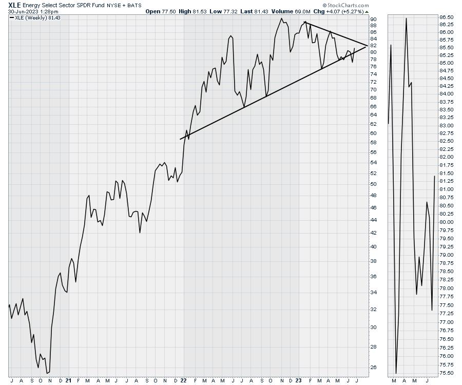
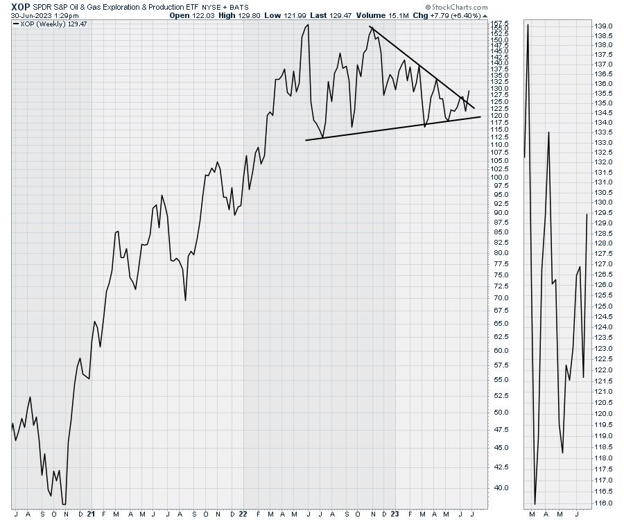
For energy, the XLE (broad energy ETF) doesn't look as close to a breakout as the XOP (exploration and production) chart. The XOP is breaking out the last couple of days.

Here is the XOP.

The Halftime Show
We are now halfway through the year. I'll be doing the halftime show on the monthly conference call at Osprey Strategic on Saturday morning. New clients will be able to listen to recording and can try out everything we offer for just $7 for the first month. My expectation is the next three sectors should make for a fabulous second half, and I'll lay out the reasons why during the conference call and the weekly newsletter.
|
| READ ONLINE → |
|
|
|
| ChartWatchers |
| A Few Bitcoin Buy Targets (If You're Betting On a Thaw) |
| by Karl Montevirgen |

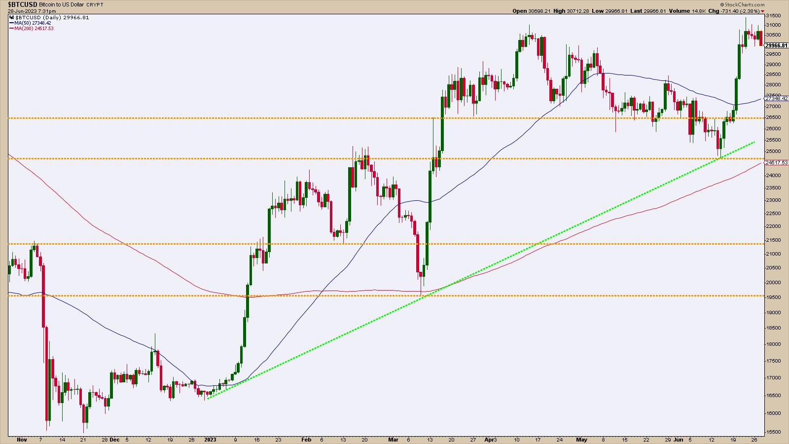
Bitcoin has been on a strong but volatile uptrend over the last seven months since hitting multi-year lows in November. But is the uptrend sustainable and robust enough to warrant an early buy?
Financial Institutions Are Betting On a Bullish Turn
Last Tuesday, there were talks that Fidelity Investments is preparing to apply for a Bitcoin exchange-traded fund (ETF) soon. If this happens, it will be the fifth company to do this, following BlackRock, which applied on June 15. Not to mention, the first leveraged Bitcoin ETF started trading this week.
Are these large financial companies noticing a change in the situation that most of us can't clearly see yet? In other words, is this the beginning of the end of the crypto ice age?
As the saying goes, it ain't over til it's over. But while you wait, there's no harm in planning a few bold moves to buy Bitcoin.
Where is Bitcoin Now?
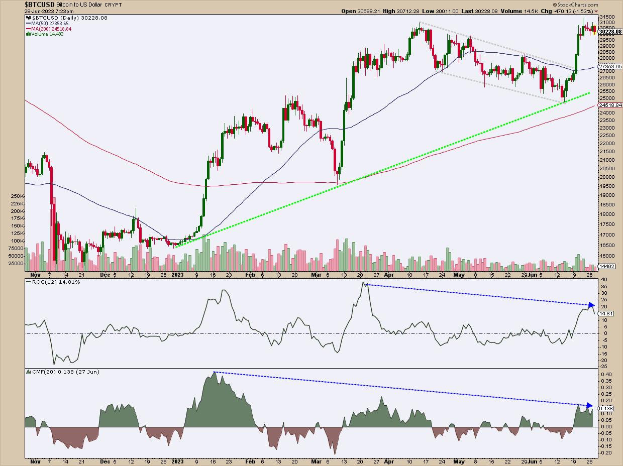
Let's take a look at the chart and plot a couple of indicators—the 50-day and 200-day simple moving average (SMA), Rate of Change (ROC), and the Chaikin Money Flow (CMF)—to get our bearings, gauge momentum, and check the buying/selling pressure.

CHART 1: SPOT BITCOIN IS CHALLENGING ITS APRIL HIGHS. After breaking out of a nearly two-month downtrending channel, the crypto rose sharply in mid-June following news of increasing institutional interest in offering Bitcoin ETFs. Still, bullish conviction seems hesitant, as price meets resistance near the $31,000 range.Chart source: StockCharts.com (click chart for live version). For illustrative purposes only.
- Bitcoin ($BTCUSD) is pushing up against the $31,000 range. It broke slightly above its April highs before pulling back.
- Notice the late-June breakout from the downsloping price channel (see gray channel), a move fueled by news of large financial institutions signaling a commitment to crypto.
- The ROC reading shows a significant burst in bullish momentum coinciding with the channel breakout. While divergence in the ROC may not always be reliable, do note the divergence in price and ROC readings in March and June (both also indicating overbought levels). In short, this indicates the likelihood of a pullback.
- Checking this against the buying pressure, we also see a long period of buying pressure divergence in the Chaikin Money Flow (CMF) going as far back as January.
Still, markets can exhibit profoundly bullish (or bearish) behavior exceeding fundamental or technical justification for extended periods. And given Bitcoin bulls' optimism over the support of large financial players, it shouldn't surprise you if sentiment pushes the crypto above current highs.
But in case Bitcoin pulls back, here are a few buy levels to target if you're willing to take a position in the digital asset early in (what just might be) winter's thaw.
A Few Buy Points to Consider
Let's take a look at the chart again. Notice that there are multiple areas of potential support (meaning, potential buy points), so pardon the busy chart.

CHART 2: POTENTIAL BUY POINTS GALORE. There are plenty of potential support levels on the chart, making Bitcoin conducive to a scaling-in strategy. However, before scaling in, you have to figure out at what level might a bullish perspective no longer be valid.Chart source: StockCharts.com (click chart for live version). For illustrative purposes only.
The first line of defense for bulls waiting to get in is the 50-day SMA, currently at 27,354 and rising, This is a commonly-viewed support level, but notice that it leaves very little room for much of a pullback.
Below this line is a market-based support range near 26,500. This support level saw a heavy amount of trading activity, serving most recently as a congestion area from which the market eventually broke down, leading to the next level of support.
The area below 25,000 marks the most recent swing low and aligns with February highs, essentially resistance that became support. Note that this support area also sees the third touch of a rising (green) trendline that some traders might be eyeing as a potential springboard. And if that wasn't enough, the rising 200-day SMA, currently under 25,00, has also entered this potential support range.
Now, depending on broader fundamental developments, and as strong as these levels appear, they can still fail. If they do, and price falls below this range, you can look forward to support at 21,500 and 19,500, both historical support levels (with the former also aligning with the November 2022 high or resistance turned support).
Managing Downside Risk
The buy levels are, indeed, far and wide. Depending on your bullishness and risk tolerance, you might consider scaling in at different levels.
The tricky thing, as always, is figuring out when and where your long bias may no longer be valid. This is all predicated on how the end of the crypto winter and institutional buying (and, to a lesser degree, retail market sentiment) will play a role in determining the turn in season.
It's More of a Trade Than an Investment ... For Now
And given the lack of fundamentals for Bitcoin as an alternative and widely-adopted currency (simply, because it isn't ... at least not yet), you're wagering on sentiment toward the crypto as a speculative asset. In short, this is more a "trade" than an "investment," so be careful.
The Bottom Line
Bitcoin has shown significant growth and has sparked interest, especially since financial giants like Fidelity and BlackRock have joined the ETF bandwagon. This movement could signal a warming trend in the crypto market—or not. Remember, Bitcoin is more of a speculative trade than an investment (in the traditional sense). But you probably already knew that. As always, exercise caution and diligent analysis, as both are key in navigating the crypto landscape.

Disclaimer: This blog is for educational purposes only and should not be construed as financial advice. The ideas and strategies should never be used without first assessing your own personal and financial situation, or without consulting a financial professional.
|
| READ ONLINE → |
|
|
|
| Top Advisors Corner |
| Farewell to the Eurodollar |
| by Tom McClellan |

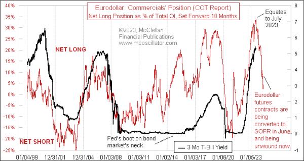
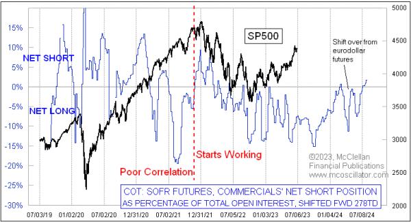
The eurodollar futures contract is now no more, having been replaced by the new SOFR contract (Secured Overnight Financing Rate). For those unfamiliar with the term eurodollar, it is not a reference to the currency markets, but rather it referred to dollar-denominated time deposits in European banks. So you can think of it as LIBOR futures.
For a variety of reasons that are not important here, the CME decided to get rid of the eurodollar contract, and it spun up the SOFR as its replacement back in 2018. The sad part of this for me is that, for many years, I have gotten great insights from the Commitment of Traders (COT) Report data on eurodollar futures. The chart above shows how it gives about a 10-month leading indication of what short-term interest rates are going to do. 10 months ago, this indicator was peaking, which tells us that a peak for short-term interest rates is due right now, regardless of what Jerome Powell thinks.
The red line in this chart reflects the net position of the "commercial" traders of eurodollar futures as a group, as reported each week in the COT Report. The commercials are the big banks, who used these futures contracts as a way of offsetting their deposit/loan imbalances and interest rate risks. The changes in their net positioning carried a magical message about what future interest rate movements were going to look like.
Or, at least, that was true most of the time. When Ben Bernanke was Fed Chairman, the Fed implemented its "zero interest rate policy," or ZIRP, which held short-term rates down to nothing for several years. That did not match the message of this model, as you can see in the middle of that chart above. But once the Fed relented and allowed interest rates to rise again, the correlation was restored.
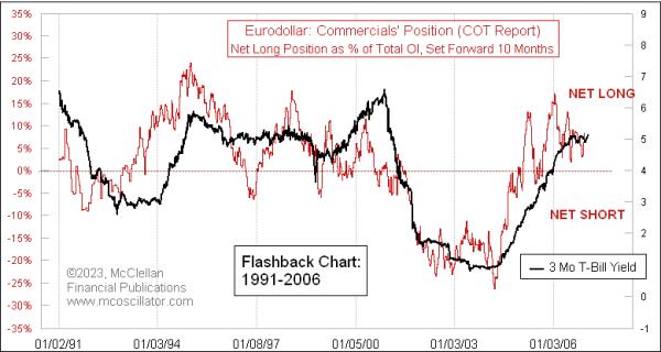
This correlation was working even before the period shown in that chart above. Here is a flashback chart from 1991-2006, showing that the 10-month leading indication relationship was working even back then (although, to my knowledge, no one had discovered it back then until I figured it out years later). Note that the red line with the COT Report data is shifted forward by 10 months in this chart.

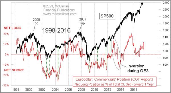
For many years before I discovered the 10-month leading indication these data gave for short term rates, I had used the eurodollar COT data as a 1-year leading indication for the stock market. And it worked great. Here is a chart showing that relationship from 1998-2016, with the red plot of the eurodollar COT data shifted forward by 1 year:

I note in the chart that this relationship did not work for a while in 2013, which was when the Fed started QE3. That was their largest ever effort (before COVID and QE4) to buy up Treasury debt, as well as mortgage-backed securities (MBS) in order to stabilize the banking system and stimulate the economy. QE3 was pretty disruptive, arguably in a good way, or at least in a bullish way. A lot of my other leading indications had also called for a stock market dip in 2013, which did not come about because of that stimulative effect from QE3. By early 2014, however, the relationship was back to working nicely again, foretelling the stock market's movements a year ahead of time.
Curiously, this relationship stopped working in 2018, which was, coincidentally, when the SOFR futures first started trading. I am not sure if that was cause and effect, especially since the SOFR trading volume and open interest were small at first. Whatever the reason, my once-great leading indication stopped working then, which is a great lesson for all of us not to come to count on anything working forever. But the eurodollar COT data did continue working beyond 2018 as a leading indication for short-term interest rates.
So with the eurodollar futures contract now having fully ridden off into the sunset, and its once-amazing COT Report data leading indications going away too, the natural question is whether its replacement, the SOFR contract, and its COT data will perform the same magic tricks. The answer is simultaneously amazing and frustrating.
I have been working with the SOFR COT data since early 2022, seeking that answer. What I have found is that, yes, the SOFR COT data do provide an interesting leading indication for the stock market, and I have shared that with subscribers of our twice monthly McClellan Market Report and our Daily Edition.

There are two curious points about this relationship. The first is that the lag time which works best is about 13 months, instead of the 12 months that had worked before with the eurodollar COT data. And that lag time is a bit imperfect, with the stock market sometimes running a bit early or late compared to the model, and varying back and forth between early and late, so I'm never sure exactly how to interpret its message.
The second curious point is that the relationship did not work at all during the first 3 years of the SOFR contract's existence. Correlation back then was horrible, but then, starting in late 2021, it seemed to finally click and start working. It may be that the SOFR was so new at first, and not being widely adopted yet, so the message from the big banks about future liquidity flows was just not yet contained in these data early on.
I will be continuing to feature this SOFR COT model in our twice monthly newsletter and Daily Edition, so, if you are interested in seeing how things turn out, and you are not already a subscriber, I hope you will decide to give one or both a try. You can sign up at https://www.mcoscillator.com/market_reports/.
|
| READ ONLINE → |
|
|
|
| MORE ARTICLES → |
|
 Chart 1
 Chart 2
 Chart 3
 Chart 4
 sChart 5


