- S&P 500 Affirms Weight of the Evidence.
- New Highs Expand Yet Again.
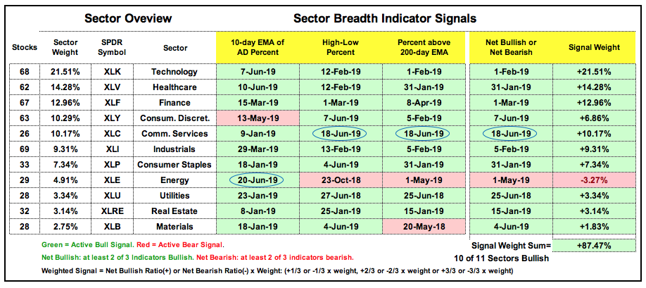
- Sector Table Improves with Two Bullish Signals.
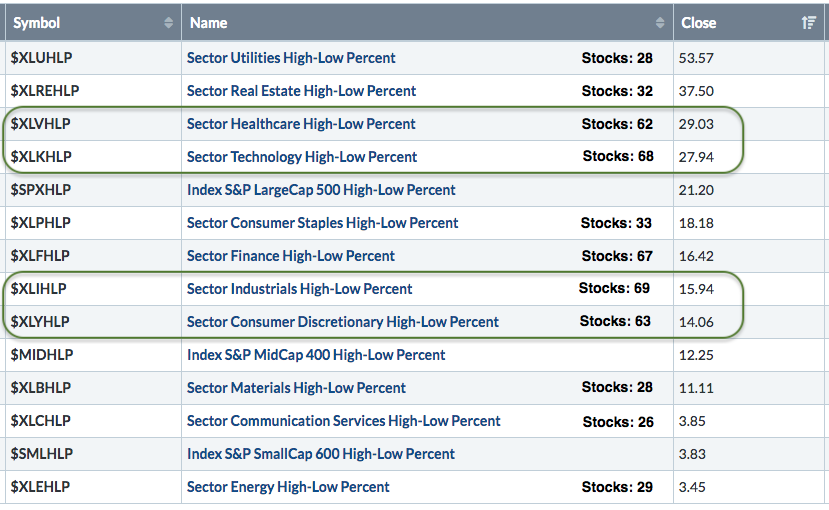
- Healthcare and Technology Lead New High List.
- What if you already Knew....?
- Art's Charts ChartList Update.
 ... All Time High Means only One Thing
... The S&P 500 hit a new all time high this week and the market remains in bull mode. It is not possible to be in a downtrend when trading at a new high and it is not possible to be in a bear market when the S&P 500 is trading at a new high. Small-caps may be lagging and defensive groups leading, but 70% of stocks in the S&P 500 are above their 200-day EMAs. In addition, over 20% of S&P 500 components recorded 52-week highs this week, and not just defensive issues. Stocks hitting 52-week highs are in strong uptrends and leading. Thus, 22% of stocks in the S&P 500 are in strong uptrends and showing upside leadership. There is always something to worry about, but the weight of the evidence remains bullish for stocks right here right now.
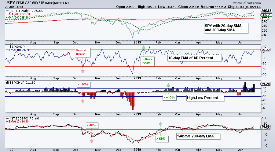
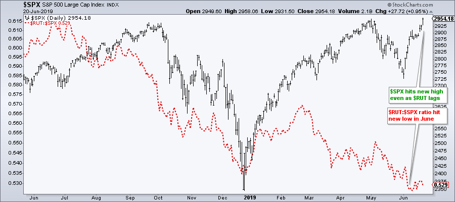
The S&P 500 is the single most important barometer for the stock market and price action is the single most important analytical tool. The 20-day SMA has been above the 200-day SMA since early March, the index hit a new all time high in early May and again this week. The path of least resistance is up.
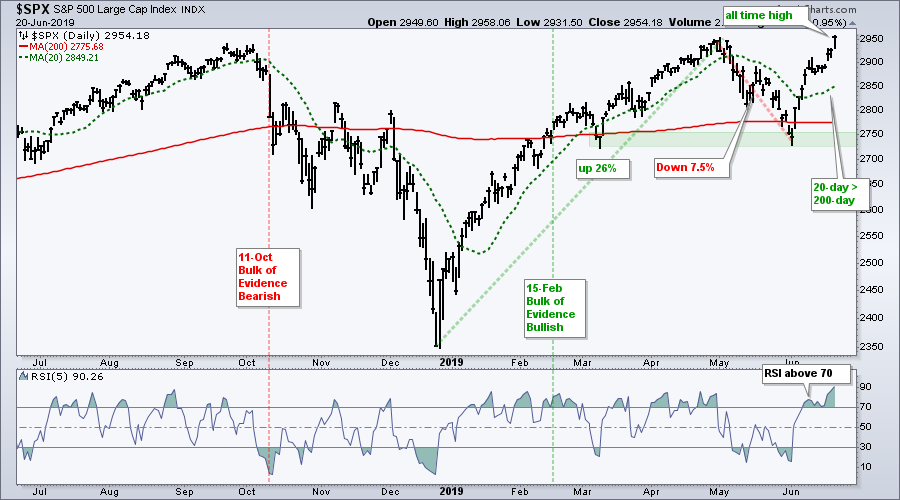
While the all time high may seem "extremely" bullish, I am hesitant to quantify the degree of bullishness with an overcharged adverb. No matter when the signal or what the signal, we do not know how long a bullish signal will last or how far the market will extend, if at all. Furthermore, we do not even know what inning we are in for this bull run. This will only become apparent after the fact. For now, the bull simply remains in place until proven otherwise. Trade accordingly.
New Highs Expand Yet Again
The breadth indicators for the S&P 500 have been net bullish since February 5th and the index breadth table has been bullish since February 15th. Small-caps are still dragging their feet because two of the three small-cap indicators are still on bearish signals. Nevertheless, two of the three mid-cap indicators are on bull signals. Overall, six of the nine indicators are on bullish signals.
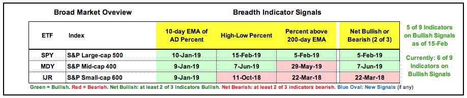
If I had to weigh these indexes and signals, I would weight the S&P 500 at eighty percent, the S&P Mid-Cap 400 at ten percent and the S&P Small-Cap 600 at ten percent. Why? Because the S&P 500 captures around 80% of the total US equity market. The chart below shows new highs in the S&P 500 hitting 110 and new highs in the S&P Mid-Cap 400 hitting 51, which is the highest level since June 2018.

Sector Table Improves with Two Bullish Signals
The sector breadth table improved with XLC High-Low% ($XLCHLP) exceeding +10% and the 10-day EMA for XLE AD Percent ($XLEADP) surging above +30%. The Communication Services SPDR is now net bullish with two of the three indicators on bullish signals. The Energy SPDR remains net bearish because two of the three indicators are still on bearish signals. All told, ten of the eleven sectors are net bullish and the sum of the signal weight is at 87.5%. Only 4 of the 33 indicators are on bearish signals.
Healthcare and Technology Lead New High List
Even though the utility and REIT sectors are responsible for a large chunk of new highs in the S&P 500, the technology and healthcare sectors are also leaders when it comes to new highs. Note that XLU and XLRE have 28 and 32 stocks, respectively. In contrast, XLK and XLV have 68 and 62 stocks, respectively. These two big sectors have twice as many stocks. High-Low Percent hit +28% for XLK and +29% for XLV. Also notice that High-Low Percent hit +16% for XLI, which has 69 stocks, and +14% for XLY, which has 63 stocks. Using a back of the envelope calculation, this suggests that there are around 55 news highs in these four sectors. Thus, there are plenty of new highs outside of utilities, staples and REITs.
This table was created by viewing a ChartList in Summary format. Click here to learn more. Note that the stock totals come from the SPDRs website (SPDRs.com) and the total equals 505. There are also 505 stocks listed in the S&P 500 SPDR (SPY). As far as new lows, I count four on Thursday: BK, KR, KSS and MAC
What if you already Knew....?
What if, in January 2019, you knew the following would play out in June 2019. I covered this topic in Thursday's show, On Trend, which can be seen on YouTube. Here are some year-to-date performance stats from the PerfChart below:
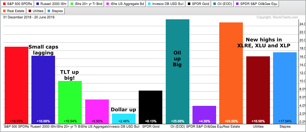
- 20+ YR T-Bond ETF +10.5%
- Dollar +2.5%
- Oil +25.7%
- Real Estate SPDR +24.9%
- Utilities SPDR +16.6
- Consumer Staples SPDR +17.5%
Despite a big rally in Treasury bonds and a 10-yr T-Yield ($TNX) near 2%, the S&P 500 SPDR (SPY) is up 18.9% year-to-date and the Russell 2000 iShares (IWM) is up 16.7%. Small-caps are underperforming large-caps, but certainly not hurting this year.
 XLU, XLRE and XLP are the only sectors to record new highs in June. Yes, the other eight sectors have yet to record new highs. Thus, the defensive sectors are leading on the price charts. Even so, it does not matter, because the S&P 500 hit an all time high on Thursday.
Even though the US Dollar ETF (UUP) is up 2.5%, the Gold SPDR (GLD) is up 8.13%. Gold is pretty much ignoring a strong Dollar.
More often than not, we are better off focusing on the symbol we are trading and ignoring shady relationships. Are you interested in the S&P 500? Then focus on the index chart and breadth indicators directly related to its performance. The S&P 500 can hit new highs when small-caps are lagging and defensive stocks are leading. Overall, the S&P 500 can move higher as long as 50 + 1 percent of its sector and/or breadth components are bullish. It does not matter which sectors or components as long as a majority show strength.
Are you interested in gold? Then focus on the gold chart. Yeah yeah, I know, the Dollar and gold have an inverse relationship. However, relationships are subject to change and nuance. Price is the ultimate arbiter and the price chart is where real signals occur. Moreover, our profits and losses are determined by price movements in the symbol we are trading, not by the symbol's relationship to another symbol.
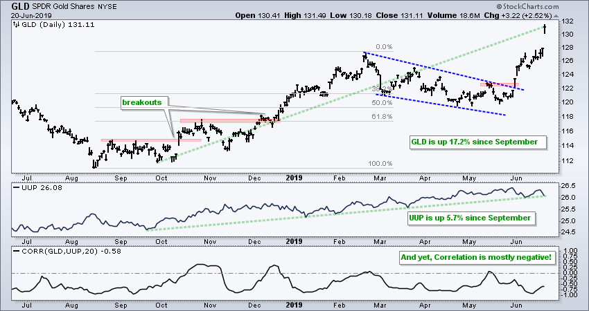
The chart above shows GLD breaking out in late May, a day before the US Dollar ETF (UUP) hit a new high. GLD is up 17.2% since late September, while UUP is up 5.7% since September and the Correlation Coefficient is mostly negative. Thus, even though UUP and GLD are negatively correlated for the most part, they are both up over the last nine months. Talking about nuance.
Admittedly, I am also guilty of over-extrapolation and nuance sniffing. I watch the spread between Junk bonds and Treasury bonds, the Fed's balance sheet and ratios to measure risk-on and risk-off. While some of this may be helpful at times, it can also distract from what is happening on the price chart for the S&P 500 and the key breadth indicators. The distractions and noise were quite high in late May, but the index was only down 7.5% and the breadth indicators were still bullish. This was a garden variety decline after a 26% advance.
It is time to get back to brass tacks and focus on the S&P 500 to assess the state of the stock market. Are the $SPX breadth indicators net bullish and is the 20-day SMA above the 200-day SMA? Fine, then be bullish on stocks overall and look for bullish setups. Are small-caps lagging? Fine, then choose large-caps over small-caps, but don't consider this bearish for stocks overall. Are defensive stocks leading? Fine, then show a preference for defensive stocks, but don't consider this bearish for stocks overall.
Art's Charts ChartList Update
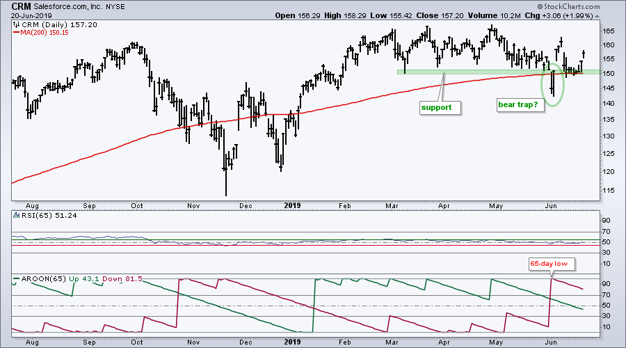
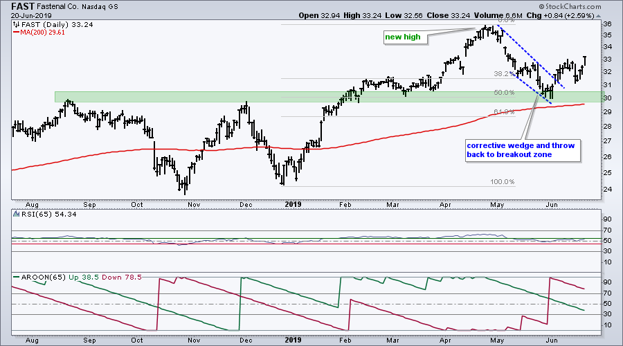
The Art's Charts ChartList was updated on Thursday with 30 stocks. I posted an article on scanning for stocks in strong and steady uptrends on Wednesday and most of the stocks were picked from the scan results. Of course, I scroll through hundreds of stock charts each week and there are five stocks on this list that did not fit the scan criteria (CRM, FAST, FISV, PPL and VRTX). Yep, technical analysis is part objective and part subjective. Let's review the five outliers.
The first chart shows CRM breaking support and recording a 65-day low as Aroon Down (65) hit 100. CRM snapped back quickly with a gap-surge back above 150 and then affirmed this support zone with a bounce on Wednesday-Thursday. Overall, the stock hit a new high in March and sideways action over the last few months looks like a correction within a bigger uptrend.
The next chart shows FAST recording a 65-day low on May 31st as Aroon Down (65) hit 100. Despite the 65-day low, the decline looks like a correction when put in context. FAST hit a new high with a 50% surge from late December to late April. The subsequent decline retraced around 50% and returned to the breakout zone. A falling wedge formed and the stock broke out in early June.
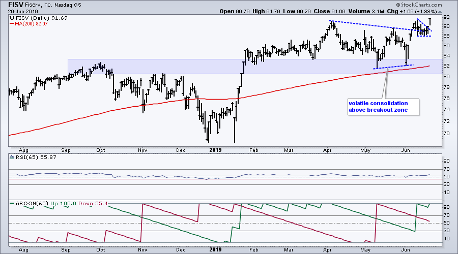
The next chart shows Fiserve (FISV) breaking out to new highs in late January and then consolidating for several months. After hiting another new high in April, a volatile consolidation unfolded that produced a 65-day low in mid May. The subjective analyst in me thinks there is a bigger support zone at work and price action from February to May is just one big consolidation (within a bigger uptrend). FISV broke out to new highs over the last two weeks and is a leading stock right now.
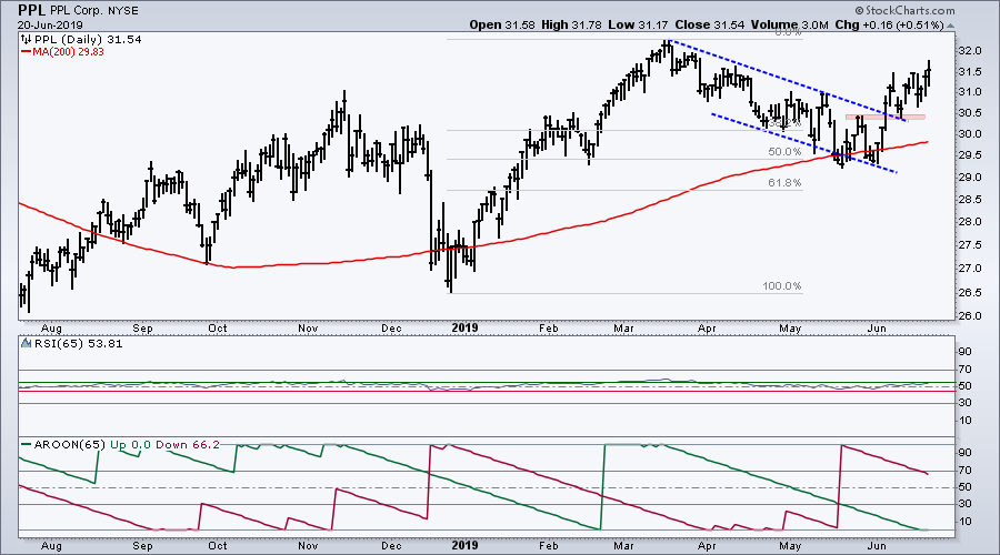
The next chart shows PPL hitting a new high in March, correcting into May and breaking out in early June. Even though the stock recorded a 65-day low in mid May, the decline looks like a correction within a bigger uptrend.
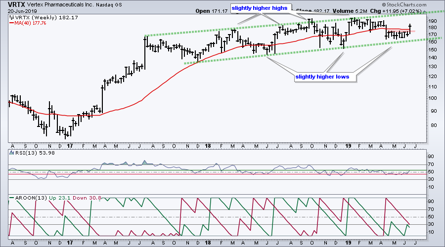
The final chart shows Vertex Pharmaceuticals with weekly price bars, 13-period RSI and 13-period Aroon. You can see RSI regularly dips below 45 (red line) and Aroon Down regularly hits 100 (13 week low). However, the price chart shows a slow and choppy uptrend. Each higher high just edges out the prior high and each higher low barely hold above the prior low. It is boring, but the trend here is up. The stock popped this week with a break above the April-May highs and this suggest that the boring uptrend is set to continue. Don't fall asleep.
In a separate, but related list, here are the leading stock ETFs: XLU, XLP, XLRE, FINX, IPAY, IGV, KIE, ITA, TAN, IHI.
Click here for the Art's Charts ChartList
Questions, Comments or Feedback?
I do not take symbol request and I cannot promise to response to all correspondence, but I will read it and take into under consideration. I greatly appreciate all feedback because it helps me improve the commentary and provides ideas for the future.

Plan your trade and trade your plan.
Arthur Hill, CMT
Senior Technical Analyst, StockCharts.com
Author, Define the Trend and Trade the Trend
Want to stay up to date with Arthur's latest market insights?
– Follow @ArthurHill on Twitter
– Subscribe to Art's Charts
– Watch On Trend on StockCharts TV (Tuesdays / Thursdays at 10:30am ET)