In a series of market manias, no one can ignore the rate that Bitcoin became a real deal, only to go quiet on it a few months later.
This is the fifth article in a series of modern day manias.
Part 1 can be found here. The Year 2000.
Part 2 can be found here. The Year 2007.
Part 3 can be found here. The Year 2011.
Part 4 can be found here. The Year 2011 Commodity Charts.
So when we talk about a mania, typically it can be represented by a chart with an increasing rate of acceleration, towards a church spire top. This top representing social interest quickly implodes and investors run for the exits.
Of course these manias can by primary cycle manias that take years to run up and burst, or flash in the pan types that last a few months.
It is not so much the time it takes. It is the rate of change in public or investor opinion towards this final end. The bigger the mania, the wider the awareness in the public space. Is it local to a small town with a new singer on the TV show, The Voice? Is it the Super Bowl run up to a final crescendo on game day, and four days later the water cooler chatter on the game is over? Is it a global phenomena that everyone in the world is watching like the World Cup? The size and scale vary, but they all lead to the same thing. A climactic church spire in interest, then an absolute drop that tarnishes any possible run back to the previous high anytime soon.
Here is the Google Trends chart for Bitcoin.
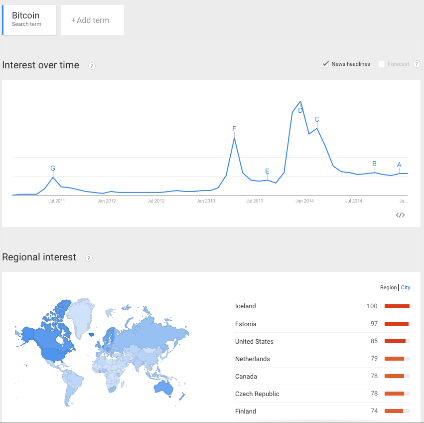
Although Bitcoin was started in 2011, 2013 was the year that the public became aware of the attempts at a digital currency. This online effort was the first time that the public became broadly aware of a new form of currency called digital currency. This reached into the public awareness almost everywhere around the globe. We were introduced to Bitcoin. The Bitcoin graph below has an interesting replication of a pattern on the chart. You can see a ten fold increase from $20 to $200. The next spike goes from $100 to $1000. This is also referred to as a fractal. A fractal is a mathematical concept where a similar pattern occurs on different scales. The fractal pattern for manias may occur briefly over a period of a few days or it may take years to appear. The summit of the mania fractal is created by a major parabolic move that results in a massive quick reversal. In the study of stock market behaviour, this sudden reversal scares new buyers. It might also be the last time that the price settles at this high level. Spotting a new mania in real time, trading a mania, and realizing when the action at the summit of the mania is final is very hard. Most investors are out too soon or in too long.
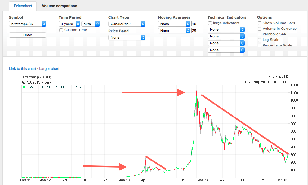
Chart courtesy of BitcoinCharts.com
For us, the summit is the most amazing part of the chart, where fortunes are made and lost. I would like to review the period from just after the April 2013 spike through 6 months to October 2013 on the graph above. After the chaotic spike up and an even faster spike down, we can see a bounce theory in action. The bounce after each move down is smaller than the previous bounce until most people lose interest completely. In a series of higher lows and lower highs we create this convergence to a price level that lacks volatility. In reality, the price is probably still volatile, but not anywhere near the scale that we saw near the summit or the subsequent reversal points on the chart. The size of the parabolic move in height compared to time is very important. While this scale is not detailed enough for us to tell the start and the end exactly, it would appear the initial run up took a little over three months. The huge price moves all took place in a few weeks. The dramatic fall took less time, and the waning of interest seemed to take 5 multiples of the parabolic move up and the punishing collapse. So if the parabolic surge and collapse took a month, it took a ballpark estimate of 5 months for the whole thing to flatten out and lose the extreme volatility.
Here is the same chart with the volume laid on it. The spike in pricing also comes with a spike in volume. There are a few outlier volume candles, but the conclusion of the story seems to be the more something is in the news, the higher the price goes. There is a second conclusion that Dr. Alexander Elder calls the greater fool theory. We buy because the price is shooting up, hoping to sell to someone who thinks it is a better buy at a higher price. The problem with manias is knowing when the last 'fool' has bought. Now Bitcoin looks to be a relative value at $300 compared to $1200. It also looked that way for the last $800.
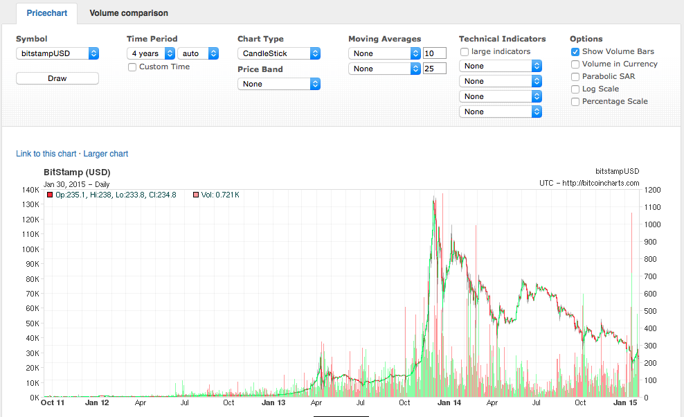
Chart courtesy of BitcoinCharts.com
Bitcoin is an interesting study of a mania because it is so new. While it might become one of the world's strongest currencies on some future date, today the chart pattern resembles the tulip mania, the gold rushes to California and Alaska, the diamond exploration licenses in Canada, or something as simple as the ALS Ice Bucket Challenge. This is a graph of the Ice Bucket Challenge from Google Trends.
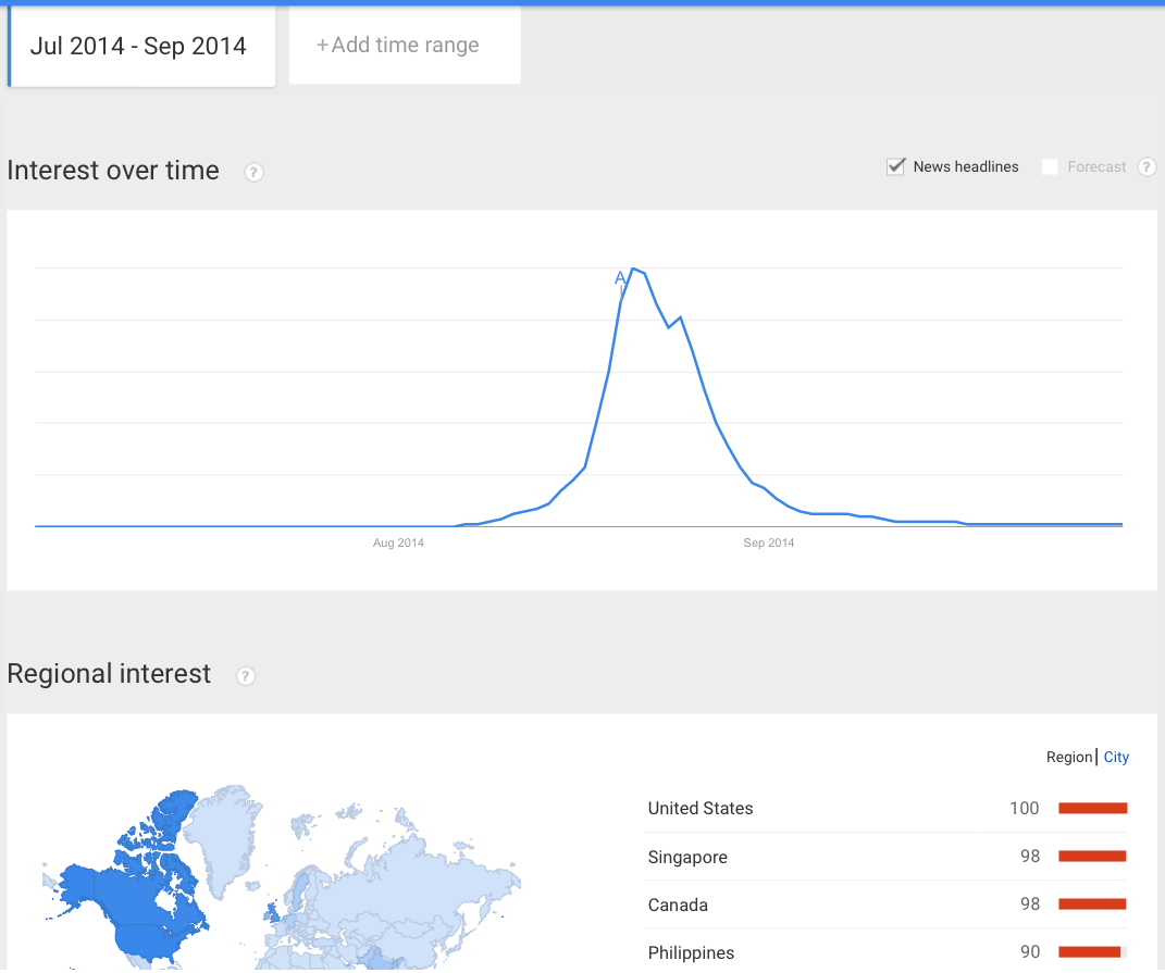
The similarity of the trend on something as simple as pouring cold water over your head to buyers of Bitcoin, oil, gold, diamonds, and biotech stocks like ICPT, can only be described as a mania fractal.
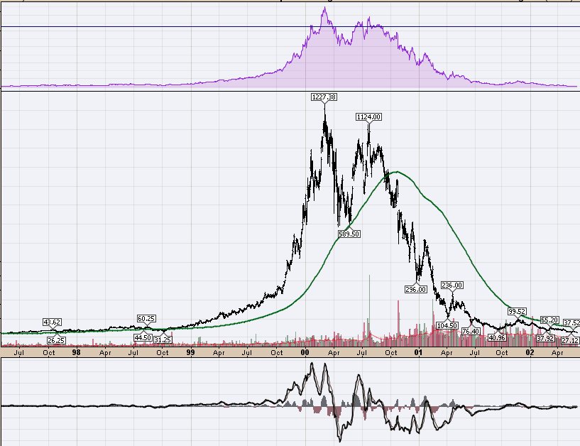
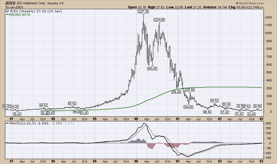
So returning to the chart that I posted at the top of this article, This was a network communications company that sold real goods and services into the communications industry.
What is important throughout this series of articles is to recognize the manias that are all around us everyday in different walks of life. Is it Taylor Swift marketing her new album or YouTube hits on a viral video? Understanding the mania dynamic in the stock market can be very valuable. Now that we have reviewed what a mania chart looks like, what a fractal is and some great examples of manias in recent history, the next article will walk the talk of 2014 market mania.
There are now four weekly webinars for StockCharts clients each week. Arthur on Tuesday, Erin on Wednesday, Greg on Thursday and Chip on Saturday. Please see the What's New section of the StockCharts.com homepage to register.
Good trading,
Greg Schnell, CMT


