This is the sixth article in a series of modern day manias. This article will be an in-depth plunge into the Oil and Gas Industry.
Part 1 can be found here. The Year 2000.
Part 2 can be found here. The Year 2007.
Part 3 can be found here. The Year 2011.
Part 4 can be found here. The Year 2011 Commodity Charts.
Part 5 can be found here. The Years 2013 - 2014.
Where to begin on one of the biggest booms since Turner Valley? Where is Turner Valley? It was a small town in the middle of the wild unbridled west, in the foothills of the Rocky Mountains. Here is a link to the Calgary Herald recently covering the history of the Dingman well in Turner Valley. Calgary Herald History of Turner Valley. The article describes the mania that accompanied the success of the well. I think it is a great grounding rod for what went on recently at the Bakken, Marseilles, and Eagleford plays to name a few. There are many more that we could add. I'll focus on the Bakken, because the reservoir was on both sides of the Canada US border. The orange frame shows the general swath of the oilfields in Canada and reaching into the USA. We can see the bright lights of the Bakken in the bottom of the rectangle and the Canadian Oil Sands in the top of the rectangle. You can see the light emitted from the compressor stations and processing facilities make an interesting 'Milky Way' corridor. You can see the same effect in the Eagleford area below San Antonio on the map.
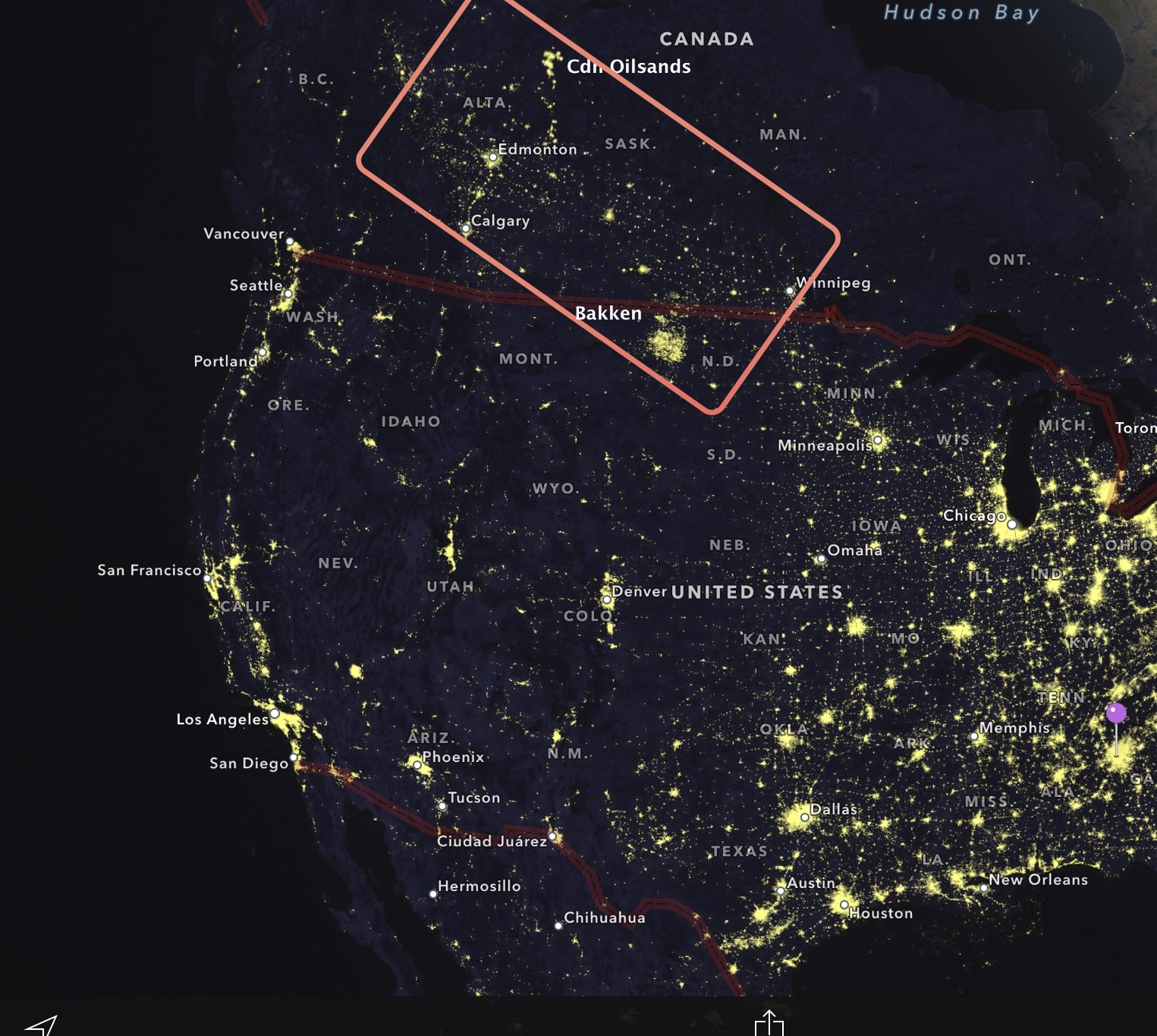
The Bakken region shows up brightly because of the flaring of the Natural Gas at the well head. Perhaps we can set the stage with some concepts. In six years from 2008 - 2014 the Bakken production went from 70,000 to over 700,000 barrels/day. A relative of mine moved from Las Vegas as a chef to drive trucks in the region. RV's were parked on prairie grassland like it was an RV storage lot. 23' trailers everywhere. Help wanted signs everywhere. A Kenworth followed a Peterbilt who followed a Navistar who followed a Freightliner with flatbed trailers in tow. Portable crude oil and water storage tanks parked everywhere sitting tilted on raw land, awaiting a call for delivery. Towns heaving with people. Hotels have sold out for years. Commuting 60 miles to work from a room and board rental was common. Pickup trucks were chromed up with mud bogging tires, paycheques gambled away in camps (call it the City of Lost Wages) like high rollers in Las Vegas. People from other states and provinces flying in and working 3 weeks in, 3 weeks out. Flare gas igniting the night sky. High school educations with 6 figure paycheques. Main highways pounded apart from all the oversized loads. Gravel was the new yellow brick road. "10-4 good buddy, how soon can you be here?"
The oil industry was changing. We had developed a drilling method that could turn corners. From the start of a well drilling down vertically, turn any direction at any depth to start running horizontally inside the reservoir with 3 dimensional location coordinates built into the drill bit motor. Nice technology. Expensive to drill but the paybacks were faster, even though the decline rates were rapid. We could enhance this with a technology known as fracking. For the non industry readers out there,"frac" is short for fracturing a well. Because mainstream media added a 'k' in there, I will too. So we will spell fracing as fracking. Fracking itself is not new. In the old days, we were trying to fracture 10 - 100 feet of vertical pay. Now we are trying to fracture the rock deep into the reservoir, where the horizontal part of the well, called the lateral leg, stays in the pay zone longer. Some fractures would be a series of fracks to get 1000s of feet of reservoir. For more information on how this all works, Trican Well Services has an excellent video. Follow this link to Trican's animation videos, specifically Horizontal Stimulation.
This was a game changer. Old well locations could be re-drilled laterally, and new reservoirs that were not very thick could be captured using laterals. Because of this technology, you could go into reservoirs that are called tight reservoirs. Essentially, we could not get the wells to flow that were containing the oil or gas in the old days. In a vertical well, the well quickly ran out of profitability. With the lateral technology, all of these 'tight' formations were able to be fractured to allow a lot more of the reservoir to flow back to the well head. Ok. Enough tech talk. The change in the drilling and fracturing technology changed the way we could produce reservoirs that were previously unprofitable. 'Unconventional plays' is the industry term used to describe them.
Much like the dawn of the internet was to the telecommunications business with banks playing a huge role in financing the dream, or the ability to sell subprime bundled loans as AAA was fuelling the housing market, the oil patch was living a whole new plan. Old reservoirs were worth billions, tight 'unconventional' reservoirs could come on stream profitably and global demand was marching ahead. Unconventional plays were the new main stream. The banking industry was focused on the energy business and the granddaddy of them all, extremely low finance costs for new wells and capital equipment in the energy space. The energy sector was responsible for 1/3 of capital spending in the S&P 500.
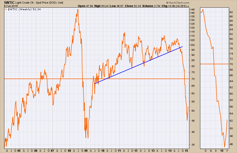
Recently, the price of oil collapsed from $107 down to $40. Here is the chart.
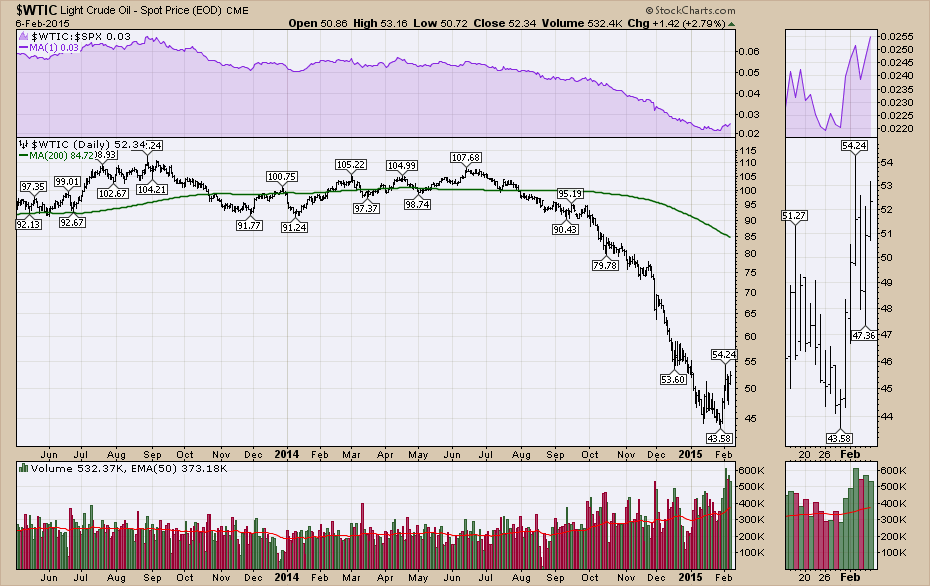
It is more important to put the move into historical context. As we can see, this is the most precipitous fall since 2008. The horizontal line in the middle of the chart is a current ballpark estimate of the marginal cost of production. Here is an article from Business Insider showing all the costs of production for new projects going forward. Oil Costs for Future Projects. Feel free to pick a number from the list, but farther down in the article it mentions that a significant amount of shale production is challenged below $72. So I have picked $70 to represent marginal cost. Lots of companies can have the full cost of production significantly higher. In 2008, the bank accounts were still full from the 2008 oil prices of $140/ barrel. In 2014, the companies were making money and the stock prices were running up into September 2014. Then the selling price broke down. The companies are not as flush with cash as they were in the heady days of 2008 because they had been aggressively reinvesting with a return near or above their full cost of production.
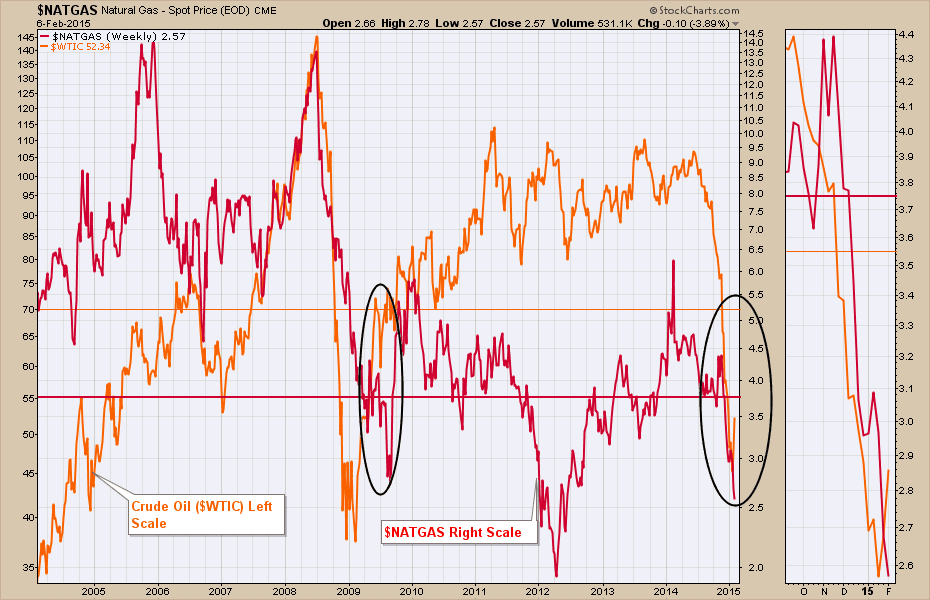
Below is the chart of Natural Gas. Natural Gas currently has a marginal cost of production around $3.75 - $4. Ken Medlock estimates Shale Gas at $4.85. Some work with regards to the marginal cost of Shale Gas is detailed in this Energy Matters Article. The article makes it pretty clear that even $4.85 is a stretch. Both Shell and Exxon have described Shale Gas as "uneconomical". I'll go with $3.75 and any number higher makes the case even worse. In 2008, with the Global Financial Crisis, the Natural Gas companies had full bank accounts with $12 gas preceding the trough in the crisis. Currently, Natural Gas prices are 30% below the marginal cost estimate. The gas producers didn't have deep rich pockets as the price plummeted in 2014 because the last 4 years have not seen a real gap between marginal cost and selling price.
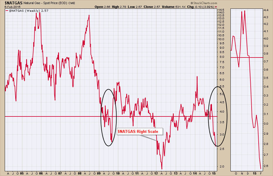
But it is the conundrum of overlaying the charts that makes the biggest message. Both of these commodities are well below their marginal costs (not even the full cost which would include head office counts, etc.) to produce at the same time. In 2008 they had full bank accounts. When one commodity dropped below the marginal cost of production, the oil and gas companies would switch to the other commodity. This is the second time in at least 10 years that both commodities are below marginal cost at the same time. Those black circles on the charts are what is causing the black circles under the eyes on the CEO's faces. But as I mentioned before, they do not have a giant cash reserve in their bank accounts this time. So, after a brief phone call to their favourite banker on a request for money to keep drilling, the banker suggests that they are revisiting all of the loans to the industry right now and won't be able to provide any new capital until one or the other product gets back above the marginal cost.
This is also the industry that was making up 1/3 of the S&P 500 capital expenditures breaking down. So the question we have to ask, is this a mania that is going to come crashing down on the industries around the energy sector and will it eventually tailspin the global economy?
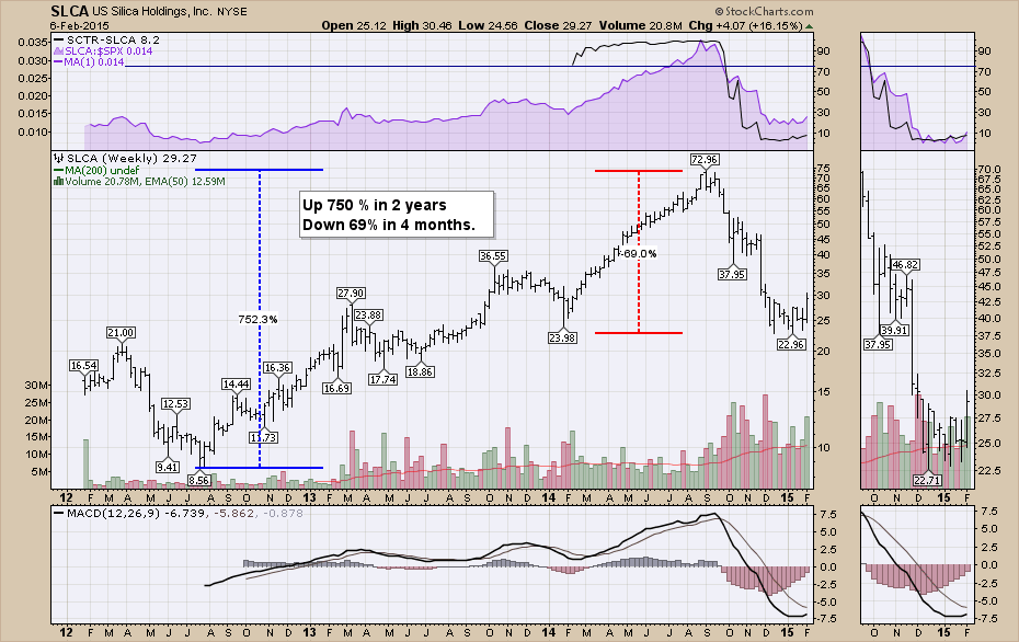
In 2014, all of the traits of the previous boom times in 2000 and 2007 were in place. We had continued investment, even though it was unprofitable to do so (shale gas and oil). We had cheap financing. We had investors buying into the biggest boom with portable housing, extremely high wages for basic labour jobs, massive capital expenditure building up for the biggest windfall. Fracking sand companies had their shares trading at astronomical levels.
Here is a company that provides fracking sand. Silica Holdings (SLCA). This would appear to be a mania style run on a stock.
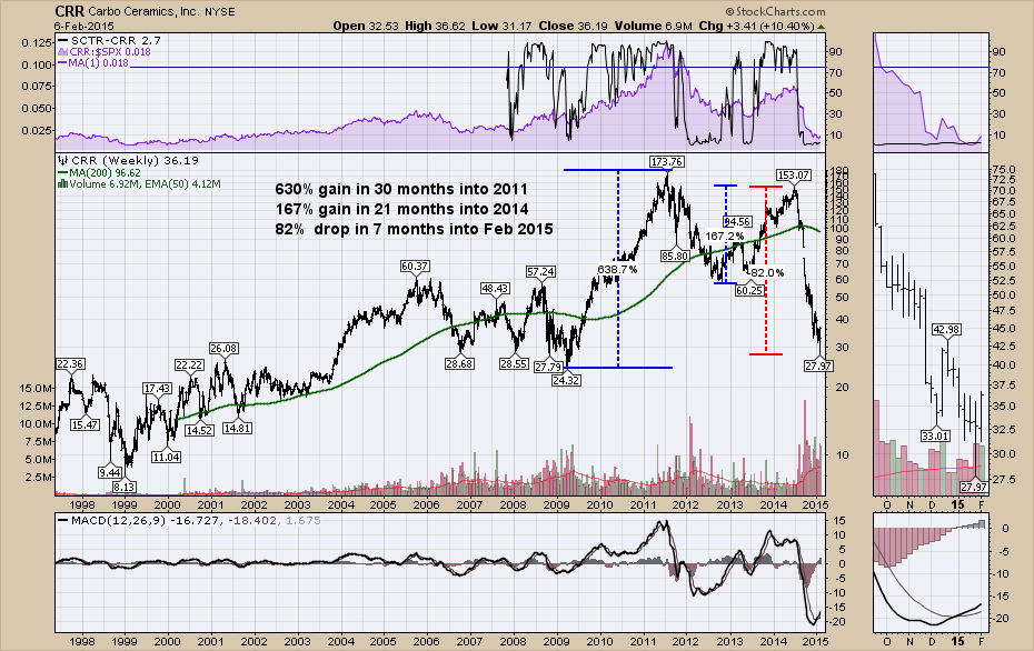
Here is a company that makes the proppant used in fracking. Gains of 630% into 2011 with a recent drop of 82% in 7 months. Do those feel manic?
That lays out the base case. Oil and Natural Gas have plummeted and are both well below marginal cost with the inventory in North America bursting at the seams. We currently have more oil in storage than any time since 1982. 1980-1982 was also a time of a massive oil price pullback that didn't start a long term recovery until 1986.
Let's go through other mania charts. Let's start with Google Trends for Fracking and Shale.
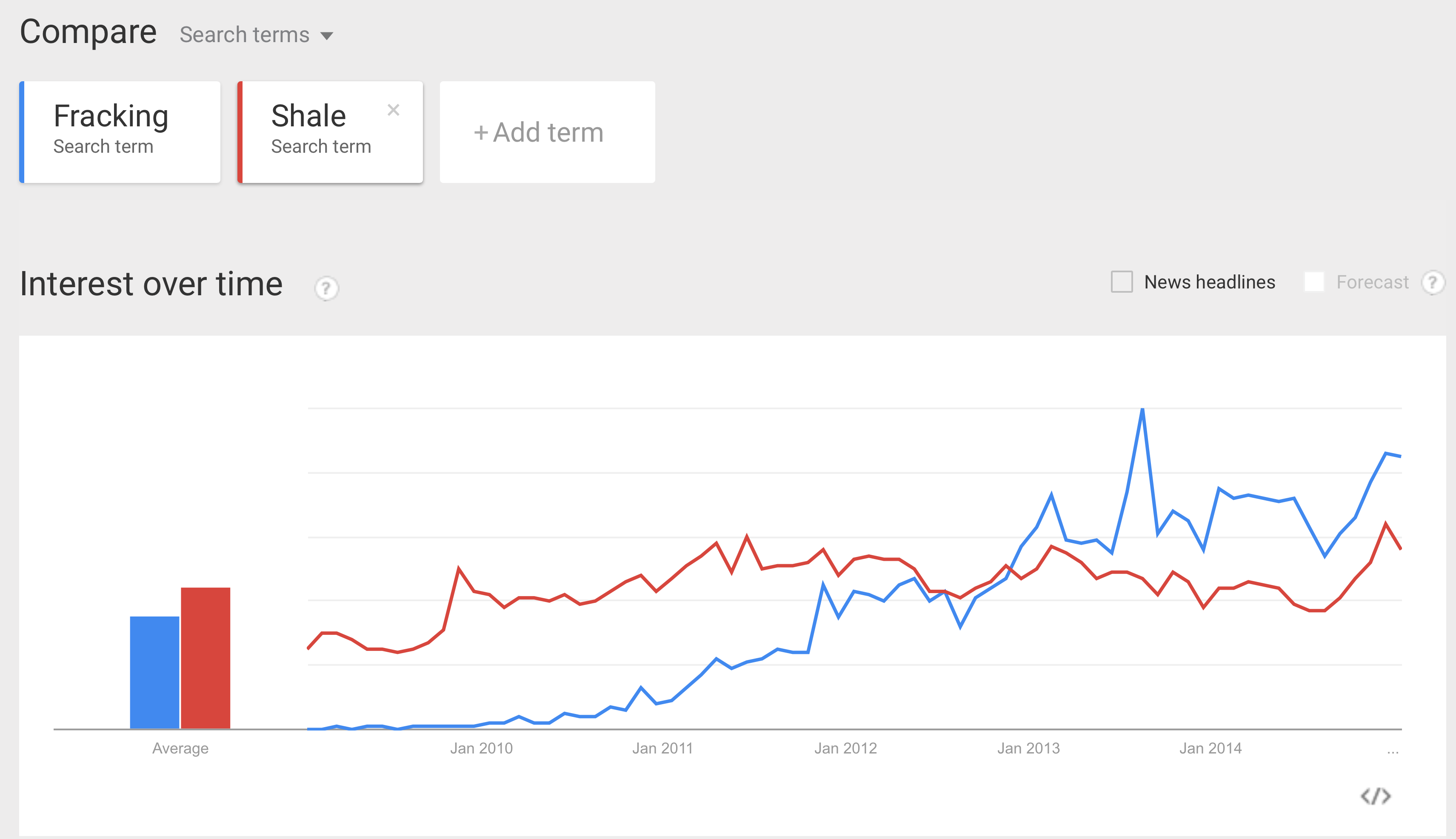
Source: Google Trends
We don't see the sudden spike in interest but rather a continuous rise for fracking. Shale does not seem to be newsworthy. So this doesn't seem to be in the mania style but if interest all of a sudden plummeted, that would complete the chart. We don't see that here.
Let's work through the indexes. So far, we do not see any breakdown in the markets. We do see consolidation since October 2014. At this point nothing notable. The recent week has a very bullish outside candle showing a tentative reversal of the 2 month downtrend. We would need to see the price action this week confirm. We are currently back to major resistance levels. The current state of the Russell 2000 ($RUT) reminds me of the Year 2000 $INDU.
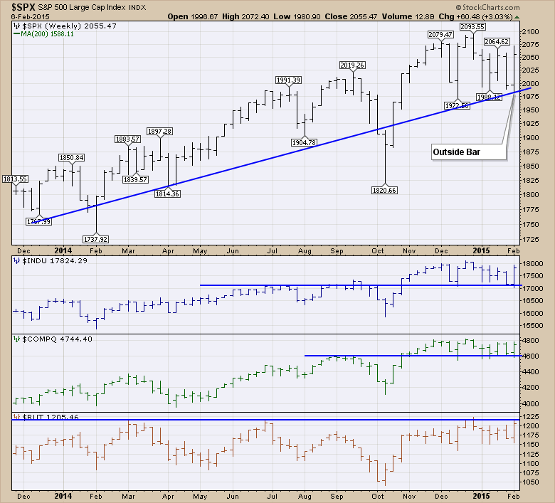
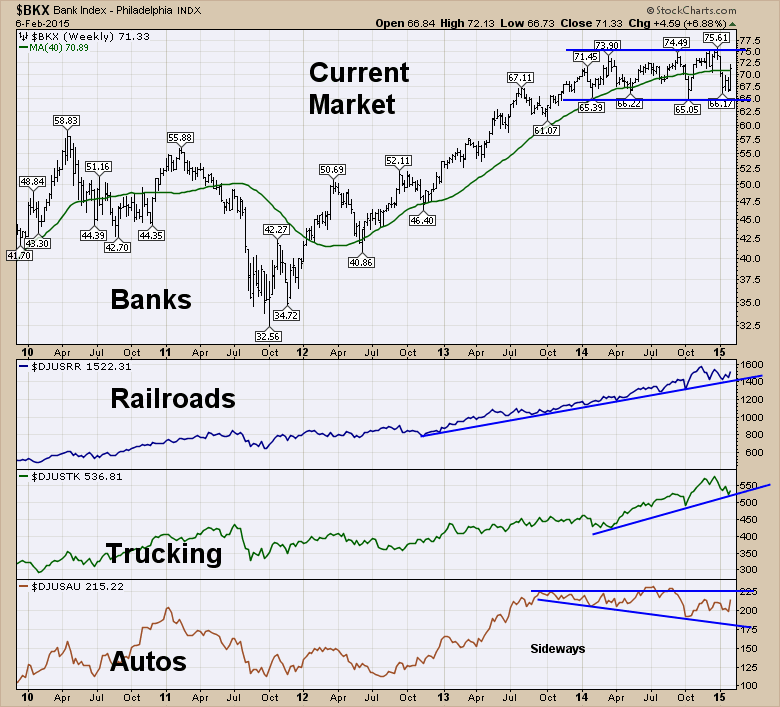
Here are the Banks and Transports. The banks have trended sideways for a year and the autos have had down trending lows for a year. However, the recent upturn on the autos chart to the middle of the range is promising. The trend in Autos and the banks suggests caution. As we have seen before the rails and trucking are not good early trend indicators.
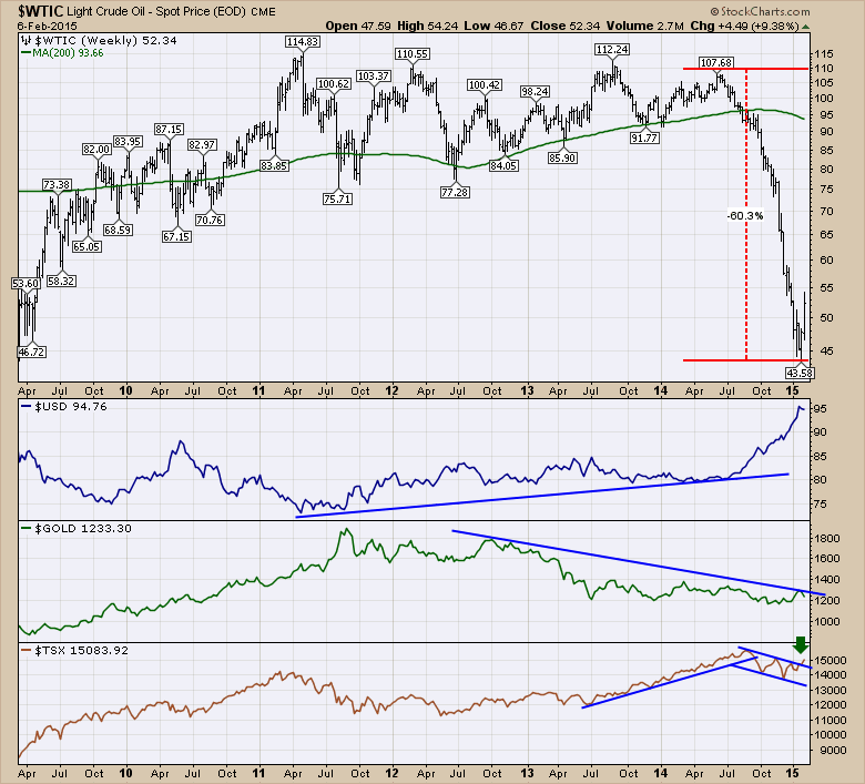
Here is Crude with The $TSX, the $USD and $GOLD. The $USD surging also happened in 2000 at the top but it didn't quit the long term trend till 2002.
I looked in on the Average True Range (ATR) for various tickers like the banks, autos and the Dow Jones Industrial Average ($INDU). They are all substantially elevated which is not good.
Let's look at the Bullish Percent Indexes. The Nasdaq Indexes don't look bullish. But they are also at the lower end of the normal range. If they can move up from here it is important. If the overall market was to pull back, this would be one of the charts that we would refer back to and say it was obvious because it is so weak.
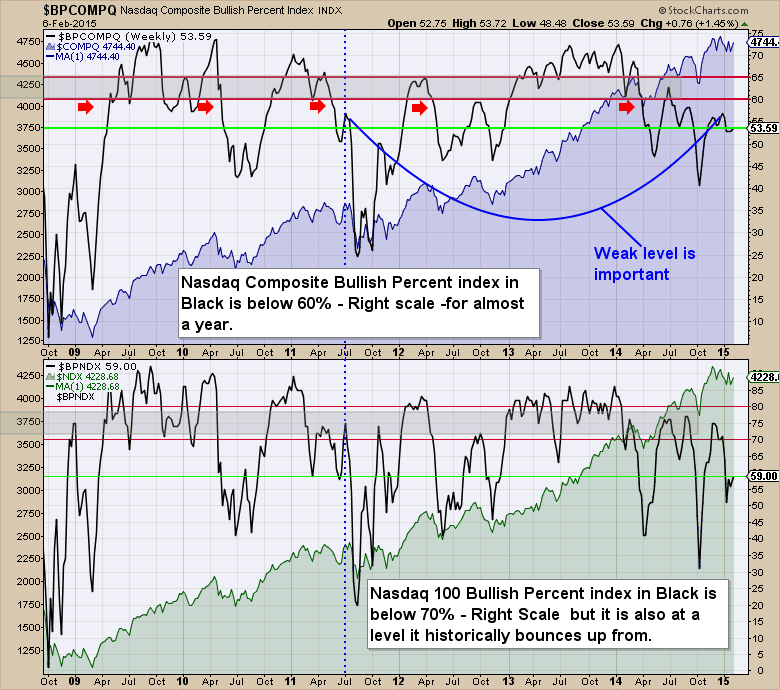
Here are the NYSE and SPX related Bullish Percent Indexes. The $BPNYA for the NYSE Composite is trying to get back into the bullish zone. It stalled here on the last two rallies. The $BPSPX is still below 70% which is usually weak enough for the market to break down. It continues to be weakening since the start of 2013!
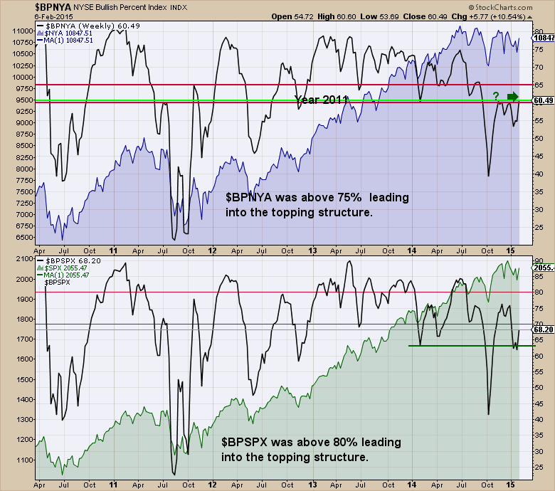
So none of the Bullish percent charts are inspiring. The recent QE program announced by Europe has been well received and we have seen a shift away from the defensive sectors recently.
The bottom line, at this point there are numerous signals telling us we are on thin ice, but so far things are ok. The big positive response to European QE leads me to believe if we are going to break down the broader markets from this oil and gas mania, it does not look imminent yet. It is important to remember that the 2000 and 2007 markets both took time for the conditions to spread. The oil patch really started to lay off in earnest in 2015. Most people are not allowed to file for unemployment insurance until their severance cheque is used up. I would expect the jobs weakness from the oil patch to show up in the US numbers in March or April.
Lastly, let's look where we might be on a primary fractal. After a vicious rollover, the crude market has never put in a singular low after the initial fall. More importantly, it looks like the next low would be a better low to buy on a historical chart. When the price plummets rather than working its way lower, I have marked that with the red arrows. On the Percentage Price Oscillator (PPO), I have marked the five worst drops in crude oil momentum.
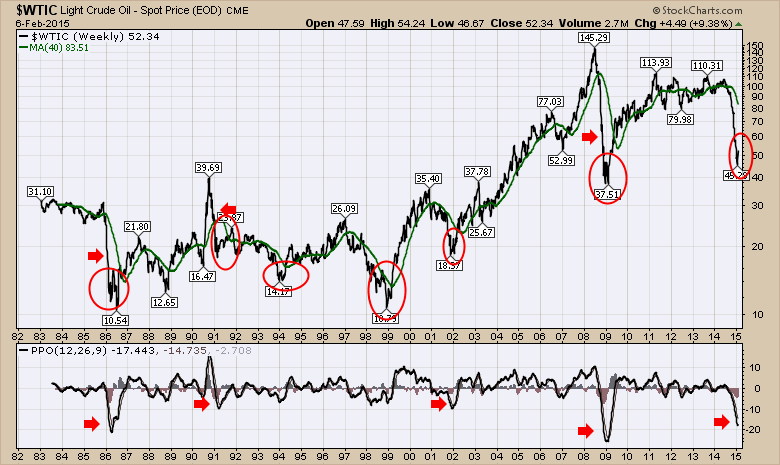
Most initial thrusts down on the really sharp corrections have some level of finality to them when the bounce is substantial enough (~20%) off that low. The recent bounce off the lows would suggest some stability near here, but no comfort that this is the final low. Some of the crude related stocks may start to bounce ahead of the actual low in crude and many have. After the next low, a good target for the bounce up would be a 40-50% retracement from the total vertical height of the fall. A 50% calculation would be $107-$42 = $65 / 2 = $32.50 suggesting $75 later this year. $42+32=$74. A 40% target would be lower than that. While that will be near marginal production, I wouldn't expect it to be near full production costs for most companies. We still have the Natural gas problem as well.
There are just so many charts to review in this. I would have added the $CRB charts, crude tankers, LNG shipping, Steel industry and global infrastructure companies like Fluor (FLR) and Jacobs Engineering (JEC). Most of those industry groups are currently a disaster. Some of the industry groups like recruiting look ready to snap down. If they can hold at these levels that would be important. Indicative companies like Manpower (MAN) continue to be important to watch. MAN moved back above the 40 WMA this week so that was a positive signal. All in all, it feels like a knife edge as to whether or not this shale or unconventional reservoir mania will be broad enough to take down the big indexes like the $SPX. I think the drillers will be weak for a long time until either the oil or the Natural Gas price can get back above marginal cost levels.
The bottom line is the charts all line up for this to be a big enough mania to create bigger problems on the wider indexes in a few months time. The bullish percent charts look weak enough to break down from here. Whether or not the Central Bank easing and European QE can stem the decline will be an interesting test. I think the $USD will take a rest if the investment rotation turns to Europe as it appears to be doing. That would finally give some life to commodities. I started to turn more optimistic this week with some of the global indexes like Australia breaking out to new highs. Canada breaking above a downward trend line. The Russell 2000 ($RUT) starting to outperform the $INDU. The real question will be when the industry layoffs from the oil patch start to put pressure on other industry groups over the next 3 to 6 months.
Thanks for following along with the series. I hope you enjoyed it.
Good trading,
Greg Schnell, CMT


