Many investors were enjoying the ride up in growth stocks through 2013 and into 2014 this year, when the whole group started dropping. This drop spilled over to the Nasdaq 100. Since early May we have bounced.
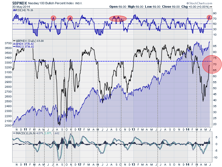
Today, I have some concerns with regards to the Nasdaq 100 Bullish Percent Index ($BPNDX) chart. While we don't know the outcome yet, we do know it is an important place on the chart. The chart is a little busy looking because of the area chart in the background. Just by looking at the chart broadly, the $BPNDX can be split into bull markets and down/corrective markets at 72. When it holds above 72, the Nasdaq is usually climbing. When it is going down while below 72, it is usually falling.
So to review the information on the chart, the RSI is marked in red when it becomes overbought but the $BPNDX is still below 72.
The critical point on the chart that we should see in the next few weeks is whether or not it fails to break out into the area above 72. Sometimes the friction level was slightly higher at 75 as shown in 2011. I have dropped vertical lines on the chart to enable viewers to see that when the bullish percent index fails to break above 72, it is usually quite important. The area chart in the back is the Nasdaq 100 Index ($NDX). While this chart makes the Nasdaq 100 ($NDX) pullback in 2011 look small, it was actually a pullback of almost 20% from 2400 to 2000. I think it is important to note that the Nasdaq 100 did not make meaningful new highs until this Bullish Percent index was back above 72.
I might suggest watching the bullish percent index closely as it approaches this level from below. If an investor is looking for a timely place to add protection in the form of options or tightening stops, this might be a good guide to timing. If the market continues to move higher and more than 75% of stocks in this index go on buy signals, we are probably in a strong place to expect higher highs and the need for significant protection is reduced.
Lastly, the major pullbacks seem to happen when this indicator can't get back above the 72-75 level from below as in 2011. If you look at the market tops on the $NDX and the $BPNDX chart, you'll notice $BPNDX usually fails while the $NDX was retesting the prior highs. This is the situation we currently find ourselves in. Conversely, in January 2012 and January 2013, the breakout on the $BPNDX chart would help define/confirm when to be more aggressive. I would encourage readers to click on the chart and view how this indicator behaved in 2007 through 2009. The $BPNDX level of where bull and bear markets were defined was very different before the 2008 financial crisis. My thoughts are that the explosion of ETF's since 2007 has affected how this index responds. The bullish percent signal has seen broad groups of stocks move together quickly since ETF's became so big which may be what has created the higher level of readings on the $BPNDX. At this point, the ETF relationship is just an untested theory but one I think about as our indicators have changed levels over time.
After the $NDX rose 4.3% in May, is it time for caution? The bottom line for me is that we are below 72 on the $BPNDX while we are retesting the prior highs on the $NDX and we should be cautious about becoming too bullish too soon.
Good trading,
Greg Schnell, CMT


