Natural Gas ($NATGAS) is the heartbeat of Western Canada's economy and a huge part of the US Energy supply. Earlier in the spring, I felt $NATGAS might just be the biggest momentum trade of the year. After having a parabolic spike and a pullback, natural gas is sending off chart signals that duplicate the price action before the last downslide. Can it reverse the trend?
First of all, the RSI is near the bottom of the range where we would expect it to bounce from. It needs to get back above 50. The two red lines on the chart from from 2005 and 2012 have the same slope. They both finished in parabolic style. What concerns me is the 2005 line saw the price of $NATGAS fall in 1/2 from the trend line break. It went from $8 down to $4.63. Analyzing the green lines, they all have very similar slopes. So here we sit at the green line and we are not bouncing off it the way we would like to see it bounce which is sharply!
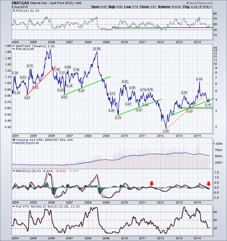
The Volume is starting to wane as you can see on the 50 Day Moving Average of Volume. The MACD moving below zero is not good. The Full Stochastics indicator is near the 20 zone. Looking left on that indicator, it usually stays down for a long period of time. The exception would be the 2004 spike down. At this point, the chart looks pretty negative. Lets zoom in on the last five years.
We can see the RSI is trying to stay above the green line to remain in bullish mode. The price action is particularly twinning in my assessment. By zooming in on the chart, we can see there was also a red line with the same slope back in 2011. It was just much shorter. The yellow boxes highlight the similar price action since breaking the red line, complete with the oscillations around the green trend line levels. We closed the week back below the trend line, so this is particularly worrisome. Horizontal support looks to be down at $3.25 or 15% below here. The two blue lines laying on the price plot but at the very bottom are indicative of the time span between the previous trend line touch and the trend line break down. They match almost exactly. We can see in 2011, we rallied into an October high and then failed big time.
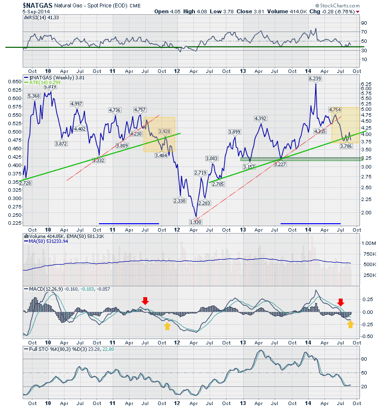
Looking at the zoomed in version of the indicators gives us some hope with the selling momentum weakening as the indicators are flat after moving down hard.
It would appear to be a very important time for $NATGAS related stocks. If this up trend starts now, that would be a big relief. If the $NATGAS market continues to trade weak and sloppy, it is not a good place to stubbornly hold $NATGAS related positions. One extremely bullish interpretation lies on the far left of the second chart in September 2009. After a small oscillation in September, the price of $NATGAS more than doubled from $2.72 to $5.81. It doesn't feel as bullish if you saw Chart 1 which shows the price falling like a pressure gauge after a major leak.
Good trading,
Greg Schnell, CMT


