The world is full of charts. Rick Santelli used the expression "Every ship at the bottom of the ocean also had a chart room." There's an important caveat, there, however: Were the navigators looking at the charts? Stock charts only tell you something if you want to hear it. There is no megaphone saying "Proceed to the lifeboats...this is an emergency!". Well, the ship analogy can only go so far, but this week I have heard my share of commentators trotting out bullish charts and ignoring facts that have been great guideposts for driving your portfolio with care.
When the charts fail, the opposing force to the message always presents an excuse. Here are examples from this week:
Regarding the Russell: The composition of that index has changed, so it no longer matters.
Regarding the banks lagging: That is just due to low interest rates.
Regarding commodities sagging: That is just due to rest of world weakness.
Regarding Industrials breaking down: That is such a small part of the economy, why would anyone give that as a clue?
Regarding Fang stocks: Watch software as a service; don't use those old names, as they no longer lead.
We also have perma-bulls and perma-bears. You know the names. Well, we don't need to look at the charts if their one-minute elevator speech is always the same and always right. Yet they differ. The bear will someday be right even though the prediction has been made every week for years. But the 20% corrections were just that: corrections. The bulls said we made a new high a few weeks ago, so ignore the bears. Well, if your opinion never changes as the market rocks in massive 20% waves, that would sink most ships. The purpose of Technical Analysis, for me, is to find attractive entries and exits, so I ignore the people continually selling uni-directional news of the day as fresh.
Below are 3 charts that will someday get more bullish, but I can't declare a victory for the bulls with the current situation.
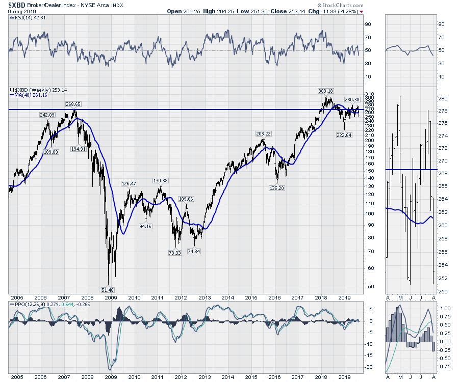
First of all, here is a chart of the Broker Dealers. The chart has been struggling to take out the 2007 highs for the last couple of years. These are considered a leading group, giving you clues to strong markets. Notice the PPO momentum indicator rolled over at zero this week. Look left and notice what happens when the PPO indicator falls below zero. Maybe it can turn higher, but this week it turned down, suggesting the most recent rally had no strength.
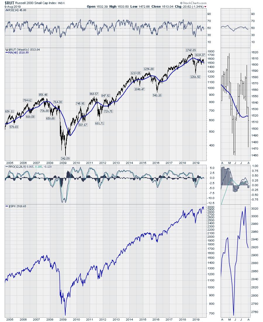
Secondly, there is the $RUT. Regardless of the composition of the Russell 2000, when the PPO momentum indicator goes below zero, this is a pretty solid chart suggesting coming weakness in the $SPX. (The $SPX is shown in the panel below.)
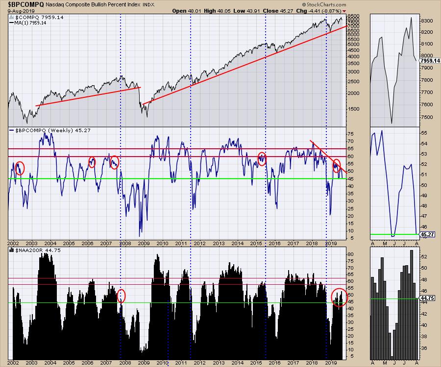
Lastly I'll present the trend in the breadth charts. The Nasdaq market hit a fresh new high a few weeks ago, but, on the most recent bounce, only 52% of the stocks got on a buy signal, as shown by the Bullish Percent Index. In the lower panel, less than 50% of the stocks are above the long-term average. That is risky. While the wiggles on the top panel on the chart don't look like much, it's an uncomfortable place to own stocks.
Of course, a chartist has a complete tool box to share, rather than three hand-chosen grisly charts. To see that tool box of charts, catch the Market Review videos on Saturdays. You can find them in the Canadian Technician playlist near this link.

Perhaps this all reverses and heads higher. The purpose of Technical Analysis is to respond to the current signals, which point lower. The problem with the charts as presented is that this level of weakness is usually associated with major downside momentum. As a chart reader, I now see signals or warning signs that triggered this week. Regular readers will be continuously informed until the potentially dangerous messages subside. Subscribe to the Canadian Technician articles for updates. Thanks for following!
Good trading,
Greg Schnell, CMT, MFTA
Senior Technical Analyst, StockCharts.com
Author, Stock Charts For Dummies
Want to stay on top of the market's latest intermarket signals?
– Follow @SchnellInvestor on Twitter
– Connect with Greg on LinkedIn
– Subscribe to The Canadian Technician
– Email at info@gregschnell.com


