|
|
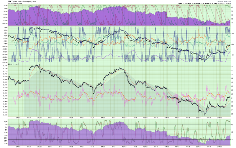
Check out the following chart:

If it takes a moment to download, don't worry. I'll wait. Even as a snapshot, this chart's a very big file. In fact, you'll need to click on it to see its true size.
Is it there yet? Good!
<ahem> "THIS CHART IS A USELESS WASTE OF TIME FOR EVERYONE IT TOUCHES!"
(Sorry, I needed to get that off my chest.)
This chart is one of the largest charts we sent out today. It was also one of the slowest - taking us almost 2 seconds to generate it and over 8 seconds to send it out to the user that requested it. (It usually takes us about 0.1 seconds to generate a chart and 0.3 seconds to send it out.)
Look at all the detail on that chart - the overlays, the area colors, the dense grid, the percentage changes! It is truly an amazingly detailed chart. But what does it say about the Banking index? Is 20 days of 1-minute bars really necessary to see what's going on here? Ignoring that issue, is it really necessary to refresh this chart automatically every 15 seconds? Why!?!!
Someone - I haven't looked it up - had several charts like this updating automatically every 15 seconds all day today. Those charts (and hundred of similar ones) put a disproportionate amount of stress on our charting servers today. While we currently have the resources to deal with that extra stress, there are limits to what we can provide. If everyone started asking for large numbers of such detailed charts, the web site would slow noticeably.
All websites are shared resources. The servers that support each website represent a limited pool of abilities. While it is our job to ensure that the site is always up and available, it really is a shared responsibility; users must understand the consequences of their charting actions. I've written about this in the past and yet the "piggy" charts still crop up everyday.
I'm not expecting everyone who reads this to sympathize me on this issue, but my hope is that the people who read this entry will stop and think before turning on auto-refresh next time - do you really need to auto-refresh such a detailed chart? Or would a simpler one do the job just as well?

