|
|
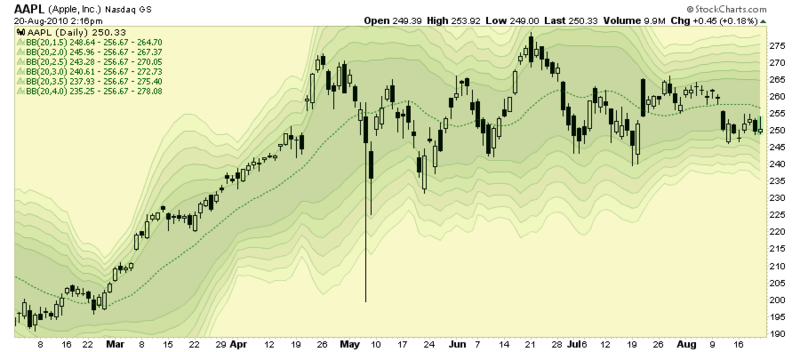
Here's a neat charting trick that I demonstrated to the audience at last night's presentation. Check out this chart:

(Click here for live version of this chart.)
This chart clearly shows the dynamic nature of Bollinger Bands and gives you a better sense of how far away from "normal" prices get. To me it sort of resembles a topographic map so I'm calling it the "Volatility Terrain" chart.
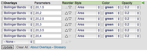
How did I create it? Basically I am using multiple Bollinger Bands with different "Standard Deviation" parameters combined with the "Area" style setting and low "Opacity" settings. Here's what the Overlays area of the SharpCharts Workbench looks like for this chart:
Note: You need to be a StockCharts.com subscriber in order to use the Style, Color and Opacity settings.
Feel free to experiment with this technique. Try using different Bollinger Band parameters or even different overlays. By overlaying the same technical indicator on top of itself with slightly different parameters and low opacities you can learn a lot about how that indicator works and what parameters best fit your style of trading.
- Chip


Posted by: James Carson August 22, 2010 at 08:19 AM