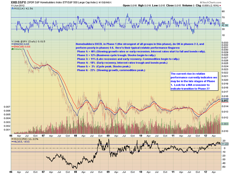
Way, way, way, WAY back in the early days of my Internet career, I maintained a mailing list called "Chip's Charts" (anyone else remember? no? lol!) In that list, I tried to keep people up-to-date with the Sector Rotation model of the business cycle. It was basicly the same idea that underlies our current S&P Sector PerfChart tool.
As you can imagine, that means that I am thrilled when I find other people using those same concepts in their own charts just like David Calloway is doing in his brand new Public ChartList. Here's a sample:
As you
Read More
