|
|
Way, way, way, WAY back in the early days of my Internet career, I maintained a mailing list called "Chip's Charts" (anyone else remember? no? lol!) In that list, I tried to keep people up-to-date with the Sector Rotation model of the business cycle. It was basicly the same idea that underlies our current S&P Sector PerfChart tool.
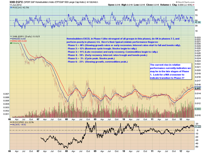
As you can imagine, that means that I am thrilled when I find other people using those same concepts in their own charts just like David Calloway is doing in his brand new Public ChartList. Here's a sample:
As you can see, David has taken the time to explain his ideas clearly in comments on the chart including his current take on where things might be in the business cycle. This is great stuff and can help you determine which sectors and industries might do well in the coming weeks and months. Be sure to vote for David's list if you enjoy this kind of analysis and consider adding it to your "Followed" lists if you are a StockCharts member.
- Chip


