Much has been made of the 10-year yield dropping below the 3-month yield. This week it was particularly acute. The equity market (stocks) plummeted as the yields fell hard. The US banks dropped significantly. When the scale of interest rates loses its normal 'sort order' of longer term (10-year or 30 year) rates having higher yields than shorter term (3-month or 1-year) rates, this is referred to as an inverted yield curve. While it does not make a top by itself, it is important. Follow me through why this looks the same as 2000- and 2007 to me.
In summary, it looks like a top and it feels like a top. The settings are all the same.
Graphs are a wonderful thing. They visualize the change quickly for us. However, portfolio managers all over the world are quickly diminishing the seriousness of this inversion as it takes months for a recession to occur after the inversion. The stock market will not wait for a recession to start to price one in.
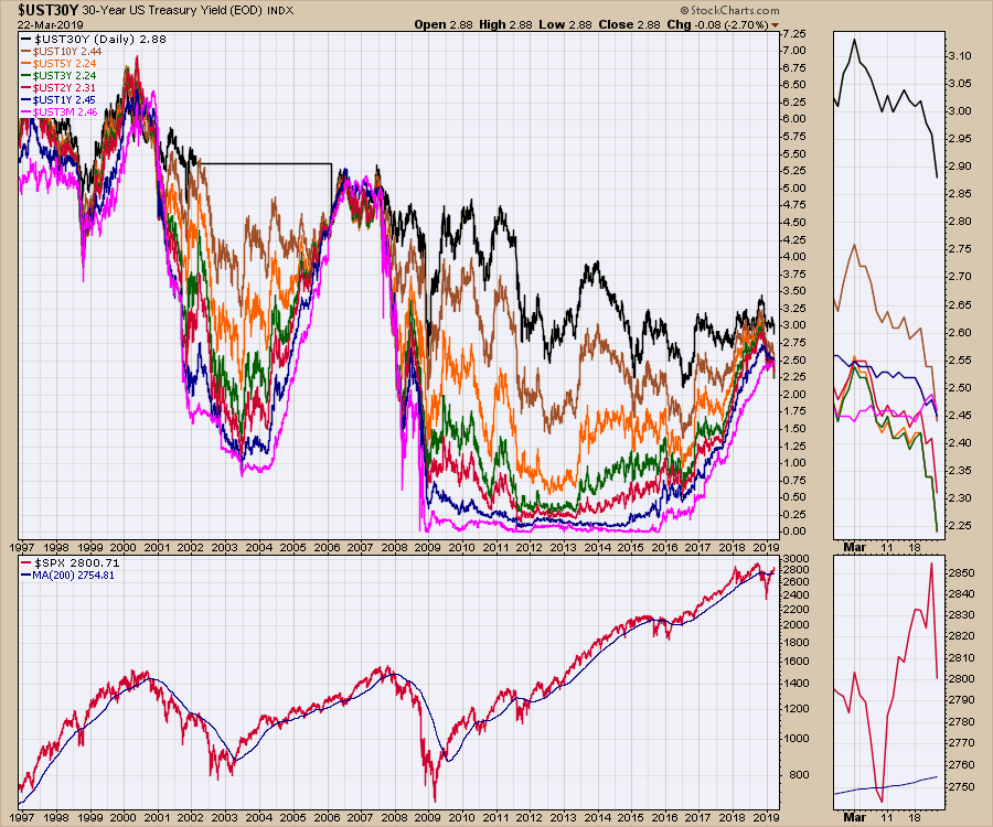
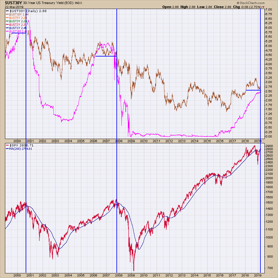
I think the chart below presents a compelling case why we should pay attention. It is not just one rate crossing another that can be a clue, as it would appear that the complete collapse of the spreads between the rates can also be a clue. In 2000, 2006 and 2007, the rates compressed meaningfully.
So while its easy to move to cash, what if waiting a year is a better idea? I wanted to look a little closer at those two periods specifically to see if we can learn anything with respect to marking the top of the equity market timing. The chart below shows 20 years of bond yields.
StockCharts members can click on these charts and save them to their own chartlists!
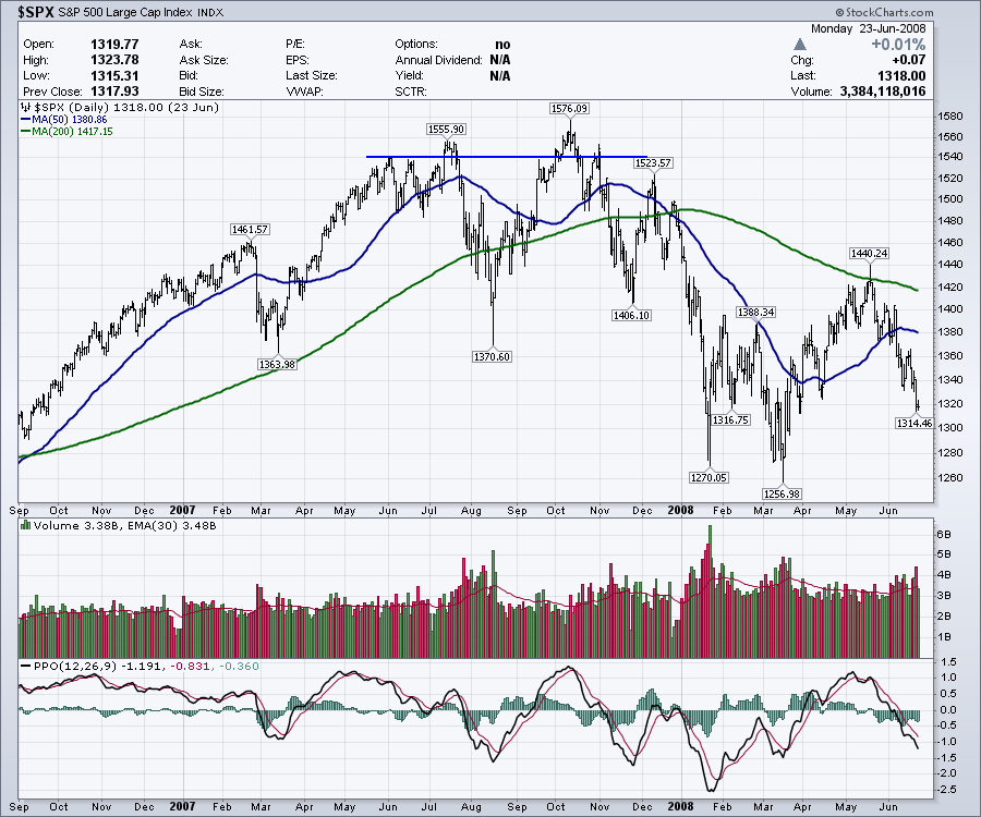
First of all, 2000.
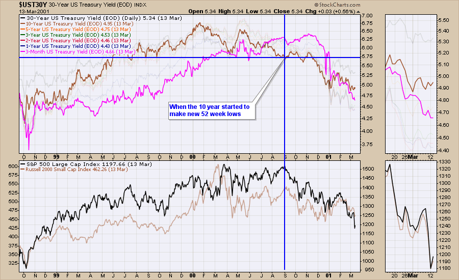
The 10-year (brown) crossed below the 3-month (pink) in July 2000 after a touch in April. I noticed that the 10-year made new 52-week lows on this chart in the same area. The 10-year made new 52-week lows in September and I have marked that on the chart. The $SPX made a final high with the 10-year breaking to 52-week lows but the actual market top was in March. The final high is a high up in the area of the absolute top, but not necessarily the highest high. For me it's the final exit that in hindsight, you wish you have exited then.
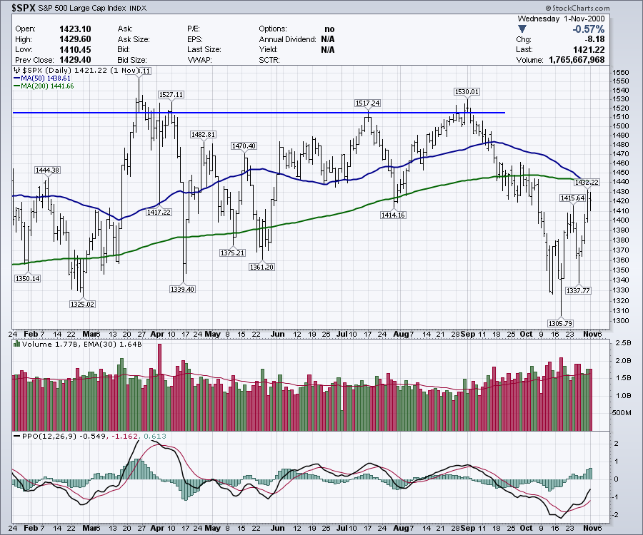
 Here is the closeup of the $SPX in 2000. Notice the September top coincided with the 10-year making new 52-week lows above. The price was also challenging an area of prior highs with the high actually in March.
Fast forward to 2007.
There were two crosses of the 10-year and the 3-month yield. One in 2006, one in 2007. However, in 2006 the 10-year yield (brown) never made a new 52-week low. In 2007, much like 2000, the 10-year yield made new 52-week lows within a few weeks of the final high.
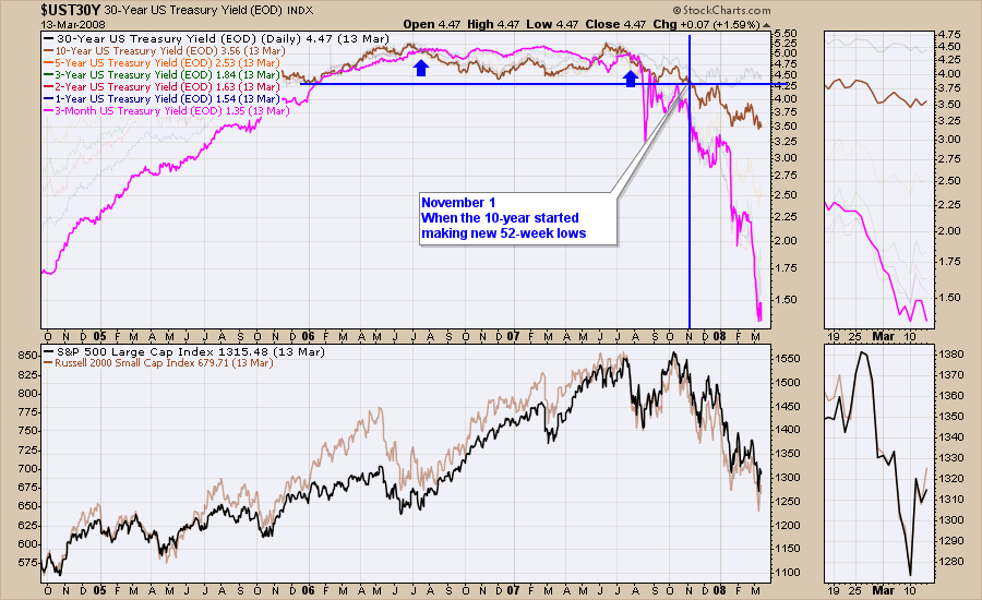 Zooming in on the stock market, here is a close up of 2007. The November 1 top occurred with a sharp rally that ended as the ten-year broke to new 52-week lows. It was also as price was coming back up to a contentious level.
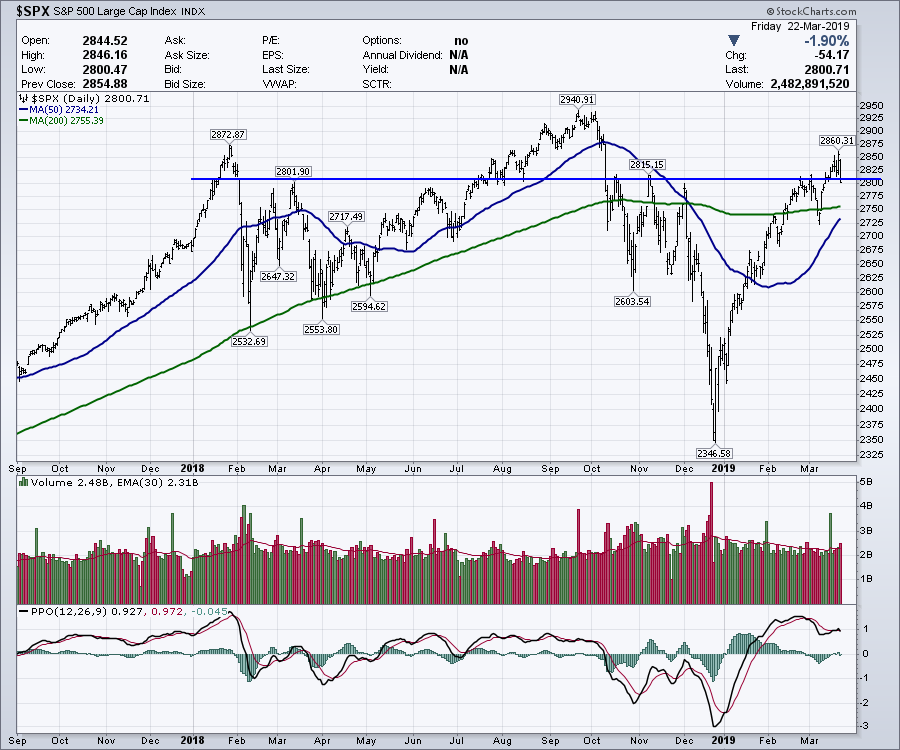
Present day, 2019.
Both conditions were met the week of March 18. On March 22, the 10-year yield closed below the 3-month yield. Secondly, the 10-year yield made a new 52-week closing low on Friday, March 23rd.
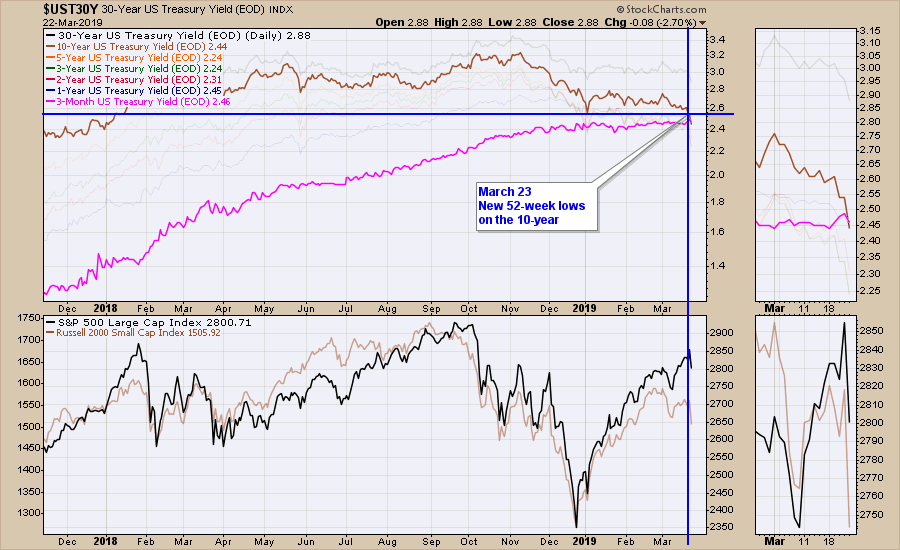 A close up look at the $SPX. Notice the 10-year closed at a new 52-week low while the market was rallying into another contentious level.
 In summary, it looks like a top and it feels like a top. The settings are all the same. Not just any top. Topping that marked significant drawdowns over the next few years and the two previous examples wiped out 50% of the account values each time.
Sometimes, it feels like a similar condition. In this case, it has all the makings across the asset classes. Plummeting bank stocks, plummeting yields, global slowdowns, and weak commodities. If it follows through, it is very important ! Nothing is for sure, but the logic of compression on the entire yield scale, the 10-year crossing below the 3-month and the 10-year yields making new 52-week lows is pretty compelling. It's only happened twice in this century. Friday marked the third time.
While it is a small sample size, it is worthy of paying attention!!
 There is a lot more information why Friday was so concerning, and you can find that article and video here.
Has A Big Bear Market Rally Just Finished? 2019-03-23 Weekly Market Roundup
I also wrote an article October 15th, 2018 that you might be interested in as well.
Zooming Out - Is A Major Top In ? 2018-10-15
If you are missing intermarket signals in the market, follow me on Twitter and check out my Vimeo Channel. Bookmark it for easy access!
Good trading,
Greg Schnell, CMT, MFTA
Senior Technical Analyst, StockCharts.com
Author, Stock Charts for Dummies
Hey, have you followed Greg on Twitter? Click the bird in the box below!
Want to read more from Greg? Be sure to follow his StockCharts blog:
----> The Canadian Technician <---