|
|
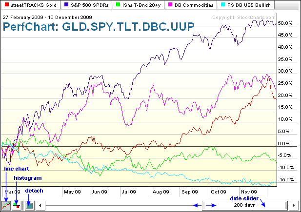
While Perfcharts are specifically designed to measure and compare performance, Sharpcharts can also be used for this purpose. First, let’s look at a Perfchart example using some key intermarket ETFs. This one shows the Gold ETF (GLD), S&P 500 ETF (SPY), 20+ Year Treasury ETF (TLT), DB Commodity Index Tracking ETF (DBC) and DB Dollar Bullish ETF (UUP). Performance covers the last 200 days, from February 27th until December 19th. With the buttons in the lower left corner, one can view this as a line chart, histogram or detach the chart. With the slider in the lower right corner, one can adjust the dates for shorter or longer timeframes. Pretty handy stuff!
 Click this chart for a test drive.
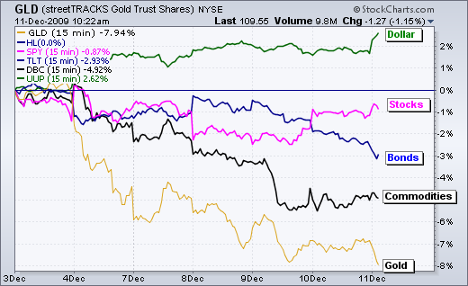
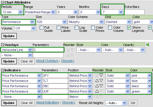
While Sharpcharts are not as flexible as Perfcharts, they can be used to see intraday performance data and to apply different indicators. Feature use depends on one’s subscription level. To start, enter a symbol for the SharpChart, go to chart attributes and then select “performance” for chart type. This will produce a line chart that plots the percentage change over a given period of time. One can add symbols for comparison by selecting “price performance” as an indicator. Notice that I added SPY, TLT, DBC and UUP. I also placed these “behind price” and selected different colors. Now I can see intraday performance for these key intermarket ETFs and analyze the interaction as it happens. Free users can add 3 price performance symbols per chart and only view daily data. Basic, Extra! And ExtraRT! users can add 6 price performance symbols per chart and view intraday data. Click here to learn more about subscription packages.
 Click this chart/image for details
 Click this chart for a test drive.
While Sharpcharts are not as flexible as Perfcharts, they can be used to see intraday performance data and to apply different indicators. Feature use depends on one’s subscription level. To start, enter a symbol for the SharpChart, go to chart attributes and then select “performance” for chart type. This will produce a line chart that plots the percentage change over a given period of time. One can add symbols for comparison by selecting “price performance” as an indicator. Notice that I added SPY, TLT, DBC and UUP. I also placed these “behind price” and selected different colors. Now I can see intraday performance for these key intermarket ETFs and analyze the interaction as it happens. Free users can add 3 price performance symbols per chart and only view daily data. Basic, Extra! And ExtraRT! users can add 6 price performance symbols per chart and view intraday data. Click here to learn more about subscription packages.

 Click this chart/image for details


