|
|
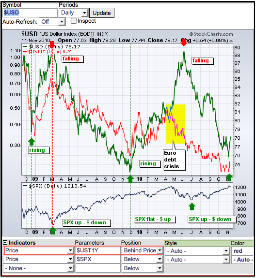
SharpCharts users can compare two securities by plotting the price of one behind the price plot of another. This can help chartists determine if two securities are positively or negatively correlated. Positively correlated securities rise or fall together. Negatively correlated securities move in opposite directions. SharpCharts users can add another security to a chart by selecting “price” as an indicator, entering the security’s symbol as the parameter and positioning the security “behind price”. The resulting chart will show the price plots for two securities in the main chart window.

Click this image for a live chart
The chart above shows the US Dollar Index ($USD) and the 1-year Treasury Yield ($UST1Y) over the last two years. $USD is the main security. $UST1Y was entered as the “price” indicator. Different colors were selected to compare and contrast. We can see a positive correlation between these two securities. Notice that both advanced in January-February 2009, declined from March to December 2009 and advanced from December to March. These two were quite closely correlated until April-May 2010, which marks the European debt crisis and severe weakness in the Euro (Dollar strength). Both got back on their positive correlation when the Dollar peaked in early June and fell along with the 1-Year Treasury Yield.


Posted by: james c. johnson November 12, 2010 at 20:24 PM