|
|
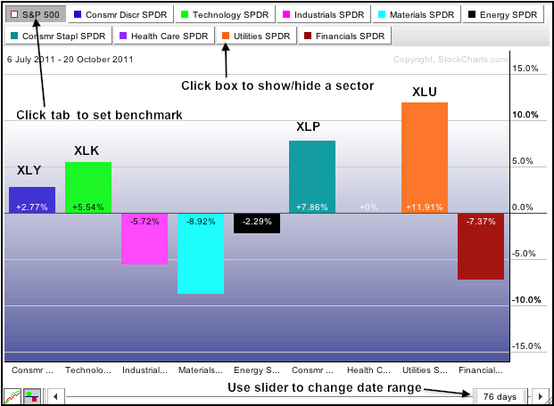
Sector rotation within the S&P 500 can be measured by using the Sector PerfChart. The default version of this chart shows the performance of the nine sector SPDRs relative to the S&P 500. If the S&P 500 is up 2% and the sector is up 4%, then relative performance would be +2%. This is because the sector is up more than the S&P 500 and outperforming. If the S&P 500 is down 4% and the sector is down 2%, relative performance would also be +2%. This is because the sector is down less than the S&P 500 and holding up better. Simply subtract the absolute gain/loss in the S&P 500 from the absolute gain/loss in the sector to find relative performance. The chart below shows current relative performance for the nine sector SPDRs. The Consumer Discretionary SPDR (XLY), Technology SPDR (XLK), Consumer Staples SPDR (XLP) and Utilities SPDR (XLU) are outperforming (leading). It is a strange foursome because XLK and XLY are offensive sectors, while XLU and XLP are defensive sectors.
Click this image to see a live chart.
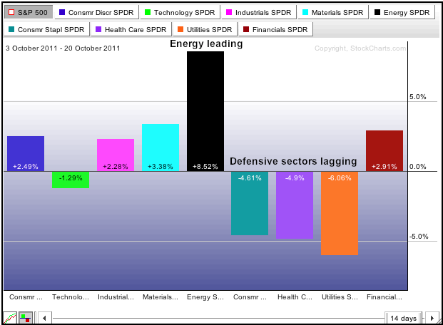
What if we want to see Sector Performance since the October low? Chartist can click the slider to adjust the date range. A different picture emerges. The Consumer Discretionary SPDR (XLY) is still showing relative strength, but the Technology ETF (XLK) turned into a laggard. Also note that the three defensive sectors are lagging this month (utilities, consumer staples and healthcare). Energy is the big winner with a whopping +8.52% relative performance.
Click this image to see a live chart.
Note that chartists can further modify these charts. First, clicking the small square boxes will hide or show a sector. Second, clicking the S&P 500 tab will change between absolute performance and relative performance. Third, chartist can click on another sector tab to make it the benchmark. A shaded tab indicates that this sector or index is the benchmark. A white tab means absolute performance is shown. Click here to learn more about using PerfCharts.


