|
|
There are, at least, two ways to measure relative performance at StockCharts.com. Chartists can use PerfCharts to compare multiple securities or isolate two securities using the Price Relative. We talked about PerfCharts a few weeks ago with a sector rotation example. Today we are going to focus on the performance of a stock relative to a benchmark index.
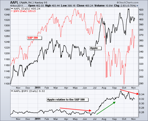
The Price Relative is a ratio plot that allows chartists to compare the performance of one security against another. Typically, chartists want to see how a stock, industry group or sector compares to the broader market. Is it outperforming or underperforming the broader market? The chart below compares the performance of Apple to the S&P 500.
Click this image for a live chart.
The Price Relative can be created in SharpCharts by choosing “Price” as an indicator. By default, the “$SPX” appears in the parameters box. In this example, I am showing Apple Corp (AAPL) in the main window as the base security. The first indicator simply plots the S&P 500 (red) behind Apple (black) in the main window. The second indicator is the Price Relative (AAPL:$SPX ratio). This shows the performance of the Apple relative to the S&P 500. Apple is outperforming when this ratio rises and underperforming when this ratio falls. Any two symbols can be used to compare performance.


