|
|
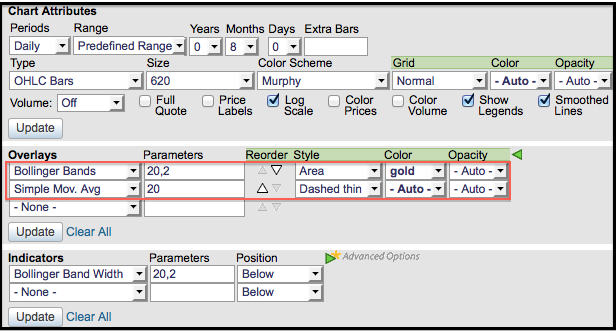
Bollinger Bands can be plotted as a normal indicator with simple lines for the upper and lower bands. SharpCharts users can enhance these bands by choosing “area” as the indicator style. This will shade the area between the two bands in the color of your choice. Sometimes the 20-day SMA, which is the middle band, is hard to see with the shading. Users can then choose a different color to make it stand out. The “area” style can also be used with Moving Average Envelopes, Keltner Channels and Price Channels.
The chart below shows Goodyear Tire & Rubber (GT) walking down the lower band with the decline from late July to early October. Notice that the Bollinger Bands are shaded gold and the 20-day SMA is red. After the October surge, the stock moved into an extended consolidation and the Bollinger Bands have narrowed since early November. It is quite easy to spot the narrow and the range when the band area is shaded. SharpCharts users can also plot the Bollinger Band Width indicator to the quantify distance between the bands. You can read more on Bollinger Bands in our ChartSchool.


