|
|
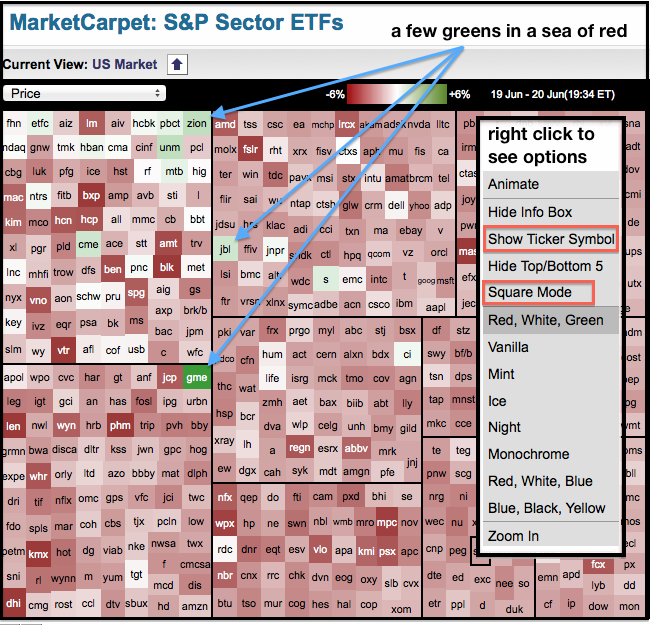
Chartists can use our color-coded MarketCarpets to easily separate the winners from the losers. The image below shows the Sector MarketCarpet with a sea of red. The red squares represent the decliners, while the green squares show the gainers, which are few and far between. The darker the red, the bigger the loss. The winners are easy to spot on the MarketCarpet because the green squares stick out. There are also some “whitish” squares visible. These squares are for stocks with very small gains or losses. Stocks with a small gain or loss show relative strength when the overall market is down sharply. Note that I selected the “show ticker symbol” and “square mode” options by right-clicking the mouse.

Click this image for a live carpet

Click this image for a live carpet


