|
|
Click here for a live PerfChart
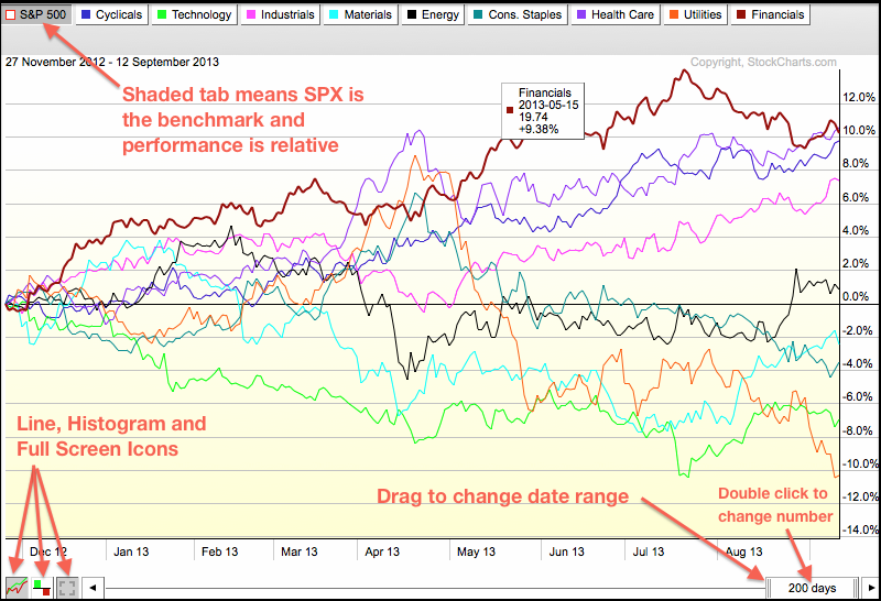
There are three main ways to customize a PerfChart. First, chartists can change from relative performance mode to absolute performance mode by clicking one of the tabs at the top. All white tabs means the chart is in absolute performance mode, which means the gains or losses are actual. A shaded tab sets that security as the benchmark and the others are shown in relative performance mode, which means the gains and losses are relative to the benchmark, which is usually the S&P 500.

Click this image for a live chart.
At the bottom of the PerfChart, chartists can switch between line and histogram using the icons in the lower left. Chartists can also move to full screen mode using the third icon. On the lower right, chartists can adjust the timeframe by double clicking the slider and entering another number (days). Chartist can also drag the left end of the slider to adjust the date range.


