|
|
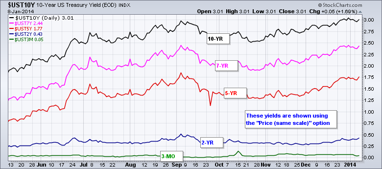
SharpCharts users can use the “Price (same scale)” option to chart several different symbols on one scale. Obviously, this works best for items with similar data ranges, such as Treasury yields or the Bullish Percent Indices. Treasury yields range from just above zero percent on the 3-month T-Bill to around four percent for the 30-Year T-Bond. Bullish Percent Indices range from zero to one hundred percent. When charting more than one, the same scale option makes it easy to compare the different plots. The chart below shows five different US treasury yields on the same scale, which ranges from 0 to 3.1%. As expected, the 10-year Treasury Yield ($UST10Y) has the highest yield, while the 3-month Treasury Yield ($UST3M) has the lowest. Also notice how the yields get progressively higher as the maturity increases. The 5, 7 and 10 year yields have risen rather dramatically the last two to three months, but the 3 month and 2 year yield remain relatively flat.
Click this image for a live chart


