|
|
StockCharts uses dividend-adjusted data by default and this can create discrepancies between our data and that of other vendors. Fortunately, StockCharts users can choose between dividend adjusted data and unadjusted data. A normal symbol entry, such as "XLU" for the Utilities SPDR, will show dividend-adjusted data. Chartists can change this to unadjusted data by adding an underscore in front of the symbol (_XLU).
Dividend adjustments are not that important for securities that do not pay dividends or that have very low dividend yields. Visible differences, however, do arise with securities that pay relatively high dividends, such as REITs, utilities and Bond ETFs. A security's price is adjusted lower on the ex-dividend date to reflect this dividend. StockCharts adjust this data by adding the dividend back to the price series. This dividend-adjusted data gives chartists a truer picture of total return, which is price appreciation plus dividends. Note that StockCharts users can track data adjustments by checking the Data Update blog. The screen shot below shows a dividend of 19.73 cents for the High Yield Bond SPDR (JNK) on December 27th.
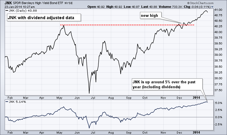
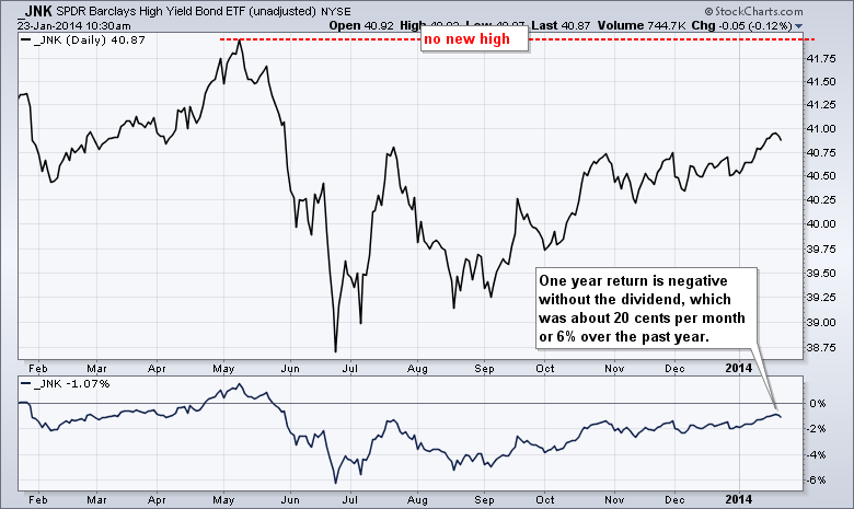
Let's look at some examples to highlight the difference. The first chart below shows the High Yield Bond SPDR (JNK) using adjusted data, which includes the dividend. Notice that JNK is trading near a 52-week high and the ETF is up around 5% over the past year. The second chart shows unadjusted data for JNK, which does not include these dividends. There were twelve dividends of around 20 cents over the past year. That is a significant part of the return, especially for a high-yield bond ETF. Without these dividends, the ETF (_JNK) shows a loss over the past year and remains well below the May high.
Click these images for live charts


