|
|
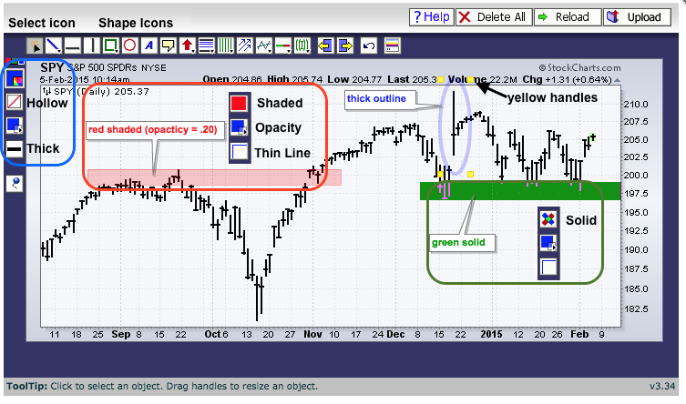
Once a shape is drawn on a SharpChart, chartists can use the "fill mode" and "opacity" settings to highlight the shape. This is a great way to draw support or resistance zones on charts, or to highlight a consolidation. Here are the steps:
1. Create a SharpChart and open the ChartNotes workbench to annotate.
2. Select a shape from the icon row at the top left.
3. Move to your starting point and click-drag to draw shape.
4. Now use the tools on the vertical icon bar on the left.
5. Choose the color with the top icon.
6. Choose fill mode with the second icon from the top (hollow, shaded or solid).
7. Choose opacity with the third icon from the top and use slider.
8. Choose line thickness by clicking the icon with short horizontal line.
If you need to activate the shape for editing, click the "select" icon in the upper left corner and then click the shape to activate it. The shape is selected when the yellow handles appear on corners.

The example shows three different shape possibilities. The first is a red shaded box and the vertical icons are shown as they appear with this setting. Notice that the fill icon is red to denote the "shaded". The green box is solid and the fill icon shows a red-blue X. The oval shape is hollow and the fill icon shows a diagonal red line.


