|
|
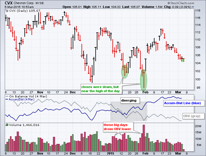
It does not always happen, but sometimes On Balance Volume (OBV) and the Accumulation Distribution Line (ACDL) diverge to paint completely different pictures. These two can diverge because they are calculated differently. First, note that both indicators use price and volume to detect accumulation and distribution. OBV, which was developed by Joe Granville, rises when the close is higher than the prior close and declines when the close is lower. On a daily chart, the period's volume is added on an up day and subtracted on a down day. Down days on big volume, therefore, will push the indicator lower.
The Accumulation Distribution Line (ACDL), which was developed by Marc Chaikin, measures the level of the close relative to the high-low range for the period. A close above the mid point of the high-low range indicates accumulation and the volume multiplier is then positive. A close below the midpoint indicates distribution and the volume multiplier is then negative. A stock, therefore, can close below the prior close and still have positive accumulation for the Accumulation Distribution Line.

Click this image for a live chart
The chart above shows Chevron (CVX) with the Accumulation Distribution Line (blue) rising from mid December and On Balance Volume (OBV) falling during this same timeframe. The red price bars and red volume bars show when the stock closed lower. These high volume declines pushed OBV lower. The green ovals on the price chart show two examples when prices closed lower, but the close was near the high of the day. This means the volume multiplier for the Accumulation Distribution Line was positive and these high volume bars pushed the indicator higher. You can read more about these indicators in our ChartSchool.


Posted by: Don Maycock March 06, 2015 at 09:00 AM