This is a series of articles designed to remind each of us the keys to identifying the many potential warning signs that create stock market tops. If you're just tuning in, you can CLICK HERE for Part 1 that begins the series. Enjoy!
This is the final part of this 7 part series. If you've learned a thing or two, then the series has certainly been worth it. Remember that calling a market top is nearly impossible - just ask the parade of "experts" gracing the CNBC stage throughout this six year bull market. They've managed to call 10 of the last ZERO bear markets. (sarcasm)
It's not about identifying the exact top. It's about recognizing the warning signs and managing your risk.
Let's take a look at the final warning sign of this series - the relative performance of small cap stocks.
In order to sustain any bull market, it's best that we see traders and investors taking risk. We want to see a "risk on" market environment. That means we want to see outperformance in higher risk areas of the market. In earlier articles, I discussed the significance of:
(1) aggressive sectors outperforming defensive sectors - Part 2
(2) the XLY (riskier consumer stocks) outperforming the XLP (safer consumer stocks) - Part 3
(3) transportation stocks outperforming utilities - Part 4
(4) the exodus of folks out of treasuries (safety) to fuel an equity bull market - Part 6
Each of these has a common denominator. It's the risk factor. When the riskier areas of the market are leading, a bull market is generally sustained. When we begin to see a S&P 500 rally fueled by money rotating into defensive areas of the market, it becomes buyer beware.
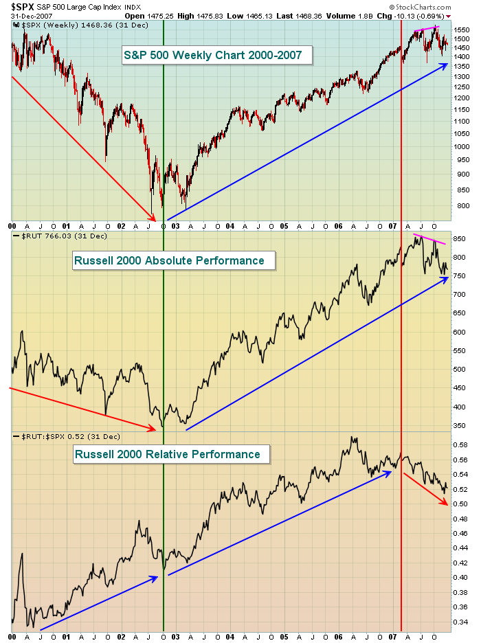
So now let's take a look at the very aggressive Russell 2000 Small Cap Index ($RUT) and how these stocks have performed relative to the benchmark S&P 500, first from 2000-2007:

There are a few points to be made here. First, the relative performance of small caps was nice back in 2000-2002, but both the S&P 500 and Russell 2000 remained in a bear market. Price action remained weak despite the improving relative strength of small caps. If you recall, that bear market mostly pertained to the dot.com stocks on the NASDAQ. From late 2002 through 2006, the relative behavior of the Russell 2000 suggested the bull market was sustainable. While both the S&P 500 and Russell 2000 were moving higher, the relative strength chart told us that money was flowing into small caps at a faster clip, a bullish sign. Warning signs began to mount, however, in late 2006. The S&P 500 moved to fresh highs as did the Russell 2000, but note the relative strength did not. This doesn't have to be bearish, but what happened in 2007 clearly was. A relative negative divergence emerged (pink lines) as the S&P 500 pushed to yet another high while the Russell 2000 failed to breakout. And the relative strength? Ummm, it was falling through the floor. It's difficult to feel bullish about the stock market when the "under the surface" signals begin to shift like this.
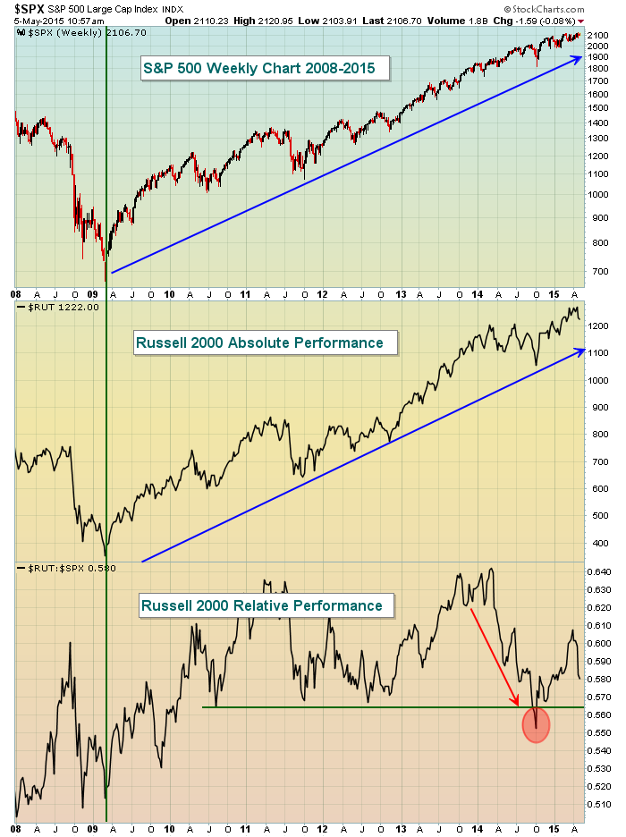
Now let's fast forward to the last several years as a couple similarities do exist:

The biggest issue on this chart is that the relative performance of small caps has been lagging since the top was made in the first quarter of 2014. This is a warning sign, but it hasn't been confirmed by any bearish price breakdowns. If the S&P 500 keeps pushing to fresh all-time highs and the Russell 2000 drops below its recent breakout near 1200, that would raise another red flag. Also, another drop in relative strength below the October 2014 low (red circle) would be a problem as well.
Based on all the topics discussed in this series, I'll give you my opinion where we stand in the stock market today:
Part 1 - Price/volume combination. All of our major indices show continuing price action to the upside on their respective weekly charts. The Russell 2000 spent a lot of time consolidating in 2014, resulting in the relative weakness that was shown above. But price support should be strong on the Russell 2000 as a result. I would look for 1160-1200 to hold as support on any short-term selling event. If 1160 is lost, there would be a much better chance of a 20% correction or possibly more.
Part 2 - Our aggressive sectors are performing well on a relative basis. Money is not rotating towards the safer sectors at this point in time.
Part 3 - The XLY:XLP ratio is currently at 1.57 within a 1.40-1.60 trading range. A breakout above 1.60 would be extremely bullish for equities.
Part 4 - The absolute performance of banks remains strong enough. Banks' relative strength vs. the S&P 500 has deteriorated a bit over the past 12-18 months and needs to be monitored. But the price action remains solid technically so I'm ok with the performance here.
Part 5 - Transportation stocks continue to perform very well, indicative of the market's belief that we'll see a strengthening economy ahead. Thus far, I see little in the way of warning signs here. Bullish action indeed.
Part 6 - The relationship between treasury yields and the S&P 500 is a bit clouded because of all the Federal Reserve intervention the past five years. We can still view the relationship between the 10 year treasury yield ($TNX) and the S&P 500 in the short-term, however. Currently, the TNX is rising and that means treasuries are being sold, the proceeds of which can be used to buy equities. The biggest intermediate-term resistance level on the TNX, in my view, will be at 2.40%. A close above that level could see a major shift away from treasuries.
Part 7 - The relative performance of small caps is certainly an issue to be mindful of. But we haven't lost any major price support levels and relative strength vacillates back and forth just as price action does. Sometimes we simply see rotation for a few months or a year and then the relative strength returns. So it's too early to try to write this bull market off because of the lack of relative strength in small cap stocks - especially since there are few other warning signs to corroborate.
Here is a summary of my thoughts. We're heading into the less productive summer months for equities. Historically, the stock market simply doesn't perform as well from May through October. In addition, there's a big question mark over the stock market right now as to what the Federal Reserve plans to do with interest rates as they monitor economic conditions. This is probably going to lead to a choppy market, one in which volatility could spike. While not included in this series, the Volatility Index ($VIX) also plays a role in evaluating the stock market from a sentiment perspective. A breakout in the VIX above the 17 level could lead to further deterioration of equity prices with the VIX possibly reaching the 25-30 level sometime this summer or early fall.
Unless we see major changes in the sector and industry group rotation, I would expect any summer selling to represent an excellent entry into the stock market on the long side. Obviously, I'll be watching the action closely as I'm sure you will too.
I hope you've enjoyed this series and, as always, happy trading!
Tom


