Hello Fellow ChartWatchers!
Small Caps have been on a tear recently - have you noticed? This week all the major market averages moved higher with the Russell 2000 Small Caps (+1.85%) leading the way. The same is true for the month of June so far with the Russell up over 5% since June 2nd. Year to date, Large Caps are still the big winners with $SPX up 6.2% but the Small Caps are gaining quickly. You can watch all of the action using our Major Markets PerfChart:
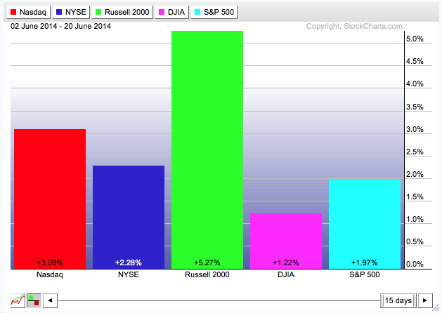
To see the exact chart above, click on the link for the Major Markets PerfChart, then click on the "Histogram" button below the lower left corner of the chart. Next, right-click on the horizontal date slider (i.e., the box below the chart that initially says "200 days") and select "Past Month". Finally, hold down the Shift key on your keyboard and press the right arrow key until the starting date in the upper left corner of the chart says "02 June 2014".
Use ChartStyles to Stop All the Clicking!
Are you a Serial Clicker? When you create a new SharpChart on our website, do you immediately start clicking all over the place to change its settings? Do me a favor; next time you sit down to use our charts, notice how frequently you click to change chart settings. If you click on more than 3 settings immediately after creating most of your charts, you my friend are a "Serial Clicker." The good news is that there is a cure for Serial Clickyness - and that cure is called "ChartStyles."
ChartStyles are essentually chart templates. A ChartStyle is a collection of all the setting that make up a SharpChart with the exception of the main ticker symbol. ChartStyles themselves are NOT charts - instead, they can be combined with any ticker symbol to create a chart. To use ChartStyles you need to be a StockCharts member. Members can save up to 50 different ChartStyles into their account.
Consistantly clicking on more than 3 different settings after creating a new SharpChart should be a signal to your brain that you need to create a new ChartStyle. It means that there is a set of settings that you use that you haven't yet captured. Once those settings are stored in a ChartStyle, you can quickly apply all of them to any chart by using just one or two clicks. Wouldn't that be nice?
Just like adding a new ChartStyle can be a huge time-saver, you also need to make sure you don't have too many ChartStyles. You really only want to create ChartStyles for chart settings that you use frequently. Hunting through a long-list of rarely used styles is not fun. The key then is to take a moment, reflect the different kinds of charts you typically look at when analyzing a new stock, and then create one ChartStyle for each of those chart types.
So what's an example of a good collection of ChartStyles? Many people use time periods as a starting point. The settings that you use for a 1-minute chart are usually different from the settings that you use for a weekly chart. Often the same is true for 10-minute charts, Hourly charts, Daily charts, etc. Each one of those "collections of settings" is a ChartStyle and you should save them as new ChartStyles in your account.
In addition to having a set of "time period" styles, many people often have a set of ChartStyles for different kinds of ticker symbols - i.e. Stocks vs. Indexes vs. Mutual Funds vs. Market Indicators, etc. Again, the key is to notice when you are clicking too much and then step back and think about the different types of charts that you are trying to create with our system when you do all that clicking.
For more on ChartStyles - including detailed instructions on how to create them and how to apply them to charts - please CLICK HERE to watch a great video put together by Arthur Hill.
ChartStyles really are the key to using your StockCharts account more effectively. I hope this article and Arthur's video will help you (and your poor mouse) stop all the clicking!
- Chip
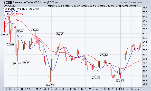
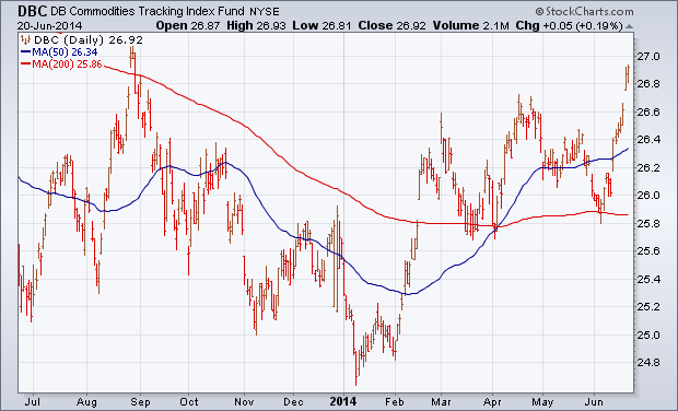
The weekly bars in Chart 1 show the Reuters/Jefferies CRB Index closing at the highest level since the third quarter of 2012. [The CRB Index includes 19 commodities that are traded on exchanges in the U.S. and U.K.]. Commodity prices turned up during the first quarter of 2014 for the first time in two years. After consolidating during the second quarter, they appear to be regaining upward momentum. Energy prices spiked higher the previous week on increased tensions in Iraq. Precious metals jumped sharply this week. That might also be the result of increased global tensions. This week's jump in precious metals may also be the result of a jump in U.S. consumer prices to the fastest pace in a year combined with the Fed decision to keep rates low for an extended period of time. The daily bars in Chart 2 show the DB Commodities Tracking Fund (DBC) surging to the highest level since last August. That helped make commodities the week's strongest asset class. A weaker dollar also helped.
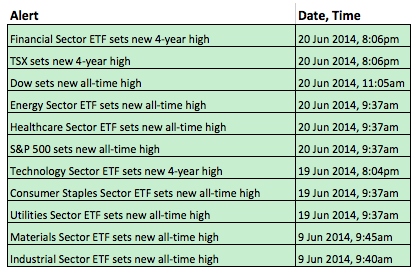
The overall picture remains bullish for stocks and sector participation is broad. Six of the nine sector SPDRs hit new highs this week, and seven of the nine hit new highs this month. The Consumer Discretionary SPDR is the only one that has yet to hit a new high and remains around 2% below its March high. Even without the consumer discretionary sector, the majority rules and the majority shows strength. The table below is an edited version of the technical alert summary. Notice that XLI and XLB hit new highs last week and the other six hit new highs this week. Even though the broader market may seem overbought and ripe for a correction, it is hard to argue against such broad strength for the longer term.
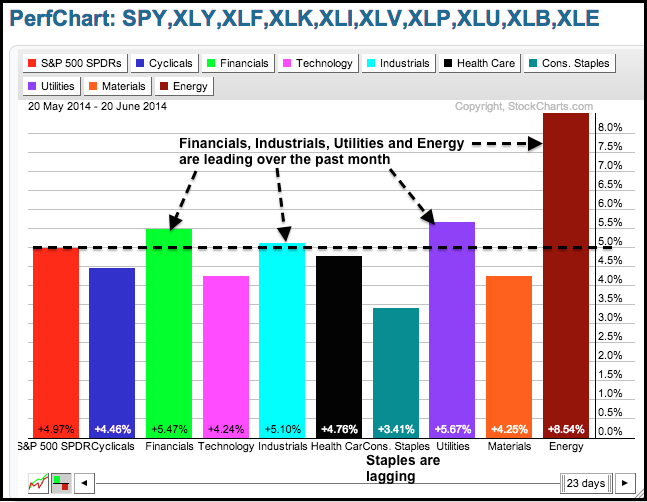
Chartists can find out which sectors are leading and which are lagging using a PerfChart. The sector dynamics over the past month show the finance, industrials, utilities and energy sectors leading because all four are up more than the S&P 500 SPDR. The consumer discretionary sector is up less, but it is holding up pretty well with a 4.46% gain and outperforming the consumer staples sector, which is up just 3.41%. Even though utilities are leading, I would not characterize this advance as defensive because the consumer discretionary sector is outperforming the consumer staples sector.
Good trading and good soccer!
Arthur Hill CMT
In reviewing my charts this weekend, I noticed that one of my annotations was about to slip off the charts. You can see it on the chart below. The Healthcare Bill passed over 4 years ago and it was about to scroll off my Healthcare Bullish Percent Index. ($BPHEAL).
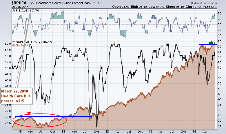
March 22, 2010 was the date the Healthcare bill passed. 42 weeks later, the Healthcare Sector SPDR (XLV) broke out to new highs above the March 22, 2010 high of $30.15. This was the birth of a new bull market for Healthcare stocks. Looking at the Healthcare Bullish Percent Index ($BPHEAL) since the announcement, the majority of stocks in the group have been on bullish chart patterns since then with 2 exceptions. There was a pullback with the initial reaction to the bill. There was also a big pullback in 2011 that correlated with the overall SP500 ($SPX) dropping in July 2011 on European issues. Other than those two reactions, the majority of stocks in the sector have been bullish ever since. Recently, the sector broke out to new highs as discussed by Arthur Hills Market Message on Friday. This is a huge bullish trend for the Healthcare Sector as shown by the Healthcare Sector SPDR (XLV).
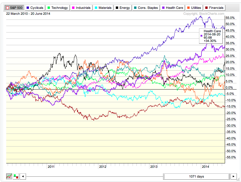
So how does that compare with other sectors? Excellent in fact. Starting at the date of March 22, 2010 only Consumer Cyclicals have outperformed Healthcare. Healthcare has outperformed the SP500 ($SPX) by 34% over the 1071 trading days since the Bill passed. This chart shows how much it outperformed the $SPX.
If we use histograms to present the absolute change since the bill passed, the chart sector comparison looks like this. This chart shows the absolute gains in each sector rather than comparing it to the $SPX.
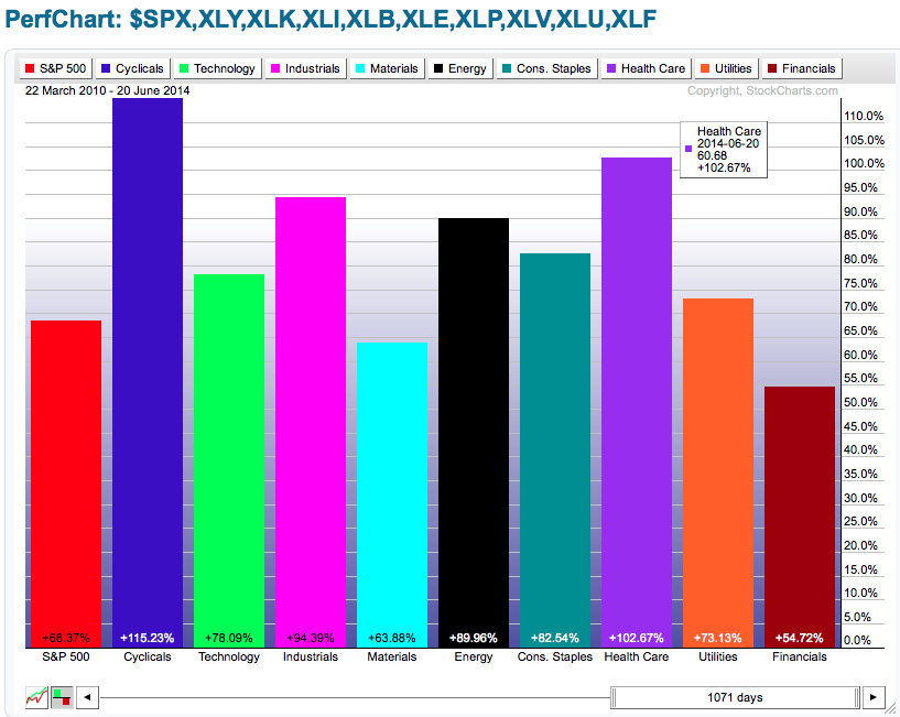
The aging demographic of the baby boomers is definitely a strong factor for the sector. Investors looking to find strong macro trends may want to consider a larger percentage in Healthcare. Financials have been the worst performing sector over the same time period which is important information for investors with a traditionally large financial weighting in their portfolios. The Healthcare Sector SPDR XLV was almost a complete double over the Financial Sector SPDR (XLF). While history may not represent the future accurately, the demographic trend of an aging baby boomer population may be stronger force for the Healthcare sector than any current macro factor for financials. I think it is something worth considering after looking at these charts.
Good trading,
Greg Schnell, CMT
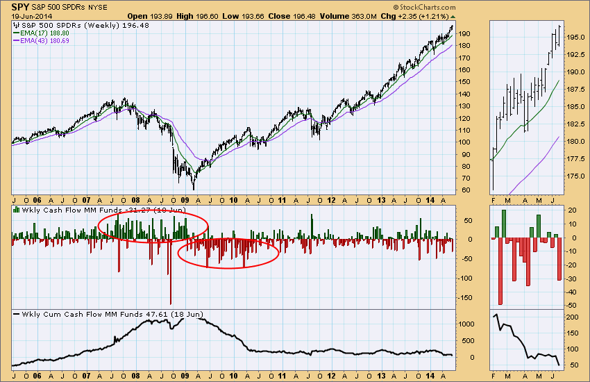
One of the data sets we keep is Money Market Mutual Fund Weekly Net Cash Flow, published on ICI.org. It is a sentiment indicator that allows us to watch short-term sentiment, as well as sentiment trends. The histogram on the chart below reflects the weekly cash flow in billions, the red bars representing cash moving out of money market mutual funds, which is an expression of bullish sentiment, because it is assumed that much of that cash is going into stocks. The green lines represent cash flow into money market funds, an indication of bearish sentiment, negative for stocks.
We can see that there were steady inflows during the 2007-2008 financial crisis, then changing to steady outflows as the bull market got under way in 2009-2010. Finally, in the last four years inflows and outflows have been about equal. This week's outflow was a reflection of bullish sentiment due to positive price action.
A companion chart shows monthly net cash flow and money market cash flow levels. (These data are published one month in arrears.)
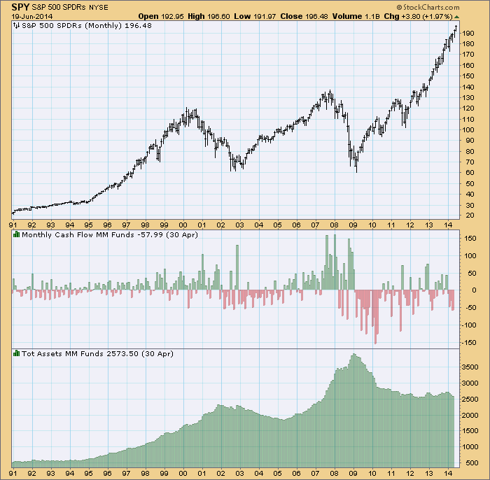
Conclusion: There was a rather large outflow from money market mutual funds this week, showing how positive price action pushes sentiment to the bullish side. This year cash flows have been predominantly out. We would want to watch for a reversal of that trend.
- Carl
The Dow Jones US Industrial Suppliers Index ($DJUSDS) experienced a HUGE bull market run off the 2009 lows through mid-2013, quadrupling in value during the period. Momentum on the weekly chart turned negative, as evidenced by the long-term negative divergence on its MACD. As a result, this index has gone nowhere for the past 15 months or so as money has rotated away from the group into other areas like semiconductors, transportation, etc. The good news is that this basing has set up what could be another powerful move to the upside as money rotates back into what is quickly becoming a very attractive area of the market technically.
First, take a look at the 5 year weekly chart:
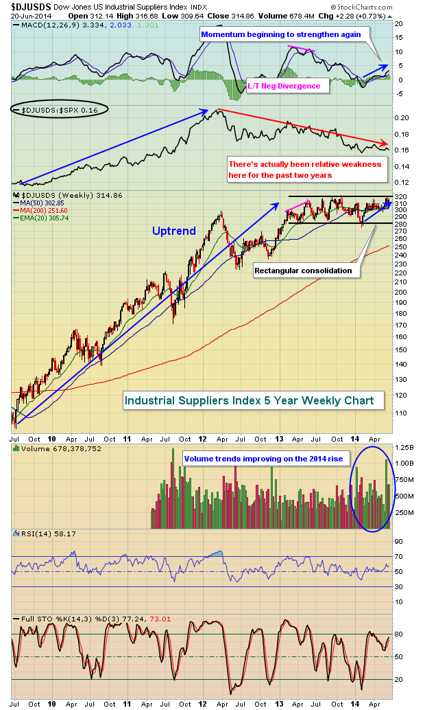
The weekly RSI on the industrial suppliers has not reached overbought territory at any point during the past year. A breakout above key technical price resistance near 320 could lead to a lengthy period of relative strength vs. the S&P 500. Currently, the relative strength line is downtrending, but I wouldn't overlook the bullish continuation pattern and the improving volume trends in 2014, not to mention the strengthening weekly MACD off the recent centerline test. These bullish patterns do require a confirming breakout, but moving through 320 on the index is likely to send many traders back into the industrial suppliers stocks.
I'm including one of the stocks in this industry group as my Chart of the Day for Monday, June 23. You can CLICK HERE to receive your copy of the chart.
Happy trading!
Tom Bowley
Chief Market Strategist
Invested Central


 I spent the weekend with my friend Dan, a prison chaplain, who always seems to have unique and useful insights. This visit was no exception. Yes, understanding the parallels between prisoners and investors will put money in your pockets. Here is his insight on decision making amongst the two populations. He observed that some of the first time prisoners he sees are people...