Hello Fellow ChartWatchers!
Long-time members know that I am always thrilled whenever I can start my article with the phrase "Today I am thrilled to announce...". And that phrase has been used so much in 2014 that it is starting to lose all meaning. As I mentioned in recent newsletters, we have added so many important new things to the website this year, but this week I do have something really special for you...
Relative Rotation Graph (RRG) Charts Now Available!
Today I am thrilled to announce that Relative Rotation Graph (RRG) charts are now available on StockCharts.com. This innovative charts give you an immediate, concrete sense of how well or how poorly each stock in a related group of stocks has been doing by plotting each stock's Relative Strength versus its Momentum. Here is an example of an RRG chart:
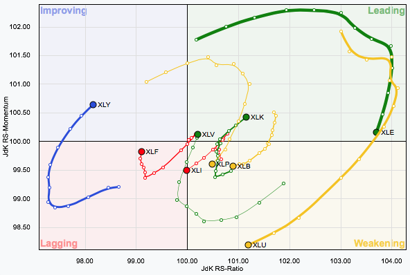
First things first: stocks generally follow a natural clockwise rotation on an RRG chart as time passes. For instance, if a stock starts out in the green "Leading" quadrant because it has good relative strength and good momentum, the typically will start to lose momentum and rotate into the yellow "Weakening" quadrant. Next its relative strength will probably falter and it will move into the red "Lagging" quadrant. After awhile, things may start to improve (relative to the other stocks on the chart) and momentum will pick up moving the stock into the blue "Improving" quadrant. Finally, relative strength will return causing the stock to move back into the green "Leading" quadrant. Make sense?
RRG charts have large dots on then showing you where each stock is currently on the chart. Extending backwards from each dot is a long "tail" that gives you a sense of the stock's recent travels through the chart. On the live RRG Chart page, you can interactively control the start and end date of the chart and watch the stocks spin around over time. Click here to try it out. Go ahead. I'll wait.
Did you have fun? These things are very addictive!
The example chart above shows the RRG chart for the nine S&P Sectore ETFs. It is only available to StockCharts members so I wanted to take a moment and talk everyone through it so you can see how useful it can be.
Did you notice that the color of each line is controlled by the color of the quadrant that the final dot is in? That makes it easy to see which stocks (Sector ETFs in this case) are in which quadrant. As of right now, Energy, Technology and Health Care are in the green "Leading" quadrant with Cyclicals in the blue "Improving" quadrant. Note that Energy is losing momentum however and should enter the yellow "Weakening" quadrant very soon. Also note that Finance (XLF) has improving momentum and may enter the blue "Improving" quadrant soon as well.
Now let's take a moment and look at our Sector Rotation model graph and see if that helps us interpret these results:
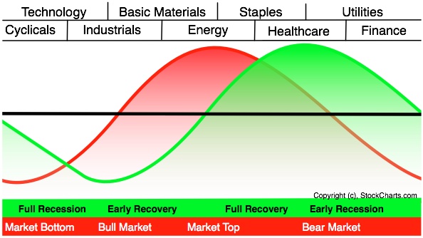
The fact that Technology is strong and Finance and Cyclicals are starting to perk up is evidence that we are still on the left side of this chart in the "bullish part of the red curve where the market picks up strength. However, the fact that Energy and Health Care are also strong brings a note of caution to this analysis. In a perfect world, we should see strong leadership from Cyclicals, Technology and Industrials with relative weakeness in Staples, Health Care, and Utilities. (Of course, there are outside factors that may be causing Health Care to ignore the general business cycle at this time.) So we have a bit of a mixed picture at the moment in terms of the Sector Rotation model. It will be interesting to watch this chart in the coming weeks to see how things resolve themselves.
Please do take some time to play with these new RRG charts and see how they can help you gain deeper insight into the market. I hope you find them useful.
- Chip
P.S. Also keep an eye out for the debut of a new "RRG Chart" blog written by Julius de Kempenaer, the inventor of RRG charts! Julius will be writing lots of articles explaining how he developed and uses these innovative charts himself to make money.
P.P.S. News Flash: Julius has been added to the speaker list for our upcoming ChartCon conference in Seattle in August. That means that ChartCon is now the perfect place to see these charts in action and learn how they work! Are you going? If not, click here and reserve one of the few seats that are still available.
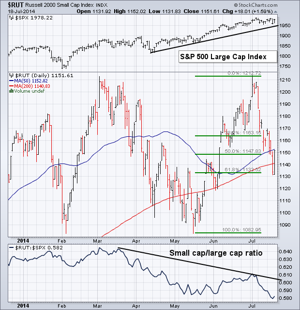
One of the nagging concerns about the current market rally is the lack of participation by small cap stocks. This week's action was another example of that troubling trend. The Russell 2000 Small Cap Index lost -0.72% this week (versus a +0.54 gain by the S&P 500 Large Cap Index). In a strong uptrend, small caps should be rising with large caps. Chart 4 shows the early July top in the Russell 2000 failing to overcome its early March peak and losing 4.5% since then. The RUT/SPX relative strength ratio (below the chart) shows how badly small caps have lagged behind. Since March 4, small caps have lost -4.7% while the S&P 500 has gained +5.5%. That 10% underperformance by the RUT is the worst since 2012 when the market was in the midst of the last downside correction. The good news is that the RUT hasn't yet suffered any serious chart damage. Friday's 1.5% gain kept it above its 200-day moving average. The RUT may also be finding support at its 62% Fibonnaci retracement level measured from its May low to its July peak (green lines). Although I remain concerned about the relative weakness of small caps, the RUT would probably have to fall below its May low to signal a serious problem with the rest of the stock market. For the record, small caps usually peak first at market tops. Janet Yellen's comment at midweek that small caps were "stretched" contributed to some of this week's selling.
Chip told me to tell you that I'm looking forward to meeting everyone at ChartCon 2014 in Seattle next month. In reality, I really am. I greatly enjoyed the previous ChartCon conferences there and I know that everyone that attends will get their money's worth out of it. See you soon. - John
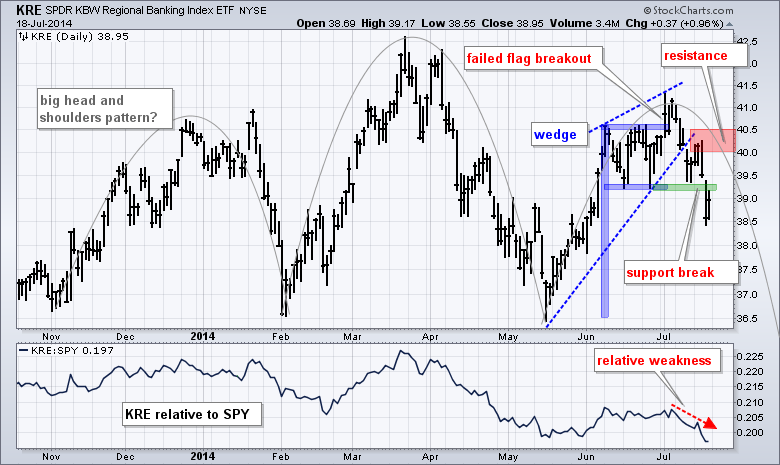
The Regional Bank SPDR (KRE) failed to hold its flag breakout and then broke support with a sharp decline this week. It would now appear that KRE formed a rising wedge that peaked below the January high. This week's wedge break signals a continuation of the prior decline and projects a move below the May low. This week's high and the trend line break to mark a resistance zone in the 40-40.5 area. With the upswing reversed, chartists can also consider a larger bearish pattern taking shape. Combined with a relatively equal high in January, a large head-and-shoulders reversal pattern could be taking shape with neckline support in the 36.5 area.
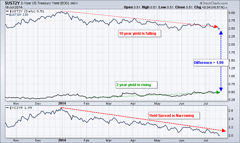
The overall stock market remains strong with the S&P 500 near all time highs and the Finance SPDR (XLF) hitting a 52-week high this month. Why are regional banks underperforming and breaking down? The spread between the 10-year Treasury Yield ($UST10Y) and the 2-year Treasury Yield ($UST2Y) may be to blame. The second chart shows a 1.99 difference between these two yields, which means the 10-year Yield is 1.99% more than the 2-year Yield. The yield curve is still very positive and this bodes well for the economy overall, but the difference between the two has narrowed significantly this year. The 10-year Yield fell, the 2-year Yield rose and the Yield Curve 10YR - 2YR ($YC2YR)) fell to its lowest level since June 2013. Banks make money by borrowing at short-term rates, lending at long-term rates and capturing the difference. This difference is less and this could be weighing on regional banks. A break above 2.2 in the Yield Curve (10YR - 2YR) would suggest that the spread is widening again and this would be positive for regional banks.
Good trading and good weekend!
Arthur Hill CMT
P.S. I just learned that my good friend Julius de Kempenaer will be presenting at ChartCon 2014, talking about his RRG charts. I hope you can join us there in Seattle next month. Click on the ad below for more details.
The Consumer Discretionary Sector SPDR (XLY) is a very important barometer in the US investing landscape. It sits on the edge of a breakout to new highs. July / August is typically the time frame that investors start to rotate into the discretionary stocks to position for the back to school stock up event and the massive Christmas shopping season. With the midst of earnings season upon us, option expiry yesterday and a few of the long trends showing weakness, it is an important time for the cyclicals to show strength. First of all a real quick check of the month long term chart to discuss the July/August acceleration in cyclical (discretionary) stocks.
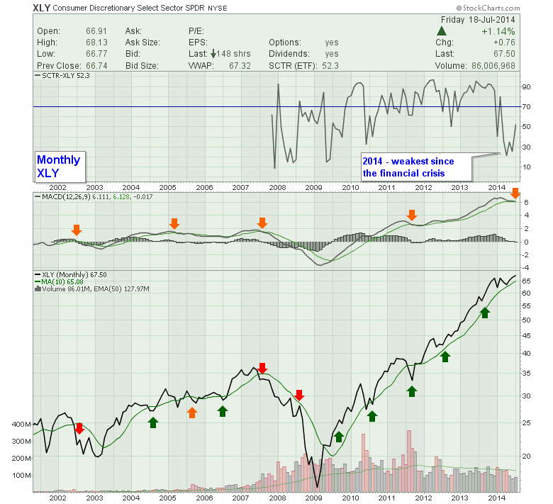
So in hindsight, July is a nice place to look for seasonal timing. It may drift into August for a low. You can see clear underperformance by the consumer cyclical sector in market years that were either down years or sideways. Notice even in 2007, the sector made the highs in May even though the S&P 500 ($SPX) made highs in October 2007. 2002 continued to be weak. In 2005, the $SPX was moving higher in the back 1/2 of the year (not shown), but not consumer discretionary. We want to see the cyclicals close higher at the end of August to confirm the sector strength into the strong period to December. In the Top plot, the SCTR ranking made lows not seen since the financial crisis. This is why I have some hypersensitivity to the sector now. The MACD has also approached its signal line to illustrate a zone of caution. Currently it resides below the signal. You can see the negative number in the MACD legend. One remarkable trend is the volume. While the $SPX is back to 2006-2007 levels, we can see this sector has a huge volume profile that is substantially larger than the 2006 period. Onto the weekly.
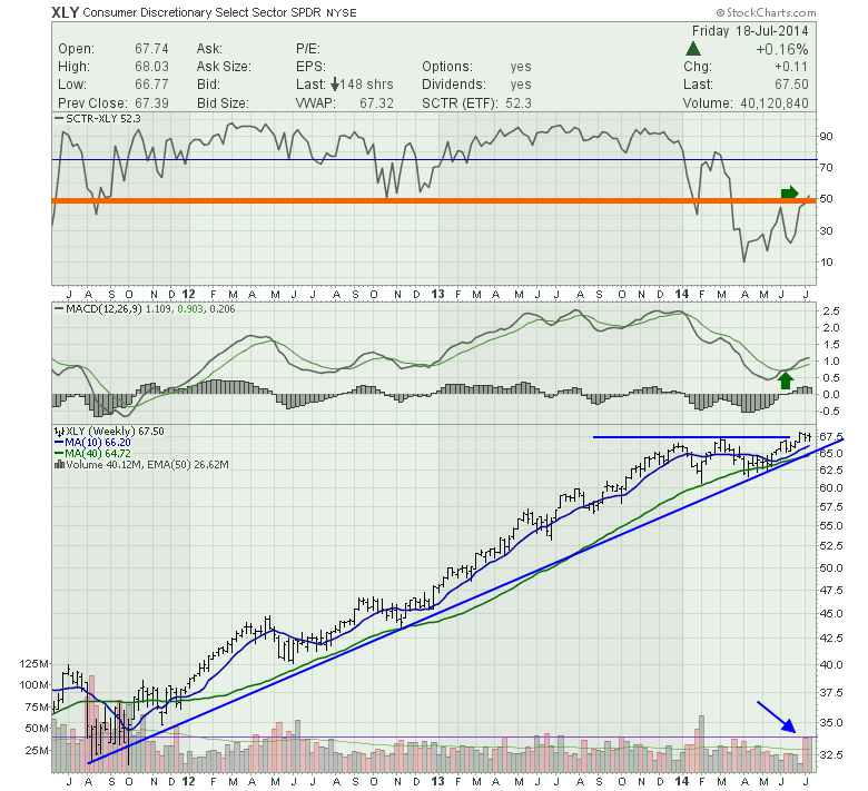
We can see the SCTR is just back to the 50% level. Will this form some sort of resistance where the sector becomes stuck at or under the average ETF? This is important as it has been hugely bullish since the Fed stimulus of 2012. The MACD has started to rally. If it was to fail here, it would be huge negative divergence, so we want to watch based on the clues of the SCTR. The recent volume has been huge and marks the 2nd largest back to back weeks all the way back to 2012. We can see the price action is near new highs and has paused here for three weeks after making new highs. As the price action is relatively close to the blue up trend line, all technicians would respect a break of a major 2 year trend line. Ok, next is short term daily.
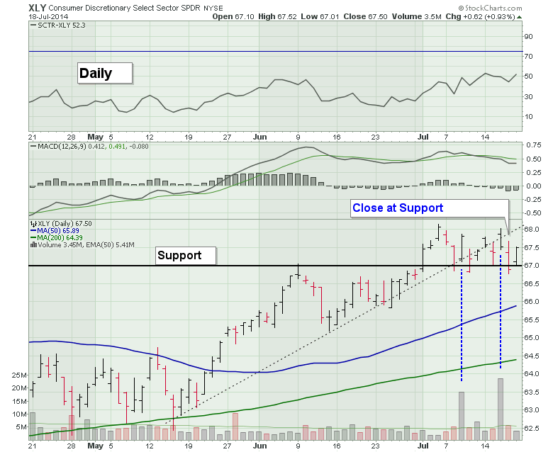
On the Daily we can see the weak SCTR. The MACD is sideways to down but nice and high. Price action is interesting on the 3 month view. Two huge high volume days are responsible for the big readings on the weekly. The first was a bounce off 1 month support. The second was a gap up and it fell all day but still closed higher than the previous day. Thursday marked a close at or below support depending where you place the line. The micro black dotted uptrend line was broken and we seem to be having trouble getting back above. It is still a bullish chart, but the long term and intermediate term (charts 1 and 2) suggest focusing on cyclicals for larger time frame direction.
Good trading,
Greg Schnell, CMT
P.S. I'm looking forward to meeting everyone in Seattle at ChartCon 2014!
Please
click here to see Erin's latest article from the DecisionPoint blog entitled "Five Charts to Keep an Eye On."
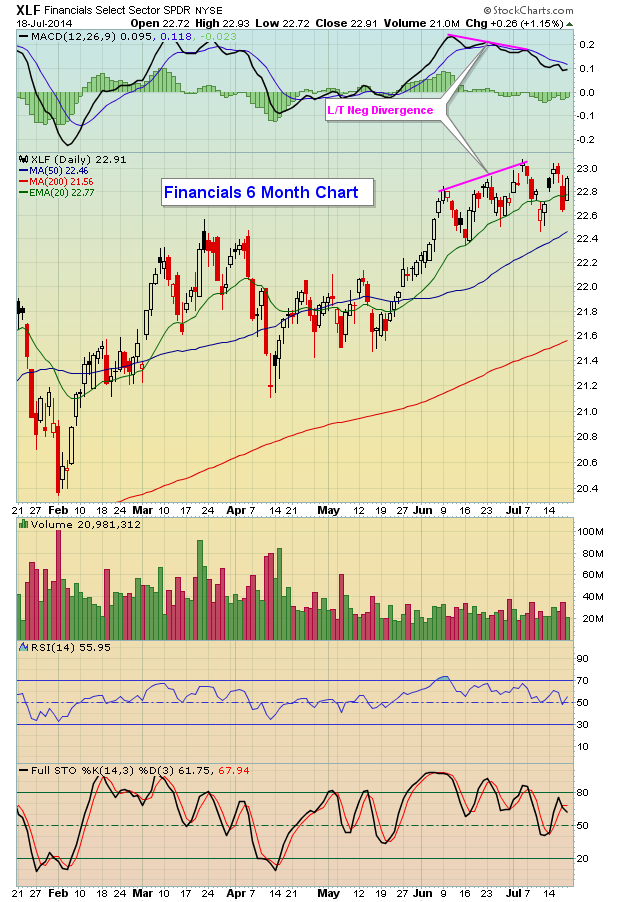
Financial stocks have lagged throughout 2014 and are showing signs of slowing momentum. That's keeping hope alive for the bears. The XLF (ETF tracking financial stocks) has a clear long-term negative divergence in play on its MACD as you can see from the chart below:
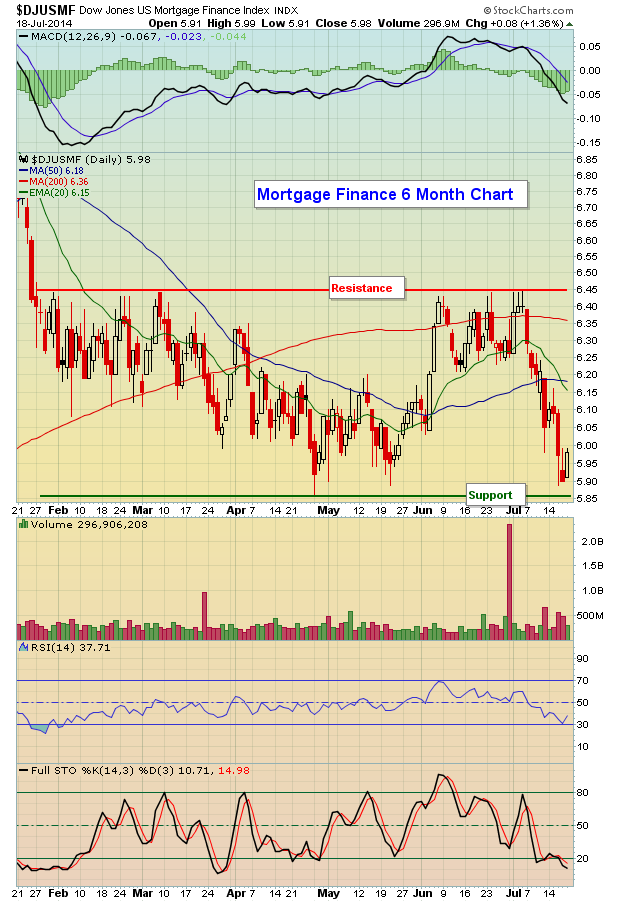
Most of the strength, however, has been concentrated in REITs, the defensive area of financials. That's not exactly where I'd like to see the strength centered, but it is what it is. One area of financials - mortgage finance ($DJUSMF) - has been lagging very badly as that industry group has dropped more than 6% over the past month, while many REITs have enjoyed gains in the 3%-5% range. The good news for mortgage finance stocks is that they reached key 2014 price support near 5.85 before bouncing on Friday. You can see this support on the following chart:
Financials are going to need to see strong earnings reports and guidance over the coming days to counter the slowing momentum issues discussed above.
At EarningsBeats.com, we've started a new feature (and it's FREE) that analyzes the technical merits of companies as they approach their earnings date. If you'd like to receive the first copy, simply CLICK HERE for more information.
In addition, I want to remind everyone that I'll be at the upcoming ChartCon conference in Seattle on August 8th and 9th and I really hope you can join me there. If you do attend, be sure to come up and say "Hi." I'd live to meet you in person. CLICK HERE for deatils on this amazing conference.
Happy trading!
Tom Bowley
Chief Market Strategist/Chief Equity Strategist
Invested Central/EarningsBeats.com


 As markets make new highs, investors often befriend a dangerous new companion. He's the greedy little devil that sits on your shoulder and whispers in your ear – assuring you that this market will make you wealthy as he coaxes you to buy more and ignore the naysayers. As I write this blog, the S&P 500 has soared nearly 300% since March of 2009 while other markets are also hitting...