| THIS WEEK'S ARTICLES |
| Market Roundup |
| What’s Happening with Last Week’s Three Featured Charts |
| by Martin Pring |
Editor's Note: This article was originally published in Martin Pring's Market Roundup on Friday, September 27th at 1:25pm ET.
Last week, I wrote that the short-term technical picture looked positive, but that I was watching three charts which would confirm a significant extension to the bull market in the event that they experienced upside breakouts. This week, I’ll reverse the process by examining what happened to those three charts and then re-examining the current short-term position.
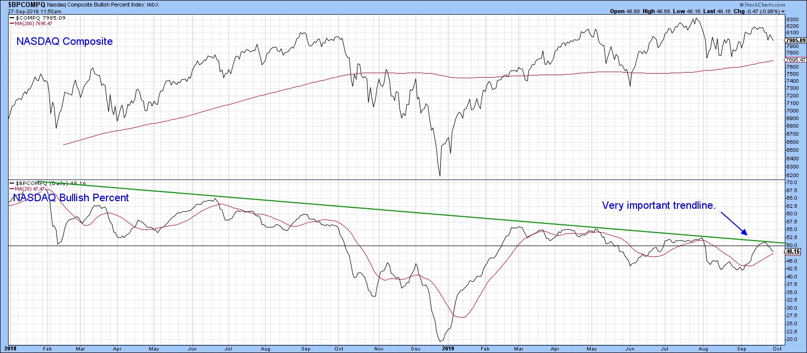
Chart 1 features the bullish percent for the NASDAQ. I was particularly interested in the 2018-19 green downtrend line, since a breakout would indicate that the number of NASDAQ stocks in positive trends would expand. That would presumably be sufficient to power the NASDAQ higher as well. The signal was never given, and the indicator is now in a declining trend just shy of its 20-day MA. Obviously, there is no signal there at the moment.

Chart 1
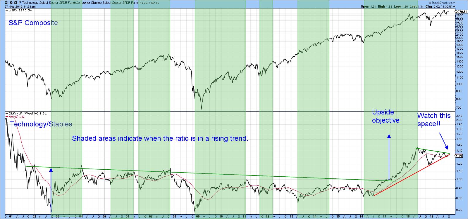
Our second chart featured a ratio between the SPDR Technology (XLK) and the SPDR Consumer Staples (XLP). The idea here was that a rising ratio reflected growing confidence, with traders flocking to higher-risk technology over the more defensive staples. The green-shaded areas indicate that a positive trend in this relationship is also bullish for the S&P. Consequently, I was looking for a break above the upper green trend line, rather than one below the red 2016-19 uptrend line. That break never came; now, the indicator is testing its 40-week MA and uptrend line, which are pretty well at the same level. Whenever you see a trend line and a reliable moving average in the same vicinity, they reinforce each other as a support/resistance zone (in this case, support). Consequently, a downside penetration would not be a good sign.

Chart 2
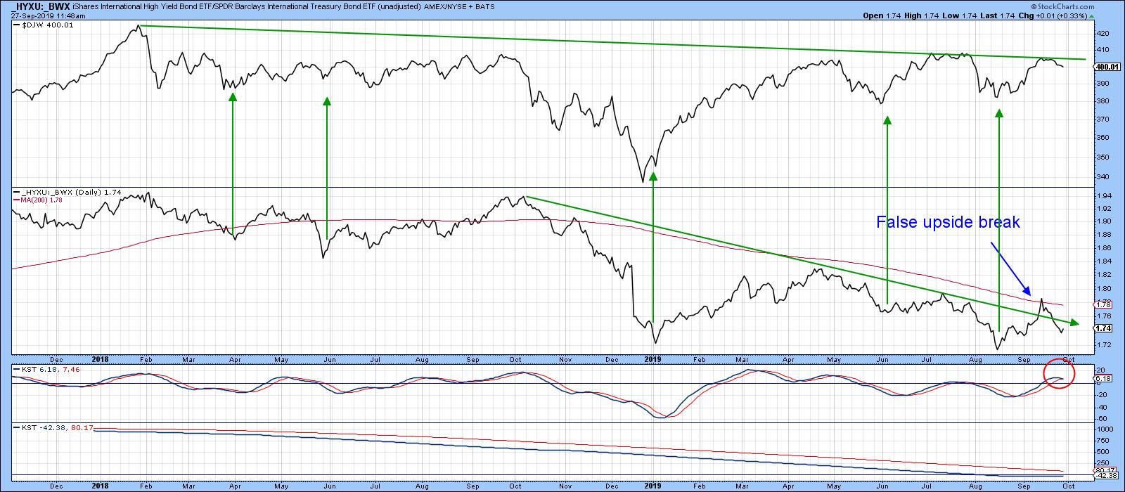
Our third indicator was effectively an international bond spread, where the price of the iShares International High Yield Bond ETF is compared to the Barclays International Treasury fund (_HYXU/_BWX). Since the Dow Jones World Index itself was very close to an upside break like the ratio, I was looking for a joint upside move. Instead, what we saw was an attempt at new highs by the Index and a false upside breakout by the ratio. Now, its short-term KST has begun to roll over. The chart has now moved from being a potentially bullish one to reflecting a relationship that is questionable.

Chart 4
So far, then, none of the charts being monitored have yet broken to the upside, thereby confirming what was an improving short-term technical position. The question naturally arises as to the current position of some of those short-term oscillators themselves.
Good luck and good charting,
Martin J. Pring
The views expressed in this article are those of the author and do not necessarily reflect the position or opinion of Pring Turner Capital Group of Walnut Creek or its affiliates.
|
| READ ONLINE → |
|
|
|
| The Mindful Investor |
| Three Reasons Why Resistance Works |
| by David Keller |
Recently, a reader responded to one of my articles on the S&P 500 and asked about the value of support and resistance levels on a broad market index. He explained that support and resistance seems to make sense for individual stocks, as they’re based on people’s reactions to a stock trading at a certain price level, resulting in that specific price level having meaning to the market.
But how would that make sense for a broad market index, which is not in and of itself a tradable vehicle?
That's a fair question… and here are three reasons why the answer is absolutely “Yes!”
First, a broad-market index like the S&P 500 is comprised of about 500 (it’s actually 505 at the moment, I believe) individual stocks. If the price of an individual stock represents the supply/demand picture for that stock, then the value of index should represent the aggregate supply/demand for all of the companies in the index.
Many equity indices are market cap-weighted, meaning the largest companies in the index can make quite a large impact on the movement in the index. To put another way, investors’ decisions on the largest stocks are what will be most reflected in the index value.
All of this means that the value of an index has meaning, and that the value of an index relative to its previously meaningful values also has meaning.

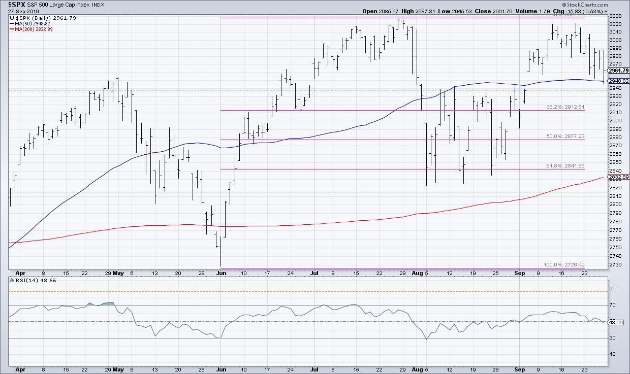
That 2940 level on SPX has meaning because investors see it and react to it.
Second, with the prevalence of passive investment strategies, especially index ETFs, more and more people are tied directly into the returns of the broad market indexes. As more people watch ETFs, I would argue that key price levels (see the third point on psychological levels!) become more relevant as investors will make buy and sell decisions based on those specific price levels.
The market has a memory, and investors tend to anchor themselves to price levels based on their entry points. The more that people use ETFs as an investment vehicle, the more of a chance that a key support or resistance level will be noted and reacted to by investors.
Finally, we have the phenomenon of psychological levels, where certain price points have meaning just because people believe they do. This is often known as “big round number” theory, the idea that stocks tend to find support or resistance at big round numbers like 100 or 1000.
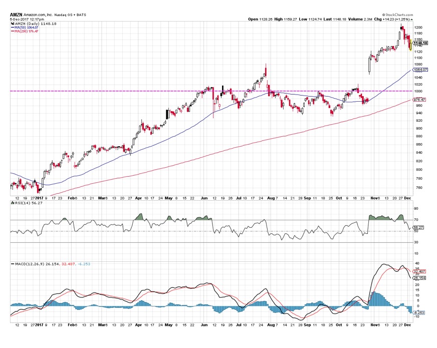
Check out this chart of Amazon ($AMZN) from 2017. Notice how important the 1000 level became over the course of the year.

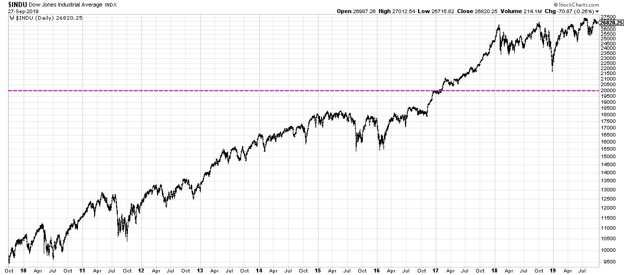
The Dow Jones Industrial Average breaking 10,000 had no particular economic meaning, but, psychologically, it made a huge difference that we needed another column to start quoting the Dow. Dow 10,000 hats were running rampant on the NYSE floor to signify this momentous occasion!

Did Dow 20,000 have any significant economic significance? No, not really...
So, if you ask me why resistance levels are valid on the broad market level, I would say it all comes down humans. Humans anchor specific price levels (and even program computers to do so as well!), humans follow index ETFs and pay attention to where they’re moving, and humans attribute greater importance to certain levels based purely on their psychological significance.
Put simply, as long as humans are still involved, then price levels have meaning.
RR#6,
Dave
David Keller, CMT
Chief Market Strategist
StockCharts.com
David Keller, CMT is Chief Market Strategist at StockCharts.com, where he helps investors minimize behavioral biases through technical analysis. He is also President and Chief Strategist at Sierra Alpha Research LLC, a boutique investment research firm focused on managing risk through market awareness. He is a Past President of the Chartered Market Technician (CMT) Association and most recently served as a Subject Matter Expert for Behavioral Finance. David was formerly a Managing Director of Research at Fidelity Investments in Boston as well as a technical analysis specialist for Bloomberg in New York. You can follow his thinking at MarketMisbehavior.com, where he explores the relationship between behavioral psychology and the financial markets.
Disclaimer: This blog is for educational purposes only and should not be construed as financial advice. The ideas and strategies should never be used without first assessing your own personal and financial situation, or without consulting a financial professional.
The author does not have a position in mentioned securities at the time of publication. Any opinions expressed herein are solely those of the author, and do not in any way represent the views or opinions of any other person or entity.
|
| READ ONLINE → |
|
|
|
|
|
| Trading Places |
| Financials Are About To Do Something They Haven't Done In Nearly 18 Months |
| by Tom Bowley |
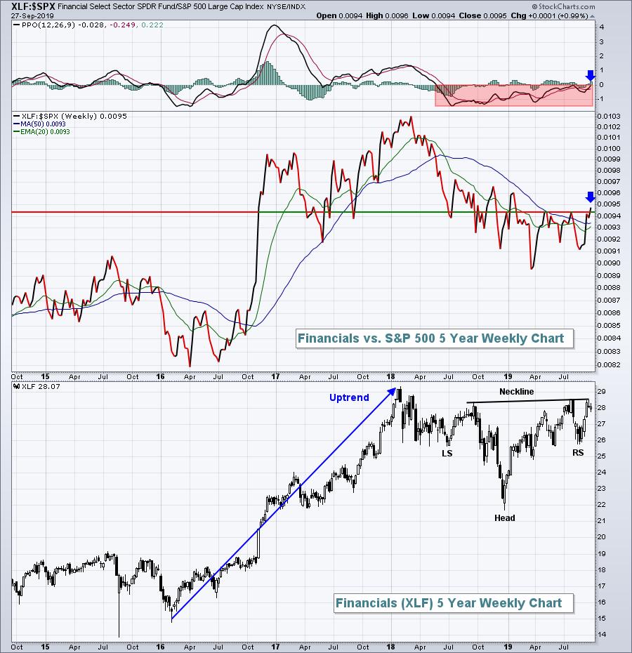
Financials (XLF) had been rather dormant for nearly 18 months - at least on a relative basis to the S&P 500 - but that is all about to change. While the group is certainly beginning to flex its collective muscle, the real confirming signal would likely be a 10-year treasury yield ($TNX) break above its earlier September high of 1.90%. The following is a relative chart vs. the benchmark S&P 500. In particular, check out the relative momentum (PPO):

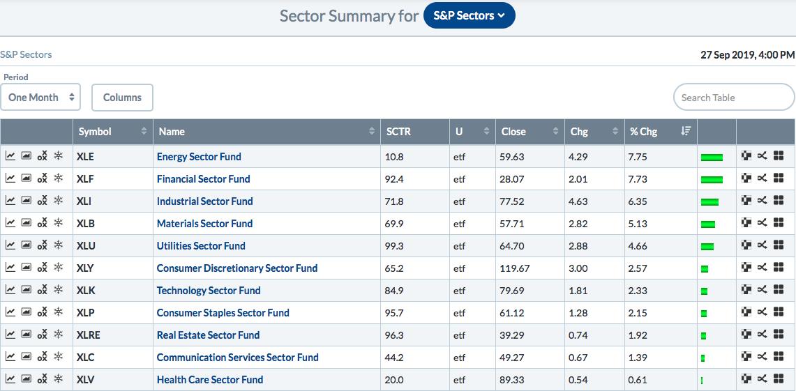
A positive relative PPO is important because it tells us that momentum on a relative basis has begun to shift the financials' way. Over the past month, financials have moved into a leadership role. Another way to look at that here at StockCharts.com is to look at the sector summary. Here's the leaderboard over the past month:

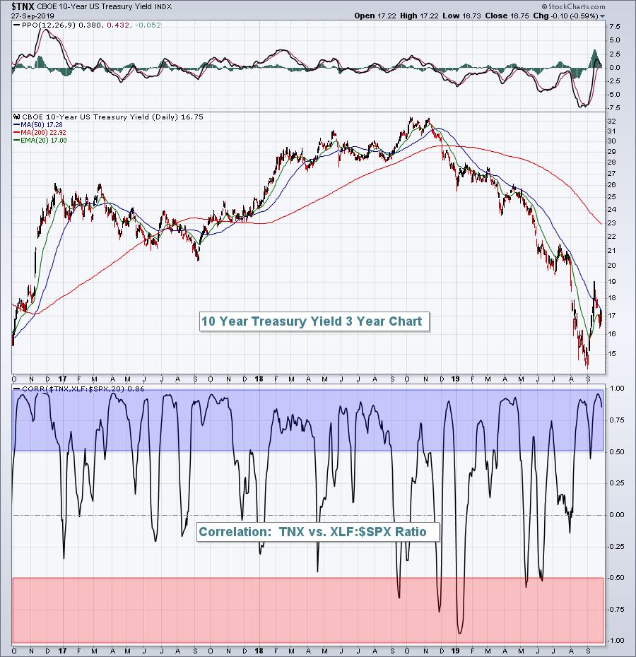
It's a little too early to say that this leadership role will continue, but the big clue will most likely be the direction of the TNX. When the TNX is on the move higher, the XLF:$SPX ratio usually is too. Check out the positive correlation here between the two:

The blue-shaded area illustrates just how positive the correlation between the TNX and the XLF:$SPX ratio truly is. The red-shaded area highlights periods where the two move in opposite directions.
If you're investing in financials, particularly banks ($DJUSBK), life insurance ($DJUSIL), investment services ($DJUSSB) and asset managers ($DJUSAG), watch the TNX for further clues. A break above 1.90% and we're likely to see significant outperformance by the financial sector continuing into Q4.
Please join the EarningsBeats.com community by subscribing to our FREE EB Digest newsletter. I publish it every Monday, Wednesday and Friday before the stock market opens; the focus is on relative strength and earnings. CLICK HERE to sign up!
Happy trading!
Tom
|
| READ ONLINE → |
|
|
|
| The MEM Edge |
| Yield Stocks With Growth Prospects: 3 Dow Stocks You Want To Be Aware Of |
| by Mary Ellen McGonagle |
It was another bumpy week in the markets, as investors digested a barrage of political headlines which brought fear-induced selling to those areas most sensitive to the latest tweet. While the Tech-heavy Nasdaq was hardest hit, the Dow Jones Industrial Average held in surprisingly well last week, with several heavyweight stocks in this Index posting solid gains.
In addition to these select stocks showing strength in a tough market environment, they also have growth prospects that should help them continue to outperform – particularly once the market’s volatility subsides. The fact that they offer a yield that’s higher than the S&P 500 average of 1.9% also makes these stocks attractive.
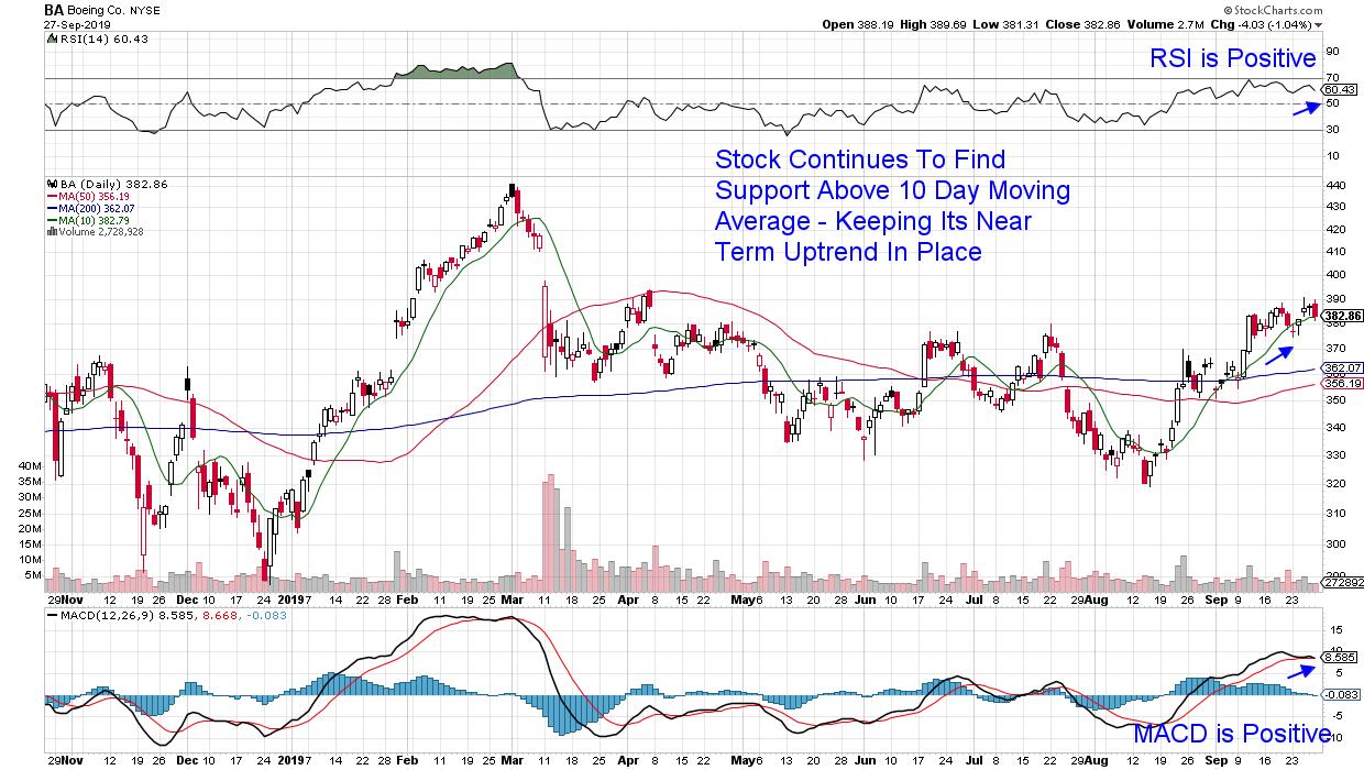
DAILY CHART OF BOEING CO. (BA)

Let’s begin with the Dow’s largest component – Boeing Co. (BA). This company has had a lot to overcome over the past year, as 2 deadly plane crashes within the span of five months led to a mandatory grounding of their 737 MAX aircraft. While the impact may not be entirely behind them, Boeing has seen growth in U.S. government contracts alongside continued sales globally. In fact, the Pentagon announced the award of a $2.6 billion contract with Boeing after the market’s close on Friday, which is on top of Air New Zealand’s $1 billion Dreamliner order earlier in the week.
As you can see in the chart above, the stock is in a bullish uptrend as it continues to find support at its upward trending 10-day simple moving average. In addition, the Relative Strength Indicator (RSI) and Moving Average Convergence Divergence (MACD) are in positive positions as well.
In addition to a bullish chart, analysts are suggesting that the stock could hit a $450 price target if they can get their MAX 737 issues resolved. BA’s CEO will be addressing Congress next month to review safety and other issues, which may help.
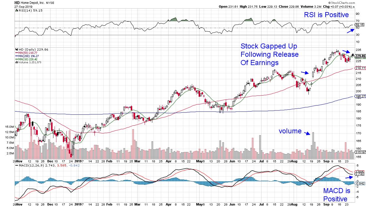
DAILY CHART OF HOME DEPOT (HD)

Next up is Home Depot (HD), which came out with their most recent earnings report in late August. While the numbers were not as robust as anticipated, management’s comments regarding a 20% increase in digital sales, coupled with easy locker pickup options and other customer service improvements, has analysts raising guidance. Lower interest rates are also helping HD’s outlook as increased home sales are leading to an increase in home improvement projects.
The stock experienced a gap up following their earnings release last month and the move was on volume, which was bullish. More recently, last week’s break back above its 10-day moving average is near-term bullish, as is the fact that the RSI and MACD are both in positive territory. A break above $235.5 would be even more bullish for a continuation of this 2.4% yielder’s uptrend.
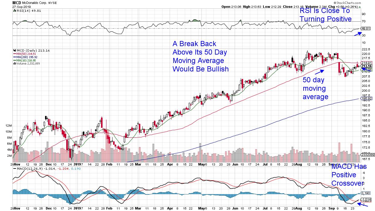
DAILY CHART OF MCDONALDS CORP. (MCD)

While the next stock has more work to do before being in a bullish position, last week’s 1.8% rally put the stock closer to a needed break back above its 50-day moving average. McDonalds Corp (MCD) had been hovering around its all-time high in price before breaking down earlier this month.
The stock’s drop below its 50-day moving average was spurred by fears of competition in the heated-up breakfast market following fast food company Wendy’s announcement that they’re entering the fray. More recent news from MCD that they’re testing a vegan burger, while also opening a lab in Silicon Valley to help incorporate new technologies, has analysts back to being interested in the company while raising guidance for 2020 earnings.
Though the current volatility in the broader markets has some investors unnerved, the fact that stocks with a positive growth outlook are continuing to be supported is a positive.
For those who would like regular insights into areas of the market that are poised to outperform the markets, take a trial of The MEM Edge Report. This high performing bi-weekly newsletter provides stock picks as well as broader market analysis and sector insights you won't get anywhere else. You can trial the report for a nominal fee by accessing this link here.
Warmly,
Mary Ellen McGonagle,
MEM Investment Research
|
| READ ONLINE → |
|
|
|
| RRG Charts |
| Using Relative Rotation Graphs For "Overwatch" On International Stock Markets. |
| by Julius de Kempenaer |
 “The appearance of U.S. Department of Defense visual information does not imply or constitute DOD endorsement.” “The appearance of U.S. Department of Defense visual information does not imply or constitute DOD endorsement.”
From time to time, you come across new or different ways to look at things or describe them. In my RRG blog from Tuesday, I introduced the concept of military overwatch tactics and compared them to Relative Rotation Graphs.
Since the public launch of Relative Rotation Graphs in 2011 on Bloomberg terminals, we have been using the tagline "RRG provides you with the BIG picture in ONE picture" as a way of emphasizing the key function of RRGs. Specifically, that function is to condense the complex interaction of many securities against each other in a universe into one picture/chart. At a later stage, someone noted RRGs provided situational awareness. That analogy comes from the military, where it is crucial to know what your position is on the battlefield and where your friends and you adversaries are located, as well as - even more importantly - how, and in which direction, they are moving.
Overwatch
Recently, I have been watching some military videos and documentaries about tactics in the field and various ways to "solve problems." One thing that got my attention was the common use of "overwatch units." I remember working and training with that doctrine when I was still in the air force, but for some reason it dropped from my memory.
However, watching these videos brought it back and I immediately made the connection to Relative Rotation Graphs. These are the perfect tool to conduct overwatch and keep the engaging elements safe from enemy fire, as well as providing them with crucial information about movements of enemy units.
According to Wikipedia: "Overwatch is a force protection tactic in modern warfare where one small unit or military vehicle supports another while it is executing fire and movement tactics. An overwatching unit takes a position where it can observe the terrain ahead, especially likely enemy positions. This allows it to provide effective covering fire for advancing friendly units. The term "overwatch" was coined in U.S. military doctrine in the 1950s."
Obviously, the unit providing overwatch will position itself as high as possible relative to the units they are covering. They want to keep the big picture in sight. Analogously, RRG will do exactly that.
The US Against the Rest of the World
As most of our readers here on StockCharts are US-based or interested in US stocks, not to mention the fact that the US market is (one of) the biggest in the world, most of the content and focus is geared towards that market. There is nothing wrong with that. It would be wrong, however, to only look at the US in isolation. The world is a big place and markets and economies are getting more and more interrelated. Everything interacts with everything. That is what makes analyzing markets difficult. However, at least for me, it is also what makes analyzing markets fun.
The good news is that we have the perfect tool to help you gain perspective on how the US (stock) market is acting in relation to other markets around the world. No surprise that, IMHO, that tool is the Relative Rotation Graph.
International Stock Markets

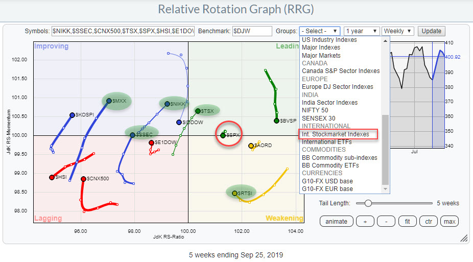
The chart above shows the RRG for international stock markets. More specifically, it shows the actual stock market indexes as opposed to the ETFs. I want to see the true relationships, without the currency effect, of the underlying stock markets as opposed to the ETFs that many investors use to get exposure to a position in an international market.
This universe of international stock market indexes is one of the predefined groups that is available on the RRG page. Click on the small arrow in the "Groups" box above the chart, scroll down to "Int Stockmarket indexes" and load this group of symbols onto the RRG.
The benchmark is set to $DJW, the Dow Jones Global index. The benchmark can easily be changed by changing the symbol in the benchmark-box. If you change the symbol (we'll use $SPX as an example) and then hit "Update", the RRG will re-render accordingly.
The benchmark will dictate how you view the universe. In this case, if you stay with $DJW, you will be looking at these international market from a global perspective. The world is your benchmark.
If you change the benchmark to $SPX, you will be looking at the world from a US point of view and be able to track rotations of international markets against relative to the US.
The chart above shows the US market ($SPX) to the right (positive territory) of the DJ Global index with a very short tail. This indicates that the relative uptrend vs $DJW is still intact and stable. So far, so good. Holding US stocks, in relation to holding stocks in other markets, still seems to be a good idea.
If you want to look for options to diversify your holdings, the markets that are at a positive RRG-heading are worth looking at. The closer to the 100-level on the JdK RS-Ratio scale, the more interesting they are.
At the moment, I am watching the rotations of $TSX, $NIKK, and $SSEC as potentially interesting. To a lesser extent, I am watching $MXX and $KOSPI, though they are still far to the left.
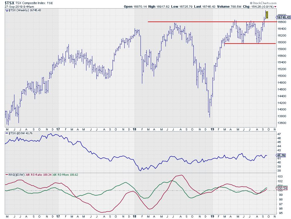
Canadian $TSX breaking to new highs
Out of these three markets, $TSX is the one that just broke to new highs, which makes it more interesting than the others.

For next week, I would look for entry opportunities in the area of the former resistance level, which should now start to act as support, and use stops just below that level.
-Julius
My regular blog is the RRG Charts blog. If you would like to receive a notification when a new article is published there, simply "Subscribe" with your email address.
Julius de Kempenaer
Senior Technical Analyst, StockCharts.com
Creator, Relative Rotation Graphs
Founder, RRG Research
Want to stay up to date with the latest market insights from Julius?
– Follow @RRGResearch on Twitter
– Like RRG Research on Facebook
– Follow RRG Research on LinkedIn
– Subscribe to the RRG Charts blog on StockCharts
Feedback, comments or questions are welcome at Juliusdk@stockcharts.com. I cannot promise to respond to each and every message, but I will certainly read them and, where reasonably possible, use the feedback and comments or answer questions.
To discuss RRG with me on S.C.A.N., tag me using the handle Julius_RRG.
RRG, Relative Rotation Graphs, JdK RS-Ratio, and JdK RS-Momentum are registered trademarks of RRG Research.
|
| READ ONLINE → |
|
|
|
| MORE ARTICLES → |
|
