| THIS WEEK'S ARTICLES |
| Market Roundup |
| Bull in a China Shop |
| by Martin Pring |
Thursday's price action in China resulted in a powerful signal that Chinese equities are headed significantly higher. That should be bullish not only for China but for the world as a whole. In making that statement, I am assuming that that this market is in the process of anticipating an improvement in business activity. Since China is the world's number two economy, that could well help in ending the global slowdown.
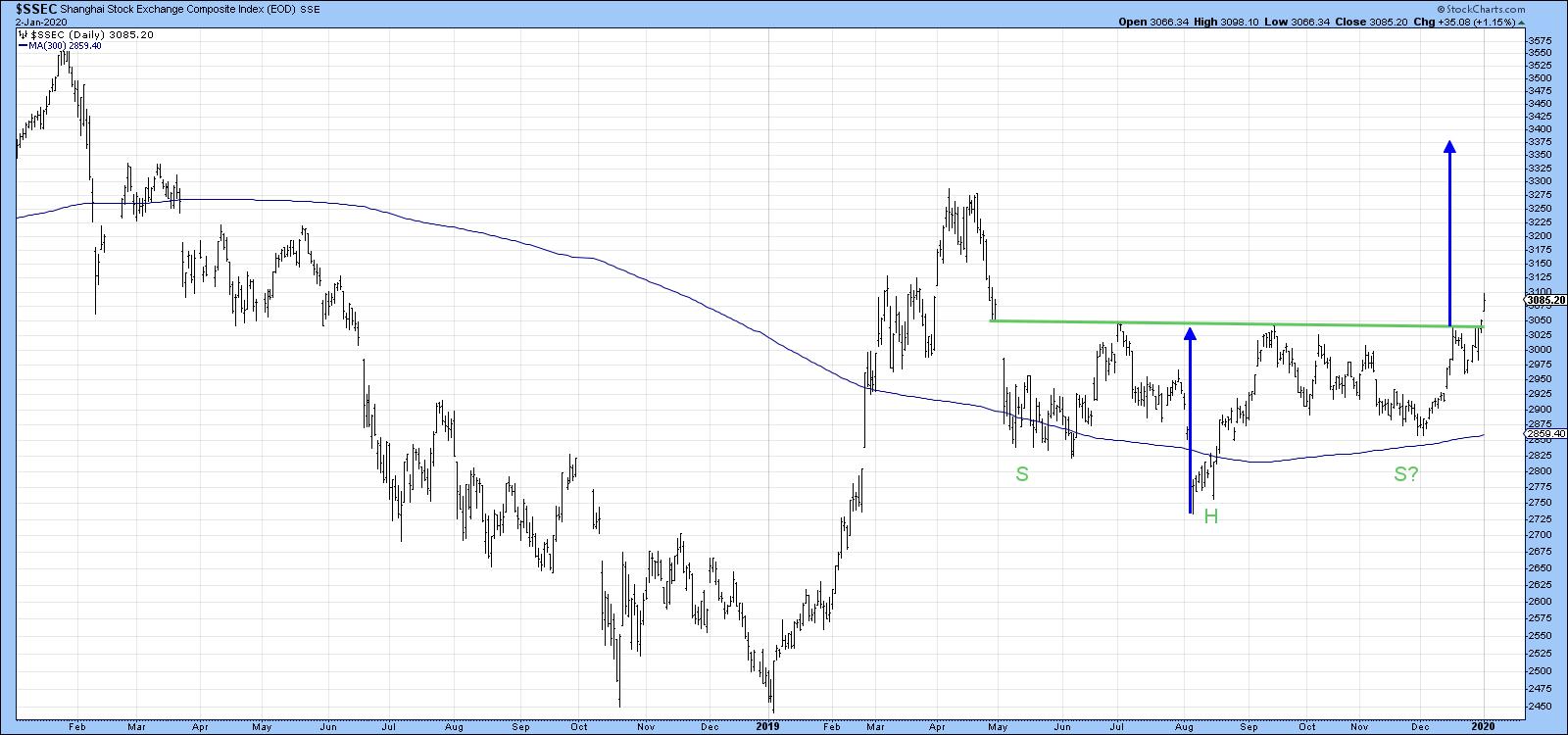
Let's start off with Chart 1, which indicates a breakout from an eight-month reverse head and shoulders. Note that the neckline formed at exactly the same level as the opening of the April/May downside gap. It's a great reminder of the importance of such phenomena as potential support and resistance areas. The blue arrows show that the minimum ultimate upside objective from this formation is for prices to reach close to 3,400.

Chart 1
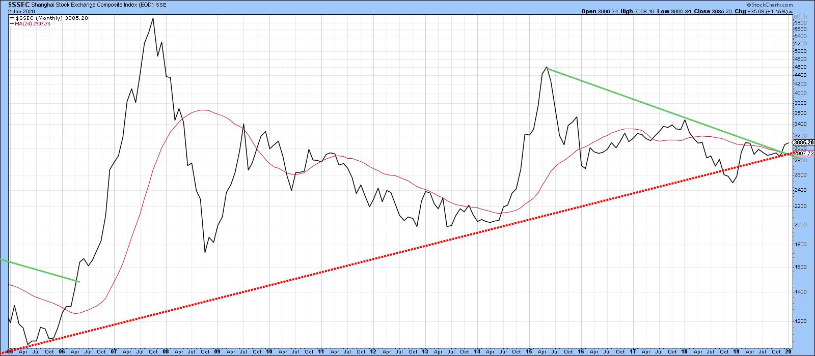
That's a nice move, but Chart 2 tells us that something far more important is happening. Three points are worth noting. First, the Index has broken above its bear market trend line and cleared its 12- and 24-month MAs. Second, it violated its secular uptrend line at the end of 2018 and has now moved back above it, a fact that is confirmed by the breaking of that green 2015-19 downtrend line. Whipsaws of this nature are often followed by above-average moves, as market participants quickly attempt to get back on the right side of the trend. That means we should be prepared for some possible unexpected explosive upside action. Finally, the 18-month ROC has broken above its 2007-19 downtrend line in a similar manner to its 2006 action. I am not predicting that we will see a similar advance to that which culminated in the 2008 peak, but something big is definitely happening here.

Chart 2
Chart 3 shows the same chart but in greater detail, so you can see how close the Index came to a second penetration of the secular uptrend line.

Chart 3
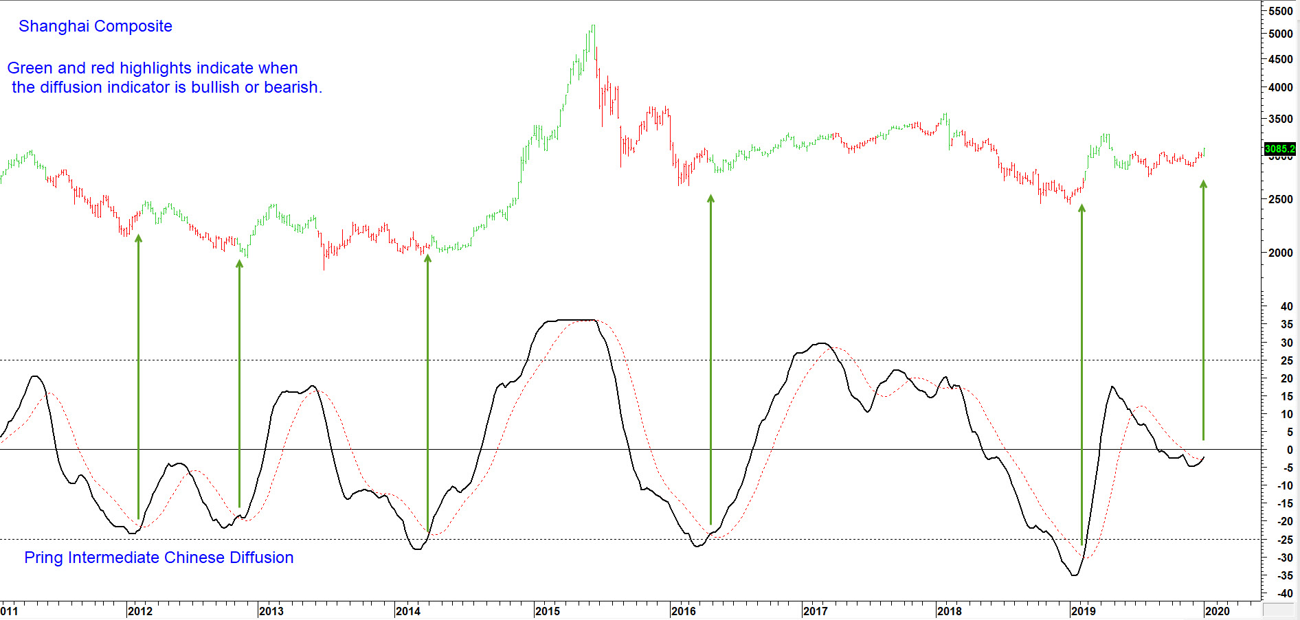
Finally, Chart 4 features a chart from my monthly Chinese newsletter. It monitors a universe of Chinese stocks in a positive trend. Green indicates when it is above its 15-week MA and red when it is below. The arrows show when the indicator bottoms from a low level. That occurred a while ago, but the indicator is now operating on all systems go as it is above its MA once again.

Chart 4
Editor's Note: This is an excerpt of an article that was originally published in Martin Pring's Market Roundup on Thursday, January 2nd at 6:25pm ET. Click here to read the full article, which includes Charts 5-10.
Good luck and good charting,
Martin J. Pring
The views expressed in this article are those of the author and do not necessarily reflect the position or opinion of Pring Turner Capital Group of Walnut Creek or its affiliates.
|
| READ ONLINE → |
|
|
|
|
|
| The Mindful Investor |
| Gold Enters Extreme Overbought Zone |
| by David Keller |
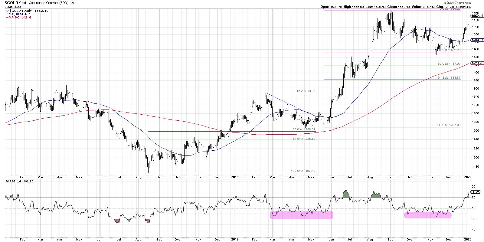
The final chart that I shared in my portion of the StockCharts 2020 Market Outlook (coming soon to our YouTube channel!) was a two-year chart of gold. After a pullback in the fall to Fibonacci support, gold appeared to be resuming its long-term uptrend. Now, gold has reached the extreme overbought region, suggesting a brief pullback before further upside.

In February 2019, gold reached a short-term peak just below the 1350 level, before pulling back to just below the 38.2% Fibonacci level. During this corrective period, the RSI on gold never really went below the 40 level, which often serves as support during bull phases.
After a three-month pullback period, gold resumed its uptrend and broke back above 1350 in June 2019. Soon after, the price rally pushed the RSI to the extreme overbought level above 80.
As I've discussed previously, this usually suggests a short-term pullback before a resumption of the uptrend. To put another way, the upside momentum is so strong that there is usually further upside in store.
Gold again reached an RSI above 80 in early August, but the final price rally in September saw a lower peak in RSI. This resulted in a bearish divergence, with higher highs in price but lower peaks in RSI (suggesting potential downside risk).
From that point on, the chart of gold has appeared to repeat this pattern. The selloff last fall saw the RSI reach down to the key 40 level but not much lower. The price also found support at the 38.2% Fibonacci level, similar to mid-2019.
Now, gold has pushed back toward its previous high around 1566, while RSI has once again become extremely overbought. Similar to what we saw in the previous example, this would suggest a short-term pullback before further upside.
In my recent interview with Ralph Acampora, he reminded me that the market doesn't always repeat, but it often rhymes. In this case, a review of gold prices in 2019 may be a good road map for gold prices in the first quarter of 2020.
RR#6,
Dave
David Keller, CMT
Chief Market Strategist
StockCharts.com
David Keller, CMT is Chief Market Strategist at StockCharts.com, where he helps investors minimize behavioral biases through technical analysis. He is also President and Chief Strategist at Sierra Alpha Research LLC, a boutique investment research firm focused on managing risk through market awareness. He is a Past President of the Chartered Market Technician (CMT) Association and most recently served as a Subject Matter Expert for Behavioral Finance. David was formerly a Managing Director of Research at Fidelity Investments in Boston as well as a technical analysis specialist for Bloomberg in New York. You can follow his thinking at MarketMisbehavior.com, where he explores the relationship between behavioral psychology and the financial markets.
Disclaimer: This blog is for educational purposes only and should not be construed as financial advice. The ideas and strategies should never be used without first assessing your own personal and financial situation, or without consulting a financial professional.
The author does not have a position in mentioned securities at the time of publication. Any opinions expressed herein are solely those of the author, and do not in any way represent the views or opinions of any other person or entity.
|
| READ ONLINE → |
|
|
|
| SPECIAL EVENT ANNOUNCEMENT |
| Don't miss your chance to hear David Keller, Chief Market Strategist at StockCharts.com! David will be a featured presenter at the upcoming Orlando MoneyShow conference, February 6th - 8th. The event is free to register and attend, and you'll have the chance to hear David speak alongside a long list of other industry legends and market experts. Click the banner below to learn more. |
 |
| LEARN MORE → |
|
| Trading Places |
| Finding the Top 15 S&P 500 Stocks for 2020 |
| by Tom Bowley |
Happy New Year and welcome to a brand new decade! A century later, I believe the stock market is about to repeat itself as I'm expecting another roaring 20's! And yes, that could lead to another rough 30's decade, but let's worry about that later. One step at a time here. :-)
Okay, so I took on a big task over the holidays and reviewed every S&P 500 component stock chart from a longer-term perspective (10-year weekly chart). Yep, all 500. Many of the biggest 2019 gains came from stocks that (1) consolidated for a lengthy period before finally breaking out, (2) broke shorter-term downtrends in longer-term uptrends (think "change of character") and (3) pulled back to test a major long-term support level. Timing is key. Let me give you great examples of all three types.
Lengthy Consolidation
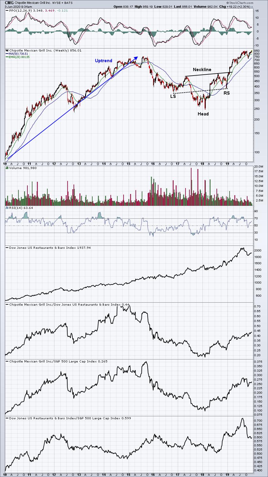
Chipotle Mexican Grill (CMG), under fire in 2016 and 2017, took those two years to create the first half of a bullish inverse head-and-shoulders pattern. In 2018, CMG began righting the ship; then, in early 2019, the neckline breakout began a surge that carried CMG to a gain of 93% over the last year. Take a look:

I liked a few things here. CMG began showing relative strength starting in early 2018, where its neckline was up-sloping, as were its left and right shoulders. That's much more bullish than the alternative. CMG has been a staple in our Model Portfolio at EarningsBeats.com since February 2019; the above chart was a big reason why.
Long-Term Uptrend, Short-Term Downtrend Breaks
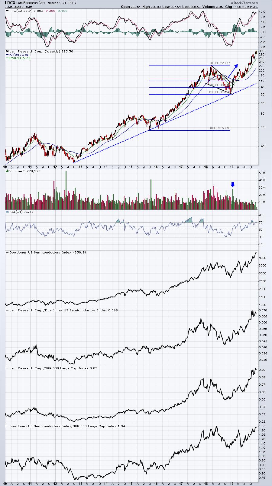
Lam Research (LRCX) saw a "character change" on its weekly chart, one which came almost squarely on a very important Fibonacci retracement level (61.8%) as it broke out of a very bullish wedge formation:

LRCX is a great company, but the masses gave up on it because of its very rough 2018 campaign. That was a BIG mistake. Once the Fibonacci retracement was completed and the bullish wedge gave way to the upside, LRCX was flying higher! You can catch stocks like LRCX, but you need to recognize these longer-term basing/consolidation patterns and await the breakout.
Pullback To Test Major Long-Term Support Level
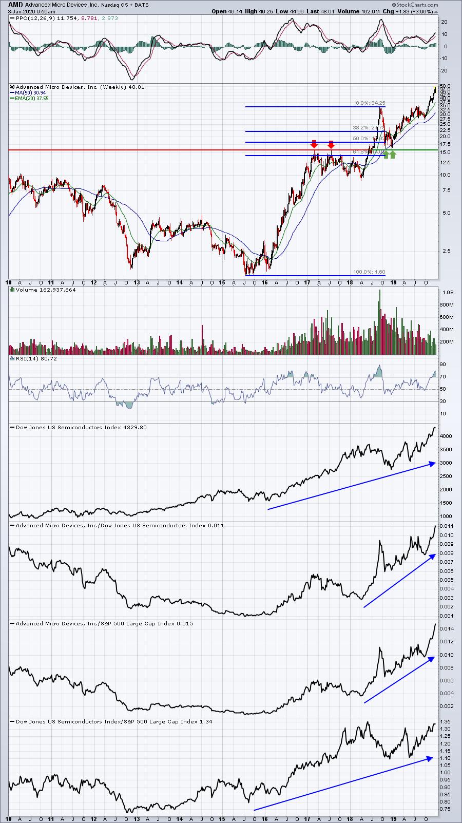
Advanced Micro Devices (AMD) was the best performing S&P 500 stock over the past year. It gained a very impressive 160%, bouncing beautifully off of key long-term price support:

Like LRCX, AMD saw a significant selloff until it hit a level between the Fibonacci 50% and 61.8% retracement levels. Also, note the double top from 2017 near the 16.00 price level. The massive December 2018 selling took us right down to the support level created by the 2018 Q2 breakout above 16.00. Spotting that support test would have yielded incredible 2019 results.
Okay, so those are three investments that, with great hindsight, would have enabled your portfolio to soar. So now we'll take on the much tougher challenge, which is... what stocks will be the 2020 leaders? Which ones will I be writing about in January 2021?
Again, I reviewed all 500 component stocks of the S&P 500, looking for exactly the type of patterns and consolidation shown above. Yes, the S&P 500 was at a record all-time high at December 31st, but not all S&P 500 stocks enjoyed the party. They may be planning their very own 2020 party. I'll unveil my favorite 15 S&P 500 charts at Market Vision 2020, which is slated for tomorrow, Saturday, January 4th. I'll be speaking with several of your favorite StockCharts.com bloggers and TV show hosts, including none other than John Murphy, who is the Keynote Speaker. There's still time to join us if you hurry and, even if you can't make the event LIVE, there'll be a full recording for all those who register. CLICK HERE to register NOW!
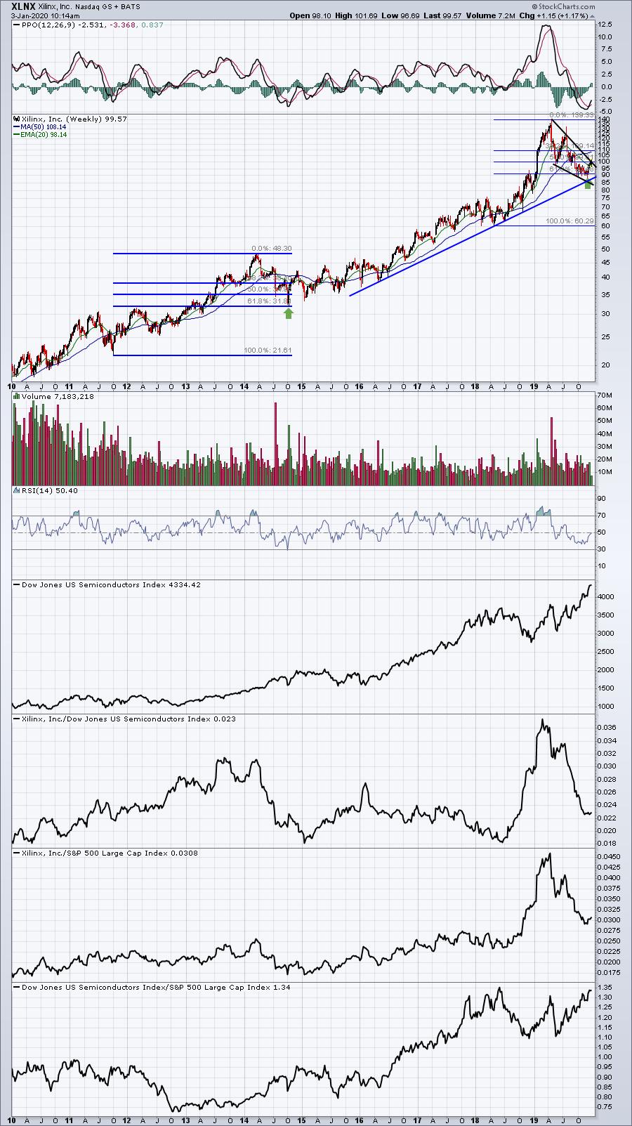
But I wouldn't leave you hanging like that. I want to share THE stock that I believe is setting up for 2020 very, very similarly to how LRCX set up for 2019. It's gained 18% over the past year, but it's down significantly from its intra-year high. I believe it's consolidating in a bullish wedge just as LRCX did. Check this out:

It's been a bad, bad 9 months since April 2018. We need to keep the long-term chart in perspective, however. XLNX has fallen nearly 30% since that April high, all while the S&P 500 is breaking out to all-time highs. Clearly, that's not good, but I see a bull wedge with 61.8% Fibonacci support recently tested. Yes, XLNX has been an extreme underperformer! Nonetheless, I have these words of wisdom:
Don't overlook XLNX in 2020. Its earnings report in a few weeks could be the trigger, so watch it closely.
If you're interested in the other 14 Top S&P 500 Stocks For 2020, I will present the long-term weekly charts of all 14 tomorrow during my Market Vision 2020 presentation that will run from 5:00pm EST to 6:00pm EST. Remember, this event will be recorded and available to all that register. I really hope you can join me, John Murphy, Arthur Hill, David Keller and so many other StockCharts.com friends and colleagues in what I believe will be the absolute best online financial conference of 2020. FOLLOW THIS LINK to register for Market Vision 2020!
Happy trading!
Tom
|
| READ ONLINE → |
|
|
|
| RRG Charts |
| Will Disney Be the New Leader in Communication Services (XLC)? |
| by Julius de Kempenaer |
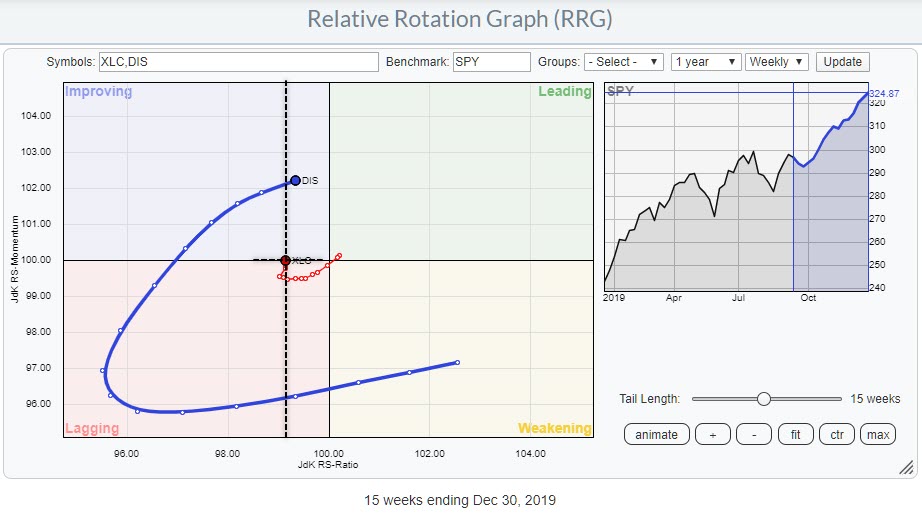
 Weekly RRG for XLC and DIS vs SPY Weekly RRG for XLC and DIS vs SPY
XLC, the Communication Services Sector, is sending some mixed signals.
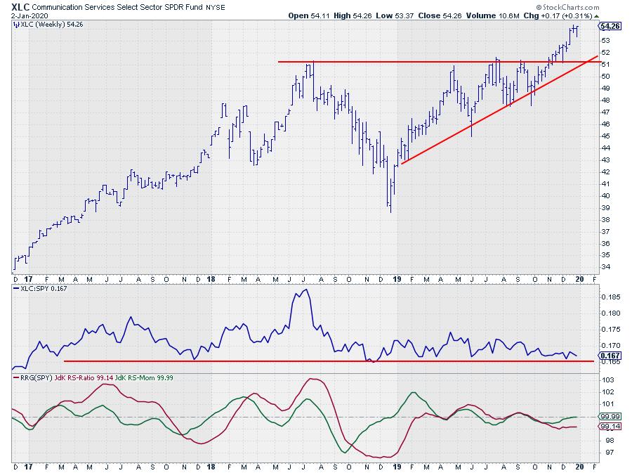
On the price chart, XLC convincingly cleared resistance at $51 in November, when it pushed above the horizontal boundary that ran over the highs (four in total) of 2018 and 2019.
 Weekly price chart of XLC with relative strength vs. SPY Weekly price chart of XLC with relative strength vs. SPY
That level was tested one more time as support a few weeks later. The rally that started after the break continues to this day. No doubt that this is a bullish structure for the sector.
Relative Strength Not Bullish... Yet!
The relative picture, on the other hand is less bullish, or maybe "not yet bullish." The raw RS-Line is hovering above a horizontal support level that has been in play since 2017. A downward break of that level will very likely have negative implications for the relative outlook/strength for XLC against the S&P 500.
The resulting RRG, on a weekly basis, puts XLC at the left hand side of the plot and on the verge of crossing over from lagging into improving, not too far from the center (SPY) of the chart. This means that the RRG-Lines, JdK RS-Momentum especially, are picking up some underlying improvement for XLC vs. SPY.
XLC starting to offer good possibilities?
When we assume the scenario that the horizontal support in relative strength for XLC will hold, as well as that the rotation for XLC on the RRG will continue into the improving quadrant and onwards to leading, this sector may be offering some good possibilities.
As we're not there yet, I want to look into the sector components to see if there are any possible future leaders for this sector to be found. To do that, I'll open the RRG for the predefined group of XLC members and walk through all members to study their tails on the RRG.
One that stands out on that chart is Walt Disney (DIS). On the RRG at the top of this article I have added both XLC and DIS, with SPY as the benchmark. Setting up an RRG like this helps you to visualize the rotation of a sector (and an individual stock) against SPY, but also the individual stock(s) against the sector benchmark.
The dotted black lines indicate the cartesian plane that visualizes the position and rotation for DIS against XLC. On the weekly timeframe, this suggests that DIS is or will be one of the leading stocks in the Communication Services sector going forward.
Daily Charts Starting to Back Up Positive Scenario
As a double check, we can run the same RRG on the daily timeframe. That shows the picture printed below.

On this time frame XLC is rotating very, VERY, close to the SPY benchmark, which means that the sector performance is in line with the benchmark. The good thing is that, at the moment the tail of XLC vs. SPY is at a positive RRG-Heading and pushing towards and into the leading quadrant.
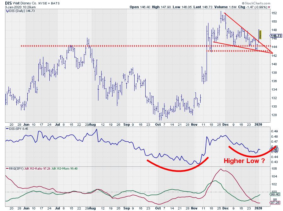
The very long tail of DIS rotated wide around both benchmarks inside the lagging quadrant, but is already rapidly picking up relative momentum. A further improvement of relative momentum on the daily scale will help DIS to push further into the leading quadrant on the weekly chart.

The upward break out of the falling wedge pattern on the daily chart will certainly help further improvement for DIS.
--Julius
#MV2020 is only one day away (or today, depending on when you read this). The event, hosted by earningsbeats.com, has a solid line up of speakers. John Murphy will kick off the day as the key-note speaker, followed by Arthur Hill, yours truly, David Keller, Greg Schnell, Mary Ellen McGonagle, Erin Swenlin, Bruce Fraser and Tom Bowley.
You can still register here.
My regular blog is the RRG Chartsblog. If you would like to receive a notification when a new article is published there, simply "Subscribe" with your email address.
Julius de Kempenaer
Senior Technical Analyst, StockCharts.com
Creator, Relative Rotation Graphs
Founder, RRG Research
Want to stay up to date with the latest market insights from Julius?
– Follow @RRGResearch on Twitter
– Like RRG Research on Facebook
– Follow RRG Research on LinkedIn
– Subscribe to the RRG Charts blog on StockCharts
Feedback, comments or questions are welcome at Juliusdk@stockcharts.com. I cannot promise to respond to each and every message, but I will certainly read them and, where reasonably possible, use the feedback and comments or answer questions.
To discuss RRG with me on S.C.A.N., tag me using the handle Julius_RRG.
RRG, Relative Rotation Graphs, JdK RS-Ratio, and JdK RS-Momentum are registered trademarks of RRG Research.
|
| READ ONLINE → |
|
|
|
| The MEM Edge |
| Defense-Related Stocks Rise Sharply on Mideast Tensions – Here are 3 Stocks Poised to Trade Even Higher |
| by Mary Ellen McGonagle |
Defense companies had a strong rally this week after a U.S. airstrike in Iraq killed a key Iranian military leader. While the big move was due to heightened risk fears, this mostly oversold group of stocks could easily trade much higher due to factors at play even prior to today's news.
The U.S. defense budget for this year has never been larger as the Trump administration has pushed forward on projects like denuclearization in N. Korea, a bitter trade war with China and now, as we're seeing, rising tensions in Iran. Wall Street analysts are expecting outperformance well into 2020.
While not all defense-related stocks will benefit from the Street's recent bullishness, here are 3 top picks that have strong growth prospects and attractive charts.
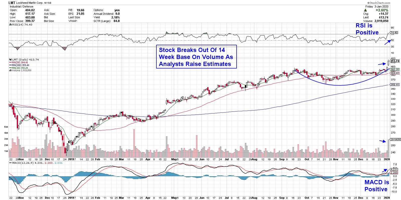
DAILY CHART OF LOCKHEED MARTIN (LMT)

The top company in this group is Lockheed Martin (LMT), which has seen new order bookings that have substantially outpaced their peers. Last month, the Pentagon ordered $35 billion worth of the company's fifth generation stealth jet – the F35 - which helped push earnings estimates into the 25% range for this year.
The stock hit a new high today on very heavy volume following a breakout from a 3 ½ month base. While the MACD is positive, the RSI is a bit extended on both the daily and weekly chart. That said, the stock is in a confirmed uptrend and can be bought on any weakness as, longer term, I think it should trade much higher.
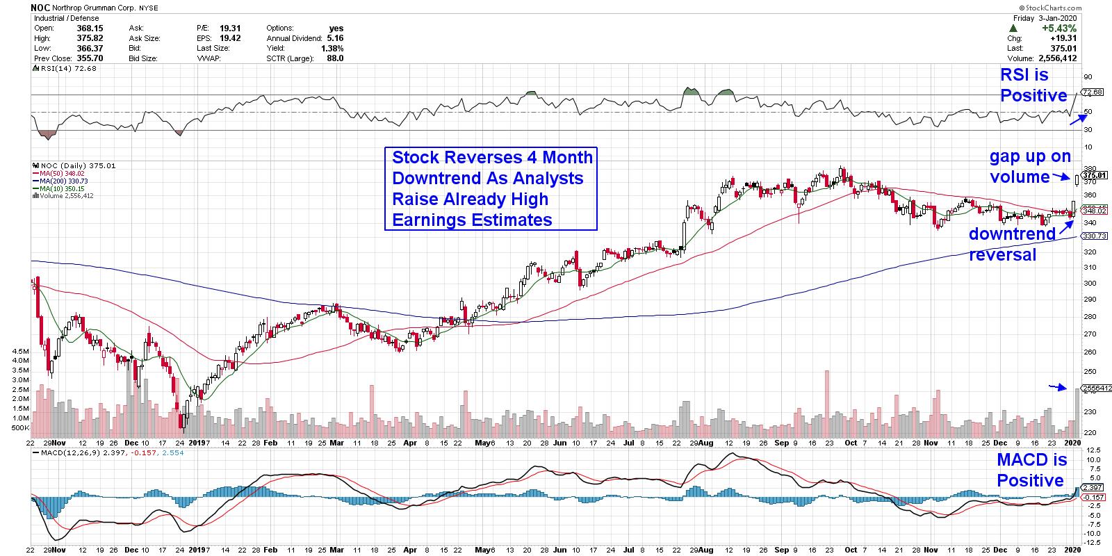
DAILY CHART OF NORTHROP GRUMMAN (NOC)

Northrup Grumman (NOC) is a major subcontractor on Lockheed's F-35. In addition, the company has big growth prospects surrounding their B-21 stealth bombers, as the Air Force plans to purchase 80 to 100 planes to replace outdated B-52s. While the price has not been disclosed, the order is expected to add up to $80 billion in revenues.
The stock peaked in price late September alongside many other defense-related names, as valuation concerns and a move back into select Technology stocks left these stocks behind. This week's action has reversed the downtrend in NOC as the stock has broken back above its key 50-day moving average on volume. With the MACD just now turning positive this week, look for NOC to trade higher following today's gap up on volume.
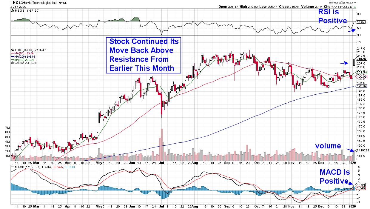
DAILY CHART OF L3HARRIS TECHNOLOGIES (LHX)
L3Harris Technologies (LHX) is the result of last year's merger between Harris Corp and L3 Technologies. The company is a producer of battlefield products such as sensors and satellite communications devices, as well as a supplier of a computer processor for LMT's F-35. Estimates call for 34% growth for 2020 as synergy from the recent merger takes hold.
LHX is another stock that's reversing a recent downtrend and, while the stock broke back above its key 50-day moving average earlier this month, this week's action has pushed the MACD into positive territory, which points to a shift into positive momentum. The RSI is also positive. I'd be a buyer on any pullback.
While this week's news-driven rally has shifted many defense related stocks into bullish positions, it's critical that those companies have strong growth prospects that will help propel them higher. If you'd like to be alerted to high-quality growth stocks in other areas of the market, I urge you to trial my MEM Edge Report. This bi-weekly report highlights stocks in groups that are poised to outperform the markets while providing entry and exit points as well.
Start the New Year out right with a trial subscription to this top performing newsletter for a nominal fee.
Warmly,
Mary Ellen McGonagle,
MEM Investment Research
|
| READ ONLINE → |
|
|
|
| MORE ARTICLES → |
|
