| THIS WEEK'S ARTICLES |
| The Traders Journal |
| My Daily Five: Island Reversal on VTI, The "Market Mindset Meter", Summer Seasonality And Two Of The "10 I'm Stalking" This Week |
| by Grayson Roze |
 Today, I kicked off the week by hosting another episode of "Your Daily Five", one of our newest series on StockCharts TV where we bring you a concise, action-packed daily rundown of the five most important charts that you need to be watching. Weekdays at 1:00pm ET, each day features a new host, which means five top charts and key insights from a different seasoned technician every single day of the week. Today, I kicked off the week by hosting another episode of "Your Daily Five", one of our newest series on StockCharts TV where we bring you a concise, action-packed daily rundown of the five most important charts that you need to be watching. Weekdays at 1:00pm ET, each day features a new host, which means five top charts and key insights from a different seasoned technician every single day of the week.
On today's edition, I took a look at the "Island Reversal" that has formed on the Vanguard Total Index (VTI). I also ran through what I call my "Market Mindset Meter" chart, which includes the inverted equity-only put/call ratio ($CPCE) charted on top of the S&P 500 with the $VIX displayed below. It's a powerful visual that helps gauge the character of the market and the mindset among traders that's driving it.
I also pulled up a 20-year seasonality chart for VTI and discussed the historical price patterns you should be aware of as we head into the summer months. Finally, I closed it out by highlighting two of the individual stocks from my "10 I'm Stalking" list this week – AYX (Alteryx) and CRWD (CrowdStrike).
Be sure to catch today's "Your Daily Five" episode below!
Money In, Eyes Open.
- Grayson Roze
VP of Operations, StockCharts.com
Author, Trading for Dummies (Wiley, 2017)
Author, Tensile Trading: The 10 Essential Stages of Stock Market Mastery (Wiley, 2016)
StockMarketMastery.com
@GraysonRoze
|
| READ ONLINE → |
|
|
|
| ChartWatchers |
| Catch "The Pitch", Featuring Greg Schnell, Julius de Kempenaer and Mary Ellen McGonagle, Hosted By Tom Bowley |
| by Grayson Roze |
|

We're back with another new edition of The Pitch, this month featuring Greg Schnell, Julius de Kempenaer and Mary Ellen McGonagle, hosted by Tom Bowley. Each analyst has come prepped with their five most compelling stock picks for the current market environment. And with volatility continuing to dominate today's climate, this month's episode comes at a fascinating time.
With their five top stock ideas on the table, our group showcases the strategies they've used to select these promising trade targets and takes you on a deep dive into the action. They reveal the themes they're tracking, names they're following, and the charts they're watching to find strength in a time of heightened volatility. Plus, see how they respond when Tom brings Greg, Julius and Mary Ellen together for a lively Q&A session to close out the panel.
Chart on, my friends.
- Grayson Roze
VP of Operations, StockCharts.com
Author, Trading For Dummies (Wiley, 2017)
Author, Tensile Trading: The 10 Essential Stages of Stock Market Mastery (Wiley, 2016)
|
| READ ONLINE → |
|
|
|
| Market Roundup |
| Is Twenty-Twenty Nineteen-Eighty Déjà vu All Over Again? |
| by Martin Pring |
The simple answer to the question posed in the title is "No!". However, there are a number of interesting parallels that have implications for 2020 and beyond. Let's see what they are.
The Decennial Cycle and Years Ending in a "0"
According to the decennial cycle, first espoused by Edgar Lawrence Smith in his 1920s best seller Tides in the Affaires of Man, years ending in a specific digit experience a similar outcome. In my book Technical Analysis Explained, I averaged out the decennial cycle from 1900-2009 using a 12-month ROC as a guide. Years ending in a zero, which applies to both 1980 and 2020, experienced a peak at the start of the year, followed by a selloff mid-year and a strong rally into year-end. This year-end advance took the ROC back to its starting point. The green shading in Chart 1 shows that the 1980 experience followed the average pattern pretty closely. The major difference was that the ROC ended 1980 not at, but well above its starting point.
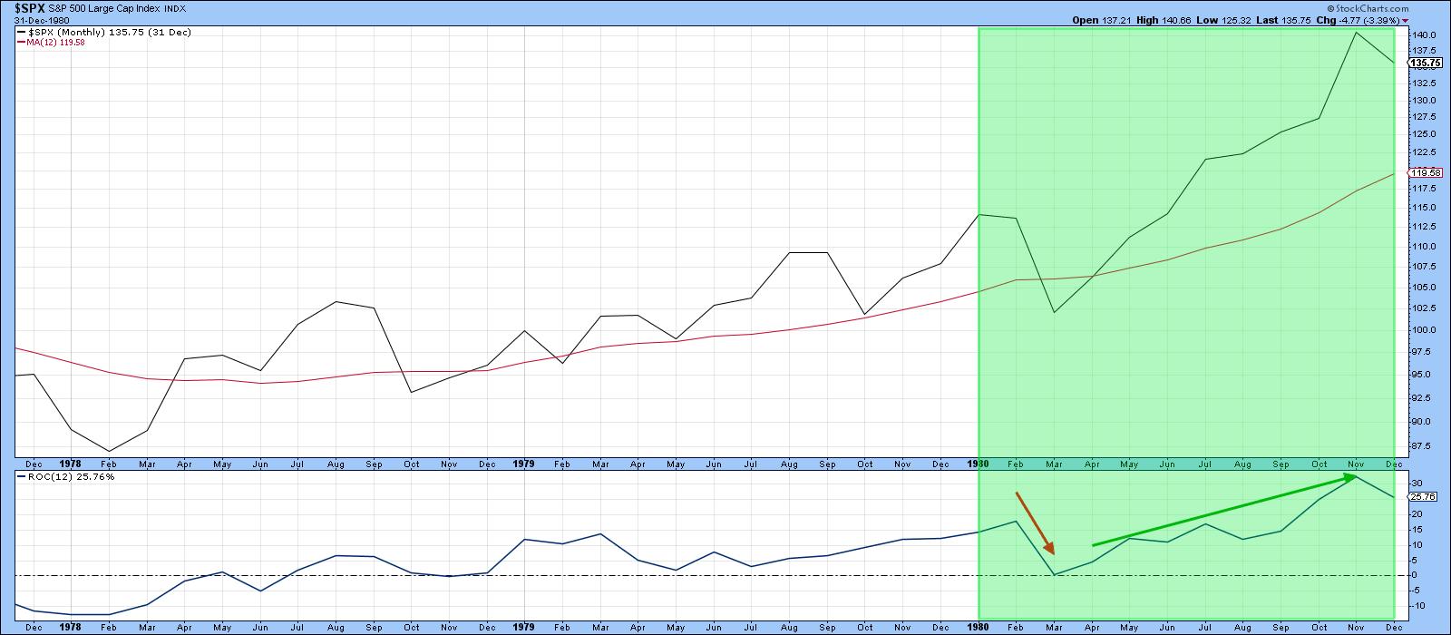 Chart 1 Chart 1
Chart 2 shows 2020 to date. A decline earlier in the year has been followed by a rally. So far, so good. We don't know where the year will end up, of course, but, in last week's article Market Action Confirms the Employment Report, I pointed out that several indicators had reached the kind of extreme level typical of the early phase of a primary bull market. Such readings have therefore signaled that a major advance is to follow. Should that analysis turn out to be correct for the current situation, the S&P will end the year higher than it started, thereby repeating Smith's decennial pattern for years ending in a zero.
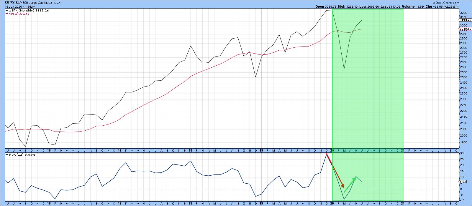 Chart 2 Chart 2
Nineteen-Eighty and Twenty-Twenty Both Experienced Recessions
In 1980, the economy peaked in February (sound familiar?) and the contraction was over by July. An interesting parallel is that both the 1980 and current recessions were brought on by artificial means. The 1980 example was caused by Fed actions that deliberately raised rates in order to curb rampant inflation. The economy quickly responded by weakening. Then, policy reversed on a dime, causing rates to drop sharply and by late summer the economy started to grow again.
The current recession has also been triggered artificially, this time by the pandemic lockdown. It seems likely to end just as quickly as the country gradually reopens. The positive May jobs report and this week's surprising jump in retail sales testify to that probability.
Further Out, Things are More Problematic
Things may look positive from here on out. However, the sharp recent drop in the economy has not come without a long-term cost. Chart 3 features Industrial Production, a coincident indicator of the economy, together with its KST. Note that in 1980 it was possible to construct an up trendline, which was subsequently violated. This break in trend was not sufficient to stop an initial sharp rebound. However, the evident loss of long-term momentum did preclude the indicator from surpassing its January 1980 peak. It was not until until the recession of 1981-82 had run its course that it did. Clearly, the 1980 trendline violation had implications for the subsequent weak recovery and the double dip recession. The chart shows two other trendline penetrations, none of which were followed by new highs in the production numbers for some time.
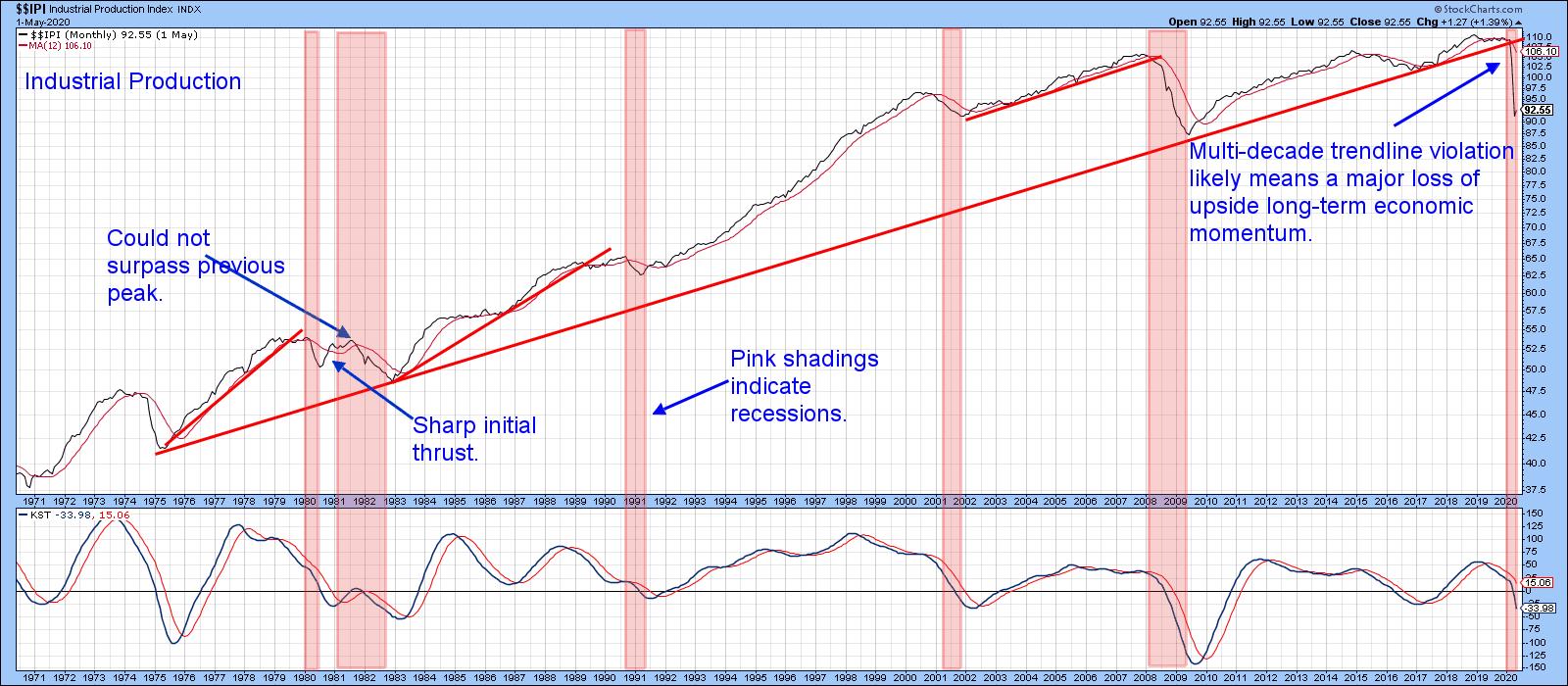 Chart 3 Chart 3
Earlier this year, we saw the violation of a much more significant multi-decade trendline. That break also underscores the likelihood of a loss of long-term economic momentum. The implication is that another slowdown or recession could be lurking once the initial bounce has run its course. Remember, the 1980-82 period was a transitional one as the secular bull market for both commodities and interest rates peaked. Perhaps the recent trendline violation is warning us that another restructuring period lies ahead. There are no shortages of possibilities. For example, it could reflect the disruptive effects of a transition to home-based work, learning and conferencing. Alternatively, after nearly 40 years of declining interest rates, perhaps it's time for a reversal to the upside.
In the interim, the 1980s sharp post-recession equity rebound to significant new highs sets an aspirational goal for the balance of 2020.
Editor's Note: This is an excerpt of an article that was originally published in Martin Pring's Market Roundup on Thursday, June 18th at 1:28pm ET. Click here to read the full article, which includes Charts 4-5 and a discussion of the Invesco China Technology ETF.
Good luck and good charting,
Martin J. Pring
The views expressed in this article are those of the author and do not necessarily reflect the position or opinion of Pring Turner Capital Group of Walnut Creek or its affiliates.
|
| READ ONLINE → |
|
|
|
|
|
| Art's Charts |
| Stocks and Treasuries: The Yin and Yang of the Markets |
| by Arthur Hill |
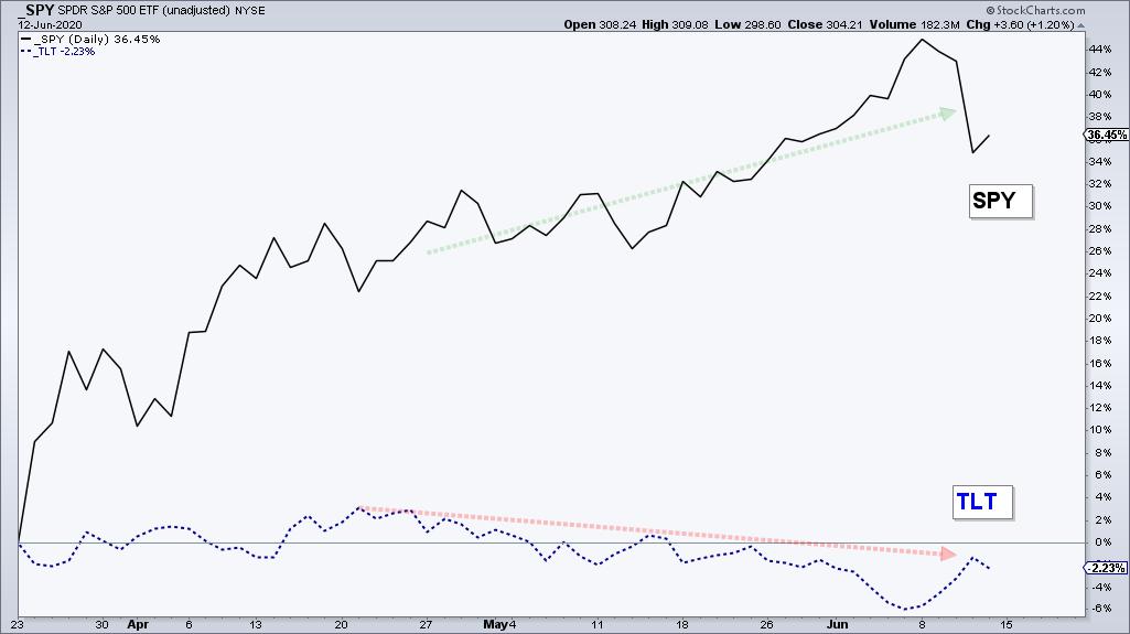
 The 20+ Yr Treasury Bond ETF (TLT) retreated as stocks advanced from mid April to early June and then popped as stocks dropped this week. Bonds are the natural alternative to stocks and TLT appears to be forming a classic bullish continuation pattern. The 20+ Yr Treasury Bond ETF (TLT) retreated as stocks advanced from mid April to early June and then popped as stocks dropped this week. Bonds are the natural alternative to stocks and TLT appears to be forming a classic bullish continuation pattern.
Let's first compare performance for these two opposites. Year-to-date, TLT is up 18.62% and the S&P 500 SPDR (SPY) is down 5.20%. However, performance looks a little different when we start from March 23rd, which is when SPY bottomed. SPY is up some 36% and TLT is down around 2%. The decline is not drastic, but safe-haven bonds clearly underperformed when riskier stocks surged.
The next chart shows TLT surging to a new high as stocks plunged in March and then forming a possible cup-with-handle pattern. Note that this pattern is still early stages because TLT has yet to confirm with a break above rim resistance.
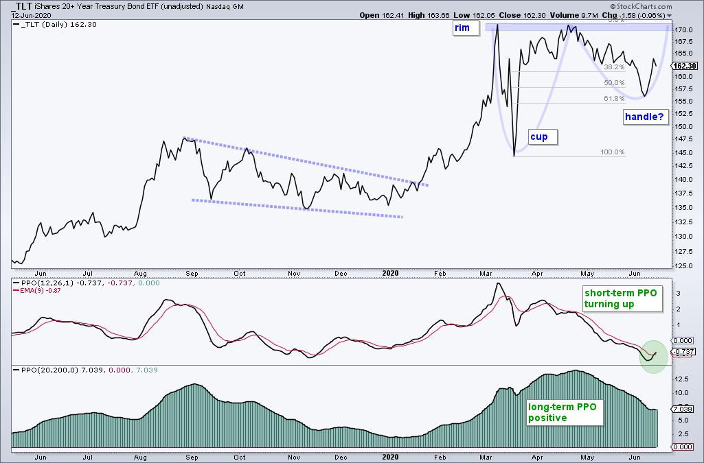
This week's reversal in a key retracement zone and upturn in the PPO suggests that a resistance challenge is imminent. Notice how the April-June decline retraced 50-61.8% of the March-April advance. This is normal for a correction and the PPO signal line cross indicates an upturn in momentum.
This week on TrendInvestorPro I tested a five indicator breadth model going back to the beginning of decimalization (2/1/2001). This model's returns are as good as buy-and-hold for SPY, but with much lower drawdowns and less exposure (risk). Such models can help you stay on the right side of the market and a new signal triggered this week. Get immediate access with a subscription to TrendInvestorPro.
Click here to take your analysis to the next level!
-----------------------------------
|
| READ ONLINE → |
|
|
|
| The Mindful Investor |
| Extremes in Sentiment Show Bullish Tilt |
| by David Keller |
When I'm prioritizing information to help me understand the broad market environment, I tend to consider this as the order of importance:
- Price
- Breadth
- Sentiment
I've found sentiment readings such as the American Association of Individual Investors (AAII) and Investors Intelligence (II) surveys to be helpful as a way to get inside other investors' heads. What are they thinking? How are they positioned?
While I would never design a trading system based off of something like survey results or magazine covers (another fantastic way to gauge social mood!), I find sentiment data like this can help you consider what questions you should be asking as an analyst.
Two sentiment reads that I regularly follow are the NAAIM Exposure Index and the Rydex Ratio. Let's review the charts and see how these indicators are near positive extremes.
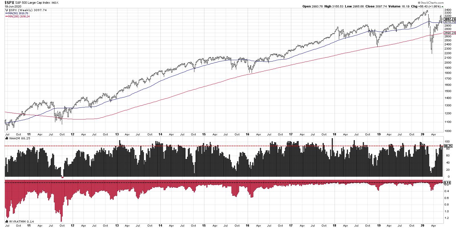
The NAAIM Exposure Index tracks positioning by active money managers. What percent have they currently allocated to equities? NAAIM insists that this is not a forward-looking indicator, moreso reflects historical positioning. Even so, I can't help but notice that allocations tend to be quite high around bull market tops and low around bear market bottoms!
Here's the catch. In extended bull markets (say 2013-2015) the exposure will remain very high (at times over 100%). But you have to remember that this indicator should not be used as a way to determine whether we're in a secular bull or bear cycle! That's done with an analysis of price. What this indicator does tell you is how exposed active managers are to market downturns. Knowing that investors are positioned in a bullish allocation, and are therefore vulnerable to a market downturn? That has value to me.
As of the end of this week, the NAAIM Exposure Index sits at 88.25, which is certainly in the upper range of potential values. Conclusion: active managers are heavily allocated to equities.
The second sentiment indicator I'm showing the Rydex Ratio, which basically compares assets in the bearish and money market funds in the Rydex family versus the bullish and sector funds. To put it another way, are investors allocated more to the bullish or bearish end of the Rydex family of funds?
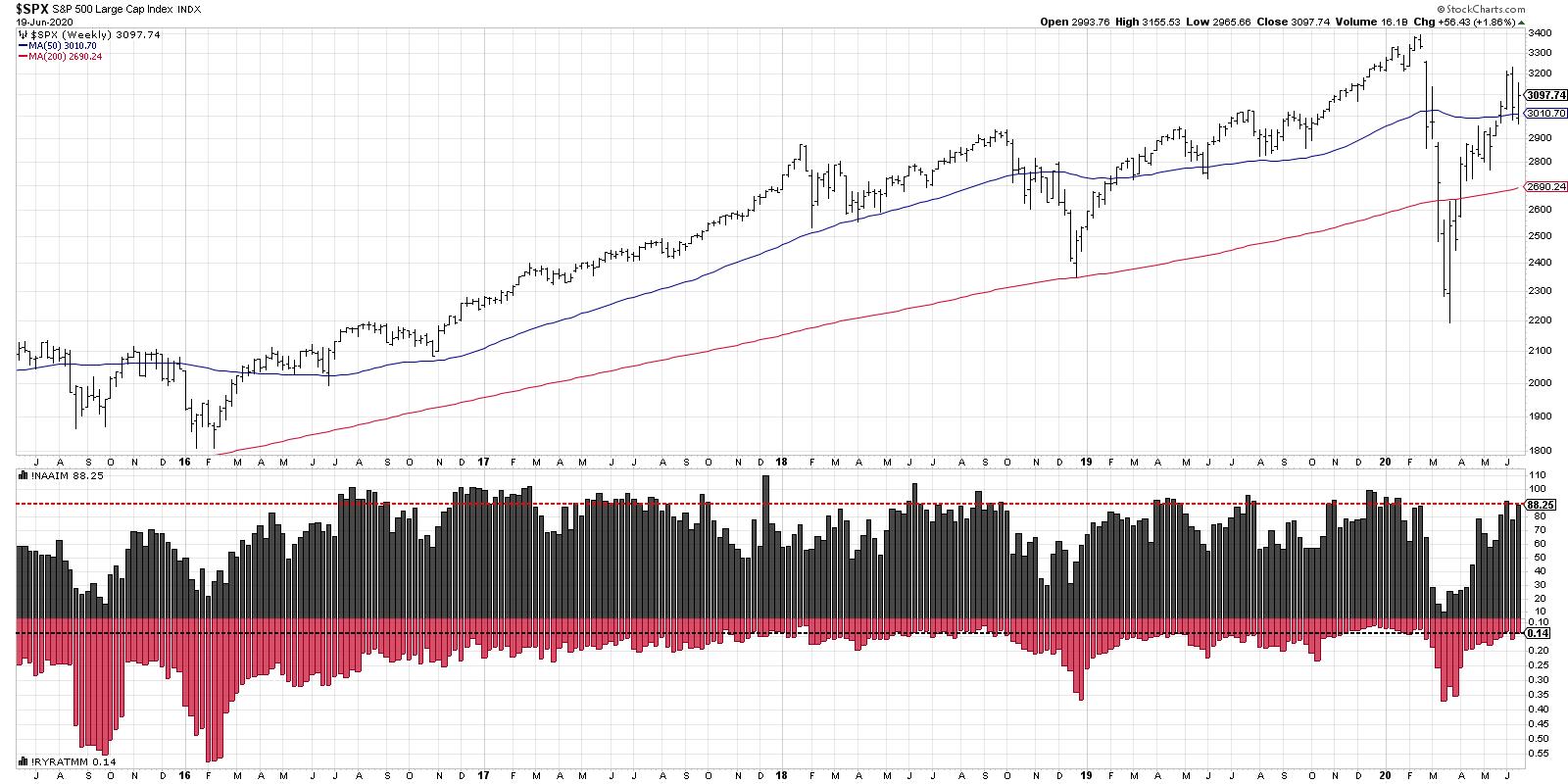
Here, I've plotted the indicator inversely, so the results line up more with the NAAIM Exposure Index. Higher on the chart means a bullish positioning, while lower on the chart represents a bearish extreme.
We can see the the Rydex Ratio is at an extremely bullish reading, similar to where it's been in late stages of cyclical bull markets in late 2017, early 2019 and late 2019. Some of these occurrences saw relative brief pullbacks, while other times it was more significant. But, similar to the NAAIM index, it shows that investors are positioned very heavily on one side of the ledger.
My goal with sentiment indicators is to try and get inside the head of all the investors out there, which, to be honest, is similar to what I try to do with price! Sentiment tells you what people are thinking and how they are positioned. Price tells you how the emotional state of investors is affecting the supply/demand picture over time.
Here, we can we see that two popular sentiment readings are at the upper end of the bullish extreme, which suggests to me that investors are positioned in a way in which a market downturn would cause maximum pain.
RR#6,
Dave
David Keller, CMT
Chief Market Strategist
StockCharts.com
Disclaimer: This blog is for educational purposes only and should not be construed as financial advice. The ideas and strategies should never be used without first assessing your own personal and financial situation, or without consulting a financial professional.
The author does not have a position in mentioned securities at the time of publication. Any opinions expressed herein are solely those of the author, and do not in any way represent the views or opinions of any other person or entity.
|
| READ ONLINE → |
|
|
|
|
|
| The Canadian Technician |
| The End Of The Trend? |
| by Greg Schnell |
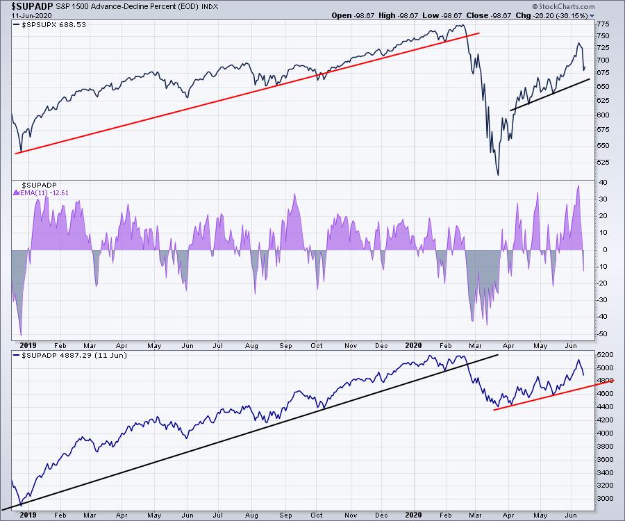
Thursday was a real portfolio rattler as most stocks went for a wild dip. Once again, the Fed meeting was one of the primary reasons for the renewed cautiousness. While the market was seemingly on a new uptrend, this was a pretty big gap for a market supported by wide breadth across sectors and industries. The chart below shows the price chart for the S&P 1500 (not the S&P 500). Below are two different looks at the advance/decline percentages for breadth. In the purple area, we have a two-week moving average of the A/D percentage. The lowest panel is a cumulative look at the indicator. The uptrend is still intact, but this was a very hard rollback. The purple area shows a major surge, but also a hard drop. With the volatility levels picking up (not shown), the trend gets rockier. The information I glean from the chart below is that this was a wild swing so far, but the uptrend is still intact.
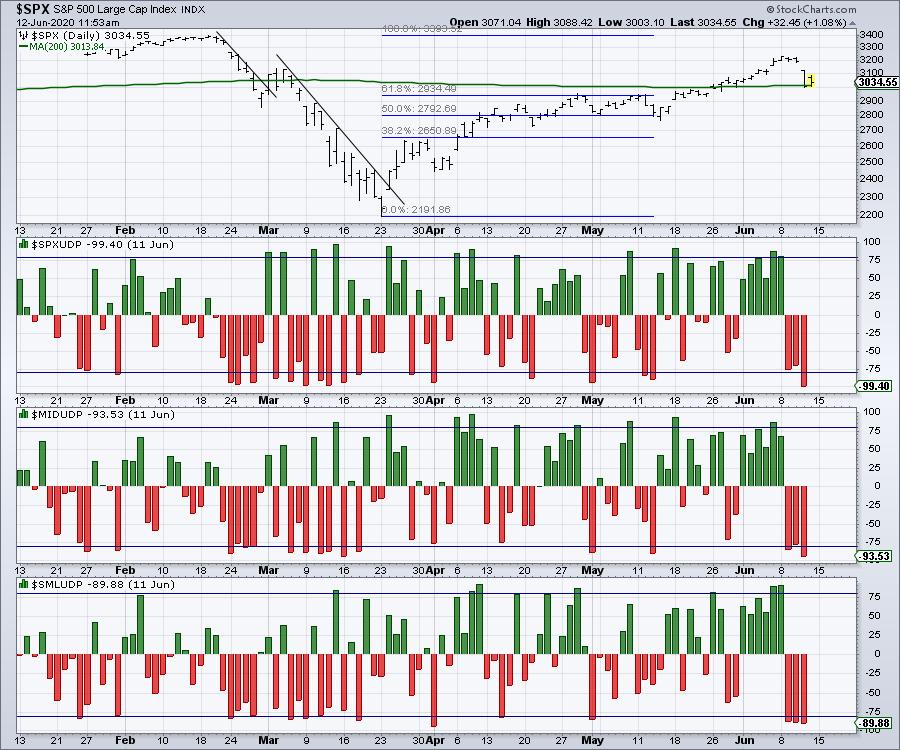
The second piece of data comes from the up/down volume percentage data. In this case, the data looks more dismal. This presentation style is from Arthur Hill, but it clearly shows this is how the market top in February started. That definitely adds more caution.
Lastly, next Friday is quadruple witching day for options expiration. The quadruple witching dates are shown in blue and they usually have extreme volumes. It is very difficult to know if the market will correct further based on the two charts above, which show contrasting information. It is reasonable to expect some volatility coming out of the options expiration, so the next two weeks look like more fireworks. All of the last four options expiration days had some swings following them.
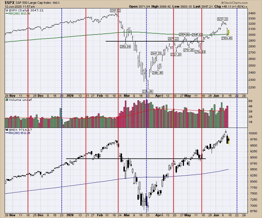
Not a bad time to trim some of the profits off here and be watchful of further downside. The Nasdaq 100 (on the lower panel) could end up being a failed breakout, whereas the $SPX (on the top panel) would be a retest and fail of the highs. I would like to think the big breadth we have would help a lot. But 5% down days are not usually showing up in the course of a regular uptrend.
Is this the end of the trend? It has some of the typical signals for it, with hard down days, failed breakouts and tests of prior highs. So far, the advance/decline data has not confirmed. Caution is advised from my perspective. That doesn't mean sell, but its a good place to be aware of the downside risk.
|
| READ ONLINE → |
|
|
|
| Trading Places |
| Wall Street Is POURING Money Into This Industry Group, Don't Miss Out! |
| by Tom Bowley |
I am constantly performing research, using my analytical skills to uncover the best stock market opportunities. At EarningsBeats.com, we have a proven process of identifying leading stocks in leading industries. It all starts with fundamental research, which helps us to limit the number of stocks in our trading universe and organize them into several different ChartLists. We then provide our members with several different scan syntax to identify great trading opportunities among those fundamentally-sound companies.
During this latest period of consolidation, the big picture doesn't tell us the whole story. Do you remember the big 1800 point plunge on the Dow Jones on Thursday, June 11th? Well, the recovery since then across our major indices, industry groups and individual stocks has been quite different as professionals rotate into the stocks and areas they want to own heading into next month's earnings. It's extremely important that we understand what's taking place under the surface. Before I talk about a few key recent areas of strength, let's look at the Dow Jones, S&P 500 and NASDAQ 100 on a 10-day, 15-minute chart in order to compare performance:
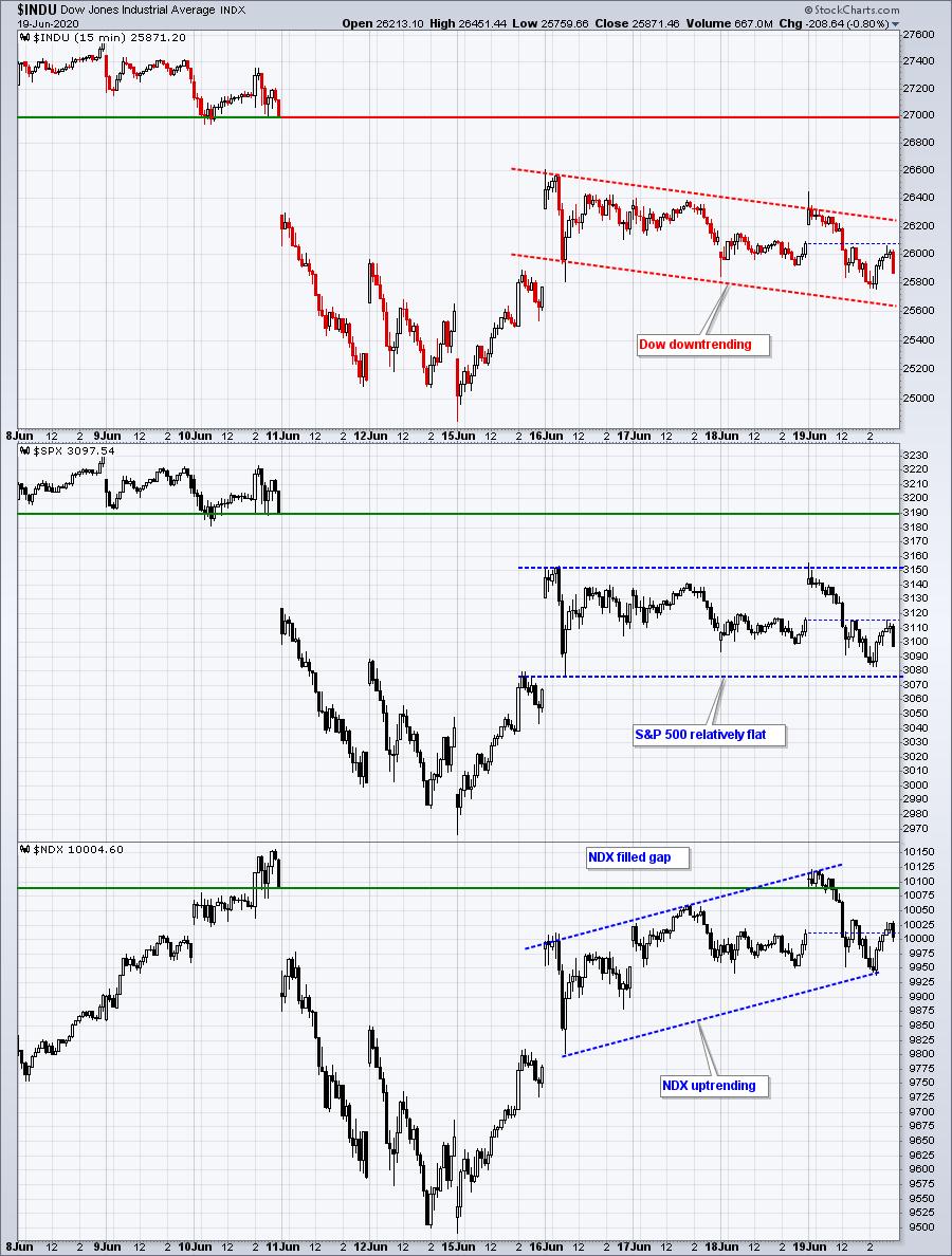
Can you see the difference? Without looking at this intraday chart, you might not realize that Wall Street is making a statement - one in which it clearly is favoring the higher growth NDX over its DJI and SPX counterparts.
Since the close on Wednesday, June 10th, the benchmark S&P 500 has fallen 2.90%. One of my tasks is to evaluate this period of consolidation in much the same way I did the action back in March and April and to understand the rotation that's taking place ahead of next month's earnings reports. Investment firms send their analysts out to meet with management teams, and the re-positioning of their money becomes apparent ONLY when we see where the money is going. Don't watch the lips moving on CNBC - that tells us absolutely nothing. And please don't watch Jim Cramer and Bad Money. He changes from bullish to bearish to bullish more often than a chameleon changes colors. Instead, simply watch where the money goes. That's all you need to do. From that June 10th close, I want to note the best-performing groups, analyze their technical outlook and decide which areas should perform well as we move into earnings season.
One group really stands out, and that's biotechnology ($DJUSBT). While the S&P 500 has given back almost 3% since that June 10th close, the DJUSBT just broke out on Friday to an all-time high. Clearly, Wall Street believes we're going to see robust earnings growth in the group and I definitely want exposure to stocks in this area. Check out the DJUSBT chart:

Why on earth would a group break out given the overall market performance the past 10 days? Because the leading stocks in the group are going to post quarterly earnings results that will blow away estimates. I loved biotechs when our latest portfolios were announced on May 19th. I included a biotech in each of our four portfolios and they all performed exceptionally well today.
The four biotechs that I added to our portfolios on May 19th were REGN, SGEN, VRTX and AMGN. My favorite for months has been REGN. Check out this chart:

Relative strength is awesome. When you own a stock like REGN, you own a leading stock in a leading industry. That makes it much easier to beat the benchmark S&P 500. I'm on record saying that I believe biotechnology will be the best area of the market during the balance of 2020, and possibly much longer. Friday's action certainly didn't change my mind.
During the June 10th to June 19th selloff and recovery, biotechs ranked 2nd out of 104 industry groups. On Saturday, I plan to send a report to EarningsBeats.com members, detailing the likely winners as we move towards the next earnings season. Get ready for a major upside move in these industries and the leading stocks within said industries. If you're not already an EarningsBeats.com member, I invite you to become one. Let me be your own personal research department. In the meantime, I'm begging you to stop listening to the media. CLICK HERE for a fully-refundable $7 30-day trial and make sure you receive the latest in market rotation and what that will mean as we move into summer. The stock market is going higher...... much, much higher!
Happy trading!
Tom
|
| READ ONLINE → |
|
|
|
| The Traders Journal |
| Peter Lynch's Radar: Stage #2 |
| by Gatis Roze |
 Years ago, Peter Lynch (of Fidelity Magellan fame) preached that when looking for investment ideas, stock pickers should look closely where they shop and find those new alluring products and retail stores that held the most promise. Times change, of course, and the retail glass on the street is not as promising as it once was. But on a global level, his advice still holds merit in looking at new businesses and technologies for investment ideas. Perhaps replace the shopping mall as your focus and look to your own firm. Which new tech companies are you embracing in your own workplace. Those are great candidates worthy of some further investigation. Years ago, Peter Lynch (of Fidelity Magellan fame) preached that when looking for investment ideas, stock pickers should look closely where they shop and find those new alluring products and retail stores that held the most promise. Times change, of course, and the retail glass on the street is not as promising as it once was. But on a global level, his advice still holds merit in looking at new businesses and technologies for investment ideas. Perhaps replace the shopping mall as your focus and look to your own firm. Which new tech companies are you embracing in your own workplace. Those are great candidates worthy of some further investigation.
Picking the right stocks is certainly a critical part of any successful investing approach. But at best, that's only 50% of the equation. Let's call this Stage #1. Possibly even more important is your investor self-behavior and your specific methodology. I'll label this Stage #2.
Try applying your Peter Lynch-type radar to general issues around you. Ask yourself both what you can learn from these trends and issues and consider how you might possibly incorporate them into investing and managing your portfolio better. This generalist type of radar could be equally as powerful — or perhaps more so — than trying always to pick the next 10-bagger stock.
In previous Traders Journal blogs, Grayson and I have dubbed this "observational investing". For us both, it's been a sort of "secret sauce" for our own portfolio management as our powers of observation have matured over many years in the markets.
A simple example presently comes to mind. Singapore and Hong Kong have a combined population of 13 million. They've had 29 COVID-19 deaths (as of June 5, 2020). If the USA had a similar fatality rate, our death rate would be 4,100 instead of 24-times higher with over 100,000 deaths. Two lessons jump out at me which may be applied to my portfolio management.
1.
Both Singapore and Hong Kong had a blueprint ready to be implemented at the first sign of an outbreak. I've written many blogs about how important it is to have a roadmap (i.e. 10-stages of stock market mastery) and both bullish and bearish scenarios for all your equity positions before you ever buy into your position. You simple cannot wait for the proverbial mud ball to hit the fan before strategizing how you'll best deal with it. Have your playbook ready. All pro sports teams subscribe to this paradigm — as an investor you should, too.
2.
Both Singapore and Hong Kong acted quickly — aggressively and strategically! Procrastinating during a pandemic will literally kill you. Procrastinating in addressing your portfolio positions can kill you financially. I've said this many times before — just because you choose to ignore the markets does not mean they will ignore you.
You see my point. It's not too late for you to fine tune your radar in both Stage #1 and Stage #2. Look at all the valuable lessons around you which you can grasp if you simply frame them within your money management endeavors.
Trade well; trade with discipline!
- Gatis Roze, MBA, CMT
StockMarketMastery.com
|
| READ ONLINE → |
|
|
|
| RRG Charts |
| Where Wall Street Meets Broad Street - Using Breadth Data to Confirm Sector Rotation |
| by Julius de Kempenaer |

Technical analysts use a lot of breadth data in their work, which is understandable as it can give us a lot of useful information about how a market as a whole, usually a broad index level, behaves. Plus, it can help us to find developments "under the hood" which may not (yet) be visible at the index level yet.
This also ties in nicely with an oft-used phrase which says that the stock market is really a market of (individual) stocks. That refers to the fact that movement in individual stocks can often differ from the movement in the overall index.
I had to think of that when I came across this image of the street signs across from the NYSE building. In a way, it perfectly illustrates how a "Broad" market index connects with individual stocks traded on "Wall" Street. Most of the time these, broad market indexes are very high-level, such as all NYSE stocks, all NASDAQ stocks, all S&P 500 stocks, etc.
Someone who has, and still does, a lot of work and analysis using breadth data is Arthur Hill. If you are interested to learn more about breadth and how to use it, I suggest you check out Art's articles.
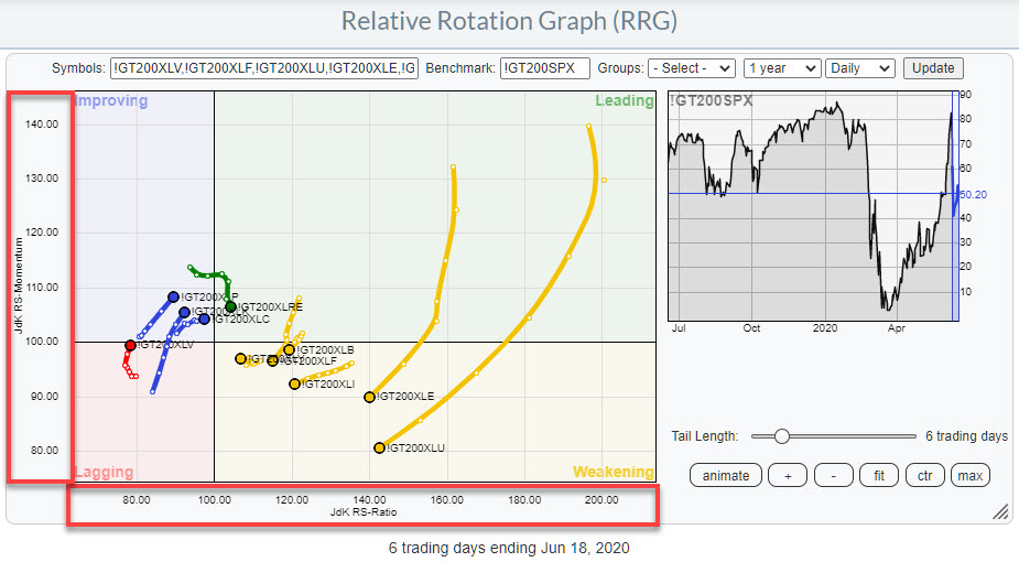
One of the breadth measures I started to use and track is the number of stocks that are trading above their own moving average. StockCharts.com maintains these data on three time frames - above 200-day, 50-day, and 20-day moving average. The symbols for these indexes start with an exclamation mark <!> followed by <GT>, then the number of days in the MA (200, 50, 20) and finally the index symbol. So, for the number of stocks trading above their 200-day MA, the symbol is !GT200SPX. For stocks above their 50-day MA, it is !GT50SPX, etc.
The main reason for my interest in this particular dataset is the fact that these metrics are available at a sector level as well. That gives me the opportunity to use them in a Relative Rotation Graph. The RRG below shows an example, illustrating the 200-day breadth rotations of the eleven sectors vs. 200-day breadth for $SPX.

One of things that you may notice is that the spread of values on both axes is much wider than what we are used to on regular, price-based RRG. That is because the values of these breadth symbols is range-bound between 0%-100%. That means that, when you compare something good, i.e. high number of stocks above their MA, with something bad, i.e. a low number of stocks above their MA, you will get a huge difference.
Also, these values can change rapidly and, because of that in combination with the range-bound nature of this metric, plotting them on a weekly RRG can sometimes cause erratic movements on the RRG. For that reason, I have a (slight) preference for using the daily timeframe for the RRG when showing breadth rotation.
On the RRG above, the XLU breadth-tail shows the widest rotation. I wrote about that in Thursday's "Don't Ignore This Chart" article (Sector) Breadth Confirms Weak Rotation for Utilities. The other tail that stands out with regard to length and rotation vis-a-vis the other sectors and the benchmark is XLE.
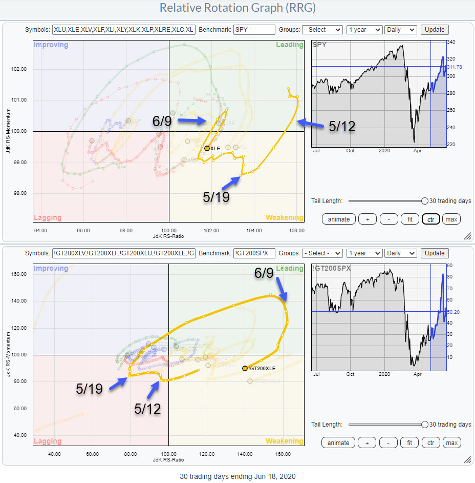
In the image below, I have lined up the rotations for the price-based RRG at the top and the breadth-based RRG at the bottom. In addition, I have annotated a few points in time where the breadth-based RRG showed turning points.

On 5/12, the first turning point, we find breadth just inside lagging and ticking up. At that time, the price-based tail was inside leading and heading lower towards weakening. In the days following, the breadth tail bends back to the left again but primarily moves sideways, no longer picking up negative momentum.
Then, on 5/19, both tails turn upward - price-based in weakening and breadth-based inside lagging. After that simultaneous turn, the breadth tail makes a big rotation back into the leading quadrant. The price tail ticks up a little, then moves left for a few days in a zig-zagging movement, before then picking up steam and moving into leading.
On 6/9, the breadth tail turns around again while inside the leading quadrant. The price-based tail follows that move a few days later and has now also turned back into the weakening quadrant.
From eyeballing and comparing a lot of these rotations between price- and breadth-based tails, it looks as if breadth leads the rotation on the price-based RRG on a regular basis. And, if they do not lead, they are pretty much in sync with the price tail. This means that breadth-based RRGs can be an additional tool to help you spot turns early without being harmful.

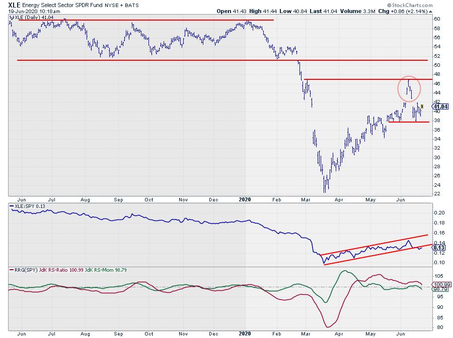
Wrapping this up with a look at the chart of the Energy sector, it looks as if the rally out of the March low has come to an end. The recent peak near $47 was formed against an intermediate resistance level and, of course, there is the clearly visible island formation, which limits the upside potential (at least in the near term).
I am watching a break below the recent low at $ 37.70. When that happens, a downward acceleration is likely, which will also fuel a further loss of relative strength.
The RS-Line is about to break out of its short-term channel while the RRG-Lines are rolling over.
All in all, energy is not a very good sector at the moment.
#$StaySafe, --Julius
My regular blog is the RRG Charts blog. If you would like to receive a notification when a new article is published there, simply "Subscribe" with your email address.
|
| READ ONLINE → |
|
|
|
| DecisionPoint |
| The Bottom of the Chart Isn't Support - UNG Proves the Point |
| by Erin Swenlin |
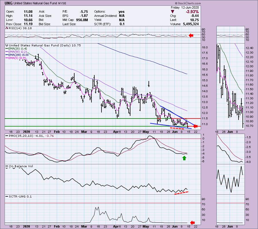
I remember hearing (and still hearing) from other analysts that one should remember that the bottom of the chart isn't a support level. This is especially true when you are looking at a stock that has been making new all-time lows. Yesterday, a DecisionPoint Diamonds reader requested I look at US Natural Gas (UNG) with an eye toward bottom fishing. In my mind, "bottom fishing" is finding an extraordinarily beat-down stock or ETF with the intention of catching the stock when it finally reverses. These type of investments carry a lot of risk, so position-size thoughtfully.
Yesterday's daily chart looked far more enticing as UNG had enjoyed two days of higher prices. It was forming a short-term double-bottom, it was in a bullish descending wedge pattern and it was seeing a positive divergence between OBV bottoms and price lows. The bearish RSI is a problem, but, as of yesterday, the PMO hadn't turned down yet. This definitely piqued my interest for a short-term trade.


As investors, we want to accomplish two basic things:
(1) Determine the trend and condition of the market and
(2) Select stocks that will ride that tide.
The DecisionPoint Alert helps with the first step, and DecisionPoint Diamonds helps with the second. Go to DecisionPoint.com and SUBSCRIBE TODAY!
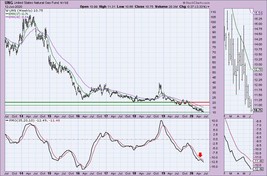
Then, I looked at the weekly chart below and realized there was no support except at the bottom of the chart... which wasn't zero. It was $10. While yesterday it looked like UNG might be able to turn it around off that support level, I did warn that new all-time lows were completely possible. Additionally, the weekly PMO wasn't favorable.

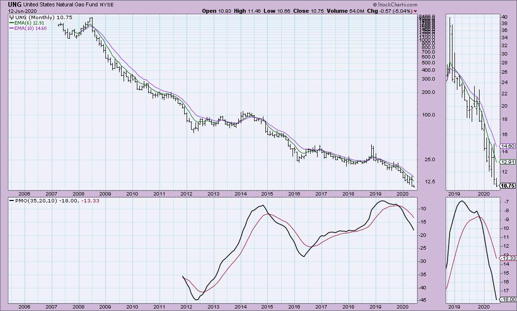
The monthly chart for UNG also tells me that, if I were to trade it, it should be considered a VERY short-term investment, one that would need to be watched continually all day. The PMO is on a SELL signal and isn't in oversold territory yet.

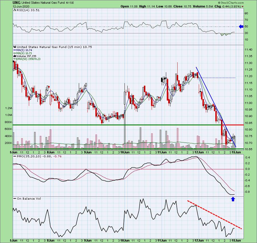
If you are thinking of risking a small position, here's a look at the 15-min bar chart. It gives us hints as to where we might look for an entry. I've marked support at today's low; it's at the bottom of the chart, but we know it could fall further. It does appear that UNG is ready to rally. The PMO has turned up and the RSI has risen out of oversold territory. Notice that overhead resistance is right there. I would be watching to see if:
- Support holds at the all-time low
- The RSI reaches above 50
- The PMO has a positive crossover
- Overhead resistance is broken
That would be the safest entry, although you could go in early and, if indicators don't turn bullish, you could then exit. Remember, these very short-term charts are quite helpful for timing your entries.

Conclusion: It may seem silly to even write about the bottom of the chart not being support. However, the brain may make visual assumptions or set biases that you're not always aware of. I do want to caveat that UNG hasn't formally set a bottom that could be considered support on the daily/weekly/monthly bar charts. Until we have a higher intraday low, a true support line hasn't been set.
If you'd like a trial to our website newsletters, contact support@decisionpoint.com and we will hook you up!
Happy Charting! - Erin
Diamond of the Week (Tuesday 6/9 DP Diamonds Report):
Below is the original article, but I have updated the charts through today and have added new commentary in italics.
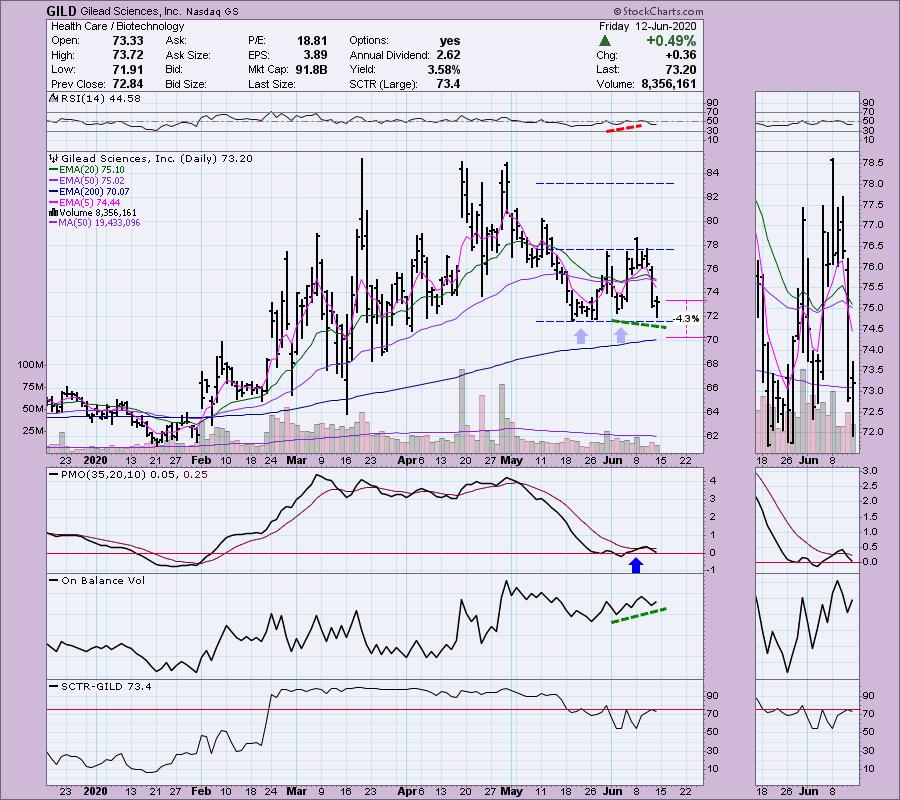
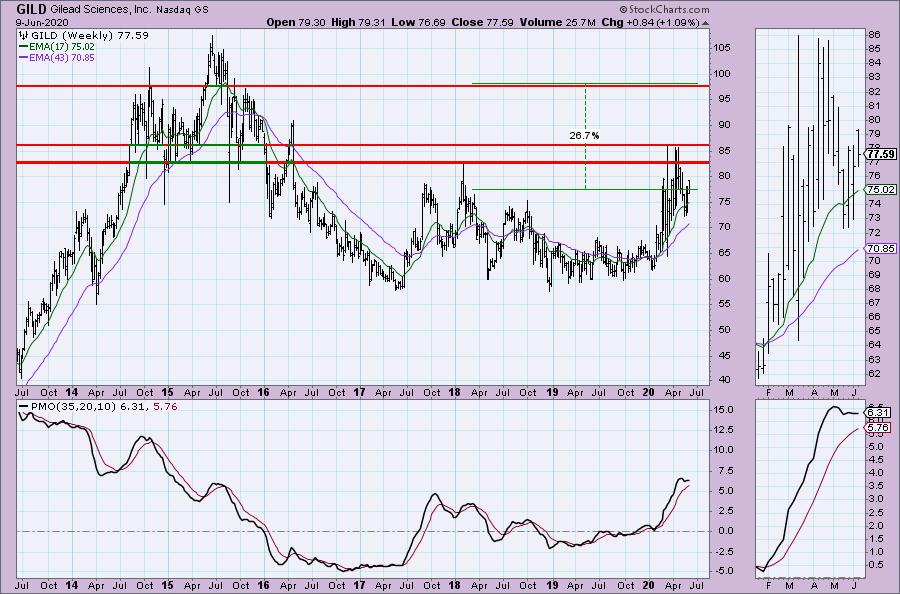
Gilead Sciences Inc (GILD) - Earnings: 7/30/2020 (AMC)
"I owned this one, having purchased it after I presented it as a "Diamond in the Rough" in April. After it gapped up and got to my target at the March high, I waited to see what might happen given its position in the news cycle regarding a new vaccine. When it began to tumble, I sold it and made a profit I was good with. Well, this one could be ready to make another move. We have a double-bottom pattern. It failed to execute on yesterday's breakout when it closed back within the pattern. Today it wasn't able to breakout but it stayed comfortably above the 5-EMA. The RSI has now moved back above 50. The PMO triggered a crossover BUY signal. The OBV is confirming the rally and the SCTR is rising." Obviously, this one did not work out this week, but most stocks took a huge hit Thursday. However, this has increased the potential gains available on a stock that still has bullish characteristics. While the RSI did drop below 50, it is neutral and the SCTR is healthy. The PMO had a whipsaw SELL signal that I can overlook based on the strength of the decline yesterday. The best element of the chart would be the OBV positive divergence. While I still have the double-bottom annotated, we could be seeing a triple-bottom lining up.

The most difficult overhead resistance is probably around $82.50, but I believe it will break above given the weekly PMO trying to turn up.

Technical Analysis is a windsock, not a crystal ball.
Helpful DecisionPoint Links:
DecisionPoint Alert Chart List
DecisionPoint Golden Cross/Silver Cross Index Chart List
DecisionPoint Sector Chart List
DecisionPoint Chart Gallery
Trend Models
Price Momentum Oscillator (PMO)
On Balance Volume
Swenlin Trading Oscillators (STO-B and STO-V)
ITBM and ITVM
SCTR Ranking
|
| READ ONLINE → |
|
|
|
| The MEM Edge |
| Stocks of these Companies are Seeing a Surge in Demand Despite an Uncertain Market |
| by Mary Ellen McGonagle |
The markets have been able to climb a wall of worry over the past 3 months in a move that's pushed the Nasdaq to a new high in price, with the S&P 500 within 6% of its peak reached in mid-February.
The significant rally over the past 3 months does not mean the markets are out of the woods quite yet, however, as new uncertainties surrounding the containment of COVID-19 infections is clouding economic recovery prospects. There's also uncertainty regarding the development of a viable vaccine to combat the deadly virus, not to mention a November election that's up for grabs. Despite the uncertainty, many startups are viewing this as an ideal time to raise capital, as higher valuations has invigorated the IPO market. In fact, ten companies went public in April, followed by 15 in May and 18 so far in June.
Of these recently listed IPOs, the average return has been 40%, which points to a strong appetite for companies that haven't yet proven themselves. This could be because many appear to be plays on the "new ways people are operating" in the face of an unprecedented pandemic.
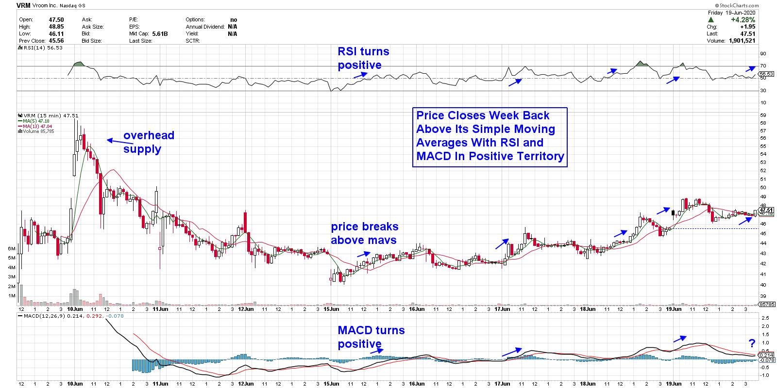
INTRADAY CHART OF VROOM, INC. (VRM)
Let's take a look at Vroom Inc. (VRM), which came public earlier this month. The company operates an e-commerce platform for buying, selling and trading-in used cars online. And while VRM is not posting earnings just yet, the company did see a 37% rise in year-over-year revenues in their first quarter.
Investors are hoping the company will replicate competitor Carvana's (CVNA) meteoric 775% increase since coming public three years. The move points to consumers that continue to embrace shopping online, even for high-priced vehicles. In fact, CVNA hit another new high this week, despite not turning a profit after 23 consecutive quarters of triple-digit revenue increases.
With less than 2 weeks of price history, you'll need to revert to an intraday (15-minute) chart for guidance on the near-term prospects for this stock. VRM posted a 10% gain last week that came in waves, with price breaks back above its 5 and 13 simple moving average coupled with a positive RSI and MACD as being an ideal entry point.
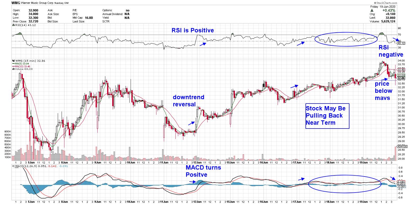
INTRADAY CHART OF WARNER MUSIC GROUP CORP (WMG)
One of the largest new offerings this year is the from Warner Music Group Corp. (WMG) - the world's 3rd largest recording label. The company posted net profits last year with a majority of revenues being generated from their recorded music catalog. Estimates for next year are calling for 0.73 earnings per share, which is a 232% increase in earnings over estimates for this year.
With consumers remaining at home more, the licensing of movie and TV content has seen a tremendous pickup in demand. A look at WMG's intraday chart shows a similar pattern to VRM, where slight intraday pullbacks are met with an upward shift in momentum. This action points to upside bias over the near-term.
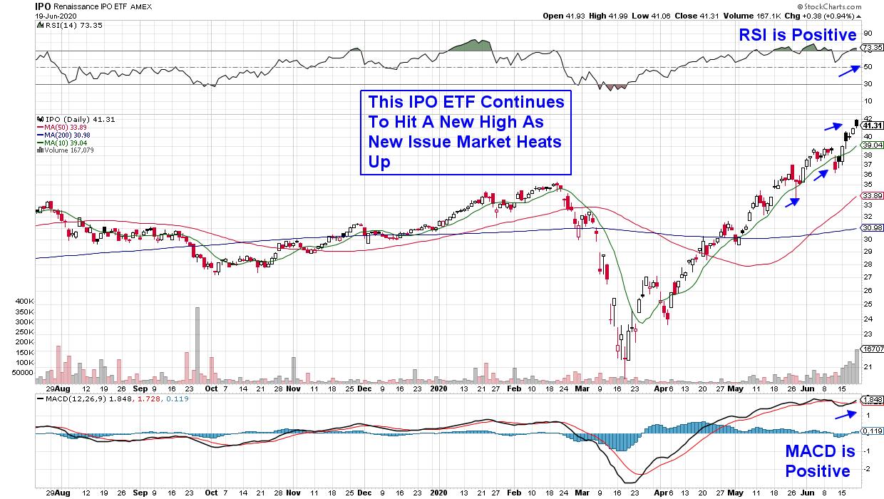
DAILY CHART OF RENAISSANCE IPO ETF (IPO)

For those who would rather gain exposure to these and other newly listed companies using a diversified ETF, you may want to consider the Renaissance IPO Index (IPO). The fund currently holds 50 stocks with each accounting for less than 10.5% exposure. With Technology being their top sector, followed by Healthcare and Communication Services, this IPO has recently seen their shares charge to new highs. A close look at the daily chart above shows that a pullback to its 10-day moving average is an ideal buy point for this upward-trending ETF.
Nasdaq President Nelson Griggs sees the number of new listings continuing to ramp up into the summer months, with Healthcare, Technology and Consumer related companies dominating the calendar.
The pickup in interest in riskier IPOs points to the overall strength in the current market environment. For those who'd like to be alerted stocks poised to outperform that have solid earnings already in place, I urge you to take a trial of my top performing bi-weekly newsletter.
The MEM Edge Report not only provides precise entry points among fast moving growth stocks, but will also alert you to when that stocks uptrend has paused or ended. In addition, you'll gain insights into market sectors that will provide you with the confidence to take advantage of the current strength in the markets. Take a look at an example here!
Warmly,
Mary Ellen McGonagle,
MEM Investment Research
|
| READ ONLINE → |
|
|
|
| ChartWatchers |
| How to Set Up Scans to Find Excellent Trading Opportunities |
| by John Hopkins |
Every day, there are thousands of companies to select from when looking for trading candidates. This includes companies in different sectors, of different sizes and with different prices. That's a lot of companies to choose from, so how does one go about zeroing in on the ones that might turn into profitable trades? One very efficient way is to use the scanning tools available at StockCharts.com to help you find golden opportunities.
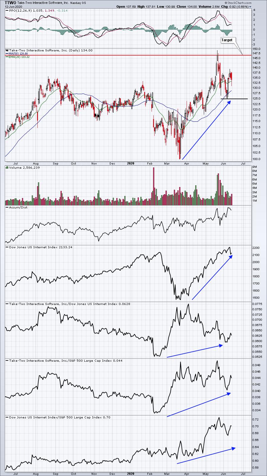
As an example, look at the chart below on Take Two Interactive Software (TTWO). This is a stock on our Strong Earnings ChartList - companies that beat both top and bottom line expectations - that we uncovered as a promising trading opportunity by using the StockCharts.com scanning feature.

In fact, EarningsBeats.com Chief Market Strategist Tom Bowley featured the stock in his Daily Market Report this past Monday after the stock had pulled back and reversed sharply. At the time Tom shared the stock, it was trading near $129, with the stock adding on $10 points by Wednesday - a nice 4.3% pop - and so far it has held well above that level while continuing to present a high reward-to-risk opportunity.
The great thing about using scans is you can define the criteria you want to use to find trading opportunities. For example, at EarningsBeats.com we have created 5 specific scans that all of our members can use, including High Volume, Downtrend Reversal (pullback scan), 20-Day Moving Average Test (pullback scan), RSI 40-50 Test (pullback scan) and 52-Week Highs (Breakout scan.) These scans can be used to scour the entire market or, in our case, our Strong Earnings ChartList, which currently contains 289 companies that beat both earnings and revenue expectations. We can then narrow down the list even further - for example, to those stocks with the highest SCTR rankings - as we look for the "best of the best."
In order for the trading community to gain a better understanding of the power of scanning, Tom Bowley will be conducting a FREE webinar this Monday, June 15 at 4:30pm Eastern Time. This "Scanning Strategies" session will include teaching some of the important basics of scanning, as well as uncovering stocks on our Strong Earnings ChartList that might be ripe for a good trade. If you would like to attend this FREE webinar and are currently NOT a part of the EarningsBeats.com community, just click here to sign up for our free EarningsBeats Digest that comes out every Monday, Wednesday and Friday; you will receive room instructions on Monday prior to the event. It's going to be a good one!
At your service,
John Hopkins
EarningsBeats.com
|
| READ ONLINE → |
|
|
|
| MORE ARTICLES → |
|
 Today, I kicked off the week by hosting another episode of "Your Daily Five", one of our newest series on StockCharts TV where we bring you a concise, action-packed daily rundown of the five most important charts that you need to be watching. Weekdays at 1:00pm ET, each day features a new host, which means five top charts and key insights from a different seasoned technician every single day of the week.



 The 20+ Yr Treasury Bond ETF (TLT) retreated as stocks advanced from mid April to early June and then popped as stocks dropped this week. Bonds are the natural alternative to stocks and TLT appears to be forming a classic bullish continuation pattern.


 Years ago, Peter Lynch (of Fidelity Magellan fame) preached that when looking for investment ideas, stock pickers should look closely where they shop and find those new alluring products and retail stores that held the most promise. Times change, of course, and the retail glass on the street is not as promising as it once was. But on a global level, his advice still holds merit in looking at new businesses and technologies for investment ideas. Perhaps replace the shopping mall as your focus and look to your own firm. Which new tech companies are you embracing in your own workplace. Those are great candidates worthy of some further investigation.
