| THIS WEEK'S ARTICLES |
| ChartWatchers |
| After 13 Years, a Key Multi-Year Sector Relationship May be Reversing - and Could Have Enormous Implications |
| by Martin Pring |
Technology, as reflected in the tech-dominated NASDAQ Composite, peaked as a group in 2000 and sank in popularity for the next 3 years. Since then, as shown by the relative graph in Chart 1, it has recaptured all of that lost ground. Now, its long-term KST may have started to flatten. Since the RS line is struggling to push above its 2000 high, the technical position could be hinting at a possible top.
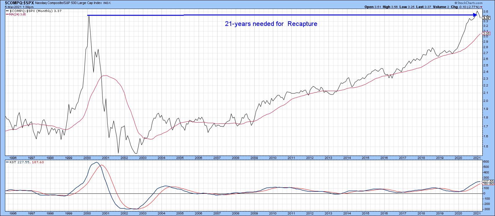 Chart 1 Chart 1
By the same token, Chart 2 indicates that the relative strength for energy, as represented by in the NYSE Oil Index ($XOI), bottomed in the 1999-2000 period and experienced a huge rally into 2008. It slipped in popularity until last October, when a sharp rally began. That formidable bounce was sufficient to reverse the downward trajectory of its long-term KST, thereby offering a credible reason why the post-2008 decline might be over.
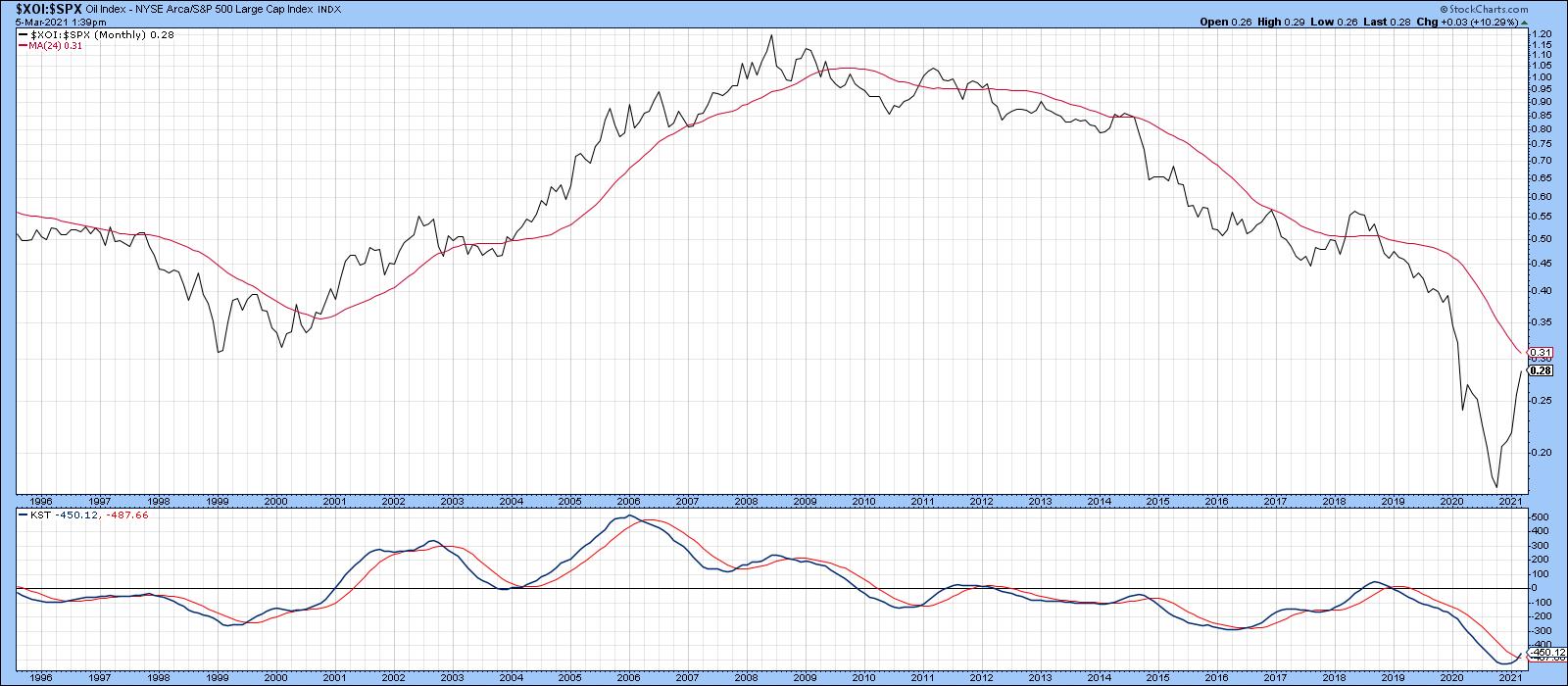 Chart 2 Chart 2
In relative terms, both sectors have essentially been moving in opposite directions for three decades. Since the KST for relative action has started to flatten for the NASDAQ Composite and reverse to the upside for energy, perhaps now is a good time to anticipate a changing of the sector guard.
Examining the NASDAQ (Tech)/NYSE OIL Index ($COMPQ/$XOI) Ratio
In that respect, Chart 3 shows the ratio between the technology-dominated NASDAQ Composite and the Energy-influenced NYSE Oil Index. Since the early 1990s, there have been three broad movements: two between 1990-2000 and 2008-2020, both of which favored technology, and the third between 2000 and 2008, when energy outperformed. Since 2008, this relationship has rallied by an approximate factor of 12x, which undoubtedly places it in bubble-type territory.
Furthermore, some indicators are suggesting that another reversal, favoring energy, is in the cards. For example, the ratio has dropped below its 12-month MA and the KST is on the verge of a sell signal. However, it's important to note there have been numerous 12-month MA crossovers in the last 30 years that have ultimately proven to be whipsaws.
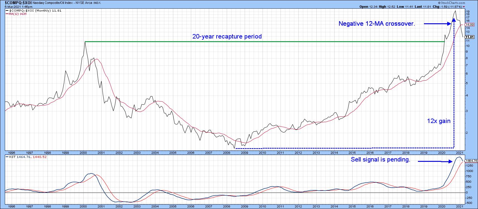 Chart 3That's why it's probably better to adopt a 24-month MA, as in Chart 4. It's not perfect, but it greatly limits the number of whipsaws in the last few decades. It's still bullish (for technology), of course. The lower window displays an 18-month ROC. Note that it has attained a reading in excess of 200%, which means that this relationship has doubled within the scope of a year and a half. In our book Investing in the Second Lost Decade, an appendixciting 30 examples of markets doubling in price during that 18-month period is included. It's a very unusual situation, which, if preceded by an extensive advance developing over many years, is almost invariably a sign that a bubble has burst. When such a reading is recorded coming off a major low, that is also unusual, but is positive because it demonstrates strong underlying momentum, rather like a bread thrust. Such action is usually followed by a small correction, but the function of early-on powerful momentum is to tell us that higher prices are ultimately likely. Chart 3That's why it's probably better to adopt a 24-month MA, as in Chart 4. It's not perfect, but it greatly limits the number of whipsaws in the last few decades. It's still bullish (for technology), of course. The lower window displays an 18-month ROC. Note that it has attained a reading in excess of 200%, which means that this relationship has doubled within the scope of a year and a half. In our book Investing in the Second Lost Decade, an appendixciting 30 examples of markets doubling in price during that 18-month period is included. It's a very unusual situation, which, if preceded by an extensive advance developing over many years, is almost invariably a sign that a bubble has burst. When such a reading is recorded coming off a major low, that is also unusual, but is positive because it demonstrates strong underlying momentum, rather like a bread thrust. Such action is usually followed by a small correction, but the function of early-on powerful momentum is to tell us that higher prices are ultimately likely.
Based on our sample of 30 cases that developed in the decades following 1974, it took an average of 15 years to return to the original bubble peak.
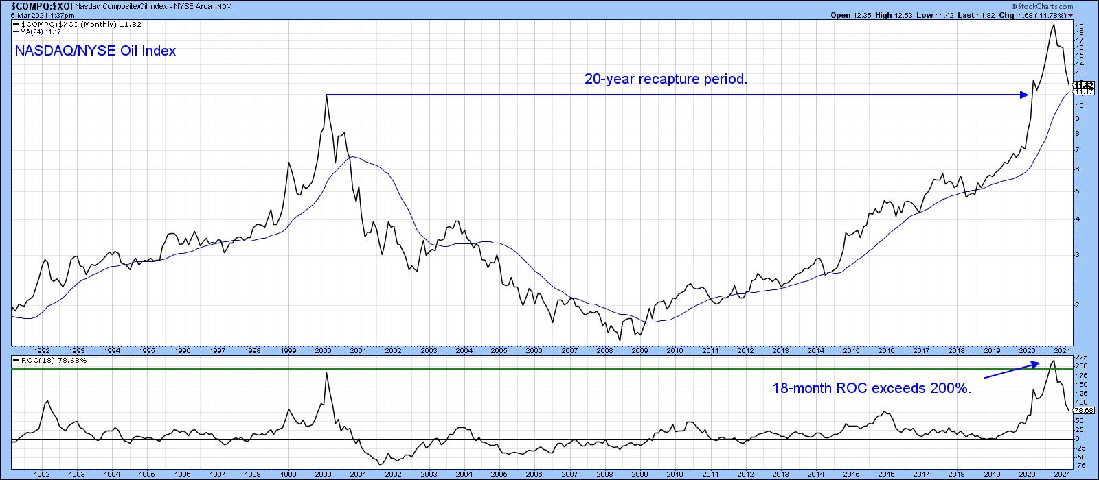 Chart 4Returning to Chart 4, you can see that, since 2009, energy has been completely outperformed by technology. That may be about to change, as the 18-month ROC, having recently exceeded the 200% level, now looks as though it has peaked, not unlike its 2000 experience. Note that the re-capture period in that instance took 20 years. If a reversal has taken place, it will say nothing about the absolute prices of these sectors - merely that leadership is in the process reverting away from technology and leaning more in the direction of energy and other resources. Chart 4Returning to Chart 4, you can see that, since 2009, energy has been completely outperformed by technology. That may be about to change, as the 18-month ROC, having recently exceeded the 200% level, now looks as though it has peaked, not unlike its 2000 experience. Note that the re-capture period in that instance took 20 years. If a reversal has taken place, it will say nothing about the absolute prices of these sectors - merely that leadership is in the process reverting away from technology and leaning more in the direction of energy and other resources.
The NASDAQ Composite/ Energy Sector Relationship Updated
Chart 5 shows a similar relationship, but this time in weekly format, where the XLE is substituted for the $XOI. Note that it has completed and broken down from a head-and-shoulders top under the backdrop of a rolling-over long-term KST. It's also well below its 200-day MA. The short-term KST, in the center panel, is getting a bit oversold, which means that some form of a retracement rally is very likely. If so, that would extend the topping out process, prior to achieving ultimately lower levels.
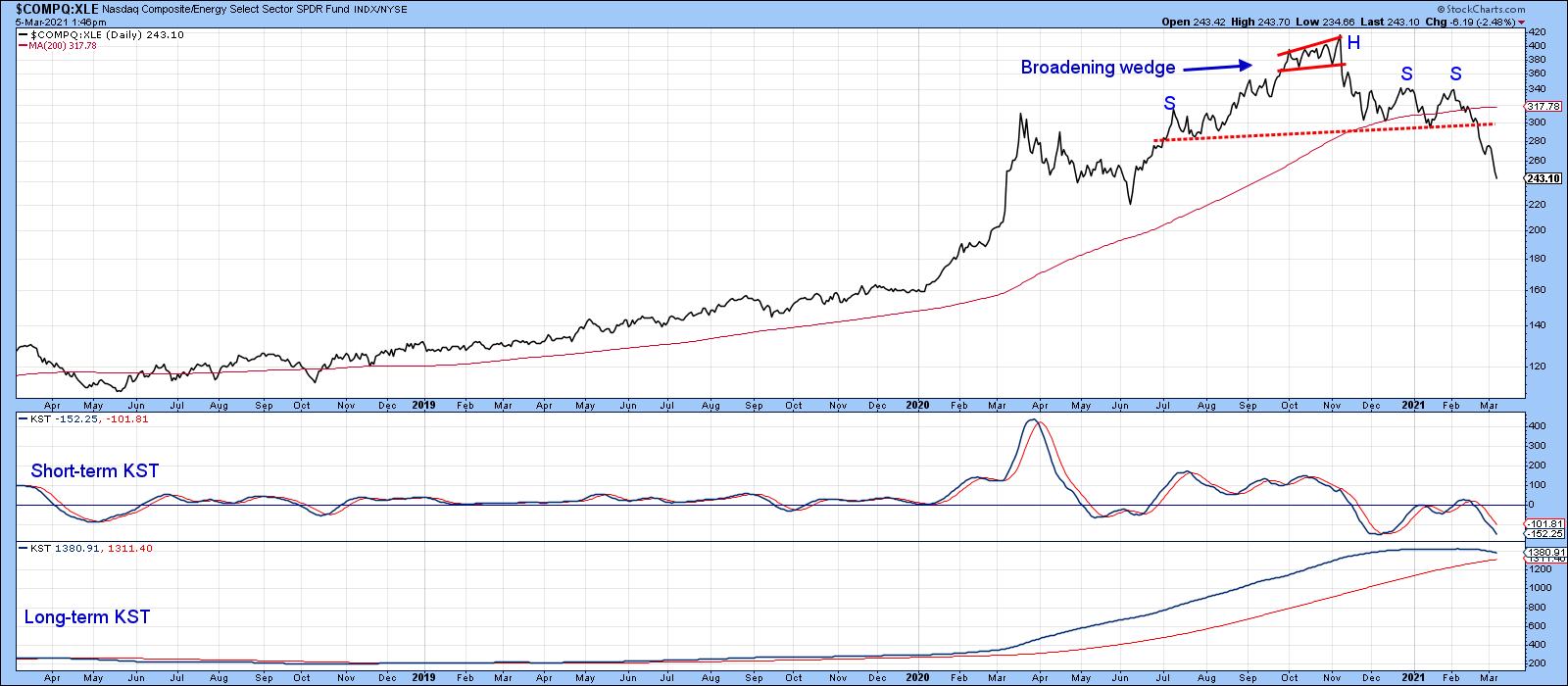 Chart 5 Chart 5
Stocks vs. Commodities
A lot of the strength reflected by the S&P Composite in the last few years has come from the buoyancy of tech stocks. As a result, equities have been able to strongly outperform commodities. Chart 6 portrays that battle since 2011. In the last couple of months, though, the ratio between the S&P and the DB Commodity ETF (SPY/DBC) has decisively broken in favor of the DBC. That's because it has violated the 2011-2021 up trendline, crossed below the 12-month MA and triggered a long-term KST sell signal. In effect, this action is confirming some of the signals currently being given by the energy/technology relationship.
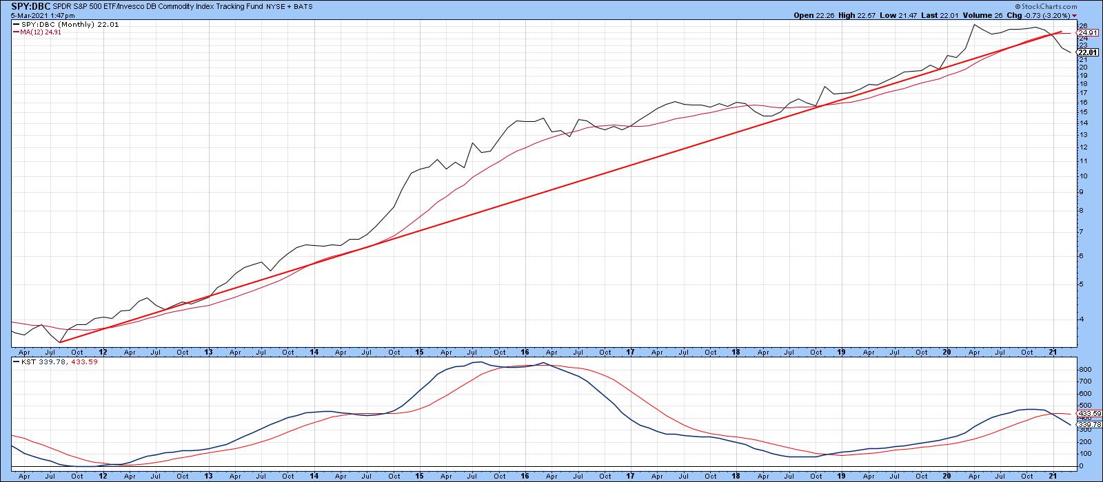 Chart 6 Chart 6
This is an updated version of an article previously published on Tuesday, March 2nd at 5:39pm ET in the member-exclusive blog Martin Pring's Market Roundup.
Good luck and good charting,
Martin J. Pring
The views expressed in this article are those of the author and do not necessarily reflect the position or opinion of Pring Turner Capital Group of Walnut Creek or its affiliates.
|
| READ ONLINE → |
|
|
|
| ChartWatchers |
| Does the 10-Year Yield Really Matter? |
| by Arthur Hill |
Two items are dominating the news narrative right now: the rise in interest rates and the decline in tech stocks. Are rising rates really an issue for tech stocks? The charts suggest that the evidence is mixed, at best. In fact, it is not very hard to find periods when tech stocks rose along with the 10-year Treasury yield. Let's check the evidence.
The chart below shows the 10-year Treasury Yield (black line) surging from .55% to 1.54% from early August to early March. It is a massive rise, but is it really a big deal? Before the covid plunge, the 10-year yield spent most of its time in the 1.5% to 4% range. Hardly a big deal. With the recent move above 1.5%, the 10-year yield is just getting back to the low end of its prior range. Give bonds a break. Just like the rest of us, bonds are trying to get back to their pre-covid routines.
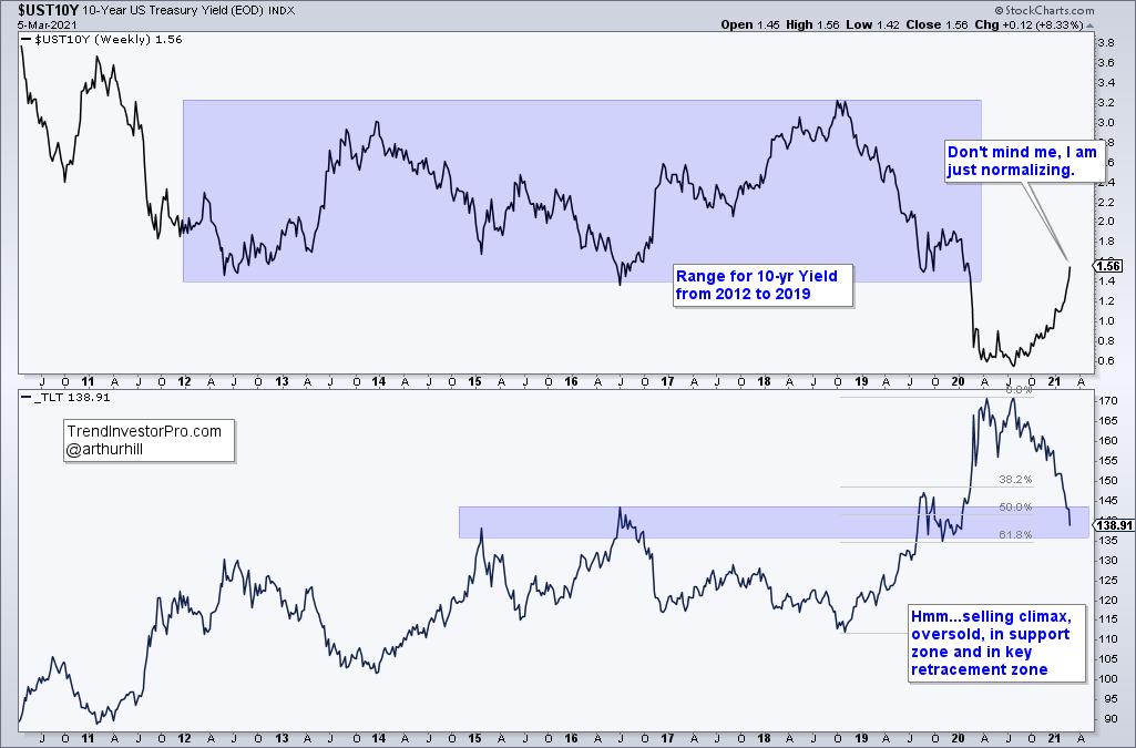
While we are on the subject of bonds, notice that the 20+ Yr Treasury Bond ETF (_TLT) experienced a selling climax over the last few weeks and is extremely oversold. Also note that price is trading in a big support zone and in the 50-61.8% retracement zone. This is a recipe for at least an oversold bounce.
The next chart shows the Nasdaq 100 ETF (QQQ) in red and the 10-yr Yield in black. The green zones show when they rose together (positively correlated) and the blue zones show when they moved opposite each other (negatively correlated). The 10-year yield doubled in each of the three green zones and QQQ still moved to new highs.
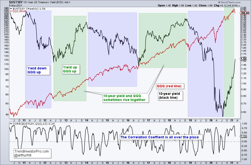
The indicator window shows the Correlation Coefficient, which is an attempt to quantify the relationship between the 10-yr yield and QQQ. It is positive when they move in the same direction and negative when they move in opposite directions. This indicator is all over the place and I do not see a clear-cut correlation one way or the other.
The charts suggest that the relationship between QQQ and the 10-year yield is fluid. Sometimes they are positively correlated and sometimes not. Sure, QQQ and the 10-year yield are negatively correlated over the last three weeks, but that does not mean they are always negatively correlated. Far from it. The moral of the story: Don't believe everything you hear, read or watch. Check the long-term evidence for yourself and then decide.
TrendInvestorPro.com specializes in objective analysis based on price action and a few key indicators. Each week we separate the leading ETFs from the lagging ETFs, highlight tradable patterns, suggest trailing stop techniques, scan for mean-reversion setups and update the broad market timing models. Click here to take your analysis to the next level!
---------------------------------------------------
|
| READ ONLINE → |
|
|
|
| ChartWatchers |
| Gushers Galore! |
| by Greg Schnell |
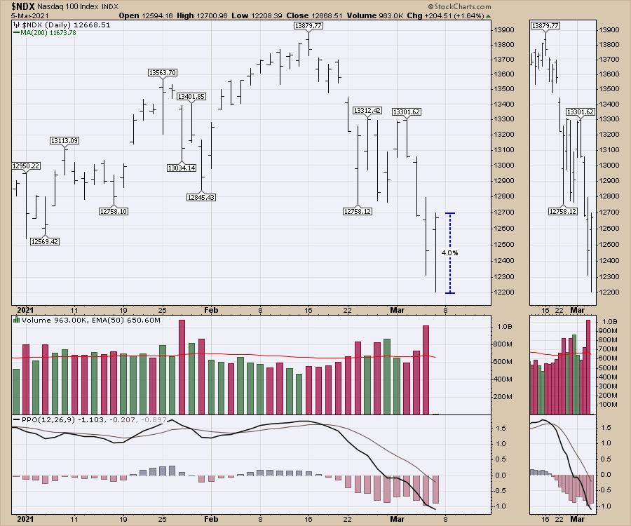
The Friday sch-w-wing on the markets was a welcome respite from the hard selling in the Technology and innovation space. The Nasdaq soared 4.0% from low to high. I like these strong intraday reversals.
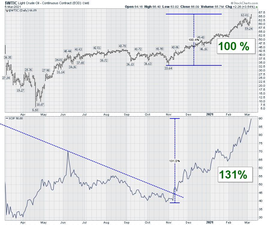
One other area of the market that continues to run persistently is energy -- long forgotten, but stunningly strong. As long as the Kingdom of Saudi Arabia keeps the excess supply off the market, this upward pressure is probably going to continue.
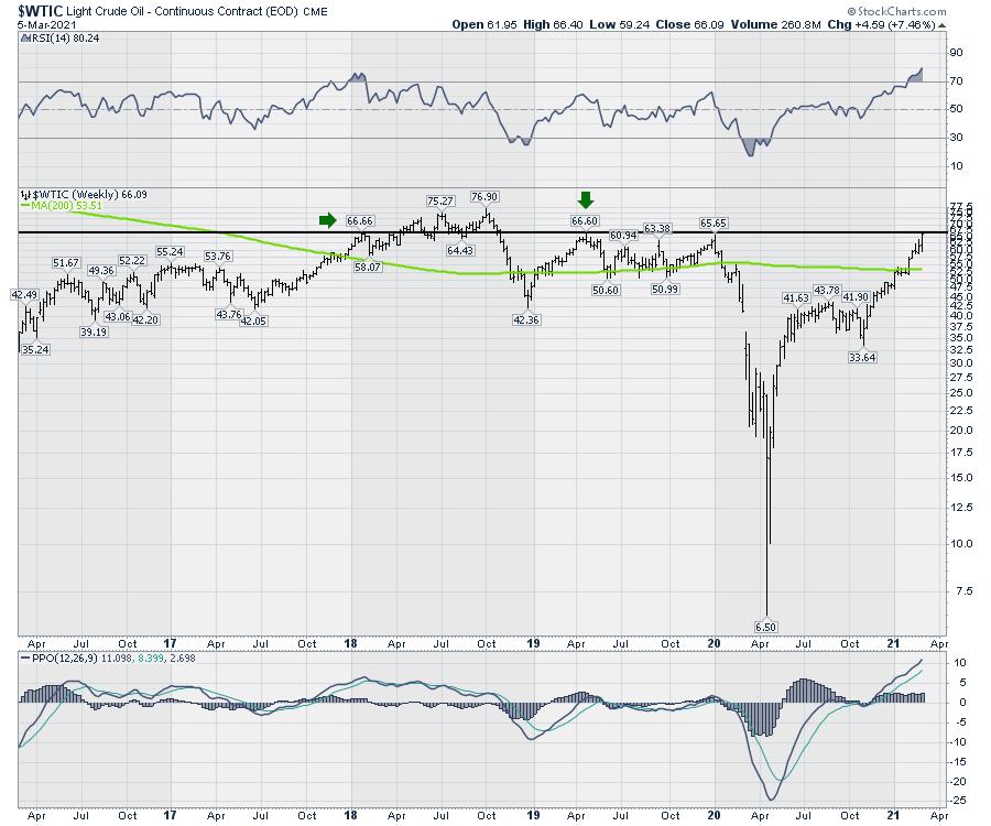
The chart below shows the doubling of the oil price from $33 at the beginning of November to the $66 close today. The XOP is outperforming the oil price by moving up 130%.
The big picture view on this is starting to become very clear. US oil prices are now above the 5-year moving average. I set the moving average to 200 weeks. We closed on 22-month highs at $66.30. The intra-week high in early 2018 is just a pump-jack push higher at $66.60. More importantly, we are entering the $10 range of the 3-drives-to-a-high price top in 2018.
It will be very important to see this play out. I have been a raging bull on energy for a while now. As long as the major oil companies continue to dismiss these price levels and focus on electric scooter networks, this price is going to continue to have upward pressure. Will five-year highs get investors attention?
I am pretty sure the oil business is tired of being called the ugly duckling, and President Biden, along with other world leaders, are creating a market for higher prices. Commodity cycles can really upset the best laid plans.
We have just set up a new sale for our membership in the month of March. You can save over 40% ($363) and pick up an annual subscription for $497 at GregSchnell.com. If your portfolio was roundly smoked by the recent correction, you'll enjoy the clues provided by the Schnell Strength Indexes to help miss the downside.
With kind words from subscribers this week: "Your analysis has literally saved the downfall in my portfolio, huge huge appreciations and thank you for doing this wonderful work." S.
|
| READ ONLINE → |
|
|
|
|
|
| The Traders Journal |
| Why ETFs Are Best-Of-Breed For Only 50% Of Your Asset Classes |
| by Gatis Roze |
 This is an update to an important blog I wrote three years ago. Investors have once again been misled by the media and bamboozled by ETF sponsors such as iShares, SPDRs and Invesco. Exchange traded funds (ETFs) are not the panacea for every asset class as they all want you to believe they are. This is an update to an important blog I wrote three years ago. Investors have once again been misled by the media and bamboozled by ETF sponsors such as iShares, SPDRs and Invesco. Exchange traded funds (ETFs) are not the panacea for every asset class as they all want you to believe they are.
In my own portfolio, approximately 40% of my asset classes are covered by ETFs, but another 40% are no-load mutual funds and each is "Best of Their Breed." Individual stocks account for about 20%. My objective with this blog is to shatter the myth that ETFs should replace all your mutual funds and stocks. I'll show you that achieving outperformance is best done by blending a mix of both passive ETFs and active mutual funds depending on your asset class!!
Upfront, I need you to embrace the fact that the biggest determination of your profitability as an investor is not which stock, ETF or mutual fund you select but how you allocate your assets amongst your different asset classes. Having said that, the first two steps are about being in the right asset classes and then optimizing the dollar allocations within each asset class. Having taken care of that business, you are free to move on.
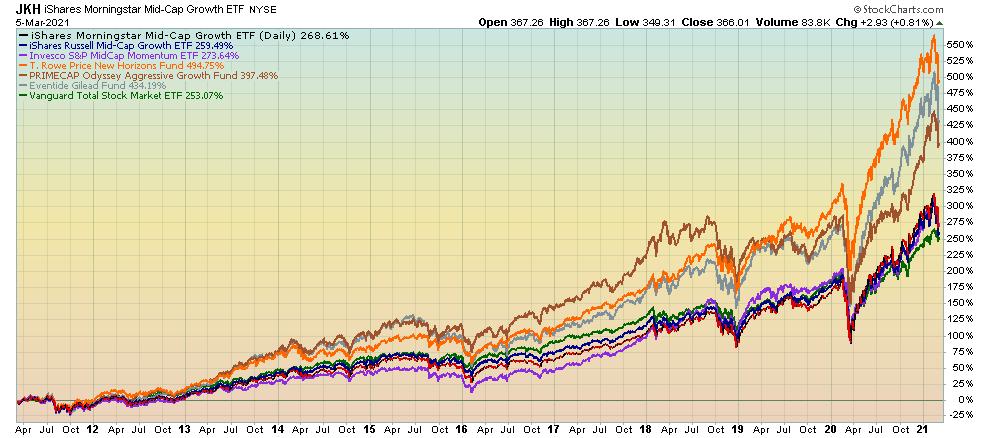
I'll use my asset class of U.S. Mid-Cap Growth Stocks as my first example. I search out the best mid-cap ETFs using Morningstar and ETF.com. I do the same with mid-cap growth mutual funds. This produces a small universe of mid-cap possibilities upon which I can now perform in-depth comparisons. Your brokerage house websites will have useful comparison tools for this which will highlight costs and performance data which I do utilize. However, I have found that over time I first gravitate to using the lens of a visual investor.
Stockcharts.com to the rescue! The PerfChart in the hands of a knowledgeable investor is indeed a profit generating tool. In fact, similar to ChartList #10.07 (59 asset classes from our book and in our ChartPack), I personally maintain a ChartList with 20 charts, each representing one of the 20 asset classes across which I have diversified my own portfolio. For most investors, you don't need 20 asset classes.
The following chart is from my personal ChartList. I maintain this mid-cap chart and update it as better ETFs or mutual funds might appear. You'll see that the mid-cap growth ETF (JKH) is my preference for best growth ETF. I considered IWP, and XMMO, but my pick was JKH. For mutual funds, you see that I have plotted PRNHX, ETILX and POAGX. I also always plot Vanguard Total Market (VTI) in green to constantly monitor the specific asset class versus the market. It's a habit I suggest for you all. In addition, I use the representative ETF for each asset class chart as my heading. This ticker always prints as a black line by default and for visual consistency. Don't ignore the visual consistency aspect of this.
So the benefits of maintaining these 20 charts of my asset classes are as follows:
- My personal investment allocation to USA Mid-Cap Growth Stocks is achieved through JKH, PRNHX and POAGX and is constantly monitored in relation to its peers and the market (VTI).
- Since both PRNHX and POAGX clearly outperform the best ETF, they justify their higher management fees .
- They also clearly outperform the market (VTI).
- When new options present themselves for consideration, such as ETILX, I plot them on this chart and can quickly ascertain if they are candidates worthy of my investment dollars.
- Monitoring extraordinary closed mutual funds also allows you to pounce on an opportunity if and when they reopen a closed fund.
This first example clearly proves that paying PRNHX higher fees than an ETF (JKH) is justified due to their consistent outperformance. I welcome your alternatives if you disagree!
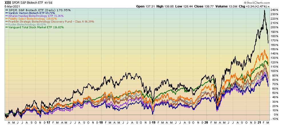
My second example will be cheered by the ETF crowd. Biotech is an asset class that I deem as a long-term hold. From the chart, you can see that XBI is outperforming its sister ETFs (PTH and BBH), as well as three top mutual funds (FBIOX, FBDIX and RYOIX).
I choose XBI as my Biotech investment vehicle, not simply based upon its outperformance but also because of the following:
• low expenses (0.35%)
• large asset base leading to small trading spreads — $8 Billion
• broad basket of 170 holdings
• mid-cap to small cap company focus
In this asset class, the mutual fund managers have not proven to me that they can justify their higher fees with long term outperformance. Therefore, the winner is an ETF in the Biotech asset class.
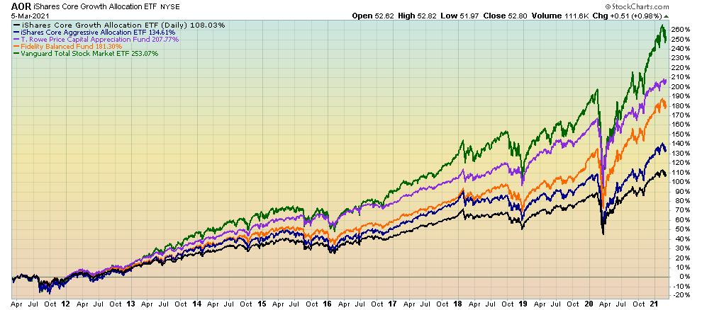
The third example is the moderate allocation asset class (or Balanced Funds) which means funds that maintain a mix of bonds and 50-70% equities. This example is an investing testimonial on three fronts:
• for long term investing
• for asset allocation executed by competent money managers
• for active mutual funds over passive ETFs
In this asset class, there are a good number of active managers to choose from who add value over the passive ETF alternatives and can justify their fees. My vehicle of choice for this asset class is the T. Rowe Price Capital Appreciation Fund which I've owned for a very long time.
The key takeaways from this blog as I see it are these five points:
- Your asset allocation decisions are high leverage and really matter big time! To do it like a pro, watch the top-selling DVD seminar that Grayson and I recorded on just this topic.
- Passive ETF investing might be the rage, but it's only best for you roughly 50% of the time.
- Maintaining a ChartList of your different asset classes that plot the best ETFs and mutual fund options will yield outperformance and minimize your fees. It's one of the rare instances where "you'll get what you don't pay for", as John Bogle used to say.
- When you are presented with a new investment candidate in a specific asset class, you can easily compare it to your existing best-of-breed charts and either embrace it or jettison it.
- Plotting VTI on each asset class chart challenges you to consistently compare your asset class and investment vehicle to the total U.S.A. market. Does it justify your investment or has it earned more investment from your portfolio?
So now you know! You will no longer be deceived or be duped by the media into believing ETFs are the only way to invest. They have their place, but so do no-load mutual funds.
Trade well; trade with discipline!
- Gatis Roze, MBA, CMT
StockMarketMastery.com
|
| READ ONLINE → |
|
|
|
| Don't Ignore This Chart! |
| KTB Holds while SLY, SPY and PSCD Drop |
| by Julius de Kempenaer |
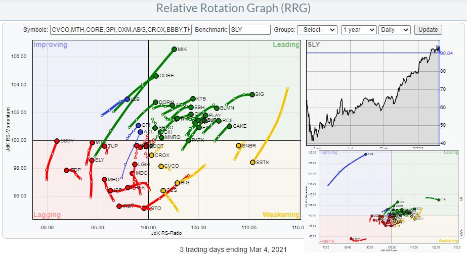
Recently, I have been talking and writing about small-cap sectors and especially how the small cap segment in the consumer discretionary sector, the PSCD ETF, is currently diverging from its large cap counterpart, XLY. For this article I have collected the top 50 members in PSCD (Invesco), and there are actually 91 stocks in this ETF.
The big RRG above shows 47 out of these 50 names. I have deleted three: CTB, STMP, and GME... yes, GME ;)
The small RRG in the bottom right corner shows the image with those three stocks in the picture and, as you can see, they completely distort the image because they are so far out. Especially GME. For obvious reasons....
 When I started writing this article I thought to have a real click bait headline, something like "Really GME... You again?" but decided against it. That was firstly because I'm really bad at coming up with clickbait headlines and, secondly and more importantly, because this stock is more in the gambling department recently than a serious investment... When I started writing this article I thought to have a real click bait headline, something like "Really GME... You again?" but decided against it. That was firstly because I'm really bad at coming up with clickbait headlines and, secondly and more importantly, because this stock is more in the gambling department recently than a serious investment...
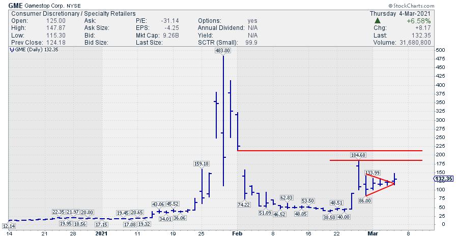
BUT, the tail on the RRG speaks volumes so I'll add a small chart.
With the market (SPY) in sell mode, GME broke away from a small consolidation pattern that formed over the last three to four days. This adds to the relative strength, and the break from the consolidation in itself is a strong sign technically.
The potential? Most likely, the recent high at $184 or somewhere higher in the gap area which started at $212. That means $50-$80 or 40%-60% upside potential. Just don't bet the farm... this is more like an educated g(uess)amble for a slot-machine.
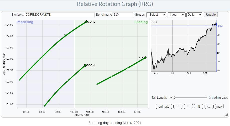
Focusing on the other members of the PSCD universe, a few interesting names popped up. KTB, CORE and DORM are showing nice rotations on the daily RRG.

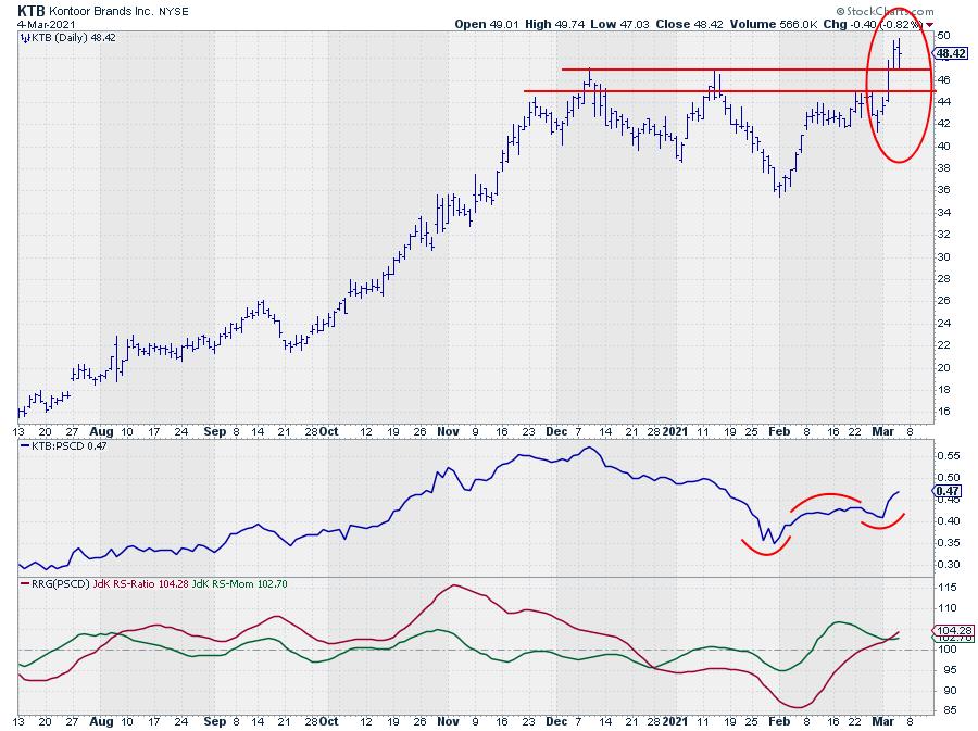
All three show nice charts breaking to new highs, which is a strong sign when the market sells off. I picked KTB as my chart for the day here.

The strong rotation on the RRG comes from the turn around that is underway in relative strength. The move lower since early January has come to an end and the RS-Line just broke above its previous high, which starts a new series of higher highs and higher lows.
Yesterday, KTB broke to a new all time high as it cleared overhead resistance at ~$47. Today, it is holding up well above that level, despite the drop in SPY, SLY and PSCD.
All in all, this makes KTB a stock worth keeping an eye on and potentially trade from the long side. The downside should now be well protected around $47, which gives excellent opportunities to put stop-losses just below that level, while the upside is not capped by any resistance levels nearby.
#StaySafe, --Julius
My regular blog is the RRG Charts blog. If you would like to receive a notification when a new article is published there, simply "Subscribe" with your email address.
|
| READ ONLINE → |
|
|
|
| ChartWatchers |
| Beware of the Negative Crossover on the DecisionPoint "Golden Cross" Index |
| by Erin Swenlin |
Carl Swenlin ingeniously created the newest DecisionPoint indicators, called the "Golden Cross Index" and "Silver Cross Index". It is actually a simple concept, and one he and I were both surprised hadn't been created yet.
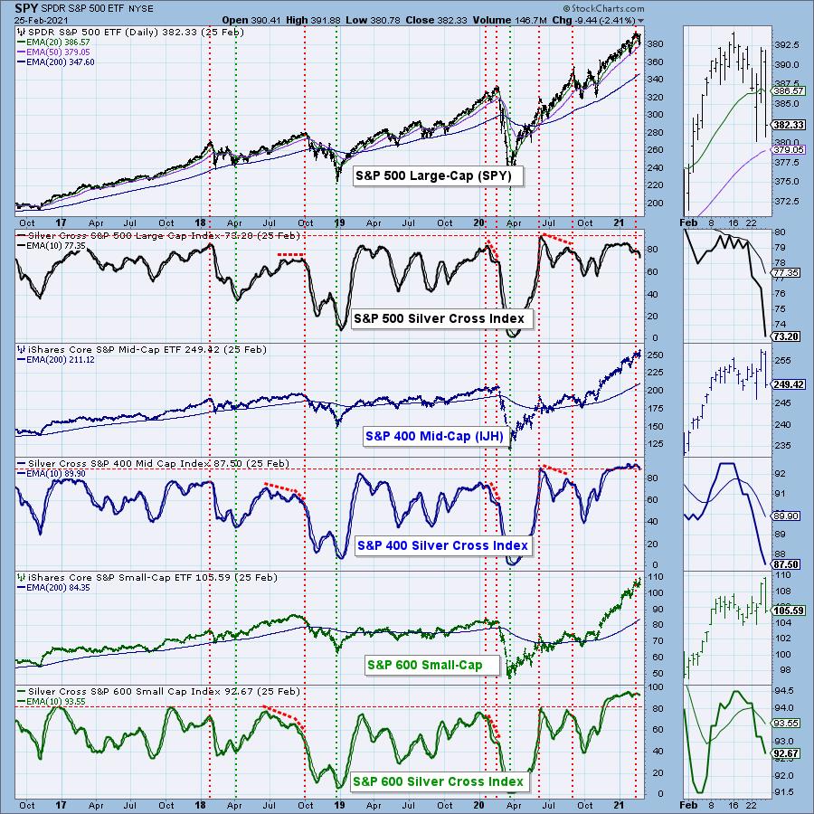
Most are familiar with a "golden cross," the positive crossover of the 50-/200-MAs. The "Golden Cross Index" measures the percentage of components in an index that currently have the 50-EMA above their 200-EMA. Carl also came up with the "Silver Cross Index". Meanwhile, a "silver cross" is a positive 20-/50-EMA crossover, so the "Silver Cross Index" measures the percentage of components in an index that currently have their 20-EMAs above their 50-EMAs.
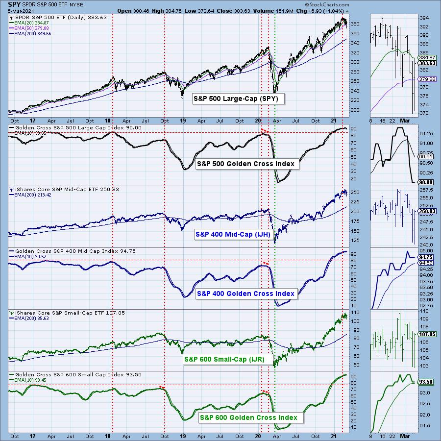
The Golden Cross Index (GCI) has been sitting at its "all-time high" (based on our data that goes back to 2017). This week, it dropped a full percentage point plus some. Last week we had a reading of 91.4%. Now, we have a reading of 90%. It moves slowly, so this decline was significant in my estimation.
Below, I have the Golden Cross Index chart for the major indexes. Notice all of them are extremely overbought. The S&P 400 currently has the healthiest GCI at 94.75%, but the S&P 600 is still above its signal line with a reading of 93.5%. It appears the longer-term foundation of the SPX is beginning to show small cracks. Note that cardinal tops (marked with the red vertical lines) typically arrive when the GCI tops.

IN JUST 10 MINUTES, EVERYTHING YOU NEED TO KNOW!
The DP Alert is the perfect primer to end every market day. In 10 minutes or less, you can read the daily DP Alert and know where the market is headed in the short- and intermediate-terms. You also get a review of Dollar, Gold, Gold Miners, Crude Oil and Bonds DAILY! We review the same charts to give you context and continuity, with interesting additions to complement the analysis for the day. Each report is easy to read and understand regardless of your level of experience.
SUBSCRIBE TO OUR BUNDLE TODAY and get one free week using this coupon code: DPTRIALCW. That is a $20 value for free!

Free DecisionPoint Trading Room on Mondays, Noon ET
Recordings Sent to All Registrants!

*Click here to register for this recurring free DecisionPoint Trading Room on Mondays at Noon ET!*
ALL REGISTRANTS RECEIVE A COPY OF THE RECORDING AT THE END OF THE DAY
The deterioration on the "Silver Cross Index" has been in force since the negative crossover of its signal line in January. The small- and mid-caps also experienced negative crossovers. None of these indicators are remotely oversold and suggest weakness ahead in the intermediate term.

Conclusion: The Golden Cross Index had a negative crossover its signal line this week, while the Silver Cross Index was already declining after an earlier negative crossover. These negative crossovers generally come at intermediate-/long-term tops. While we likely saw a buying initiation today in the short term, look at it as an opportunity to sell into strength or move into more defensive areas of the market, like Utilities (XLU) and Consumer Staples (XLP).
Happy Charting! - Erin
Technical Analysis is a windsock, not a crystal ball.
Helpful DecisionPoint Links:
DecisionPoint Alert Chart List
DecisionPoint Golden Cross/Silver Cross Index Chart List
DecisionPoint Sector Chart List
DecisionPoint Chart Gallery
Trend Models
Price Momentum Oscillator (PMO)
On Balance Volume
Swenlin Trading Oscillators (STO-B and STO-V)
ITBM and ITVM
SCTR Ranking
DecisionPoint is not a registered investment advisor. Investment and trading decisions are solely your responsibility. DecisionPoint newsletters, blogs or website materials should NOT be interpreted as a recommendation or solicitation to buy or sell any security or to take any specific action.
|
| READ ONLINE → |
|
|
|
| ChartWatchers |
| Here's a Stock That Deserves Your Attention |
| by John Hopkins |
Everyone is giving up on growth stocks, especially given the sharp rise in rates, with the 10 Year US Treasury Note rising as high as 1.62% on Friday. And now, any good news - i.e., a solid jobs report - is seen as bad news, with concerns of a hot economy. Go figure.
I always find it fascinating that traders fall over themselves when the market gets to lofty levels; they can't get enough of stocks, no matter how stretched. But when an overheated market pulls back after sizzling for such a long time, they want nothing to do with stocks, even those that have posted strong earnings and that pull back to key support levels.
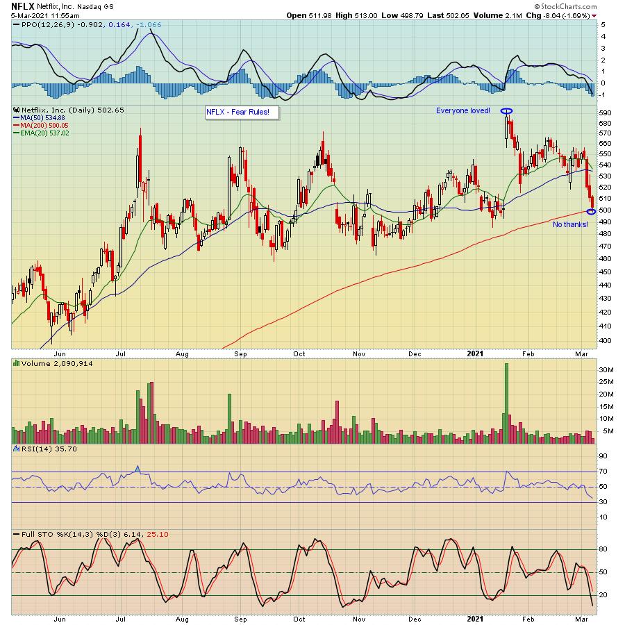
As an example, take a look at the chart below on Netflix (NFLX) at its session low on Friday, which easily beat analysts' expectations when they last reported their numbers. And since that report? Down, down, down and now right to a very key support level, the 200-day moving average, with the stock oversold and 16% off the high it posted after earnings were released. But with fear hanging over the market, most traders won't even consider putting money to work, just when it makes more sense to buy then when the stock was at $593.

Some will argue that stay-at-home stocks like NFLX have run their course, and perhaps that will turn out to be true. But NFLX was flying high well before the pandemic hit; they're not going away. But the more likely scenario for many traders is they've held NFLX from that all time high of $593 and will be exiting just when the reward-to-risk is to the upside. Could the stock move lower? Absolutely. But these are the types of opportunities that should be considered when everyone else balks.
Many analysts and "talking heads" are petrified that the 10-year note has risen just above 1.50%; the sky is falling. But as our Chief Market Strategist Tom Bowley has pointed out many times, the rise in rates will ultimately favor equities. So you need to separate fact from fiction and zero in on those stocks that reported excellent earnings and have retreated to key support levels.
Speaking of Tom, every M, W and F he sends his FREE EarningsBeats Digest to community members. If you would like to get on the list, just click on this link and sign up to keep up on important market and earnings-related news.
At your service,
John Hopkins
EarningsBeats.com
|
| READ ONLINE → |
|
|
|
| MORE ARTICLES → |
|
 Chart 1
 Chart 2
 Chart 3That's why it's probably better to adopt a 24-month MA, as in Chart 4. It's not perfect, but it greatly limits the number of whipsaws in the last few decades. It's still bullish (for technology), of course. The lower window displays an 18-month ROC. Note that it has attained a reading in excess of 200%, which means that this relationship has doubled within the scope of a year and a half. In our book Investing in the Second Lost Decade, an appendixciting 30 examples of markets doubling in price during that 18-month period is included. It's a very unusual situation, which, if preceded by an extensive advance developing over many years, is almost invariably a sign that a bubble has burst. When such a reading is recorded coming off a major low, that is also unusual, but is positive because it demonstrates strong underlying momentum, rather like a bread thrust. Such action is usually followed by a small correction, but the function of early-on powerful momentum is to tell us that higher prices are ultimately likely.
 Chart 4Returning to Chart 4, you can see that, since 2009, energy has been completely outperformed by technology. That may be about to change, as the 18-month ROC, having recently exceeded the 200% level, now looks as though it has peaked, not unlike its 2000 experience. Note that the re-capture period in that instance took 20 years. If a reversal has taken place, it will say nothing about the absolute prices of these sectors - merely that leadership is in the process reverting away from technology and leaning more in the direction of energy and other resources.
 Chart 5
 Chart 6


 This is an update to an important blog I wrote three years ago. Investors have once again been misled by the media and bamboozled by ETF sponsors such as iShares, SPDRs and Invesco. Exchange traded funds (ETFs) are not the panacea for every asset class as they all want you to believe they are.


 When I started writing this article I thought to have a real click bait headline, something like "Really GME... You again?" but decided against it. That was firstly because I'm really bad at coming up with clickbait headlines and, secondly and more importantly, because this stock is more in the gambling department recently than a serious investment...