| THIS WEEK'S ARTICLES |
| ChartWatchers |
| Bitcoin and Chinese Equities Go their Separate Ways |
| by Martin Pring |
After months of quiet frustrating trading, Bitcoin finally broke out to the upside this week. It's too early to say whether this is the beginning of a move to new all-time highs, as lots more backing and filling is probably necessary in order for it to form a nice base to counterbalance the recent decline. However, it does appear likely that it will stay clear of the high $28k-30k zone for some time.
The Big Breakout
Let's go back to last October, when the price broke out from its 2018-2020 inverse head-and-shoulders pattern. Chart 1 shows that the indicated upside objective was quickly achieved, so it could be argued that the base has completed its work as a platform for price gains and the early 2021 price action will turn out to be a top. However, when you study pauses in other bubble-type markets, breakouts from similar formations usually support a much more extensive rally timewise than has currently been the case.
Right now, things look promising, as the price has bounced from a point where it should have found support, which is its 65-week EMA. In addition, the recent severe decline did cause the long-term KST to stabilize, but was not sufficient to push it to the downside. Both of these long-term indicators therefore remain in the bullish camp.
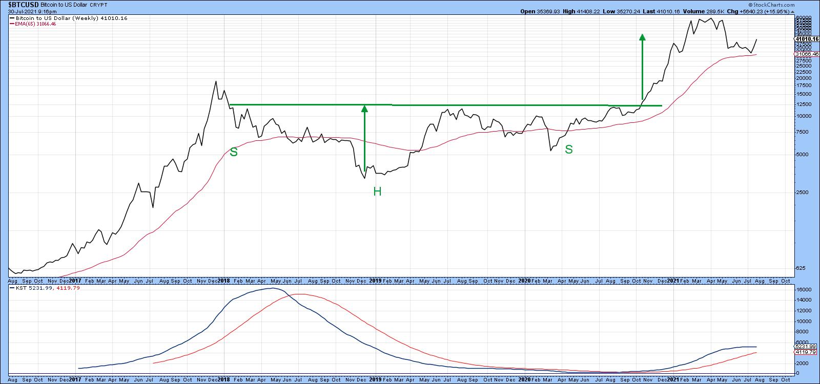 Chart 1This Week's Breakout Chart 1This Week's Breakout
Chart 2 shows recent action in greater detail. First, a selling climax developed in mid-May. This was followed by a whipsaw break to the downside in mid-June. However, it was never confirmed by a positive trendline penetration or MA. A second whipsaw developed at the start of last week. This one, though, has been confirmed. That confirmation took the form of a break above the dashed green down trendline and 50-day MA. Volume started to kick in with Monday's sharp rally, which is also a positive sign.
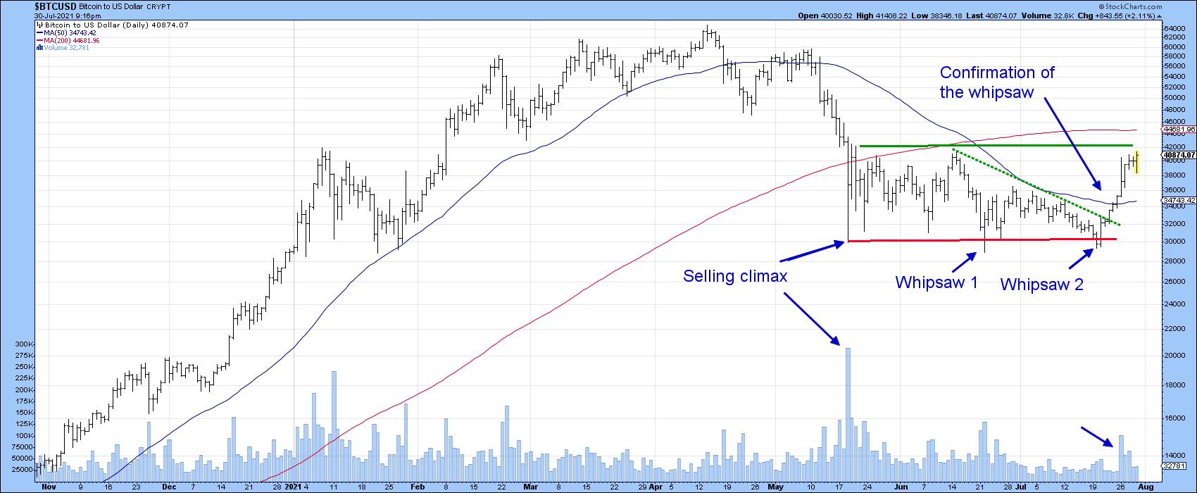 Chart 2Resistance, first of all, exists at the June high at $42,000 and, second, in the area of the 200-day line at around $44,000. Usually, a confirmed whipsaw or false break is followed by an above-average move in the opposite direction to the break. That occurs because many traders bet on the false signal and are forced to quickly get back on the right side of the market. In this case, it could be attributed to traders who incorrectly interpreted the post-May action as a bearish continuation head-and-shoulders formation. Chart 2Resistance, first of all, exists at the June high at $42,000 and, second, in the area of the 200-day line at around $44,000. Usually, a confirmed whipsaw or false break is followed by an above-average move in the opposite direction to the break. That occurs because many traders bet on the false signal and are forced to quickly get back on the right side of the market. In this case, it could be attributed to traders who incorrectly interpreted the post-May action as a bearish continuation head-and-shoulders formation.
Higher prices look likely over the near-term as the short-term KST, featured in Chart 3, has only just gone bullish. The chart indicates that, during a strong bull run, signals 1-7 were each followed by healthy gains. Signals 8-10 developed during the mini-bear market and were not successful. The current one is likely to do well since the price was recently at a marginal new closing low and the KST at a much higher level than its June bottom. This positive divergence has been flagged with the two dashed-green arrows.
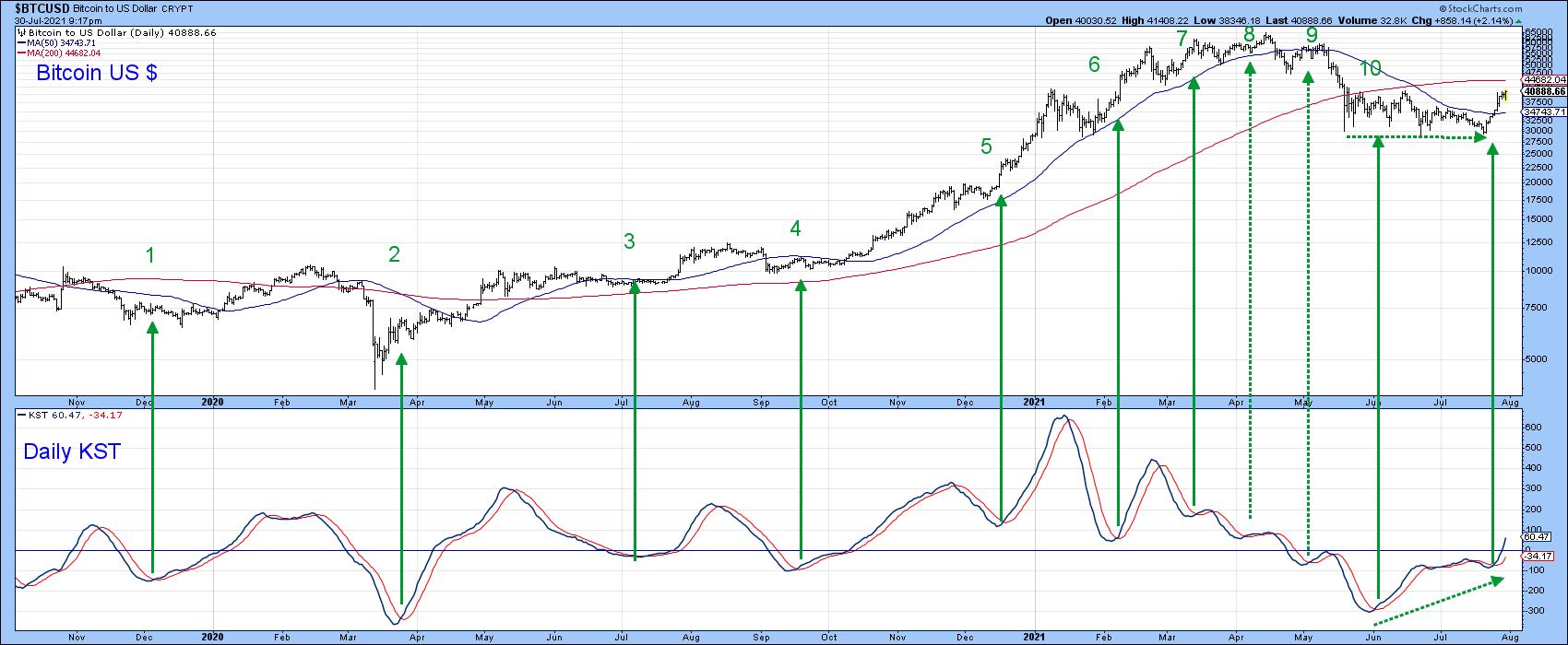 Chart 3Charts 4-6 of differing cryptocurrencies show that the current rally is broadly based, as Monero, Litecoin and Etherium have all broken to the upside. Etherium is of particular interest because it is already above its 200-day MA, unlike the rest, which are not. Chart 3Charts 4-6 of differing cryptocurrencies show that the current rally is broadly based, as Monero, Litecoin and Etherium have all broken to the upside. Etherium is of particular interest because it is already above its 200-day MA, unlike the rest, which are not.
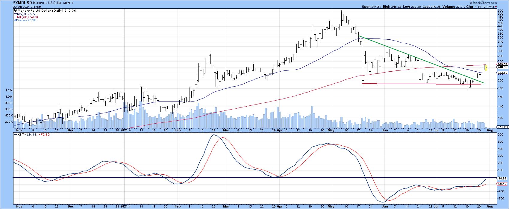 Chart 4 Chart 4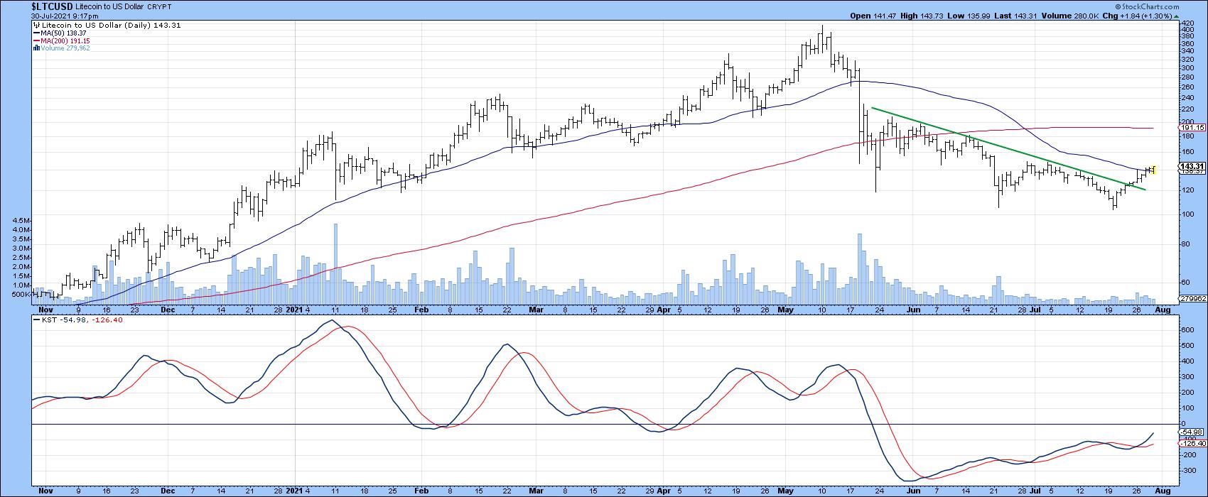 Chart 5 Chart 5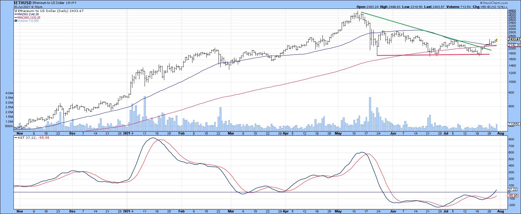 Chart 6Chinese Equities are Starting to Break Down Chart 6Chinese Equities are Starting to Break Down
The cryptos may be heading north to their 200-day MAs, but Chinese equities are moving in the opposite direction. That's because this week's action took the Shanghai Composite back below its 200-day line.
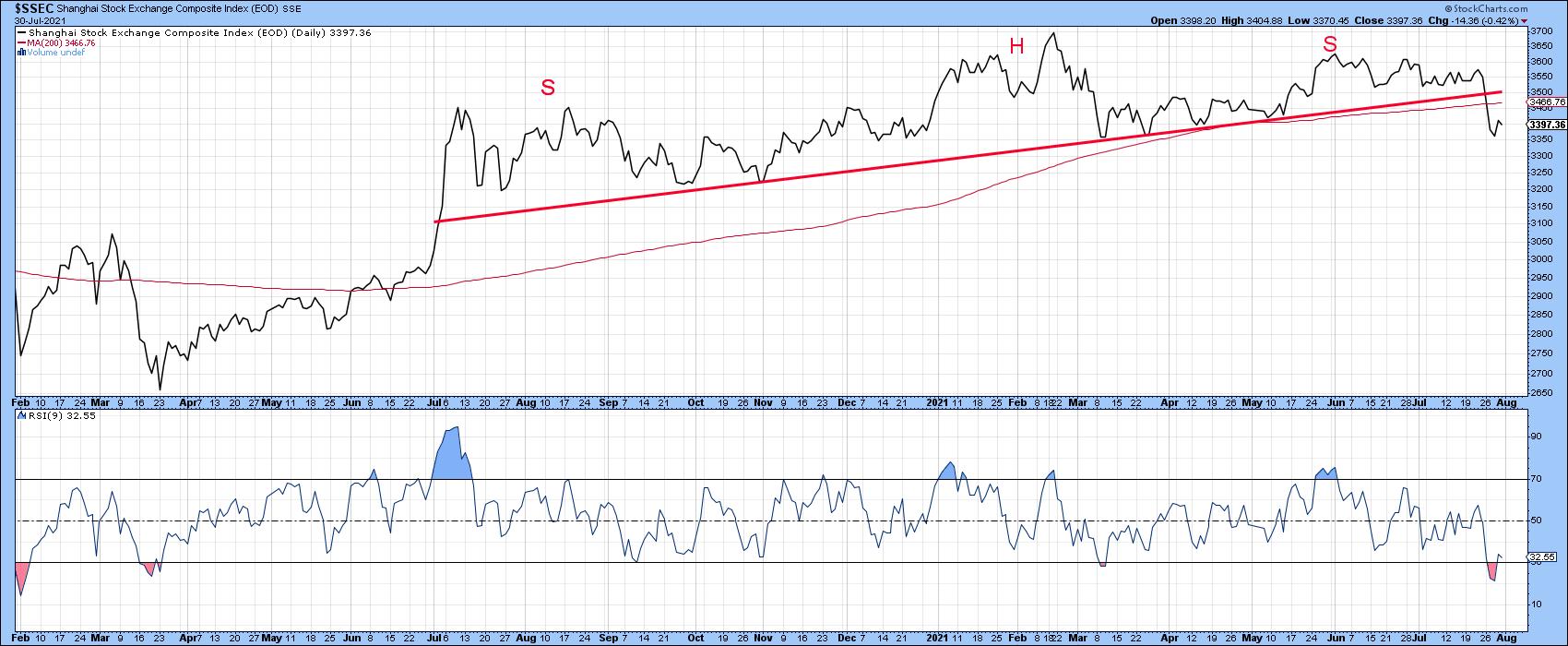 Chart 7 Chart 7
That same move pushed it below the 2020-2021 up trendline, which is effectively the neckline of a bearish upward-sloping head-and-shoulders pattern. If that break holds and the 65-week (Chart 8) EMA does not, such action will likely trigger a long-term KST sell signal. Its short- and intermediate-term counterparts (Chart 8) are already in a marginally bearish mode, so near-term downside pressure looks likely.
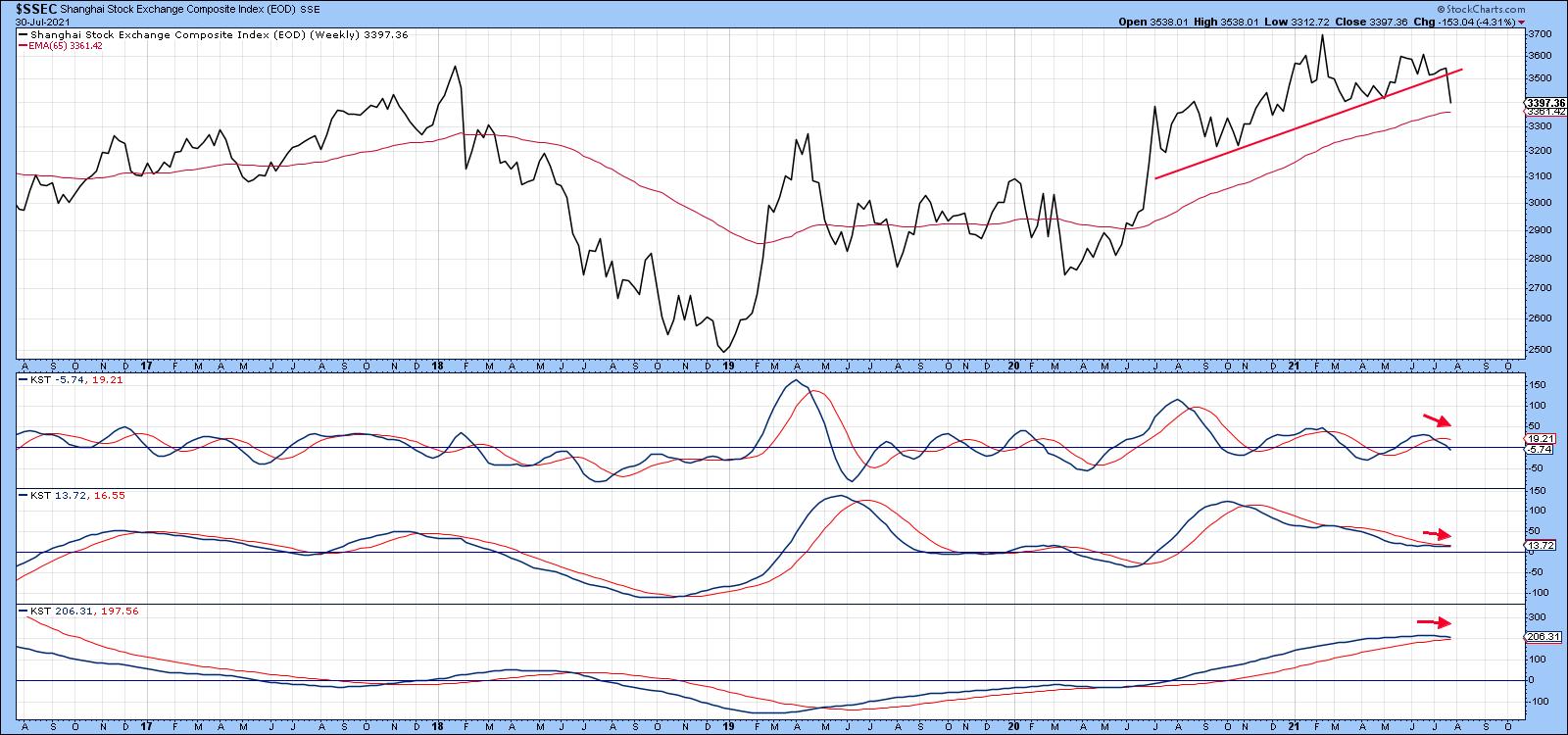 Chart 8The most liquid market average-related Chinese ETF is the iShares MSCI China Fund (MCHI), which is even weaker than the Shanghai Composite. Chart 9 shows that it has completed a 1-year top and dropped decisively below its 65-week EMA. Relative action has been even more questionable, with the violation of a 5-year up trendline and distinct long-term KST sell signal. Chart 8The most liquid market average-related Chinese ETF is the iShares MSCI China Fund (MCHI), which is even weaker than the Shanghai Composite. Chart 9 shows that it has completed a 1-year top and dropped decisively below its 65-week EMA. Relative action has been even more questionable, with the violation of a 5-year up trendline and distinct long-term KST sell signal.
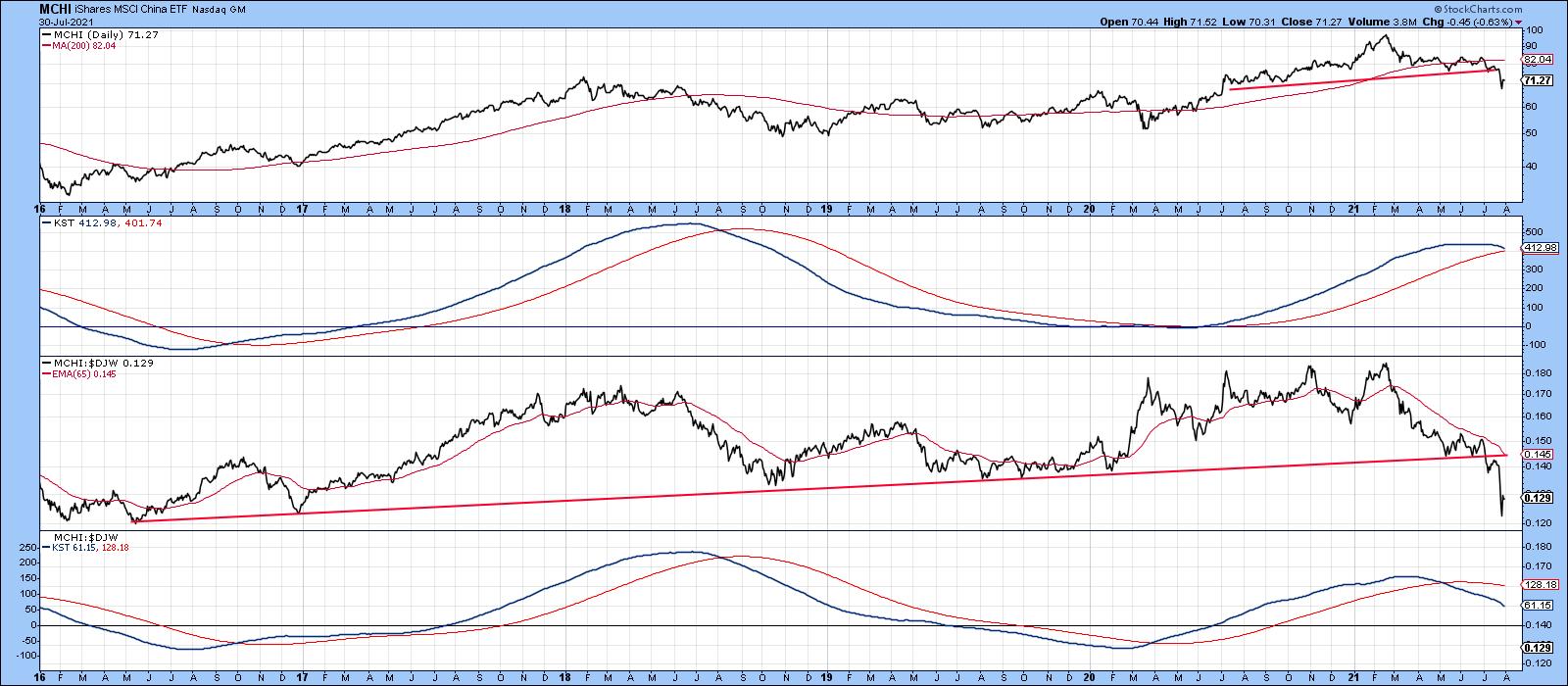 Chart 9Good luck and good charting, Chart 9Good luck and good charting,
Martin J. Pring
This article is an updated version of an article previously published on Monday, July 26th at 7:22pm ET in the member-exclusive blog Martin Pring's Market Roundup.
The views expressed in this article are those of the author and do not necessarily reflect the position or opinion of Pring Turner Capital Group of Walnut Creek or its affiliates.Chartwatchers update
|
| READ ONLINE → |
|
|
|
| ChartWatchers |
| PayPal's Pullback May Be a Broader Signal |
| by David Keller |
Markets in healthy uptrends, with improving bullish characteristics, see price breakouts follow through to further upside. Stocks like AAPL and AMZN and PYPL and others break above previous resistance levels and continue to push onward and ever upward.
Except that was not the upside follow through scenario that the markets provided this week, was it?
Earlier this week, I had the pleasure of hosting our latest episode of The Pitch, featuring top ideas from Mark Newton, CMT, Jeff Huge, CMT and Greg Schnell, CMT. They each had the opportunity to highlight five stock ideas and defend their picks using the charts. The only group that was represented in all three of their presentation was the payment processing group, particularly MA, SQ and PYPL.
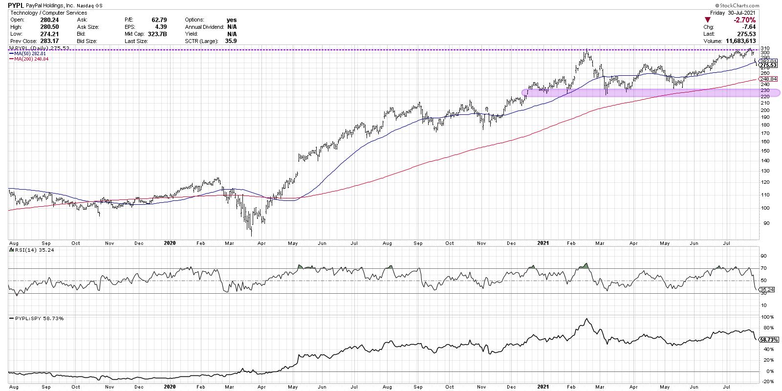
The chart of PayPal stuck out to me because, while other key names like AAPL and AMZN had already broken above their previous highs, PYPL was actually approaching this key resistance level from below. Would there be enough buying power to push this stock to new highs?
The answer this week was "no"... or at least "not yet."
If I was bullish in the medium term (which I am not), I would be concerned by mega-cap stocks that break out to new highs, only to drop back below the breakout level soon after.

On the chart of PayPal, I would be concerned that, instead of a blowout earnings release propelling the stock to new heights, we saw an underwhelming earnings report that caused the price to top out at $310, almost exactly where it peaked back in February.
Macro thesis aside, what does this pullback mean for PYPL?
I think this chart provides a master class in support and resistance levels. $310 appears to be the ceiling for this name until proven otherwise. If we get a bounce next week, I would assume many PYPL investors will be keyed on this level to determine whether there is upside potential.
It's worth noting that Friday's down day pushed the price below its 50-day moving average for the first time since May. As the S&P 500 has continually found support at its 50-day moving average, it's telling that 44% of S&P 500 members are now below their own 50-day moving averages.
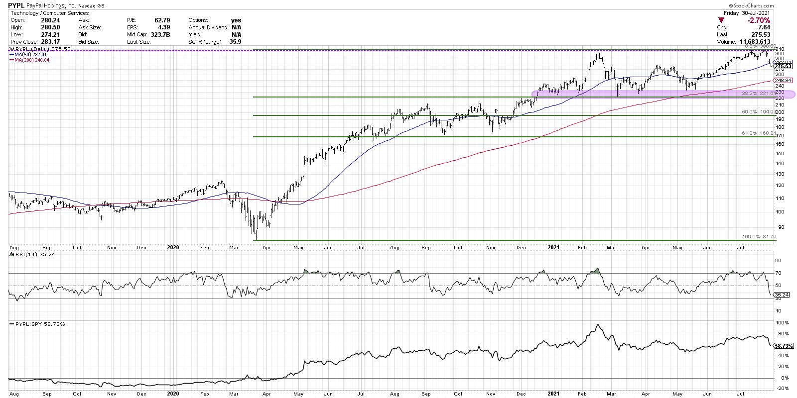
If this week's selloff in PayPal continues into next week, I would focus on two key levels. The 200-day moving average currently lies around $250; further below, we have a consistent support range in the $220-230 area. Remaining above this range would be an important bullet point in the long-term bull thesis for PYPL.
One final observation is that the Fibonacci retracements line up quite well here.

If you use the March 2020 low and the February 2021 high, you'll see that the 38.2% retracement level falls right within the support range indicated. This gives even more validation to the importance of support around 222-225.
As my Market Trend Model remains bearish on the medium-term timeframe, I'm compelled to think more about potential risk than potential return. Stocks like PYPL failing at resistance seem to validate that cautionary thesis.
Want to see digest this article in video format? Just head to my YouTube channel!
RR#6,
Dave
PS- Ready to upgrade your investment process? Check out my free course on behavioral investing!
David Keller, CMT
Chief Market Strategist
StockCharts.com
Disclaimer: This blog is for educational purposes only and should not be construed as financial advice. The ideas and strategies should never be used without first assessing your own personal and financial situation, or without consulting a financial professional.
The author does not have a position in mentioned securities at the time of publication. Any opinions expressed herein are solely those of the author, and do not in any way represent the views or opinions of any other person or entity.
|
| READ ONLINE → |
|
|
|
| John Murphy's Market Message |
| S&P 500 TOUCHES NEW RECORD |
| by John Murphy |
S&P 500 TOUCHES NEW RECORD... Stocks continue to rise with major stock indexes at or near record highs. Chart 1 shows the S&P 500 touching new record territory. Smaller stocks have been lagging behind the large cap rally. But are starting to look stronger. That includes small caps and midsize stocks.
 Chart 1 Chart 1
MID CAP INDEX CLEARS 50-DAY LINE...Chart 2 shows the S&P 400 Mid Cap Index rising decisively above its 50-day moving average today. Its short-term momentum indicators in the upper and lower boxes are also turning positive. That's also a positive sign for the market as whole. Small caps are gaining as well.
 Chart 2 Chart 2
SMALL CAPS LOOK STRONGER...Small caps are having a strong day as well. Chart 3 shows the Russell 2000 iShares (IWM) rising to a two-week high and nearing a test of its 50-day line. Small caps have been lagging behind large caps since the start of the second quarter. So it's encouraging to see them starting to attract new buying.
 Chart 3 Chart 3
|
| READ ONLINE → |
|
|
|
|
|
| ChartWatchers |
| Hottest Stocks in The Hottest Industries |
| by Tom Bowley |
It's no secret that I'm a fan of leading stocks in leading industries. So, as we move through yet another earnings season -- and there's still plenty left in it -- I thought I'd review what I consider to be the best stocks in the best industries. Here they are, in no particular order:
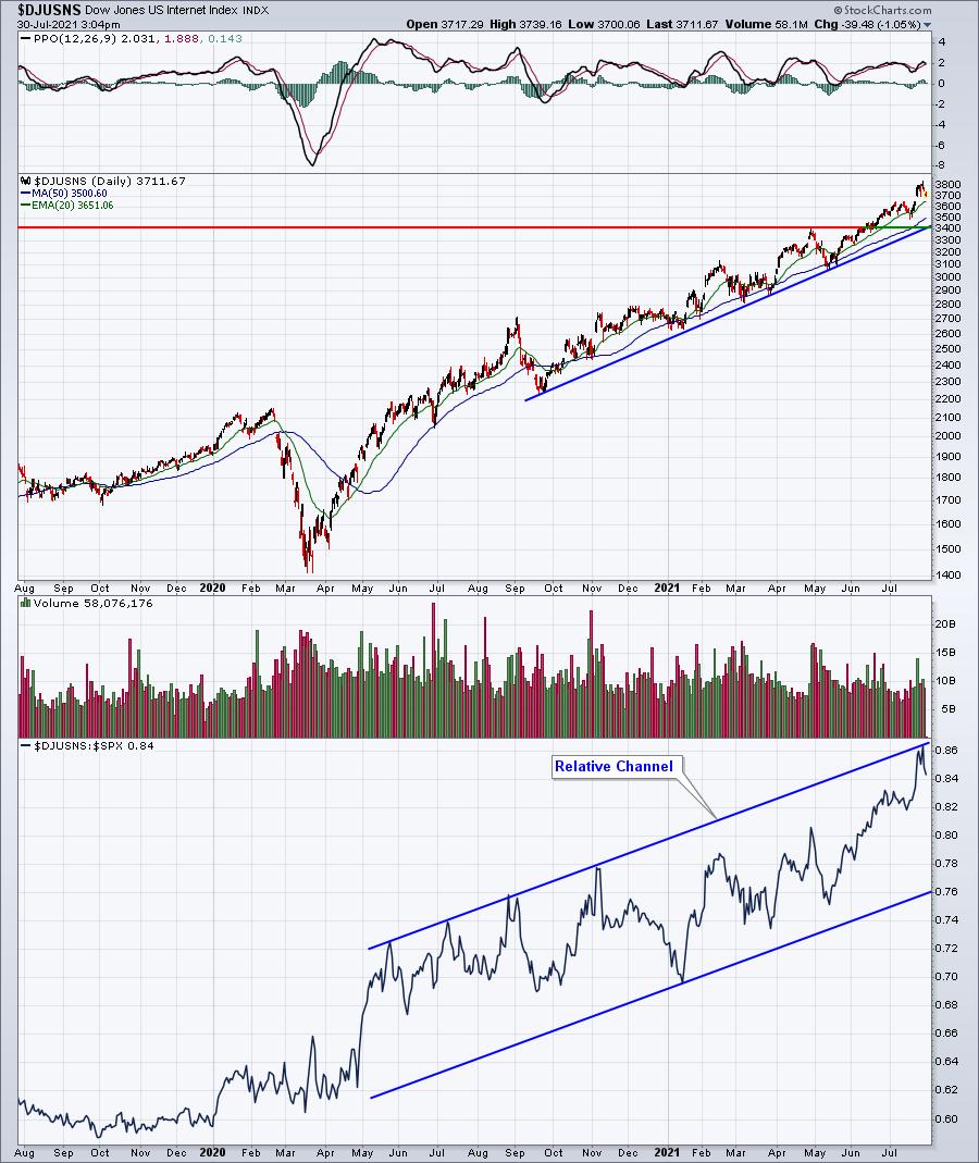
Internet ($DJUSNS)
Internet stocks have been powering forward in 2021 and remain the primary driver behind the relative strength in the communication services sector (XLC). Check out this chart:

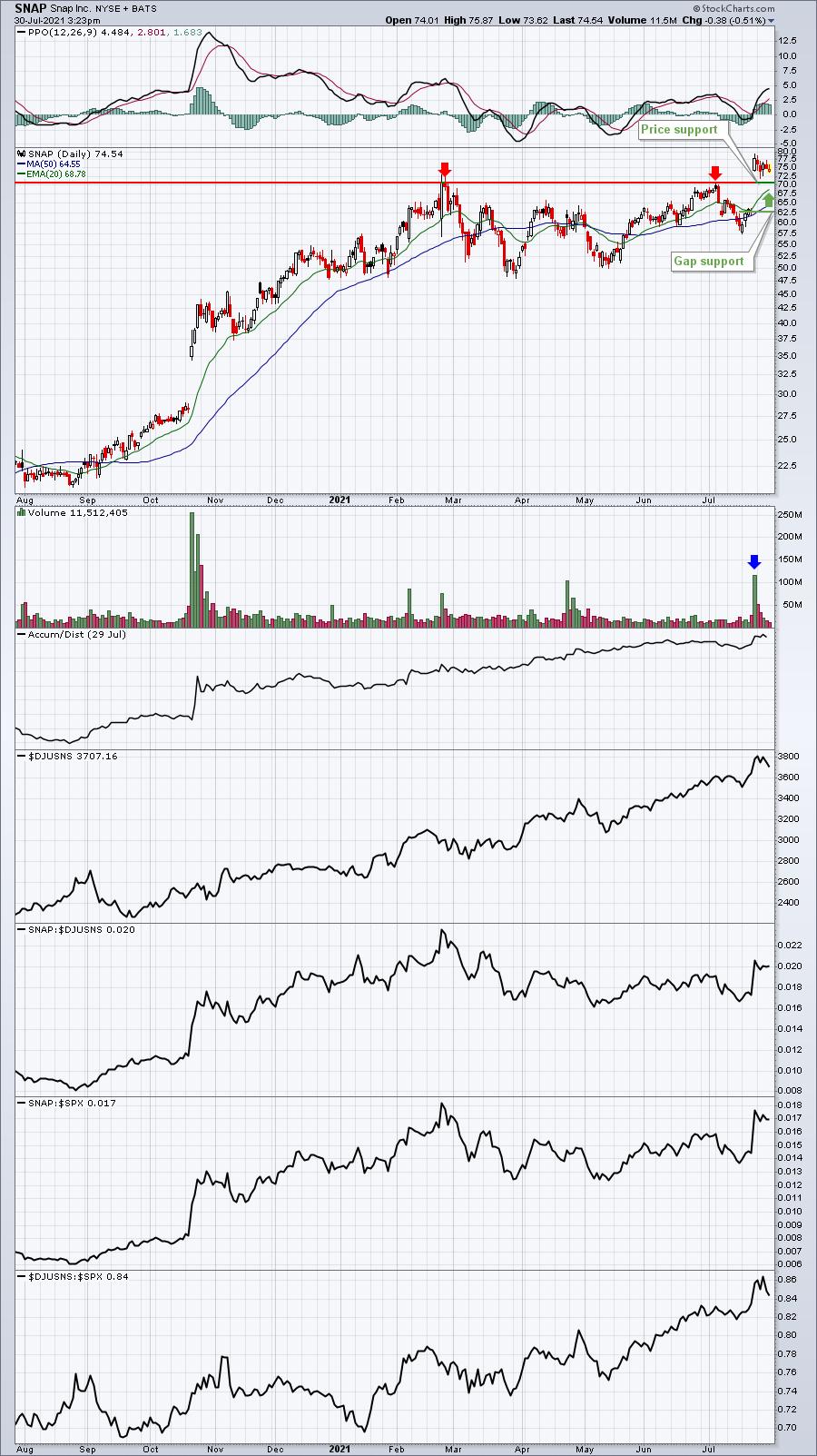
Nothing seems to slow internet stocks down, although there's been a big disparity between market reactions this quarter among some of the more widely-known internet companies. Alphabet (GOOGL), for instance, was up more than $125 per share on Wednesday morning after reporting blowout results. On Friday, though, Pinterest (PINS) fell nearly 20% after monthly user data and lowered revenue guidance spooked traders. The stock that seems to have the most interest in the group is Snap, Inc. (SNAP) after very strong volume accompanied its gap higher on earnings:

Should the stock market weaken, I believe gap or price support would serve as excellent entry points into SNAP.
Footwear ($DJUSFT)
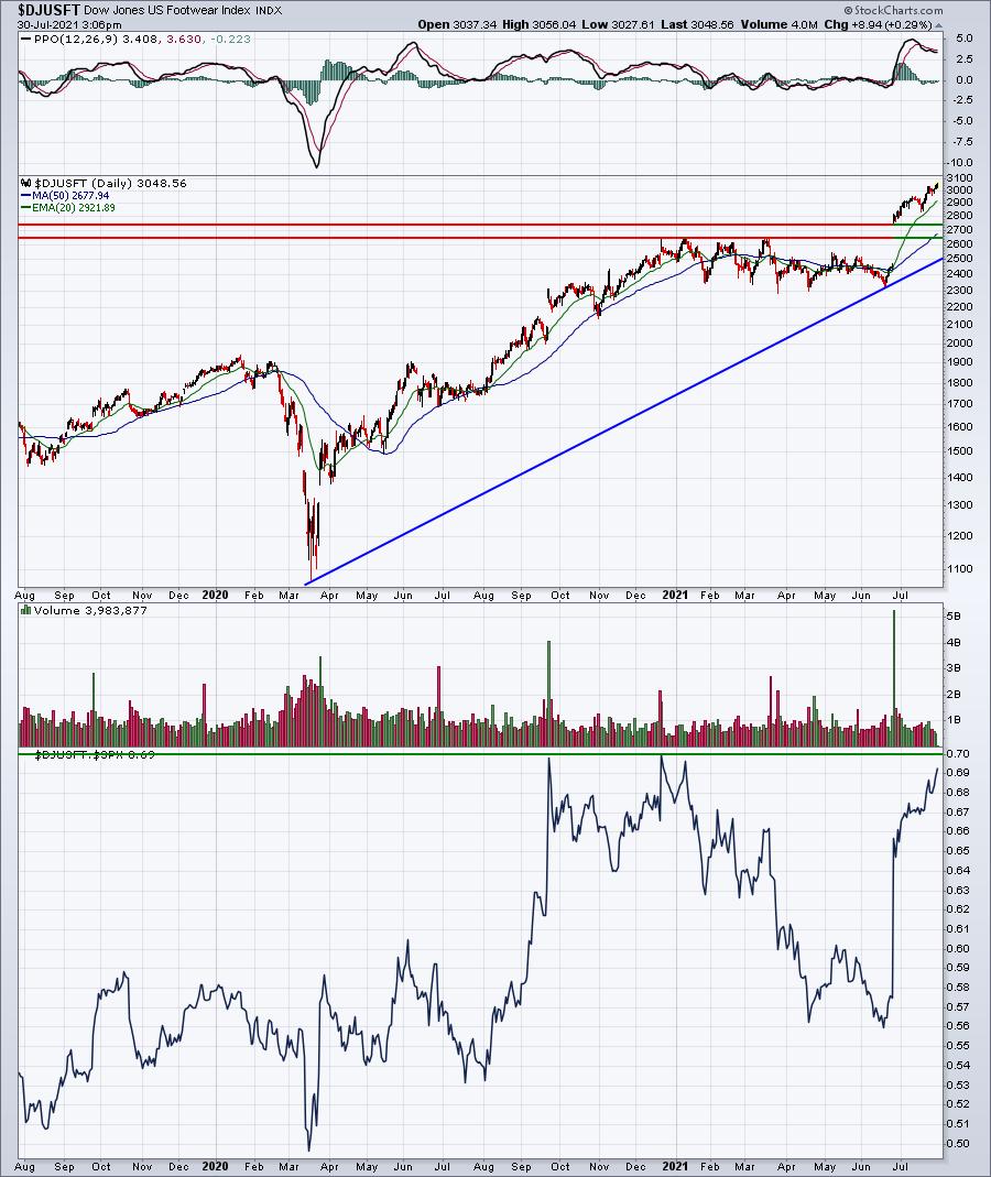
Footwear saw a huge lift when Nike (NKE) reported its quarterly results in June. Since that time, both Crocs (CROX) and Skechers (SKX) have also delivered blowout numbers, resulting in the latest breakout in the DJUSFT:

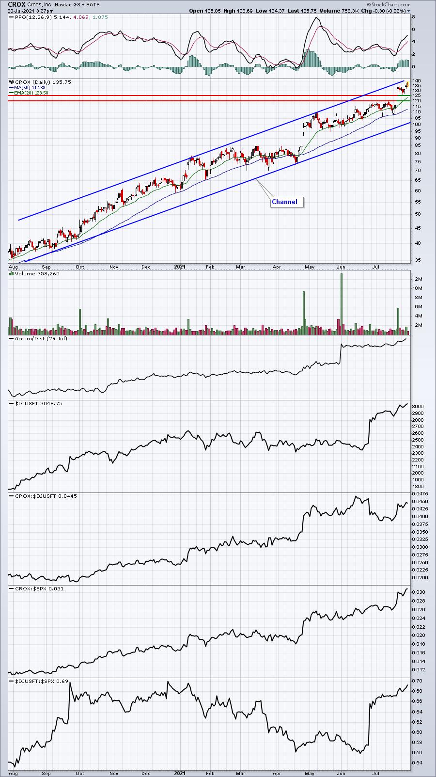
Footwear's relative strength has been a lot choppier, but there's no denying the current relative strength. I'd grow even more bullish if the DJUSFT can break out above its relative highs in the second half of 2020. For my money, CROX has been the consistent winner, but others may opt for NKE given its longer-term stability and track record. Here's a quick look at CROX:

Specialty Finance ($DJUSSP)
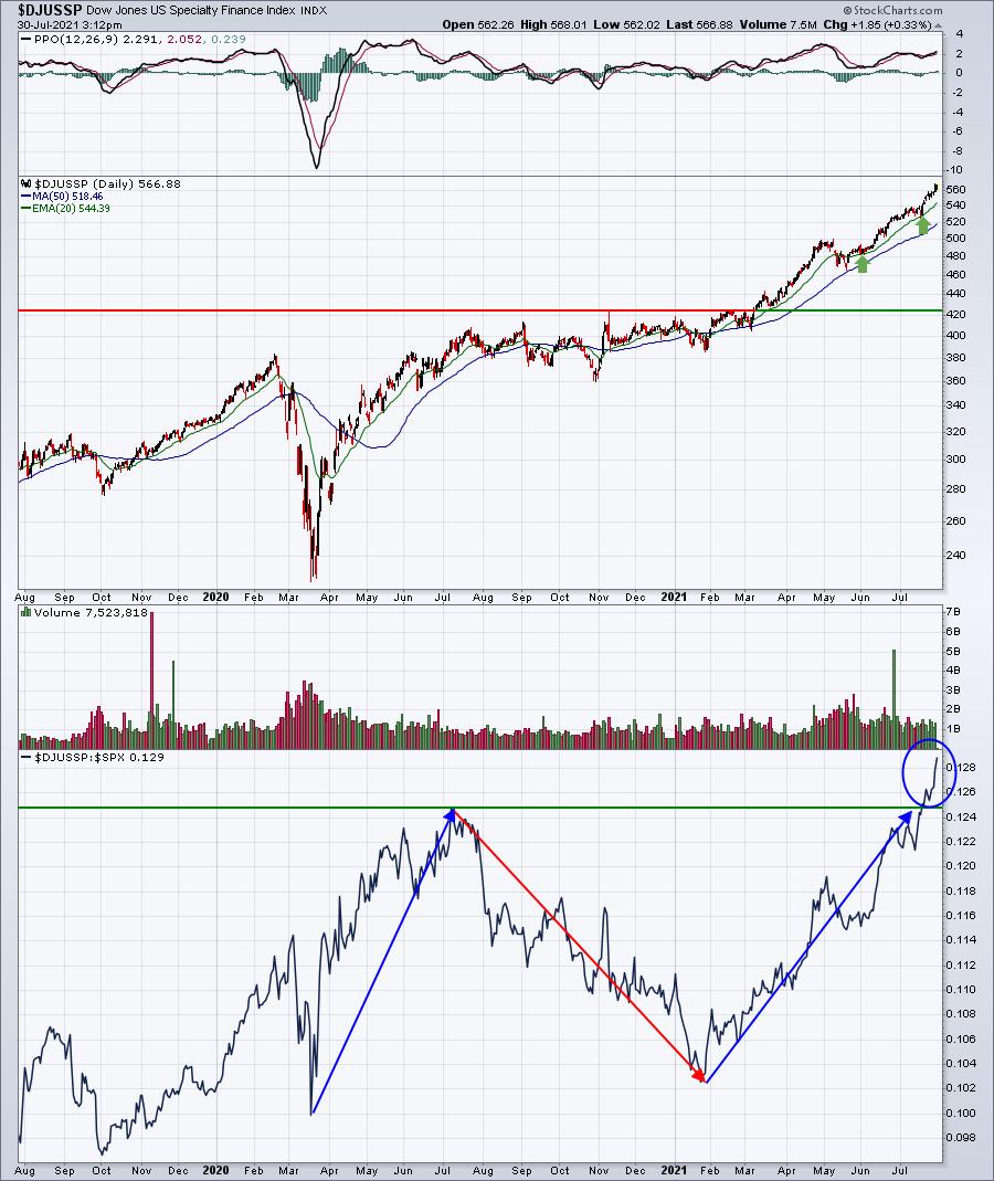
Specialty finance was one of the biggest absolute and relative winners during the early stages of the pandemic, but its relative strength fell apart from the middle of 2020 until late January 2021. Relative strength has returned, however, in full force:

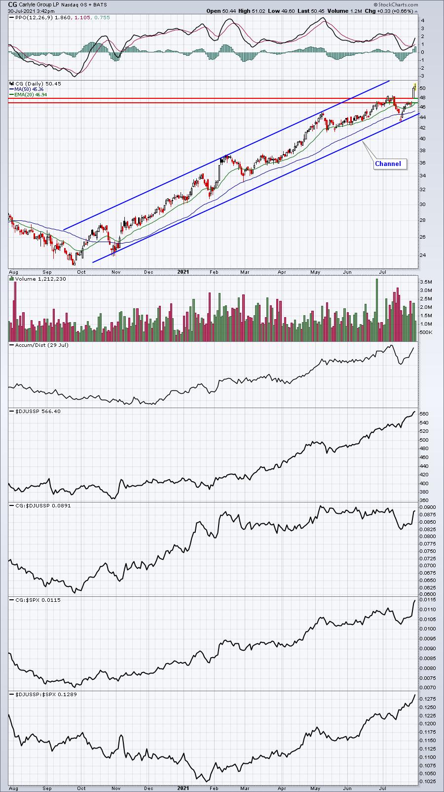
The stock I like in this space is Carlyle Group (CG). There have been a number of excellent earnings reports out recently in specialty finance and that includes CG, but CG has enjoyed big volume to accompany the recent advance:

Tracking great earnings and bullish momentum is one of things we do at EarningsBeats.com. Stocks like the three provided above will be part of our Strong Earnings ChartList (SECL). There are typically anywhere from 400 to 600 charts on this ChartList at any given time, always providing fresh trading opportunities among those stocks that beat Wall Street consensus estimates as to both revenues and EPS.
Do you think the PE ratios are too high, based on history? In my opinion, it's the absolute biggest mistake that investors and traders are making right now -- trying to call a major market top because PEs are too high. The "P" in PE is price and price ALWAYS anticipates future earnings growth. We're seeing no signs of earnings growth slowing down. In fact, I'll have some eye-popping statistics on earnings season thus far in my Monday EB Digest newsletter. This newsletter is 100% free with no credit card required. If you haven't already subscribed, you'll want to CLICK HERE to enter your name and email address in the spaces provided.
Happy trading!
Tom
|
| READ ONLINE → |
|
|
|
| Art's Charts |
| The 10-yr Yield, Banks, Techs and Rotation |
| by Arthur Hill |
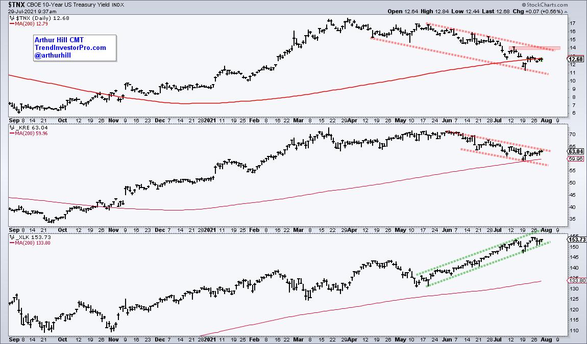
The decline in the 10-yr yield is not the only factor at work in the markets, but there is clearly a correlation at work recently, especially with banks. The chart below shows the 10-yr Yield ($TNX) and Regional Bank ETF (KRE) falling from mid May to July. Meanwhile, the Technology SPDR (XLK) advanced sharply during this timeframe.

The 10-yr yield and KRE are testing their rising 200-day SMAs and both have falling channels working. A channel breakout in the 10-yr yield would put a different dynamic at work in the markets and this could be bullish for banks. I would not consider this outright bearish for tech-related ETFs, but such a signal could kick off another rotation within the stock market.
As the name suggests, TrendInvestorPro specializes in trend identification and finding short-term bullish setups within the bigger uptrend. We constantly monitor a core ETF list with over 120 names and regularly update trend signals. Click here to subscribe and get immediate access to our reports and videos.
---------------------------------------------
|
| READ ONLINE → |
|
|
|
| ChartWatchers |
| A Warning From Small Caps Weakness Across The Board |
| by Julius de Kempenaer |

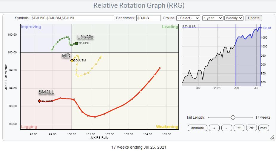
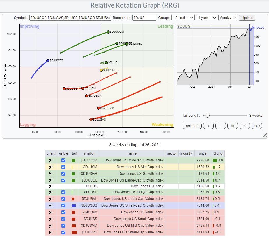
The Relative Rotation Graph showing the rotations for Large-, Mid- and Small-Cap indexes is sending a very clear message: Avoid Small-Caps. (And also Mid-Caps.)
The large-cap segment pushes further into the leading quadrant, while small-caps are on a very long tail moving deeper into negative territory. It looked as if the tails for mid- and small-caps were curling back up and on their way towards the leading quadrant for a continuation of their relative uptrend during May and June. Meanwhile, large-caps were rolling over inside, improving and heading back towards lagging.
That situation changed 4-5 weeks ago, when small-caps rapidly started accelerating towards and into the lagging quadrant, followed by mid-caps. At the same time, large-caps picked up the pace again and now crossed over into the leading quadrant.
Although it is not a "hard rule," it is generally a weak sign for the market when Small-Caps (rapidly) deteriorate. In bull markets, investors are happy to invest in small-caps looking for the next 10- or 100-bagger. However, when the going gets tough, many of them revert to well-known, usually large- or even mega-cap names, as a "safe haven."
Growth-Value

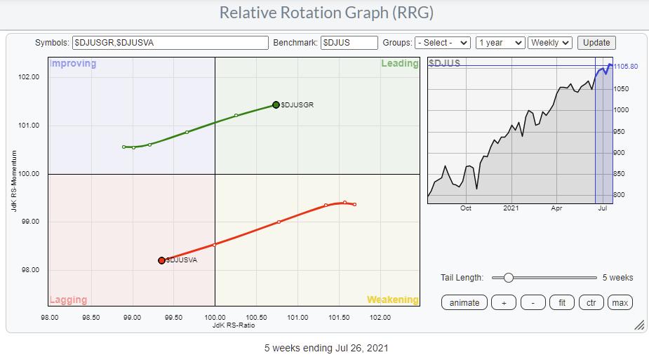
The Growth-Value relationship is sending a conflicting message at the moment. Since the start of 2021, the DJ US Value index has moved on the right-hand side of the RRG (and the Growth index), indicating a preference for Value stocks. In general, that is a situation that is considered "weak" for the general markets, as big rallies are mostly carried by the performance of growth stocks.

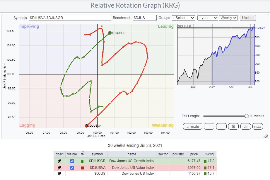
If we extend the tails out to the maximum of 30-weeks, we see that the actual difference in performance between these two segments is negligible, 17.2% vs. 17.1%. So we have to conclude that the relative trend for Value was only marginally better during that entire period. Only in the first few months of the year was Value really in much better shape than Growth, but the latter has caught up rapidly, and both are now at very similar performance levels.
Given that SPY managed to add similar gains over the same period, there was not much Alpha to be gained by playing either Growth or Value unless you switched at the end of May.
Breaking Growth and Value Down Into Sizes.

Combining both of these RRGs into one gives the image above. This chart holds the Growth and Value indexes and the Size indexes of the previous RRGs above. But it also adds the large-, mid- and small-cap segments for Growth and Value, which gives a much more granular view on where the relative performance is found in the market.
Looking in the table below the RRG, you can see that the red lagging quadrant is dominated by the small-cap index and all sizes of the Value segment. The green, leading quadrant holds the large-cap and the growth indexes and both the mid- and large-cap Growth variants. The only growth index missing is the small-cap growth index, which is far away to the left, just inside the improving quadrant but at the lowest RS-Ratio reading. This tells me that the small-cap component of the Growth segment is lagging the general improvement visible for Growth in general.
Small-caps and Small-Cap Value are inside lagging and heading lower on both axes. On the other hand, Small-Cap Growth is inside improving, but at the lowest RS-Ratio level, which means that there is a decent chance that the tail will roll over before hitting the leading quadrant.
All in all, a pretty negative reading for the entire small-cap universe. As long as that situation continues, I remain on my guard concerning the ability of SPY to move considerably higher. The current (imho) risk does not outweigh the upside potential at the moment.
#StaySafe and have a great weekend, --Julius
My regular blog is the RRG Charts blog. If you would like to receive a notification when a new article is published there, "Subscribe" with your email address.
|
| READ ONLINE → |
|
|
|
| ChartWatchers |
| Stocks Setting Up for Big Moves Next Week! |
| by Mary Ellen McGonagle |
Over the past couple of weeks, over 50% of the companies in the S&P 500 have reported results for Q2 2021. Of those, 88% have reported EPS results above estimates. This is well above the average over the past five years.
The markets are all about future growth, however, and the good news is analysts are upgrading their EPS estimates for Q3 by an average of 3.6%. This marks the third largest increase in EPS estimates during the first month of a quarter in eleven years. (source: Factset Research)
Even better news, many of those companies that reported strong 2nd quarter earnings and also had their estimates revised higher are posting huge gains. Each of the top performers from the S&P 500 last week was a company that came in ahead of estimates and had their outlooks upgraded.
Below are four of many examples, and their average gain for the week was 11% -- well above the S&P 500's generally flat performance.
TOP PERFORMERS IN S&P 500 LAST WEEK

It's not too late to capitalize on this market action, as there are plenty more corporations due to report their 2nd quarter results. Below are two companies due next week. They're in industry groups where peer companies have seen explosive moves following strong results, as they provide products that are in high demand.
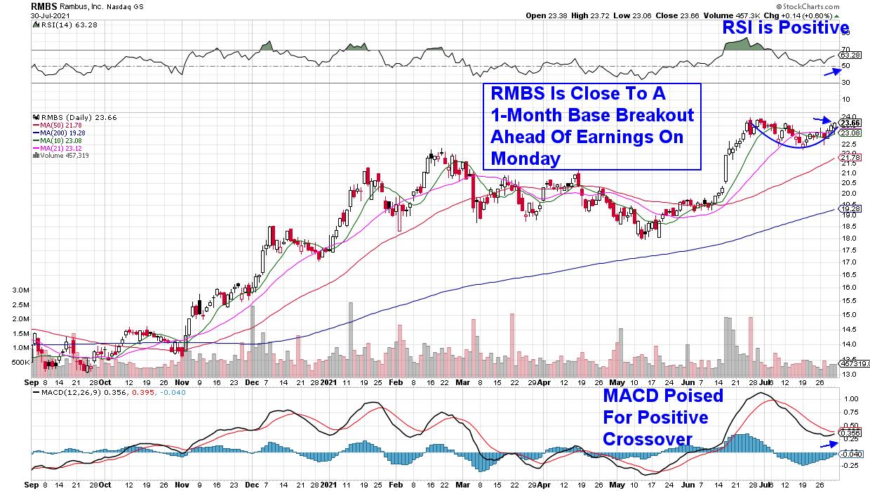
First up is Small Cap Semiconductor stock Rambus (RBMS), which provides chip design products for the computing, gaming and graphics market. Analysts are anticipating 2nd quarter earnings to grow 875% vs. last year as demand for their products has grown substantially.
RBMS is in the same industry as much larger Applied Micro (AMD), which is listed among the outperformers above. In addition to bullishly receiving a price target upgrade last week, Rambus is a hair away from a 1-month base breakout at $24. The company is due to report earnings after the market's close on Monday.
DAILY CHART OF RAMBUS, INC. (RMBS)

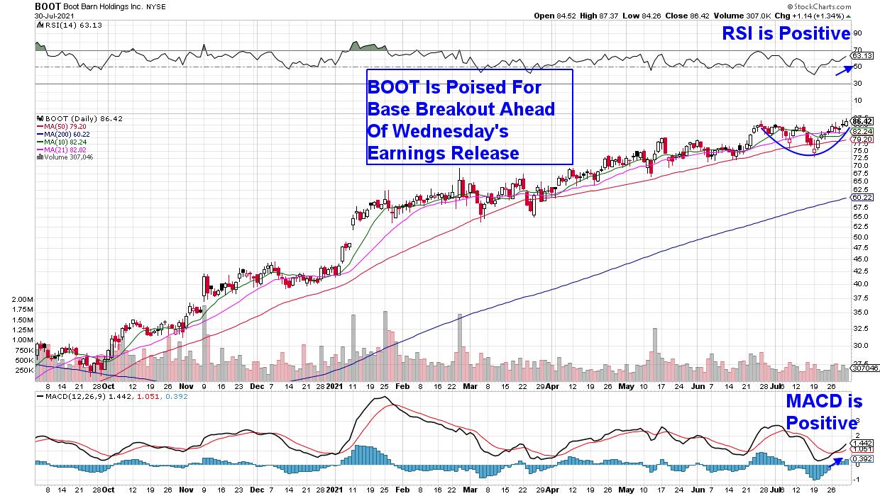
Next up is Western footwear and apparel retailer Boot Barn (BOOT) which is due to report earnings after the market closes on Wednesday. The average estimate is calling for $1.16 in earnings per share, which would be well above last year's negative report due to the pandemic.
BOOT also received a price target upgrade last week ahead of their report, and the stock is in the strong Footwear group, where several peer names such as Crocs (CROX) have gapped up to new highs after coming in ahead of estimates, with analysts raising estimates going forward.
DAILY CHART OF BOOT BARN HOLDINGS, INC. (BOOT)

When searching for additional stock candidates that may far outpace the markets following the release of their 2nd quarter results, here are some key attributes that will improve your success:
First, you'll want the stock to be part of an Industry Group that's seen a number of companies beat estimates and guide higher. This means you're in an area that is experiencing high product demand.
Subscribers to my MEM Edge Report were introduced to West Pharmaceutical (WST) in late April, as it was breaking out of a lengthy base following strong 1st quarter results. The stock is among the top performers (above) as, last week, it gained 9% following another strong quarter. The Medical Supply company provides inject-able drug delivery products which have seen increased demand as vaccine rollouts continue globally.
Another attribute is an analysts' upgrade within 2 weeks of the earnings release. Wall Street analysts are not going to put their neck on the line unless they have some researched insight that have them positive. With Advanced Micro (AMD) listed above, Citigroup finally turned bullish on the stock 2 weeks prior to the company's earnings.
Lastly, a bullish chart is always going to provide an advantage. You'll want the stock to be trading above key support and in an uptrend. While many Bank stocks have been reporting very strong quarterly results, their current downtrends are holding them back from trading higher on the news.
Of course, you'll need the broader markets to remain positive for the above strategy to work. Subscribe to my bi-weekly MEM Edge Report to remain on top of the broader markets, while also being alerted to stocks poised to outperform the broader markets. Use this link here for a special 4-week trial offer!
Warmly,
Mary Ellen McGonagle, MEM Investment Research
In this week's edition of StockCharts TV's The MEM Edge, I review last week's market dynamics and uncover what's supporting the continued uptrend in the broader markets. I also share how to capitalize on the strength in 2nd Quarter GDP. Watch now!
|
| READ ONLINE → |
|
|
|
| The Canadian Technician |
| These Industries are Getting Some Attention |
| by Greg Schnell |
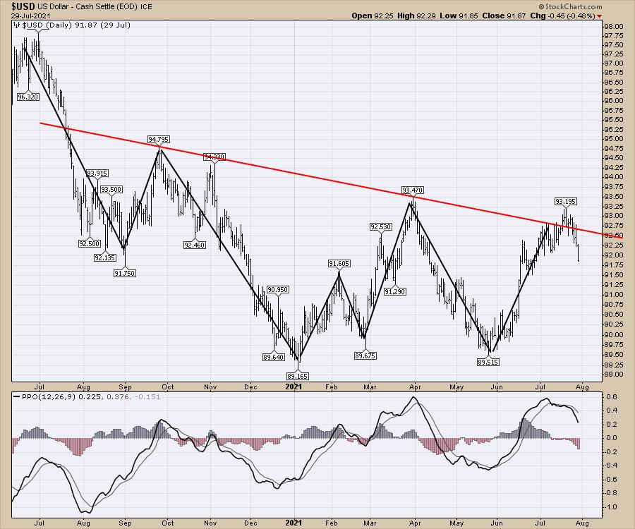
The dollar sits at a key level. It broke the downtrend, but failed at the breakout to a higher high at 93.5. So far, the dollar looks comfortably on the way lower. Friday's price action is not shown.

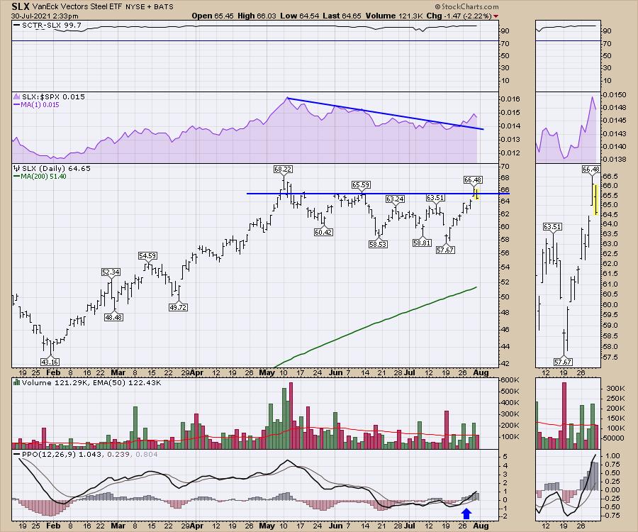
The commodities markets surged nicely this week on the back of a weakening US Dollar. However, the steel chart is at a very important level to keep going from. The breakout Thursday to 2-month highs looks great. The failure to hold that breakout Friday looks concerning! One day does not make a trend, but we need to see the steel stocks behind this ETF continue higher.

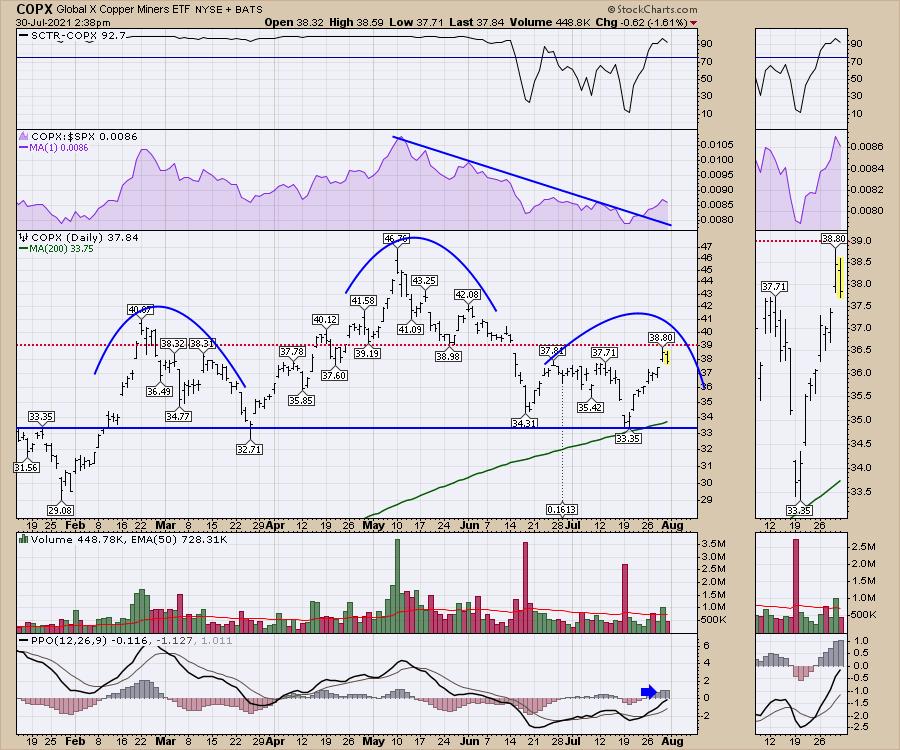
Secondly, the copper miners also look strong, but this is an important level to keep going from. Currently, there is a potential topping structure in place with a neck line at $33. The chart is trying to make new one-month highs in relative strength (shown in purple). I do not like the chart stalling Friday at the $39 level, which just happens to be the major support/resistance line (red) for the chart. It's important to see this follow-through, as the momentum rolling over at zero (PPO) would point to a problem.

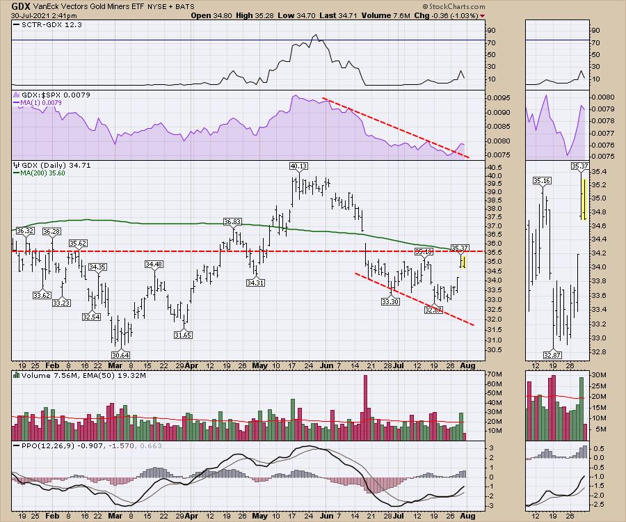
Lastly, the gold miners. These have been weak since they topped out a year ago. The relative strength in purple is trying to make new one-month highs. Currently, the chart is stalling below the 200-day moving average and the horizontal support resistance line in red. If the dollar continues lower, I would expect this chart to pop meaningfully.

While these all looked great on Thursday, the weight of the market on Friday looks heavy, as all the indexes were declining to end the day, the week and the month.
It's an important place to pay attention to both the dollar and and these metal-related ETFs. I expect a breakout to the topside. Will I be on the right side of the trade? We'll know more next week.
|
| READ ONLINE → |
|
|
|
| Analyzing India |
| Week Ahead: NIFTY Stays Crucially Poised; RRG Charts Hints At Markets Turning Defensive |
| by Milan Vaishnav |
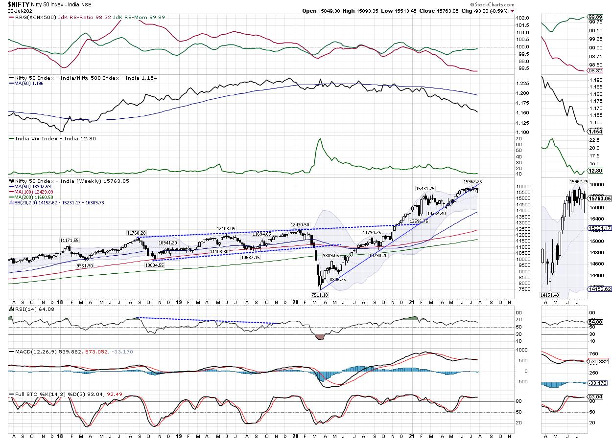
It was one more consolidating week for the Indian equity markets, as the NIFTY continued to consolidate over the past five days. Despite a couple of attempts, it failed to clear the important resistance zone of 15900-15950 and suffered violent profit-taking twice from those levels. On the short-term daily charts, it has kept its head above crucial closing supports; however, on the weekly chart, it looks evidently weaker. The trading range remained a bit wider; the index oscillated 379 points during the week but did not make any major directional call. The headline index ended with a net loss of 93 points (-0.59%) on a weekly basis.

The weekly charts continue to paint a precarious picture for the markets. The NIFTY has continued to resist to the 15900-15950 area; at the same time, it has slipped below the rising trend line support and remains underneath. This trend line is drawn from the lows seen in March 2020 and it joins the subsequent higher bottoms. This was the support for the index earlier; however, it has now slipped, and the line will pose resistance to every up move that the markets may attempt over the coming days. The volatility spiked a bit; the INDIAVIX rose by 8.84% to 12.80 on a weekly note.
In the coming days, we will continue to see the zone of 15900-15950 as a stiff area of resistance for the markets. The support on the lower side exists at 15600 and 15550. The trading range for the market is likely to remain wider than usual for the following week.
The weekly RSI is 64.08; it continues to evidently show bearish divergence against the price. If we subject RSI to regular pattern analysis, it appears that, over the past many weeks when the NIFTY was marking incremental highs, RSI was not making any fresh highs, resulting in a bearish divergence. The weekly MACD is bearish and remains below the signal line. A close examination reveals that the histogram is widening; this implies that the momentum is accelerating on the downside.
A candle with a long lower shadow occurred on the charts. The current candle resembles a classical hanging man, except that it has a small upper shadow. The emergence of such candles just below key resistance zones adds to the credibility of the overhead resistance area.
Overall, the analysis for the coming week remains on similar lines. The NIFTY will face stiff resistance at the 15900-15950 area. Even if the markets manage to inch higher, it will keep facing stiff resistance to the falling trend line support that it has violated. Given the rising nature of the trend line, the longer the NIFTY stays below this pattern resistance, the higher will be the chances of it turning weak. We continue maintaining strict trailing stop-losses while following the momentum on the upside. While continuing to stay highly stock-specific, a defensive approach and vigilant protection of profits on either side is suggested over the coming week.
Sector Analysis for the Coming Week
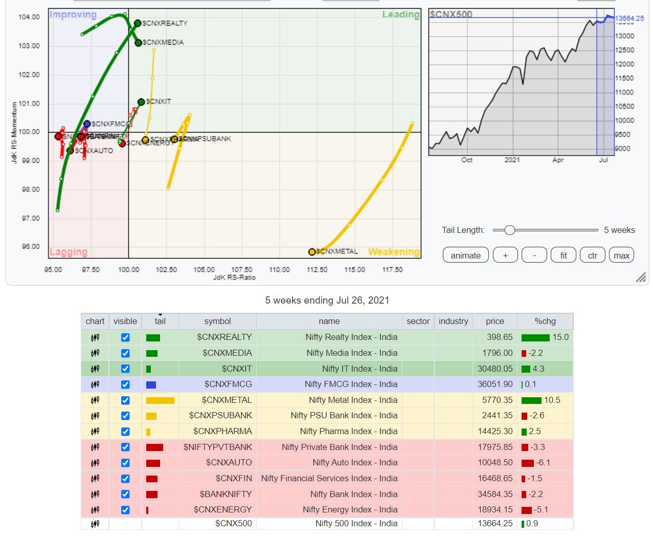
In our look at Relative Rotation Graphs®, we compared various sectors against CNX500 (NIFTY 500 Index), which represents over 95% of the free float market cap of all the stocks listed.

The review of Relative Rotation Graphs (RRG) shows the NIFTY IT Index has made a strong rollover inside the leading quadrant. It is likely to relatively outperform the broader markets, along with NIFTY Realty, which is also firmly placed inside the leading quadrant. The Media Index is also inside the leading quadrant, along with the Small Cap Index.
The NIFTY Commodities and Metal Indexes are placed inside the weakening quadrant. NIFTY, NIFTY Pharma, PSE Index and the PSU Bank Indexes have also rolled inside the weakening quadrant. This means that we will see reduced relative outperformance from these groups against the broader markets.
NIFTY Energy and BankNIFTY have rolled inside the lagging quadrant. NIFTY Auto, Financial Services, Services Sector and the Infrastructure indices also appear to be languishing inside the lagging quadrant.
FMCG and Consumption have rolled inside the improving quadrant and are expected to relatively outperform the broader markets.
Important Note: RRG™ charts show the relative strength and momentum for a group of stocks. In the above Chart, they show relative performance against NIFTY500 Index (Broader Markets) and should not be used directly as buy or sell signals.
Milan Vaishnav, CMT, MSTA
Consulting Technical Analyst
www.EquityResearch.asia | www.ChartWizard.ae
|
| READ ONLINE → |
|
|
|
| MORE ARTICLES → |
|
 Chart 1This Week's Breakout
 Chart 2Resistance, first of all, exists at the June high at $42,000 and, second, in the area of the 200-day line at around $44,000. Usually, a confirmed whipsaw or false break is followed by an above-average move in the opposite direction to the break. That occurs because many traders bet on the false signal and are forced to quickly get back on the right side of the market. In this case, it could be attributed to traders who incorrectly interpreted the post-May action as a bearish continuation head-and-shoulders formation.
 Chart 3Charts 4-6 of differing cryptocurrencies show that the current rally is broadly based, as Monero, Litecoin and Etherium have all broken to the upside. Etherium is of particular interest because it is already above its 200-day MA, unlike the rest, which are not.
 Chart 4
 Chart 5
 Chart 6Chinese Equities are Starting to Break Down
 Chart 7
 Chart 8The most liquid market average-related Chinese ETF is the iShares MSCI China Fund (MCHI), which is even weaker than the Shanghai Composite. Chart 9 shows that it has completed a 1-year top and dropped decisively below its 65-week EMA. Relative action has been even more questionable, with the violation of a 5-year up trendline and distinct long-term KST sell signal.
 Chart 9Good luck and good charting,

